10,000 search results
(0.287 seconds)
- Atlantis by Solotype,
$19.95This is Solotype's alternative sans serif version of the once popular caps-only font Atlanta issued by the Central Type Foundry in St. Louis in 1885. As we often do, we have created a lowercase, adding to its versatility. - Story Element by Ali Hamidi,
$10.00 Story Element is a friendly, simple, and fun display font. Whether you’re using it for crafts, digital design, presentations, or making greeting cards, this font has the potential to become your favorite go-to font, no matter the occasion!
 - Cavergiz by Rvandtype,
$9.00 Cavergiz Serif is a cool, thick lettered and assertive display font. Featuring the perfect amount of trendiness, this font will make your designs come to life. Cavergiz is PUA encoded which means you can access all of the glyphs.
 - Gallard by Type-Ø-Tones,
$40.00 Gallard is a two weights family that contains the display type of the great cartoonist and illustrator Miguel Gallardo. In addition, as we usually do for this kind of author fonts, there is a collection of drawings called Victims.
 - Midnight Terror by Invasi Studio,
$19.00 Midnight Terror Font has powerful and solid stroke brush styles that speak to the instant nightmare sensations when you place them into your horror design project. It was inspired by horror and thriller movie posters from the ancient age.
 - Page Ephesian NF by Nick's Fonts,
$10.00 A clean, classic woodtype face from the William H. Page Company, as fresh today as it was over 120 years ago. Both versions of this font support the Latin 1262, Central European 1250, Turkish 1254 and Baltic 1257 codepages.
 - Nffinitage by Eoriraya.type,
$17.00 Nffinitage is a sans serif typeface design, published by Eoriraya. The basis of this typeface is geometric shapes with a modern and futuristic impression, making it suitable for digital communication needs. Nffinitage consists of the regular and rounded typestyle
 - Niemi by Blank Is The New Black,
$10.00 Niemi is a continuation of the work started with Versteeg. Where Versteeg was separated into individual circles, Huet connects these circles and adds a sharp geometric style. This creates a nice juxtaposition between the rounded ends, and sharp corners.
 - Navue by Gholib Tammami,
$15.00 The Navue font is a typeface designed with an elegant and feminine style, making it suitable for enhancing the quality of your product branding. This font is well-suited for various purposes, including displays, printing, branding, and many others.
 - Andilay by Rezastudio,
$9.00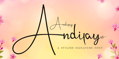 Andilay is a lovely and timeless handwritten font. It is the best choice for creating eye catching logos, branding and quotes. This font is PUA encoded which means you can access all of the glyphs and swashes with ease!
 - De Roos Mediaeval NF by Nick's Fonts,
$10.00 Here’s a classic face from Dutch master type designer Sjoerd H. de Roos. Use it where timeless elegance is the goal. Both versions of this font support the Latin 1252, Central European 1250, Turkish 1254 and Baltic 1257 codepages.
 - Ballerose by Nissa Nana,
$27.00 Ballerose is an elegant and flowing handwritten font. It is PUA encoded which means you can access all of the glyphs and swashes with ease! Fall in love with this font and bring your projects to the highest levels!
 - Salminah by Letterafandi Studio,
$14.00 Salminah is a fashionable and thin lettered script font. Suitable to a wide variety of designs due to its neat and simple style, this font has the potential to become your favorite go-to font, no matter the occasion!
 - RM New Albion by Ray Meadows,
$19.00 A classic blackletter Which looks best at 16pt and above. Due to the modular nature of this design there may be a slight lack of smoothness to the curves at very large point sizes (around 100 pt and above).
 - Sophistica by RagamKata,
$14.00 Sophistica is a stylish and classic typeface and twist harmoniously together. The Eleanor font style will make you love designing and taking advantage of the cool designs for this font. Keep following us for updates on making further fonts
 - Qareluna by Typebae,
$12.00 Qareluna is a beautiful and elegant sans serif font. Suitable to a wide variety of designs due to its neat and simple style, this font has the potential to become your favorite go-to font, no matter the occasion!
 - Dino Dingbats by Beewest Studio,
$10.00 Dino Dingbats Font is cute and adorable Dinosaurus dingbats font. Whether you’re using it for crafts, digital design, presentations, or making greeting cards, this font has the potential to become your favorite go-to font, no matter the occasion!.
 - Adore Serif by Elvina Studio,
$12.00 Adore font is an elegant serif typeface with delicate details. This neat font can contribute to the modern and fashionable appeal of the brand. Perfectly suited to logo, branding, signature, wedding cards, packaging design, stationery, website design and more.
 - Danity by Sesa Grafika,
$35.00 Danity is a gorgeous and retro styled display font. Add it confidently to your projects, and you will love the results. This font is PUA encoded which means you can access all of the glyphs and swashes with ease!
 - Bewick Roman NF by Nick's Fonts,
$10.00 In 1905, artist and illustrator Will Bradley devised the pattern for this charming face. A little bit quirky and a whole lot of fun. Both versions support the Latin 1252, Central European 1250, Turkish 1254 and Baltic 1257 codepages.
 - Semrawut by Andrey Font Design,
$9.00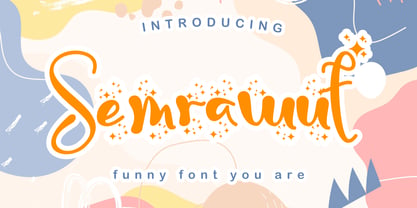 Semrawut is a lovely and timeless handwritten font. It is the best choice for creating eye catching logos, branding and quotes. This font is PUA encoded which means you can access all of the glyphs and swashes with ease!
 - HU BlueoceanKR by Heummdesign,
$25.00 This is a headline typeface created by imagining the appearance of waves in a square glass tube. It is a typeface that adds a wave shape to the gothic style in a full square module. HU BlueoceanKR includes Korean.
 - Speedblur by Greater Albion Typefounders,
$12.00 Speedblur - the name says it all really! Want a display typeface that suggests speed and motion? Well this is it. Ideal for all those retro-future designs, anything streamlined or the boy (or girl) racer in all of us!
 - MBF Raveny by Moonbandit,
$19.00 Raveny is a high contrast modern display font by moonbandit, This typeface is a unicase font, meaning that the uppercase and lowercase has the same height. Raveny also comes with multilingual support and several alternates for you to explore.
 - Bojimtes by Twinletter,
$12.00 Introduce Bomjites font. Calligraphy fonts are made by hand in detail on each letter character so that they can be combined with various kinds of writing design needs. This font is designed to produce lovely and beautiful words and sentences, creating beautiful writing has never been easier. Not limited to that, the bold calligraphy font is designed to keep paying attention to the beauty of each letter, there are alternate options for the letters which are certainly easy for you to access, so you can automatically customize the letters you want to enhance the visual appearance of your design project. This charming font also offers the beauty of abstract typography harmony for a wide variety of design projects, including digital natural handwriting for designs, quote designs, for social media business designs, advertisements, trademarks, food and beverage promotion banners, text, posters, a signature, and all designs require handwriting or whatever design you want. ============================================================================================================ What’s Included : File font Web Fonts Standard glyphs Ligature Works on PC & Mac Simple installations Accessible in Adobe Illustrator, Adobe Photoshop, Adobe InDesign, even work on Microsoft Word. PUA Encoded Characters – Fully accessible without additional design software. Fonts include multilingual support for; Afrikaans, Albanian, Croatian, Czech, Danish, Dutch, English, Estonian, Finnish, French, German, Hungarian, Italian, Norwegian, Polish, Portuguese, Slovak, Slovenian, Spanish, Swedish Thank you for your purchase! Hope you enjoy our font!
 - Archeron Pro by Mostardesign,
$25.00 Archeron Pro is a modern serif font family with 18 fonts ranging from light to Heavy with the corresponding italics. This new font family revisits the neo-classical style of highly contrasted serifs and brings a resolutely contemporary touch to graphic or editorial projects. Archeron Pro has also been designed with high-contrast character ratios and a high x-height to give sentences more rhythm and legibility to long texts for on-screen display or printed materials. The italic styles of this family of characters are voluntarily removed from the calligraphic style to bring modernity to the italicized style, thus giving more of a typographic style. With these features, Archeron Pro is an elegant and contemporary serif specially adapted for modern communication as well as complex typographic projects. Archeron Pro also has a complete set of real small capitals with a little more tension than uppercase and generous proportions to give more emphasis to the texts you want to highlight. In terms of features, Archeron Pro is equipped with professional features such as case sensitivity, alternative glyphs, F-ligatures, circled numbers, localized letters, ordinals, or “Pro Kerning” with more than 5,000 pairs of glyphs which brings more clarity when reading long paragraphs. Archeron Pro also has a complete set of proportional and tabular numbers, fractions, and circled numbers for complex realizations such as tables or numerical lists.
 - Bohemian Initials by Kaer,
$24.00 I’m happy to present you the Bohemian initials font family. Regular and Colored styles (Uppercase & Numbers) based on Codex Gigas originated in medieval Bohemia. The manuscript has been dated 1230. The elaborate initials are at the beginning of the main texts and their principal divisions. The painter was aiming to achieve a plastic depiction of the trailing vines of the initials, and he painted with solid colours. He used only four of the primary colours cinnabar red, blue, green and yellow, brightly toned, as well as white accents and contours. The trailing vines of the initial letters are painted in a decorative, advanced Romanesque style, already bordering on naturalism. The plant taken as the starting point is the acanthus, a thistle-like plant which grows wild in the Mediterranean countries. The decoration of the Devil’s Bible is not the work of an amateur. Scholars have concurred: it is book illuminations created in Northeast France and Southern England in the so-called Channel style which provided the starting point for the coiled trailing-vine shapes in the initials of the Devil’s Bible. --- You can use color fonts in PS CC 2017+, AI CC 2018+, ID CC 2019+, macOS 10.14 Mojave+ Please note that the Canva & Corel & Affinity doesn't support color fonts! --- Please feel free to request any help you need: kaer.pro@gmail.com Thank you!
 - Keratine by Zetafonts,
$39.00 The letterforms that we now accept as the historical standard for printing latin alphabets were developed in Italy around the end of 1400. Deriving from Roman capitals and from italic handwriting, they soon replaced the blackletter letterforms that were used a few years before by Gutenberg for his first moveable types. Between these two typographical traditions there's an interesting and obscure middle ground of historical oddballs, like the Pannartz-Sweynheym Subiaco types, cut in Italy in 1462. Keratine is the result of Cosimo Lorenzo Pancini's exploration of that territory. Like our Kitsch by Francesco Canovaro it explores the impossible territory between antiqua and blackletter, not as a mere historical research, but rather as a way to re-discover and empower an unexpected and contemporary dynamism. Using contemporary digital aesthetics to combine the proportions of humanistic type with the gestural energy of Fraktur letterforms, Keratine develops a "digitally carved", quasi-pixelated appearance (clearly stressed in Keratine's italics) that allows an unexpected balance between small-size readability and display-size personality. Keratine also relies heavily on a variable identity as the letterforms change dynamically with weight, developing from a contrasted, text-oriented light range to more expressive and darker display range, for a total of 8 weights with italics. Open type features and glyph alternates further enrich the usage possibility of this typeface that embodies our contemporary swap culture by embracing the contradictory complexity at the crossroads between Gothic and Humanist styles, while playfully empathising with a digital, brutalist spirit.
 - Grafical by Halbfett,
$30.00 Grafical is a contemporary take on 19th-century sans serifs. In this family, the amount of geometry inherent within the letterforms has been amped up. Many shapes have received further streamlining, too. All the geometric forms you see have been optically corrected, ensuring their delivery of better legibility. Grafical ships in two different formats: depending on your preference, you can install the typeface as two Variable Fonts or use the family’s 16 static OpenType font files instead. The static fonts offer eight weights, running from Extralight through Black. Each weight has an upright and an italic font available. While the static-format fonts offer a good intermediary-step selection, users who install the Variable Fonts have vastly greater control over their text’s stroke width. The Grafical Variable and Grafical Variable Italic font’s weight axes allow users to differentiate between almost 1,000 possible font weights. That enables you to fine-tune your text’s exact appearance on-screen or in print. Grafical is the perfect tool for a range of design uses, including text on the web, text in print, and text in motion graphics. Its fonts are typographic workhorses – not just from their legibility perspective but also because of the amount of OpenType features they include. There are ligatures, for instance, as well as proportional and tabular lining and oldstyle figures, fractions, numbers placed inside circles, and even Roman numerals. Users can also substitute alternate versions of the “a”, “g”, “i”, “j”, “y”, “G”, and “Q” into their work.
 - Selfie by Lián Types,
$37.00 ATTENTION CUSTOMERS :) There's a new Selfie available, have a look here; Selfie Neue is better done and more complete in every aspect. However, you can stay here if you still prefer the classic version. -But first, let me take a Selfie!- said that girl of the song and almost all of you at least once this year. While some terms and actions get trendy, some font styles do it too. It wouldn't be crazy to combine these worlds, in fact it happens often. Selfie is a connected sans serif based in vintage signage scripts seen in Galerías of Buenos Aires. These places are, in general, very small shopping centres which pedestrians sometimes use as shortcuts to get to other parts of the city. Their dark corridors take you back in time, and all of a sudden you are surrounded by cassettes, piercings, and old fashioned cloth. For some reason, all these shops use monolined geometric scripts. Surely, neon strings are easier to manipulate when letterforms have simple shapes. My very first aim with Selfie was to make a font that would serve as a company to those self-shot pictures that have become so popular nowadays. However, the font turned into something more interesting: I realised it had enough potential to stand-alone. Selfie proves that geometry itself can be really attractive. In this font, elegance is not achieved with the already-known contrast between thicks and thins of calligraphy, but with the purity of form. Its curves were based in perfectly shaped circles which made the font easy to be used at different angles (some posters show it at a 24.7º angle) without having problems/deformities. In addition to its nice performance when used over photographs, the font can be a good option for packaging and wedding invitations. TIPS Adding some lights/shadows between letters will for sure catch the eye of the viewer: Words will look as if they were made with tape/strings; so trendy nowadays. Try using Selfie at a 24.7º angle so that the slanted strokes become perfectly vertical. Having the decorative ligatures feature (dlig) activated is a good option to see letters dance. TECHNICAL It is absolutely recommended to use this font with the standard ligatures feature (liga) activated. It makes letters ligate perfectly and also improves the space between words.
 - LoveYaHoney by Typadelic,
$14.95 Aw, aren't they sweet? This lettering is based on a 1950s note a husband wrote to his wife shortly after they were married. His beautifully controlled and strong handwriting knows no lowercase characters; he gets his point across in uppercase only. In today's world of email and internet writings, we know that uppercase means shouting and is considered quite rude, but he didn't know that when he wrote this letter to his lovely wife! Love Ya Honey is very legible and looks beautiful when used for headlines, titling or even long expanses of body copy. Perfect for scrapbooking too!
 - End Crawl by Wing's Art Studio,
$10.00 End Crawl - A Halloween Brush Font Introducing a new creeping terror this Halloween, End Crawl is a hand-drawn brush font inspired by the gore-soaked horror movies and comic books of the 1970s and 80s. This textured all-caps design evokes a nervous energy that will leave your readers frozen in suspense! With a bold painted look surrounded by an anxious outline, it offers the tools to leave your readers stomach in knots! The End Crawl font family includes all-caps uppercase and lowercase characters, along with numerals, punctuation, symbols and language support. Also included are a complete set of alternative characters and additional paint marks, drips and splashes. Wingsart Studio Design Tip! The uppercase and lowercase characters work great when mixed in an alternating fashion, with shapes that combine to create a dynamic, trembling look that's perfect for the Halloween season. Add the alternatives and paint marks into the mix and you'll have yourself a title or header design that looks truly custom-made. I've even included the base font and outlines separately, allowing to overlay your own colour combinations!
 - Corporative Soft by Latinotype,
$26.00 Corporative Soft is the slightly rounded-edged version of Corporative. This font has a marked personality and distinctive traits, which makes it suitable to be used at large text sizes. At the same time, the smooth transition from straight to curved lines gives the font a more friendly feel. This display typeface is the perfect choice for logos, posters, signs, branding, packaging and so on! Corporative Soft comes with Latinotype’s standard set of 350 characters, making it possible to use the font in 128 different languages. Corporative Soft provides users with a wide range of characters, weights and widths for every project. By combining different variants, designers can achieve the best results. The family consists of 64 fonts: a basic family that includes 8 weights plus italics, an alternative family of 8 weights with matching italics and 2 condensed families, one regular and one alternative, both with italics. Corporative Soft was created by LatinotypeTeam and developed by Javier Quintana, Eli Hernández and Rodrigo Fuenzalida, under the supervision of Luciano Vergara and Daniel Hernández.
 - Adriane Text by Typefolio,
$49.00 Adriane Text was designed between 2006 and 2007 with additional production completed by Silas Dilworth for this 2008 release [v1.002]. Focusing on text composition and unique typographic characteristics, details within the characters provide both personality and excellent legibility at small sizes. With a medium contrast, a predominantly vertical axis, and a generous x-height, it can be classified as a transitional typeface. This package of advanced OpenType fonts consists of the style-linked quartet of Regular and Bold weights accompanied by corresponding Italics, each of which include small caps and full support for Extended Latin character sets - now including Central European diacritics. Old style and lining figures are provided in both proportional and tabular spacing, and an extensive set of ligatures, ornaments, dingbats, and alternate ampersands are available across the family. The Italics possess a fluidity that contrasts with the staid posture of the Roman styles. The degree of inclination for the uppercase and lowercase characters are slightly different, offering an enhanced visual rhythm in the text settings.
 - Hatchet Job by Wing's Art Studio,
$10.00 Hatchet Job - A Halloween Brush Font Unleashed onto an unsuspecting public this Halloween, Hatchet Job is a brush font inspired by the slasher and cabin-in-the-woods horror movies and comics typical of the 1970s and 80s. This textured all-caps design takes its visual style from old cabins, ghost ships and axe-splintered wood that can only spell danger! With a bold brush strokes and frayed edges, it offers the tools to leave your readers nerves in tatters! The Hatchet Job font family includes all-caps uppercase and lowercase characters, along with numerals, punctuation, symbols and language support. Also included are a complete set of alternative characters and additional paint marks, drips and splashes. Wingsart Studio Design Tip! The uppercase and lowercase characters work great when mixed in an alternating fashion, with shapes that combine to create a dynamic, un-hinged look that's perfect for the Halloween season. Add the alternatives and paint marks into the mix and you'll have yourself a title or header design that looks truly custom-made.
 - Towienk by Twinletter,
$13.00 Introducing “Towienk Font” – Your Passport to Summer Creativity. Embrace the sun-soaked vibes of summer with Towienk Font, your perfect companion for creating designs that radiate the essence of the season. This delightful display font captures the spirit of summer in every character, making it an ideal choice for all your warm-weather projects. Towienk Font’s playful and breezy style adds an instant touch of summer to your designs. Whether you’re working on beachside invitations, tropical-themed posters, or anything in between, this font will infuse your work with the carefree spirit of the season. With meticulous attention to detail, Towienk Font ensures that your text pops with the vibrancy of summer. It’s a versatile typeface that adapts effortlessly to various design applications, from travel brochures to poolside party banners. Dive into the world of Towienk Font and let your designs sizzle with the warmth and energy of summer. Elevate your creativity and make every project a sun-drenched masterpiece. – PUA Encoded Characters – Fully accessible without additional design software.
 - Verbatim by Monotype,
$25.99 This extensive 60-font type family was inspired by the best (and worst) of 1970s science fiction TV shows and movies. Verbatim aims to extract the essence of futuristic type from that era, add a dash of modern style and conjure a cinematic typeface for the 21st century. From the extremes of the thin condensed, all the way through to the black extended, Verbatim has the scope to add drama to your titles and headings, and finesse to your logo and branding projects. Distinguishing features include a large x-height and open counters that aid legibility. This typeface crosses a few boundaries of type specification in that it is both rounded and square, it is part geometric in construction with a touch of humanistic flair and stroke contrast – giving Verbatim a distinctive and confident air. Key features: • 6 weights in Roman and Oblique • 5 Styles – Condensed, Narrow, Regular, Wide, Extended • Small Caps and 7 Alternates • European Language Support (Latin) • 600 glyphs per font. See more detailed examples at the Verbatim microsite.
 - Mangerica by Ndiscover,
$25.00This design incorporates different styles into a consistent look. A pinch of script, a little of geometric and some humanistic shapes as well create a very distinguishable sans-serif. It has an overall good feeling specially on the heavier weights that have intended contrast irregularities to create a 'cartoonish' look. On the intermediate weights the design will preform well on small font sizes because of its large counters, low contrast and large x-height, but as you go to the extremes you will see shapes full of personality that will pop out in large font sizes. The font is loaded with opentype features such as small caps, ligatures, alternates, old style figures, and much more. The italic version is deeply rooted in the calligraphic heritage of the Italics. This way the brush inspired strokes are emphasized as well as an overall calligraphic look. Far from being a mere slant, Mangerica Italic had every lowercase glyph redesigned as well as some uppercase, besides that, every glyph was optically adjusted to ensure not only aesthetics but functionality too. - ITC Japanese Garden Ornaments by ITC,
$29.99ITC Japanese Garden Ornaments is a symbol font designed by Akira Kobayashi (before Kobayashi became Linotype's Type Director in 2001, he worked as an independent typeface designer in Tokyo). The images in Japanese Garden are, as the name suggests, mostly floral or herbaceous, derived from designs used in Japanese indigo stencil dyeing. In Japanese Garden," Kobayashi says, "I tried to create a set of type fleurons that are very familiar to a Japanese eye, but not too exotic to people in other countries." Several of the designs fit together seamlessly in repeating patterns; others work either together or as isolated ornaments, a flexibility that also characterizes traditional Western type fleurons. "The original illustrations," notes Kobayashi, "were mostly cut from white paper squares, about two by two inches in size, and were simply scanned and traced. That is why there are few smooth curves and perfectly straight lines in the illustrations. I simply liked the ragged textures of them."" - Barberry by FontaZY,
$35.00 Barberry is a hand-made brush script typeface equipped with some decorative OTF features, made by Zakhar Yaschin (FontaZY). Barberry font contains stylistic alternates, initial and final alternates (which is duplicated by contextual alternates in the case when ini & fina are not supported), ligatures, titling alternates, small caps and large collection of swashes (additional variants - in Stylistic Set). The Barberry font is essential for hand-made lettering and design. The Barberry family also includes Barberry Vigniette font with over 200 icons and vigniettes in it. Barberry Letters supports most of Western languages (including Central Europian, Baltic and Eastern European languages) and also Cyrillic. Each lowercase letter has three positional versions of the design – basic (if the letter is in the middle of a word), initial (if the word starts with it) and the final (in the end of the word) that makes the set look more alive and expressive. Working with Barberry Letters you can enable and disable if needed such typographic tools as swashes, ligatures, small caps, titling alternates, stylistic alternates, additional swashes and the already mentioned initial and final alternates. If your design software does not support the use of the initial and final alternatives, they can be duplicated by contextual substitutions. There are more than 20 Latin and Cyrillic ligatures in the Barberry Letters. It works by default as the standard ligatures, but you can switch it off for design reasons or to select the more appropriate typographic solution in any particular case. Ornamental font Barberry Vigniette has more than 200 pictograms and vignettes that can decorate your typographic layout. All icons are drawn with a brush in the same style as the Barberry Letters. You can use them inside the text lines, or make the ornamental decoration for text, or use separately, without any letters. OpenType extensions of the Barberry Letters significantly expand the choice of typographical tools to design a better, more expressive layout. Choosing the optimal variant of certain letters in each case, you can receive a unique composition. Whether it is lettering for packaging or magazine headline, logotype or the name in the invitation – just one Barberry font-family gives you the very wide typographic possibilities.