10,000 search results
(0.083 seconds)
- Scandals JNL by Jeff Levine,
$29.00 Scandals JNL is free-form hand lettering with an Art Nouveau influence showing up on a 1928 piece of sheet music for the song "American Tune", and is based on the cover text noting the song was from the popular (9th Edition) of George White's Scandals; a Broadway musical-variety show. Available in both regular and oblique versions.
 - Corvone by Greater Albion Typefounders,
$16.95 Corvone is a heavy bullnosed display family, inspired by the post war era's ideas of modernity. Two faces are offered, plain—a solid black face, and regular—which employs a three-dimensional pipeline effect to add real emphasis. Use Corvone to give work a retro feel, and/or where you want to really drive your point home.
 - Facility Signage JNL by Jeff Levine,
$29.00 A famous 1971 photo shows boxing champ Muhammad Ali making faces through a window at Joe Frazier at the challenger’s training facility. A small sign sits in the window that says “Joe Frazier Training Headquarters” and is lettered in a simple sans serif condensed typeface. This is now available as Facility Signage JNL in both regular and oblique versions.
 - Movie Producer JNL by Jeff Levine,
$29.00 The Nov. 13, 1915 and Nov. 27, 1915 issues of Moving Picture World carried ads for Jesse L. Lasky Productions in which the titles of the upcoming films were hand lettered in an elegant Art Nouveau spurred serif style. This stylish alphabet is now available digitally as Movie Producer JNL in both regular and oblique versions.
 - FF Snafu by FontFont,
$41.99 British type designer Jonathan Hitchen created this display FontFont in 2002. The family has 5 weights, ranging from Light to Regular and is ideally suited for film and tv, poster and billboards, software and gaming as well as sports. FF Snafu provides advanced typographical support with features such as ligatures. It comes with tabular lining and proportional lining figures.
 - Dance Moderne JNL by Jeff Levine,
$29.00 A small book entitled “Portfolio of Alphabet Designs for Artists, Architects, Designers & Craftsmen” [published in 1938 by Irene K. Ames] contained a number of pages displaying hand lettered alphabet examples. One sample in particular stood out for its bold Art Deco look and unusual design. This is now available as Dance Moderne JNL, in both regular and oblique versions.
 - Flocking Stencil JNL by Jeff Levine,
$29.00 Vintage packaging for Frosty Stencil Flock contained the hand lettered term “spray flock” which served as the basis for Flocking Stencil JNL; available in both regular and oblique versions. Commonly referred to as “Spray Snow”, these kits of holiday stencils and spray cans were a popular item in the households of the 1950s and early-to-mid 1960s.
 - Spaghetti Joint JNL by Jeff Levine,
$29.00 An image from the Library of Congress showing a New York City Italian Kitchen storefront window and its various neon signs inspired Spaghetti Joint JNL, which is available in both regular and oblique versions. The term “Spaghetti Joint” is old-fashioned slang for any restaurant serving Italian cuisine, especially those featuring spaghetti or other pasta dishes.
 - Bettrish by Bluestudio,
$6.00 Bettrish is made to resemble scratchy quick hand writing, so it looks like a natural style like your own scribbles. Bettrish offers beautiful typographic harmony for a variety of design projects, including logos & branding, wedding designs, social media posts, advertisements, product designs, magazines and more. What's included? -Bettrish Regular (OTF) -Bettrish Italic (OTF) -Ligatures -Multilingual support
 - Sweet Vanity by Prestige Artsy Studio,
$20.00 Sweet Vanity is a remarkable modern and rich serif that comes with its beautiful outline. It works beautifully for branding projects, headlines, magazines, product packaging, quotes, posters and more. Sweet Vanity can be easily read thanks to its sophisticated and clean curves. WHAT’S INCLUDED: • Sweet Vanity – Regular • Sweet Vanity – Outline Follow me on Instagram for future updates : www.instagram.com/zak.mansouri/
 - FF Angst by FontFont,
$41.99 German type designer Jürgen Huber created this display FontFont in 1996. The family contains 3 weights: Regular, Condensed, and Heavy and is ideally suited for film and tv, music and nightlife, poster and billboards as well as software and gaming. FF Angst provides advanced typographical support with features such as ligatures. It comes with proportional lining figures.
 - Show Card Pen JNL by Jeff Levine,
$29.00 The 1920 edition of “How to Paint Signs and Sho’ Cards” by E. C. Matthews offered a number of examples of then-modern lettering styles for sign painters and show card writers. A bold display alphabet made with a round lettering nib is now available as Show Card Pen JNL, in both regular and oblique versions.
 - DINosaur by Type-Ø-Tones,
$60.00 DINosaur is the typographical mise en scène of a calligraphic standard for technical writing, found in a 1967 manual. Although its base is a regular grid and its main reference is the DIN norm, it is full of a multitude of small original features. The microtypographic details refer to the tools originally used for its reproduction.
 - Zenia by Greater Albion Typefounders,
$9.50 Zenia, offered in regular and bold weights is a homage to the streamline era of the later 1930s. It's a distinctive display family, glyphic yet still intuitive and easy to read. Use it anywhere you want that 30's streamlined feel, or perhaps in science fiction inspired work particularly those that have a 'past inspired future' feel...
 - Silica by Stone Type Foundry,
$49.00 This slab serif is a general purpose type in six weights. The lighter weights are useful for short passages of text. The heavier weights are a versatile tool for setting headlines. Available weights are Extra Light, Light, Regular, Semibold, Bold, Black. Silica was designed to withstand condensation using horizontal scaling without compromising the weighting scheme of the design.
 - Prospect Heights JNL by Jeff Levine,
$29.00 While the inspiration for Prospect Heights JNL may have been a piece of vintage sheet music entitled "My Ohio Lullaby", the name is classically New York. To be precise, it's a neighborhood in the Borough of Brooklyn. Prospect Heights JNL is available in both the regular version (with an engraving line) and a solid (plain) version.
 - Arnika by Typejockeys,
$50.00 This charming type family comes in four widths: Regular, Semi Condensed, Condensed and Extra Condensed – bringing flexibility and diversity to your drawing table. Crisp details convey confidence without losing fineness. Arnika is your ally for all things classy. Although it is a match made in heaven for beauty products and fashion magazines, we leave its usage to your imagination.
 - Made In Japan JNL by Jeff Levine,
$29.00 A set of rubber stamp letters, figures and punctuation used for marking electrical or communications equipment [and made in Japan] is the basis for this serif typeface. Varying widths and some letters in more of a block style than rounded are typical of Japanese packaging text from the 1950s and 1960s. Available in regular and oblique styles.
 - Plank Rollouts by Areatype,
$23.00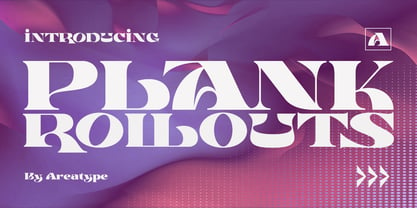 Plank Rollouts is a very versatile font.perfect for magazine images, to wedding invitations, to branding, poster design, and more. Files included: Plank Rollouts Regular Numerals & Punctuation Ligatures PUA Encoded Characters Thanks so much for looking, I really hope you enjoy it and please don't hesitate to drop me a message if you have any issues or queries :)
 - Imported Goods JNL by Jeff Levine,
$29.00 In the December, 1947 issue of Modern Screen magazine, a feature article showcased actress Deborah Kerr with the title “Imported”. The typography used for the headline of the article was a hand lettered, extra-bold, sans serif stencil design. This lettering became the inspiration for Imported Goods JNL, which is now available in both regular and oblique versions.
 - Retirement JNL by Jeff Levine,
$29.00 The hand lettered film credits for 1937’s “Make Way for Tomorrow” were done in a sans serif design with an ever-so-slight flare and a slightly semi-calligraphic look. Unusual in both style and varying character thicknesses, the lettering has been digitally redrawn as Retirement JNL, which is available in both regular and oblique versions.
 - Going Places JNL by Jeff Levine,
$29.00 Based on hand lettering from a January 26, 1930 ad for the 1930 Fox Studios film "Let's Go Places", the lettering is an ultra bold serif design with numerous ball terminals throughout the character set. The typeface is both formal, yet casual and playful in appearance. Going Places JNL is available in both regular and oblique versions.
 - Oddly Deco JNL by Jeff Levine,
$29.00 A quirky and unusual Art Deco monoline typeface can be found within the pages of the Esterbrook Drawlet Pen instruction book [circa the 1940s]. Drawlet was the direct competitor to Speedball Lettering pen nibs. This unusual type design of varying width and character shapes is now available digitally as Oddly Deco JNL, in both regular and oblique versions.
 - EM by Wilton Foundry,
$29.00 Time to EMbrace the new EMerging typeface from WiltonFoundry : EM consisting of EM Regular, EM Italic, EM Bold, EM Bold Italic. Loosely based on our very popular Cyan typeface, EM is EMphatically the most distinctive and modern typeface we’ve created yet. Slight variations between thick and thin with stenciled effects, and Flared stem EMphasis for character. Go get’EM!!
 - Raker by Wordshape,
$20.00 Raker is a science fiction-inspired geometric sans serif text typeface family with a humanist influence and solid spacing/kerning. Regular, Display, stencil, and display stencils versions are included. Think NASA. Think the Space Race. Think Geometric. Think “works with text, too.” Detailed spacing, Western and Eastern European language support, and automated ligatures. Think hidden glyphs.
 - Aussie Stencil JNL by Jeff Levine,
$29.00 An assortment of antique, hand-punched brass stencils from Australia [used for crate marking and shipping] served at the models for Aussie Stencil JNL, which is available in both regular and oblique versions. The lettering of the original stencil punches had rounded edges to the characters; looking more machine rendered than hand punched into the brass sheets.
 - Ambretta by Areatype,
$20.00 Ambretta serif is a very versatile font.perfect for magazine images, to wedding invitations, to branding, poster design, and more. Files included: Ambretta Regular Numerals & Punctuation Stylistic Alternates & Ligatures PUA Encoded Characters Thanks so much for looking, I really hope you enjoy it and please don't hesitate to drop me a message if you have any issues or queries :)
 - Saturator Serif FA by Fontarte,
$39.00 Saturator Serif FA is a younger brother of Saturator FA. It comes with upper and lower case letters and with diacritic characters for many Latin languages. Its informal and cheerful character allows for different creative ways of usage. This slab serif typeface is designed to accompany sans serif version. It has three variants: Regular, Italic and Shadow.
 - Egon Sans Condensed by TipografiaRamis,
$29.00 Egon Condensed is a geometric sans serif typeface family built in nine styles - light, regular, bold weights in roman and italic respectably, plus three alternatives in roman. Egon Sans Condensed is an extension of Egon family - Egon Slab Serif (2008) and Egon Sans Serif (2010). Egon Sans is released as OpenType single master with a Western CP1252 character set.
 - Conscription JNL by Jeff Levine,
$29.00 The sheet music for the 1914 Word War I comic novelty song "When the War Breaks Out in Mexico I'm Going to Go to Montreal" had one of those overly-worded song titles popular during this period (13!), along with interesting sans serif hand lettering. It now debuts digitally as Conscription JNL in both regular and oblique versions.
 - Monthly Issue JNL by Jeff Levine,
$29.00 An Art Nouveau, hand lettering on a Good Housekeeping magazine cover from the 1920s inspired Monthly Issue JNL, which is available in both regular and oblique versions. Prior to the 1940s, it was not unusual to find the covers of many popular magazines hand lettered with either their names and/or content information; often in different type styles.
 - Mixoma by Something and Nothing,
$12.00 Introducing Mixoma, a combination of Serif and Sans strokes gives Mixoma a stylish look. The available stylistic alternates are designed to make your typography look more unique and help bring out your inner Mixologist. Mixoma is available in 9 weights, Thin, Extra Light, Light, Regular, Medium, Semi Bold, Bold, Extra Bold and Black each having an italic version. Enjoy!
 - FF Inkling by FontFont,
$30.99 American type designer Joel Decker created this script FontFont in 1997. The family contains 2 weights: Regular and Bold and is ideally suited for advertising and packaging, poster and billboards as well as software and gaming. FF Inkling provides advanced typographical support with features such as ligatures and case-sensitive forms. It comes with proportional oldstyle figures.
 - Project Fairfax by Miller Type Foundry,
$15.99 Project Fairfax is a unique stencil typeface designed on a strict grid. It is perfect for any stencil design, especially a military look. It comes in three styles, sans, regular, and slab; each with a non stencil counterpart. It comes with a full Latin character set, tabular and lining figures, numerous ligatures, and stars and arrows for ornaments.
 - Squared Off JNL by Jeff Levine,
$29.00 In an 1896 specimen catalog for American Type Founders there is a design called Geometric Gothic. The lettering style looks as if it’s ahead of its time; foreseeing the 1980s. With its squared characters, some pointed overhangs and modified character shapes, this type design is now available as Squared Off JNL, in both regular and oblique versions.
 - Deco Power JNL by Jeff Levine,
$29.00 A June 18, 1929 issue of the Hollywood trade paper “The Film Daily” ran an ad for a film called “The Power House”. The film’s title was hand lettered in an extra bold sans serif design with strong Art Deco influences. This is now available digitally as Deco Power JNL in both regular and oblique versions.
 - Deco Pen JNL by Jeff Levine,
$29.00 Hand lettering found across the sheet music cover of 1931's "Bend Down, Sister" [from the Eddie Cantor film "Palmy Days"] covered a couple of varying Art Deco styles; both made with a round-tipped pen nib. Deco Pen JNL combines the best of both styles into one design that's available in both regular and oblique versions.
 - Top Forty by Jeff Levine,
$29.00 A 1963 issue of Billboard Magazine contained an ad for Jimmy Smith (along with some other artists on the same record label) that was hand-lettered in a free-form style similar to show-card ‘one-stroke’ typographic design. This was the inspiration for Top Forty JNL, which is available in both regular and oblique versions.
 - Tarquin AT by Akufadhl,
$15.00 Tarquin is a All-Caps sanserif typeface, inspired by the beautiful hand-painted sign. It has a strong personality, high contrast stem, and widely opened counter to improve the readibility as it designed for display purposes. It's available in 3 different style, REGULAR, STENCIL, and SHADOW designed for display purpose design Crafted beautifully and carefully with hand.
 - Didonesque Ghost by Monotype,
$25.99 Didonesque Ghost is a family of 10 fashionable fonts that will enhance any project that requires a touch of class. These fonts turn the contrast right up to 11 – giving each weight a ghost-like appearance by means of their hairline stems and serifs. This extreme contrast gives Didonesque Ghost a very stylish appearance which is intended for use in display purposes at very large sizes – posters, signage, branding, corporate identities, headlines, advertising, wedding invitations and the like. See more detailed examples here . Key features: • 5 Weights in Roman and Italic • Small Caps, Petite Caps, Contextual Alternates, Ligatures and Discretionary Ligatures • European Character Set – Latin Only • 750 glyphs per font.