5,276 search results
(0.011 seconds)
- Bahiyoh by Twinletter,
$18.00
- Federal Streamliner by Greater Albion Typefounders,
$9.95
- Moonface Script by TypeFaith Fonts,
$6.00
- La Reyna Catalina NF by Nick's Fonts,
$10.00 - Word From Radio by Dharma Type,
$14.99
- Freakin Wicked by Nicky Laatz,
$30.00
- Spooky Vibes by Ake,
$18.00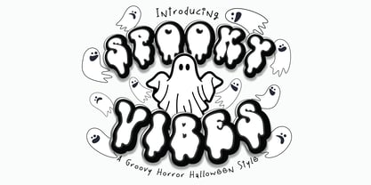
- Distressed Groovy Funky by Beast Designer,
$15.99
- ST Titan by ShimanovTypes,
$20.00
- Modern Abstract by Cultivated Mind,
$19.00
- Dead Mementro by Letterhead Studio-VG,
$20.00
- Babes In Toyland NF by Nick's Fonts,
$10.00 - Wonderbear PB by Pink Broccoli,
$14.00
- Nirvanium NB by No Bodoni,
$39.00
- Fichte Fraktur by RMU,
$25.00
- Emilia Gotisch by RMU,
$25.00
- Ordinary Gothic JNL by Jeff Levine,
$29.00
- Nick and Daddy by Awan Senja,
$14.00
- P22 DeStijl by P22 Type Foundry,
$24.95 - Girder Poster by GroupType,
$15.00
- RMU Trifels by RMU,
$35.00
- Aldo Manuzio by RMU,
$30.00
- Lastik by That That Creative,
$120.00
- Ephemera Nickson by Ephemera Fonts,
$15.00
- Concordia by RMU,
$30.00
- Italiano Doc by RM&WD,
$35.00
- Oakland by Greater Albion Typefounders,
$9.50
- Bllides by Maulana Creative,
$14.00
- High Tea by Hanoded,
$15.00
- Compressed Wood JNL by Jeff Levine,
$29.00
- East Anglia - 100% free

- spinwerad - Unknown license

- B de bonita shadow - Personal use only

- Gothic Birthday Cake - 100% free

- Source Code Pro - 100% free

- Miama - 100% free

- Anfalas - 100% free

- B de bonita - Personal use only

- Exo - 100% free

- Hollow Roachian Futhark - 100% free


