10,000 search results
(0.056 seconds)
- Dryer Grain by Patrick Dewenter,
$-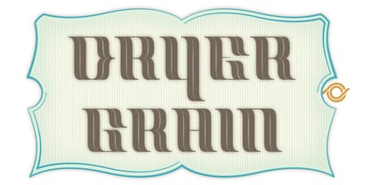 This typeface is intended for use with single words or phrases at a large point size. Suggesting some sort of calligraphic inspiration, I sketched a couple of these letters while creating a logo concept and decided to make a complete alphabet. The stroke through the letterforms adds some interest and elegance, although I believe this typeface expresses a sort of vehement or serious character. This is my new, and first, typeface. I plan to create more in the future. If you use it for anything interesting, I'd love to see!
 - CA Slalom Condensed by Cape Arcona Type Foundry,
$40.00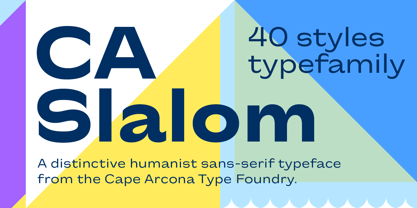 The starting point for CA Slalom was the aspiration to create a contemporary interpretation of classics like Gill and Antique Olive in terms of aesthetics, flexibility and usefulness. The outstanding S soon became the visual hook and starting from the extra bold extended weight, CA Slalom evolved into a huge family with four widths. It’s rather round instead of squarely with stroke-ends pulled deep and a relatively low x-height. This gives CA Slalom a taste of its own, and although it is clearly contemporary, it has the potential to become a classic.
 - Lyonette NB by No Bodoni,
$39.00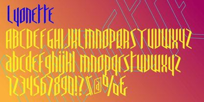 These four typefaces, Berlinette NB, Lyonette NB, Marseillette NB and Parisette NB, were designed from the same basic shape, a geometric form that avoids strict horizontals and uses more offbeat triangular shapes. Lyonette is a fanciful type, gentle and precocious. It seems aloof at times but isn�t really. The frivolity and quirkiness of the narrow width is offset by the fey, finger-like horizontals, vaguely reminiscent of strange encounters and dark closets. It�s great for fashion advertising with literary pretensions. Or maybe a kinder, gentler sci-fi movie.
 - Englebert Pro by Stiggy & Sands,
$29.00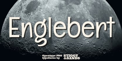 Our Englebert Pro draws inspiration from the title screen of the 1930's film entitled, "Der Blaue Engel", starring Marlene Dietrich. Playful but subdued, yet striking enough to catch the eye, this casual sans has a distinct signature look to it. The offbeat letterforms engage the reader, while the SmallCaps and extensive figure sets lend a wider versatility to the typeface. Opentype features include: - SmallCaps. - Full set of Inferiors and Superiors for limitless fractions. - Tabular, Proportional, and Oldstyle figure sets (along with SmallCaps versions of the figures). - Stylistic Alternates for Caps to SmallCaps conversion.
 - Fourth by J Foundry,
$25.00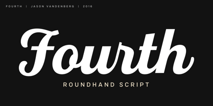 Fourth is a contemporary roundhand script with a classic feel. It draws inspiration from classic Americana – baseball scripts, sign painting and branding. The family consists of seven weights with ornament extras for good variety in layout and logo development. The forms are rational and refined for consistency and legibility. Contextual alternates are included for smooth initial and ending forms. Stylistic alternates are available for the commonly substituted forms; s, r, l, f, k, and z. Fourth also features Swash capitals, swash lowercase, underlines and catchwords for custom styling.
 - Charlemagne by Adobe,
$29.00The capital alphabet Charlemagne was designed in 1989 by Carol Twombly. The basic forms are modelled on those used in classical Roman engravings. They are distinguished by pointed serifs which sometimes extend beyond the bounds of the forms, for instance on the E, F and S. These serif forms have made other historial appearances, for example, in handwritten rectangular capitals of the 9th century. The serifs lend the typeface a light ornamental touch. Charlemagne is a typical titling typeface and is best used in large and very large point sizes to emphasize its classical elegance. - CA Slalom Extended by Cape Arcona Type Foundry,
$40.00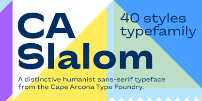 The starting point for CA Slalom was the aspiration to create a contemporary interpretation of classics like Gill and Antique Olive in terms of aesthetics, flexibility and usefulness. The outstanding S soon became the visual hook and starting from the extra bold extended weight, CA Slalom evolved into a huge family with four widths. It’s rather round instead of squarely with stroke-ends pulled deep and a relatively low x-height. This gives CA Slalom a taste of its own, and although it is clearly contemporary, it has the potential to become a classic.
 - Nanueng by Jipatype,
$27.00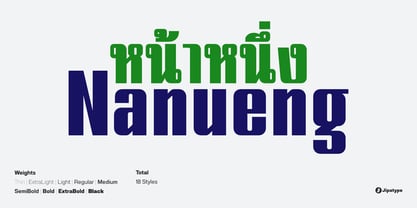 ฟอนต์sหน้าหนึ่ง เป็นอักษรแบบแซนเซอริฟที่แบบอักษรโดยรวมมีความเป็นสีเหลี่ยม ซึ่งแบบอักษรจากหนังสือพิมพ์เป็นแรงบันดาลใจ ดูแข็งแกร่ง มีความเป็นเครื่องกล เครื่องจัก ทันสมัย เหมาะสำหรับการใช้พาดหัว รองพาดหัว มีทั้งหมด 9 น้ำหนักและตัวเอียงของแต่ละน้ำหนักรวมทั้งหมดมี 18 สไตล์ และมีฟีเจอร์อื่น ๆ เช่น Small Caps หรือ Stylistic Set 01 และฟีเจอร์อื่น ๆ พร้อมให้คุณได้เลือกใช้งาน รองรับหลากหลายภาษา Nanueng is a sans serif display typeface with square shape base. Inspiration from typeface on the Thai newspapers. Look strong, machine and modern feel. Suitable for headline, sub-headline Comes with 9 weights and italics of each weight total 18 styles, and there are features such as Small Caps or Stylistic Set 01 and many features available for you. Support multi-languages.
 - MFC Chaoxiang Monogram by Monogram Fonts Co.,
$269.00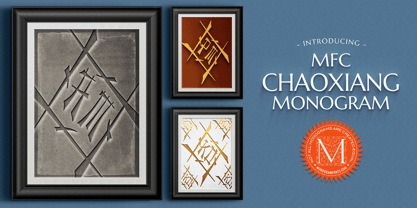 The inspiration source for Chaoxiang Monogram is another hand-drawn treasure from a vintage embroidery publication which plays on the anglo-version of chinese letters with stabbing strokes and the charm of the orient. While the original intent of this monogram style is uncertain, the possibilities of its use are up to your imagination. This is one of many monogram designs from the early 1900’s which fall into a two letter format bound within a framing element. Download and view the MFC Chaoxiang Guidebook if you would like to learn a little more.
 - MFC Gilchrist Monogram by Monogram Fonts Co.,
$24.95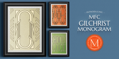 The inspiration source for MFC Gilchrist Monogram is an extremely ornamented letterset from a vintage embroidery publication from the early 1900's. We’ve digitally recreated the ornamental glyphs from the original design, and created a matching set of smallcaps in order to offer more versatility with this monogram. We have also created two additional sets of alternate glyphs with different fills for more variations. Experiment with all of these in different combinations for unique designs. Download and view the MFC Gilchrist Monogram Guidebook if you would like to learn a little more.
 - Linotype Fehrle Display by Linotype,
$29.99Erich Fehrle designed this robust alphabet for headlines and titles in 1976. The constructed figures of Linotype Fehrle Display were built on the geometric form of the rectangle. Lines of text look closed and compact. The letter forms are the result of fine open spaces. Design-specific characteristics of Linotype Fehrle Display are its serif-like additions to the strokes of the figures a, c, G or M, and the alternating rounded and angular outlines of the figures a, e, s and others. Typefaces similar to Linotype Fehrle Display: Bigband, Frutiger 95. - Belinsky Text by Tabular Type Foundry,
$32.99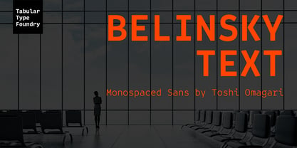 Belinsky is a monospace sans serif typeface inspired by early 20th century geometric sans serifs, architectural letterings, and retro video games to some extent. Its exaggerated proportions and sharp details appear less harsh thanks to the corner rounding. It is comprised of a standard and text families, and the latter is especially suited for small text and programming, with wider spacing and more centralised gravity of certain letters like E. It still gives your codes a lot of personality. The typeface name is a reference to the designer�s favourite animated film, American Pop.
 - CA Slalom by Cape Arcona Type Foundry,
$40.00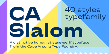 The starting point for CA Slalom was the aspiration to create a contemporary interpretation of classics like Gill and Antique Olive in terms of aesthetics, flexibility and usefulness. The outstanding S soon became the visual hook and starting from the extra bold extended weight, CA Slalom evolved into a huge family with four widths. It’s rather round instead of squarely with stroke-ends pulled deep and a relatively low x-height. This gives CA Slalom a taste of its own, and although it is clearly contemporary, it has the potential to become a classic.
 - Belinsky by Tabular Type Foundry,
$32.99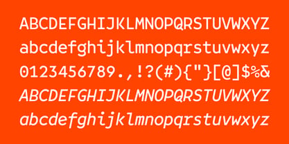 Belinsky is a monospace sans serif typeface inspired by early 20th century geometric sans serifs, architectural letterings, and retro video games to some extent. Its exaggerated proportions and sharp details appear less harsh thanks to the corner rounding. It is comprised of a standard and text families, and the latter is especially suited for small text and programming, with wider spacing and more centralised gravity of certain letters like E. It still gives your codes a lot of personality. The typeface name is a reference to the designer�s favourite animated film, American Pop.
 - CA Slalom Compressed by Cape Arcona Type Foundry,
$40.00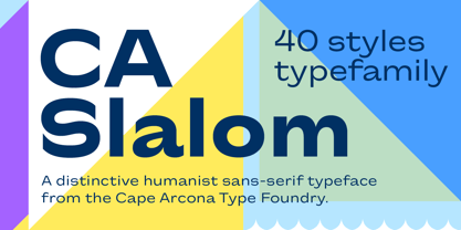 The starting point for CA Slalom was the aspiration to create a contemporary interpretation of classics like Gill and Antique Olive in terms of aesthetics, flexibility and usefulness. The outstanding S soon became the visual hook and starting from the extra bold extended weight, CA Slalom evolved into a huge family with four widths. It’s rather round instead of squarely with stroke-ends pulled deep and a relatively low x-height. This gives CA Slalom a taste of its own, and although it is clearly contemporary, it has the potential to become a classic.
 - Fine Food by Jeff Levine,
$29.00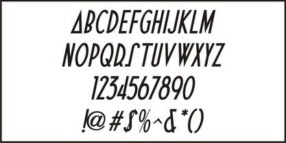 A 1942 photograph showing the exterior of the famous Hollywood restaurant Sardi’s and it’s unusually lettered sign was the inspiration for Fine Food JNL. Classically Art Deco, the Sardi’s sign had an ‘S’ looking like an inverted ‘J’ with a flat tail, a traditional ‘A’ replaced by a triangle and the ‘R’ composed of a ‘D’ with a diagonal extension. These elements were balanced against more traditional [but complementary] characters to retain the novel charm of the original signage. Fine Food JNL is available in both regular and oblique versions.
 - Banshee by Adobe,
$29.00The wind howled, the night grew long, and British type designer and lettering artist Tim Donaldson created the typeface Banshee. This dramatic display face is modeled after one of Donaldson�s handwritten lettering styles. Banshee began as letters rapidly written by Donaldson with one of his homemade ruling" pens. The letterforms are firmly rooted in the tradition of classical chancery italics. With its ragged lines and counters, Banshee realistically captures the irregularity of pen and ink on paper, lending an immediacy to packaging, advertisements, posters, and invitations that few digital typefaces can match." - Kopik by The Northern Block,
$49.50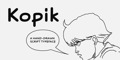 Kopik is a modern hand-drawn script inspired by the 1960's architectural handwriting style practised by draftsmen. Originated using a Copic 1.0 Multiliner pen, then traced digitally using a stylus and tablet to help reduce imperfections. The result is a simple, readable, monolinear typeface with a marker pen quality suitable for a wide range of written applications. Details include 440 characters, three weights with matching italics, alternative a, g, and y four numerals variations. Opentype features inferiors, superiors, fractions and language support covering Western, South and Central Europe.
 - Dnipro by Apostrof,
$36.00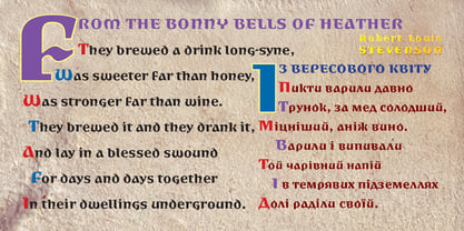 Dnipro is a version of experience generalization of Ukrainian decorative font creation. The generalization development was initited by Georgy Narbut and Mark Kirnarsky in the 1920s and continued in 1970-80s. Latin letters of the font have half-uncial forms, which makes it appropriate for the printing of the relevant content. Besides its decorative properties the font is easy to read and quite suitable for short texts. It is well suited for folk tales, Ukrainian and Slavic in general as well as Western European.
 - Magnitudes by DuoType,
$29.00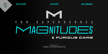 Magnitude is a font inspired by classics like Eurostyle and Bank Gothic, with geometric characteristics and dynamics style. Designed to be used in a wide variety of applications such as advertising, corporate projects, branding and retail product design. The font is well-suited for headings, display use and short text. The Magnitudes family is available in 36 weights, ranging from Extra light to heavy, to condensed and expanded with matching italics . The font contains a character set of 401 characters supporting 206 different languages.
 - Cirkel Pro by Forte Type,
$4.90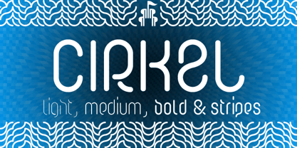 Cirkel is a contemporary font family based on circles. Its geometrical and unusual forms gives us a nice feel of modernity and humor. Created by Jarbas Gomes, Cirkel family is composed by 3 weights (Light, Medium & Bold) and its respective ornamented fonts made of patterns (Stripes Light, Stripes Medium & Stripes Bold). The fonts also have a great set of ligatures and swashes that can be accessed in softwares with support to OpenType features. Cirkel is indicated for hype designs, on titles and short texts.
 - Voltdeco V02 by Owl king project,
$29.00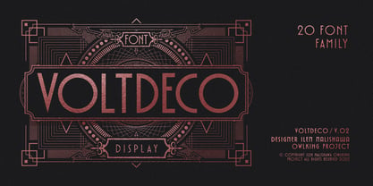 Finally, voltdeco V02 is basically capital letters (all-caps) for display, then to complement various needs for body text and headline layouts, it is developed into a font family. Voltdeco is an art deco uppercase font with a modern style, Voltdeco works great in short sentences or words, but the (20 weight) fonts allow for more options for exploration. Voltdeco can also work well for medium or regular text. Explore with voltdeco for creative works, whether printing the final design or digital design, happy exploring with voltdeco.
 - Gladiora by Owl king project,
$37.00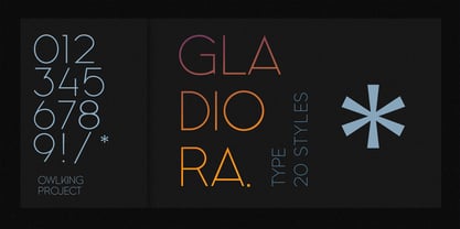 Gladiora Sans serif font family with tapered accents in some of the letters gives it a modern and bold character, even being quite prominent in thin characters. This font aims to give an elegant impression and also looks so luxurious in short wording for a letter-based title and logo. With 20 types and support for multi-languages, this font provides a wider range of exploration, which can be useful also for reading sentences and giving variety to each sentence by combining it with several sizes.
 - Linotype Araby Rafique by Linotype,
$29.99Araby Rafique is a part of the Take Type Library, winners of Linotype’s International Digital Type Design Contest. This font was designed by the British artist Tehmina Rafique. The forms lean sometimes left, sometimes right, which, combined with the stroke contrast, gives the font a dynamic character. Other distinguishing characteristics are the mix of teardrop and fine hair strokes and the handwritten style. This font is good for very short texts and headlines, especially when the look of the text is as important as its meaning. - Irongate by CozyFonts,
$25.00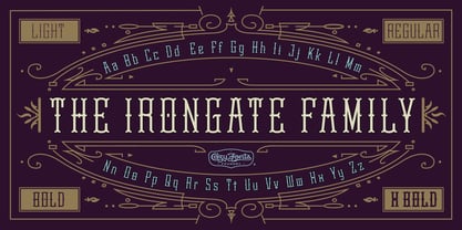 The Irongate Font Family has a retro personality. The common denominators, in all the glyphs, is a blunt center serif. The main top & bottom of each Cap & lower case glyphs have 'fan serifs', yep serifs that fan out. This font's influence is based on a monogram I designed for my daughter's wedding where she described her image of the event being 'Classic with a Vintage Flair'. Irongate can be pictured on many things dated from 1918 - 2018. The font is available in 4 basic weights Light, Regular, Bold & Extra Bold. An additional pdf is included that gives the code for an additional 14 Dingbats, with each weight. Irongate works extremely well with Invites, Stationary, Signage, Embroidery, Letterpress, Ads, Logos and anything that feels Industrial or Hand-Crafted, eg. Coffee, Breweries, Antiques, Woodcuts, Western Styles, Sports Styles, etc.
 - Deseada by Type-Ø-Tones,
$40.00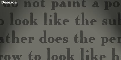 Deseada is a blurred roman face with a small x-height —actually a modified Caslon— that fits perfectly into retro environments. Use it as a parody, it's just a sort of Catalan custom.
 - Gramercy Eight JNL by Jeff Levine,
$29.00Gramercy Eight JNL is an outline and drop shadow treatment of Crestview Six JNL, inspired by some 1930s-1940s era Art Deco hand lettering spotted on a sales flier for some decorator decals. - Paradox Runa by Dawnland,
$13.00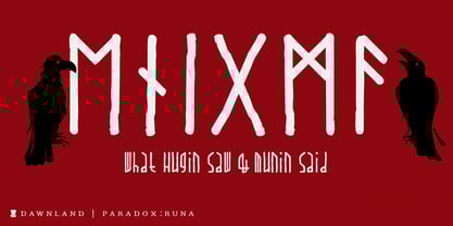 Paradox Runa is based on the futhark, norse elder runes. “Missing” characters has been replaced with either other “real” runes, or “new” ones have been “invented” so that the font hold all characters for the latin alphabet (A-Z + swedish Å Ä & Ö) + “Numbers” 0-9. I do not claim that this rune alphabet is totally authentic nor correct! All upper and lower-case letters are the same except for the letter S. “Ligatures” have been created for the th, ng and eo sounds. These are accessed by writing TH, NG and EO (in upper case letters). Space is automatically replaced by a ‘colon’ (':') - if you want a “real” space, write an underscore! (open type version of the font and open type compatible layout application required). Paradox Runa goes perfect with the font Paradox X (regular yet enigmatic hand drawn latin letters)!
 - Naive Inline by S&C Type,
$8.00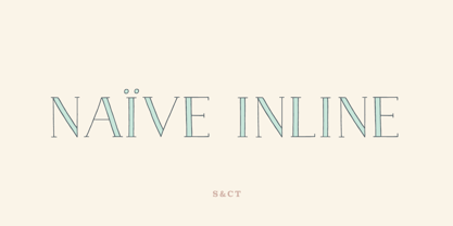 Naïve Inline is a layered serif handwritten font designed by Fanny Coulez and Julien Saurin in Paris. Our goal was to draw a font with finely irregular lines that give a human and whimsical feeling. We designed three weights to assure a good readability whatever the size. They can be enhanced with five different interior patterns and three shadows to improve your designs and bring a charming and unusual feeling. To do so, you can simply superimpose the layers with a compatible software like Photoshop, the weight above and the pattern(s) below, then choose a color for each. This font is part of our Naïve superfamily that contains lot of variations: Line, Inline, Serif, Sans Serif, and a special Art Deco one. Just click on our foundry name to see them all! We hope you will enjoy our work. Merci beaucoup!
 - 1726 Real Española by GLC,
$42.00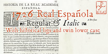 This family was inspired from the set of fontfaces used by Francisco Del Hierro, to print in 1726 the first Spanish language Dictionary from the Spanish Royal Academy (Real Academia Española, Diccionario de Autoridades). These two Transitional styles are said to have been the first set of official typeface in Spain, like the French “Reale” (take a look at our "[/fonts/glc/1790-royal-printing/ 1790 Royale Printing)". In our two styles (Regular & Italic), fontfaces, kernings and spaces are as closely as possible the same as in the original. This Pro font is covering Western, Eastern and Central European, Baltic and Turkish languages, with standard and “s long” ligatures and twin letters in each of the two styles and a few Italic swashes inspired from the font used in 1746 by the same printer for another edition from the Royal Academy.
 - Feliks Handwriting by SoftMaker,
$7.99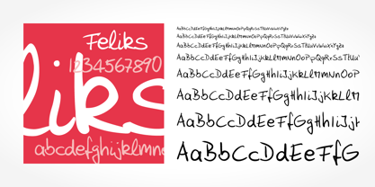 Digitized handwriting fonts are a perfect way to give documents the “very special touch”. Invitations look simply better when handwritten than when printed in bland Arial or Times New Roman. Short handwritten notes look authentic and appealing. There are numerous occasions where handwritten text makes a better impression. Feliks Handwriting is a beautiful typeface that mimics true handwriting closely. Use Feliks Handwriting to create stunningly beautiful designs easily.
 - Jay Handwriting Pro by SoftMaker,
$15.99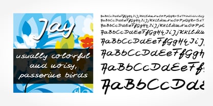 Digitized handwriting fonts are a perfect way to give documents the “very special touch”. Invitations look simply better when handwritten than when printed in bland Arial or Times New Roman. Short handwritten notes look authentic and appealing. There are numerous occasions where handwritten text makes a better impression. “Jay Handwriting Pro” is a beautiful typeface that mimics true handwriting closely. Use Jay Handwriting Pro to create stunningly beautiful designs easily.
 - Pascal Handwriting by SoftMaker,
$15.99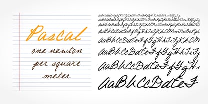 Digitized handwriting fonts are a perfect way to give documents the “very special touch”. Invitations look simply better when handwritten than when printed in bland Arial or Times New Roman. Short handwritten notes look authentic and appealing. There are numerous occasions where handwritten text makes a better impression. “Pascal Handwriting” is a beautiful typeface that mimics true handwriting closely. Use Pascal Handwriting to create stunningly beautiful designs easily.
 - Brian Handwriting by SoftMaker,
$7.99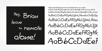 Digitized handwriting fonts are a perfect way to give documents the “very special touch”. Invitations look simply better when handwritten than when printed in bland Arial or Times New Roman. Short handwritten notes look authentic and appealing. There are numerous occasions where handwritten text makes a better impression. Brian Handwriting is a beautiful typeface that mimics true handwriting closely. Use Brian Handwriting to create stunningly beautiful designs easily.
 - Thery Handwriting by SoftMaker,
$15.99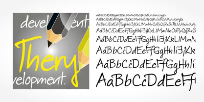 Digitized handwriting fonts are a perfect way to give documents the “very special touch”. Invitations look simply better when handwritten than when printed in bland Arial or Times New Roman. Short handwritten notes look authentic and appealing. There are numerous occasions where handwritten text makes a better impression. Thery Handwriting is a beautiful typeface that mimics true handwriting closely. Use Thery Handwriting to create stunningly beautiful designs easily.
 - Larissa Handwriting by SoftMaker,
$15.99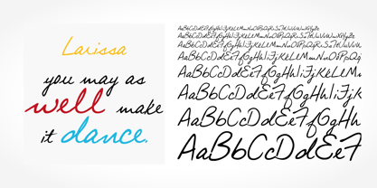 Digitized handwriting fonts are a perfect way to give documents the “very special touch”. Invitations look simply better when handwritten than when printed in bland Arial or Times New Roman. Short handwritten notes look authentic and appealing. There are numerous occasions where handwritten text makes a better impression. Larissa Handwriting is a beautiful typeface that mimics true handwriting closely. Use Larissa Handwriting to create stunningly beautiful designs easily.
 - Kuno Handwriting by SoftMaker,
$15.99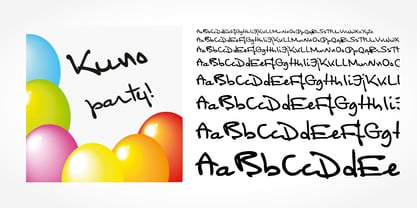 Digitized handwriting fonts are a perfect way to give documents the “very special touch”. Invitations look simply better when handwritten than when printed in bland Arial or Times New Roman. Short handwritten notes look authentic and appealing. There are numerous occasions where handwritten text makes a better impression. Kuno Handwriting is a beautiful typeface that mimics true handwriting closely. Use Kuno Handwriting to create stunningly beautiful designs easily.
 - Tommi Handwriting by SoftMaker,
$15.99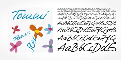 Digitized handwriting fonts are a perfect way to give documents the “very special touch”. Invitations look simply better when handwritten than when printed in bland Arial or Times New Roman. Short handwritten notes look authentic and appealing. There are numerous occasions where handwritten text makes a better impression. Tommi Handwriting is a beautiful typeface that mimics true handwriting closely. Use Tommi Handwriting to create stunningly beautiful designs easily.
 - Valerian Handwriting by SoftMaker,
$15.99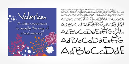 Digitized handwriting fonts are a perfect way to give documents the “very special touch”. Invitations look simply better when handwritten than when printed in bland Arial or Times New Roman. Short handwritten notes look authentic and appealing. There are numerous occasions where handwritten text makes a better impression. “Valerian Handwriting” is a beautiful typeface that mimics true handwriting closely. Use Valerian Handwriting to create stunningly beautiful designs easily.
 - Turandot Handwriting by SoftMaker,
$7.99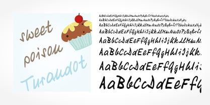 Digitized handwriting fonts are a perfect way to give documents the “very special touch”. Invitations look simply better when handwritten than when printed in bland Arial or Times New Roman. Short handwritten notes look authentic and appealing. There are numerous occasions where handwritten text makes a better impression. Turandot Handwriting is a beautiful typeface that mimics true handwriting closely. Use Turandot Handwriting to create stunningly beautiful designs easily.