7,213 search results
(0.63 seconds)
- Dopestar by 38-lineart,
$15.00 Street art has become so inspiring that it's been featured on a range of mediums from advertising to album art. Thanks to the emergence of street art in the mainstream media. Dopestar is a heavy font that has a bold grafitti feel whilst being super clear to read, Dopestar is certainly versatile. Dopestar is a great typeface for display and it comes with a full set of characters with loads of variants and all the punctuation you'll need.
 - Abella Bosley by Bungletter,
$10.00 Abella Bosley is a beautiful script that's perfect for branding, wedding invitations, and other romantic projects. This love-centered look makes it perfect for use in all your design projects be it logos, labels, packaging designs, blog titles, posters, wedding designs, social media posts, Instagram designs, etc. 2 types fonts: Regular, Slant Contains full set: -Uppercase -Lowercase -Alternative - Ligature - Punctuation -Number - Multilingual support. I hope you enjoy this font. If you have any questions, feel free to message me.
 - Berkshire Pro by Stiggy & Sands,
$35.00 This family began with Berkshire Swash Pro, an alluring semi-sweet typestyle with a bold yet feminine flair to it. This was always meant to be a trio family, complete with Regular, Loops, and Swash Pro styles. See the last graphics for a comprehensive character map preview. Opentype features include: A collection of ligatures. Smallcaps. Full set of Inferiors and Superiors for limitless fractions. Tabular, Proportional figures for Berkshire Pro, and Oldstyle figure sets for Loops & Swash Pro.
 - Cicero by Présence Typo,
$36.00Cicero was the first typeface designed by Thierry Puyfoulhoux in 94. It is what could be called a semi-serif. Only the serifs which occur naturally when drawing letters with a flat nib pen have been retained. The absence of certain serifs allows for much tighter spacing. The remaining serifs still stabilize the baseline, although less effectively than a "full-serif" typeface. By borrowing features from both the sans and serif styles, Cicero truly stands at their crossroads. - Darleyna by Jamalodin,
$19.00 Darleyna Script is a new classic legendary calligraphy font that is suitable for branding, wedding invitations, greeting cards, posters, name card, quotes, blog header, logo, fashion, apparel, letter, stationery and other projects. Come with 600+ glyphs. Uppercase (Two style) & Lowercase, International Language, Symbols Support Punctuation & Numeral, Alternates Stylistic Set 1-17 Character Variant Contextual. And this Font has given PUA Unicode. so that all the alternate characters can easily be accessed in full by a craftsman or designer.
 - Kiddo by EPtackArts,
$3.00 Kiddo is a whimsical, handwritten font family created for use along side children's media. It pairs nicely with Monterrat and other neat, rounded sans serif fonts. It looks great with brightly colored, soft illustrations to create lively layouts full of movement. The characters are simple and easy to read as to not compete with the semi-inconsistent baselines and stroke weights. The line variations add a lot of character to the typeface that really compliments a good story.
 - Reliquaire AOE by Astigmatic,
$24.95 Historical elegance finds its place in the digital era with Reliquaire AOE. Reliquaire AOE is the historical revival and elaboration of the "Memorial" typeface created by Boston Type Foundry in January of 1881. What began as a basic character set of Capitals, lowercase, numerals, and a small handful of punctuation characters has been expanded to a full character set including unlimited fractionals, superiors & inferiors, ordinals, tabular & proportional figures, and an expanded language glyph set. History has found new life.
 - Evuschka by Petra Sucic Roje,
$33.00 A dramatic contrast between thick and thin strokes, “ball” shapes at stroke terminals, and straight hairline serifs are main Evuschka characteristics. In this font, the x-height is specifically accentuated in relation to body height. In spite of its extreme geometrical shape, Evuschka exudes fairytale romance. Belonging to decorative type fonts, it is best suited for headlines, titles, and small amounts of text in large sizes. Evuschka was selected for TDC Certificate of Typographic Excellence 2017.
 - Forever Loved by Joanne Marie,
$19.99 Forever Loved is a delightful new handwriting font which is full of character and suitable for every occasion. It has OpenType features such as alternates (two sets of uppercase alternates), swashes, ligatures, terminal forms in lowercase, and a European language support. This wonderful script font is perfect for wedding stationery, engagements, and baby, family and friends orientated themes. Not only that - it can be used for logos, tattoos, delicious food and drink, mugs, clothing, the list is endless!
 - Fineprint by Monotype,
$29.99The script typeface named Fineprint is based on its designer's own handwriting, or at least as Steve Matteson saw his handwriting on a really good day. Unlike many digitizations of handwriting, Fineprint maintains a consistent harmony and balance across its letters in a line of text. The Fineprint family includes a number of swash and alternate letterforms, which helps pull this quirky personal nature off. Use Fineprint whenever you want to make something appear personal, friendly, or informal! - The great by Sulthan Studio,
$14.00 The great display font. The great -This font is perfect for modern projects, quotes, shirt designs, websites, branding, children's designs, svg designs, blogs, logos, invitations and more! The great - includes alternative characters. Coded with Unicode PUA, which allows full access to all additional characters without having special design software. Mac users can use Font Book. Windows users can use the Character Map to view and copy one of the additional characters to paste into your favorite text editor.
 - Rosiecated by sizimon,
$20.00 Introducing our New Collection, she is really pretty and sweet. Let's call Rosiecated, she's a stylish modern calligraphy with casual chic flair. She's perfect for packaging, wedding invites and cards, and branding. She will show you with a full set of lower & uppercase letters, a large range of punctuation, numerals, and multilingual support. What she have : Web Font PUA encode Multilingual support If you have any question please do not hesitate to contact me. Thank You!
 - Bokar by Pelavin Fonts,
$25.00 I am inspired by imagery that technology has rendered obsolete. I treasure anachronistic packaging and design which has somehow evaded obliteration by focus groups.I especially admire the packaging for A&P coffee brands Eight O'Clock, Red Circle and Bokar whose eccentric yet elegant typography harkens back to an earlier, less complicated era. The font Bokar is my nod of appreciation to those robust and full-bodied blends spared from the bland, tasteless scourge of corporate branding.
 - Darling Duo Script by Haksen,
$13.00 Darling Duo include two font styles with full set of handwritten style draw for script and cute style letters for sans. Numerals, a large range of punctuation and ligatures giving realistic hand-lettered style. In order to use the beautiful ligatures for script also all uppercase for sans serif, you need a program that supports OpenType features such as Adobe Illustrator CS, Adobe Photoshop CC, Adobe Indesign and Corel Draw. Thanks and have a great day :) Haksen
 - Black Stay Script by madjack.font,
$15.00 Black Stay Script is a signature collection font with natural movement creating an elegant, classy and beautiful look for your latest project. Black Stay Script is perfect for branding projects, logos, wedding designs, social media posts, advertising, product packaging, product design, labels, photography, watermarks, invitations, stationery and any project that requires a handwritten feel. Full set of standard alphabet and punctuation Additional set of brushed lowercase letter endings Handwriting binder. Thank you so much for checking out my shop!
 - Wedding Doodles Too by Outside the Line,
$19.00Wedding Doodles Too is the follow-up font to the popular Wedding Doodles. This font gives you all you need to make your own invitations, announcements, RSVP cards, save your date cards and thank you notes. Font includes 3 sets of hand-lettered words… save our date, thank you and RSVP. Just add a wedding cake, flowers, top hat, wedding bell, heart or flower and you are done. Check out Wedding Doodles, you may need both. - Off Side by HansCo,
$15.00 Off Side is a bold and chunky lettered display font. Add this font to your creative ideas and notice how it will make them stand out. This texture is very detailed. Off Side is suitable for logos, product branding, printable templates, posters, flyers, shirts, or for text overlay to any background image. This font comes with a FULL CAPS, numbers and punctuation + standard multilingual support in ALL CAPS. We recommend using Adobe Illustrator or Photoshop. Ennjoy!
 - Retroteen by Ask Foundry,
$19.00 Meet "Retroteen," the font that takes you on a nostalgic journey back to the vibrant 80s and 90s. The striking contrast between horizontal and vertical strokes adds a unique touch, exuding a bold and dynamic personality. From funky posters and album covers to retro-themed branding and advertisements, this font brings an air of nostalgia and playfulness to any artwork. It is also provides language support for the full Latin alphabet along with Western and Eastern European characters.
 - Alaskano by Maulana Creative,
$14.00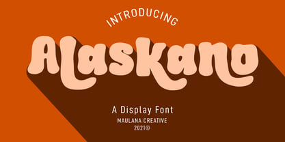 Alaskano is a handwritten Display font. With chunky bold stroke, bulb and fun character with a bit of ligatures and lowercase alternate. To give you an extra creative work. Alaskano font support multilingual more than 100+ language. This font is good for logo design, Social media, Movie Titles, Books Titles, a short text even a long text letter and good for your secondary text font with sans or serif. Make a stunning work with Alaskano font. Cheers, MaulanaCreative
 - Bakewell by Kimmy Design,
$25.00 Bakewell is the 4th typeface of the Winslow Type System. It's a low contrast sans-serif with ball terminals and a sweet disposition. The typeface includes a wide range of styles, widths and weights that make it a great addition to any type collection. From Narrow to Wide and Hairline to Bold, the font family offers extended optionality. Packed with Opentype Features, users can create one-of-a-kind designs perfectly tailored to their specific needs!
 - Sardo by SD Fonts,
$34.00 Not serif, nor sans, partly soft, partly crude, but highly individual. Sardo comes with a vivid slanted look resulting from the contrast of its common classic stroke difference and straight thin serifs, adding a rigid component to its appearance. Thus Sardo shows a strong character projecting a huge amount of individuality. A new display font made to draw attention where classic serifs and sans serifs appear just dull. So please meet Sardo, a cosy wild cat showing Sharpe claws.
 - Collean by Create Big Supply,
$15.00 Collean is a handwritten, monoline-style Signature typeface. Be mesmerized by its beautiful style and use it to create beautiful wedding invitations, beautiful stationary art, eye-catching social media posts and more! This font is PUA encoded which means you can access all the amazing glyphs and ligatures easily Features: Uppercase & lowercase Numbers and punctuation Multilingual Ligatures Alternate PUA Encoding Full Character Set !"#$%&'()*+,-./0123456789:;?@ABCDEFGHIJKLMNOPQRSTUVWXYZ[\]^_`abcdefghijklmnopqrstuvwxyz{|}~¡¢£¤¥§¨©ª«®¯°±²³´¹º»¿ÀÂÃÄÅÆÇÈÉÊËÌÍÎÏÑÒÓÔÕÖ×ØÙÛÜÝÞßàáâãäåæçèéêëìíîïñòóôõö÷øùúûüýþÿ•†‹›‒–ˆˇ˜€“‘ŸœŒš˚”’ıžŠ
 - Zalea by Eurotypo,
$42.00 Zalea script is an expressive and dynamic font. It has an appealing "punch" characteristic that gives it its charm and strong visual impact. Zalea was specially thought for labelling and packaging design. It has also good legibility for body text, useful in magazines and web pages. We recommended it for headlines, logos or where a friendly script is needed. Zalea font includes a full international character compliment, alternate characters, swash and ligatures to allow flawless typesetting in OpenType format.
 - Tiresias by Bitstream,
$29.99Tiresias was designed for subtitling by Dr. John Gill from the Royal National Institute for the Blind (RNIB), in the United Kingdom. The Tiresias font is designed to have characters that are easy to distinguish from each other, especially important for the visually impaired. The following key factors were considered during the design process: character shapes, relative weight of character stokes, intercharacter spacing, and aspect ratios that affect the maximum size at which the type could be used. The benefits of the Tiresias font are greatest on lower resolution displays, such as televisions, train and airline information terminals, and low resolution displays on wireless communication and handheld devices. InfoFont is for printed instructions on public terminals where legibility is the primary consideration; these instructions are often read at a distance of 30 to 70 cm. Infofont is not designed for large quantities of text. The Tiresias LPfont is a large print typeface specifically designed for people with low vision. Large print publications should be designed to specifically help with reading problems, and should not just be an enlarged version of the ordinary print. The Tiresias LPfont family, made up of roman, italic, and bold weights, was designed to address and solve these issues. The RNIB developed PCfont for people with low vision to use on computer screens. It is designed for use at larger sizes only. PCfont includes delta hinting technology in the font to ensure pixel-perfect display at key sizes. Signfont is for fixed (not internally illuminated) signage. The recommended usage is white or yellow characters on a matt dark background. Note that the “Z” versions have slashed zeroes, and are identical in all other respects. These faces were developed together with Dr. John Gill of the National Institute of the Blind, Dr. Janet Silver; optometrist of Moorfields Eye Hospital, Chris Sharville of Laker Sharville Design Associates, and Peter O'Donnell; type consultant. Tiresias himself is a figure from Greek mythology, a blind prophet from Thebes. - Gothikka - Unknown license

- DIN Next Arabic by Monotype,
$155.99 DIN Next is a typeface family inspired by the classic industrial German engineering designs, DIN 1451 Engschrift and Mittelschrift. Akira Kobayashi began by revising these two faces-who names just mean ""condensed"" and ""regular"" before expanding them into a new family with seven weights (Light to Black). Each weight ships in three varieties: Regular, Italic, and Condensed, bringing the total number of fonts in the DIN Next family to 21. DIN Next is part of Linotype's Platinum Collection. Linotype has been supplying its customers with the two DIN 1451 fonts since 1980. Recently, they have become more popular than ever, with designers regularly asking for additional weights. The abbreviation ""DIN"" stands for ""Deutsches Institut für Normung e.V."", which is the German Institute for Industrial Standardization. In 1936 the German Standard Committee settled upon DIN 1451 as the standard font for the areas of technology, traffic, administration and business. The design was to be used on German street signs and house numbers. The committee wanted a sans serif, thinking it would be more legible, straightforward, and easy to reproduce. They did not intend for the design to be used for advertisements and other artistically oriented purposes. Nevertheless, because DIN 1451 was seen all over Germany on signs for town names and traffic directions, it became familiar enough to make its way onto the palettes of graphic designers and advertising art directors. The digital version of DIN 1451 would go on to be adopted and used by designers in other countries as well, solidifying its worldwide design reputation. There are many subtle differences in DIN Next's letters when compared with DIN 1451 original. These were added by Kobayashi to make the new family even more versatile in 21st-century media. For instance, although DIN 1451's corners are all pointed angles, DIN Next has rounded them all slightly. Even this softening is a nod to part of DIN 1451's past, however. Many of the signs that use DIN 1451 are cut with routers, which cannot make perfect corners; their rounded heads cut rounded corners best. Linotype's DIN 1451 Engschrift and Mittelschrift are certified by the German DIN Institute for use on official signage projects. Since DIN Next is a new design, these applications within Germany are not possible with it. However, DIN Next may be used for any other project, and it may be used for industrial signage in any other country! DIN Next has been tailored especially for graphic designers, but its industrial heritage makes it surprisingly functional in just about any application. The DIN Next family has been extended with seven Arabic weights and five Devanagari weights. The display of the Devanagari fonts on the website does not show all features of the font and therefore not all language features may be displayed correctly.
 - DIN Next Devanagari by Monotype,
$103.99DIN Next is a typeface family inspired by the classic industrial German engineering designs, DIN 1451 Engschrift and Mittelschrift. Akira Kobayashi began by revising these two faces-who names just mean ""condensed"" and ""regular"" before expanding them into a new family with seven weights (Light to Black). Each weight ships in three varieties: Regular, Italic, and Condensed, bringing the total number of fonts in the DIN Next family to 21. DIN Next is part of Linotype's Platinum Collection. Linotype has been supplying its customers with the two DIN 1451 fonts since 1980. Recently, they have become more popular than ever, with designers regularly asking for additional weights. The abbreviation ""DIN"" stands for ""Deutsches Institut für Normung e.V."", which is the German Institute for Industrial Standardization. In 1936 the German Standard Committee settled upon DIN 1451 as the standard font for the areas of technology, traffic, administration and business. The design was to be used on German street signs and house numbers. The committee wanted a sans serif, thinking it would be more legible, straightforward, and easy to reproduce. They did not intend for the design to be used for advertisements and other artistically oriented purposes. Nevertheless, because DIN 1451 was seen all over Germany on signs for town names and traffic directions, it became familiar enough to make its way onto the palettes of graphic designers and advertising art directors. The digital version of DIN 1451 would go on to be adopted and used by designers in other countries as well, solidifying its worldwide design reputation. There are many subtle differences in DIN Next's letters when compared with DIN 1451 original. These were added by Kobayashi to make the new family even more versatile in 21st-century media. For instance, although DIN 1451's corners are all pointed angles, DIN Next has rounded them all slightly. Even this softening is a nod to part of DIN 1451's past, however. Many of the signs that use DIN 1451 are cut with routers, which cannot make perfect corners; their rounded heads cut rounded corners best. Linotype's DIN 1451 Engschrift and Mittelschrift are certified by the German DIN Institute for use on official signage projects. Since DIN Next is a new design, these applications within Germany are not possible with it. However, DIN Next may be used for any other project, and it may be used for industrial signage in any other country! DIN Next has been tailored especially for graphic designers, but its industrial heritage makes it surprisingly functional in just about any application. The DIN Next family has been extended with seven Arabic weights and five Devanagari weights. The display of the Devanagari fonts on the website does not show all features of the font and therefore not all language features may be displayed correctly. - DIN Next Cyrillic by Monotype,
$65.00DIN Next is a typeface family inspired by the classic industrial German engineering designs, DIN 1451 Engschrift and Mittelschrift. Akira Kobayashi began by revising these two faces-who names just mean ""condensed"" and ""regular"" before expanding them into a new family with seven weights (Light to Black). Each weight ships in three varieties: Regular, Italic, and Condensed, bringing the total number of fonts in the DIN Next family to 21. DIN Next is part of Linotype's Platinum Collection. Linotype has been supplying its customers with the two DIN 1451 fonts since 1980. Recently, they have become more popular than ever, with designers regularly asking for additional weights. The abbreviation ""DIN"" stands for ""Deutsches Institut für Normung e.V."", which is the German Institute for Industrial Standardization. In 1936 the German Standard Committee settled upon DIN 1451 as the standard font for the areas of technology, traffic, administration and business. The design was to be used on German street signs and house numbers. The committee wanted a sans serif, thinking it would be more legible, straightforward, and easy to reproduce. They did not intend for the design to be used for advertisements and other artistically oriented purposes. Nevertheless, because DIN 1451 was seen all over Germany on signs for town names and traffic directions, it became familiar enough to make its way onto the palettes of graphic designers and advertising art directors. The digital version of DIN 1451 would go on to be adopted and used by designers in other countries as well, solidifying its worldwide design reputation. There are many subtle differences in DIN Next's letters when compared with DIN 1451 original. These were added by Kobayashi to make the new family even more versatile in 21st-century media. For instance, although DIN 1451's corners are all pointed angles, DIN Next has rounded them all slightly. Even this softening is a nod to part of DIN 1451's past, however. Many of the signs that use DIN 1451 are cut with routers, which cannot make perfect corners; their rounded heads cut rounded corners best. Linotype's DIN 1451 Engschrift and Mittelschrift are certified by the German DIN Institute for use on official signage projects. Since DIN Next is a new design, these applications within Germany are not possible with it. However, DIN Next may be used for any other project, and it may be used for industrial signage in any other country! DIN Next has been tailored especially for graphic designers, but its industrial heritage makes it surprisingly functional in just about any application. The DIN Next family has been extended with seven Arabic weights and five Devanagari weights. The display of the Devanagari fonts on the website does not show all features of the font and therefore not all language features may be displayed correctly. - DIN Next Paneuropean by Monotype,
$92.99DIN Next is a typeface family inspired by the classic industrial German engineering designs, DIN 1451 Engschrift and Mittelschrift. Akira Kobayashi began by revising these two faces-who names just mean ""condensed"" and ""regular"" before expanding them into a new family with seven weights (Light to Black). Each weight ships in three varieties: Regular, Italic, and Condensed, bringing the total number of fonts in the DIN Next family to 21. DIN Next is part of Linotype's Platinum Collection. Linotype has been supplying its customers with the two DIN 1451 fonts since 1980. Recently, they have become more popular than ever, with designers regularly asking for additional weights. The abbreviation ""DIN"" stands for ""Deutsches Institut für Normung e.V."", which is the German Institute for Industrial Standardization. In 1936 the German Standard Committee settled upon DIN 1451 as the standard font for the areas of technology, traffic, administration and business. The design was to be used on German street signs and house numbers. The committee wanted a sans serif, thinking it would be more legible, straightforward, and easy to reproduce. They did not intend for the design to be used for advertisements and other artistically oriented purposes. Nevertheless, because DIN 1451 was seen all over Germany on signs for town names and traffic directions, it became familiar enough to make its way onto the palettes of graphic designers and advertising art directors. The digital version of DIN 1451 would go on to be adopted and used by designers in other countries as well, solidifying its worldwide design reputation. There are many subtle differences in DIN Next's letters when compared with DIN 1451 original. These were added by Kobayashi to make the new family even more versatile in 21st-century media. For instance, although DIN 1451's corners are all pointed angles, DIN Next has rounded them all slightly. Even this softening is a nod to part of DIN 1451's past, however. Many of the signs that use DIN 1451 are cut with routers, which cannot make perfect corners; their rounded heads cut rounded corners best. Linotype's DIN 1451 Engschrift and Mittelschrift are certified by the German DIN Institute for use on official signage projects. Since DIN Next is a new design, these applications within Germany are not possible with it. However, DIN Next may be used for any other project, and it may be used for industrial signage in any other country! DIN Next has been tailored especially for graphic designers, but its industrial heritage makes it surprisingly functional in just about any application. The DIN Next family has been extended with seven Arabic weights and five Devanagari weights. The display of the Devanagari fonts on the website does not show all features of the font and therefore not all language features may be displayed correctly. - WolfieBoy - Unknown license

- David Hadash Sans by Monotype,
$50.99Monotype Imaging is pleased to present David Hadash (New" David), the full family of typefaces by Ismar David, in its intended authentic form. The Estate of Ismar David has sought to revive this jewel of Twentieth-Century design by granting an exclusive license to Monotype Imaging to implement it in industry-standard format. Never before has the typeface in its full set of sub-styles been made available to the design community. David Hadash consists of three style families, Formal, Script, and Sans. Each of these appears in three weigths: regular, medium, and bold. Originally devised as a companion to the upright Formal style, the Script style has a beauty and grace all its own that allows it to be used for full-page settings also. While it is forward-leaning and dynamic, it does not match any of the existing cursive styles of Hebrew script. Ismar David created an eminently readable hybrid style which is like no other by inclining the forms of the upright while blending in some features of Rashi style softened with gentle curves. One can say that the Script style is the first truly italic, not just oblique, typeface for Hebrew script. Although the proportions of the Sans style are very similar to those of the Formal style, its visual impression is stunningly different. If the Formal style is believably written with a broad-point pen, the Sans is chiseled in stone. Rounded angles turn angular and stark. The end result is an informal style that evokes both ancient and contemporary impressions. David Hadash (Modern) supports the writing conventions of Modern Hebrew (including fully vocalized text) in addition to Yiddish and Ladino. David Hadash Biblical is a version of the Formal style that supports all the complexities of Biblical Hebrew, including vocalization and cantillation marks. " - Pseudonym by Monotype,
$20.99 Pseudonym is a low-contrast, subtly-flared serif available in four weights across three styles in both roman and italic. As with all of my typeface designs, I am creating fonts that I would use myself for branding purposes—typefaces with style and purpose that are intended for use in creating logos and distinctive branding typography. I wanted to create a typeface that had incisive flared serifs combined with the strength and solidity of modern grotesque faces. The result is Pseudonym, which I feel has great presence, style and legibility. Although I must admit, I had to tone down the flared serifs during the design process in order to achieve that :) I’m sure you will have great fun playing with some of the Open Type features that I’ve added to Pseudonym. There’s a full set of true small caps with their corresponding diacritics and figures. There are also a number of discretionary ligatures, these are chosen from the glyphs palette in your layout app to replace pairs of standard characters. You’ll also enjoy making use of the catchwords – these have been created to harmonise with each style, again, giving you more flexibility and scope to create some innovative typography. Finally, there are some alternate characters for /C/D/O/. You may wish to use these when creating logos that include standard contractions for limited, number, incorporated, etc. Key features: • Pseudonym is a low-contrast, subtly-flared serif that has great presence, style and legibility • 3 styles – Narrow, Regular and Wide • 4 weights in roman and italic: • Light | Regular | Medium | Bold • Full set of small caps with diacritics and figures • 30+ discretionary ligatures, catchwords and alternate characters • Full European character set • 600 glyphs per font
 - Hot Rush by Set Sail Studios,
$16.00 Prepare yourself for a wild retro ride with Hot Rush – 80s nostalgia is about hit you harder than a DeLorean at 88 miles per hour. This Sans & Script font duo were simply meant to be together; the unmistakeable clean & condensed sans is complimented perfectly by the long, fast, textured strokes of the script. It’s the ideal font pairing for retro-inspired high impact display text, merchandise design, logos, packaging & more. The Hot Rush font family consists of; Hot Rush Script • A fast, textured script font hand-made with a marker pen. Hot Rush Script contains uppercase-only characters, however a full alternate set of uppercase letters is available when you switch to lowercase. Supports a full set of numerals & punctuation. Hot Rush Sans • A condensed sans-serif font with a big impact, containing uppercase-only characters. Supports a full set of numerals & punctuation. Hot Rush Sans Striped • A second version of Hot Rush Sans, with vertical stripes running through each letter for added retro style. Italic Versions • For Hot Rush Sans & Hot Rush Sans Striped are also included as separate fonts. Extra Stuff; End Forms For Hot Rush Script are available for the letters A, C, E, F, G, H, K, L, R & T. These have elongated horizontal strokes and look great as the last letter of a word. Simply turn on ‘Stylistic Alternates’ with any Opentype capable software to access these characters. 4 Swashes For Hot Rush Script are available, these are great for underlining your text for extra style. Simply type any of the square brackets [ ] { } in the Hot Rush Script font to access the swashes. Language Support; All fonts support English, French, Italian, Spanish, Portuguese, German, Swedish, Norwegian, Danish, Dutch, Finnish, Indonesian, Malay, Hungarian, Polish, Turkish, Slovenian
 - Aviano Gothic by insigne,
$22.00 The Aviano collection returns, refined into a new, mid-contrast sans-serif inspired by the design and style of early 1900ís American engravers. Engravers would meticulously carve lettering into copper plates for printing, and often these letters, for more impact, would be extended and only utilize capitals. While taking inspiration from the past, Aviano Gothic is distinctly one-of-a-kind, and is not a revival, but instead is based on the structure of pre-existing Aviano type families for interchangeability and interoperability. Aviano Gothic has been diligently honed to be sinuous and seductive, making it great for high-end work such as including jewelry, beauty, and other luxury products. The full Aviano Gothic family presents you with six distinct weights and is full of OpenType options. Available with the face are deco alternates for replicating inscriptions and signage of the í20s and í30s. Style sets are offered, together with four full sets of art deco-inspired alternates, swashes, and titling, in addition to an expansive range of other alternates to help ìunique-ifyî your layouts. Aviano Gothic also features forty discretionary ligatures for inventive typographic compositions. Begin planning your work with Aviano Gothic by looking at these options in the instructive .pdf brochure. OpenType-able applications, including Quark or the Adobe suite, allow for the comprehensive benefit of the ligatures and alternates. This typeface also features the glyphs to aid a broad number of languages. Several variants have been made to extend the usefulness of the typeface, and it makes for a fine substitute for Copperplate, ITC Blair or Engravers Gothic. Aviano Gothic also pairs perfectly with the other members of the Aviano collection, including the original Aviano, Aviano Serif, Aviano Sans, Aviano Didone, Aviano Flare, Aviano Future, Aviano Wedge, Aviano Contrast and Aviano Slab.
 - David Hadash Script by Monotype,
$50.99Monotype Imaging is pleased to present David Hadash (New" David), the full family of typefaces by Ismar David, in its intended authentic form. The Estate of Ismar David has sought to revive this jewel of Twentieth-Century design by granting an exclusive license to Monotype Imaging to implement it in industry-standard format. Never before has the typeface in its full set of sub-styles been made available to the design community. David Hadash consists of three style families, Formal, Script, and Sans. Each of these appears in three weigths: regular, medium, and bold. Originally devised as a companion to the upright Formal style, the Script style has a beauty and grace all its own that allows it to be used for full-page settings also. While it is forward-leaning and dynamic, it does not match any of the existing cursive styles of Hebrew script. Ismar David created an eminently readable hybrid style which is like no other by inclining the forms of the upright while blending in some features of Rashi style softened with gentle curves. One can say that the Script style is the first truly italic, not just oblique, typeface for Hebrew script. Although the proportions of the Sans style are very similar to those of the Formal style, its visual impression is stunningly different. If the Formal style is believably written with a broad-point pen, the Sans is chiseled in stone. Rounded angles turn angular and stark. The end result is an informal style that evokes both ancient and contemporary impressions. David Hadash (Modern) supports the writing conventions of Modern Hebrew (including fully vocalized text) in addition to Yiddish and Ladino. David Hadash Biblical is a version of the Formal style that supports all the complexities of Biblical Hebrew, including vocalization and cantillation marks. " - David Hadash Biblical by Monotype,
$50.99Monotype Imaging is pleased to present David Hadash (New" David), the full family of typefaces by Ismar David, in its intended authentic form. The Estate of Ismar David has sought to revive this jewel of Twentieth-Century design by granting an exclusive license to Monotype Imaging to implement it in industry-standard format. Never before has the typeface in its full set of sub-styles been made available to the design community. David Hadash consists of three style families, Formal, Script, and Sans. Each of these appears in three weigths: regular, medium, and bold. Originally devised as a companion to the upright Formal style, the Script style has a beauty and grace all its own that allows it to be used for full-page settings also. While it is forward-leaning and dynamic, it does not match any of the existing cursive styles of Hebrew script. Ismar David created an eminently readable hybrid style which is like no other by inclining the forms of the upright while blending in some features of Rashi style softened with gentle curves. One can say that the Script style is the first truly italic, not just oblique, typeface for Hebrew script. Although the proportions of the Sans style are very similar to those of the Formal style, its visual impression is stunningly different. If the Formal style is believably written with a broad-point pen, the Sans is chiseled in stone. Rounded angles turn angular and stark. The end result is an informal style that evokes both ancient and contemporary impressions. David Hadash (Modern) supports the writing conventions of Modern Hebrew (including fully vocalized text) in addition to Yiddish and Ladino. David Hadash Biblical is a version of the Formal style that supports all the complexities of Biblical Hebrew, including vocalization and cantillation marks. " - David Hadash Formal by Monotype,
$50.99Monotype Imaging is pleased to present David Hadash (New" David), the full family of typefaces by Ismar David, in its intended authentic form. The Estate of Ismar David has sought to revive this jewel of Twentieth-Century design by granting an exclusive license to Monotype Imaging to implement it in industry-standard format. Never before has the typeface in its full set of sub-styles been made available to the design community. David Hadash consists of three style families, Formal, Script, and Sans. Each of these appears in three weigths: regular, medium, and bold. Originally devised as a companion to the upright Formal style, the Script style has a beauty and grace all its own that allows it to be used for full-page settings also. While it is forward-leaning and dynamic, it does not match any of the existing cursive styles of Hebrew script. Ismar David created an eminently readable hybrid style which is like no other by inclining the forms of the upright while blending in some features of Rashi style softened with gentle curves. One can say that the Script style is the first truly italic, not just oblique, typeface for Hebrew script. Although the proportions of the Sans style are very similar to those of the Formal style, its visual impression is stunningly different. If the Formal style is believably written with a broad-point pen, the Sans is chiseled in stone. Rounded angles turn angular and stark. The end result is an informal style that evokes both ancient and contemporary impressions. David Hadash (Modern) supports the writing conventions of Modern Hebrew (including fully vocalized text) in addition to Yiddish and Ladino. David Hadash Biblical is a version of the Formal style that supports all the complexities of Biblical Hebrew, including vocalization and cantillation marks. " - RQND Pro V.2 by Tondi Republk,
$25.00 Introducing RQND Pro 2 - The Futuristic and Industrial Sans Serif Font Welcome to the world of RQND Pro 2, a cutting-edge sans serif font designed to elevate your designs to new heights. With its industrial aesthetic and futuristic appeal, this font is the perfect choice for projects seeking a bold and contemporary look. Key Features: 1,201 Glyphs: RQND Pro 2 boasts an extensive character set, offering you a vast array of design possibilities. Supports 123 Languages: No matter where your audience is, this font ensures that your message is conveyed clearly and effectively. 20 Font Styles: With 5 font weights and 5 font widths, RQND Pro 2 offers 20 unique styles to suit every creative vision. Expanded to Extra Condensed: Whether you need a spacious layout or a compact design, this font delivers unmatched versatility. 18 OpenType Features: Unlock the full potential of RQND Pro 2 with various OpenType features, including small caps, alternate characters, standard numerals, circled numerals, fractions, and more. All Caps Font: Embrace the power of uppercase letters with this font, enhancing the impact of your message. Full Character Set: From standard numerals to punctuation marks, mathematical symbols to special characters, RQND Pro 2 has everything you need for seamless communication. Latin and Cyrillic Support: Perfect for international projects, this font provides complete support for both Latin and Cyrillic languages. RQND Pro 2 empowers designers, creatives, and typographers to explore new design territories. Its sleek and modern appearance makes it ideal for tech branding, UI design, editorial projects, advertisements, web design, and more. Discover a font that combines sophistication with contemporary flair. Elevate your designs with RQND Pro 2 and leave a lasting impression on your audience. Explore the full range of styles and unleash your creativity today.
 - ChrisMaster - Personal use only

- Neon Goo by Hanoded,
$16.00 I’m a bit of a sucker for neon lights, especially in big cities. My favourite city is Tokyo, with its brightly coloured billboards and its back alleys full of neon-lit eateries. At first sight, Neon Goo is a slightly warped font, with some funny looking glyphs and a generous spacing. When you start using it, you’ll find out that the glyphs do complement each other! Neon Goo comes with all diacritics and a set of alternates for the lower case letters.


