7,213 search results
(0.038 seconds)
- Constaller by Namara Creative Studio,
$18.00 Modern calligraphy font with casual-chic flair. Magical pressure makes this font perfect for creating signature logos and watermarks for photography studios or wedding invitations. Constaller includes the full set of uppercase and lowercase letters, multilingual symbols, numerals, punctuation, alternates, swash and ligatures. Thanks and have a wonderful day.
 - Authentica Script by IM Studio,
$18.00 Authentica is a modern, caligraphic script. It contains a full set of lowercase and uppercase letters, various kinds punctuation marks, numbers, and multilingual support. The font also contains several alternative ligatures and Stylistic Sets for those of you who have software which can work OpenType (Photoshop / Illustrator / InDesign).
 - Beachbuoy by Vanderfont,
$24.00 Beachbuoy floats on the foamy surface of fun, rising & falling with the waves. Lower case characters take a siesta when it comes to the baseline, an oasis away from mainland rules. Tropical and relaxed with an island attitude, Beachbuoy is a unicase font with a full character set.
 - Modestine by Kavoon,
$15.00 Modestine comes with a full set of upper and lower case characters - giving you the extra freedom to turn your text into authentic custom-made hand lettering. Modestine font Includes a large range of glyphs including numerals, punctuation & multilingual support. Punctuation & numbers Splashes & Splatters Uppercase letters Multi Language
 - Cadaques by Supfonts,
$18.00 Cadaques is a bold, condensed font inspired by the nostalgia and aesthetics of the early 90s. Ideal for advertising, headlines, editorial design, branding, and posters. Cadaques Font Features: - Full Set of standard alphabet and punctuation - PUA Encoded - no special software needed to access extra characters - Multilingual Characters AÁĂÂÄÀĀĄÅÃÆBCĆČÇĊDÐĎĐEÉĚÊËĖÈĒĘẼFGĞĢĠḠHĦIIJÍÎÏİÌĪĮĨJKĶLĹĽĻŁMNŃŇŅÑ OÓÔÖÒŐŌØÕŒPÞQRŔŘŖSŚŠŞȘẞTŤŢȚUÚÛÜÙŰŪŲŮŨVWẂŴẄẀXYÝŶŸỲỸZŹŽŻ
 - Ralyne Script by Mindtype Co.,
$15.00 Introducing Ralyne, a stylist lovely calligraphy font with handwritten, sophisticated flows. Ralyne offers beautiful typographic harmony for a diversity of design projects, including logos & branding, wedding designs, social media posts, advertisements & product designs. Ralyne includes full set of lovely uppercase and lowercase letters, multilingual symbols, numerals, punctuation and ligatures.
 - Pixel_Block by fontkingz,
$19.00The Pixel_Block font-family is specially designed for use with Flash so that it doesn't blur or fill. In contrast to most other pixelfonts Pixel_Block also works well in dynamic and input text fields. Pixel_Block fonts include a full character set and also contain outlines for any print application. - Brewing Crafters by Vozzy,
$10.00 Introducing a vintage look label font named Brewing Crafters. All available characters you can see at the screenshot. This font have 6 styles - Regular, Full, Shadow, Texture, Shadow FX and Texture FX. This font will good viewed on any retro design like poster, t-shirt, label, logo etc.
 - Christmas Story by Fikryal,
$15.00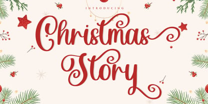 Christmas Story is a beautiful Script font perfect for crafting, branding, invitation, stationery, wedding designs, social media posts, advertisements, product packaging, product designs, label, photography, watermark, special events or anything. Christmas Story with full set of uppercase and lowercase letters, swash alternates, ligatures,multilingual symbols, numerals and punctuation.
 - Dohrma by The Northern Block,
$12.80 A bold display typeface that blends subtle curves with precision geometry. This crafted detailing creates a wide variety of typesetting options ideal for use on signage, book jackets, packaging, posters and t-shirts. Details include 4 unique styles, a full character set, manually edited kerning and Euro symbol.
 - Bingo Player JNL by Jeff Levine,
$29.00Bingo Player JNL is a thorough reworking of Jeff Levine's old freeware font - cleanly redrawn with fresh glyphs and a set of "alphabet balls" for creating short headlines. To match the fonts in these dingbats for other text applications, use Shopkeeper JNL, Trade Journal Wide JNL and Market JNL. - Boku by Handiwork,
$12.00 Boku is a brush font inspired by Suiboku-ga/Sumi-e paintings and Japanese calligraphy. This hand made font is a soft, charming, and a versatile brush font to add to your collection! In addition to a full alphabet, Boku comes with 10 unique Suiboku-ga inspired illustrations.
 - Alderamind by Differentialtype,
$10.00 Alderamind is a modern-themed san serif font with alternates and ligatures in it. You will get as if two fonts from Alderamind, because Alderamind has a full alternate in the uppercase. This font is perfect for logos, as well as other needs. immediately get our best offer.
 - Maritha by MJB Letters,
$17.00 Maritha is a classy handwritten script, it has beautiful beginning and ending swashes, this font is perfect for branding design, packaging, logo design, watermark, fashion design, wedding invites, and more. this font includes the full set of lowercase and uppercase letters, numeral, punctuation, multilanguage support, titling, and ending swashes.
 - Ajuga by Daily Studio,
$14.00 Ajuga - a typeface designed by Daily Studio. This is a geometric type font. with smooth and rounded egde. You can enjoy and play with the uppercase or lowercase to make it more entertaining. Perfect for header, poster, title, and cards. Ajuga contains full uppercase, lowercase, punctuation, and multilingual letters.
 - The Strong Signature by Fikryal,
$15.00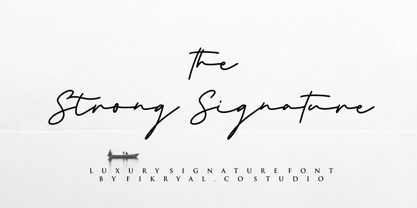 The Strong Signature is a beautiful Signature font perfect for crafting, branding, invitation, stationery, wedding designs, social media posts, advertisements, product packaging, product designs, label, photography, watermark, special events or anything. The Strong Signature comes with full set of uppercase and lowercase letters, ligatures, multilingual symbols, numerals and punctuation.
 - Imaginary Cash by PizzaDude.dk,
$15.00 Here's Imaginary Cash - it features a full set of crusty upper- and lowercase letters, as well as ligatures for the most common double-letters (bb, cc, dd, ee, ff, gg, hh, kk, ll, mm, nn, oo, pp, rr, ss, tt, ww, xx and zz) Included is also multilingual support
 - Pretty Smile by Sronstudio,
$15.00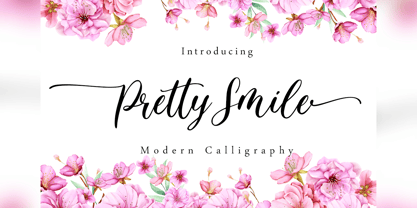 Pretty Smile is a beautiful calligraphy font perfect for crafting, branding, invitation, stationery, wedding designs, social media posts, advertisements, product packaging, product designs, label, photography, watermark, special events or anything. Pretty Smile comes with full set of uppercase and lowercase letters, swash alternates, ligatures,multilingual symbols, numerals and punctuation.
 - Feel Love by Fikryal,
$15.00 Feel Love is a natural script font perfect for crafting, branding, invitation, stationery, wedding designs, social media posts, advertisements, product packaging, product designs, label, photography, watermark, special events, or anything. Feel Love comes with full set of uppercase and lowercase letters, swash alternates, ligatures,multilingual symbols, numerals and punctuation.
 - Pearl White by Fikryal,
$15.00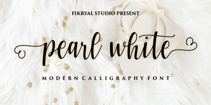 Pearl White is a beautiful calligraphy font perfect for crafting, branding, invitation, stationery, wedding designs, social media posts, advertisements, product packaging, product designs, label, photography, watermark, special events or anything. Pearl White comes with full set of uppercase and lowercase letters, swash alternates, ligatures,multilingual symbols, numerals and punctuation.
 - Speech Bubbles by Harald Geisler,
$68.00 The font Speech Bubbles offers a convenient way to integrate text and image. While the font can be used to design comics, it also gives the typographer a tool to make text speak – to give words conversational dynamics and to emphasize visually the sound of the message. The font includes a total of seventy outlines and seventy bubble backgrounds selected from a survey of historic forms. What follows is a discussion of my process researching and developing the font, as well as a few user suggestions. My work on the Speech Bubbles font began with historic research. My first resource was a close friend who is a successful German comic artist. I had previously worked with him to transform his lettering art into an OpenType font. This allowed his publishing house to easily translate cartoons from German to other languages without the need to use another font, like Helvetica rounded. My friend showed me the most exciting, outstanding and graphically appealing speech bubbles from his library. I looked at early strips from Schulz (Peanuts), Bill Waterson (Calvin & Hobes), Hergé (TinTin), Franquin, as well as Walt Disney. The most inspiring was the early Krazy Kat and Ignatz (around 1915) from George Herriman. I also studied 1980’s classics Dave Gibbon’s Watchmen, Frank Miller’s Ronin and Alan Moore and David Lloyd’s V for Vandetta. Contemporary work was also a part of my research—like Liniers from Macanudo and work of Ralf König. With this overview in mind I began to work from scratch. I tried to distill the typical essence of each author’s or era’s speech bubbles style into my font. In the end I limited my work down to the seventy strongest images. An important aspect of the design process was examining each artist’s speech bubble outlines. In some cases they are carefully inked, as in most of the 80’s work. In others, such as with Herriman, they are fast drawn with a rough impetus. The form can be dynamic and round (Schultz) with a variable stroke width, or straight inked with no form contrast (Hergé). Since most outlines also carry the character of the tool that they are made with, I chose to separate the outline from the speech bubble fill-in or background. This technical decision offers interesting creative possibilities. For example, the font user can apply a slight offset from fill-in to outline, as it is typical to early comic strips, in which there are often print misalignments. Also, rather than work in the classic white background with black outline, one can work with colors. Many tonal outcomes are possible by contrasting the fill-in and outline color. The Speech Bubbles font offers a dynamic and quick way to flavor information while conveying a message. How is something said? Loudly? With a tint of shyness? Does a rather small message take up a lot of space? The font’s extensive survey of historic comic designs in an assembly that is useful for both pure comic purposes or more complex typographic projects. Use Speech Bubbles to give your message the right impact in your poster, ad or composition.
 - Magnate by Stiggy & Sands,
$29.00 The Magnate Family began as a digitization of a film typeface from LetterGraphics known as "Wilshire". What began as a basic glyphset was fleshed out with a full character set with a smallcaps feature. We also decided to add a slightly more delicate side to Magnate, softening up the sharp flair serifs just a little. See the 5th graphic for a comprehensive character map preview. Opentype features include: - Full set of Inferiors and Superiors for limitless fractions. - SmallCaps feature. - Tabular and Proportional figure sets. - A small collection of Standard Ligatures. - A Stylistic Alternates feature for an alternate lowercase t style. Approx. 687 Character Glyph Set: Each style of Magnate comes with a glyphset that includes standard & punctuation, international language support, and additional features.
 - Monogamma by Tolya Doodko,
$45.00 Monogamma is an experimental typeface which explores opportunities for harmonious connection of broad nib writing and the aesthetics of monospaced typefaces. The typeface is primarily designed for headings and typesetting in large sizes. It is not intended for technical usage, therefore its metrics and characters proportions are optimized and the spacing between letters is optically evened out. Thereby, Monogamma has even letter spacing, contrasting styles and is free from the imperfections of monospaced fonts. It is supplied with kerning and OpenType features and comes in three weights, with full character set or capitals only. Supporting Latin and Cyrillic, it covers most European languages. The full character set includes an alternative capital U and zero, punctuation marks for the upper case and a set of arrows.
 - CAL iWasLike Pro by California Type Foundry,
$47.00 CAL iWasLike™ Pro is totally for sure the amazing friendly font you need for, like, everything! Its conversational tone makes reading fun and enjoyable! Designed for friendly, paragraph reading ease on screen or medium res print, with the full set of OpenType features. It's design gives it the most even text shade for digital fonts, and has less holes in the text for easier reading. iWasLike™ is a large x-height, informal text and caption font designed to render well for Apple Quartz and Microsoft devices, low res to high res printing, with full Western Central European, and Turkish support, small caps, superiors, inferiors, fractions, as well as some special additions like music symbols, pricing feature, arrows, and two sets of circled numbers.
 - Feverish by Veil of Perception,
$66.00 “Feverish” was a font borne out of perceived need in the marketplace. Hallmark retired font designer and master letter designer Myron McVay first approached Bill LaFever to collaborate on a project to design a semiformal calligraphic script that could be set as text copy with a large variety of swash and alternative characters and small caps. Bill penned the initial forms and Myron did the digital conversions and initial technical work. After Myron passed away, Terry Lee, a protégé of Myron’s at Hallmark, also retired, took over and the project was completed. “Feverish” is a semi-formal italic which can be used in a wide variety of commercial and advertising applications. The font family is large which can accommodate a variety of unique applications.
 - Senlot Serif by insigne,
$29.00 Senlot Serif is a follow-up to the technical yet elegant sans serif Senlot . In this serif edition, the original’s calligraphic tension shines through, with a moderate amount of contrast. Moreover, you can use Senlot Serif to set large amounts of text or for titling. It has a special calligraphic tension, and lends itself to luxury and design work of high quality. There’s a full set of small capitals and titling capitals and a real italic. Including thin to heavy, there are nine weights and three widths. Also included are a full set of OpenType features, super and subscript, old style numbers, and expanded Latin with support for more than 72 languages. For your next luxury campaign, the new rich text is Senlot Serif.
 - Aarde by Scholtz Fonts,
$19.00This is the definitive standard African font. It combines wonderful readability with tremendous panache. The fact that it has a full character set (UPPER and lower case), all punctuation and all special characters, means that it can be used in just about any African design context. If you had only one African font in your arsenal, it would have to be Aarde Black. The name "Aarde" means "earth" and refers to the gutsy, earthy character of the letterforms. It includes a full character set: characters for English, French, Italian, German, and Portuguese. The numerals are mono-spaced, and are very readable so that they will line up correctly in columns of figures. The letters of the alphabet are correctly kerned so that they appear correctly in text. - Bulkr by Hackberry Font Foundry,
$24.95 Over the years, I've used Impact a lot. But, not because I liked it—rather because it was the only font I could find with the bulk I needed for a given title or whatever. I finally decided to make my own. It was originally built off Librum Sans Bold, but I quickly made a mask of Impact for the widths, bumped the x-height way up, made the horizontals much heavier, and on and on. You know how it is when you start designing. The result is a black sans with the bulk of Impact and much more interesting character shapes. I suspect I'll use it a lot. My hope is that you like it as much as I do. Have fun!
 - Straight Edge by HIRO.std,
$25.00 STRAIGHT EDGE – Sans Serif Modern Font Combination STRAIGHT EDGE is a Modern Classic Font Combination STRAIGHT EDGE Regular, STRAIGHT EDGE Extrude, STRAIGHT EDGE Shadow, STRAIGHT EDGE Outline, STRAIGHT EDGE other). STRAIGHT EDGE has more than 637 Glyphs This Font Template contains strong, cool, catchy and easy to use. FEATURES - Ligatures - Stylistic Alternates - Full Uppercase letters - Numbering and Punctuations - Multilingual Support - Works on PC or Mac - Simple Installation - Support Adobe Illustrator, Adobe Photoshop, Adobe InDesign, also works on Microsoft Word USE STRAIGHT EDGE works great in any branding, logos, magazines, films, apparel, poster, and of course your board. The different weights give you full range to explore a whole host of applications, while the outlined fonts give a real modern feel to any project.
 - 1913 Typewriter by GLC,
$38.00 This font was patterned after a few characters on a genuine old 1913 small portable typewriter. It looks like those early typescripts, rough, irregular and eroded, suggestive of mythical famous authors, such as Hemingway, as well as “serie noire” movies or anonymous state employee working in a gloomy Kafkaesque office. It is a complete alphabetic full font. It can be used as web-site titles, poster design, or book editing. It may be preferable, if possible, when printing, to choose a pale color a little rather than condensed - dark grey instead of heavy black, for example - to give the best appearance and to benefit from the full details. The old typewriter character size is 11 to 12 points, but this font easily supports enlargement.
 - Sigmund Freud Typeface by Harald Geisler,
$29.00 “For those who regret what keyboards and touch screens have done to their penmanship, typographer Harald Geisler has an answer: Sigmund Freud.” — The Wall Street Journal Sigmund Freud was a neurologist who lived from 1856 to 1939. His research and studies led to the foundation of ‘Psychoanalysis’. When I first saw Freud’s century old letters, I was fascinated by the beauty of these historic manuscripts. It made me smile to imagine a person writing his or her shrink a letter set in Freud’s handwriting. I started to plan creating a font based on his manuscripts. I contacted the Sigmund Freud Museum Vienna and Freud Museum London. To start the creation I selected eight handwritten documents from the archive in Vienna – This selection of specimen was my orientation during the design process. The Samples were created between 1883 to 1938 and are of various character such as handwritten scientific papers, personal letters, notes and a telegram. A successful Kickstarter Campaign "The Sigmund Freud Typeface - A Letter to your Shrink" with over 1400 Backers enabled me to visit the archive in Vienna and study the original manuscripts of Sigmund Freud. After a year of preparation and design work, I finished four alphabets based on Freud’s handwriting. What are the different Versions PRO, Kurrent, #1, #2, #3 and #4 about? “This project gives people the convenience afforded by the computer while maintaining the romantic nostalgia, beauty, and character of letter writing with real handwriting.” — Daniel Vahab, The Huffington Post When you write with your hand, every letter looks a little different. When you write a text on your computer every letter looks exactly the same. In order to make type look like handwriting, I chose four different variations of each letter from Freud’s manuscripts, drew and stored them in the font. The font is then programmed to exchange letters while you are typing. This makes the rendered result on your screen or print look like unique handwriting. PRO While you are typing… the PRO Version actively combines all four alphabets and exchanges them automatically. Through this mechanism never the same two o’s will stand next to each other. With every touch a unique look is generated. This works in certain applications i.e. Word 2010(or newer), Pages, TextEdit, Editor(Pre-installed on Windows 7 or newer), InDesign, Illustrator… →Here you can see an animation of what this effect looks like in action. (Please Note: some applications like LibreOffice, OpenOffice do currently not support this feature. Date: December 2013) #1 #2 #3 and #4 The Sigmund Freud Typeface #1, #2, #3 and #4 each hold one individual lowercase alphabet based on Freud’s handwriting. Kurrent Most of Freud’s correspondence was written in German. Until the 1950′s a different handwriting was taught throughout German speaking countries (Switzerland, Austria, Germany). This style is called Kurrent. The name Kurrent and Cursive derive from the Latin word currere - to run, hurry - both styles were designed to write fast. As you can see in the samples above, Freud practiced both Kurrent and when writing english Cursive (Latin script or Joined-up). Kurrent has three significantly different letters (s,h,e). Use Kurrent to render the authentic look of an historic Sigmund Freud letter in German. Bundle On the Top of this page you can get all six fonts of the Sigmund Freud Typeface Family in a bundle. International Typeface All styles of the Sigmund Freud Typeface feature a wide range of accented letters so you can write to all your friends in Sweden (Bjørn) France (Chloé & Zoë), Ireland (Dáirine), Poland (Łucja), Germany (Jörg) and almost everywhere around the globe (Find a complete list in the tech specs). Usage recommendations I hope that this design will be valuable to you and most of all that you have fun with this typeface! 1. Point Size — To reproduce the size of Sigmund Freud’s handwriting adjust the type size between 18-24 point in your word processor. If you are using an imaging software like Photoshop set the resolution to 300dpi and adjust the point size between 18-24. 2. Line Spacing — Narrow the line hight until swashes of capital letters touch the baseline above. This also happens when you write a letter and gives the document a unique handwritten look. 3. Right Aligned — Freud had the habit to write towards the right edge of the page and start loosely on the left. Set your text alignment to ‘right’ to incorporate this dramatic expression also to your documents. What do other People say about the Sigmund Freud Typeface? “Wouldn’t you love to write a letter to your shrink using the Sigmund Freud typeface?” — Dorothy Tan, Design TAXI ''“JUST DON’T WRITE A LETTER TO YOUR MOTHER WITH IT… …until the reader looks a bit closer, and they see 70+ years of modern science weighing in on turn-of-the-century pop psychology."'' — Mark Willson, Fast Company “Doctor, what does it mean if you dream of creating a font of Freud’s handwriting?” — Ayun Halliday, Open Culture “…geekily romantic, at once artistic and scientific” — Edie Jarolim, Freud’s Butcher “…sympathisch” — Jürgen Siebert, Fontblog !WOW! Thank you for reading the complete font description! You are awesome! If you still have a question please contact me through MyFonts or my website haraldgeisler.com. Credits This project was made possible by the help of 1481 Backers on Kickstarter and the kind support of the Sigmund Freud Museum Vienna and the Freud Museum London. Thank you. All of Freud’s Manuscripts shown are © Sigmund Freud Museum Vienna. Poster Image: IN17 - Sigmund Freud, Germany 1932. © Freud Museum London. Flag Image: IN19 - Sigmund Freud 1930’s. © Freud Museum London.
 - Seventies by Lián Types,
$37.00 'Meeeeoooow'! Seventies is another of my 'funkadelic' attempts (1) to fill the existing gap of seventyish looking fonts. In my opinion, that decade has a hidden treasure regarding type that remains unexplored: Only very few fonts rescue its 'groovy' essence, its ‘colourful’ qualities. But, don't have a cow man , and keep on truckin! With Seventies, my new foxy mama , your projects will stand out among the rest. Since there’s not much information available about this kind of lettering I had to get ideas from other styles: Nowadays it’s easy to find all kind of books or guides to understand and practice how different styles of calligraphy and lettering should be done. However, for some reason, 60s and 70s letters seemed to ignore/be free of rules... Was this suggesting the birth of postmodernism? I incorporated some ideas of the copperplate style of calligraphy: The ductus of its forms may be compared to the way letters are made in snell/engrosser’s script. Obviously, this is just the idea behind; the delicacy of thins is replaced here with the graceful imprint of really thick thicks with a brushy look and tons of good vibe . Seventies will work awesome in posters, brands, magazines, book-covers of any kind, due to its modern look adapted to our century. Well, catch you on the flip~side ! STYLES To make you more psyched , Seventies is a layered font! See examples in the posters using Seventies Shade, Seventies Shine and Seventies Printed. NOTES (1) My first one was with Beatle in 2014.
 - Boogie by Linotype,
$40.99German graphic designer Ralf Weissmantel created Boogie in 2003. Boogie is an ironic reference to pop art, and to disco lettering from the 1960s and 70s. Its round forms and outlines evoke the flashing, pulsating lights and music of that era. Shipping with five different, width-compatible fonts, the Boogie typeface has four different components: an outlined letterform is the base element, and forms the first font. Three additional fonts may be layered over top of this base, surrounding the first font with up to three bubble-outlines. In graphics applications like Adobe PhotoShop or Illustrator, these elements can each be assigned different colors. There is also a fifth font, which contains the base outlined letterform pre-surrounded by three additional outlines of the same color. Boogie works best in large headline, display and signage applications, where its forms can be clearly seen and enjoyed. When different colored layers are applied, text set in Boogie will gyrate and jive across the page! Weissmantel has worked as an art director for various international advertising agencies, and has led Corporate Design projects for firms such as Grey and MetaDesign. His design work, honored internationally, has been included in the typography collection of the Museum for Art and Trade in Hamburg. He is currently teaching graphic design at the Düsseldorf University of Applied Sciences. Weissmantel has been an associate of the United Designers Network since August 2002. Boogie received an Honorable Mention in the 2003 International Type Design Contest, sponsored by Linotype GmbH. - NCL Nostalgic Wedding by Enxyclo Studio,
$12.00 NCL NOSTALGIC WEDDING is romantic wedding script font. It is unique handwritten script font with lots of swash variants. Masterfully designed to become a true favorite, this font has the potential to bring each of your creative ideas to the highest level! It was purposely crafted to be used in large point sizes, although it doesn’t lose its magic in small point sizes. It is perfect for wedding or romantic event, headline, billboard, magazines, website, titles, poster, branding, t-shirt design, and logos. No matter the topic, this font will be an incredible asset to your fonts’ library, as it has the potential to elevate any creation. With this beautiful font, absolutely you can make your project stand out from the rest. See the previews above to get some inspiration on how to use them. FEATURES Contains 478 Glyphs Uppercase, Lowercase & Numeral Punctuation, Symbol & Currencies 70 Stylistic Set 1-4 48 Swash Variants Support for 87 languages: Afrikaans, Albanian, Asu, Basque, Bemba, Bena, Breton, Catalan, Chiga, Colognian, Cornish, Croatian, Czech, Danish, Dutch, Embu, English, Esperanto, Estonian, Filipino, Finnish, French, Friulian, Galician, German, Gusii, Hungarian, Indonesian, Irish, Italian, Kabuverdianu, Kalenjin, Kamba, Kikuyu, Kinyarwanda, Latvian, Lithuanian, Lower Sorbian, Luo Luxembourgish, Luyia, Machame, Makhuwa-Meetto, Makonde, Malagasy, Maltese, Manx, Meru, Morisyen, North Ndebele, Norwegian Bokmål, Norwegian Nynorsk, Nyankole, Oromo, Polish, Portuguese, Quechua, Romansh, Rombo, Rundi, Rwa, Samburu, Sango, Sangu, Scottish Gaelic, Sena, Serbian, Shambala, Shona, Slovak, Soga, Somali, Spanish, Swahili, Swedish, Swiss German, Taita, Teso, Turkish, Upper Sorbian, Uzbek (Latin), Volapük, Vunjo, Walser, Welsh, Western Frisian, Zulu.
 - Achates by Karandash,
$29.00 Good, faithful Achates… Named after the trusty Trojan that followed Aeneas throughout his adventures, Achates is a humanist sans workhorse well suitable for broad range of design projects. Its soft, delicate and almost cursive shapes define warm and friendly typeface that is legible and easy on the reader's eye. Following into the footsteps of its namesake, it is humble, informal yet stable and trustworthy. Ideally suited for advertising and packaging, editorial and publishing, logo, branding and creative industries, poster and billboards, small text and signage as well as web and screen design. Achates provides a broad range of advanced typographical features such as language localization, alternates, stylistic alternates, extended ligatures, fractions and case-sensitive forms. It comes with a complete figure range set of old-style, lining and tabular figures. The family has extensive multilingual support, covering more than 70 Latin-based languages and specially designed Cyrillic with Bulgarian and Russian localization. As Achates was a humble hero, a devoted friend and faithful companion to Aeneas on his journey to greatness, so this font can be your trusty sidekick on your creative path. The marvelous Agate is also named after the Trojan hero. It is considered as the stone to call on for support when you need stability and grounding in your life. Along with its supportive energy, the Agate stone has been long admired for its incredible beauty. So… a Trojan hero or a thing of beauty – it is up for you to decide… or just maybe both!
 - FS Pele by Fontsmith,
$50.00 Iconic Conjuring memories of chunky typefaces from the late-60s and early-70s, and named after the world’s greatest footballer of that and probably any other era, FS Pele is one of a set of Fontsmith fonts designed specifically for headlines and other prominent applications. “We wanted to create fonts that could be integral to the design of posters, album covers and magazines,” says Jason Smith. Welcome to FS Pele, iconic, like its namesake (though, perhaps, a little less nimble). Big Pele, little Pele There was only one Pele. But there are two sizes of FS Pele. FS Pele One, with the finer counters and details, adds considerable weight and style at large sizes, especially in big block headlines on posters. FS Pele Two’s thicker “slots” make it a better choice for smaller-sized text. A load of blocks FS Pele began as an exercise by Phil Garnham in turning squares into legible letters, via the least means necessary. The idea extended his ideas about logo-making, and the search for a stamp-like brand mark that lends authority, stability and instant identification. “The thought that the type was a 2D/3D jigsaw of slotted, architectural pieces was almost an after-thought. I wanted to create a strong, stacking, block aesthetic for the most contemporary poster design. “At the time there were a lot of designers creating their own versions of the same thing but I wanted to take the blocker forms to the next step, and infer a more legible text without sacrificing the idea.”
 - FS Pele Variable by Fontsmith,
$199.99Iconic Conjuring memories of chunky typefaces from the late-60s and early-70s, and named after the world’s greatest footballer of that and probably any other era, FS Pele is one of a set of Fontsmith fonts designed specifically for headlines and other prominent applications. “We wanted to create fonts that could be integral to the design of posters, album covers and magazines,” says Jason Smith. Welcome to FS Pele, iconic, like its namesake (though, perhaps, a little less nimble). Big Pele, little Pele There was only one Pele. But there are two sizes of FS Pele. FS Pele One, with the finer counters and details, adds considerable weight and style at large sizes, especially in big block headlines on posters. FS Pele Two’s thicker “slots” make it a better choice for smaller-sized text. A load of blocks FS Pele began as an exercise by Phil Garnham in turning squares into legible letters, via the least means necessary. The idea extended his ideas about logo-making, and the search for a stamp-like brand mark that lends authority, stability and instant identification. “The thought that the type was a 2D/3D jigsaw of slotted, architectural pieces was almost an after-thought. I wanted to create a strong, stacking, block aesthetic for the most contemporary poster design. “At the time there were a lot of designers creating their own versions of the same thing but I wanted to take the blocker forms to the next step, and infer a more legible text without sacrificing the idea.” - Proteron - Unknown license

- Favourite by Fidan Fonts,
$18.60 Favourite is a hand-lettered font. Mix it up with uppercase and lowercase and you'll get a different vibes from it. It's works perfectly for headlines, pull quotes, wordmark logos, posters and many more. Latin-based Language Support (You can check your language typing characters in text box below). Happy creating!
 - Blackleather by Clint English,
$25.00 Blackleather is a gothic display typeface best for dark and moody vibes. Included are full sets of upper and lowercase letters, numbers, symbols and bonus alternate characters for select letters. Blackleather is designed in a classic blackletter style with sharp, clean 90º/45º lines for the highest quality output possible.
