10,000 search results
(0.048 seconds)
- Koo Koo Puff by astroluxtype,
$20.00 Does the world really need one more vernacular pop culture typeface? We here, at astroluxtype shout a resounding yes! Sure, at myfonts.com, you can find the apex of fine font design that will have your mind and eyes burst with joy at the level of sophistication and craftsmanship they exhibit- Koo Koo Puff Light Condensed and Regular Condensed are not one of those fonts. But if kooky goofy is your thing, we're selling it at the astroluxtype booth. Koo Koo Puff Regular Condensed is the companion font to Koo Koo Puff Light Condensed. Both fonts includes an upper and lowercase glyph set. Regular Condensed has a different upper and lowercase “O” from the original Koo Koo Puff Light Condensed. Spacing metrics are looser, as well. The font is not a match for Light Condensed, it is a separate font. Both are headline display faces, for optimum usage it is recommended to be set at 48 points or larger in size. Look to astroluxtype’s Sugarbang ! as the first in a series of fonts inspired by vintage product packaging, Koo Koo Puff is the second release in the Cerealboxx series. The third font is in the fridge getting cool now, watch for it in the future. Rave on you design genius.
 - Buballen by Alit Design,
$15.00 Presenting 🕌Buballen Arabic Typeface🕌 by alitdesign. Buballen Arabic Typeface is an elegant and sophisticated font product that is designed to add a religious and Islamic touch to your designs, making it an excellent choice for Ramadan promotions and other Islamic design projects. The font's carefully crafted design is sure to impress your audience and enhance the visual appeal of your designs. One of the standout features of Buballen Arabic Typeface is its support for PUA Unicode, which ensures that users can easily access all of the font's characters without any issues. The font also supports multilingual characters, making it perfect for use in various languages other than Arabic. With 739 glyphs characters, Buballen Arabic Typeface offers a vast range of options, allowing users to create unique and eye-catching designs. The font's characters are well-crafted and easily readable, making it an excellent choice for any design that requires an Arabic font. As a bonus, Buballen Arabic Typeface comes with a Buballen Dingbats font that includes a collection of 304 Islamic symbols and ornaments. These extra glyphs can be used to add a Islamic touch to your designs and enhance their visual appeal, especially during the holy month of Ramadan. In summary, Buballen Arabic Typeface is a versatile and elegant font product that is perfect for Ramadan promotions and other Islamic design projects. With PUA Unicode support, multilingual characters, 739 glyphs characters, and a bonus Buballen Dingbats font with 304 characters, this product offers everything you need to create stunning designs that resonate with your audience.
 - Mushym by Alit Design,
$18.00 Mushym Arabic Typeface is an elegant and sophisticated font product that is designed to add a religious and Islamic touch to your designs, making it an excellent choice for Ramadan promotions and other Islamic design projects. The font's carefully crafted design is sure to impress your audience and enhance the visual appeal of your designs. One of the standout features of Mushym Arabic Typeface is its support for PUA Unicode, which ensures that users can easily access all of the font's characters without any issues. The font also supports multilingual characters, making it perfect for use in various languages other than Arabic. With 845 glyphs characters, Mushym Arabic Typeface offers a vast range of options, allowing users to create unique and eye-catching designs. The font's characters are well-crafted and easily readable, making it an excellent choice for any design that requires an Arabic font. As a bonus, Mushym Arabic Typeface comes with a Mushym Dingbats font that includes a collection of 304 Islamic symbols and ornaments. These extra glyphs can be used to add a Islamic touch to your designs and enhance their visual appeal, especially during the holy month of Ramadan. In summary, Mushym Arabic Typeface is a versatile and elegant font product that is perfect for Ramadan promotions and other Islamic design projects. With PUA Unicode support, multilingual characters, 845 glyphs characters, and a bonus Mushym Dingbats font with 304 characters, this product offers everything you need to create stunning designs that resonate with your audience.
 - Anger & Wrath by Omaikraf Studio,
$10.00 Introducing "Anger Style": Unleash the Power of Emotion Are you ready to harness the raw energy of emotions and bring them to life in your designs? Look no further than "Anger Style," an electrifying and dynamic font that will leave a lasting impact on your audience. Designed by our team of expert font designers, "Anger Style" is a captivating blend of intensity, power, and expressiveness. Possible Design Uses: "Anger Style" is a font that excels in making a bold statement. Its commanding presence and fiery nature make it perfect for various design applications, including: Headlines and Titles: Grab your audience's attention and make a lasting impression with powerful headlines that demand to be noticed. Logos and Branding: Infuse your brand identity with passion and intensity, creating a memorable and distinct visual presence. Posters and Flyers: Advertise events, concerts, or special promotions with eye-catching designs that embody rebelliousness and energy. Book Covers: Create striking covers that captivate readers and convey the emotional depth of your story or message. Apparel and Merchandise: Add an edgy touch to your clothing designs, making a statement that resonates with your target audience. Unique Qualities: What sets "Anger Style" apart from other fonts is its ability to evoke a wide range of emotions, not just anger. It transcends its name, allowing you to express passion, determination, and rebellion through your designs. Its versatility lies in its bold strokes and sharp edges, which convey a sense of intensity and power. By choosing "Anger Style," you gain access to a font that embodies the very essence of raw human emotion. Font Pairing: "Anger Style" pairs exceptionally well with other fonts that complement its intensity and create harmonious combinations. Consider combining it with: "Bold Sans Serifs": The clean lines and strong presence of a bold sans serif font can enhance the impact of "Anger Style," creating a balanced and eye-catching composition. "Elegant Script Fonts": To add a touch of contrast and sophistication, pairing "Anger Style" with an elegant script font can create a visually engaging and dynamic design. Functional Aspects: "Anger Style" offers a range of functional aspects designed to enhance your creative possibilities: Styles: "Anger Style" is available in bold and regular styles, allowing you to emphasize different levels of intensity within your designs. Character Sets: The font includes an extensive character set, covering uppercase and lowercase letters, numbers, punctuation marks, and special characters. This ensures versatility and legibility across various design projects. Special Features: "Anger Style" includes stylistic alternates and ligatures, providing you with additional design options and allowing you to create a truly customized and unique look.
 - DT Paperside by Dragon Tongue Foundry,
$15.00 Paperside: Neither Papyrus nor SSI Countryside. Inspired in some ways by the Papyrus form, but untextured and smoother, with the dimensions and proportions more open, like that of Countryside SSi, with its larger easily readable lowercase body, and more consistent, shorter stems. Paperside has an open scripted feel which is pleasing on the eye and easy to read. Paperside can enhance the first letter of most sentences automatically, and changes other letters to suit their position within words, and the letters they appear beside. Now comes in 5 weights plus italic. For best results, use this ‘smart font’ with Contextual Ligatures turned on. Mulitiple Stylistic Alternatives are included. Inspiration for this font came from two other fonts. Papyrus: was designed by Chris Costello and created in 1982, it is a hand-drawn textured typeface, emulating texts written in biblical times. One of the most used (and misused) fonts of all times. Owned by Letraset, and currently published by the Internation Typeface Corporating (ITC). Countryside SSi: The serif font of an unknown designer, is currently licensed by Southern Software Inc. Feel free to preview some of the Dragon Tongue fonts that are yet to be released, at https://www.dragon-tongue.com/fonts
 - Bivoac by Sabrcreative,
$15.00 Discover Bivoac, a versatile layered display sans font that offers easy usability and is perfect for creating stunning 3D and vintage designs. We present this unique font, designed to add depth and character to your projects. With its layered system, Bivoac allows you to effortlessly create multi-dimensional typographic compositions. Whether you're working on a vintage poster project or aiming for eye-catching 3D effects, this font provides the tools you need to bring your vision to life. Bivoac features both uppercase and lowercase letterforms, ensuring versatility and allowing for creative combinations. It also includes numbers, punctuation marks, and comprehensive multilingual support, enabling you to cater to a wide range of audiences in various languages. When you purchase Bivoac, you receive the complete set of font variations: Bivoac Regular: Perfect for the base layer Bivoac Outline: Adds an outline effect Bivoac Shadow: Creates a shadow effect Bivoac Dark: Provides a bold and dark variation Bivoac Drop Shadow: Adds depth with a drop shadow effect Unlock your creativity and enjoy the layered features of Bivoac. Enhance your designs with its diverse options and explore the possibilities of captivating 3D and vintage visuals.
 - Wakcaho by Twinletter,
$17.00 Wakcaho is a traditional serif typeface that is ideal for classic or retro modernist projects. With an exquisite and outstanding personality, this font will provide a memorable traditional touch to your designs. Wakcaho’s particular characteristics, like ligatures and alternatives, provide you the freedom to create unique text display variations. These typographic components can be simply combined to create distinctive and eye-catching compositions. Furthermore, Wakcaho is bilingual, allowing you to display your messages in a variety of languages all across the world. This allows you to reach an international audience while maintaining consistency in your designs regardless of language barriers. By using Wakcaho as the main font for your project, you will achieve an attractive style with a traditional vibe. Use Wakcaho right away to give your ideas a remarkable appeal and a unique visual experience. What’s Included : - File font - All glyphs Iso Latin 1 - Alternate, Ligature - Simple installations - We highly recommend using a program that supports OpenType features and Glyphs panels like many Adobe apps and Corel Draw so that you can see and access all Glyph variations. - PUA Encoded Characters – Fully accessible without additional design software. - Fonts include Multilingual support
 - Thorowgood Sans by HiH,
$8.00 A three-dimensional all-cap font for title use, Thorowgood Sans Shaded was released by the Fann Street Foundry of W. Thorowgood & Co. in 1839. Interestingly, it more closely resembles Figgins' Four-Line Emerald Sans-Serif Shaded of 1833 than Fann Street’s own Grotesque Shaded of 1834 (with light and shadow reversed). The idea of a shaded font is of an outline font whose letters have each been extruded through a die and then viewed from the lower right to reveal the third dimension. That third dimension has also been referred to as a shadow. Vincent Figgins' 1815-release of a shaded serif typeface was the first known of many shaded faces, as the other foundries rushed to bring out their own versions. Thorowgood Sans Shaded may be gainfully used today as a eye-catching headline font, just as it was so popularly used in the early nineteenth century. To assist with the usual all-cap letter-spacing problem, the following pre-kerned pairs are included: AT, AV, AW and AY. Be sure to download the Type Specimen showing the full character set, as well as a sample text. Live large - use it boldly.
 - Lovely Signature by Create Big Supply,
$17.00 Discover Lovely Signature, an exquisite handwritten font that adds a touch of elegance and authenticity to your designs. With its flowing lines and natural feel, Lovely Signature resembles real handwriting, bringing a personal and charming element to your projects. Whether you're creating wedding invitations, stationary art, or eye-catching social media posts, this font is perfect for making a lasting impression. Lovely Signature offers a complete character set, including both uppercase and lowercase letters, numbers, and punctuations. This extensive range ensures versatility and compatibility, allowing you to express your creativity across various design applications. The font's multilingual support enables you to incorporate different languages seamlessly, reaching a diverse audience worldwide. With its PUA encoding, Lovely Signature grants easy access to a collection of ligatures, allowing you to enhance the visual appeal of your text. These ligatures offer beautiful connections and flourishes, adding a sophisticated and unique touch to your designs. Whether you're designing logos, branding materials, or personal projects, Lovely Signature provides endless possibilities. Capture the essence of elegance and elevate your designs with Lovely Signature. Perfect for weddings, events, branding, and more, this handwritten font will evoke emotions and create memorable experiences for your audience. Add a personal and enchanting touch to your designs with Lovely Signature, and let your creativity shine.
 - Irish Penny by K-Type,
$20.00 Irish Penny is based on the lettering from Percy Metcalfe's beautiful and influential pre-decimal coinage of Ireland, the Barnyard Collection. The font is more monoline than is conventional for Irish insular styles, almost giving the feel of a modern soft sans, and perfect for small and large scale display purposes. Irish Penny contains a full complement of Latin Extended-A accented characters, Irish lenited consonants with the dot accent, and the tironian et which is commonly used in Ireland instead of an ampersand. Lowercase characters are provided small caps style, slightly reduced in size and subtly thickened in weight. The licensed font comes with a faux italic, and although obliques are not common among insular typefaces, Irish Penny Italic is a useful smart and sporty extra. Although the insular G/g is usually understood, Irish Penny also includes a more latinised option as an alternate G/g. The supplemental 'Irish Penny Alternate G' font places the latinised G and g characters at the normal G/g keystrokes, and makes the original insular glyphs the alternates. An alternate E/e with an angled crossbar is also included. The font contains a selection of discretionary ligatures, these include the ligatures that were used for pre-decimal coins: AC/ac, AE/ae, AL/al, AO/ao, AU/au, AT/at (halfpenny, half crown), AX/ax, AY/ay CA/ca, CC/cc, CE/ce, CO/co (half crown), CU/cu, CY/cy EA/ea (halfpenny, half crown), EC/ec, EE/ee, ET/et, EU/eu (sixpence), EY/ey FE/fe (farthing), FF/ff, FL/fl (florin) GI/gi (penny), GU/gu KA/ka, KE/ke, KI/ki, KO/ko, KT/kt, KU/ku LA/la, LE/le (halfpenny, half crown), LL/ll (shilling), LO/lo, LT/lt, LU/lu, LY/ly RA/ra, RC/rc, RE/re (three/sixpence), RH/rh, RI/ri (florin), RK/rk, RN/rn, RM/rm, RO/ro (half crown), RR/rr, RT/rt, RU/ru, RY/ry TA/ta, TE/te, TO/to, TU/tu NOTE - Irish Penny contains some characters that are not accessible directly from your keyboard, but which may be copied from a font viewer such as Character Map, Font Book or FontExplorer, and pasted into documents. They can also be accessed from the Glyphs browsers within OpenType-aware applications like Adobe InDesign and Illustrator, and Affinity Photo and Publisher.
 - Somedeals by Din Studio,
$29.00 Somedeals is a captivating script font that beautifully captures the essence of cursive handwriting with a touch of elegance. This typeface exudes a sense of grace and sophistication, making it perfect for projects that require a refined and stylish look. With its smooth and fluid letterforms, this font offers a natural and seamless writing style, evoking the charm of handwritten notes. The high letter contrast in this font adds a dynamic and eye-catching quality, enhancing the overall visual appeal and making each word stand out. The cursive handwriting style of this font ensures that each letter flows gracefully into the next, creating a harmonious and aesthetically pleasing rhythm. This script font exudes a sense of personality and elegance, adding a distinctive flair to your typography. For the best legibility you can use this font in the bigger text sizes. Enjoy the available features here. Features: Stylistic Sets Ligatures Multilingual Supports PUA Encoded Numerals and Punctuations Somedeals fits in headlines, logos, movie posters, flyers, invitations, greeting cards, branding materials, print media, editorial layouts, headers, and many more. Find out more ways to use this font by taking a look at the font preview. Thanks for purchasing our fonts. Hopefully, you have a great time using our font. Feel free to contact us anytime for further information or when you have trouble with the font. Thanks a lot and happy designing.
 - Raj JY by JY&A,
$39.00JY Raj has had a lengthy gestation. The original one was a sans serif adaptation of a slab serif typeface design by Jure Stojan. Raj looked instantly better as a sans serif. After refining it further one lengthy night in 2001, he showed the drafts to Jack Yan, who completed the character sets and finished the kerning. A characterful sans serif, JY Raj pushes the boundaries of what is possible with various geometric shapes, combining legibility and tradition with sharp, unexpected angles. As with Stojan's earlier JY Koliba, it possesses a delightful balance, thanks to the designer's eye for detail and typographic harmony. The name has little to do with the Asian subcontinent: it translates to paradise in Stojan's mother tongue, Slovenian. - Kavitta by Pixesia Studio,
$23.00 Introducing Kavitta - Modern Clean Serif Kavitta is a modern and classic serif typeface that exudes nostalgia and elegance in equal measure. With its clean lines and bold strokes, Kavitta offers a touch of luxury and sophistication to any design project. Its fancy and retro look make it the perfect choice for creating eye-catching headlines, logos, and branding materials. Whether you're designing for print or digital media, Kavitta is the ideal choice for any project that requires a touch of vintage charm and modern aesthetics. FEATURES - Stylistic Alternates - Ligatures - PUA Encode - Uppercase and Lowercase letters - Numbering and Punctuations - Multilingual Support - Works on PC or Mac - Simple Installation - Support Adobe Illustrator, Adobe Photoshop, Adobe InDesign, also works on Microsoft Word Hope you Like it. Thanks.
 - SF Cross by Fonts66,
$16.00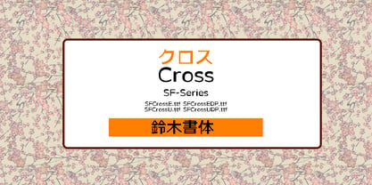 Expressive style for logos and eye catches, titles. 表現力の強い書体。ロゴやアイキャッチ、タイトルに最適。 縦画と横画の太さがほぼ同じのゴシック体の基本を崩して、太さをアトランダムに組み合わせデザインしたのがクロスです。 おやっと思わせるスタイルがアッピール度を高めてアイキャッチを生かしたロゴタイプやヘッドラインなどに適しています。 DPは仮名を大きくし多セットでより強い印象になります。
 - Altissimo by Soneri Type,
$32.00 Altissimo is a display type family, derived from the Ample typeface, it has large x-height, optical mono linear and a bit squarish in nature. It has a smooth curve instead of sharp angles formed by the junction of two strokes, which is a prominent feature of its design. It is designed to be a little eye-catching yet legible. It has clear and distinguishable letterforms, which helps to elaborate and emphasise the message. It is graphically strong and commands viewer's attention. The overall appearance of this type is suitable in setting it as heading, title, headline, etc. The type family consists of seven weights viz. Thin, ExLight, Light, Regular, Medium, Bold and ExBold. Altissimo is designed by Aakash Soneri in a period between 2017 and 2018.
 - Bannetters by Ingrimayne Type,
$10.00 Bannetters (Banner Letters) was designed to alternate two letter sets. Both sets are formed on parallelograms, with one set of parallelograms sloped upward to the right and the other sloped downward to the right. When alternated, the result is a zigzaggy line of text. In applications that support the OpenType feature contextual alternatives (calt), the two sets of letters are automatically alternated. The Bannetters family has two styles, one with straight outer edges and the other that rounds these shapes for letters that have curved exteriors. Both styles are largely monospaced and monoline (not to mention weird, strange, and unusual). The tiling pattern of text created by Bannetters makes it attention-grabbing and appropriate for signage, posters, advertising, and other uses where eye-catching text is desired.
 - Seconda Soft by Durotype,
$49.00 Seconda Soft is the soft companion of Seconda. A little friendlier, a little easier on the eye, a little more informal, a little more fashionable — but still the refined and reliable Seconda. Seconda Soft’s softness comes from the moderate rounding of the edges of its characters. Seconda Soft has sixteen styles, extensive language support, eight different kinds of figures, sophisticated OpenType features — so it’s ready for advanced typographic projects. For text and display use. When using Seconda Soft in small text sizes, it will be a reliable and legible text face. When using it in big display sizes, it will show its refined details. Seconda Soft in use: 1 2. For more information about Seconda Soft, download the PDF Specimen Manual.
 - Mateo Unique by IbraCreative,
$14.37 Mateo is an extraordinary and unique handwritten typeface that stands out with its captivating originality. With letters that seem like hand-drawn works of art, each character in Mateo carries a distinct personality, exuding a sense of authenticity and creativity. The charmingly irregular lines and artistic flourishes lend this typeface an artistic and handcrafted feel, making it a perfect choice for projects that require a touch of individuality and unconventional style. Mateo’s versatility is showcased in its ability to seamlessly adapt to diverse design contexts, whether used for eye-catching logos, expressive quotes, or artistic illustrations. With its one-of-a-kind appearance, Mateo transcends traditional typefaces, inviting viewers to explore the world of handwritten artistry in every stroke and curve
 - Ample by Soneri Type,
$50.00 Ample is a display type family, optical mono linear and a bit squarish in nature. It has a smooth curve instead of sharp angles formed by the junction of two strokes, which is a prominent feature of its design. It is designed to be a little eye-catching yet legible. It has clear and distinguishable letterforms, which helps to elaborate and emphasise the message. It is graphically strong and commands viewer’s attention. The overall appearance of type is suitable in setting it as heading, title, headline, etc. The type family consists of six weights viz. Thin, ExLight, Light, Regular, Medium and Bold. Considering the nature of this type family, italics have been excluded. Ample is designed by Aakash Soneri in a period between 2013 and 2014.
 - KOEEYA by Product Type,
$13.00 Koeeya is a font with a charming Display Graffiti theme. Created to give your projects a touch of freedom and uniqueness, Available in three different variations, Koeeya provides flexibility and the opportunity to express your creativity in limitless ways. You can choose between solid and plain styles, dramatic shadows, or interesting textures. With eccentric designs and beautifully handwritten characters, Koeeya gives each design a different and memorable impression. This font combines the boldness and creativity of graffiti writing with the amazing smoothness and clarity of handwriting. By using Koeeya, you can give a unique and stylish touch to your promotional materials, posters, merchandise designs, and much more. This font exudes energy and freedom, capturing the attention of potential customers in an instant. Now is the time to let your imagination run wild and express yourself through eye-catching designs. Choose Koeeya as your main font and watch how your project becomes unique, interesting, and unforgettable. What’s Included : - File font - All glyphs Iso Latin 1 - Ligature, Alternate - We highly recommend using a program that supports OpenType features and Glyphs panels like many Adobe apps and Corel Draw, so you can see and access all Glyph variations. - PUA Encoded Characters – Fully accessible without additional design software. - Fonts include Multilingual support
 - ITC Tactile by ITC,
$29.99ITC Tactile is a puzzle of subtle typographic contradictions. Capitals have traditional epigraphic proportions, but the lowercase has a uniform optical width. Light weights are stately and elegant, but bold designs are almost jolly. This paradoxical alphabet even combines two distinctively different serif designs. Designer Joe Stitzlein says, “I wanted to create a modern and dynamic serif face that draws its forms from antiquity. I also wanted to have as much fun as possible with the drawing and architecture of each letter. Hopefully I've created a very legible typeface that grabs the reader's eye in a nice, 'tactile' way.” The apparent inconsistencies of the design are the result of careful consideration. Of the seemingly odd serif design, Stitzlein explains, “The transitional serif is an entry point for the eye into the letterform, and the long slab is an exit, leading to the next letter.” The result is a typeface that's easy to read at text sizes but offers surprising details when enlarged to display sizes, setting ITC Tactile apart from more traditional designs. While this is his first commercial typeface design, Stitzlein has ample experience creating custom typefaces for corporate branding, including companies such as Silicon Graphics and Sempra Energy. His graphic design business has served a wide range of clients, including Apple Computer and the 2002 Salt Lake City Olympics. The ITC Tactile family is available in three weights, with complementary italic designs and a suite of small caps for each of the roman designs. Stitzlein drew the small caps to match the height of the lowercase x-height, which enables “bi-form” or “unicase” setting in display copy. - Boston Skyline by Set Sail Studios,
$16.00 Boston Skyline is a carefully hand-crafted duo of premium Sans & Script fonts, designed to create a bold, authentic, and timeless lettering combination. The contrasting yet complimentary strong sans and free-flowing script lend themselves perfectly as primary and secondary fonts for logo designs, product packaging, eye catching quotes and display text. Here’s what’s included in this product: Boston Skyline Rough • A hand drawn script font with authentic textures built-in. Contains upper & lowercase characters, all punctuation and numerals. Boston Skyline Rough Alt • This is a second version of Boston Skyline Rough, with a completely new set of upper & lowercase characters. If you wanted to avoid letters looking the same each time to recreate a custom-made style, or try a different word shape, simply switch to this font for an additional layout option. Boston Skyline Sans Rough • A bold Sans font with a built-in rough 'letterpress' texture. Contains uppercase characters, all punctuation and numerals. Boston Skyline Swashes • This font contains 26 swashes, perfect for underlining your script text and adding some extra custom flair. Simply install this font separately and type any a-z character when using this font to generate a swash. Clean Versions • Are included for all fonts with textures completely removed and edges smoothed. Language Support; All fonts support English, French, Italian, Spanish, Portuguese, German, Swedish, Norwegian, Danish, Dutch, Finnish, Indonesian, Malay, Hungarian, Polish, Turkish, Slovenian
 - Elegise by Nathatype,
$29.00 Elegise is a captivating script font that gracefully captures the essence of cursive handwriting with a touch of elegance. This typeface exudes an air of sophistication and refinement, making it perfect for projects that require a stylish and polished look. Each letter in this font is meticulously crafted with high contrast, adding a dynamic and eye-catching quality to the font. The combination of thick and thin strokes creates a sense of fluidity and movement, adding a touch of liveliness to your typography. The long swinging endings in some letters of Elegise bring a sense of graceful flair and drama to the font. These charming details add a touch of elegance and uniqueness, making the script come to life with a sense of poise and grace. For the best legibility you can use this font in the bigger text sizes. Enjoy the available features here. Features: Stylistic Sets Ligatures Multilingual Supports PUA Encoded Numerals and Punctuations Elegise fits in headlines, logos, movie posters, flyers, invitations, greeting cards, branding materials, print media, editorial layouts, headers, and many more. Find out more ways to use this font by taking a look at the font preview. Thanks for purchasing our fonts. Hopefully, you have a great time using our font. Feel free to contact us anytime for further information or when you have trouble with the font. Thanks a lot and happy designing.
 - Levigate by Nathatype,
$29.00 Levigate is a graceful script font that beautifully captures the essence of cursive handwriting with a touch of sophistication. This typeface exudes an air of elegance and refinement, making it perfect for projects that require a stylish and polished look. Each letter in this font is meticulously crafted with high contrast, adding a dynamic and eye-catching quality to the font. The combination of thick and thin strokes creates a sense of fluidity and movement, adding a sense of energy and vibrancy to your typography. The swinging endings in some letters of Levigate bring a touch of whimsy and personality to the font. These charming details add a flourish of creativity and uniqueness, making the script come to life with a sense of playfulness. For the best legibility you can use this font in the bigger text sizes. Enjoy the available features here. Features: Stylistic Sets Ligatures Multilingual Supports PUA Encoded Numerals and Punctuations Levigate fits in headlines, logos, movie posters, flyers, invitations, greeting cards, branding materials, print media, editorial layouts, headers, and many more. Find out more ways to use this font by taking a look at the font preview. Thanks for purchasing our fonts. Hopefully, you have a great time using our font. Feel free to contact us anytime for further information or when you have trouble with the font. Thanks a lot and happy designing.
 - Cenzo Flare by W Type Foundry,
$20.00 Cenzo Flare is a mixture of modern sans serif base with a touch of flare to it. The inspiration is drawn from all kinds of old Americana advertising, Italian posters, old century logos and signs. All that plus the strong trend on retro fonts now displayed on tv series and current music imagery results on Cenzo Flare. A typeface designed for headlines, posters, advertising and corporate identity. With its appealing curvy smooth edges it is sure to catch the eye. Also enjoy multiple styles that work on their own or as overlapping layers with the InLine & Line variants to create colorful designs. This 40 font family consists of four 5-weight subfamilies: Regular, InLine, Line & Condensed. All of them with matching italics. Designed with powerful opentype features, each weight includes alternate characters to play with, extended language support and many more. We’re proud to introduce: Cenzo Flare. Learn about upcoming releases, work in progress and get to know us better! On Instagram W Foundry On facebook W Foundry wtypefoundry.com
 - ITC Simran by ITC,
$29.99ITC Simran was created by the London designer Satwinder Sehmi in 1998. The Indian influence is recognizable at first glance and lends the font an exotic feel - at least to the western eye. Sehmi borrowed forms and feelings from northern Indian writing systems for this typeface. Both the upper and lowercase letters make use of the same lowercase forms, but the upperacse letters have the addition of a horizontal bar running over them at the ascender height. This feature is directly reminiscent of writing systems in northern India, and is ITC Simran's most distinguishing characteristic. But there were other influences as well: Sehmi was also inspired by uncial forms when designing this typeface. ITC Simran exhibits the typical look of writing with a broad-tipped pen, with its strong strokes, as well as characteristic letter forms, for example, the a or h. ITC Simran is a fascinating and harmonious symbiosis of a variety of influences from different cultures. This font is best used for headlines and short texts in point sizes of 12 and larger. - Toboggan by Jeremy Nelson,
$11.00 TOBOGGAN | Utility Display Typeface Toboggan is a utility display typeface with classically influenced proportions, calligraphic elements, and sporting roots. With 9 weights, upright, and true italics, Toboggan comes in a total of 18 fonts. With flexibility from a crisp Thin weight to an imposing Super in both upright and italic, Toboggan thrives as a utility font spanning the columns of extended text, in artful editorial layouts, eye-catching motion graphics, or commanding headlines in a title role. First drafted around the frame of a perfect circle, Toboggan evolved by taking inspiration from the sweeping contours of the automotive world, expanding into wider proportions, and adopting an abrupt set of constructed features. Sturdy with the spirit of sport, Toboggan’s final form preserves a human connection through features of the written hand, while minimal contrast and its chopped terminals bring a decisive tone with clinical precision. Features: - Nine weights and true Italics - Multilingual support (Extended Latin - Includes Western European coverage and more) - OpenType features including small-caps, stylistic sets, contextual punctuation & more - Extensive numeral sets including stylistic sets, circled, and squared numbers
 - Terfens Contrast by insigne,
$35.00 Terfens draws influence from chancery scripts, updating it for the twenty-first century. Terfens Contrast is derived from Terfens' DNA and retains its humanist tone. It’s tall x-height gives it a friendly but not informal feel. With Terfen Contrast, calligraphy-inspired letterforms are rendered with a high contrast nib, lending raw vitality and expressivity. This juxtaposition gives the letters a sense of firmness and energy, but also of heavenly, delicate beauty. Terfens is a full-service branding and packaging solution, containing a lot of personality, combining the passion of a broad nib pen with the beauty of a brush. Terfens is a "workhorse typeface" comprising 48 typefaces in three widths and eight weights. There are ligatures and swashes in all weights, as well as support for more than 72 languages. Another powerful typeface to add to your collection of eye-catching fonts. Terfens draws influence from chancery scripts, updating it for the twenty-first century. Terfens Contrast is derived from Terfens' DNA and retains its humanist tone. It’s tall x-height gives it a friendly but not informal feel. With Terfen Contrast, calligraphy-inspired letterforms are rendered with a high contrast nib, lending raw vitality and expressivity. This juxtaposition gives the letters a sense of firmness and energy, but also of heavenly, delicate beauty. Terfens is a full-service branding and packaging solution, containing a lot of personality, combining the passion of a broad nib pen with the beauty of a brush. Terfens is a "workhorse typeface" comprising 48 typefaces in three widths and eight weights. There are ligatures and swashes in all weights, as well as support for more than 72 languages. Another powerful typeface to add to your collection of eye-catching fonts. • Recommended uses: modern branding and logo design, powerful editorial design, exciting packaging, and a wide range of additional jobs. • 54 font styles, including eight weights, eight italics, and three widths. • Each weight has 500+ glyphs. Useful Opentype features include: Access All Alternates, Discretionary Ligatures, Denominators, Fractions, Kerning, Standard Ligatures, Lining Figures, Numerators, Oldstyle Figures, Ordinals, Scientific Inferiors, Subscript and Superscript.
 - ITC Japanese Garden Ornaments by ITC,
$29.99ITC Japanese Garden Ornaments is a symbol font designed by Akira Kobayashi (before Kobayashi became Linotype's Type Director in 2001, he worked as an independent typeface designer in Tokyo). The images in Japanese Garden are, as the name suggests, mostly floral or herbaceous, derived from designs used in Japanese indigo stencil dyeing. In Japanese Garden," Kobayashi says, "I tried to create a set of type fleurons that are very familiar to a Japanese eye, but not too exotic to people in other countries." Several of the designs fit together seamlessly in repeating patterns; others work either together or as isolated ornaments, a flexibility that also characterizes traditional Western type fleurons. "The original illustrations," notes Kobayashi, "were mostly cut from white paper squares, about two by two inches in size, and were simply scanned and traced. That is why there are few smooth curves and perfectly straight lines in the illustrations. I simply liked the ragged textures of them."" - Itaca by Tipo Pèpel,
$21.00 Known sometimes as “utopia”, “journey” other times, but also named with name´s place where one wants to go, “Ithaca” home of Ulysses. Typographic Cartesian coordinates are usually two, from the skeleton, the narrower, to the black, the widest. Nowadays, Maese Patau had traveled a road made by four Cartesian axes of typographic geography. A road from thick to thin, from expanded to condensed, to offer us a new family, a larger and extensive series than the traditional family. 48 “relatives” in a pure neo-grotesque font, with a large “eye” that makes it especially suitable for display. Solid hinting in small sizes due to it´s pure and simple basic forms. The jazzy cursive, available in all weights, looks as a simply slanted letter, but when works in conjunction with its regular version, generates an outstanding typographic game. As usual, Maese Patau offer us a extensive typeface in weights, extensive on supported languages, and all kind of OpenType´s capabilities.
 - If This Be Doomsday by Comicraft,
$19.00 THE END IS NIGH! Judgment Day has come and this planet has been CONDEMNED! Do not conspire to hide what remains of your paltry world from my eyes! Know you not that NONE may thwart my will? Of what import are brief, nameless lives -- to DOOMSDAY?? Death is Certain! Apocalypse is UNAVOIDABLE. At last, my cosmic hunger will be sated, if only briefly! This planet shall SUSTAIN me until it has been drained of all elemental life! SO SPEAKS DOOMSDAY! But do not fret. Even if the Domesday Book has been closed on your planet... your utter destruction is being made available in Font form, I call it IF THIS BE DOOMSDAY, and I will deliver it to you via comicbookfonts.com in Regular, (Roach) Chew and Outline weights. Never let it be said that DOOMSDAY is without mercy. Features: Three weights (Regular, Chew & Outline) with small cap characters and Western & Central European international characters.
 - Chez Moustache by PintassilgoPrints,
$29.00 Based on Irma La Douce film opening titles, Chez Moustache is a very eye-catching display font loaded with cool special effects. It is a unicase typeface with 2 versions for each letter, each easily accessible through upper and lower case keys. To prevent double letters from displaying the same glyph, just type the alternate glyph, or use the neat OpenType feature to make things even easier: just turn on the contextual alternates in any OpenType aware program and it's all done before you can say Jack Robinson. Did you push the stylistic alternates button instead of the contextual one? Voilà, so you've got a pocketful of flowers! There's a complete set of sweet stylistic alternates to instantly flourish your way. And it's not over yet: check out the cool initial and terminal forms for that extra twist. Pick your choices with a glyphs palette or just turn on the OpenType swash feature. Now go ahead, there's a lot to do Chez Moustache. But that's another story...
 - Merc by Canada Type,
$24.95 Merc is a four-letter word that stops just one y short of Mercy. Merc is also the standard street abbreviation for mercenary, or a soldier for hire. Now that the global security business has become a two hundred billion dollar industry, we thought you would like to have your very own affordable merc. Knew you'd be pleased. Merc is based on an all-cap metal face called Agitator, designed by Wolfgang Eickhoff and published by Typoart in 1960. The rough brush letters look like they were made by someone who is capable of elegance but has no time for it. These are letters that live to catch the eyes and warn them loudly: Doom is here, and if you want it screamed out, this Merc is at your service. This font contains more than 460 glyphs, which means quite a few stylistic alternates and support for the majority of Latin languages.
 - Correspond by Create Big Supply,
$17.00 Create beautiful invitations, eye-catching logos, engaging social media posts, and more with Correspond. Its seamless integration of uppercase and lowercase characters, along with its extensive range of numbers and punctuations, ensures a harmonious and cohesive look throughout your design. One of the key features of Correspond is its multilingual support, allowing you to express your creativity in various languages and reach a global audience. No matter the project, Correspond has you covered with its wide array of characters and symbols. Unlock the full potential of Correspond with its PUA encoding, granting you easy access to a wealth of alternate glyphs and ligatures. This enhances your design possibilities and lets you add your personal touch to every project. Experience the power of Correspond Script Font and elevate your typography game. Its seamless curves and elegant flourishes make it a timeless choice for any design. Discover the beauty of Correspond and let your creativity shine.
 - Linotype Mindline by Linotype,
$29.00Linotype Mindline is part of the Take Type Library, chosen from the entries of the Linotype-sponsored International Digital Type Design Contests of 1994 and 1997. With Mindline, the German designer Critzler plays with geometry and typefaces. Each character is basically a rectangle with a geometric form etched in it which happens to be a member of the alphabet. This formal style comes from the advertisement typefaces of the 1920s and is reminiscent of the constructivist posters of this time. The appearance of the characters take priority over the funcitonality and the eye can hardly recognize the forms of letters and numerals which meet it everyday. Linotype Mindline makes us take another look at forms which we see so often that we hardly notice them, only reading them for the information which they impart, and the font is therefore best used when the content of the text less important is than the impression its forms make. - Higery by Craft Supply Co,
$20.00 Higery – Serif Typeface: Uniquely Engaging Distinctive Tapered Details: Higery – Serif Typeface stands out with its unique tapered serifs. These details add a sophisticated charm. This font is ideal for captivating visual displays. Perfect for Visual Displays: Higery’s elegant tapering makes it perfect for eye-catching displays. It excels in adding an artistic touch to posters, ads, and more. Its uniqueness ensures your design stands out. Versatility in Design: Though unique, Higery remains versatile for various design needs. It seamlessly fits into digital and print media. This adaptability makes it a valuable tool for designers. Ease of Use for All: Higery is designed with user-friendliness in mind. It’s easy to use for designers of all skill levels. This approachability makes it a popular choice in the design community. Elevating Aesthetic Appeal: Incorporating Higery into your projects can significantly enhance their aesthetic appeal. Its distinctive serifs and elegant design elevate any content. Higery isn’t just a typeface; it’s a visual experience.
 - Desire Lite by Borges Lettering,
$30.00 With over five years of design and development, Desire is a pursuit of epic proportions and ready to make a statement by adding elegance and unique flair to your next design project. Desire offers an expansive set of options to create logos, headlines and titling. It is well suited for books, editorial, packaging, advertising, branding and more. From period style and Victorian to modern and elegant, Desire is strong and stately yet elegant and decorous. A wide selection of alternate upper and lowercase forms feature delicate line flourishes creating a subtle background for additional letters to rest ? The result is an intertwining and beautifully flourished design. Unique ligatures go beyond function and add eye catching flair and style. Desire is truly a designer's dream come true! Desire Lite is PUA encoded! PLEASE NOTE: Image samples show Desire Lite A, B and C. Please check Character map above to see which letters are included in each font.
 - P22 Schumann Pro by IHOF,
$29.95 Schumann Pro is the very first issue of a long lost early 1960s typeface project done by Heinz Schumann while he was at the University of Graphics and Book Design in Leipzig, where he studied under German type design giants Albert Kapr and Herbert Thannhaeuser. This alphabet was never published as a typeface, but Schumann went on to design Stentor for Typoart a couple of years after graduating. Albert Kapr’s influence is unmistakable in this playful upright script, especially in the wide and breezy capital forms. Unique exit strokes and serif placement work together to define the bouncy rhythm of this face. This is an expressive original alphabet that successfully bridges the gap between expert calligraphy and everyday sign lettering. P22 Schumann Pro comes with over 500 glyphs, which include plenty of alternates, quite a few ligatures, and extended Latin language support. It is a very effective font when used sparingly in packaging, signage, posters and things designed to catch the eye.
 - Chandia by Gold Type,
$15.00 Chandia Elegant Script is one of the Elegant script fonts that comes with a very beautiful character change, a kind of classic copper decorative script with a modern touch, designed with high detail to present an elegant style. You will get: Chandia Files Chandia Elegant Script is interesting because the typeface is pleasing to the eye, clean, feminine, sensual, glamorous, simple and very easy to read, because of the many luxurious letter connections. I also offer a number of decent stylistic alternatives for some of the letters. The classic style is very suitable to be applied in various formal forms such as invitations, labels, restaurant menus, logos, fashion, make up, stationery, novels, magazines, books, greeting / wedding cards, packaging, labels or all kinds of advertising purposes. . . Chandia has alternate characters, including multiple language support. With OpenType features with alternative styles and elegant ligatures. If you need help or have any questions, let me know. Thanks & Happy Designing.
 - M Banquet P PRC by Monotype HK,
$523.99 M Banquet is a humanistic script written by a Chinese restaurant owner, which the name ‘Banquet’ comes from. It is a calligraphic style that always being seen in traditional Chinese banquet menu. Incorporated a feeling of masculinity, fill with strength and energy and attracts eyeballs of customers. It was written with a thin ball pen in a unique, personal and expressive writing style, such that it is realistic, natural and masculine. Contrast of strokes is low and the text is visible and eye-catching. Its light to medium stems (豎) make it suitable for small text to subheading with little conglutination. All strokes are irregular, inconsistent, irregularly oriented and tightly coupled. Spatial distribution, positioning, size and relative proportion of radicals fully reflect a natural and personal style. It is one of the few proportional-width font in a full scale. It is best suited for casual lively atmosphere, illustrations, set upright (non-slanted), non-condensed.