10,000 search results
(0.023 seconds)
- Blob by Superfried,
$32.50 Blob, designed by Superfried, is available in two formats Round and Square. It is an experimental, sans-serif display typeface based on simple geometric shapes. Although unorthodox, care has been taken to ensure that it is completely legible. Blob has been featured on the Behance curated typographic gallery TypographyServed.com.
 - Gafeniv by Rvandtype,
$10.00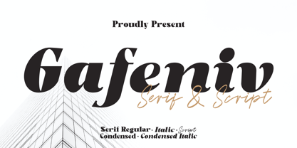 Gafeniv is Duo font Serif & Script. It has a elegant, and modern look which can be used for logos, establishing brand identities, crafting invitations, creating stunning stationery, shaping wedding designs, or producing eye-catching social media posts. Features: 5 Styles Font Numbers and punctuation Multilingual PUA encoded Thank You
 - Cracksmoon by Zamjump,
$15.00 Cracksmoon was hand-drawn with a marker pen and converted to font - and like the marker, it has natural edges and realistic shapes. Includes bonus ligatures and style swashes. Perfect for designs where you need a font that's a little rougher around the edges. Including : Alternate Multilingual support
 - Ethlinn by Paweł Burgiel,
$38.00 Ethlinn is a modern gaelic (celtic) typeface with uncomplicated appearance and geometric glyphs shapes. Character set support Central and Eastern European as well as Western European languages and include also popular recycling symbols used for packaging. It is useful for display, poster, books titling, advertising, and magazine work.
 - Break Snooze by Crumphand,
$30.00 Introducing, Break Snooze fonts. Break Snooze have a unique shape, rounded and fun. Comes with 3 style Regular, Outline and Extrude, then can mix and match with Stylistic Set. What's Included Inside The Fonts ? Uppercase Lowercase Symbols Numerals Stylistic Set 1 Stylistic Set 2 European Multilingual Thank you, Regards!
 - Reso by JCFonts,
$30.00 Reso is an experimental geometric typeface built from a pointed arch module. Its minimal and contemporary letter shapes makes it well suited for logo design, headers and short texts. Five weights are available in OpenType format. The fonts include some standard OpenType features and support for most European languages.
 - Masyte by holyline design,
$17.00 MASYTE by Holyline is a sans serif display typeface with reguler and italic style . It's very bold and fun with a unique shape. Perfect for headline, custom logo, or anything for your creativity and MASYTE is perfect typeface if you want something new with your project. Happy creating!
 - Soest St Mary by New Renaissance Fonts,
$10.00Unusual decorative capitals from embroidery work in a German church. Upper case has a diamond-shaped frame around each letter; lower case is just the letters without the diamond frame; and the ampersand gives just the diamond frame so you can use a different colour from the letter. - Zaptron by Patria Ari,
$15.00 Zaptron is a modern sci-fi fonts with different shapes on uppercase and lowercase. With this difference, you can explore different combinations, also with more than 100 discretionary ligatures you can access by hit capslock/uppercase. This logo perfect for logotype especially on technology, construction, automotive, and more.
 - Cyntho Next by Mint Type,
$35.00 Cyntho Next is a totally reworked typeface based on our previous bestseller Cyntho Pro. It also has a slab-serif counterpart - Cyntho Next Slab. Cyntho Next is a modern geometric sans based on a hybrid waterdrop-like shape with eight weights varying from Thin to Black and featuring Cyrillic.
 - Kryptic LP by LetterPerfect,
$39.00 Kryptic is based on a design for computer optical character recognition (OCR) from the 1960s developed by Epps & Evans at the National Physical Laboratory. Its pure geometric and elemental shapes create graphic patterns and visual puzzles that only secondarily communicate meaning. Not recommended for extended text, unless intentionally encrypting!
 - FS Olivia Paneuropean by Fontsmith,
$90.00Antwerp On a visit to Belgium and the Netherlands while still an MA student at Reading University, Eleni Beveratou made some important discoveries. First, there was the letter ‘g’ from the Didot family seen at Plantin Moretus Museum in Antwerp, which seemed “almost like a mistake”. Then there were strange details such as the serifs on the “l”, “h”, “k”, “b” and “d” in Egmont Cursive and other typefaces by Sjoerk Hendrik de Roos, found in volumes of poetry she picked up from a chaotic bookshop in Amsterdam. These were characters that stood out from the text but seemed to blend harmoniously with the rest of the letters. “And there it was, the spark. I decided to design a typeface that would capture the details of the process of writing.” A guiding hand Eleni shared her initial thoughts with Phil Garnham and Jason Smith. They liked what they saw in her tentative first sketches, and gave her the chance to develop her ideas further. Phil, in particular, provided valuable input as FS Olivia took shape. Eleni’s main influence – the handwritten – would give the font its character. “When creating a typeface,” says Eleni, “it’s fair to say that it reflects some of the designer’s personality. And that’s certainly the case with FS Olivia. “Although technology is part of my everyday life. I am a great admirer of traditional graphic design where you can touch and feel paper and ink.” Irregular “What I particularly like,” says Eleni, “is that a printed item can develop its own personality sometimes as a result of imperfections in the print. “FS Olivia has some of these characteristics as it’s inspired by handwriting, and yet it also includes some very modern features.” Feminine and fascinating, FS Olivia captures the expressive twists and turns of (the poet’s?) pen on paper, with low junctions, deep top serifs and semi-rounded edges. Round outstrokes contrast with the rough corners of the instroke, while strong diagonals and inclined serifs create a richly textured pattern. Polytonic It’s only fitting that there should be a version of this poetic font for one of the birthplaces of poetry and song. Eleni, who hails from Athens, developed an extensive range of glyphs that could be used for the Greek language, in both modern and ancient texts. For the latter, there is a version of Olivia for displaying polytonic Greek (a system that utilises a range of accents and “breathings”), which brings the 21st century technology of OpenType to the presentation of poetic texts from Ancient Greece. Just think what Homer could have done with that. - FS Olivia by Fontsmith,
$70.00 Antwerp On a visit to Belgium and the Netherlands while still an MA student at Reading University, Eleni Beveratou made some important discoveries. First, there was the letter ‘g’ from the Didot family seen at Plantin Moretus Museum in Antwerp, which seemed “almost like a mistake”. Then there were strange details such as the serifs on the “l”, “h”, “k”, “b” and “d” in Egmont Cursive and other typefaces by Sjoerk Hendrik de Roos, found in volumes of poetry she picked up from a chaotic bookshop in Amsterdam. These were characters that stood out from the text but seemed to blend harmoniously with the rest of the letters. “And there it was, the spark. I decided to design a typeface that would capture the details of the process of writing.” A guiding hand Eleni shared her initial thoughts with Phil Garnham and Jason Smith. They liked what they saw in her tentative first sketches, and gave her the chance to develop her ideas further. Phil, in particular, provided valuable input as FS Olivia took shape. Eleni’s main influence – the handwritten – would give the font its character. “When creating a typeface,” says Eleni, “it’s fair to say that it reflects some of the designer’s personality. And that’s certainly the case with FS Olivia. “Although technology is part of my everyday life. I am a great admirer of traditional graphic design where you can touch and feel paper and ink.” Irregular “What I particularly like,” says Eleni, “is that a printed item can develop its own personality sometimes as a result of imperfections in the print. “FS Olivia has some of these characteristics as it’s inspired by handwriting, and yet it also includes some very modern features.” Feminine and fascinating, FS Olivia captures the expressive twists and turns of (the poet’s?) pen on paper, with low junctions, deep top serifs and semi-rounded edges. Round outstrokes contrast with the rough corners of the instroke, while strong diagonals and inclined serifs create a richly textured pattern. Polytonic It’s only fitting that there should be a version of this poetic font for one of the birthplaces of poetry and song. Eleni, who hails from Athens, developed an extensive range of glyphs that could be used for the Greek language, in both modern and ancient texts. For the latter, there is a version of Olivia for displaying polytonic Greek (a system that utilises a range of accents and “breathings”), which brings the 21st century technology of OpenType to the presentation of poetic texts from Ancient Greece. Just think what Homer could have done with that.
 - VVDS Minorica by Vintage Voyage Design Supply,
$15.00 Hey folks! Glad to introduce you a new MINORICA handwritten collection to imitate a hand lettering style! A complete font kit with graphics give you a fantastic result. A roughen pencil written letters with the same rustic shapes and decorate doodle elements looks very authentically! Play with styles, use the stroke style with inlines, or just a regular. You'll get: Bouncing baseline spooky serif with all caps letters, stroke style and inline decoration Handwritten textured and roughen brush script Bold playful sans with inline and stroke styles. Decoration font with text shapes and doodle elements decoration. A helpful kit to create a funny stuff as greeting cards, t-shirts, advertisement content, cafe or coffee shop decoration, book covers etc. Thank you and Enjoy! VVDS
 - Arial Nova by Monotype,
$45.99The Arial® Nova family takes Arial back to its roots. Character spacing has been adjusted and a number of subtle modifications were made to the design to return the shapes and proportions to those of the original 1982 design created for IBM's then new high-speed laser printers. Although these first Arial fonts, called "Sonora Sans" by IBM, were low-resolution bitmaps, it was apparent that the design could also be an important high-resolution digital typeface, and Arial was redrawn for Monotype's imagesetters in the late 1980s. In the process Arial evolved from its original design loosing some of its earlier personality. The restored Arial Nova family is made up of three weights of roman design of standard proportions and three weights of condensed - all with complementary italic designs. The Arial Nova family is also compatible with the fonts that Microsoft® provides in the Windows® 10 operating system. - ZT Vollun by Khaiuns,
$29.00 ZT Vollun is a work of awakening from my valley of boredom in making fonts, it is not only a transformation of thickness, but also in terms of theme, aura, shape and beauty. Maybe this is a superstition of adulthood and also as we get older, our taste in cigarettes can change too. And the taste of the coffee is also getting bitter, in fact there is no sugar anymore, but the enjoyment is increasing. ZT Vollun consists of seven weights, starting from the thin one with curves combined with thin strokes, offering a playful aura, to the thickest one with a firm design that will present a thick modern atmosphere. Whether you're working on a branding project, an editorial project, or any other graphic project, ZT Vollun is the perfect choice for a modern, elegant look or any design vibe you can get your hands on. I hope you have fun using ZT Vollun. Thanks for using this font
 - LCT Palissade by LCT,
$19.90 Started during 2012, LCT Palissade is a letter type belonging to the Didone classification. It takes over the Italian characters from the XVII century. Century affected by a huge artistic and industrial mutation, we assist to the eruption of the railroad network and Turner’s paintings. In typography, the Didones(XVIIe) begins to concede the place to the Egyptians XIXe. We noticed an evolution to rectangular drawings, that were heavier and darker. LCT Palissade is in fact the study of a history flow, crossing through the industrial revolution and romanticism; the result of a strong letter type, solid, strict the drawing is orientated towards very dark, reminiscent of the characters beginning XIXe. The serifs are the summary between the British characters from the end of (XVIe) and the Italian ones beginning of (XVIIe). In order to spread out the romanticism, they are very fine to allow a largest contrast and keep the elegance of the global shape.
 - Vogan by Heinzel Std,
$9.00 Vogan Typeface is a versatile font that comes in both regular and outline versions, both of which are in all capital letters. The regular version of the Vogan typeface features solid, bold characters that are perfect for making a statement. The letters are clean and well-defined, making them highly readable and suitable for a variety of design projects. Whether used for headings, logos, headlines, magazines, posters, or other creative applications, the regular version of Vogan Typeface commands attention with its bold and impactful appearance. In contrast, the outline version of Vogan Typeface provides a different aesthetic. The characters in this version are defined by their outer contours, creating a stylish and modern look. The outline font maintains the overall shape of the letters while allowing the background to show through the center, adding a touch of sophistication and creativity to any design. This version is particularly popular for design projects where a contemporary and edgy vibe is desired.
 - Hejira by Sudtipos,
$49.00 Hejira means “rupture” and this concept was the primary principle that guided the creation of this typeface: to escape conventions and take up the challenge of designing letters with an unusual and fresh approach. Unlike traditional typefaces, each member of this somewhat atypical family has its own distinct personality and formal features. A thin, spiky font that looks like its sharp serifs could pierce through. A more experimental sibling, based on the same skeleton but taken to the extreme, that is best suited to setting big titles. An odd-one-out, sans-serif style whose shapes mimic those generated by the movement of a calligraphic pen. And a quirky fat-face with a flair for combining round curves with pointy elements. Regardless of how different they may be, all four styles feel part of the same system and can be used alongside each other seamlessly. The Hejira set includes multiple ligatures and supports a wide variety of Latin alphabet-based languages.
 - Tepuy by John Moore Type Foundry,
$20.00 Tepuy is the name given to the ancient plateau-shaped mountains that abound in the Venezuelan Amazon. Tepuy is a display typeface inspired by the symbolic forms of the Venezuelan ethnic roots. It is constructed based on a very precise geometry of open forms that produce a double letter in form and counterform. Tepuy originates as an evolution curve of my Font Makiritare rectilinearly. Was devised for a book of photographs of the ancient mountains of the Venezuelan Amazon, its form and Makiritare are morphologically inspired crafts in the ethnic groups of the region. Tepuy is held in a very precise geometric construction based on rounded forms, each letter is a form envelope enclosing another in counterform, is a letter to display. Tepuy comes in four versions Regular, Light and thin, and there is a double line version enclosed. Tepuy recommended for creative headlines for the label and packaging design aimed at all ages.
 - Scala Pro by Martin Majoor,
$49.00 The award-winning Scala family (1990-1993) is a worldwide bestseller and has established itself as a ‘classic’ among digital fonts. It was one of the first serious digital text fonts to support small caps, ligatures and different set of numbers. In fact Scala and Scala Sans (1990-1993) are two different typefaces sharing a common form principle: the skeletons of both Scala and Scala Sans are identical. Scala’s dark colour and low contrast works to prevent the thin parts from breaking up. The generous length of Scala italic’s serifs gives it a strong rhythm. The bold weight has the same character widths as the normal weight, so changing a text from normal into bold does not affect the set width. Another part of Scala is very popular among its users: Scala Hands, containing more than one hundred decorative hands and pointers, is a free bonus. Scala Jewels is a set of four highly decorative typefaces, based on the bold capitals of Scala.
 - Esm by Harvester Type,
$15.00 Esm is a font that tries to convey the reinterpreted aesthetics of German and Swiss typography along with a new trend of unusual shapes. The font has a different approach to the internal elements of letters-ovals that have a straight line on one side, drawing the glyph "a" example. I wanted to diversify the font with different styles to avoid the effect of triviality of machine text. The font has a large language support and contains 626 characters. And a large number of special characters. The font family is universal. It is suitable for large text, magazines, posters, logos, and headlines. Thanks to 6 different font styles and customized kerning, the font will look just fine. The thin print is incredibly elegant. The regular is great for a large amount of text. And bold for posters and headlines. Named by the French feminine name Esm. The name itself has a meaning: dear and beloved. I hope my font will convey these feelings.
 - Fieldwork by TipoType,
$24.00 Download Fieldwork’s PDF Type Specimen Fieldwork brings back the manual tradition of typography production, veering away from lab interpolations. Each of its 24 variants was drawn based on optical evaluation; many of its curves and details were specifically adjusted for each weight, reformulating them to better suit the requirements of the distinct stroke weighs. It is the product of a collaborative effort by the TipoType team, combining their personal strengths and “most importantly” their enriching individual outlooks to achieve a more versatile and fresh outcome. Its shapes successfully combine geometric strokes (in the Geo variants) with the humanistic warmth of the double-storey glyphs (like a and g in the Hum variant) in a system that grows with alternates, swashes and the corresponding italics for every weight. It includes a very thorough coverage for a wide variety of Latin alphabet-based language families. Special thanks to: • José “Pollo” Perdomo: Font production assistent. • Rasmus Jappe Kristiansen: Detroit City project
 - Rahere Sans by ULGA Type,
$18.98 Rahere is a humanist sans with subtle features that give the typeface a distinctive, warm appearance without distracting the reader. Legible at large and small sizes, Rahere is a versatile family suitable for a wide range of applications such as annual reports, advertising, brochures, catalogues, information signage, screen text and visual identities. For projects that need to convey a sense of authority or credibility, this is the ideal sans serif to use. The family consists of six weights ranging from light to extra bold with corresponding italics and the character set covers most of the major European languages. Each weight contains lining & non-aligning numerals in both proportional & tabular spacing. The tabular numerals share the same width across all weights and styles – a must for financial tables in annual reports. Spirited and lively, the italic lowercase is more cursive and calligraphic than the roman, although it harmonises perfectly, displaying enough character to create emphasis without looking out of place. When used on its own, for pull-out quotes or poetry, the italic exudes a charm that draws attention to the text. The typeface is named after Rahere, a 12th-century Anglo-Norman priest, who founded St Bartholomew's Hospital, London in 1123. I will always be indebted to Barts (as it is now commonly known) because in 2007 I was successfully treated for relapsed testicular cancer. Way back in 1992 I designed my first sans serif, Charlotte Sans, and although it was relatively successful, I was never really satisfied with the end result: not enough weights & italics, a small character set, lack of accented characters, and my design skills were still in their infancy. Whilst Rahere shares many common elements with Charlotte Sans, it is much more than just a reworking; it represents over 20 years of accumulated knowledge and experience as a designer.
 - Veto Sans by Monotype,
$50.99 Veto® Sans is both highly legible and handsomely distinctive – a rare blend in a typeface. It’s a design that stands out and fits in. Veto Sans is equally competent on screen and in print. It’s four carefully determined weights in both normal and condensed proportions, each with an italic complement, give the family an exceptionally deep range of applications. All the designs in the family are valuable design tools. None are superfluous. Advertising, brand, corporate, editorial and interactive design are all in Veto Sans’ wheelhouse. It also shines in wayfinding and other signage projects. And to all these, it brings a warmth and personality. An ample x-height, open counters, vertical stroke endings and subtly condensed capital letters enable Veto Sans fonts to perform with grace in print and digital environments while being space efficient. An added benefit is that all-capital typography set in Veto Sans is not only space saving, it’s also easy to read. Drawn as a complete reimaging of his earlier Veto design, Swiss designer Marco Ganz worked to create character shapes distilled to their purest forms while maintaining a relaxed and natural demeanor. Ganz, who is also a three-dimensional artist, is acutely aware that the negative space between letters and the internal space within letters is as important as the positive shape of the letters themselves. This dynamic balance between the negative and positive aspects of character forms gives Veto Sans a sense of immediacy without looking hurried. Ganz also took great care to draw a suite of italic designs that not only complement the roman weights perfectly, but also give the family a dynamic verve. A large international character set also ensures ease of localization. “Veto Sans,” says Ganz, “is a typeface for designers that search for a new and different solution to age-old typographic challenges.”
 - Bourton Text by Kimmy Design,
$25.00 Bourton Text is a modern sans-serif typeface family perfect for both text type settings and display purposes. While it’s not a layering type family like its brother, Bourton, it come packed with features, extras and over 2,000 characters that make it stand on its own. HISTORY Bourton Text is a new take of the Bourton family that was one of the best-selling and favorite fonts of 2016. After countless requests for lowercase alphabet, or suggestions for a font pairing with Bourton, this new text setting family is based on the original shapes of Bourton. DESIGN & CREATION In taking Bourton Base was the starting point as they narrowest width and boldest weight. From there, lowercase shapes were designed that matched the aesthetic and details of the popular capitals. As Bourton was a heavy display font, some small tweaks were done to make it more fitting for smaller text settings, including reducing the letter-spacing and reworking some counters. Some areas needed complete reconstruction, such as the figures. The design of those began anew with a style that worked with the capitals and lowercase but also as a standalone set. Currency shapes were updated to match the numerals. Punctuation was also reimagined to work better in smaller type settings. Diacritics and extended language support was also updated and expanded to include full Latin plus language support for 219 latin based language spoken in 212 countries. Once the basic alphabet for Bourton Text Bold Narrow was formed, the font was expanded in both weight and width. Taking the weight from Bold down to Hairline, it allowed for more range in use. The typeface needed to be expanded in order to reach better as a book weight and width, in addition to a regular width, a wider version was create as well. FEATURES Once the extremes were set in place, small capital forms were designed for text and display purposes. These also allow for nested capital letters, lifted small caps and other display features offered in the typeface. One of the most popular fonts in the Bourton layering font family is Bourton Line. This led to an experimentation with rounded Bourton Text completely and thus a complete set of duplicated characters with rounded terminals. By using the Opentype Panel, a rounded font is a single click away. Every feature has been carefully thought out and updated across the entire font. In total, Bourton boasts over 2,300 glyphs, 42 font files with 3 widths and 7 weights in upright and italic.
 - Foxtale by Gabe Silverstein,
$29.00 Foxtale was inspired by an ancient Hebraic scriptural style, boasting flared seraphs, classic structures and dramatic shapes. Foxtale is perfectly suited for impactful word marks or subtext. A fully featured typeface with upper and lowercase, Latin characters, numbers, symbols, currency and alternatives - Foxtale will surely excite your next design adventure!
 - TOMO Tosca by TOMO Fonts,
$15.00 Tosca is a new face designed by TOMO FONTS. Is a massive all-caps font with a stone age feel. Good-humoured shapes ideal strong messages. Very useful for kids related stuff, like books, posters, or websites. Lowercases are a slightly different from uppercases for a more natural look. Enjoy!
 - ZT Grafton by Zeune Type Foundry,
$30.00 ZT Grafton is a neo-grotesque typeface based on geometric shapes with contemporary, friendly, and strong emotion. ZT Grafton was built from scratch to be calm, smooth, and clean, while subtle humanist influences add warmth to this typeface. It's available in 8 weights and includes the exciting variable font format.
 - Conigen by Yukita Creative,
$14.00 Conigen Modern is a modern typeface that looks both futuristic and contemporary. The lines are sharp and clean with an aerodynamic shape that exudes a modern and technologically advanced feel. Perfect for technology design and branding. There are 12 fonts from Regular to Black and italic fonts are also available
 - Singularity Type by Davide Mascioli,
$15.00 Singularity Type is a Modern sans-serif Geometric font with homogeneous thickness, based on essential geometric shapes. Built around 4 different widths, ranging from Extra Light up to Bold, the font contains 744 glyphs and supports more than 30 Latin alphabet languages. Singularity Type is Designed by Davide Mascioli ©2021
 - Breaknight by Zamjump,
$19.00 Breaknight is a bold, italic style display font, with a futuristic twist keeping the simplicity and unique shape. Breaknight can be used in various projects, such as product branding, logos, apparel greeting cards, sneakers, billboards, video graph, magazines, sports, and many others. give it a try you will definitely find more,....
 - Bake Sans by S6 Foundry,
$15.00 Bake Sans is a captivating contemporary typeface that exudes style and personality. Crafted with modern and distinctive shapes and curves, this font offers the perfect visual consistency for your branding and communication projects. Elevate your designs with Bake Sans and make a lasting impression. Ideal for logos, websites, and marketing materials.
 - Ayr Thrope by Aiyari,
$25.00 Introducing Thrope the irregular retro display font family heavy influence by motter ombra typeface, geometric basic shape, and 60s to 70s pop culture. Thrope typeface includes 3 font family (regular, bold,& heavy) it comes with stylistic alternates 01-04 & ligatures. Thrope font family best used for logotype, headline, header, signage.
 - Caliber by Loaded Fonts,
$15.00A highly decorative slab-serif that is combat ready. The steady contrast and sharp angles make it great for titles and posters. Mechanical and aggressive but can easily be used for static background text and shapes. May keep Bodoni and Niagara Solid company if not for just a short while. - Sabinka by Patria Ari,
$15.00 Sabinka, a fun condensed fantasy font with bouncy clean shapes. Sabinka is an all-caps font that easy to use as the decoration to make design more beautiful. Sabinka suitable for children's merchandise, t-shirt, books, poster, title, quotes, and many more! Fonts featured : All caps - Numbers - Punctuation & symbols - Accented characters
 - Edangu by Twinletter,
$15.00 Edangu Arabic display font is a new typeface inspired by the oriental fonts used in Arabic calligraphy and other Middle Eastern architectural features. This font features a Kufic version that has beautiful and neatly arranged shapes. This font will make your design elegant, especially designs that carry the middle eastern theme.
 - Sympathetic by Bülent Yüksel,
$19.00 “Sympathetic Font” multi-purpose use is an open designed font. It is possible to produce unlimited designs using this font. “Sympathetic Font” is made up of 24 different forms. Hearts, square, triangle, circles, moon and stars, horizontal and vertical lines, sloping inner lines and wavy lines. Shading and decorations are also available. Ideally suited for advertising and packaging, logo, branding, slogans and creative industries, poster and billboards as well as web and screen design. You can create unique designs using fonts in layers. TECHNICAL: Sympathetic provides advanced typographical support for Latin-based languages. An extended character set, supporting Central, Western and Eastern European languages, rounds up the family. “Sympathetic” has 24 different forms and italics total 48 types. The family contains a set of 321 characters. Stylistic Alternates, Localized Forms and Old Style Figures just one touch easy In all graphic programs. Sympathetic is the perfect font for web use. You can enjoy using it.
 - Many Weatz - Personal use only

- Beckasin - Personal use only


