9,283 search results
(0.015 seconds)
- ITC Woodland by ITC,
$29.99ITC Woodland is the work of Japanese designer Akira Kobayashi. It is based on Kobayashi's hand lettering with a flat brush or square-edged pen. I wanted to design each weight to act its own part," says the designer. "The light version tends to look almost fading in small sizes, but the heavy weight is as black as Cooper Black." The cheerful ITC Woodland is ideal for graphics, greeting cards, correspondence, and other applications requiring a light touch. - Epoxy by Ahmad Jamaludin,
$15.00 EPOXY - A font that exudes the playful and iconic vibes of the y2k era, inspired by the beloved Barbie cartoon style, where all hues are dipped in pretty pink. With 6 captivating styles for each type - Regular, Italic, Outline, Extrude, Outline Italic, and Extrude Italic Features: Epoxy Main File Has 6 Variable: Regular, Italic, Outline, Extrude, Outline Italic, and Extrude Italic Instructions (Access special characters, even in Cricut Design) Simple Installations PUA Encoded Characters Dharmas Studio
 - Emily Lime Brush by Emily Lime,
$16.00 This brush script is what you call real. Designed using a pentel brush pen on paper, it captures all the nuances of real lettering. Texturized streaks are inconsistent, just as you would expect in real life. This font has tons of personality but it doesn't yell at you like many brush scripts can. Emily Lime Brush is an easy choice that can cover many design projects. Designed to be straight-forward & easy to use. Multilingual support.
 - Scapegoat by Hanoded,
$15.00 I have been making some clean, connected fonts lately and when I was working on another one of these, I felt the need for something chaotic. So, Scapegoat was born. I used a round nibbed steel pen and Chinese ink and the result is quite a messy font. It may look chaotic, but as Nietzsche once said: ‘from chaos comes order’. Amen to that! Comes with double letter ligatures for the lower case and a whole lot of diacritics.
 - Variety Store JNL by Jeff Levine,
$29.00 Ben Harris' illustrated cover for the sheet music of "I Found A Million Dollar Baby (in a Five and Ten Cent Store)" from 1931's "Billy Rose's Crazy Quilt" lists the show's stars and other credits in a pen lettered monoline design with rounded terminals. This early Art Deco type style has now become the digital font Variety Store JNL (a reference to the Five and Ten Cent stores alluded to in the song title from the sheet music).
 - Elodie by Franzi draws,
$12.00 Elodie is an Art Nouveau inspired all caps font with some extra quirky characters. It was hand drawn with a brush pen. Elodie is designed for titles, short quotes, product names etc. Use lower-case letters for regular text, and then add a some special quirks to your writing by using the characters in the upper-case section. Multilingual support is included for Western, Central and Eastern European languages. Please test your characters in the font previewer before purchase.
 - Central Park JNL by Jeff Levine,
$29.00 The beautiful Art Deco monoline pen lettering on the cover of a 1940s piece of sheet music inspired Central Park JNL. The 1940s was an era when couples took romantic walks along the pathways of Manhattan's Central Park or rode around it in hansom cabs. Big bands played at the major clubs and ballrooms and "uptown" meant the well-to-do. Men dressed in their tuxedos and top hats and the ladies were in their jewels and evening gowns.
 - Kumo Sans by EchadType,
$10.00 Kumo Sans is a clear and comprehensible font stylized to mimic marker pen handwriting. The idea was to interpret swift and negligent hand movement in a distinct and easy to read familiar glyph silhouette. Family comes in three weights and italic slant option. Shadow version with outline and shadow effect is perfect for short catchy phrases, brand names and headlines use. Font contains Latin diacritics, Hebrew cursive writing, Bitcoin, Indian Rupee, New Israeli Shekel symbols, fractions etc.
 - French Stencil Serif JNL by Jeff Levine,
$29.00 Spotted for sale online, a partial set of antique tin stencils from France had a distinctively handmade look about them. Many of the characters were inconsistently wider than others, some characters were missing and one was damaged. Despite the obvious flaws, the image of these stencils served as the model for a digital font revival once the characters took on a more uniform appearance. French Stencil Serif JNL is available in both regular and oblique versions.
 - The Story So by Comicraft,
$19.00 Trapped in a world they never made, the characters in our Story So Far have been engaged in final battle with their Arch Enemies... the characters known only as ToBeContinued. One of our characters will win, one will die, at least two of them will be engaged in a Clash of Titans. Face Front, True Believer, This One's Got it All! The Story So Far & Near complete family includes eight weights with support for Western & Central Europe.
 - Work Yard Stencil by Jeff Levine,
$29.00 The image of a set of vintage French tin stencils spotted online was the starting point in designing Freight Yard Stencil JNL. A more traditional ‘B’ and ‘R’ replaces the original characters (which looked kind of awkward due to extra ‘stencil breaks’ within the letters). However, there are a few interesting variants in other characters to set the design apart from similar stencil fonts. Work Yard Stencil JNL is available in both regular and oblique versions.
 - Andrila by Sulthan Studio,
$14.00 Andrila is a brush font that I made using a pen and I bolded it in several parts, making it a beautiful calligraphy styled font, also very sweet and cute. It can be used for various purposes such as titles, logos, wedding invitations, t-shirts, letterheads, signage, labels, news, posters, badges, and more. Andrila is built with OpenType features and includes swashes, ligatures and everything to add touches to your design, as well as support for other languages.
 - PLatinum by Letterhead Studio-IG,
$35.00 The pLatinum family was created in 1998. Ink, scanner, Fontographer and as a result Regular and Italic styles of pLatinum typeface. Kyrillitsa'99 International type design competition Award winning typeface. The design style is “Irregular Serif”. The glyphs of pLatinum roman are reminiscent of the Russian types of early eighteenth century—especially in the smaller point sizes. An Italic, surprisingly close to the handwriting copybooks of mid-eighteenth century, is a later addition to the design.
 - Freezetide by Tanincreate,
$18.00 Freezetide is a handwritten font with alternates, ligatures, OpenType features which give your design a natural handwriting feel with personality. Freezetide comes with 299 glyphs including multilingual characters, standard numbers, lowercase stylistic and standard alternates, discretionary ligatures for variety. Letters have jagged edges imitating dip pen writing. Using these ligatures allows you to give a realistic somewhat quirky hand-lettered look to your typography. Write the same word differently by combining the default set, alternates, standard and discretionary ligatures.
 - Orbitens by Maulana Creative,
$11.00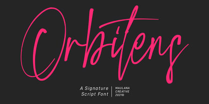 Orbitens is a fancy signature script font. With gel pen stroke, slanted and Unique Upper and lower characters with a bit of ligatures. To give you an extra creative work. Orbitens font support multilingual more than 100+ language. This font is good for logo design, Social media, Movie Titles, Books Titles, a short text even a long text letter and good for your secondary text font with sans or serif. Make a stunning work with Orbitens font. Cheers, MaulanaCreative
 - Shababa by Okaycat,
$24.50 Shababa is a hand-drawn 3-D font. The linework is fairly relaxed, mostly smooth with some distressed edges. There is lots of texturing from the pen strokes which becomes more evident at larger point sizes. This looseness enhances the smooth technicality of the properly extruded forms. With extended codepages for Cyrillic, Romanian, Turkish, Baltic & Central Europe, Shababa is suitable for multilingual environments & publications. It also features West European diacritics, ligatures & a sprinkling of dingbats for extra fun!
 - Carrot Juice by Hanoded,
$15.00 I like Carrot Juice a lot. I don’t drink it that often (and I should, really), but nothing beats a freshly squeezed glass of cold carrot juice!! Carrot Juice font is a lovely script font: handmade with love (and a rather cheap Chinese brush pen which I bought online). Carrot Juice will come in handy when you need that handmade look - cookbooks, websites and product packaging spring to mind. Comes with a abundant harvest of diacritics.
 - Komorebi by LiffeyType,
$9.00 Komorebi consists of handmade letters made with just a Stabilo pen. It is perfect for large scale texts and headlines. This font is suitable for posters, flyers, business cards or just a beautiful visual with a signature word. The family consists of three styles with both lower and upper case letters, accent characters and special characters. Though I personally recommend using all caps to give your words that bold touch, lower case works just as well!
 - Astomia Duslons by Maulana Creative,
$12.00 Astomia Duslons is a fancy casual handwritten script font. With light pen contrast stroke, fun character with a bit of ligatures. To give you an extra creative work. Astomia Duslons font support multilingual more than 100+ language. This font is good for logo design, Social media, Movie Titles, Books Titles, a short text even a long text letter and good for your secondary text font with sans or serif. Make a stunning work with Astomia Duslons. Cheers, Maulana Creative
 - Cicero by Présence Typo,
$36.00Cicero was the first typeface designed by Thierry Puyfoulhoux in 94. It is what could be called a semi-serif. Only the serifs which occur naturally when drawing letters with a flat nib pen have been retained. The absence of certain serifs allows for much tighter spacing. The remaining serifs still stabilize the baseline, although less effectively than a "full-serif" typeface. By borrowing features from both the sans and serif styles, Cicero truly stands at their crossroads. - Crowd Funded by Hanoded,
$15.00 Crowd Funded fonts wasn’t really crowd funded… In fact, all of the funding came from me, as I had to buy paper and a new pen to get this font going! Crowd Funded is an all caps display font, which I based on a recent font of mine called Longreach. Crowd Funded is narrower and rounder than Longreach and, in a way, more delicate. It comes with a generous amount of diacritics and basic Cyrillic as well!
 - Shinokai by Lukas Schiltknecht,
$14.00 The Shinokai is a sans serif of two weights that is both dynamic and consequent. Originally concepted as a font for application letters by Lukas Schiltknecht it quickly became a more sophisticated piece of work. This Typeface is inspired by some of his favorite fonts the FF DIN and the ITC Officina. It is made to suit a variety of uses like advertising and packaging, film and tv, editorial and publishing as well as posters and billboards.
 - Near Myth by Comicraft,
$19.00 The Norse Gods of Asgard, the Titans of Olympus and the Elders of Middle Earth have spoken! Their pronouncements have been carved in the solid rock across the mountains of Midgard and their Legend will now be known to many... 'cause JG --- our very own Mr Fontastic -- signed a license for comicbookfonts.com to make the typestyles of the gods commercially available. No really, he made a deal with Loki. Dipped his pen in his own blood and everything.
 - Filibuster NF by Nick's Fonts,
$10.00The Ayes have it! The 1909 specimen catalog from the H. C. Hansen Type Foundry of Boston contained a lovely decorative face named Congress, which is the pattern for this font. It's a winning choice for distinctive headlines, and the uppercase letters are also suitable by themselves for use as decorative initials. The PC Postscript, Truetype and Opentype versions contain the complete Latin language character set (Unicode 1252) plus Central European (Unicode 1250) languages as well. - Bassy by ErlosDesign,
$15.00 Bassy is an incredibly stylish script font which will look stunning in a wide variety of contexts. Created with the help of an outstanding brush pen, this font will elevate your projects to the highest level. This font is PUA encoded which means you can access all of the glyphs and swashes with ease! The file you will get is: • Works on PC & Mac • Simple installation • Encoded PUA Character - Can be accessed completely without additional design software. Enjoy!
 - NorB Sketch by NorFonts,
$30.00 NorB Sketch is inspired from my NorB Felt Pen font, so trying a new technique of lettering. It is a handwritten text font witch can be used with any word processing program for text and display use, print and web projects, apps and ePub, comic books, graphic identities, branding, editorial, advertising, scrapbooking, cards and invitations and any casual lettering purpose… or even just for fun! It comes with 6 weights, Normal, Bold and Heavy each with their Italics.
 - Auzhera by Floves Type,
$39.99 Looking to take your design game to the next level? Look no further than Auzhera Brush Font! Handmade from a real analog fude brush pen, this stunning handwritten font boasts a unique brushed texture that adds a natural, hand-written feel to any project. From bold headlines to understated designs, Auzhera Brush Font’s versatility is unmatched. Crafted with meticulous attention to detail, this font is perfect for creatives looking to add a touch of personality to their work.
 - Dear Rae, Love Dad by Outside the Line,
$19.00 Dear Rae, Love Dad is a modern calligraphy font drawn by hand using ink and a folded nib dip pen on rough watercolor paper. Best used in Open Type apps, it has automatically changing alternates. It is upright, dramatic, and personal. It is named Dear Rae, Love Dad because who wouldn't like to get a letter signed, Love Dad. There is also a freebie font of several blobs and some hearts. Because it just seems right.
 - Salto by Linotype,
$29.99 Salto was developed by Karlgeorg Hoefer and introduced in 1952 by the foundry Gebr. Klingspor in Offenbach. The capital letters were drawn with a brush, the lower case with a broad-tipped pen developed by Hoefer especially for the task. Salto reflects the Zeitgeist of the 1950s, appearing frequently in advertisements during the years of the Wirtschaftswunder. The font’s extravagance and dynamic quality arise from the contrast between the strong, zestful capitals and the more reserved lower case letters.
 - RAN by URW Type Foundry,
$35.99 RAN Reformed Typeface for Beginners by Georg Salden - a headstrong and courageous approach to an improved handling of handwriting. Diverse and sometimes irreconcilable theories exist about how beginners are supposed to learn writing and reading. This has led to fierce discussions among experts already. We don’t want to pour more oil on the fire, but hope to create a new awareness for this topic, which is important to everyone of us. For beginners the combination of single characters (sounds) to whole words is essential during the acquirement of reading and writing. In this process they develop the skill to recall entire terms from memory. Therefore, after current practice, every word shall be written in a single stroke without lifting the pen in between. Georg Salden contradicts this postulate and warns, that coercively holding the pen down within a word can easily lead to exaggerated loop formations and a general meandering of the written text. The intellectual process in connecting single sounds to words while writing would happen anyway and the prohibition to lift the pen would often lead to tensions. To still support the necessary connections in general and to simplify the connecting, he teaches to write all round letters like a, e, g, o with inclusion of the connecting stroke, so that the spacing and combining with the next character arise by themselves. By settling the stroke at certain points and with a clear and logical writing method, a conscious and careful contact with the various strokes arises. All this automatically leads, together with a certain deceleration, to an increase of beauty and readability in the handwriting. The repeatedly discussed topic »connected or unconnected« appears to be solved in the most comfortable way as, depending on the particular character combination, both solutions are possible.
 - ITC Aram by ITC,
$29.99Jana Nikolic was finishing her degree program at the Faculty of Applied Arts, in Belgrade, with a final project that would combine her two majors: type and book design. Three stories from William Saroyan's My Name Is Aram would provide the text for the book, to be set in a typeface that Nikolic would design. Nikolic knew something special was happening the moment she put pen to paper. The letters just emerged," she recalls. "I started to explore a few new pens and found one I loved. I was able to make its tip bend with pressure." Like the family Saroyan writes about, the design flowing from Nikolic's pen would be simple but a little quirky. "When there were a whole bunch of little black letters around me," continues Nikolic, "I saw that this was going to be a very interesting typeface family." Nikolic drew Latin and Cyrillic letters, lowercase and capital letters, wide letters and narrow letters. She was surprised at how quickly and easily the design came. "There were no badly written letters," she says. "I hardly had to rework them and they fit together remarkably well." ITC Aram's standard character complement consists of one set of lowercase letters and two sets of capitals: one narrow and the other wide. The wide caps can be used with the standard lowercase, or mixed with the narrow caps for a variation on "cap and small cap" copy. The ITC Aram create the opportunity to mix and combine the letters into playful typographic expressions. Words and sentences that twinkle; text that seems light and alive - one runs the risk of creating work that is both delightful and charming when setting copy in ITC Aram." - Fairplex by Emigre,
$49.00 Zuzana Licko's goal for Fairplex was to create a text face which would achieve legibility by avoiding contrast, especially in the Book weight. As a result of its low contrast, the Fairplex Book weight is somewhat reminiscent of a sans serif, yet the slight serifs preserve the recognition of serif letterforms. When creating the accompanying weights, the challenge was to balance the contrast and stem weight with the serifs. To provide a comprehensive family, Licko wanted the boldest weight to be quite heavy. This meant that the "Black" weight would need more contrast than the Book weight in order to avoid clogging up. But harmonizing the serifs proved difficult. The initial serif treatments she tried didn't stand up to the robust character of the Black weight. Several months passed without much progress, and then one evening she attended a talk by Alastair Johnston on his book "Alphabets to Order," a survey of nineteenth century type specimens. Johnston pointed out that slab serifs (also known as "Egyptians") are really more of a variation on sans serifs than on serif designs. In other words, slab serif type is more akin to sans-serif type with serifs added on than it is to a version of serif type. This sparked the idea that the solution to her serif problem for Fairplex Black might be a slab serif treatment. After all, the Book weight already shared features of sans-serif types. Shortly after this came the idea to angle the serifs. This was suggested by her husband, and was probably conjured up from his years of subconscious assimilation of the S. F. Giants logo while watching baseball, and reinforced by a similar serif treatment in John Downer's recent Council typeface design. The angled serifs added visual interest to the otherwise austere slab serifs. The intermediate weights were then derived by interpolating the Book and Black, with the exception of several characters, such as the "n," which required specially designed features to avoid collisions of serifs, and to yield a pleasing weight balance. A range of weights was interpolated before deciding on the Medium and Bold weights.
 - Rotulona Hand - Personal use only

- Die Lara by Ingo,
$27.00 A girl’s handwriting written on the iPad Writing changes – throughout history over centuries, but also from generation to generation. Each new generation of students learns to write the basic forms of the letters a little differently than their predecessors. The role model is also changing. The cursive handwriting taught in school is getting closer and closer to printed type. The children no longer learn the forms of cursive handwriting required for connected writing, but first the “block letters”, only later should they develop their own individual handwriting from this, which many of them no longer do. And the writing tool is also changing. Of course, script looks different when children no longer learn to write on paper with a fountain pen, but on a tablet computer with the “pencil”. The writing experience is completely different, and the “material properties” are different too. There is practically no writing resistance that would make it difficult to move against the direction of writing. "Die Lara" was created based on the template by Lara Mörwald from the winter of 2023. The font version "Black" corresponds to the handwritten original, all thinner variants up to the wafer-thin "Hairline" are derived from it. In the variable font, the intermediate forms can be selected steplessly. In order to preserve the handwritten character of the font, "Die Lara" contains several alternates to most letters and numerals, so that different character forms alternate in the typeface. If the "ligatures" function is activated in the app (which is the default in most programs), these alternates appear automatically as you type. There is also an alternative "swashed" variant of some letters. So you can set somewhat livelier accents at the beginning or end of a word. "Die Lara" also contains fractions and tabular figures.
 - FS Sally by Fontsmith,
$80.00 Bookish A little bit bookish, but quietly elegant and well-proportioned, FS Sally is a graceful font family. It’s a refreshingly uncomplicated design that brings sophistication to text and display type, and a distinctive aplomb to both large and small volumes of text. Hidden talents There’s more to FS Sally than meets the eye. Choose Standard for the Latin alphabet or Pro if you work with Cyrillic and Greek typography. There’s a large range of special features, including elegant small caps and a set of discretionary ligatures to add a traditional flavour to figures and fraction sets. Rhythmic There’s a rhythm and flow to FS Sally – the result of the classic but asymmetric design of its serifed feet and shoulders. The inward curve of the serif at the shoulder and the outward curve at the foot subliminally guide the eye through each letterform, and the flicked feet of the “a”, “d” and “u” add an extra kick of energy to the rhythm. The italic forms have their own flow, too, with a pen-like fluency that retains the formal discipline required for a text type. Regular to heavy FS Sally’s five weights, all with italics, cover every kind of print application. The regular weight is elegant in display and an easy read in longer texts. A subtle step up from the regular is the medium, which was created to deliver a stronger colour and finish in poorer printing conditions. The semibold offers a strong alternative to the regular at smaller sizes, and its intermediate feel suits it to sub-headings, title pages and calmer designs. The bold works excellently in book and title headings, and FS Sally Heavy lends weight and punch to poster headlines and logotypes.
 - FS Sally Paneuropean by Fontsmith,
$90.00Bookish A little bit bookish, but quietly elegant and well-proportioned, FS Sally is a graceful font family. It’s a refreshingly uncomplicated design that brings sophistication to text and display type, and a distinctive aplomb to both large and small volumes of text. Hidden talents There’s more to FS Sally than meets the eye. Choose Standard for the Latin alphabet or Pro if you work with Cyrillic and Greek typography. There’s a large range of special features, including elegant small caps and a set of discretionary ligatures to add a traditional flavour to figures and fraction sets. Rhythmic There’s a rhythm and flow to FS Sally – the result of the classic but asymmetric design of its serifed feet and shoulders. The inward curve of the serif at the shoulder and the outward curve at the foot subliminally guide the eye through each letterform, and the flicked feet of the “a”, “d” and “u” add an extra kick of energy to the rhythm. The italic forms have their own flow, too, with a pen-like fluency that retains the formal discipline required for a text type. Regular to heavy FS Sally’s five weights, all with italics, cover every kind of print application. The regular weight is elegant in display and an easy read in longer texts. A subtle step up from the regular is the medium, which was created to deliver a stronger colour and finish in poorer printing conditions. The semibold offers a strong alternative to the regular at smaller sizes, and its intermediate feel suits it to sub-headings, title pages and calmer designs. The bold works excellently in book and title headings, and FS Sally Heavy lends weight and punch to poster headlines and logotypes. - Bodoni Highlight by Image Club,
$29.99Giambattista Bodoni (1740-1813) was called the King of Printers; he was a prolific type designer, a masterful engraver of punches and the most widely admired printer of his time. His books and typefaces were created during the 45 years he was the director of the fine press and publishing house of the Duke of Parma in Italy. He produced the best of what are known as modern" style types, basing them on the finest writing of his time. Modern types represented the ultimate typographic development of the late eighteenth and early nineteenth centuries. They have characteristics quite different from the types that preceded them; such as extreme vertical stress, fine hairlines contrasted by bold main strokes, and very subtle, almost non-existent bracketing of sharply defined hairline serifs. Bodoni saw this style as beautiful and harmonious-the natural result of writing done with a well-cut pen, and the look was fashionable and admired. Other punchcutters, such as the Didot family (1689-1853) in France, and J. E. Walbaum (1768-1839) in Germany made their own versions of the modern faces. Even though some nineteenth century critics turned up their noses and called such types shattering and chilly, today the Bodoni moderns are seen in much the same light as they were in his own time. When used with care, the Bodoni types are both romantic and elegant, with a presence that adds tasteful sparkle to headlines and advertising. This version of Bodoni was done by Morris Fuller Benton for American Typefounders between 1907 and 1911. Although some of the finer details of the original Bodoni types are missing, this family has the high contrast and vertical stress typical of modern types. It works well for headlines, logos, advertising, and text." - Hymers JNL by Jeff Levine,
$29.00 Born on May 8, 1892 in Reno Nevada, Lewis Franklin (“Lew” ) Hymers left an indelible mark as a caricaturist, cartoonist and graphic artist. At the age of twenty [in 1912] he worked for the San Francisco Chronicle. During World War I he worked for the Washington Post. He even was employed for a time by Walt Disney as an animator - but most of his life was spent in either Tujunga, California or his birthplace of Reno, Nevada as a self-employed illustrator. Hymers inked a feature for the Nevada State Journal called “Seen About Town”, which was published during the 1930s and 1940s. In this panel, he caricaturized many of the familiar faces around Reno. He also designed signs, logos, post cards and numerous other commercial illustrations for clients, but what has endeared him to a number of fans was his vast library of stock cuts (the predecessor to paper and electronic clip art) which feature his humorous characters in various professions and life situations. So popular is his work amongst those “in the know” that a clip art book collection of over seven hundred of his drawings that was issued by Dover Publications [but long out of print] commands asking prices ranging from just under $15 to well over $100 for a single copy. Lew Hymers passed away on February 5, 1953 just a few months shy of his 61st birthday. Although his artwork depicts the 1930s and 1940s lifestyles, equipment and conveniences, more than sixty years after his death they stand up amazingly well as cheerful pieces of nostalgia. The twenty-seven images (and some variants) in Hymers JNL were painstakingly re-drawn from scans of one of his catalogs and is but just a tiny fraction of the hundreds upon hundreds of illustrations from the pen of this prolific artist.
 - Schrodingers Signature by Ferry Ardana Putra,
$12.00 Schrödinger's is a remarkable signature font which was made hand-drawn manually using Hitech-C pen, This typeface is very natural-like and make your design stand out! Schrödinger's is perfect for gorgeous logos, cards, quotes, posters, wedding invitations, blog posts, social media, and more! To keep it more natural-like, we provide you hundreds of ligature! Schrödinger's font contains following ligatures: aa ab ac ad ae af ah ak al am an ar as and ant at att all av aw ax ay az bb bl bt cc cd ce ch ck cl cm cn cr cs ct db dd dl dt ea eb ec ed ee ef eh ek el em en er es end ent est et ett ell ev ex ey ez ff fi fl fo gh ght gt he ht ib ic idd ie if ih ik il im in ir is ind int ist it itt ill iv ix iy iz kk la le ll lt mm mt ns nt oa oe of oh oi ok ol om oo or os ond ont ost ot ott oll ov ow ox oy oz pp rr sh sl ss st th the tl tt ub uc ud ue uf uh uk ul um un ur us und unt ut utt ull uv uw ux uy uz wh yy zz nn Not only that, we also include swashes and love swashes for those who interested in valentine stuff! Schrödinger's features: A full set of upper & lowercase characters Numbers & punctuation Multilingual language support PUA Encoded Characters +418 Glyph Up to 163 Ligatures Swashes OpenType Features In order to use the beautiful swashes, you need a program that supports OpenType features such as Adobe Illustrator CS, Adobe Photoshop CC, Adobe Indesign and Corel Draw. For more information about accessing alternative, you can see this link: http://adobe.ly/1m1fn4Y
 - Parma by Monotype,
$29.99Giambattista Bodoni (1740-1813) was called the King of Printers; he was a prolific type designer, a masterful engraver of punches and the most widely admired printer of his time. His books and typefaces were created during the 45 years he was the director of the fine press and publishing house of the Duke of Parma in Italy. He produced the best of what are known as modern" style types, basing them on the finest writing of his time. Modern types represented the ultimate typographic development of the late eighteenth and early nineteenth centuries. They have characteristics quite different from the types that preceded them; such as extreme vertical stress, fine hairlines contrasted by bold main strokes, and very subtle, almost non-existent bracketing of sharply defined hairline serifs. Bodoni saw this style as beautiful and harmonious-the natural result of writing done with a well-cut pen, and the look was fashionable and admired. Other punchcutters, such as the Didot family (1689-1853) in France, and J. E. Walbaum (1768-1839) in Germany made their own versions of the modern faces. Even though some nineteenth century critics turned up their noses and called such types shattering and chilly, today the Bodoni moderns are seen in much the same light as they were in his own time. When used with care, the Bodoni types are both romantic and elegant, with a presence that adds tasteful sparkle to headlines and advertising. Parma was designed by the monotype Design Team after studying Bodoni's steel punches at the Museo Bodoniana in Parma, Italy. They also referred to specimens from the "Manuale Tipografico," a monumental collection of Bodoni's work published by his widow in 1818.
