10,000 search results
(0.013 seconds)
- Sugar Peachy by Ahmad Jamaludin,
$21.00 Hey there! Introducing Sugar Peachy Retro Soft Display - a font that exudes happiness, uniqueness, and wonder! This groovy display font has a retro 70s style with soft and chewy characteristics that are perfect for display, titling, and even logos or headers. With 5 styles ranging from thin to black, you can use it for short text or large displays. Plus, Sugar Peachy has special features like alternates and ligatures that make it ideal for all kinds of design purposes like branding, product design, websites, posters, stickers, merchandise, and more! Similar Item: Gyoza : https://www.myfonts.com/collections/gyoza-font-ahmad-jamaludin Gunydrops : https://www.myfonts.com/collections/gunydrops-font-ahmad-jamaludin Kelpo : https://www.myfonts.com/collections/kelpo-font-ahmad-jamaludin Swipe: https://www.myfonts.com/collections/swipe-font-ahmad-jamaludin Replay : https://www.myfonts.com/collections/replay-font-ahmad-jamaludin Bright : https://www.myfonts.com/collections/bright-font-ahmad-jamaludin Margin : https://www.myfonts.com/collections/margin-font-ahmad-jamaludin Nighty : https://www.myfonts.com/collections/nighty-font-ahmad-jamaludin What you get? Sugar Peachy Light Sugar Peachy Regular Sugar Peachy Medium Sugar Peachy Bold Sugar Peachy Black Features : Alternates and Ligatures Instructions ( Access special characters, even in circuit design ) Letters, numbers, symbols, and punctuation No special software is required to use this typeface even work in Canva Multilingual Support Give your design projects that fun, playful edge with Sugar Peachy! Thank you, Dharmas Studio
 - Bodrum Sweet by Bülent Yüksel,
$19.00 Bodrum Collection: 1- Bodrum Sans 2- Bodrum Sweet 3- Bodrum Stencil 4- Bodrum Slab 5- Bodrum Styte 6- Bodrum Soft "Bodrum Sweet" is a sans serif type family. Designed by Bülent Yüksel in 2018/19. The font, influenced by style serifs, popular in the 1920s and 30s, is based on optically corrected geometric forms for better readability. "Bodrum Sweet" is not purely geometric; it has vertical strokes that are thicker than the horizontals, an “o” that is not a perfect circle, and shortened ascenders. "Bodrum Sweet" some corner is rounded. These nuances aid in legibility and give "Bodrum Sweet" a harmonious and sensible appearance for both texts and headlines. Bodrum Sweet provides advanced typographical support for Latin-based languages. An extended character set, supporting Central, Western and Eastern European languages, rounds up the family. The designation “Bodrum Sweet 14 Regular” forms the central point. "Bodrum Sweet" is available in 10 weights (Hair, Thin, Extra-Light, Light, Regular, Meduim, Bold, Extra-Bold, Heavy and Black) and 10 matching italics. The family contains a set of 650+ characters. Case-Sensitive Forms, Classes and Features, Small Caps from Letter Cases, Fractions, Superior, Inferior, Denominator, Numerator, Old Style Figures just one touch easy In all graphic programs. Bodrum Sweet is the perfect font for web use. You can enjoy using it.
 - Revista by Latinotype,
$29.00 Revista is a typographic system that brings together all the features to undertake any fashion magazine-oriented project. The font harmoniously blends different styles into a single big family, which consists of a Didone uppercase and small caps family—including 4 variants ranging from a monolinear Thin to Black with matching italics—and an Inline Black variant that works as a decorative alternative to the Didone fonts. Revista Stencil, one of its versions, comes with the same number of variants. Revista also comes with a Script Family that includes 5 weights, ranging from Thin (monolinear) to Black, contrasting in a tidily untidy way with many ligatures and alternates. You can choose between using stylistic alternates—if you want to give your designs a different untidy look, in the style of the modern calligraphy—or switching between different options if you are looking for a hand-written style. We highly recommend using the default contextual alternates and discretionary ligatures in order to take more advantage of this great font family. Revista includes 2 sets of dingbats, varying from zodiac signs symbols to technology symbols, and complementary ornaments in 3 different weights: Thin (monolinear), Regular and Black. All these features make Revista an ideal typeface for users to design to their liking! Photo by Fervent-adepte-de-la-mode
 - Geminian by Sudtipos,
$49.00 Geminian is a set of fonts that started as a simple idea based on a theoretical level and developed during a long time, to be able to take shape under a creative impulse inspired by the need to communicate, today more than ever. From an astrological point of view, it celebrates and contributes to this practice, the study of stars position and movement and their influence on people's destiny. As a good Gemini, this set revives the main features of the opposite twins sign. Gemini is associated with thoughts, creativity, and communication. Its ruler Mercury (Hermes for the ancient Greeks), messenger of the Gods, and spokesman of the divine word, gives the natives of this sign intelligence, wit, eloquence and poetry. Geminian aims to be a medium to carry different messages from one end to the other. And this is because when using words, Geminis always surprise. Thanks to this gitf (and language and communication), they are able to bring up the most ingenious ideas, to solve any problem and to contribute new perspectives. These qualities may be the secret of its magnetism. The Geminian set comes in 5 styles including a script with multiple ligatures and alternates, 3 sets of caps and dingbats. In addition the complete font family supports a wide variety of Latin alphabet-based languages.
 - Promenadenmischung - Personal use only

- Green by ITC,
$29.99Green is the work of British designer Timothy Donaldson, known for his experimentation with letter forms. This typeface features a sharp stroke contrast and eccentric lower case letters, giving it a vital, clean-cut style. Green is perfect in both large display sizes and small text sizes and gives any work a fresh, new look. - VAG Rounded Next Variable by Monotype,
$172.99VAG Rounded Next Variable Regular is a single font file that features one axis: Weight. For your convenience, the Weight axis has preset instances from Light to Extra Black. This Roman (upright) font is provided as an option to customers who do not need Italics, and want to keep file sizes to a minimum. - FunFair by Andrew Footit,
$14.00 This fun sans-hand typeface gives your designs and layouts a personal touch that leaves a smile. FUNFAIR has two weights each with italics. FunFair has tall letters and tight kerning to give a natural hand written style. It’s great for posters, cards and headings but also versatile enough for many kinds of typographic layouts.
 - Shield 2 Letters Monogram by MonogramBros,
$12.00 Shield 2 Letters Monogram Font is a perfect shield shaped monogram font consisting of 52 letters and 1 basic frame. With just a single font file you will be able to create beautiful monograms in just a matter of minutes after the purchase! Shield 2 Letters Monogram Font comes with font file in OTF format.
 - dubfresh - 100% free

- Roundico - Unknown license

- Printers Assistants JNL by Jeff Levine,
$29.00 Printers Assistants JNL is a collection of vintage letterpress stock cuts and embellishments features monthly title blocks (for newsletters or calendars of events) in an Art Deco style, a cartoon character counting [with fingers] one through five to emphasize selling points and assorted cartoons and decorations sure to please any lover of nostalgic art.
 - Goma Mono by Daniel Uzquiano,
$20.00 Goma Mono is a display monospaced rounded sans serif font built in ten styles. This family, with five weights, covers a wide variety of character due to the large difference in thickness. The typeface can be used perfectly in display sizes and logos. Goma Mono is released with 414 glyphs and includes Open Type features.
 - CompassOne by Ingrimayne Type,
$9.00 CompassOne was a design I began in 1990 or so, but did not bother to finish until five years later. Its name comes from the fact that all the letters could have been drawn with a compass (which draws circles) and a straight edge. The typeface Demotte was a further development of this design idea.
 - Yarikha by ActiveSphere,
$30.00 Yarikha is a geometric display font and works best in display applications, such as posters, logos and titles. It has five weights: regular, semibold, demibold, bold and extrabold, each available in italic, making a total of ten styles. Each style has a full upper and lower-case, accents, punctuation and a selection of monetary symbols.
 - Bear Anark by Ingrimayne Type,
$9.00 BearAnark is a decorative slab-serifed typeface that can be used for some text purposes. It has moderate contrast and comes in five weights, each with a true italic. The development of the family began with a blending of two other slab-serif faces, Anarckhie and BearButteT, and this origin is reflected in its name.
 - Manifest by Yasin Yalcin,
$12.00 Manifest is a geometric typeface family based on the principles of simplicity, modernity and functionality. With a low-contrast design approach, it performs excellently in any project from print to digital. It comes in five weights with an extended character set including 240+ glyphs per typeface which supports Western and some Central European languages.
 - Allioideae by URW Type Foundry,
$49.99 This fine lined display type face was named Allioideae because of the ascenders of the lower cases. They are rising upright with a single stroke and are ending - depending on the font style - into a spherical blossom. The name was chosen concerned to the plant allium, that forms an umbel at the top of a leafless stalk, when it is blooming. Allioideae is the name of a subfamily of monocot flowering plants in the family Amaryllidaceae. The name is derived from the generic name of the type genus, Allium. The wide and round capital letters are showing a nice contrast to the lower cases and giving the font a kind of female feeling. That provides a functional and lovely use in headlines for all beauty and cosmetics issues.The typeface appears in 4 different styles. a plain style – Allioideae, a stencil style - Allioideae Stencil, a (dotted) style for both - Allioideae Dot and Allioideae Stencil Dot. It supports multi language as it covers all the latin diacritics and a cyrillic character set. Lots of numbers as monospaced, lining figuers, old styles, sub- and superscript and many fractions in two different styles are giving a nice finish to that font. Also some matching ornaments are included.
 - Drafbink by Twinletter,
$17.00 Say hello to classic elegance with the Draftbink font. With a compelling classic serif theme, this font is the perfect choice for creating projects with an elegant touch of classic modernism. Draftbink brings powerful features to give you unlimited flexibility and creativity. The ligature and alternate features allow you to combine interesting characters and create unique and attractive typography compositions. Not only that, Draftbink also supports multilingualism, so you can easily adapt this font to various languages. This opens up the opportunity to reach a wider audience and increase the attractiveness of your project. With its distinctive classic serif characteristics, Draftbink gives your design an elegant and bold impression. Each letter is carefully designed to display stunning beauty and sharpness. Make Draftbink your best choice to present an unforgettable classic modernism feel. Get this font now and show elegance in every detail of your project. What’s Included : File font All glyphs Iso Latin 1 Alternate, Ligature Simple installations We highly recommend using a program that supports OpenType features and Glyphs panels like many Adobe apps and Corel Draw so that you can see and access all Glyph variations. PUA Encoded Characters – Fully accessible without additional design software. Fonts include Multilingual support
 - Rougon by VanderKeur,
$30.00 The reason for Nicolien van der Keur to design the Rougon font was the translation of twenty novels written by Emile Zola, a French writer, and translated by Martine Delfos. It follows the lives of the members of the two titular branches of a fictional family living during the Second French Empire (1852–1870) and is one of the most prominent works of the French naturalism literary movement. This series deserved a font with French roots and corresponded to the period in which Zola’s books were written and published, the period between 1870 and 1893, the end of the nineteenth century. Extensive research into French historical typefaces has led to a type specimen from the French type foundry Deberny et Cie in Paris around 1907. It turned out to be good and helpful source as it contained a sample of a typeface that reflected the content and style of the novels, but also represented the period in which the books were written in France. A large part of the novels are about the generations of Rougon, so it seemed a natural choice to give the font that name. It is available in one weight and contains stylized portraits of Emile Zola and the French Marianne. This font also contains various ornaments.
 - Sommet Slab Rounded by insigne,
$22.00 Sommet Slab Round is the latest in the Sommet series, designed as a slab serif companion to Sommet Rounded. The typeface features slightly wider counters to accommodate the serifs and this more generous whitespace allows the typeface to display well on-screen and as a webfont. Rounded serifs give the face more warmth than the original Sommet Slab, which is strong, rigid and technical. Sommet Slab Rounded’s serifs are not just blunted, but slightly obliqued, giving the face dynamic forward momentum. This geometric typeface is based on bold and clean rounded rectangles. It’s soft and friendly look lends itself to a number of applications. It would be a fine choice for tech company logotypes, magazine headlines and can be used for body copy. The typeface family also includes some alternate titling forms. These alternates can be accessed by activating OpenType features and style sets. In order to use these OpenType features, you will need a program with advanced typography capabilities such as the Adobe Suite or Quark. These alternates include a group of simplified forms that can be accessed under the swash alternates. Sommet Slab is just the latest in the versatile Sommet superfamily from insigne. Be sure to check out the rest of the design family that includes serif and sans members.
 - Symcaps Vario X3 by Deniart Systems,
$20.00 The Symcaps Vario X3 typeface is a monospaced design created to give optically symmetrical message forms.
 - Barnboard by BA Graphics,
$45.00A true rustic design to give the feeling of real wood (no press board used here). - Runcible by PintassilgoPrints,
$24.00 A runcible font for dolomphius designs. I do not believe you won't give it a try !
 - Symcaps Vario X2 by Deniart Systems,
$20.00 The Symcaps Vario X2 typeface is a monospaced design created to give optically symmetrical message forms.
 - Alfie by Monotype,
$29.99 Alfie™ is lively, friendly, inviting and easy on the eyes. What more could you want in a script? How about four flavors of the same design? Alfie Script is a delightful connecting script with a touch of comfortable elegance. Use it for everything from social announcements to headlines and packaging. Alfie Casual is a little more laid-back with letters standing on their own. It works great in short blocks of text copy, subheads and navigational links. Alfie Informal has spirited serifs and its own demeanor, while Alfie Small Caps does a fine job of supporting its other siblings. There’s an immediacy to words and messages set in these lighthearted confections. Jim Ford was practicing drawing with a new brush pen when the inspiration for Alfie came to him. He had filled several pages in a notebook with letters and, at one point, realized that there might be a typeface among them. As it turned out, there were four. The process, however, wasn’t choosing one design and modifying it. The makings of all the designs were on the pages. It was just a matter of culling out the right collection of characters to build the foundations for the four flavors of Alfie. Because they share the same family roots, each design in the Alfie family can be paired and intermixed. Ford admits that there’s a hint of Emil Klumpp’s 1950s Murray Hill typeface (https://www.myfonts.com/fonts/bitstream/murray-hill/) in the Alfie family. Just enough to give the design a 50s vibe. (Some fashions never go out of style.)
 - Relayfun by Yebhu,
$10.00 Relayfun is a hand-drawn font that really gives a real personal touch to your project. This mixed typeface gives a feeling of 'entertaining' something very quickly! It is perfectly used for various purposes such as art quotations, branding, book titles/covers, clothing designs, editorial designs, labels, posters, product packaging, special events or anything else that requires hand taste.
 - Shield Classic 2 Letters by MonogramBros,
$12.00 Shield Classic 2 Letters Monogram Font is a perfect shaped monogram font consisting of 52 letters and 1 basic frame. With just a single font file you will be able to create beautiful monograms in just a matter of minutes after the purchase! Shield Classic 2 Letters Monogram Font comes with font file in OTF format.
 - Brigned by Krafted,
$10.00 Want to give your brand image a modern and chic twist? Whether you're a trendsetter or a conventional, we have what you need. Introducing Brigned - A Modern Serif Font. From logo design to digital and print media, Brigned creates a lasting impression and charm. Give it a try and see how a beautiful font can make all the difference.
 - Empirez by Almarkha Type,
$29.00 Introducing A display font that gives you strong and bold typography. Empirez – Slab Serif Family with 4 Style is an adaptation and progression Empirez – Slab Serif Family, giving the user some cool options when creating artwork. This font perfect for both print and digital, in headlines for editorial, posters, banners, websites, apparel, packaging, logos or magazines. Thank’s
 - Wrought by Jon Cartagena,
$10.00 Wrought is a bold geometric display font by Jon Cartagena. It's purpose is to give a rugged, heavy feeling to your designs. Wrought is available in four weights: Thin, Light, Regular, and Bold. Each character is carefully designed to be vertically aligned at the center. This gives Wrought a unique flair, while promoting a harmonious look through each word.
 - Trochera by Sardiez,
$20.00 The agressive moves, the lateral spurs and the heavy leaf endings of Trochera resemble the silvan plants behavior giving it a very expressive and festive personality. Its features make Trochera very useful for flamboyant and colorful purposes, but it is also attractive in black and white, the saturation of the ornaments will give an appealing texture to headings.
 - Fauna by Del Alma,
$14.99 Fauna is the set of cute animals you were looking for! We know these animals will give their best in order to give a lovely touch to your work. With a total of 108 characters; the font family is divided into two styles of 54 each: Fauna Blanca and Fauna Negra. Choose one of them... or better, choose both!
 - Astroz by Gravitype,
$14.90 Astroz is a single weight display font inspired by sci-fi culture and space environments. It has been conceived for logos, headlines and posters. The sharp lines mixed with perfect circles give a wonderful futuristic aesthetic. In addition, alternates of letter “A” and number “1” are included to give you more stylistic options. Multilingual support is available.
 - Acryle Script by Mans Greback,
$59.00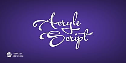 Clean high quality script font with multiple ligatures and alternate glyphs. Gives your project a creative touch.
 - Semantica MF by Masterfont,
$59.00 Formal, yet with very high legibility even in small point sizes. Many weights gives you design alternatives
 - Akvarel MF by Masterfont,
$59.00 Fine strokes make this elegant font family a great companion for invitations and signs, indoor and outdoor.
 - Katty Signature by Dieza Design,
$15.00 Give your design the feel of authentic craft. "Katty Signature" is perfect for stationary, logos and more.
 - Wilhelm Klingspor Schrift by Alter Littera,
$25.00 A comprehensive and faithful rendition of one of the finest metal typefaces of the 20th century. Rudolf Koch designed Wilhelm Klingspor Schrift (initially conceived as “Missal Schrift”, and later referred to also as “Wilhelm Klingspor Gotisch”) between 1919 and 1925 for the Gebr. Klingspor Type Foundry in Offenbach am Main. It is an impressive textura typeface, being sharp, elegant, spiky, sensitive and noble at the same time. Some of its most notable features have to do with the delicate decorations, the thin but subtly swelling lines that parallel or bridge strokes in the capitals, the hairline endings that terminate each stroke in both the capitals and the lowercase letters, the subtle joining of hairlines to thicker strokes, and the tension of some of the transitional curves. Koch’s original design included two sets of capitals (normal and condensed); alternates for a, d, e, r, s and z, plus long s; short and long flourished finial forms for f and t; thirty-five ligatures; and eighteen decorative pieces (Zierstücke). All of these features, plus several additional ones for modern use (including the usual standard characters for typesetting in modern Western languages, additional alternates and ligatures, plus carefully coded Opentype features), have been thoroughly implemented to the highest and most lively level of detail in the present font, in the hope that the past greatness of Wilhelm Klingspor Schrift will finally step into the modern OpenType realm. The main sources used during the font design process were several pages from a specimen book issued by the Gebr. Klingspor Type Foundry in 1927. Other sources were as follows: Bain, P., and Shaw, P. (Eds.) (1998), Blackletter: Type and National Identity, New York: Princeton Architectural Press (p. 43); Hendlmeier, W. (1994), Kunstwerke der Schrift, Hannover: Bund für Deutsche Schrift und Sprache (pp. 56-7); Kapr, A. (1983), Schriftkunst, Dresden: VEB Verlag der Kunst (p. 453); Kapr, A. (1993), Fraktur - Form und Geschichte der gebrochenen Schriften, Mainz: Verlag Hermann Schmidt (pp. 124-5); and Klingspor, K. (1949), Über Schönheit von Schrift und Druck, Frankfurt am Main: Georg Kurt Schauer (pp. 136-7). Some public and private comments by renowned designer and design historian Paul Shaw have also influenced both the design and the description of the present font. Specimen, detailed character map, OpenType features, and font samples available at Alter Littera’s The Oldtype “Wilhelm Klingspor Schrift” Font Page.
 - Instrumenta - Personal use only


