7,337 search results
(0.022 seconds)
- Facundo by Latinotype,
$35.00 Facundo is based on both simple geometric shapes and our hit Trend's uppercase glyphs https://www.myfonts.com/fonts/latinotype/trend/ yet subtle nuances make it stand out among its peers. Facundo may look familiar but has a modern and fresh feel, giving your designs a friendly, and at the same time, renewed and singular appearance. Facundo comes in 7 weights, plus matching italics, well-suited to meet any corporate, brand identity or web design needs. The font contains a set of 715 characters which support over 200 languages that use both Cyrillic and Latin scripts. Facundo was designed by Paula Nazal and Daniel Hernández. Digital editing and review by Rodrigo Fuenzalida.
 - Antapani by Monoco Type,
$15.00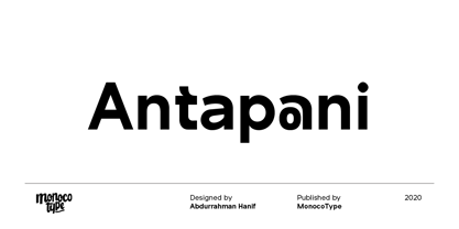 Antapani is a grotesk sans style with some stylistic style to some letter. Designed for readability but can also function as a display text. Come with 9 style from Thin to Black so you can choose which style you want. Designed with opentype features in mind. Each weight includes extended language support (+ Cyrillic), fractions, tabular figures, arrows, ligatures and more. Perfectly suited for graphic design and any display use. It could easily work for web, signage, corporate as well as for editorial design. Designed by Abdurrahman Hanif, a young Jakartans Graphic Designer who fell in love into type design after his graduation. Published by Monoco Type
 - Neue Frutiger Hebrew by Linotype,
$79.00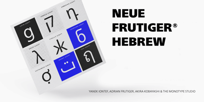 Neue Frutiger Hebrew was created by Yanek Iontef and a team of designers and font engineers from the Monotype Studio, under the direction of Monotype type director Akira Kobayashi. The family is available in 10 weights from Ultra Light to Extra Black, with matching italics. Neue Frutiger Hebrew embodies the same warmth and clarity as Adrian Frutiger’s original design, but allows brands to maintain their visual identity, and communicate with a consistent tone of voice, regardless of the language. It is part of the Neue Frutiger World collection, offering linguistic versatility across environments – suited to branding and corporate identity, advertising, signage, wayfinding, print, and digital environments.
 - Freehouse by Device,
$39.00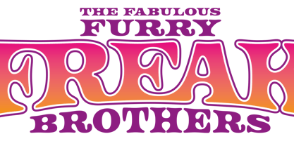 Freehouse is a reinterpretation of the well-remembered Watney’s logo, a brewery and pub chain infamous for its poor quality beer and brutalist decor. In Design Research Unit’s corporate guidelines from 1966 the font is described as Clarendon Bold Expanded — however, this is not the case. Clarendon has square serifs, whereas the Watney’s font is rounder and friendlier. A fixture of the British high street landscape for decades, this digitisation adds a full international character set, numbers, punctuation and many other characters that did not exist in the original. A distressed version that evokes rough print on a wet beermat has also been developed.
 - Neue Frutiger Georgian by Linotype,
$39.00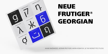 Neue Frutiger Georgian was created by Akaki Razmadze and a team of designers and font engineers from the Monotype Studio, under the direction of Monotype type director Akira Kobayashi. The family is available in 10 weights from Ultra Light to Extra Black, with matching italics. Neue Frutiger Georgian embodies the same warmth and clarity as Adrian Frutiger's original design, but allows brands to maintain their visual identity, and communicate with a consistent tone of voice, regardless of the language. It is part of the Neue Frutiger World collection, offering linguistic versatility across environments – suited to branding and corporate identity, advertising, signage, wayfinding, print, and digital environments.
 - ITC Einhorn by ITC,
$29.99Einhorn is a peculiar typeface. Difficult to classify, this upright, bold, script-like semi serif typeface was designed in 1980 by Alan Meeks. Meeks was inspired by the art nouveau period, and may have been trying to liven up the design scene. In 1980, typefaces like Helvetica and Univers were ubiquitous, and the digital revolution was still years away. Experimental faces like Einhorn helped fill the gap for creative designers looking for untraditional choices in which to set headlines and advertising work. The merit of pioneer display faces like Einhorn have never lessened; Einhorn still sets a mean display text, and works great in logos and other corporate ID solutions. - Orkhon by Plastikdna,
$16.00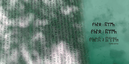 The Old Turkic script (also known as variously Göktürk script, Orkhon script, Orkhon-Yenisey script) is the alphabet used by the Göktürks and other early Turkic khanates during the 8th to 10th centuries to record the Old Turkic language. Words were usually written from right to left. According to some sources, Orkhon script is derived from variants of the Aramaic alphabet, in particular via the Pahlavi and Sogdian alphabets of Persia, or possibly via Kharosthi used to write Sanskrit The texts are mostly epitaphs (official or private), but there are also graffiti and a handful of short inscriptions found on archaeological artifacts, including a number of bronze mirrors.
 - Lubeck by FoxType,
$15.00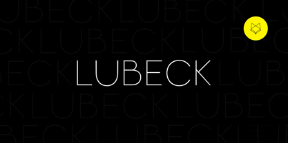 Introducing Lubeck Display, new generation Typeface with 3 Weights. Lubeck Typeface created with the vision of to attract the audience to your brand . The finest details of this typeface are methodically and mathematically created. Lubeck is created with all the tasks of a corporate font and also for the usage in a variety of projects, including branding, logos, titles, headlines, servers, screens, display, digital ads, and everything else. We are putting a lot of effort on this font as a long-term project. The Typeface includes Three Weights. Light, Regular and Medium Features: Numerals, extended punctuation & Basic Symbols(200+ Glyphs). Expert kerning and quality crafting. Uppercase Letters & Lowercase Letters.
 - Nofela by DYSA Studio,
$18.00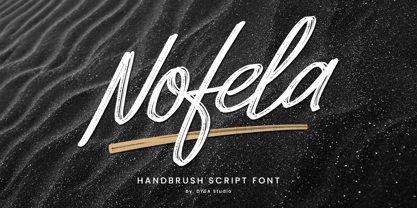 Nofela is a Handwritten Brush Script font. This another collection of script is perfect for your next personal branding project, excellent for your business. Nofela have a smooth edges, so this font gives an authentic handcrafted feel style. Nofela is perfect choice for people looking for clean, modern, minimalist, elegant, beauty design styles. Suitable for almost any graphic designs such as logo, branding materials, business cards, gift cards, t-shirt, cover, thumbnail, print, poster, photography, quotes .etc sans-serif, legible, geometric, clean, sans, modern, display, grotesque, corporate, branding, magazine, contemporary, text, headline, elegant, sans serif, grotesk, advertising, classic, swiss, poster, logo, editorial, technical, logotype
 - The D3 Smartism TypeA font, designed by the creative minds at D3, is an intriguing and versatile typeface that effortlessly bridges the gap between traditional readability and contemporary flair. Thi...
- Neuromancer by Harvester Type,
$15.00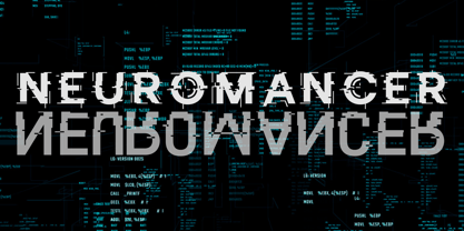 NEUROMANCER is a font inspired by the novel of the same name by William Gibson, the TV series "The Lone Gunmen" and the game "Watch Dogs". Two versions of glitch and regular, for different purposes. I wanted to convey the atmosphere of all references. The atmosphere of cyberspace and the oppressive atmosphere of hacking. The font can be used in posters, covers, texts, titles, banners, and others. If you find an error in the font or kerning, please write to me at: bunineugene@gmail.com
 - DeForme by Ingo,
$39.00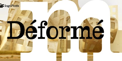 A deconstructive variation of ”Clarendon“ DéFormé was born out of the distortion of the time-honored ”Clarendon“ letterforms, in which the stems and thin strokes have been reversed. Thus, a typeface was created which will remind some readers of a Western typeface, and others of the ordinary typeface of a typewriter. Actually, it is still a robust Clarendon, which has survived ists disfigurement quite well. DéFormé, like its ”mother“, is easily legible, in spite of the inherent emphasis which one is not used to seeing.
 - Bougainville Neo by Type Associates,
$24.50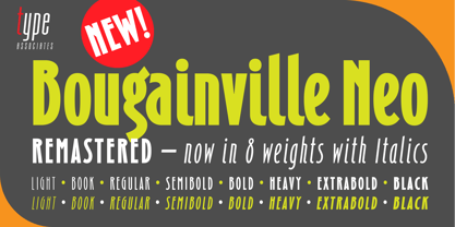 Bougainville Neo is a complete remake of our popular Bougainville series which first appeared at MyFonts in 2005. Neo is now in 4 additional weights plus italics. The original typeface family was named in honor of the renowned eighteen-century French mathematician and explorer Louis-Antoine de Bougainville to whom we owe the naming of South Sea Islands and colorful tropical flora he discovered along his journey. Bougainville Neo makes for effective headings at any size and is equally readable at semi-display sizes.
 - DynaGrotesk by Storm Type Foundry,
$55.00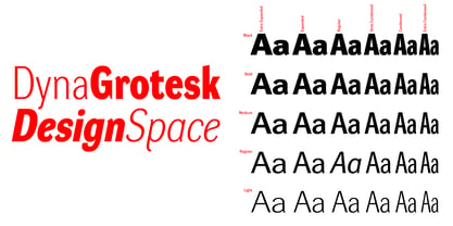 The most exciting new feature of DynaGotesk is the Vintage Italics stylistic set, which activates the decorative forms. It includes the looped "w", curved ascenders and descenders of many lowercase letters. These can significantly change the feel of a poster or invitation. DynaGrotesk may look like a revival of an old typeface, but it is not. It uses only some historical reminiscences, sharp edges and curved shapes, but it’s completely original design aimed at ease of use. The bigger the size, the more evident and pronounced are the spicy details. In smaller and even smallest sizes it’s appearance is qieter, very well suited even for long portions of text. DynaGrotesk was created in 1995 with the use of Multiple Master interpolation. But the MM fonts never achieved the desired application in industry, so designers returned back to single fonts. Over the following decades, the font was modified several times as an old house, and the present re-animation includes the Variable font format. Since its first release in the mid-nineties, it is widely used in all areas of graphic industry from small publishing to international corporate identity. The warm character of DynaGrotesk derives from early sans-serif typefaces, those which appeared before Helvetica. All 60 styles contain common OTF features like Small Caps, various sorts of figures, ligatures, Cyrillics, Greek, and full Latin diacritics. Perfect for branding systems and corporate identities, lettering, as well as cultural posters and catalogs.
 - Yusyad by Eyad Al-Samman,
$20.00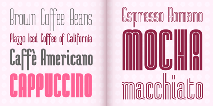 The typeface Yusyad is designed mainly for a very sentimental and emotional reason. Metaphorically, it is a modest artistic gift offered virtually from the designer to one of his beloved and cherished persons in this life, namely, his loyal and devoting wife. She represents one of the most essential motives for many artistic and non-artistic works that the designer achieved during his life. This was done through her tranquil personality, infinite patience, sincere support, and endless encouragement. The designer's partner (i.e., the significant other) lives with him along with their three children looking both always for a life full of peace, achievements, philanthropy, and of course love. The typeface's name Yusyad is a portmanteau word consists of two morphemes. It is a simple name-meshing for two different names. Those names represent the name of the designer's wife (Yusra) and the name of the designer (Eyad). Yusyad is like an epithet that ties the two partners' honest and eternal relationship until the last day of their lives. Technically, Yusyad is a sans-serif condensed and display typeface. It comprises seven fonts with dual styles and multiple weights. Specifically, it has two main styles, namely, the normal and the inline design. The normal style comes in five weights (i.e., thin, light, regular, bold, and black) whereas the inline style has two weights (i.e., regular and bold). The typeface is designed with more than 700 glyphs or characters. Its character set supports nearly most of the Central, Eastern, and Western European languages using Latin scripts including the Irish and the Vietnamese languages. The typeface is appropriate for any type of typographic and graphic designs in the web, print, and other media. It is also absolutely preferable to be used in the wide fields related to publication, press, services, and production industries. It can create a very impressive impact when used in movies' or TV-series titles, posters, products’ surfaces, logos, signage, novels, books, and magazines covers, medical packages, as well as the product and corporate branding. It has also both of lining and old-style numerals which makes it more suitable for any printing or designing purposes. To end, Yusyad's condensed appearance—especially the inline style—makes it very memorable, eye-catching, and striking for advertising, marketing, and promotional purposes.
 - Power Grotesk by Power Type,
$15.00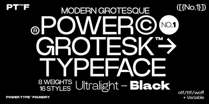 Power Grotesk is a sans serif typeface with details that give typography that has its own characteristics from the thinnest to the thickest that is slightly widened. The goal is to create a typeface with legibility and good contrast between black and white so that it is suitable for different sizes. The typeface has a special feature that aids in reading and reproducing, trapping the right-sized ink for the text to work. The geometric shapes and structures reflect the inspiration and influence of medieval typography. Power Grotesk moves between the vast historical material that makes up modern typography, combining contemporary details with classic styles.
 - Chocolate by Sparklefonts,
$22.00A digital foundry situated in England's rural South-West and established in 2005, Sparklefonts is Geoff Andersen, a man on a quest, from philosophy to aesthetics, from wild inspiration to wild gesticulation, from post-modernism right through to post-rationalisation. Boldly seeking unique and viable letterform architectures, he is equally determined to maintain legibility without compromising style. His journey has taken him through stencils and uncials, calligraphy and typography, through graphic design and guitar design. The story has been moving, the view spectacular, the punctuation superb. Geoff's sources are apparently limitless, his passion overwhelming, his fonts a labor of love, his therapist a Trojan! - Adamiya Pro by Pista Mova,
$15.00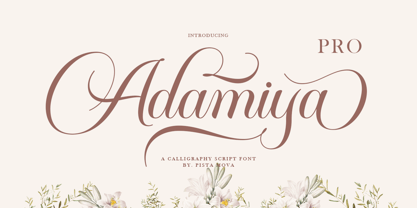 Adamiya Pro is carefully designed with consistent strokes, this beautiful script font offers a minimalist, luxurious, and classy feel. Adamiya Pro is inspired by classical calligraphy. This font is perfect for anything that needs an elegant, pretty, feminine, and dramatic look. You can apply this font to weddings, invitations, logotypes, romantic quotes, labels and branding. Adamiya Pro consists of a complete character set and comes with hundreds of alternative characters that you can use to enhance your designs. As many as 500+ glyphs you can mix and match and multilingual support! What you will get: Uppercase Lowercase Numbers & punctuation Stylish alternative With Love, Pista Mova
 - Ride my Bike by Latinotype,
$39.00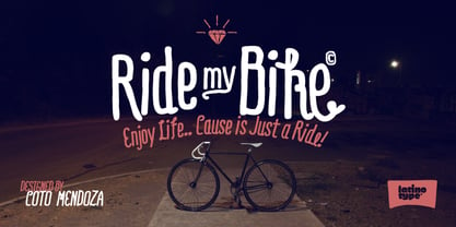 Ride my bike is a fresh handmade typeface inspired by street style and the new culture that moves pedaling around the city. Perfect for use in headlines, brands and fashion photography compose alternative, thanks to its leading characters, terminals, alternate characters and ligatures that you can find in the Pro version. This version contains more than 600 glyphs. The 'Dingbats' font in this family has 91 dingbats, very fun to compliment and accentuate the handmade design. If you do not want to ride so fast, you can find a version without OpenType features - Essential. Come! Get on it and let’s go ride my bike! Photography by Seba Sanchez.
 - Tungsten by Sparklefonts,
$22.00A digital foundry situated in England's rural South-West and established in 2005, Sparklefonts is Geoff Andersen, a man on a quest, from philosophy to aesthetics, from wild inspiration to wild gesticulation, from post-modernism right through to post-rationalisation. Boldly seeking unique and viable letterform architectures, he is equally determined to maintain legibility without compromising style. His journey has taken him through stencils and uncials, calligraphy and typography, through graphic design and guitar design. The story has been moving, the view spectacular, the punctuation superb. Geoff's sources are apparently limitless, his passion overwhelming, his fonts a labor of love, his therapist a Trojan! - Dialog by Sparklefonts,
$22.00A digital foundry situated in England's rural South-West and established in 2005, Sparklefonts is Geoff Andersen, a man on a quest, from philosophy to aesthetics, from wild inspiration to wild gesticulation, from post-modernism right through to post-rationalisation. Boldly seeking unique and viable letterform architectures, he is equally determined to maintain legibility without compromising style. His journey has taken him through stencils and uncials, calligraphy and typography, through graphic design and guitar design. The story has been moving, the view spectacular, the punctuation superb. Geoff's sources are apparently limitless, his passion overwhelming, his fonts a labor of love, his therapist a Trojan! - Festival by Sparklefonts,
$22.00A digital foundry situated in England's rural South-West and established in 2005, Sparklefonts is Geoff Andersen, a man on a quest, from philosophy to aesthetics, from wild inspiration to wild gesticulation, from post-modernism right through to post-rationalisation. Boldly seeking unique and viable letterform architectures, he is equally determined to maintain legibility without compromising style. His journey has taken him through stencils and uncials, calligraphy and typography, through graphic design and guitar design. The story has been moving, the view spectacular, the punctuation superb. Geoff's sources are apparently limitless, his passion overwhelming, his fonts a labor of love, his therapist a Trojan! - FT Drobbs by Foxys Forest Foundry,
$9.00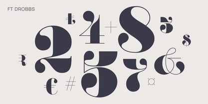 FT Drobbs is inspired by the Didot font group, known for its neoclassical style reminiscent of the Age of Enlightenment. The font includes a combination of very narrow and very wide lines. FT Drobbs features increased contrast between wide and narrow lines and includes rich teardrop endings. I love to watch how the lines bend, how they move, expanding or going into the thickness of the hair. I love their graceful beauty. FT Drobbs is not alphabetic, but it contains numbers, a set of basic currency symbols, and a few typographic characters. It is suitable for use as accents in labels, posters and infographics.
 - SF Olive by Fonts66,
$16.00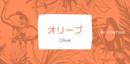 The font for illustrations. Ideal for moving expressions. イラスト風味のフォントの発想から、形の単純な葉のイメージのエレメントを使い読む文字というより、楽しさを感じるフォントにしました。 写真やイラストカードに添えると柔らかな雰囲気がなじみ軽い雰囲気が得られます。 ダンスは風に吹かれたようなスウィングしているような文字です。
 - Granesta by Arterfak Project,
$19.00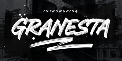 Introducing Granesta, a freestyle brush font moving with energy. This font was created with digital brush strokes, carefully vectorized to keep the textures. Granesta is a street font that delivers a loud message and strong. This font is an all-capitals font, equipped with stylistic alternates and swashes to gives a more powerful design. Granesta is ideal for logos, merchandise, apparel, banner, quotes, books, social media posts, posters, flyers, stickers, and many more! What you'll get : Granesta TTF & OTF Uppercase Smallcaps Numbers Punctuation Stylistic alternates Swashes (simply type underscore + number. eg. _1, _2, _3, etc) Multilingual support Thank you for watching. Never give up!
 - Type Warmers JNL by Jeff Levine,
$29.00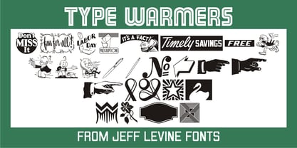 The name Type Warmers JNL traces its lineage to small catalog booklets issued by Indianapolis' Cobb Shinn for his line of letterpress cuts; of which a few can be found included within this typeface. Presumably type could "warm up to" these stock illustrations and work hand-in-hand to deliver the message, hence the "Type Warmers" sobriquet. Originally known for illustrating many attractive and comical postcards of the early 1900s, Shinn moved into the field of purchasing stock art and redistributing them as electrotypes or "cuts", the predecessor to today's digital clip art. A number of the cartoons he sold can be found in the Shinn Kickers JNL font.
 - Groundhog by Sparklefonts,
$22.00A digital foundry situated in England's rural South-West and established in 2005, Sparklefonts is Geoff Andersen, a man on a quest, from philosophy to aesthetics, from wild inspiration to wild gesticulation, from post-modernism right through to post-rationalisation. Boldly seeking unique and viable letterform architectures, he is equally determined to maintain legibility without compromising style. His journey has taken him through stencils and uncials, calligraphy and typography, through graphic design and guitar design. The story has been moving, the view spectacular, the punctuation superb. Geoff's sources are apparently limitless, his passion overwhelming, his fonts a labor of love, his therapist a Trojan! - Sassafras by Monotype,
$49.00Arthur Baker's display script Sassafras, designed in 1995, is based on the natural inline effect created when writing with a split-metal nibbed pen. Black and white are nicely balanced, giving this calligraphic face a remarkably smooth appearance. The regular and italic versions of Sassafras include two alternate faces: one with long, tall ascenders and regular-length descenders, and one with shortened ascenders and descenders that allow it to fit where its companion might not. In both, the ascenders increase in width as they move upward, while the descenders taper to a fine point. This variety of form makes Sassafras a very flexible choice for display work. - The font named Skeksis, created by Neale Davidson, is a fascinating typeface that draws inspiration from the rich tapestry of fantasy and science fiction. This font serves as a bridge between the mys...
- As of my last update, there isn't a specific font named "CNN" officially created or endorsed by Ray Larabie that is widely recognized in the type design industry. Ray Larabie is a prolific Canadian t...
- Ghibli by Eyad Al-Samman,
$-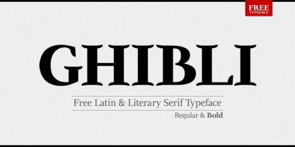 The word ‘Ghibli’ per se refers to a Saharan hot and dry wind commonly known as the Sirocco. In Arabic language, ‘Ghibli’ is known as ‘Qibli or Kibli’, meaning ‘Southern’ for those Arabic nations who live in the North of Africa. The ‘Ghibli’ wind is most common during spring and autumn, and can blow at almost 60mph; it is this wind which is responsible for the dry, dusty conditions on the Mediterranean coast of North Africa. ‘Ghibli’ can last for days making life miserable and is therefore feared by the desert dwellers in that region. It can also have profound effect on the landscape by moving vast quantities of sand and dunes. Inspired by the Studio Ghibli’s unique and magical characters, the ‘Ghibli’ typeface is designed as a Latin free and literary serif typeface. It strongly expresses transition, imagination, sharpness, characterization, and modernization. It is a literary type that can capture the eyesight of readers and other observers with its acute and stylistic letterforms, dots, and numerals. It has transitional serifs and it is generally based upon the Latin printing style of the 18th and 19th centuries, with a pronounced vertical contrast in stroke emphasis (i.e., vertical strokes being heavier than the horizontal strokes). It has more regular forms in which serifs are bracketed and more symmetrical. The main characteristic of ‘Ghibli’ typeface is in its new designed serif letters. Special letters that can be described as having modern designs include small ‘g’, ‘p’ (with their open ends), ‘x’, and capital ‘B’, ‘P’, ‘Q’, and ‘R’ (with their open ends). ‘Ghibli’ typeface has also both of lining and old-style numerals which makes it more suitable for any literary and printing purposes. This gratuitous font comes in only two weights (i.e., Ghibli Regular and Ghibli Bold). It is absolutely preferable to be used in the wide fields related to literature and publication industry. This includes typing titles of diverse literary and academic books, readable texts of novels, novellas, short stories, prose, poetry, textbooks, newspapers, and magazines. It is also notable if chosen for designs that include movies’ titles, logos of academic institutions such as colleges and universities, organizations and associations’ names, medical packages such as those dedicated for tablets and syrups, and also other different educational and social materials. ‘Ghibli’ is simply a free literary typeface dedicated for all who want to write and read using a modern and stylish serif font. Enjoy it.
 - Palaima by John Moore Type Foundry,
$19.00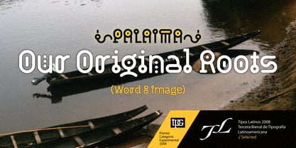 Palaima is a geometric display font, its name means word-image and is inspired by our aboriginal pictographs, Palaima was created to compose texts informal, where each character is an entertainment, featuring several variations of this font letters to make more enjoyable composition. Palaima has a set of characters that include swash, stylistic alternates, ligatures, fractions and twenty funny icons. Palaima was selected in the third Biennial of Latin American Typography "Tipos Latinos" also was honored by the Ruben Fontana's JournalTipográfica of Argentina "Best Latin American Typographic Creativity".
 - ITC Mudville by ITC,
$29.99ITC Mudville was Christopher Wolff's entry in the 1998 U&lc Type Design Competition, for which he won an Honorable Mention (Display). Mudville evolved from variations on hand-lettering that Wolff had done on a variety of projects over the years. The underlying shapes of the letters are formal roman letterforms, but the actual strokes retain the look of letters sketched casually on a layout. Mudville straddles the line between inline and outline type designs. It recalls some of the styles of popular lettering used in display advertising in the '20s. - Ball Game JNL by Jeff Levine,
$29.00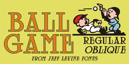 What has become a rite of passage at baseball games got its start in 1908 when lyricist Jack Norworth and music composer Albert Von Tilzer wrote "Take Me Out to the Ball-Game" (which was published by Von Tilzer's York Music Company). The Art Nouveau hand lettered title on the cover of the sheet music was eccentric and attractive enough to warrant being turned into a digital type face, and in honor of its namesake song is called Ball Game JNL; available in both regular and oblique versions.
 - MultiType Glitch by Cyanotype,
$-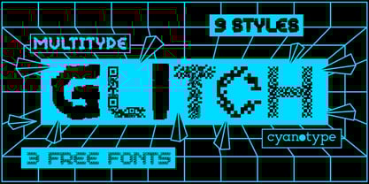 MultiType Glitch, an all caps typeface focused in display purposes. 9 styles with a glitchy look. This is the third release of an expanding multiverse of mixable fonts. The whole family of typefaces has been designed to work at big sizes and display purposes such as branding, headlines, thumbnails, posters and animations. You can swap between the three additional alternate sets through all the styles to add diversity to your composition, even in Cyrillic. MultiType Glitch is inspired glitch effects, errors and hacks. Have fun mixing all the styles in your projects.
 - Aurelac by Harvester Type,
$20.00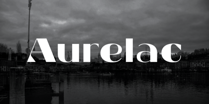 Aurelac - is a font that was inspired by the cover of the book "Learn to sew" by authors Egorova R. I. and Monastyrnaya V. P. This is a contrasting font that has unusual serifs and combines elegance and brutalism. Many uppercase letters are bold, while lowercase letters are lighter, which gives a more unusual effect to the text and the beginning of the sentence. It is perfect for headlines, posters, logos, banners, covers and much more. If you find errors in the font, kerning, then a huge request to write to the address: bunineugene@gmail.com
 - Daddy's Hand by Breauhare,
$39.00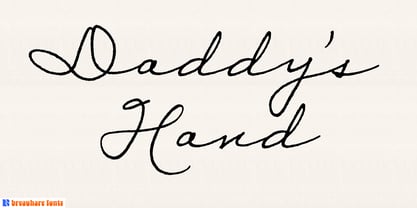 Daddy’s Hand is based on the actual handwriting of my dad. He always prided himself on his fine penmanship, and to see him write was kind of like watching a ballroom dance--his pen would smoothly and elegantly waltz across the paper as he wrote, gliding effortlessly. I know if he were alive today he would be quite honored that his handwriting is now a font. This font can be used for all sorts of elegant occasions or advertising, and has ligatures & alternate letters. Digitized by John Bomparte.
 - Aries by FontHaus,
$19.00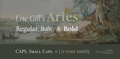 In 1995, FontHaus came upon a rare opportunity to create a revival of Aries, a little known and previously unavailable typeface designed by the legendary Eric Gill in 1931. Discovering a lost typeface by one of the major designers of the 20th Century, was the discovery of a buried treasure, and being the first type company to release it in a digital format was an honor. Aries® is now in the fonts catalog of GroupType who owns the the registered trademark and has licensed this historical typeface exclusively to FontHaus as distributor.
 - Aries by GroupType,
$19.00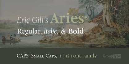 In 1995, FontHaus came upon a rare opportunity to create a revival of Aries, a little known and previously unavailable typeface designed by the legendary Eric Gill in 1931. Discovering a lost typeface by one of the major designers of the 20th Century, was like the discovery of buried treasure, and being the first type company to release it in a digital format was an honor. Aries® is now in the fonts catalog of GroupType who owns the the registered trademark and has licensed this historical typeface to FontHaus as distributor.
 - Eckhardt Dualine JNL by Jeff Levine,
$29.00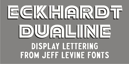 While searching online for vintage type inspirations, an image was spotted of an old letterhead for a steel manufacturing company. The hand lettering of the word 'Ludlum' only offered D,L,M and E as visual examples, but from this Jeff Levine has designed Eckhardt Dualine JNL - a Deco-flavored dual-line type font. As with a number of other releases that emulate hand-lettering or sign painting, Jeff has named this font in honor of his good friend, the late Albert Eckhardt, Jr.; who ran Allied Signs in Miami from 1959 until his passing.