7,337 search results
(0.023 seconds)
- Stinger by Zetafonts,
$39.00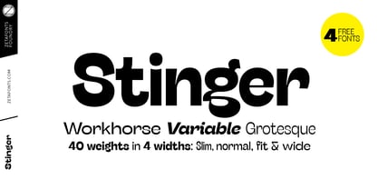 Since their first appearance as Italians on the pages of the 1821 William Caslon type specimens, reverse contrast typefaces have been typography's best loved quirky outcasts. Subverting the traditional relationship between thick verticals and thin horizontals made them perfect for eye-catching advertisements. The unexpected contrasts and the thick slabs produced by reverse-contrast serifs became ubiquitous in period posters, and synonymous with wild west and circus iconography. In designing Stinger, the Zetafonts design team composed by Maria Chiara Fantini, Andrea Tartarelli and Francesco Canovaro and orchestrated by Cosimo Lorenzo Pancini decided to marry this subversive tradition with the workhorse approach of modernist sans serif typefaces like Univers, developing a super-family with four widths, each in five different weights, from thin to heavy. This gives the designer a full range of options for type setting, with the Normal and Fit widths providing two different text-sized alternatives, the wide width adding display and titling options and the Slim ready to deal with the space-saving necessities of extremely long texts. True italics have been added developed for all weights and variants, bringing the Stinger family to a total of 40 fonts, with a latin extended + Russian Cyrillic character set covering over 200 languages, and open type features including positional numbers, stylistic sets and alternate forms. In the crowded panorama of contemporary grotesque typefaces, all aiming to stark geometric perfection, Stinger stands out with its bold choices and strong personality. From the calligraphy-inspired terminals in the thin weights to the logo-ready sculptural approach in the heavy weights, each variant manages to look striking without forgetting the readability and flexibility lessons of modern reverse-contrast classics like those designed by Excoffon or Novarese. A variable version is included with the full family, allowing maximum flexibility and control for the designer over the wide range of expression capabilities of the Stinger super family.
 - Jukebox Hero by Grype,
$19.00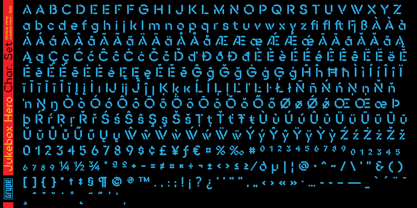 As one of the most popular rock bands of the world, Foreigner has rocked the charts with 10 multi-platinum albums and sixteen top 30 hits in the last 40 years. But one might ask what a band this successful has been missing all these years? No head games here...a consistent typeface based on their logo is the answer. As fans of Foreigner, we've taken the essence of their iconic logotype and expanded it out into a full typeface in regular and bold weights to celebrate their 40th anniversary tour. The Jukebox Hero Family celebrates the typographic stylings of Foreigner, with the soft rounded terminals and an open geometric feel, including the unique stencil flavor of the original logo. It inherited the friendly stylings of the all Capitals logo that inspired it, and goes on to include a full standard character set with expansive international support of latin based languages, and two weights jumping from regular to a beefy bold. This family is ready to rock the charts for your designs towards that of a modern, comfortable appeal. Here's what's included with Jukebox Hero Family bundle: 413 glyphs - including Capitals, Lowercase, Numerals, Punctuation and an extensive character set that covers multilingual support of latin based languages. (see the 3rd graphic for a preview of the characters included) 2 weights: Regular & Bold. Fonts are provided in TTF & OTF formats. The TTF format is the standard go to for most users, although the OTF and TTF function exactly the same. Here's why Jukebox Hero Family bundle is for you: You're a die-hard Foreigner fan, and have a case of "Double Vision" and need both font weights. You're looking for a stylish and sophisticated soft sans-serif stencil typeface family. You've been waiting for fonts like these. You're looking for a Sci-fi vibe typeface that has a look that feels familiar. You just like to collect quality fonts to add to your design arsenal
 - Sancoale Softened by insigne,
$22.00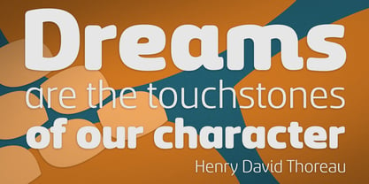 Sancoale Softened is the new rounded companion to Sancoale. While the original Sancoale is crisp and defined, its delicate forms also lend themselves well to a lighter, more rounded version. The stems of Sancoale Softened are blunted, and its corners have been carefully rounded, avoiding the “sausage” look seen with some rounded fonts. This blend of definition and delicacy makes the Sancoale Superfamily versatile and appropriate for a variety of applications. The design minimizes the characters to their essence, leaving a default set of simple characters without notches or spurs. However, the typeface family’s slightly technological feel still appears friendly and approachable to the reader. It’s slightly condensed proportions and tall x-height also make the design readable at a wide range of sizes, which works especially well for web pages. These softer letterforms give Softened its unique, futuristic look--great for distinguishing your text or display. There are six weights with true italics. All insigne fonts are fully loaded with OpenType features. Sancoale Softened is also equipped for complex professional typography, including alternates with stems, small caps and plenty of alts, including “normalized” capitals and lowercase letters. The face includes a number of numeral sets, including fractions, old-style and lining figures with superiors and inferiors. OpenType capable applications such as Quark or the Adobe suite can take full advantage of automatically replacing ligatures and alternates. You can find these features demonstrated in the .pdf brochure. The Sancoale family also includes the glyphs to support a wide range of languages, including Central, Eastern and Western European languages. In all, Sancoale Softened supports over 40 languages that use the extended Latin script, making the new addition a great choice for multi-lingual publications and packaging. Sancoale Softened continues with Sancoale’s successfully simple, geometric and legible structure. With its suitability for a wide range of uses, the Sancoale superfamily is a very economical and versatile addition to any designer’s font collection.
 - Coegit by insigne,
$32.00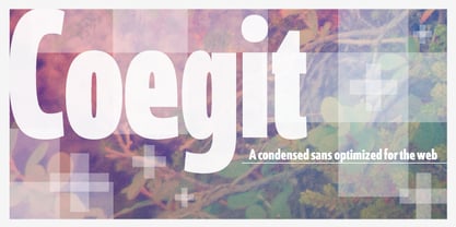 In the world of webfonts, Condensed proportions are key to maximizing your page's premium real estate while keeping your copy clean and catchy as you cut down to the essentials. Soon after the introduction of webfonts, I began to see Insigne's Le Havre used frequently for web headlines, not so much for its Art Deco look as for its more compact proportions. There seemed to be a need for a font that was designed to be used solely for the web's unique constraints. Enter Coegit Sans. Coegit is built specifically for web applications. Its highly Condensed forms range from thin--offering the greatest number of uses--to the attractive, accenting black. With three widths--Compressed, Compact, and the widest, Condensed --the family holds a total of sixteen fonts. The typefamily has also been hinted for excellent, onscreen display quality, even at small sizes. Overall, its lighter, humanist features provide the reader a more congenial welcome than its square, sans-serif counterparts can offer. Coegit is equipped for complex professional typography with stems, small caps and plenty of alts, including titling capitals. The face includes a number of numeral sets, including fractions, old-style and lining figures with superiors and inferiors. OpenType-capable applications such as Quark or the Adobe suite can take full advantage of automatically replacing ligatures and alternates. You can find these features demonstrated in the .pdf brochure. The family also includes glyphs to support a wide range of languages, including Central, Eastern and Western European languages. In all, Coegit supports over 40 languages that use the Latin script, making the new addition a great choice for multi-lingual publications and packaging. While the advanced OpenType features of webfonts are not currently supported in many browsers, the near future promises wide support. As acceptance of these features grow, Coegit Sans will prove to be a versatile element for your wide range of web projects.
 - Madison Street by Studioways,
$40.00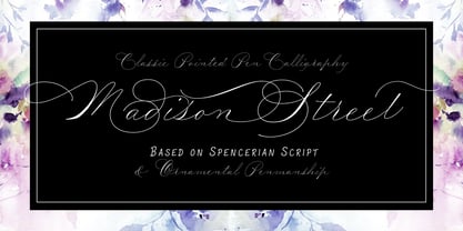 Madison Street is a font family with 8 fabulously fun typefaces! Eliza Gwendalyn & Jim Lyles of Studioways have teamed up with Spencerian calligrapher Elaina DeBoard to create a classic pointed pen calligraphy font. From its ornamental monograms, to its variety of complimentary text styles, and to its Madison Street Pro, with its elegant stylistic swashes and OpenType goodies, there is a font for every designer. Enjoy the sleek Madison Street Sans, Serif or Script, paired with the Ornaments font, complete with ornate monograms, or use each typeface on its own! Madison Street Pro has all the OpenType bells and whistles. The Ligature feature automatically substitutes beginning and ending letterforms, as well as 100 ligatures. Turn on the Swash feature for elegantly sweeping swash lowercase forms. Enable Stylistic Alternates for even more variations. There are also 10 Style Sets to chose from. And many more OT features! Madison Street is a basic version of the Pro font, intended for users who do not have OpenType savvy applications. Madison Street Stylistic is also a basic version of the Pro font, intended for users who do not have OpenType savvy applications. It has stylistically different ascenders and descenders. Madison Street Swash is intended to be used with the basic fonts, Madison Street and Madison Street Stylistic. It has lowercase beginning and ending swash glyphs and cannot be used to set text by itself. Madison Street Sans, Serif, and Script are text fonts modeled after the handwriting of Elaina. They are intended to be complimentary to any of the script fonts. However, you'll need to set them at a smaller point size (about 1/3 the size) in order to get the preferred scale and weight. Finally, the hairline weight of the Madison Street script fonts is very thin, and at small sizes up to 40 pt, you may notice some breaking up when printing to desktop printers. To remedy this, we recommend outline stroking the text a small amount (.1 -.3 value). this should improve the output without adding to much weight overall.
 - The Shoguns Clan font, created by the talented Chris Hansen, exudes a powerful and captivating presence that takes its inspiration from the aesthetics and legacy of the historic Japanese shogun warri...
- Eckhardt Titling JNL by Jeff Levine,
$29.00Eckhardt Titling JNL is another treatment of a popular typeface that lends itself well to the hand-lettered sign and display work of days past. A clean sans serif with a slight touch of Art Deco, this font renders well from small point sizes to large posters. As with other fonts in this series, it is named in honor of Jeff Levine’s good friend Albert Eckhardt, Jr. who owned Allied Signs in Miami, Florida from 1959 until his passing. - Jolly Roger by Red Rooster Collection,
$45.00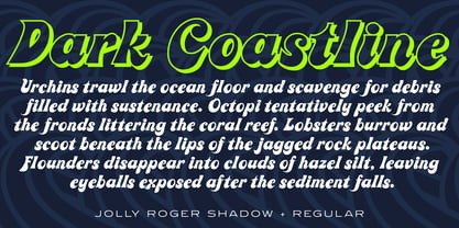 Steve Jackaman has refined and optimized Jolly Roger for digital release. The original design was created in 1970 by the legendary American type designer Phil Martin, founder and creator of the Alphabet Innovations and TypeSpectra type collections. Although quirky, playful and highly unusual, Phil describes Jolly Roger as his personal favorite out of his entire library of over 400 typefaces. We are proud and humbled to reintroduce the design in honor of our good friend and colleague.
 - CTM Sans by Gspr one,
$-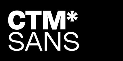 CTM Sans is a typeface of the grotesk category, it is designed based on a previous Herokid typeface, but with greater freedom to creative tastes and at the same time with more rebellion and errors (quite a few, but well-intentioned) than its predecessor. This makes Bellavista a somewhat messy clone, for the grotesk style. This font does not seek to be a correct typography, but rather fun and useful for the designer. I hope you like it
 - Secombe by Greater Albion Typefounders,
$14.50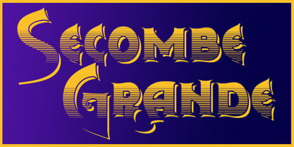 Secombe is a lively fun family of typefaces in the spirit of the turn of the last century. It's a boisterous fun design, named in honor of the late Harry Secombe (or if you prefer, Neddy Seagoon). Secome is a family of two 'small capitals' display faces, offered in a regular solid form and the 'Grande' form, engraved and shadowed. Ideal for posters, book covers and any other design work where a feel of the 1900s is needed.
 - Miss Rhythm JNL by Jeff Levine,
$29.00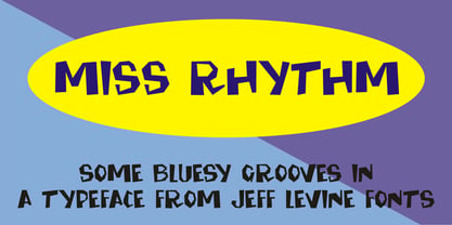 An early 1960s hand-lettered trade publication ad for an upcoming single 45 rpm release inspired the type design of Miss Rhythm JNL. The nickname of "Miss Rhythm" was given to Ruth Brown because of her popular "jump tunes"; that is rhythm and blues with an uptempo beat. Because the trade ad for her record was the inspiration for the font, it was only fitting to use that nickname as the font's name in honor of her.
 - Bundle Of Joy NF by Nick's Fonts,
$10.00This in-yer-face kinda face is based on a broad brush font from "The New ABC of Showcard & Ticketwriting" by C. Milne, published in Australia in the late 1930s. Brought to my attention by Ms. Kat Black, and named in honor of Ms. Kat's grannie, to whom the book originally belonged. The Postscript and Truetype versions contain a complete Latin language character set (Unicode 1252); in addition, the Opentype version supports Unicode 1250 (Central European) languages as well. - Compose by Arkitype,
$18.00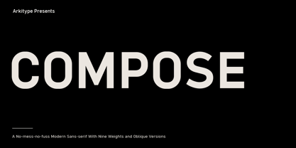 Compose is a clean modern and minimal font family. It has nine weights each with an oblique version. Compose has alternate "a" and "y" options as stylistic sets, circled numerals, arrows and more to make up the extensive character set. Suited for graphic design and display use. It is an excellent editorial typeface option as well as a perfect fit for web, signage, corporate and branding. With a higher x-height Compose had great legibility in smaller sizes, it is versatile typeface and a great addition to your font library, a typeface that can easily become a go to font option.
 - Modesta by OhType!,
$25.00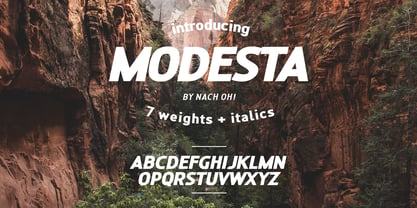 Modesta Sans is a Neo Grotesque sans serif typefamily of seven weights plus matching italics. Inspired by Didone serif fonts and the first Sans serif types from the late 19th century and early 20th century, It reduces many of the eccentricities in order to make them more suitable to modern tastes. Every weight has more than 220 characters and includes uppercase, lowercase, numbers, special characters and a powerful opentype features. Perfectly suited for graphic design, headlines, advertisements, and any display use. It could easily work for editorial design, corporate, web, signage and many other uses in print and digital media.
 - Statement Sans by Sudtipos,
$39.00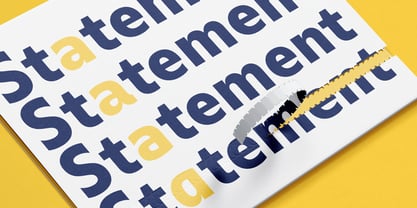 Statement Sans is a versatile sans serif font family created by the Sudtipos team in the spirit of modern neo humanistic fonts, with a deep grotesk and industrial influence that can be discovered along the system. Developed to express its potential in UX and UI projects, corporative interfaces or editorial web and print layouts, Statement is available in 9 weights with matching real italics, extended latin language support, and also including classic and old style figures as well as plenty of stylistics alternates. Last but not least, Statement Sans includes a one file variable font to join the party.
 - Interrupt Display Pro by T4 Foundry,
$21.00Torbjörn Olsson's Interrupt is a salty dog of a sanserif, harboring memories of freighters unloading their cargo in a run-down port. Interrupt works great for signs, and looks just fine painted on the side of a wooden crate or stencilled on an old tarpaulin. Interrupt is recommended for use over 36 points. You have run out of packing crates and would like to use it on paper? Sure, Interrupt can add its sturdy sailor's gait to any medium... just don't set any novel in Interrupt. Not even Melville. Interrupt is an OpenType typeface for both PC and Mac. - Jesper by Linotype,
$29.993 robbers is not a typeface family, only a collective name for three typefaces with the looks of handtexted characters: Kasper, Jesper and Jonatan. There are some common traits between them, but they are three individuals. As the three terrible" robbers in the Swedish writer Lennart Hellsing's Kamomillastad - the ones who borrowed their names to the typefaces - are three individuals. They always appear in the same order: first Kasper, then Jesper and last Jonatan. Swedish children love to sing about them and are not at all scared of them. All three robbers were released in 1995. - Cerebri Sans by Hanken Design Co.,
$30.00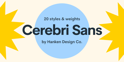 Cerebri Sans is a design inspired by early geometric and grotesque typefaces. Subtle humanist details provide an undercurrent of warmth that simmers just beneath the bones of its contemporary simplicity. Cerebri Sans’ concept involved the development of a hybrid appearance. Its soft elegance and finely-tuned legibility make it appropriate for a vast range of applications including headlines, editorials, publishing, advertising, corporate communications, white papers, educational texts, web content, and mobile applications. Cerebri Sans' multilingual support is extensive, covering Basic Latin, Western European, Euro, Baltic, Turkish, Central European, Romanian, Vietnamese, Pan African Latin, Pinyin and Igbo Onwu for global accessibility.
 - Flexo Soft by Durotype,
$49.00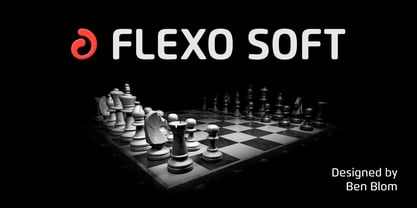 Flexo Soft is the soft companion of Flexo. In Flexo Soft, the sharp edges of Flexo's characters have been tempered by a moderate rounding—creating a softer and friendlier typeface. Flexo Soft has a squarish design, making it stand out in many uses. It will shine in both headlines and text. It is well suited for graphic design and corporate identity design. Flexo Soft has sixteen styles, extensive language support, eight different kinds of figures, sophisticated OpenType features—so it’s ready for advanced typographic projects. For more information about Flexo Soft, download the PDF Specimen Manual.
 - Cigar by Durotype,
$22.00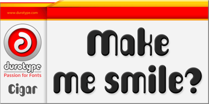 Cigar is a revival of a 1970s and 1980s typeface called Cucumber or Nassel Black or Scanner. It has been carefully redrawn and expanded into a full-featured OpenType font. Cigar Octo and Cigar Quarto are new angular reinterpretations of Cigar. In Cigar Octo, most round shapes have been replaced by octagonal shapes. In Cigar Quarto, most round shapes have been replaced by rectangular shapes. Use Cigar to get attention. Use it for headlines, advertisements, magazines, brochures, book covers, corporate design, presentations, websites, signs, event announcements, and for other things that need attention. For more information about Cigar, download the PDF Specimen Manual.
 - Banco by Linotype,
$40.99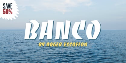 Designed for Linotype Library GMBH and the International Typeface Corporation in 1997 by Phil Grimshaw. Based on bold script Banco designed by French graphic and poster designer Roger Excoffon and released in 1952 by the Fonderie Olive. Originally Banco was an all-caps bold typeface, and the lower case and the corresponding light weight were created for ITC. The tapering slightly slanted strokes of Banco made by sharp-edged flat brush. The face has the effect of being quickly sketched by a powerful hand. For use in advertising and display typography. Cyrillic version developed for ParaType in 2000 by Tagir Safayev.
 - Boudoir by Juraj Chrastina,
$29.00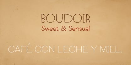 Come into the boudoir. This simple hand-drawn sans tries to invoke the same feelings as its name - and not to be overluscious. Boudoir is sweet and sensual like women, but it’s at the same time uncluttered and masculinely straightforward. The font borrows some playful capital shapes from the all caps Baronessa and draws inspiration for others from old classics. Thanks to the bolder weights, it can also be used in smaller sizes, you can combine different weights for different sizes to obtain a more balanced look, or you can just give emphasis using different weights.
 - Graublau Slab Pro by FDI,
$49.00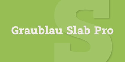 Graublau Slab is the latest addition to the popular Graublau type family designed by the Berlin-based type designer Georg Seifert. Since its release in 2008, the Graublau Sans Pro typeface has been a popular choice for corporate designs, books, magazines, websites and much more. With Graublau Slab Pro, the type family becomes even more versatile. With its contemporary and expressive design, it’s perfect for editorial design, web headlines or any other text use, that should really draw the reader’s attention. And since Graublau Slab Pro comes in the exact same 7 weights as Graublau Sans Pro, both typefaces work together perfectly.
 - Frutiger Arabic by Linotype,
$149.00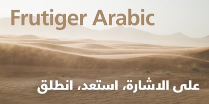 Neue Frutiger Arabic was created by Nadine Chahine and a team of designers and font engineers from the Monotype Studio, under the direction of Monotype type director Akira Kobayashi. The family is available in 10 weights from Ultra Light to Extra Black. Neue Frutiger Arabic embodies the same warmth and clarity as Adrian Frutiger's original design, but allows brands to maintain their visual identity, and communicate with a consistent tone of voice, regardless of the language. It is part of the Neue Frutiger World collection, offering linguistic versatility across environments – suited to branding and corporate identity, advertising, signage, wayfinding, print, and digital environments.
 - Droid Serif by Ascender,
$92.99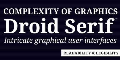 The Droid Serif Pro Family (4 fonts) is a contemporary serif typeface family designed for comfortable reading on screen. The font is slightly condensed to maximize the amount of text displayed on small screens. Vertical stress, sturdy serifs and open forms contribute to the readability of Droid Serif while its proportion and overall design complement its companion Droid Sans. The fonts were designed by Steve Matteson, the Type Director at Ascender Corporation. The Droid Serif Pro Family (4 fonts) includes Latin 1 and WGL character sets, along with Old Style Figures (requires an application that support advanced OpenType typographic features).
 - Rozanova by Variable Type Foundry,
$22.99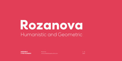 Rozanova glyph proportions and shapes make it functional, legible and with personality. The personal character of its shapes makes Rozanova a versatile, dynamic, recognizable, legible and functional typeface, perfect for editorial projects, corporate use, and strong brand identity design such as posters, logotypes and packaging. This typeface shows two version shapes: geometric and humanist. Rozanova consists of a standard version (geometric) and an alternative version (humanistic), each in 9 weights (ranging from Thin to Black) with matching italics. The font also includes OpenType features, like case-sensitive forms, and the whole 503 character set supports more than 200 languages.
 - Jonatan by Linotype,
$29.993 robbers is not a typeface family, only a collective name for three typefaces with the looks of handtexted characters: Kasper, Jesper and Jonatan. There are some common traits between them, but they are three individuals. As the three terrible" robbers in the Swedish writer Lennart Hellsing's Kamomillastad - the ones who borrowed their names to the typefaces - are three individuals. They always appear in the same order: first Kasper, then Jesper and last Jonatan. Swedish children love to sing about them and are not at all scared of them. All three robbers were released in 1995. - Ersatz by Galapagos,
$39.00Ersatz has its vibrant roots in the Mediterranean climate of Spain. Tired of the functional monoline sanserif fonts used throughout Europe from road signage to corporate identity, Richard Dawson and Dave Farey, British type designers who crave color and sunlight, created a style that is refreshing and lively. The basic constructions are simple and attractive, mixing lower case shapes into the capitals - and unique letterforms into the lower case. There's a raunchy feel to Ersatz, soft curves and back kicks, if you listen very carefully you can hear the sharp guitars and the soft tambourine of the Flamenco. - Unless by Gassstype,
$23.00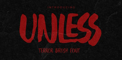 Introducing of our new product Unless is Terror Brush Font and Multilanguage support font with a dramatic movement with special alternative glyph and Ligature glyph. This font is great for your next creative project such as logos, printed quotes, invitations, cards, product packaging, headers, Logotype, Letterhead, Poster, Label, and etc. That is why Unless has Rough and strong characteristic more natural look to your text with a more modern look to your text. You can activate Ligature and Alternative glyphs OpenType panel . Unless is perfect for homeware designs,branding projects, Logo design, Quotes product packaging,and cartoon.
 - Giuconda by Sealoung,
$25.00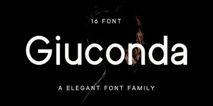 Giuconda is an elegant and modern sans font. This font provides a cleaner, more geometric look, preserving the essence and structure of an early 20th century sans classic font but with a fresh, clean and contemporary look. Giuconda consists of two subfamilies of 8 weights, ranging from Thin to Heavy, with matching italics, giving a total of 16 fonts. Giuconda is the perfect font for publishing, titles, books, magazines, and corporate designs. Its Alt version is ideal for logo types, branding, packaging, and use on the web and TV. The family contains a 355 character set that supports 207 different languages.
 - Botham Grotesque by Aiquitype,
$15.00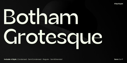 Introducing Botham Grotesque, a versatile typeface meticulously crafted to embody the essence of modernity and sophistication. This exquisite font, classified under the renowned Grotesque category, boasts four distinct styles that seamlessly blend form and function. Its clean lines and balanced proportions lend a professional, making it an ideal choice for a myriad of applications, from corporate branding to editorial design. What’s Include ? 1. Uppercase, Lowercase, Number and Punctutation 2. Ready 4 Style : Condensed, Semi Condensed, Reguler and Semi Ektended 3. Multilingual Support 4. Ligature and Alternate 5. Installed on Mac and Windows 6. PUA Encode Enjoy our Font.
 - Liga Sans by Linotype,
$29.99The German designer Alexander Dosiehn developed the Liga Sans type family as part of his graduate thesis at the Fachhochschule Düsseldorf in 2001. Liga Sans is a sans serif typeface that acts as a bridge between classical modern styles. Traces of pen forms and brush strokes can be seen mixed together with the most legible elements from grotesk-style faces in the alphabet’s letterforms. These features work together to create a style that works very in many sizes, including smaller ones! Liga Sans is an original, lively addition to the porfolio from Linotype suitable for text, magazines, and corporate identity work. - Newsletter by Die Typonauten,
$19.00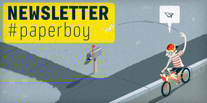 Monospaced but no mono space. Created from 2002 to 2007 this font family is influenced by fonts like OCR-B, DIN and the work of Erik Spiekermann. Newsletter is not a real monospaced font but has the ease of recognition these fonts have - even though these fonts are often criticized for their aesthetic qualities. Newsletter has a computer-related impression but is more legible and aesthetic than real monospaced fonts are. Since 2006 Newsletter is the corporate font of the design agency "die Typonauten". It is eminently suitable for correspondence use. After a testing period and fine tuning it is now published.
 - Spock by Los Andes,
$19.00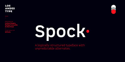 Spock has a neutral and clean structure but as we explore its OpenType features we will begin to discover a rich variety of alternates—even glyphs with pointed ears. All these combined elements provide a wide range of choices to meet different design needs. Each of the 4 sub-families consists of 6 weights and matching italics, making Spock a super family of 48 styles. The Pro family set contains 609 characters and it includes a generous number of alternates. The three other Essential sets are composed of alternative glyphs. Spock is specially suited for advertising as well as editorial and corporate design.
 - Contemporary Sans by Ludwig Type,
$45.00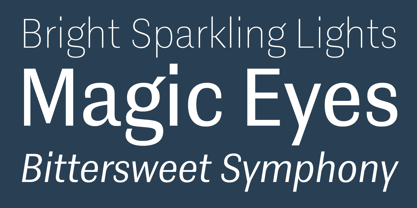 Contemporary Sans is a unique grotesque with a distinct contrast between its horizontal and vertical strokes that gives it a lively and elegant appearance. Friendly, subtly formed strokes and individual letter forms make it both legible and pleasant to read at small sizes, and striking at display sizes. Its narrow proportions make it a very easily useable typeface, particularly for narrow columns or tight headlines. It is suited to a wide range of applications, from corporate to editorial design, where a clear and distinctive impression is required. Visit this minisite to see the Contemporary Sans webfonts in action.
 - Deposit Pro by Mint Type,
$35.00 Deposit Pro is a wide slab-serif family with low x-height. In both headlines and paragraph text it creates a serious yet friendly texture between a typewriter and a contemporary slab-serif, making it particularly suitable for corporate communication design. Deposit Pro consists of 16 styles (8 weights and their corresponding italics) and features broad language support including all European Latin and Cyrillic languages. It also sports plenty of OpenType features including 6 sets of digits, fractions, small caps, ordinals, all-cap punctuation, and contextual forms for ‘f’, eliminating the need for too many ligatures.
 - Alethia Pro by Mint Type,
$-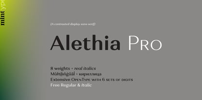 Alethia Pro is a grotesque sans-serif typeface with high contrast in all weights. It has been designed to serve as a display typeface in various editorial projects, such as magazines or corporate brochures, as a sans-serif pair to serif types of modern style. Alethia Pro comes in 8 weights + matching italics, each supporting numerous Latin-based languages as well as major Cyrillic languages. It is packed with OpenType features like ligatures, small caps, 6 sets of digits, 3 stylistic sets, superiors and inferiors, fractions, ordinals, respective punctuation varieties including all-cap punctuation, as well as language-specific alternates.
 - Squid GT Display by FoxType,
$15.00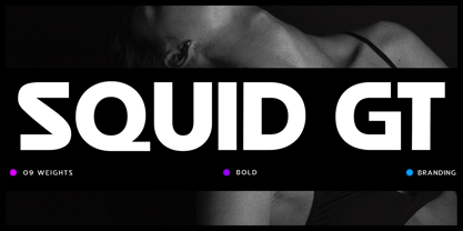 Introducing Squid GT Display new generation Typeface with 9 Weights. Squid GT Typeface created with the vision of to attract the audience to your brand . The finest details of this typeface are methodically and mathematically created. Squid GT is created with all the tasks of a corporate font and also for the usage in a variety of projects, including branding, logos, titles, headlines, servers, posters, screens, display, digital ads, and everything else. We are putting a lot of effort on this font as a long-term project. The Typeface includes Nine Weights. Thin, ExtraLight, Light, Regular, Medium, SemiBold, Bold, ExtraBold, Black.
 - Deja Rip by Anatoletype,
$33.00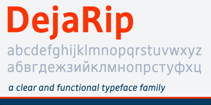 DejaRip is a contemporary, neutral, all-purpose sans-serif. It is modest and inconspicuous thanks to its basic, natural shapes; yet it lends a remarkable sense of clarity and accuracy to the overall design. DejaRip was originally designed for a mobile phone interface. Although it was eventually developed into a much more versatile family, DejaRip remains particularly readable on screen. The DejaRip family is an ideal solution for corporate design. DejaRip’s extended character set includes Unicode Latin Extended A and B, as well as full support of Cyrillic. Small caps for all languages are also included.
 - Neue Frutiger Vietnamese by Linotype,
$29.00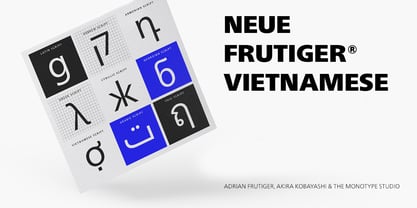 Neue Frutiger Vietnamese''' was developed by a team of designers and font engineers from the Monotype Studio under the direction of Monotype type director Akira Kobayashi. The family is available in 10 weights from Ultra Light to Extra Black, with matching italics. Neue Frutiger Vietnamese embodies the same warmth and clarity as Adrian Frutiger's original design, but allows brands to maintain their visual identity, and communicate with a consistent tone of voice, regardless of the language. It is part of the Neue Frutiger World collection, offering linguistic versatility across environments – suited to branding and corporate identity, advertising, signage, wayfinding, print, and digital environments.