10,000 search results
(0.034 seconds)
- 1510 Nancy by GLC,
$20.00 This set of decorated initial letters was inspired by those used in 1510 in Nancy (France, Lorraine) for printing of "Recueil ou croniques des hystoires des royaulmes d'Austrasie ou France orientale[...]" Author Symphorien Champion, unknown printer. There were three sorts of initials family, but only one complete and clear, except a very few characters. The printer used some letters to represent others, as V, turned over to make a A, D to make a Q, M for E, So, the reconstruction was a little less difficult. Thorn, Eth, L slash and O slash were also added. The original font's letters was only drawn in white on a black background only, but it was tempting to propose a negative version in black on white. A few letters have multiple appearance, but only the A was clear enough to be reproduced. It can be used as variously as web-site titles, posters and flyer design, publishing texts looking like ancient ones, or greeting cards, all various sorts of presentations, as a very decorative, elegant and luxurious additional font... This font supports strong enlargements revealing its fine details and remaining very smart. Its original medieval height is about one inch equivalent to about three to four lines of characters. This font may be used with all our blackletter fonts, but as well with "1543 Humane Jenson", "1557 Italic" and "1742 Civilite", without any fear about anachronism.
 - Arcade King by Ditatype,
$29.00 Arcade King is an exciting display font inspired by classic arcade games. Designed in uppercase, this typeface captures the nostalgic essence of retro gaming with its playful style. With consistent letter proportions and high contrast, this font ensures easy readability while immersing you in a world of gaming fun. The consistent letter proportions of Arcade King create a sense of harmony and balance throughout the font. Each uppercase letter is carefully crafted to maintain visual cohesion, ensuring a smooth and enjoyable reading experience. This design choice guarantees that every character complements the others, resulting in a visually appealing and cohesive typographic composition. The stark difference between thick and thin strokes enhances the visibility of each letter, making them easily distinguishable even at smaller sizes. The high contrast design adds a touch of boldness and excitement to the font, capturing the essence of the arcade gaming experience. Enjoy the available features here. Features: Stylistic Sets Multilingual Supports PUA Encoded Numerals and Punctuations Arcade King fits in headlines, logos, posters, product packaging, branding materials, print media, editorial layouts, website headers, and any projects that aim to evoke a sense of fun and adventure. Find out more ways to use this font by taking a look at the font preview. Thanks for purchasing our fonts. Hopefully, you have a great time using our font. Feel free to contact us anytime for further information or when you have trouble with the font. Thanks a lot and happy designing.
 - Fundstueck by Ingo,
$12.00 Inspired by a find a coarse but decorative font was created. "Fundstueck" ist the German term for it. Fonts can be so simple. That is what I was thinking as my attention was turned to this rusty piece of metal. Only a few centimeters in size, I couldn’t imagine which purpose it might truly serve. But my eyes also saw an E, even a well-proportioned E: a width to height ratio of approximately 2/3, black and fine strokes with a 1/2 proportion — could I create more characters on this basis? Thought it, did it. The form is based on a 5mm unit. The strikingly thick middle stroke of E suggests that the emphasis is not necessarily placed on the typical stroke, and likewise with the other characters. But if the font is going to be somewhat legible, then you cannot leave out slanted strokes completely. Eventually I found enough varying solutions for all letters of the alphabet and figures. A font designed in this way doesn’t really have to be extremely legible, which is why I forwent creating lower case letters. Nevertheless, Fundstueck still contains some diverse forms in the layout of upper and lower case letters. Thus, the typeface is a bit richer in variety. By the way — the “lower” letters with accents and umlauts stay between the baseline and cap height. And with that, you get wonderful ribbon-type lines.
 - Bleeding Cowboys Pro by CheapProFonts,
$10.00 A very popular grungy font, now made even more useful! With this Pro version you have the possibility to tone it down a bit - I have made alternate letters without swashes (use the OpenType Swash feature to switch them) and without so much bleed (use the OpenType Stylistic Alternates/ss01 feature). And then you can turn it up again by adding six different swashes to any letter! Write { or after a letter to add a swash to the right side, _ will add one below. Added fun and language support! ALL fonts from CheapProFonts have very extensive language support: They contain some unusual diacritic letters (some of which are contained in the Latin Extended-B Unicode block) supporting: Cornish, Filipino (Tagalog), Guarani, Luxembourgian, Malagasy, Romanian, Ulithian and Welsh. They also contain all glyphs in the Latin Extended-A Unicode block (which among others cover the Central European and Baltic areas) supporting: Afrikaans, Belarusian (Lacinka), Bosnian, Catalan, Chichewa, Croatian, Czech, Dutch, Esperanto, Greenlandic, Hungarian, Kashubian, Kurdish (Kurmanji), Latvian, Lithuanian, Maltese, Maori, Polish, Saami (Inari), Saami (North), Serbian (latin), Slovak(ian), Slovene, Sorbian (Lower), Sorbian (Upper), Turkish and Turkmen. And they of course contain all the usual “western” glyphs supporting: Albanian, Basque, Breton, Chamorro, Danish, Estonian, Faroese, Finnish, French, Frisian, Galican, German, Icelandic, Indonesian, Irish (Gaelic), Italian, Northern Sotho, Norwegian, Occitan, Portuguese, Rhaeto-Romance, Sami (Lule), Sami (South), Scots (Gaelic), Spanish, Swedish, Tswana, Walloon and Yapese.
 - TT Tsars by TypeType,
$39.00 TT Tsars useful links: Specimen | Graphic presentation | Customization options The TT Tsars font family is a collection of serif display titling fonts that are stylized to resemble the fonts of the beginning, the middle and the end of the XVIII century. The project is based on title fonts, that is, the fonts that were used to design book title pages. The idea for the project TT Tsars was born after a small study of the historical development of the Cyrillic type and is also based on Abram Shchitsgal’s book "Russian Civil Type". At the very beginning of the project, we had developed a basic universal skeleton for the forms of all characters in all subfamilies of the family, and later on, we added styles, visual features, artifacts and other nuances typical of the given period onto the skeleton. Yes, from the historical accuracy point of view it might be that such an approach is not always justified, but we have achieved our goal and as a result, we have created perfectly combinable serifs that can be used to style an inscription for a certain time period. The TT Tsars font family consists of 20 fonts: 5 separate subfamilies, each of which consists of 4 fonts. Each font contains 580 glyphs, except for the TT Tsars E subfamily, in which each font consists of 464 characters. Instead of lowercase characters in the typeface, small capitals are used, which also suggests that the typeface is rather a display than text one. In TT Tsars you can find a large number of ligatures (for Latin and Cyrillic alphabets), arrows and many useful OpenType features, such as: frac, ordn, sinf, sups, numr, dnom, case, onum, tnum, pnum, lnum, salt (ss01), dlig. Time-related characteristics of the subfamilies are distributed as follows: • TT Tsars A—the beginning of the 18th century (Latin and Cyrillic) • TT Tsars B—the beginning of the 18th century (Latin and Cyrillic) • TT Tsars C—the middle of the 18th century (Latin and Cyrillic) • TT Tsars D—the end of the 18th century (Latin and Cyrillic) • TT Tsars E—conditionally the beginning of the 18th century (only Latin) TT Tsars A and TT Tsars B families (both the beginning of the 18th century) have different starting points: for TT Tsars A it is Latin, for TT Tsars B it is Cyrillic. The development of the TT Tsars A family began in Latin, the font is based on the royal serif Romain du Roi. The Cyrillic alphabet is harmoniously matched to the Latin. The development of the TT Tsars B family began in Cyrillic, which is based on a Russian civil type. Characteristic elements are the curved one-sided serifs of triangular characters (A, X, Y), drops appear in the letter ?, the middle strokes ? and P are adjacent to the main stroke. Latin was drawn to pair with Cyrillic. It is still based on the royal serif, but somewhat changed: the letters B and P are closed and the upper bar of the letter A rose. This was done for the visual combination of Cyrillic and Latin and at the same time to make a distinction between TT Tsars A and TT Tsars B. TT Tsars C is now the middle of the 18th century. Cyrillic alphabet itself did not stand still and evolved, and by the middle of the 18th century, its forms have changed and become to look the way they are shown in this font family. Latin forms are following the Cyrillic. The figures are also slightly modified and adapted to the type design. In TT Tsars C, Cyrillic and Latin characters are created in parallel. A distinctive feature of the Cyrillic alphabet in TT Tsars C is the residual influence of the flat pen. This is noticeable in such signs as ?, ?, K. The shape of the letters ?, ?, ?, ? is very characteristic of the period. In the Latin alphabet, a characteristic leg appears at the letter R. For both languages, there is a typical C characterized by an upper serif and the appearance of large, even somewhat bolding serifs on horizontals (T, E, ?, L). TT Tsars D is already the end of the 18th century when with the development of printing, the forms of some Cyrillic characters had changed and turned into new skeletons of letters that we transposed into Latin. The figures were also stylized. In this font, both Cyrillic and Latin are stylistically executed with different serifs and are thus logically separated. The end of the century is characterized by the reduction of decorative elements. Straight, blueprint-like legs of the letters ?, R, K, ?. Serifs are very pronounced and triangular. E and ? are one-sided on the middle horizontal line. A very characteristic C with two serifs appears in the Latin alphabet. TT Tsars E is a steampunk fantasy typeface, its theme is a Latinized Russian ?ivil type (also referred to as Grazhdansky type which emerged after Peter the Great’s language reform), which includes only the Latin alphabet. There is no historical analog to this typeface, it is exclusively our reflections on the topic of what would have happened if the civil font had developed further and received a Latin counterpart. We imagined such a situation in which the civil type was exported to Europe and began to live its own life.
 - Morris by HiH,
$10.00 Morris is a four-font family produced by HiH Retrofonts and based on the work of the very English William Morris. William Morris wanted a gothic type drawn from the 14th century blackletter tradition that he admired both stylistically and philosophically. He drew from several sources. His principal inspiration for his lower case was the 1462 Bible by Peter Schoeffer of Mainz; particularly notable for the first appearance of the ‘ear’ on the g. The upper case was Morris’s amalgam of the Italian cursive closed caps popular throughout the 12th through 15th centuries, a modern example of which is Goudy’s Lombardic Capitals. The gothic that Morris designed was first used by his Kelmscott Press for the publication of the Historyes Of Troye in 1892. It was called “Troy Type” and was cut at 18 points by Edward Prince. It was also used for The Tale of Beowulf. The typeface was re-cut in at 12 points and called “Chaucer Type” for use in The Order of Chivalry and The Works of Geoffrey Chaucer. Morris' objective is designing his gothic was not only to preserve the color and presence of his sources, but to create letters that were more readable to the English eye. ATF copied Troy and called it Satanick. Not only was the ATF version popular in the United States; but, interestingly, sold very well in Germany. There was great interest in that country in finding a middle ground between blackletter and roman styles -- one that was comfortable for a wider readership. The Morris design was considered one of the more successful solutions. Our interpretation, which we call Morris Gothic, substantially follows the Petzendorfer model used by other versions we have seen, with the following exceptions: 1) a larger fillet radius on the upper arm of the H, 2) a more typically broadpen stroke in place of the foxtail on the Q, which I do not like, 3) inclusion of the aforementioned ear on the g and 4) a slightly shorter descender on the y. We have included five ornaments, at positions 0135, 0137, 0167, 0172 and 0177. The German ligatures ‘ch’ & ‘ck’ can be accessed using the left and right brace keys (0123 & 0125). Morris Initials One and Morris Initials Two are two of several different styles of decorative initial letters that Morris designed for use with his type. He drew from a variety of 15th century sources, among which were Peter Schoeffer’s 1462 Mainz Bible and the lily-of-the-valley alphabet by Gunther Zainer of Augsburg. Each of the two initial fonts is paired with the Morris Gothic lower case. Morris Ornaments is a collection of both text ornaments and forms from the surrounding page-border decorations.
 - Gundrada ML by HiH,
$12.00 Gundrada ML was inspired by the lettering on the tomb of Gundrada de Warenne. She was buried at Southover Church at Lewes, Sussex, in the south of England in 1085. The Latin inscription on her tomb, STIRPS GUNDRADA DUCUM, meaning “Gundrada, descendant of the Duke” may have led to the speculation that she was the daughter of William, Duke of Normandy and bastard son of Robert the Devil of Normandy and Arletta, daughter of a tanner in Falaise. In 1066 William defeated Harold at the Battle of Hastings and was crowned William I of England. More commonly known as William the Conquerer, he commissioned a string of forts around the kingdom and charged trusted Norman Barons to control the contentious Anglo-Saxon population. William de Warenne, husband of Gundrada, was one of these Barons. There has also been the suggestion that Gundrada may have been the daughter of William’s wife, Matilda of Flanders, by a previous marriage. According to the Dictionary of National Biography (Oxford University Press, Oxford, England 1921-22), both of these contentions are in dispute. Searching the past of a thousand years ago is like wandering in a heavy fog: facts are only dimly in view. Regardless, I know that I found these letterforms immediately engaging in their simplicity. Unadorned and unsophisticated, they have a direct honesty that rests well in the company of humanistic sans serifs like Franklin Gothic or Gill Sans, appealing to a contemporary sensibility. The lettering on the tomb is in upper case only. Although Gundrada does not sound Norman French to me, her husband certainly and her father probably were Norman French. Nonetheless, the man that carved her tombstone was probably Anglo-Saxon, like most of the people. For that reason, we are quite comfortable with a fairly generic lower case from an Anglo-Saxon document of the time. The time was a time of transition, of contending language influences. This font reflects some of that tension. Features 1. Multi-Lingual Font with 389 glyphs and 698 Kerning Pairs. 2. OpenType GSUB layout features: onum, dlig, liga, salt & hist. 3. Tabular Figures and Alternate Old-Style Figures. 4. Alternate Ruled Caps (line above and below, matching to brackets). 5. Central Europe, Western Europe, Turkish and Baltic Code Pages. 6. Additional accents for Cornish and Old Gaelic. 7. Stylistic alternates A, E, y and #. 8. Ligatures ST, Th, fi and fl. 9. Historic alternate longs. The zip package includes two versions of the font at no extra charge. There is an OTF version which is in Open PS (Post Script Type 1) format and a TTF version which is in Open TT (True Type)format. Use whichever works best for your applications.
 - Trump Script by Canada Type,
$29.95 One of the earliest fonts published by Canada Type was Tiger Script, Phil Rutter's digitization of Jaguar, Georg Trump's 1967 wild calligraphic brush face. In 2010, when the font was revisited for an update, it was shown that it too light for applications under 24 pt, and too irregular for applications over 64 pt. So the face was redigitized from scratch. This new digitization brings a more seamless contour and a much steadier stroke, and much better outlines for use at both extremes of scaling. Language support was also greatly expanded, and many alternates and ligatures were added to the redigitized character set. The name was also changed to Trump Script, to better reflect the origins of the design. Trump Script is a master calligrapher's hand producing very uncommon jolts and bursts of sharpness. It showcases some of the most suprising letter forms ever drawn, like the very unique treatments of B, K, W, Y and Z. In the lowercase one can see the cattiest g ever made, and some of the wildest shapes in the f, j, p, y and z. Trump Script comes in all popular formats. The TrueType and PostScript packages are comprised of two fonts. The OpenType version, Trump Script Pro, combines both fonts into one, and includes features for intelligent substitution in software that supports advanced typography. Language support includes Western, Central and Eastern European character sets, as well as Baltic, Esperanto, Maltese, Turkish, and Celtic/Welsh languages.
 - Andreae by Proportional Lime,
$9.99 Hieronymus Andreae or latter in life Hieronymus Formenschneider as he proudly took a new surname to proclaim his success in the printing industry as the man who introduced the Fraktur script to the world of print. This project was undertaken at the orders of Emperor Maximilian I. One of Fraktur’s first appearances was in a joint venture with the great Albrecht Dürer. This font was based on a later work, Andreae’s magnus opus in the music field, the Coralis Constantini by Henry Isaac. Andreae worked as woodblock cutter and then became a publisher in the city of Nuremberg until his death in 1565. We at PLTF are proud to revive this enormously influential typeface.
 - Ziggy by Jonahfonts,
$35.00 A free-spirited hand-script font. Very similar to pre-computer hand-written letttering with a ruling pen.
 - Smallstep Pro by Evolutionfonts,
$- Smallstep - One geometric sans serif with a free spirit. If we presume that geometric typefaces play with the idea of what typography would look like in the future when all unnecessary elements would disappear, than most of their designers seem to envision the future in a rather metropolisque kind of way. We love geometric faces, but the cold and heartless feelings that most of them leave is just not our cup of tea. That is why we are happy to bring some optimism in that genre with our new typeface. We called it Smallstep. Smallstep is a typeface that follows the traditions of classic geometric sans serifs like “Futura”, but is at the same time friendly and whimsical. We took the liberty to deviate from the standard sans serif glyphs while drawing some characters (such as ”a” and ”r” ), others (“w” “k”) are completely redesigned. Probably the biggest trademark of this typeface is the way vertical lines in most lower case characters are “cut” so they end in a 60 degree angle. Smallstep is over all a expressive face, which means it brings some emotions to your design and feelings in itself, and should be used accordingly. Other than that, it is suitable for both headline and body text, print and web. So what kind of name is “Smallstep”? We view the type design process as a form of evolution: There can be no typeface that differs drastically from the current standards, since its characters would be unrecognizable and thus unreadable. But at the same time there are hundreds of faces that differ a little, and still manage to make a difference by moving with small steps towards better and more refined looks. Smallstep consist of 4 weights, that cover all the features, that are expected of a modern Opentype face: kerning pairs, ligatures, true italics and alternative characters, plus a set of symbols, that will help you start off your designs more easily.
 - Arched Gothic Condensed SG by Spiece Graphics,
$39.00 Like a bright star shimmering on a still and quiet summer night, Arched Gothic Condensed is a glowing example of Victorian type. Thin in the middle with clumpy wedges on top and bottom, it truly bears the spirit of a bygone era. Originally known as Concave Extra Condensed, this typeface has shed its waist-high spur notches and gained new figures and lowercase letters. Developed around 1885 by the James Conners & Son Foundry (New York), Arched Gothic Condensed is a marvel of sparkle and glitter in nineteenth century typeface design. Arched Gothic Condensed is also available in the OpenType Std format. Some new characters have been added to this OpenType version. Advanced features currently work in Adobe Creative Suite InDesign, Creative Suite Illustrator, and Quark XPress 7. Check for OpenType advanced feature support in other applications as it gradually becomes available with upgrades.
 - Honest John's Shadow - Unknown license

- ZITZ - Unknown license

- Alvia by Zane Studio,
$12.00 Alvia is a clean, modern script font that is carefully crafted with a touch of elegance. This font can be used to write letters, invitations, food products, headlines and more. It will turn any creative idea into a true work of art!
 - Copperplate Alt by Wiescher Design,
$39.50 Copperplate Alt is the sister font to Copperplate Wide. The »Alt« version stands for alternative and has lowercase letters that are slightly smaller than the uppercase. It gives you another possibility to use this elegant typeface. Your forever inventive type designer - Gert Wiescher
 - Vampliers by Remedy667,
$18.00 Vampliers is a handmade horror font, inspired by the lettering of classic sci-fi and horror film posters. It’s perfect for Halloween party invites, posters, packaging design… Any project you want to give that “vintage spooky” feel, Vampliers will protect your neck.
 - Stocks and Bonds JNL by Jeff Levine,
$29.00 The hand lettered opening title for the 1935 movie “Thanks a Million” is rendered in a condensed, thick and thin Art Deco sans serif design. It is now available as the digital typeface Stocks and Bonds JNL – in both regular and oblique versions.
 - LDJ Doodaddles by Illustration Ink,
$3.00The letters of this TrueType font are decked out with holiday star ornaments for a festive and slightly quirky look. Your Christmas messages will sparkle and shine. Try it on your annual family newsletter or as a title for Christmas eve scrapbook pages. - Saissant by Magpie Paper Works,
$54.00 Edgy and modern, Saissant is a hand-drawn font that leaves an impression. Bold capitals and kinetic lowercase letters have been designed for emotional impact. Saissant includes multi-language support as well as contextual alternates and discretionary ligatures for a convincing calligraphic effect.
 - Velvet by Reserves,
$39.99 Velvet is a heavy rounded block retro face inspired by the typeset album cover of the protopunk rock band The Velvet Underground’s debut. Stylistically, Velvet’s extreme angled terminals exude a sense of tension and irreverance, contrasting the smooth rounded block letter forms.
 - Friedhof by Storm Type Foundry,
$25.00Friedhof family is inspired by a tombstone lettering dated from about 1900. Beside the solid, fat style, it contains handtooled and shadowed (Geist + Deko) variations, as well as narrowed & lowercase styles. Note: Very complex, shadowed fonts may not work on slow machines! - Sweet Kitten by Yumna Type,
$16.00 Sweet Kitten is a elegant handwritten font. Made for any professional project branding. It is the best for logos, branding and quotes. Every letter has a unique and beautiful touch. Features: Standard Ligatures PUA Encoded Multilingual Support Numerals and Punctuation by Yumnatype
 - Brown Chunkers by Letterhend,
$19.00 Brown Chunkers is an unique serif based display typeface containing many alternates, swashes, ligatures that can make your lettering/logotype become more interesting. The clean and neat of a serif combined with the swirl swashes makes this font one of a kind.
 - Parisian Ornamentals by Celebrity Fontz,
$24.99Beautiful, richly ornamented shadowed letters in the Empire fashion, similar to the fonts of the Parisian type founder J. Gille', cut around 1810. Includes one set of A-Z ornamental initials conveniently assigned to both the upper and lower case alphabet characters. - Silly Treat by PizzaDude.dk,
$10.00 The Silly Treat font is actually handmade, but I traced each and every letter and cleaned them up - however, I wanted to keep the handmade look, and left just about enough details for you to find details of my original drawn lines.
 - Morgow by Scriptorium,
$18.00Morgow is a decorative Celtic uncial font based on original hand lettering. It is similar to other uncial fonts, but the characters are embellished with traditional Celtic spiral designs. The font is appropriately named after a species of legendary Cornish sea serpent. - Tomseig Northek by Warisand,
$17.00 Tomseig Northek is a Vintage Font inspired by beautiful vintage sign art and lettering. The font comes with unique alternate design characters to give your designs an elegant and artistic look. It is perfect for logo and packaging design, short phrases or headlines.
 - Scripty by Turtle Arts,
$20.00Scripty is a hand drawn, calligraphy longhand handwritten font. With careful spacing, the letters can be used together to create words that look like theyπve been written with an old≠fashioned fountain pen, or used alone as embellishment to more plebean text. - Starland by Sulthan Studio,
$10.00 Starland is a cute handwritten font. Perfect for stellar quotes, handwritten notes, sweet greeting cards, and of course stand-out branding. Font includes a full set of gorgeous uppercase and lowercase letters, numbers, a large selection of punctuation marks and multilingual support.
 - Gimoc Botuned by Warisand,
$17.00 Gimoc Botuned is a Vintage Font inspired by beautiful vintage sign art and lettering. The font comes with unique alternate design characters to give your designs an elegant and artistic look. It is perfect for logo and packaging design, short phrases or headlines.
 - Barinek by Warisand,
$17.00 Barinek is a Vintage Font inspired by beautiful vintage sign art and lettering. The font comes with unique alternate design characters to give your designs an elegant and artistic look. It is perfect for logo and packaging design, short phrases or headlines.
 - P22 Canterbury by IHOF,
$49.95 Canterbury is a late Medieval Gothic font with a rough edge. This blackletter face is available with four different types of Capital initial letters or combined into one Opentype Pro font with all variations plus historic ligatures, alternates and even a few ornaments.
 - Poetry Grow by Carpiola Studio,
$12.00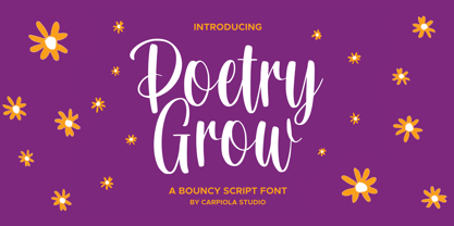 Poetry Grow is a bouncy and timeless handwritten font. It is the best choice for creating eye-catching logos, branding, and quotes. Every letter adds a unique and beautiful touch to your design, making it come alive with a classy and elegant look.
 - Ashlyn by Sipanji21,
$20.00 This font can be used easily and simply because there are many features in it. contains a complete set of lowercase and uppercase letters, assorted punctuation, numbers, and multilingual support. font also contains multiple ligatures and many contain alternative Style Stylistic Sets
 - Tropical Country by Sronstudio,
$18.00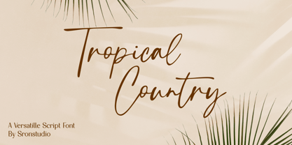 Tropical Country - Handwritten Font, this font perfect for branding, invitation, stationery, wedding designs, social media posts, advertisements, product packaging, product designs, label, photography, watermark, special events, and more. Features: Uppercase and lowercase letters Multilingual, numerals, and punctuation Follow Instagram: @sronstudio Thank You!
 - ITC Gamma by ITC,
$29.99ITC Gamma font is the work of designer Jovica Veljović. Named after the third letter of the Greek alphabet, ITC Gamma has almost no sharp corners. Its serifs, stroke endings and terminals are all rounded, a feature best seen in larger point sizes. - Nomarch by Scriptorium,
$24.00Nomarch is a charming new Art Nouveau font based on samples of poster lettering from the beginning of the twentieth century. The relatively bold weighting of the characters makes Nomarch particularly good for use in large sizes for titles on posters and flyers. - Kids by Nirmalagraphics,
$14.00 Kids is inspired by the writing style of a child who is learning to write letters and numbers. This font can be used for a variety of needs including logos, flyers, magazines, clothes, business cards brochures and more. It includes multi-lingual support.
 - Flower Shop JNL by Jeff Levine,
$29.00 A piece of sheet music for “Broken Blossoms” circa the 1920s or early 1930s has its cover title hand lettered in a wide thick-and-thin Art Deco design. This is now available as Flower Shop JNL, in both regular and oblique versions.

