10,000 search results
(0.025 seconds)
- Valliciergo by Tipo Pèpel,
$44.00 This font is inspired by the samples of the booklet "Caligrafía inglesa" published in Madrid in the late nineteenth century by the spanish calligrapher Vicente Fernández Valliciergo. Hundred of new glyphs have been added, taking advantage of Opentype features. Ligatures, decorative figures, initials and final forms, inspired in the samples of English Calligraphy as shown in "The universal penman" by George Bickham have been added to the font. The result is Valliciergo, a font with more than 1000 glyphs, meant to be a useful tool to simulate the master strokes of the great calligraphers.
 - Zart by DSType,
$40.00 Zart is a heavy yet delicately sensitive display typeface filled with character, a free interpretation of the classical French styles from the late eighteenth century, reimagined for modern use. While it’s vertical strokes carry the typical weight of this style, the thinness of the horizontal strokes is further extended into the characters with the introduction of large vertical ink traps. This allowed us to design slightly narrower letters which, coupled with shorter serifs, result in a overall darker expression, creating really impactful headlines. Zart is available in three versions: Regular, Italic and Script.
 - Diocletian by Type Fleet,
$12.00 Diocletian fortiter in re, suaviter in modo Diocletian typeface captures the essence and glory of the Diocletian’s palace, one of the most imposing heritages of the late Roman empire. It is designed to bring the confidence and fortune to contemporary communication in a heroic and gentle manner. Diocletian typeface is based on the Uncial script, made up of wide, rounded letters. It is desirable for cafes, restaurants, shops, hotels and apartments. The typeface’s x-height is around 76% of its capitals. The font is enriched with ligatures and special characters.
 - 1890 Registers Script by GLC,
$38.00 This script font was inspired by the “Ronde” French script. It was in use from 1700s to 1900s (until 1960s in special circumstances) for registers, legal documents and texts, certificates, labels and other documents that must be particularly legible. Today in France, it is still being used for menus, advertising, and labels. The present version is a late 19th Century pattern. This font supports very strong enlargements as well as small sizes. When printed, it remains perfectly legible and elegant from 9/11 pts even if using an ordinary inkjet printer.
 - Ehrhardt MT by Monotype,
$29.99 The Ehrhardt name indicates that this typeface is derived from the roman and italic typefaces of stout Dutch character that the Ehrhardt foundry in Leipzig showed in a late-seventeenth-century specimen book. The designer is unknown, although some historians believe it was the Hungarian Nicholas Kis. Monotype recut the typeface for modern publishers in 1937 to 1938. Ehrhardt has a clean regularity and smooth finish that promote readability, as well as a slight degree of condensation, especially in the italic, that conserves space. Ehrhardt is a fine text face, especially for books.
 - Birthday Wish PB by Pink Broccoli,
$16.00 Birthday Wish is a totally off-kilter sans-serif font inspired by a late 70's birthday greeting card. Much like a typographic drunken stumble, this font wonderfully and awkwardly fumbles across designs, surprising with each letter typed. With a pseudo unicase character set, and offbeat letter weighting, Birthday Wish is fun to typeset with, with a cluster of ligature combinations that add to the quirky playfulness. You’ll find this Birthday Wish is a typesetting ride of a font. Try typing standard, all caps, or all lowercase for even more visual variety.
 - AlbertBetenbuch by Ingrimayne Type,
$14.95 The inspiration for AlbertBetenbuch came from a typeface drawn by Albert Dürer and an interpretation of that face in Arthur Baker’s Historic Calligraphic Alphabets (Dover, 1980). It is not a recreation of either. The characteristic common to AlbertBetenbuch and the faces inspiring it is the decorative zig-zag with the upper-case letters. In late 2018 the inside of the shadowed style was separated out. It looks very much like the plain face but its spacing matches the shadowed version. It can be layered with the shadowed version to easily create two-colored letters.
 - Backwash AOE by Astigmatic,
$19.00 Backwash AOE is a typeface I drew up back in 2000 inspired by various graffiti artists. Coming across all of my sketches recently and seeing a trend lately in graffiti inspired styles, I finally came around to finishing it up digitally for release. I love the break the rules, wildchild aspect, of graffiti lettering. And while this typeface is nothing like the wilder inspirations that I spawned this typeface from, it has a more legible direction to it, retaining just the flavor of the originals. I hope you enjoy it.
 - Casual Deco JNL by Jeff Levine,
$29.00 The hand lettered sans serif title on the1931 sheet music for “(Potatoes are Cheaper-Tomatoes are Cheaper) Now’s the Time to Fall in Love” presented another opportunity to create a typeface from the wealth of unusual alphabets found on the covers of vintage and antique song sheets. However, it seems that even as late as the 1930s, song writers had the urge to pen long-worded titles for their musical compositions. This thirteen word verbal excursion became the model for Casual Deco JNL, which is available in both regular and oblique versions.
 - College Nouveau JNL by Jeff Levine,
$29.00 By the late 1920s, lettering and design had already begun to feel the influences of what would become the Art Deco Movement. The sheet music for the 1927 song "Without You Sweetheart" had its title hand lettered in a block style letter with rounded corners – with the exception of the 'S' and 'R' in "Sweetheart"; reflecting design elements of both styles. For consistency, those letters were changed to fit the rest of the design, and the result is the digital font College Nouveau JNL, available in both regular and oblique versions.
 - Freak by HiH,
$10.00 Freak was originally released by The Great Western Type Foundry in 1889. According to Maurice Annenberg, Great Western became Barnhart Brothers & Spindler when the Barnhart brothers bought out the Toepfer family in 1868.The plant superintendent, Charles Spindler, became Secretary of the new firm. Specimen books as late as 1899 show the name Great Western alongside the BB&S name. At some point, prior to 1925, Freak was renamed “Bamboo” by BB&S. It was delisted when BB&S was absorbed by ATF in 1929. Listed in McGrew under “Bamboo”.
 - Architype Ingenieur by The Foundry,
$50.00 Architype Ingenieur was inspired by Wim Crouwel’s late 1950s exhibition catalogues and posters, for which he had created a few geometrically constructed, simplified letterforms. In the 1960 Venice Biennale Dutch entry poster, he drew grid-based letters with 45-degree angles for ‘olanda’, the style influenced by his boyhood fascination with naval lettering. A subtle variation appeared in the Stedelijk Museum catalogue for painter Jean Brusselmans. Several dot matrix versions followed. The themes and systems in these early letterforms are encapsulated in this new four weight family Architype Ingenieur.
 - Boostnia by Twinletter,
$14.00 Introducing our newest font called Boostnia, a bold signature font written with abstract curves but still looking modern and elegant, This font in addition to having a charming and unique shape is also equipped with various options that support good results when you use it in your project. This font is perfect for business cards, photography studios, autographs, interior designs, model names, coffee late, travel, weddings, cosmetics, jewelry, social media posts, product packaging, watermarks, special events, or anything else. Start using this font to add an authentic and heartfelt vibe to any design project.
 - CalligraphiaLatina by Intellecta Design,
$24.90 One of the most successful new ornament fonts is CalligraphiaLatina. It is part of a trend that's been quite popular lately: messed-up calligraphy. You can dirty up (or "deconstruct") gracious classic-looking curves in many ways: using a variety of software filters; by superimposition; or even by hand. Brazilian designer Paulo W has his own method, possibly involving a scanner and some auto-tracing. The result works well when you want that worn-down grungy look, combining CalligraphiaLatina ornaments with the equally wobbly Liam. Source : Rising Stars February 2008.
 - Pleasant Valley Sundae JNL by Jeff Levine,
$29.00 It seems only fitting that Pleasant Valley Sundae JNL, a typeface re-drawn from hand lettering on a piece of vintage sheet music, should take its name as a pun on another song's title from a different era. "Pleasant Valley Sunday" was a 1967 hit for the Monkees and was written by the legendary songwriting team of Carole King and the late Gerry Goffin; inspired in turn by a street they'd lived on named Pleasant Valley Way, in West Orange, New Jersey. The record made it to #3 on the pop charts.
 - Reforma Grotesk by ParaType,
$30.00 PT Reforma Grotesk was designed for ParaType in 1999 by Albert Kapitonov based on the letterforms of Russian pre-revolutionary hand composition typefaces: Uzky Tonky Grotesk («Condensed Thin Sans»), Poluzhirny Knizhny Grotesk («Semibold Book Sans») and Reforma, of H. Berthold and O. Lehmann foundries (St.- Petersburg). This extra compressed sans serif with distinctive letter shapes is typical for display fonts of the late 19th and early 20th centuries. For use in advertising and display typography. The face got 'Galina' prize at Kirillitsa'99 International Type Design Competition in Moscow.
 - New Alphabet by The Foundry,
$50.00 New Alphabet was created as a four weight family in close collaboration with Wim Crouwel. His response in the late 1960s to the first device for electronic typesetting was a radical experiment designed to follow the underlying dot-matrix system. With his strong interest in grids, Crouwel worked within the constraints of existing electronic technology, to produce characters that worked with the mechanical means that conveyed them. His original New Alphabet experiments have now been further developed by The Foundry into a typeface family that also includes the dot version.
 - P22 Ruffcut by IHOF,
$24.95 Ruffcut is an antique wood type style that evokes the look and feel of type used in the design of poster-sized advertisements for circus, fairground and like events in the late 19th century. It is inspired by the memories of printing letterpress posters on an old cast-iron flatbed press where the oversized posters were usually composed directly on the bed of the press using mostly wood type as large as two feet high. Ruffcut is optimal at large sizes for a wide array of decorative issues.
 - Retro Nouveau JNL by Jeff Levine,
$29.00 Because of the large influx of Irish immigrants during the late 1800s and early 1900s, it was not unusual for songwriters of the day to craft songs around Irish themes, offering a nostalgic link to their homeland. One such 1917 piece entitled "You Brought Ireland Right Over to Me" had the title hand lettered on the sheet music cover in a sans serif design reflecting the popular Art Nouveau movement of the day. This design is now available digitally as Retro Nouveau JNL, in both regular and oblique versions.
 - Forest Shaded by ITC,
$29.00Forest Shaded is the work of Martin Wait. It is reminiscent of the countless eccentric advertisement typefaces at the turn of 20th century. The industrial revolution in England saw the beginning of business advertisement and demanded ever more new and showy typefaces. Forest Shaded is an ornamental outline font and its thick figures have lively, even eccentric, forms, whose shading makes them look three dimensional. Forest Shaded is reminiscent of display window and metal sign typefaces of the late 19th and early 20th centures and is perfect for headlines in large point sizes. - Vododeo JNL by Jeff Levine,
$29.00 Vododeo JNL is directly named for the free-form sheet music title lettering from Jack Yellen and Milton Ager's "Vo-Do-De-O". The term itself was a catchphrase made popular during the era known as the "Roaring 20s". Yellen and Ager were responsible for such hits as "Ain't She Sweet" (1927) and "Happy Days Are Here Again" (1930) along with countless others. During his career, Jack Yellen provided lyrics to over 200 songs. As a side note, Yellen was married to a distant cousin of type designer Jeff Levine's late mother.
 - Caslon 540 by URW Type Foundry,
$89.99 William Caslon (1692-1766) laid the foundation for English typefounding, when he cut his first roman face in London in 1722. He modeled his designs on late seventeenth-century Dutch types; thus his typefaces are classified as Old Styles. The original Caslon punches have been preserved, enabling a perfect recutting of his faces. Notice the hollow in the apex of A and the two full serifs or beaks in the C. The italic capitals are irregular in their inclination. The Caslon font family is distinctive for use in subheadings or continuous text.
 - Milkista by Maulana Creative,
$13.00 Milkista is a vintage script font. Inspired by the retro print from the movies poster in the late 70's. With bold stroke, italic and fun character with a bit of ligatures and swashes. To give you an extra creative work. Milkista font support multilingual more than 100+ language. This font is good for logo design, Social media, Movie Titles, Books Titles, a short text even a long text letter and good for your secondary text font with sans or serif. Make a stunning work with Milkista font. Cheers, MaulanaCreative
 - Retro 86 by Parker Creative,
$18.00 Introducing RETRO-86 - A modern take on old-school computer graphic fonts. RETRO-86 was inspired by the low-resolution computer graphics of the 1970s, 80s, and 90s seen in classic games and on computer screens and interfaces. RETRO-86 features a beautifully limited, blocky design and is perfect for projects relating to the tech industry, the gaming world, and nostalgic work from the late 20th century. RETRO-86 is also a hyper versatile typeface. It comes in 2 complementary styles (regular, and shadow) and features 8 weight options each!
 - Adiystas by Twinletter,
$15.00 Adiystas is a dramatic signature font written in a cute, modern and elegant style, with natural and beautiful strokes. This font in addition to having a dazzling and unique shape is also equipped with various options that support good and elegant results when you use it and your project. This font is perfect for business cards, photography studios, autographs, interior designs, model names, coffee late, travel, weddings, cosmetics, jewelry, social media posts, product packaging, watermarks, special events or anything else. Start using this font to add an authentic and heartfelt vibe to any design project.
 - Nouveau Techno JNL by Jeff Levine,
$29.00 The French publication “La Lettre Dans le Decor et La Publicite Modernes” (“The Letter in the Modern Décor and Advertising”) was a 24-page booklet showcasing the then-current trends of the time (circa late 1930s-early 1940s). On one page was found a squared, extra bold sans serif alphabet set with strong Art Nouveau influences, yet it was ahead of its time by taking on the look and feel of 1980s techno typography. They say “everything old is new again”, and Nouveau Techno JNL is now available digitally in both regular and oblique versions.
 - Mumford by fragTYPE,
$16.00 Mumford began as a revival of the early designs for sans serif fonts of the late 19th and early 20th centuries, but along the way it morphed into a reinterpretation of this style and it adaptation to more contemporary shapes. It's strong contrast, signature of the design, works along it 9 weight variables each with their corresponding oblique. Each variable includes extended language support (+ Cyrillic), fractions, tabular figures, ligatures and opentype features. Mumford was design with strong graphic display design in mind, perfectly suited for poster, magazine headers, titles and editorial design.
 - Triole 21 by KaiserType,
$40.00 "Triole 21" is the name of a gothic script font designed by Bertram Kaiser. The forms of this so called "Rotunda" script are based on the manuscripts of italian calligraphers of the late 14th century. Inspiration for this project also comes from the calligrapher Lisa Beck. The glyphs were first written with a broad-nib and then digitized. The Open-Type font is equiped with multilingual (Latin-based) alternates, ligatures and oldstyle figures for various typographical purposes. It can be used for headlines and also stays legible in smaller textsizes for longer textpassages.
 - Mozsar by Miklós Ferencz,
$59.00 Mozsár, named after Mozsár Street in the downtown of Budapest (pronounced ‘mo-zhar’, meaning mortar in Hungarian.) Mozsár is a unicase display typeface with constructivist characteristics from the early 20th Century. It uses pure geometric shapes and purposefully departs from strict typographical rules to give a more friendly look. With Mozsár you can create really unique and awesome looking displays, titles and even name plates for your business. It works very well in big size. The central idea behind the design was that two variants of the typeface would randomly alternate as the user types. The typeface uses Contextual Alternates (CALT) created with the OpenType’s semi-random feature to mix the variants. The width and height of the letter shapes are generally equal, but I made some exceptions to lend the type a character of unexpectedness. The curves are identical in both versions of each letter, and the intersections of the axes are always perpendicular (with some evident exceptions).
 - Spills by Comicraft,
$19.00 The infield dirt is raked, the outfield grass is mowed and the baselines chalked. So grab a beer, smother a stadium dog with mustard and relish, take a seat on the bleachers and get ready -- that handsome devil SPILLS is back on the mound and ready for a comeback! It’s true, Manager [the person who coaches a baseball team is a ‘manager’ not a coach] John JG Roshell has coaxed the wily veteran out of retirement, and he’s returned to the field with the wisdom of extra years and the addition of five new pitches (fonts): Stadium, Dugout, Outfield, Infield, Pennant and Base. The stadium is packed to capacity and we're pretty sure the first time he’s at the plate, it’s gonna be strike-out city! [to continue the logic of the baseball pitching ace as font metaphor, the pitcher would hopefully prevent a home run not facilitate one.] See the families related to Spills: SpillProof .
 - Burberry Script by Hrz Studio,
$17.00 Burberry is a Script calligraphy font, Burberry is handcrafted with copper plate stylus and features opentype with pua encode, Burberry is a Script Calligraphy includes alternatives, style sets, ligatures, and swashes, Each lowercase glyph has a stylised styling, Swiss is perfect for branding , wedding invitations and cards or quotes. In order to use beautiful swashes, you need a program that supports OpenType features such as Adobe Illustrator CS, Adobe Photoshop CC, Adobe Indesign and Corel Draw. Swash is called alternate style. For example, the letter "a" with ss.01 and a closing swash is an alternate style for "a". To access you need it, you need to open the Glyphs panel. Photoshop has a glyph panel where you can find alternatives and ligatures. Select the Beloved Gray font and open the Glyphs Window and double click on the glyph you want to use. To open from Illustrator, please follow: Window --Types --Glyphs. Thank you and have a nice day
 - Outspace Fighter by Ditatype,
$29.00 Outspace Fighter is an electrifying game-themed display font designed in uppercase, capturing the essence of futuristic space battles. This font is made in boxy shapes with sharp corners, evoking a sense of strength and precision. Each uppercase letter is meticulously crafted to exude a futuristic aesthetic, mirroring the angular and geometric forms found in the vast expanse of outer space. This design choice gives the font a sleek and modern appeal, perfect for conveying the intensity of space battles. With low-contrast letters, this font places emphasis on the overall form and structure of the font. The subtle differences in stroke width create a balanced and unified visual experience. This design choice ensures legibility while maintaining a cohesive and visually appealing composition, allowing your audience to effortlessly engage with your game-themed designs. You can also enjoy the available features here. Features: Stylistic Sets Multilingual Supports PUA Encoded Numerals and Punctuations Outspace Fighter fits in headlines, logos, posters, titles, branding materials, print media, editorial layouts, website headers, and any other projects. Find out more ways to use this font by taking a look at the font preview. Thanks for purchasing our fonts. Hopefully, you have a great time using our font. Feel free to contact us anytime for further information or when you have trouble with the font. Thanks a lot and happy designing.
 - Schotis Text by Huy!Fonts,
$35.00 Schotis Text is a workhorse typeface designed for perfect reading on running texts. Its design is based in Scotch Roman 19th-century style but designed from scratch, with a more contemporary and not nostalgic look. It has seven weights plus matching italics, with 1100 glyphs per font, with a very extended character set for Latin based languages as well as Vietnamese, and shows all its potential with OpenType-savvy applications. Every font includes small caps, ligatures, old-style, lining, proportional and tabular figures, superscript, subscript, numerators, denominators, and fractions. The Scotch Romans were one of the most used letters during the 19th and early 20th century, but they don’t have their own place in the main typographical classifications. They appeared at the beginning of the 19th century with Pica No. 2 in the catalog of William Miller (1813) and assumed the British route towards high contrast and vertical axis modern Romans. In fact, they were called just Modern. In opposition to the continental route of Fournier, Didot, and Bodoni, the English way opted for a wider, more legible letter also resistant to bad printing conditions. The name Schotis comes from the misspelling of Scottish that gave the name to a popular dance in Madrid in the 19th-century. It first was called Schotis and today is knows as Chotis.
 - Joe Hand by MatchaJoeJoe Fonts,
$10.00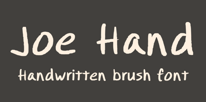 A handwritten brush font containing upper & lowercase characters, numerals and a large range of punctuation.
 - Wave Path by Attype Studio,
$16.00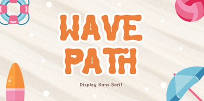 Wave Path inspired by Ocean Wave on summer. perfect Sans serif display font for summer business, summer flyer, summer sign & summer decor. Comes with Ligatures character, Perfect combination effect for typography that you creates. Wave Path is perfect for branding, logo, invitation, stationery, social media post, product packaging, merchandise, blog design, game titles, cute style design, Book/Cover Title and more. Features : - Wave Path.otf - Ligatures - Multilingual Support --- Hope you enjoy with our font! Attype Studio
 - Brother Grade by Create Big Supply,
$15.00 Brother Grade clean and stamp effect. This font is PUA encoded which means you can access all the glyphs and sweeps easily Features: All Uppercase Numbers and punctuation Multilingual Alternates PUA Encoding Full Character Set !"#$%&()*+,-./0123456789:;?@ABCDEFGHIJKLMNOPQRSTUVWXYZ[\]^_abcdefghijklmnopqrstuvwxyz{|}~ ¡¢£¤¥§©ª«®°±²³¹º»¿ÀÁÂÃÄÅÆÇÈÉÊËÌÍÎÏÑÒÓÔÕÖ×ØÙÚÛÜÝÞßàáâãäåæçèéêëìíîïñòóôõö÷øùúûüýþÿıŒœŠšŸž–—‘’“”†•‹›€−
 - Donthank by Letterhend,
$19.00 Introducing, Donthank Script Typeface. Donthank is a script typeface with swash.This font is perfect for quotes, branding, packaging, etc. What will you get: Including number and symbol. Support Multi Language Ligatures Alternates This font also support PUA Encoded! So, grab your own. Thank You!
 - Old Bikers by Fractal Font Factory,
$8.00 Introducing a new font - an old biker. It is a multilayer vintage typeface with 5 styles. The font contains stylistic alternatives for uppercase and lowercase letters. Numbers, punctuation and multilingual characters for each style. The font design is inspired by gothic, biker and rock culture.
 - Wofisty by Jadatype,
$15.00 Wofisty is a display font that comes with Retro-Fun Style. suitable for tshirt, branding, social media, and so on. contains standard English letters, numbers, punctuation, and several accents that support multilingualism. Can be installed on applications such as adobe family, affinity, or Ms. Office.
 - Merchandising JNL by Jeff Levine,
$29.00 With some slight variation, Merchandising JNL was modeled from the lettering on a display box for Meyercord Decal letters and numbers. The phrase "make your own signs with decals" was lettered in a casual brush-like style, and is reproduced for the first time digitally.