4,039 search results
(0.018 seconds)
- Pickled Limes by Missy Meyer,
$15.00 It all started with the letter S. I drew it, I liked it, I based a font around it! This is Pickled Limes, a tall and narrow single-case font. It's built clean from the ground up, for ultra-sharp lines and corners, as well as super-smooth curves. The slightly flared ends and quirky character mix make this font a ton of fun to use on its own, but it will also pair well with tons of hand-written styles! I've branched out on this one; in addition to over 300 Extended Latin characters, I've also included Unicode's 256 Cyrillic and 121 Greek characters for even more language support. Add in the 90+ alternates, ligatures, and catchwords, and Pickled Limes clocks in at just over 1000 characters. I hope you enjoy using my tasty Pickled Limes for your branding project, logo, crafting work, or design project. Happy fonting, MyFonts fans! :)
 - HWT Geometric by Hamilton Wood Type Collection,
$24.94 This late 19th century design conjures up early 20th century Dutch DeStijl lettering with a mostly strict adherence to right angles and minimal stroke modulation. Geometric began its life as a metal typeface from the Central Type Foundry, circa 1884. Soon after, this design was officially licensed to Morgans & Wilcox and was shown in their 1890 catalog in Regular, Light and Condensed Light variations. After acquiring Morgans & Wilcox, Hamilton Manufacturing offered Geometric Light Face Condensed as their own No 3020 and the Geometric Light Face as No 3021. HWT Geometric has been expanded digitally to include a Regular Condensed version. A heavier wood type specimen was found from an unknown manufacturer and digitized as it was found, resulting in the HWT Geometric Shopworn and Shopworn Inked variations. These digital versions all include a full Western and Central European character set of over 380 glyphs.
 - Plasma by Corradine Fonts,
$19.95 Plasma is a contemporary font family, characterized by its clean and geometric appeareance. As a square based style, Plasma has a technological and futuristic feeling, so is suitable for a very wide range of uses, such as editorial, corporate, packaging, posters and web design. Plasma Family consists in 21 fonts, which comes in seven weights, and three different wides. Each font has 516 characters, and can be managed by using its Open Type features, and supports Western European, Central/Eastern European, Baltic, Turkish and Romanian Languages.
 - Hiruko Pro by Thinkdust,
$10.00 Charming and friendly, Hiruko Pro is a modern and legible font cleverly combining smooth lines and playful curves. It’s a complete revamp of the original 2008 Hiruko family. With its softened edges, it emits a family friendly, kids welcome vibe and is easily legible in any situation. With a full family of 21 weights, varying from bold and attention-grabbing, to slick and smart outlines, to extra light and delicate, Hiruko Pro has a tonne of applications, and we still come across new ones.
 - Fallons by Gassstype,
$25.00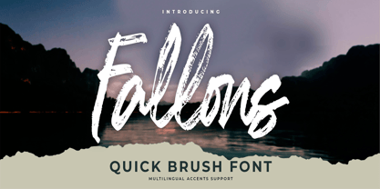 Hello Everyone, introduce our new product Font Fallons it is Quick Brush Font.This is a Textured Natural Style and classy style with a clear style and dramatic movement. This font Fallons is great for your next creative project such as logos, printed quotes, invitations, cards, product packaging, headers, Logotype, Letterhead, Poster, Design this font is great for your creative projects such as watermark on photography, and perfect for logos & branding, invitation,advertisements,product designs, stationery, wedding designs,and label. You can activate 32 Ligatures glyphs OpenType panel.
 - Pinatas Marks by Piñata,
$12.00 Original Foundry: TypeType Original name: TT Marks The typeface Pinatas Marks is made in the style of the traditional American sign painting, which is the traditional art of painting on buildings, billboards and signage for the purpose of announcing or advertising of products, services, and activities. Font family Pinatas Marks consists of 32 fonts and has 8 different weights: Thin, ExtraLight, Light, Regular, Medium, Bold, ExtraBold, Black. Pinatas Marks is looking great on all the modern information media, ranging from small labels to entire text blocks.
 - Waymar by NREY,
$25.00 The Waymar font family is an modern elegant high-contrast serif, inspired by the fashion glossy magazines typography and handwritten signature script. It perfectly represents modern & vintage esthetics. Both fonts includes multilingual support (32 languages: Afrikaans, Basque, Bosnian, Catalan, Croatian, Czech, Danish, Dutch, English, Estonian, Filipino, Finnish, French, Galician, German, Indonesian, Irish, Italian, Latvian, Lithuanian, Malay, Norwegian Bokmal, Portuguese, Romanian, Russian, Slovak, Slovenian, Spanish, Swahili, Swedish, Turkish, Zulu), alternate characters and beautiful ligatures. The font is perfect for wedding elegant invitation cards, beauty and fashion package design.
 - Hevanola by IbraCreative,
$17.00 Hevanola – A Marker Brush Script Font Hevanola, an alluring marker brush script font, embodies a distinctive blend of spontaneity and grace. With its free-flowing strokes and handcrafted aesthetic, Hevanola effortlessly captures the essence of natural, expressive writing. The font’s marker-inspired design infuses a sense of authenticity, as if each character was meticulously crafted by a skilled artist’s hand. The dynamic interplay of thick and thin lines, coupled with its slightly slanted and fluid letterforms, imparts a lively and energetic quality to Hevanola. This script font is well-suited for projects that seek a personal touch, radiating a modern yet timeless appeal that brings warmth and character to any design endeavor. Whether used in branding, invitations, or creative displays, Hevanola adds a touch of vibrant personality and casual sophistication to the visual narrative. Hevanola is perfect for branding projects, logo, wedding designs, social media posts, advertisements, product packaging, product designs, label, photography, watermark, invitation, stationery, game, fashion and any projects. Fonts include multilingual support for; Afrikaans, Albanian, Czech, Danish, Dutch, English, Estonian, Finnish, French, German, Hungarian, Italian, Latvian, Lithuanian, Norwegian, Polish, Portuguese, Slovak, Slovenian, Spanish, Swedish.
 - BigNoodleTitling - 100% free

- Kongress by Tipo Pèpel,
$24.00 Kongress is a typeface that includes all that is needed for building a proper corporate identity. The design relies on the use of straight lines and a squarish structure for the characters, which provides the text with a compact appearance. This feature helps to save space when required by the typographic composition. The design is also defined by wide counterforms and clean cuts for the strokes. All of this helps the shapes to adapt better to digital environments. Nevertheless, Kongress is not another techno typeface. The slight modulation of the strokes—especially in the italic letterforms—and the large apertures for most characters result in what we will call a techno-humanist style. The squarish structure of a techno-font blends with the calligraphic modulation of a humanist sans serif typeface.
 - Hisham by Linotype,
$187.99Hisham is a modern Arabic headline face, designed by the Lebanese calligrapher, Ahmed Maged, originally for Linotype-Hell Ltd. The Hisham design has a distinctive style with a strong baseline, relieved by strategic cut-away effects, which is counterbalanced by the bold vertical strokes and some strong diagonals. This somewhat compact font adds a new style to the range of Linotype’s Arabic headline fonts. This OpenType font includes Latin glyphs from Optima Extra Black, allowing users to set text in both most Western European and Arabic languages without switching between fonts. Hisham incorporates the Basic Latin character set and the Arabic character set, which supports Arabic, Persian, and Urdu. The font also includes tabular and proportional Arabic, Persian, and Urdu numerals, as well as a set of tabular European (Latin) numerals. - Gabriela by Latinotype Mexico,
$29.00 The Gabriela project is of great importance to us since it is the first font published by Latinotype México which is our brand-new sister foundry in Mexico. Gabriela, yet more versatile, shares all of its DNA with Gabriela Stencil. The font is an excellent choice for short and medium-length text. Gabriela is a Didone typeface well-suited to classy branding and editorial designs. Its alternate version includes swashes and more than 300 glyphs and 75 ligatures, allowing for more stylized designs. It may look different from its "regular" counterpart, but the essence of both is the same. Gabriela comes in 9 styles, ranging from Thin to Black, and includes matching true italics. Each font weight has an average of 750 characters which support more than 200 Latin-based languages.
 - Noemi Slab by Brackets,
$22.00 Noemí is a broad typeface based on a formally classic skeleton, but with a strong Meccano character, where its quadrangular serifs are the protagonists of the slab style. It is a typeface designed to solve the basic problems of newspaper printing, adapted to a novel and strong communication, in the case of a wide typeface and with generous ink traps making the impression. Noemí was born from the need to create a broad, functional typeface family with a strong compact character intended for use in the press. Intended for editing and layout in a newspaper / magazine with a wide range of subfamilies thought and designed to achieve a diverse graphic functionality; designed from the same common skeleton, with a style based on the mix between the Mecan characters of traditional typewriter fonts and Roman fonts.
 - Samplex by Tipo Pèpel,
$22.00 Neutral and universal are two words that could describe a kind of perfection. The search for neutrality and universality is part of history in type design; it was specially important in the so-called Swiss Style. Samplex is a typeface that joins this particular search. The design gets rid of unnecessary elements and stays away from style conflicts. The large and slightly condensed body of lowercase letters makes Samplex a good choice for long paragraphs, and especially appropriate for screen devices. Letters with a blocky appearance give shape to a text in perfect order, ideal for grid lovers and layouts with a strict structure. The design of Samplex is clean and efficient. The diagonal cuts are reserved to the italic letterforms, setting some distance between the solid upright characters and the dynamic oblique forms.
 - FF Daxline by FontFont,
$83.99 German type designer Hans Reichel created this sans FontFont in 2005. The family has 14 weights, ranging from Thin to Black (including italics) and is ideally suited for advertising and packaging, book text, editorial and publishing, logo, branding and creative industries, poster and billboards, small text as well as web and screen design. FF Daxline provides advanced typographical support with features such as ligatures, small capitals, case-sensitive forms, fractions, super- and subscript characters, and stylistic alternates. It comes with a complete range of figure set options – oldstyle and lining figures, each in tabular and proportional widths. As well as Latin-based languages, the typeface family also supports the Cyrillic and Greek writing systems. This FontFont is a member of the FF Dax super family, which also includes FF Dax and FF Dax Compact.
 - Miau by Cuchi, qué tipo,
$5.95 “Miau” is a display typeface designed by “Cuchi, ¡qué Tipo”! (Hey, what a type!”). Its name comes from the onomatopoeia of "Meow" in Spanish, and it is only to be used for letters or single words. It is built from the basic skeleton of cursive script letters, and its origin and main concept is based on experimenting with shapes that play the limit of readability. Being a variable format typeface, we have from the thinnest and lightest version ("Hiss"), to the thickest, dense and compact ("Purr"), passing through the average ("meow"). The final result of this experimentation is defined into a very contemporary typeface with a geometric, modular and “no-terrestrial” flavour. It aims to be a representation of the times we live about typographic design, a whole explosion of implausible experiments and formals researches.
 - Qonora by Charles Casimiro Design,
$22.50 Qonora is an innovative new sans-serif text face that combines flowing, almost calligraphic strokes with a post-modern sensibility for a look that works as well on the printed page as it does on screen. Its comfortable proportions and no-nonsense streamlining (note the lack of spurs, serifs or any unnecessary ornamentation) make it an excellent choice for legibility even at very small point sizes. Qonora includes a true italic, drawn independently from the Roman. Strokes for the italic have been re-weighted to complement the Roman, and idiosyncratic italic glyphs have been substituted where appropriate. The typeface’s extensive Hebrew implementation (including diacritics and cantillation marks) is an important part of its character. The Latin, Cyrillic and Greek ranges of the face maintain a consistent ethic of form and function.
 - Streetscript Redux by Eclectotype,
$40.00 Streetscript Redux is an update to the now discontinued Streetscript. In the original version, it seems a lot of users didn't like the s’s in the font, and after seeing them redrawn (not always with the best results!) a few times, I decided to make a new version of the font with less idiosyncratic s’s, and this is the result, Streetscript Redux. (I should have listened to my other half - “those s’s look like fives,” she said) All other features of the original Streetscript are intact (barring a couple of s-ligatures no longer necessary). There’s been a little tweaking of some outlines, and slight changes with spacing too, but for the most part, all I've done is redraw those pesky five-like s’s, so that you don't have to.
 - Strokes by Favorite Fonts,
$17.00 The "Strokes" font family presented here has several styles: regular, italic, bold and bold italic. The font supports the alphabet consisting of Latin letters and symbols, Cyrillic, Tatar. The composition of the font "Strokes" includes graphemes from uppercase and lowercase letters, numbers, standard characters. The originality of the font lies in its name. The "Strokes" font is made up of many intersecting lines, forming rounded sans-serif letters, but at the same time smooth and easy to read, which will fit perfectly into your composition. The unusualness and attractiveness of the font makes it noticeable among the texts that surround us everywhere. This property is convenient to use on signs, logos, corporate identity, product packaging. The decorativeness of the font is eye-catching and will add important accents to your work.
 - Poleno by DizajnDesign,
$39.00 Poleno is a custom typeface originally designed in 2006 for the Slovak folk dance ensemble Poleno, as a part of their corporate identity. Ever since, new weights have been added to complete six variables and two different options for accents. The typeface adds a fresh, bold and non-rational feeling to headlines and titles in books and posters in display sizes where emphasis and detail are equally important. Randomly-generated contextual alternates included in the family contribute to add a distinctive look to words with repeating characters, whenever they occur next to each other. The difference between the Poleno Set and the Poleno Alt Set is in the accented characters. In the first one, accents are merged with the characters and in Alt version, accents are separated from the characters.
 - Majorelle by S&C Type,
$14.00 Majorelle is a textured script font designed by Fanny Coulez and Julien Saurin in Paris. This finely balanced font was designed to be easy to read, and because it’s just as important, easy to use. Majorelle includes alternates and OpenType ligatures that you can use to improve your designs and make them look natural and friendly. With a lot of extras like swashes, keywords, or splatters, this organic script could be used for any project that needs a warm and informal touch. We hope you will enjoy our work :) You could follow us on our Instagram: instagram.com/sc.type Merci beaucoup! Note: You could perfectly combine Majorelle with other S&C Type’s fonts, such as Naïve or The Hand for example. Just click on our foundry name to check them out!
 - Cougar by Canada Type,
$24.95It is still a mystery to us why Martin Wilke's 1968 Konzept design was ignored by the digital age. It certainly has the elements of attractive yet realistic handwriting, as well as a few very distinctive letters that make it very unique in its class. So here it comes digitally under another feline name from Canada Type. We named it Cougar because the top of the C gives off just that impression. Ditto the G's casual descender, and the gorgeous a and g. With casual letters like these, a handwriting font cannot get any more realistic. Cougar is ideal for handwritten notes, both long letters and friendly short sentences. It's also great for use in scrawl design, titling, or any environment where friendly and casual appearance is of importance. - Unava by Myristica,
$15.00 The font is inspired by the history of the native land - a city that blossoms on a high mountain, surrounded by the blue ribbon of the Unava River. The swift rapidity of the river, the important slow flow of its reservoirs, golden beaches and steep banks of which remember the glorious times of Cossack glory. Times when bright flags flew over the Cossack army, which swiftly swept the green meadows with lightning cavalry, and dusty paths under the scorching sun. To go out to defend their homes, to cross the cold steel of ringing sabers with the enemy, and, bravely going into battle, to fight back the invaders. The font combines the straight lines of sharp steel sweeps, the broken lines of jousting blows, and the refinement of the accent of undulating flag lines.
 - Quiroh by Hashtag Type,
$32.00 Quiroh is a functional typeface that expresses both artistic life and emotion. Taking its inspiration from the industrial revolution of the 19th Century where romance and science coincided. With a cushioned finish and designed according to traditional conventions, the sentiment is equally as important as the reason, resulting in a very pleasurable read. Quiroh includes both heavy display weights and lighter weights for small copy, it's a perfect tool for communicating to the masses. Tall ascenders and descenders give the typeface a distinctive look with an elegant feel, and while these expressive forms invite the reader to observe its visible shape and appearance, its rhythm and function invites the reader to peruse at their leisure. Full details include 7 weights from thin to heavy with over 470 characters, manually edited kerning and OpenType features.
 - Solitas by insigne,
$- You request perfection--that ideal equilibrium of compact dimensions and geometric underpinnings that leaves you with pure, clean lines of a highly legible sans. We give you Solitas, a 7-weight sans-serif from Jeremy Dooley. Made of 42 fonts, from the slender thin to the powerful bold and their matching italics, this typeface family features typographic options including ligatures, fractions, alternate unicase, upright italics, and titling caps. Coupled with its pure design and style, this makes Solitas a successful workhorse typeface. The result of simplification and reduction, Solitas is well-suited for the headlines and shorter texts of promotions, packaging, editorials and branding, both in print and on your website. That's it. It's that clean, that simple, and possibly that perfect for your next layout. Get it today.
 - Cyan Neue by Wilton Foundry,
$29.00 Cyan Neue is a substantial update variation to the original Cyan we launched in 2006. Most notably the contrast has decreased making it more contemporary. Many glyphs have been improved especially in the italics. The design of Cyan Neue was inspired by features found in classic Roman. It shows a preference for geometric Roman proportions while incorporating open centers (B,P,R) and compact serifs. The characters stay true to the same features as the capitals, resulting in an unusually distinctive style. There are many subtle details in Cyan Neue that become more interesting in display sizes, for instance the subtle curves in the serifs and the overall smoothness. Cyan Neue is a robust font that will exceed your expectations. Cyan Neue is clearly ideal for headlines, inscriptions, publications, annual reports, corporate identities, packaging.
 - Jet by Brownfox,
$39.99 Jet is an assertive italic sans that anticipates the return of the simpler, optimistic times when progress was considered positive and forward seemed to be the only way to go. It may have felt right at home in the mid-1970s, the time of Sc-Fi, synthetics and disco, yet it unmistakably belongs to the present. Its dynamic sturdy forms and angular tapering of some horizontal forms convey movement and edgy impatience for change, with a few re-imagined details, like the reversed slant on top of the lowercase t and the atypical round counter of the lowercase a, showing a new hope for the bygone optimism. Available in five weights in Latin and Cyrillic, supporting many languages, with stylistic alternates and two sets of figures. Designed by Gayaneh Bagdasaryan and Vyacheslav Kirilenko, 2020
 - Dingos by Antipixel,
$18.00 Dingos is a display typeface specially handcrafted for potent usage. It is compact, solid, and dense, with a heavy-built structure, tight internal space, and a versatile touch. Dingos is perfect for large settings due to its precise shapes. The 'Display' and 'Display Outline' styles have sharp and clean paths with angular ink traps, while 'Stamp' and 'Stamp Outline' have round ink traps and irregular, soft, curvy outlines optimized to ensure high-quality contours. Stamp textured styles have three sets of alphabets that slightly differ from one another. Thanks to the Contextual Alternates, these alphabets are automatically alternated to avoid repeating the same curvy textures. Some of Dingos' features are ligatures, discretionary ligatures, stylistic sets, numerators, fractions for any number combinations, arrows, special decorative characters, and a glyph coverage that ensures extended language support.
 - LHF Saratoga Panels 4 by Letterhead Fonts,
$53.00The final collection in the series of 4 fonts. Each font contains 37 expertly drawn panels. All you have to do is add your own text and color for a quick and easy design. All 37 of these panels are exclusive to Letterhead Fonts. Typing each letter generates a different panel. Special Note: Due to the large file size of these fonts, they will not convert for use in Gerber Omega. Instead, Omega users may wish to use an alternate program to type the characters and import them into Omega as .eps files. CorelDraw users should use the "Weld" command rather than "Convert to Curves" command to convert these fonts to vector outlines. Otherwise, the program may crash due to the sheer number of points in each panel. - Lucida Console by Monotype,
$50.99 Kris Holmes and Charles Bigelow designed Lucida Console in 1993 for on-screen console and terminal emulation windows that needed monospaced fonts with sturdy letter shapes. Lucida Console has simple, clear, robust letterforms, a big x-height, and economical fitting. It looks large on-screen and in print but takes up less space than traditional typewriter and monospaced fonts. Its short capitals were originally technical adaptations to user interfaces on computers, but its compact look and active italic appeals to typographers and designers for a wide variety of uses, including in games and digital devices. The Lucida Console family has 675 glyphs in each font, and supports the WGL and W1G character sets. This includes the Extended Latin, Greek, and Cyrillic alphabets along with a generous set of symbols, box-draw, and graphical characters.
 - Benda by Suitcase Type Foundry,
$45.00 Benda is a modern geometric script font with roots in the calligraphy and lettering of legendary artist Jaroslav Benda. With bold, predominantly low joins, the robust monolinear character strokes shine in one-word and short inscriptions as well as in longer headlines. The practical letterforms do not clutter the space with loops and curlicues, while the emphasised baseline helps to underline the importance of the message. What’s more – Benda is a smart font, automatically replacing conflicting characters with suitable alternatives as you write so that the final text flows seamlessly. Because Benda is the sequel to Jaroslav, it derives the slant, colour, and geometric characteristics from the sans typeface, forming the perfect companion to the font. So much so, it can serve as a second italic emphasis in long texts.
 - Bougainville by Type Associates,
$29.95 Bougainville was inspired by many of my favorites and has been on the drawing board in excess of ten years. Only this year I decided to expand the original 1994 design to include other weight variants. The quirky Binner Gothic-inspired high axis and its funky g, rounded e, angled stroke endings together with the influence of contemporary designs such as Officina Sans, Din Mittelschrift and MetaPlus, Bougainville exhibits a similar flavor and compactness to Bodega Sans. This typeface family has been named in honor of the renowned eighteen-century French mathematician and explorer Louis-Antoine de Bougainville to whom we owe the naming of South Sea Islands and colorful tropical flora he discovered along his journey. Bougainville makes for effective headings at any size and is equally readable at semi-display sizes.
 - Museum Tertia Cursive by T4 Foundry,
$21.00Museum Tertia Cursive is inspired by a beautiful set of 126 matrices in the Swedish Norstedts type collection. These types were probably manufactured in Germany before 1750. The matrices are part of a set imported to Sweden by J.P. Lindh from Breitkopf & Härtel 1818. Now this exquisite design is available again, thanks to type designer Torbjörn Olsson. Please note modern additions like the ?-mark, @-sign and €-sign. Museum Tertia Cursive is an OpenType creation, for both PC and Mac. Swedish type foundry T4 premiere new fonts every month. Museum Tertia Cursive is our eighth introduction. Museum Tertia Cursive is part of the growing Museum type family. Museum also includes three different border fonts, an ornament font with some of Granjon's arabesques and a flowery Fournier font with Rococo capitals. - Halenoir by Ckhans Fonts,
$34.00 • Composed of 3 sets: Normal, Compact, Expanded. • Consisting of 3 distinct optical sizes: Display and Text, Expanded. • Comprises 102 fonts • Support for 28 languages: Afrikaans Albanian Catalan Croatian Czech Danish Dutch English Estonian Finnish French German Hungarian Icelandic Italian Latvian Lithuanian Maltese Norwegian Polish Portugese Romanian SlovakSlovenian Spanisch Swedish Turkish Zulu Swedish Turkish Zulu • Contains OpenType features with alternates or substitutes • Tabular Figures • Ordinal numbers • 74 icons (It will keep updating.) • 72 graphic patterns for designer (It will keep updating.) • 28 brand symbols (It will keep updating.) • 27 arrows glyphs • 0-99 line circled glyphs • 0-99 solid circled glyphs • A-Z line circled glyphs • A-Z solid circled glyphs Halenoir is a modern sans serif with a geometric touch that support for 28 languages. It comes in 10 weights, 102 uprights and its matching outlines, Obliques, pattern, so you can use them to your heart’s content, in each of which there are more than 801+ glyphs. Halenoir is composed of 3 types: Original, Compact, Expanded, and each is designed to be suitable for mobile, graphic, and editorial design. Halenoir comprises 102 fonts, consisting of three distinct optical sizes: Display and Text. Each one has been carefully tailored to the demands of its size. The larger Display versions are drawn to show off the subtlety of Halenoir and spaced with headlines in mind, while the Text sizes focus on legibility, using robust strokes and comfortably loose spaces. In the typeface, each weight includes extended language support, fractions, tabular figures, arrows, ligatures and more. Perfectly suited for graphic design and any display use. It could easily work for branding, web, signage, corporate as well as for editorial design. documents and folders, mobile interface. Useful links: Gravitica PDF Type Guide and Specimen (You can know how to use icons and arrows, other glyphs.)
 - Aanaar by Letterjuice,
$66.00 This typeface comes from a self initiated project called Sápmi, which aims to contribute to keep a group of minority languages alive through solving issues in the education environment. This re-thought edition takes the name of Aanaar and joins our library with a bigger character set and two new weights which complete the typeface providing a big typographic palette as well as adding stylistic two-story a and g for more advanced readers as well as to enable the typeface to be used in other environments. The typeface was originally designed for children’s text books. Analysing kid’s typeface design, we identified some important problems and solved them within the boundaries we had. The main concern in a typeface which will be used by children is letter recognition, as they have not yet fully develop their reading skills. For example, letters like “a” and “g” share a very similar structure in this particular kind of typefaces, where the only distinctive part is the descender of the “g”. It is known that the lower part of the letter is the less important feature when reading, therefore we decided to make a clear distinction between them by having an “a” with a spur on the top right. This also helped distinguishing “a” and “o”. Children typefaces usually have one story “a”, making “a” usually too close to “o”. Additionally we moved the joint in “a” upwards and narrowed very slightly the “a” to make sure they cannot be mistaken. More generally, the x-height is fairly tall and the typeface has a bit of movement which give it a good rhythm helping moving along nicely when reading. Aanaar consists of 5 weights (Light, Regular, Medium, Bold and Black) plus two Italics (Light Italic and Italic).
 - Sancoale Slab Soft by insigne,
$24.75 Ready for the designs of today, the Sancoale superfamily takes a softer turn with a rounded slab serif. Crafted from Sancoale’s simple geometry, new softened slab serifs provide a lively typeface that conveniently enhances its cousins: Sancoale Softened--a sans with blunted terminals; Sancoale Slab; and, certainly, the first Sancoale. The weights of each and every member are balanced diligently to be compatible with one another. When used alongside one another, the combination makes for robust and tight design. With weights starting with the slender thin ranging to the juicy black, Slab Soft opens the doorway to the vary of uses. Its design is legible and neutral enough for bodies of copy--both in print and on your website. The web font also stands out perfectly as a headline or a display face. Slab Soft carefully places a foot ahead, and doesn't overpower like many slabs. This font’s the choice to seize the day and get the job done. All insigne™ fonts are absolutely loaded with OpenType options. Sancoale Slab is geared up for pro typography, together with alternates with stems, compact caps and lots of alts, together with “normalized” capitals and lowercase letters. The font features many numeral sets, with fractions, old-style and lining figures with superiors and inferiors. OpenType-capable programs like Quark or the Adobe suite allow you to quickly change ligatures and alternates. You can see these options shown in the .pdf brochure. Bundled are compact caps, fractions, old-style and lining quantities, scientific superior/inferior figures, entire ordinal and inferior alphabet. The Sancoale superfamily also features the glyphs to aid a variety of languages, together with Central, Eastern and Western European languages. In all, Sancoale Slab supports around forty languages that utilize the Latin script, earning Sancoale the pick for for multi-lingual publications and packaging.
 - TE Rekaah3 by Tharwat Emara,
$50.00 Introducing TE Rekaah3: Unleash the Beauty of Arabic Calligraphy by Tharwat Emara TE Rekaah3 is not just a font; it is a masterpiece crafted by renowned calligrapher Tharwat Emara, bringing the timeless beauty of Arabic calligraphy to life. With its exquisite design, meticulous attention to detail, and captivating aesthetics, TE Rekaah3 invites you to embark on a journey of creativity and immerse yourself in the artistry of Arabic script. Impeccable Craftsmanship: Tharwat Emara, a master calligrapher, has poured his expertise and passion into every curve and stroke of TE Rekaah3. The result is a font that showcases the flawless craftsmanship and artistic precision that Tharwat Emara is renowned for. Each letterform is meticulously designed, reflecting the elegance and grace of Arabic calligraphy in its purest form. Elegance Redefined: TE Rekaah3 embodies a harmonious balance between tradition and innovation. It embraces the timeless elegance of Arabic script while infusing it with a contemporary flair. The graceful letterforms and balanced proportions of TE Rekaah3 exude sophistication, making it the perfect choice for projects that demand refined aesthetics and a touch of modernity. Captivating Visual Appeal: TE Rekaah3 captivates the eye with its visually striking composition. The seamless flow of each character, carefully curated ligatures, and distinctive swashes create a captivating rhythm that draws the viewer in. Whether used for headlines, logos, or editorial layouts, TE Rekaah3 ensures that your designs make a lasting impression. Unparalleled Legibility: Tharwat Emara's expertise in calligraphy shines through in TE Rekaah3's exceptional legibility. Each letterform is thoughtfully crafted to ensure clarity and readability, even at smaller sizes or in intricate design compositions. Your message will be conveyed with precision and impact, making TE Rekaah3 a reliable choice for a wide range of design applications. Versatile Expressiveness: TE Rekaah3 offers a wealth of creative possibilities. With its comprehensive character set, including alternates, ligatures, and stylistic variations, you have the freedom to express your artistic vision. Whether you seek a contemporary look or a more traditional feel, TE Rekaah3 provides the versatility to bring your creative ideas to life. Seamless Integration: TE Rekaah3 seamlessly integrates into your design workflow, ensuring a smooth and efficient experience. Available in various file formats and compatible with popular design software, it offers convenience and ease of use. Focus on your creative process and let TE Rekaah3 effortlessly elevate your designs. Celebrate the Art of Arabic Calligraphy: TE Rekaah3, born from the creativity of Tharwat Emara, celebrates the rich heritage of Arabic calligraphy. It pays homage to centuries of artistic tradition while embracing the demands of contemporary design. By choosing TE Rekaah3, you honor the legacy of Arabic calligraphy and create designs that resonate with cultural richness and artistic expression. Immerse yourself in the beauty of TE Rekaah3, where the mastery of Tharwat Emara converges with the art of Arabic calligraphy. Unleash your creativity, elevate your designs, and let TE Rekaah3 become the embodiment of your artistic vision.
 - Posterama by Monotype,
$40.99 The Posterama™ typeface family contains 63 fonts and is a true journey through space and time. Designed by Jim Ford, each Posterama family contains 7 weights from Thin to Ultra Black, in 9 distinct families. What makes Posterama so unique and versatile are the eight alternative display families. By making use of a collection of alternative glyphs, Posterama sets an evocative flavor to visualize an entire century of futuristic reference points from art, architecture, poster design and science fiction into one family. Posterama Text is the base family. It has the most robust character set including upper and lowercase glyphs and pan-European language support (including Greek and Cyrillic). Note: all the other Posterama variants described below do not have lowercase letters or Greek and Cyrillic support. Posterama 1901 recalls the decoratively geometric style of Art Nouveau from the turn of the 20th century. Letterforms such as the slender, snaking ‘S’, the high-waisted ‘E’ and the underlined ‘O’ revive the spirit of Charles Rennie Mackintosh and the designers of the Viennese Secession. Posterama 1913 pays homage to the Armory Show, or 1913 Exhibition of Modern Art, which brought the revolutionary work of European artists such as Picasso, Duchamp and Kandinsky to the US for the first time to the shock and astonishment of press and public. Near-abstract, angular characters such as the ‘A’, ‘E’ and ‘N’ hint at cubism’s jagged and clashing planes. Posterama 1919 uses a small, but important, variation to set a tone when the Bauhaus was founded, and the surge in radical European typography that followed. The straight-sided, roundheaded ‘A’ adds a flavor of 1919 – this style of ‘A’ can still be seen in the Braun logo, designed in 1934. Posterama 1927 captures the year of Metropolis, The Jazz Singer and Paul Renner’s pioneering, geometric Futura typeface from 1927, which had a profound influence on design in the US and Europe. Posterama 1933 – With its low-waisted, sinuous designs, the Posterama 1933 typeface family echoes lettering of the Art Deco period, which in turn had its roots in Art Nouveau, the key influence on Posterama 1901. The two fonts make a great team and can be used interchangeably. Posterama 1945 features a few Cyrillic characters to conjure up an era when Russian art and political posters made their mark in cold war propaganda, espionage and also giant aliens and monsters. Posterama 1984 takes its typographic influences from George Orwell’s classic novel, publicity for the dystopian action and sci-fi movies (Blade Runner, Videodrome and Terminator) and games like Space Invaders and Pac-Man that made an impact at that time. Posterama 2001 was inspired by Stanley Kubrick’s science fiction masterpiece, which made extensive use of the Futura typeface. Posterama 2001 finds its cosmic orbit with its nosecone-style ‘A’ from NASA’s much-missed ‘worm’ logotype. There’s an echo, too, in Bauhaus designs from as early as 1920, whose minimalist, geometric lettering also featured a crossbar-less ‘A’.
 - Phoenica Std Mono by preussTYPE,
$29.00 Phoenica Std Mono expands the already large family of my very successful Phoenica. The motivation to develop a new mono-Phoenica family was that I was not satisfied with monospaced fonts in programming code, or simply in e-mail correspondence. The Mono Phoenica solves the problem of a typical monospaced font, a rigid, fixed width. The design gradations from Condensed monospaced to monospaced from 390em to 600em-square incurred a total of 21 fonts. Packages contain the fonts in CFF-OpenType and TrueType format, so you can use these beautiful fonts on all operating systems.
 - Black Ravens by Arterfak Project,
$26.00 Introducing Black Ravens, a freestyle dry-brush font with a natural single brush. Black Raven's is a street urban font, youth theme, sporty, and masculine looks that visualize smooth strokes, and rough texture at the same time. This font is an all-caps font that perfects for displays, title, logos, packaging, craft, labels, T-shirt, hoodie, tote bag, posters, hats, stickers, quotes, and any advertising which needs energetic typography. Black Ravens equipped with 31 stylish ligatures, swashes, multilingual, and alternates characters that you can mix and match to get your own typographic design!
