10,000 search results
(0.061 seconds)
- Darrell Rolando by Grezline Studio,
$15.00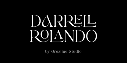 Darrell Rolando is a stylish display font with vintage and classic looks. This font comes with unique glyph ligature set. Very suitable for logo, headline, title, invitations, labels, magazines, books, greeting/wedding cards, packaging, fashion, makeup, stationery, novels, labels, or any type of advertising purpose. Feature : - Alternates and Ligatures - Multilingual Language - Works on PC & Mac - Simple installations Thank You! Grezline Studio – Akhmad Reza Fauzi
 - Chicago by Rezastudio,
$5.00 CHICAGO is a Fancy Modern vintage serif typeface with beautiful ligatures, tons of special alternative glyphs, ornament and multilingual support. It's a very versatile font that works great in large and small sizes. Perfect for editorial projects, Logo design, Clothing Branding, product packaging, magazine headers, or simply as a stylish text overlay to any background image. 2 Weights font Lowercase and Uppercase Stylistic Alternates & Ligatures Numerals & Punctuation
 - Calrida by Muksal Creatives,
$12.00 Calrida is a modern high-class display serif font typeface. It includes all basic glyphs with international characters. This font will pair beautifully with a script, signature or handwriting style font. Calrida is perfect for headlines, titles, magazine headings, logos, presentations, posters, name cards, web layouts, invitations, books, branding, and more. Calrida Features: Uppercase Multilingual Letters Lowercase Multilingual Letters Numbers & Punctuation Ligatures Stylistic Alternates
 - Mitchell Wesley by Fargun Studio,
$18.00 Mitchell Wesley is a beautiful Handwritten Font, A beautifully handcrafted font combined with brush style that’ll make your guests sing and elevate your projects! Every stroke, and curve was created to entice happiness and elegance. It suitable for wedding invitation, greeting cards, T-Shirt, Logo or any design that you create. Comes with a complete set of standard characters, Alternates, Ligatures, Punctuation & International glyphs
 - Ongunkan Younger Futhark by Runic World Tamgacı,
$45.00 The Younger Futhark, also called Scandinavian runes, is a runic alphabet and a reduced form of the Elder Futhark, with only 16 characters, in use from about the 9th century, after a "transitional period" during the 7th and 8th centuries. The reduction, somewhat paradoxically, happened at the same time as phonetic changes that led to a greater number of different phonemes in the spoken language, when Proto-Norse evolved into Old Norse. Also, the writing custom avoided carving the same rune consecutively for the same sound, so the spoken distinction between long and short vowels was lost in writing. Thus, the language included distinct sounds and minimal pairs that were written the same. The Younger Futhark is divided into long-branch (Danish) and short-twig (Swedish and Norwegian) runes; in the 10th century, it was further expanded by the "Hälsinge Runes" or staveless runes. The lifetime of the Younger Futhark corresponds roughly to the Viking Age. Their use declined after the Christianization of Scandinavia; most writing in Scandinavia from the 12th century was in the Latin alphabet, but the runic scripts survived in marginal use in the form of the medieval runes (in use ca. 1100–1500) and the Latinised Dalecarlian runes (ca. 1500–1910)
 - Few Grotesk by Studio Few,
$24.00 Tall X-Height, Angled Terminals and Medium Contrast, Few Grotesk is a UI font designed with personality. Originally conceived as a hybrid between Grotesque & Humanist, Few Grotesk pairs legibility with character.
 - Chelsey Bobby by Gatype,
$10.00 Chelsey Bobby model original handwritten simple font, the newest you can get now! With an updated hand calligraphy model with special glyphs that have been given a combination of fantasy and handwritten ink. This font will look beautiful on all designs, Wedding designs, branding materials, blog titles, quotes and invitations, business cards. OpenType includes: Alternative Style Set styles Including fonts: . Chelsey Bobby. OTF To enable the OpenType Stylistic alternative, you need a program that supports OpenType features such as Adobe Illustrator CS, Adobe Indesign & CorelDraw X6-X7, Microsoft Word 2010 or later. There are additional ways to access the alternative/swash, using the Character Map (Windows), Nexus Font (Windows), Font Book (Mac) or a software program such as PopChar (for Mac and Window). This font has provided PUA unicode (custom code font)
 - Marioline by Josstype,
$10.00 Marioline Script is a handwritten typeface with classical root, a beautiful formal script and elegant touch. It works perfect in the world of weddings, logos, greeting cards, branding, print ads, quotes, signage, magazines etc. Marioline features 500+ glyphs and 315 alternate characters. It includes initial and terminal letters, alternates, swashes, ligatures and multiple language support. To enable the OpenType Stylistic alternates, you need a program that supports OpenType features such as Adobe Illustrator CS, Adobe Indesign & CorelDraw X6-X7, Microsoft Word 2010 or later versions. How to access all alternative characters: http://youtu.be/iptSFA7feQ0nn http://cuttingforbusiness.com/2016/01/28/how-to-use-opentype-fonts-in-silhouette-studio-or-cricut- design-space/ https://www.youtube.com/watch?v=Go9vacoYmBw Thank you for your purchase! and please let me know if you have any questions. via email: joelpopon@gmail.com
 - YLab Variable by Par Défaut,
$40.00 yLab is geometric typeface compose of 10 fonts (5 weights and oblique declination) Perfect for titles and text, yLab supports many languages (Latin pro..). 11 OpenType Features (Alternative; Fraction; Numerator; Denominator; Superior; Inferior; Tabular figure; Ordinals; Discretionary Ligature; Stylistic Set; Case Sensitive Forms). • Ordinal feature includes the Latin alphabet (Uppercase & Lowercase). • Five Stylistic set for “a”, “g”, "i" and "l", includes accents. • Discretionary Ligature includes “AE”, “IJ”, “OE”, available in lowercase. • Contextual Alternate includes ligatures for arrows : <- -> ^| v| <-> v^| Add parentheses around period, numbers or arrows, add n or d for numerator, denominator. Add n, d or +, for numerator, denominator or case arrows. All Case sensitive characters become after the uppercase and number.
 - YLab by Par Défaut,
$30.00 yLab is geometric typeface compose of 10 fonts (5 weights and oblique declination) Perfect for titles and text, yLab supports many languages (Latin pro..). 11 OpenType Features (Alternative; Fraction; Numerator; Denominator; Superior; Inferior; Tabular figure; Ordinals; Discretionary Ligature; Stylistic Set; Case Sensitive Forms). • Ordinal feature includes the Latin alphabet (Uppercase & Lowercase). • Five Stylistic set for “a”, “g”, "i" and "l", includes accents. • Discretionary Ligature includes “AE”, “IJ”, “OE”, available in lowercase. • Contextual Alternate includes ligatures for arrows : <- -> ^| v| <-> v^| Add parentheses around period, numbers or arrows, add n or d for numerator, denominator. Add n, d or +, for numerator, denominator or case arrows. All Case sensitive characters become after the uppercase and number.
 - Rainy Stars by Mans Greback,
$59.00 Rainy Stars is an irresistibly adorable, naive sans-serif font that captures the magic of a child's imagination. With its round, cute, and cartoon-like letterforms, this font adds a touch of whimsy and playfulness to your designs, perfect for projects aimed at children, nature, or rustic themes. The soft, bold strokes and charming personality of Rainy Stars make it a delightful choice for comic books, illustrations, and any creative work that aims to evoke the innocent joy of a toddler's world. The Rainy Stars font family includes six delightful styles to suit various design needs: The weights Light, Regular and Bold for balancing and impact, as well as each thickness as Italic for a touch of movement. Use asterisk * to make a star. Use multiple asterisks to make different space symbols. Example: Magic**Planet (Download required) Built with advanced OpenType functionality, Rainy Stars ensures top-notch quality and provides you with full control and customizability. It includes stylistic and contextual alternates, ligatures, and other features to make your designs as unique and enchanting as the font itself. Rainy Stars offers extensive lingual support, covering all Latin-based languages, from Northern Europe to South Africa, from America to South-East Asia. It contains all the characters and symbols you'll ever need, including all punctuation and numbers.
 - Sofia Pro by Mostardesign,
$25.00 Sofia Pro is a geometric sans font family who dares the modernism and the harmony of the curves. Created in 2009 and completely redesigned in 2012, it has become over time a popular alphabet and has received many accolades from graphic industry professionals. It has very rounded curves with very open terminals that makes this font family elegant, friendly and contemporary. Sofia Pro has been designed with a higher x-height than other fonts in its class to make tiny readability more obvious in any use situation. It will be ideal for use in small sizes such as business cards or mobile applications. This typeface is also equipped with powerful OpenType features to satisfy the most demanding professionals. It has solid features like case sensitivity, small, true capitals, full ligatures, tabular figures for tables, old style figures to elegantly insert numbers into your sentences, circled numbers, and more alternative characters to give personality to your projects. This typeface already has a powerful home kerning system called “Pro Kerning”. With all its specificities, Sofia Pro is a geometric sans that can meet the needs of professionals who want a family of clean geometric font; elegant with a wide character set for more than 130 languages of Western Europe, Europe Eastern, Central Europe, Greek and Cyrillic for international communication.
 - Averia Serif - 100% free

- Old Standard TT - 100% free

- Pecita - 100% free

- News Cycle - 100% free

- Pfennig - 100% free

- nineveh - 100% free

- Justus - Unknown license

- Averia Sans - Unknown license

- Averia - 100% free

- Aurulent Sans - Unknown license

- Nibby - 100% free

- Rambat Campotype - Personal use only

- Aurulent Sans Mono - Unknown license

- LT Stopwatch - 100% free

- LT Sonoma - 100% free

- LT Superior - 100% free

- LT Superior Serif - 100% free

- LT Makeup - 100% free

- LT Beverage - 100% free

- LT Renovate - 100% free

- Emynam Crew by Alit Design,
$23.00 Introducing the Emynam Crew: A Funky Retro Display Typeface Dear Design Enthusiasts, Are you ready to groove to the rhythm of creativity and nostalgia? Say hello to the Emynam Crew, the font that's bringing back the funky retro vibes of yesteryears with a modern twist. With its unique blend of style, flair, and a whopping 705 glyphs, this typeface is a must-have for anyone looking to make a statement. Key Features: Retro Vibes: Emynam Crew captures the essence of the 70s and 80s with its bold, funky letterforms. It's like a blast from the past, perfect for adding a touch of nostalgia to your designs. Ligatures and Alternatives: Dive into the world of creativity with multiple ligatures and alternative characters. Mix and match to create stunning, one-of-a-kind typographic compositions. PUA Multilingual Support: Emynam Crew is not just about style; it's about substance too. With PUA multilingual support, you can use this font to communicate in various languages, making it a versatile choice for global projects. Endless Possibilities: With 705 glyphs at your disposal, the possibilities are endless. Whether you're designing posters, album covers, branding materials, or anything else, Emynam Crew gives you the freedom to express your unique vision. Stylish Display: Make a bold statement with Emynam Crew as your headline or display font. Its eye-catching style ensures that your message won't go unnoticed. Perfect for Retro Revival: Whether you're working on a retro-themed project or just want to infuse a touch of nostalgia into your designs, Emynam Crew is your go-to choice. Easy to Use: Emynam Crew is designed with user-friendliness in mind. It's compatible with popular design software and is easy to install and use. Unleash your inner artist and let Emynam Crew transport your designs to a bygone era. Embrace the funk, the retro, and the style with this one-of-a-kind typeface. Don't miss out on this opportunity to own the Emynam Crew – a font that's all about style, character, and endless possibilities. Get ready to turn back the clock and add a touch of funky nostalgia to your next project. Order your Emynam Crew Typeface today and start designing with retro flair!
 - FutstencilSerif - 100% free

- Toons One - Unknown license

- Seatyio by Twinletter,
$14.00 Introducing our new Font named Seatyio This font is designed with a script model that is suitable for writing for outdoor and indoor events, such as traveling or for the title of any particular event. and to be sure this font is not only limited to that purpose but also very special for every need of your project, be it a formal or non-formal project, this font is still beautiful and elegant. start creating awesome designs with this font! This charming font also offers the beauty of abstract typography harmony for a wide variety of design projects, including digital natural handwriting for designs, quote designs, for social media business designs, advertisements, trademarks, food and beverage promotion banners, text, posters, a signature, and all designs require handwriting or whatever design you want. This font is equipped with uppercase, lowercase, numbers, punctuation marks, swhases and several variations on each character including multi-language. ================================================== This font is best suited for open type friendly applications. How to get alternative glyphs from open type fonts: http://adobe.ly/1m1fn4Y PUA Character Code - Fully accessible without additional design software. do not hesitate anymore start using this font. and Feel free to send any message you want to convey.
 - PF DIN Stencil by Parachute,
$39.00 DIN Stencil on Behance. DIN Stencil: Specimen Manual PDF. Despite the fact that over the years several designers have manually created stencil lettering based on DIN for various projects, there has never been a professional digital stencil version of a DIN-based typeface. After the successful introduction of DIN Monospace a few months earlier, PF DIN Stencil now completes Parachute’s extensive library of DIN superfamilies. It was based on its original counterpart DIN Text Pro and was particularly designed to address contemporary projects, by incorporating elements and weights which are akin to industries such as fashion, music, video, architecture, sports and communications. Traditionally, stencils have been used extensively for military equipment, goods packaging, transportation, shop signs, seed sacks and prison uniforms. In the old days, stencilled markings of ownership were printed on personal possessions, while stencilled signatures on shirts were typical of 19th century stencilling. Two companies dominated the market in the mid-twentieth century: the Marsh Stencil Machine Company in the United States and the Sächsische Metall Schablonen Fabrik in Germany. Ever since the late 1930s, it was the German Sächsische Metall Schablonen Fabrik which used heavily the new DIN 1451 standard font (introduced in 1936), attempting to overthrow the reign of the Didot-style modern roman which was at the time the most common stencil letter in Germany. These letters were manufactured mainly as individual zinc stencils which could be ordered in sizes between 10 and 100mm. The DIN Stencil family manages to preserve several traditional stencil features, but introduces additional modernities which enhance its pleasing characteristics and make it an ideal choice for a large number of contemporary projects. Furthermore, the spacing attributes of the glyphs were redefined and legibility was improved by revising the shape of the letterforms. The DIN Stencil family consists of 8 diverse weights from the elegant Hairline to the muscular Black. Currently, it supports Latin, Eastern European, Turkish and Baltic.
 - Neue Aachen by ITC,
$40.99 Impressed by the quality of the Aachen typeface that was originally designed for Letraset in 1969 and extended to include Aachen Medium in 1977, Jim Wasco of Monotype Imaging has extended this robust display design to create an entire family. Derived from the serif-accented Egyptienne fonts dating to the early 20th century, Aachen has serifs that are very solid but considerably shorter than those of its precursor. The incorporated geometrical elements, such as right angles and straight lines, provide the slender letters of Aachen with a slightly technological, stencil-like quality. Despite this, the effect of Aachen is by no means static; its dynamism means that this typeface, originally designed for use in headlines, has come to be used with particular frequency in sport- and fitness-related contexts. Jim Wasco, for many years a type designer at Monotype Imaging, recognized the potential of Aachen and decided to extend the typeface to create an entire typeface family. He appropriated the existing Aachen Bold in unchanged form and first created the less heavy cuts, Thin and Regular. Wasco admits that he found designing the forms for Thin a particular challenge. It took him several attempts before he was able to achieve consistency within the glyphs for Thin and, at the same time, retain sufficient affinity with the original Aachen Bold. But he finally managed to adapt the short serifs and the condensed and slightly geometrical quality of the letters to the needs of Thin. The weights Light, Book, Medium and Semibold were generated by means of interpolation. Supplemented by Extralight and Extrabold, the new Neue Aachen can now boast a total of nine different weights. Wasco initially relied on his predilection for genuine cursives in his designs for the Italic cuts. But it became apparent with these first trial runs that the soft curves of cursives did not suit Aachen and led to the loss of too much of its original character. Wasco thus decided to compromise by using both inclined and cursive letters. Neue Aachen Italic is somewhat narrower than its upright counterparts; the lower case 'a' has a closed form while the 'f' has been given a descender, but the letters have otherwise not been given additional adornments. The range of glyphs available for Neue Aachen has been significantly extended, so that the typeface can now be used to set texts not only in Western but also Central European languages. Wasco has also added a double-counter lowercase 'g' while relying on the availability of alternative letters in the format sets for the enhancement of the legibility of Neue Aachen when used to set texts. The seven new weights and completely new Italic variants have enormously increased the potential applications of Aachen and the range of creative options for the designer. While the Bold weights have proved their worth as display fonts, the new Book and Regular cuts are ideal for setting text. And the subtlety of Ultra Light will provide your projects with a quite unique flair. The new possibilities and opportunities in terms of design and applications that Neue Aachen offers you are not restricted to print production; you can also create internet pages thanks to its availability as a web font.
 - Aqille by Creaditive Design,
$12.00 Aqille is an elegant script font with a contemporary atmosphere and impeccable form, inspired by timeless classic calligraphy. This font is PUA encoded which means you can access all of the glyphs and swashes with ease!
 - Whitenights by Linotype,
$29.99Whitenights is a contemporary text family, which was developed by the prolific Swedish typographer Lars Bergquist in 2002. Containing five weights (11 different fonts total), this family contains every tool you need to set splendid text. The base font of the family is Whitenights Regular, a reliable face designed in the old style manner. It ships in OpenType format, with old style figures. Whitenights Ligatures Regular is a supplementary font, which contains many extra ligatures (e.g., ffb, ffk, tt, and fj) whose use will improve the color" of a page of text set in Whitenights Regular. Whitenights Regular may be accented by combination with Whitenights Small Caps, Whitenights Italic, Whitenights Bold, and/or Whitenights Bold Italic. The Whitenights Italic, Bold and Bold Italic styles all have supplementary Ligature fonts available for purchase, similar to the Whitenights Ligatures Regular face described above. For larger, headline text, the specially designed Whitenights Titling is quite useful. This titling font has been optically redrawn and respaced for use in large sizes. Naturally, it has its own supplementary Ligature font as well. In books, magazines, and newsletters this font is a great display companion to the rest of the Whitenights family. Its use in conjunction with the text faces will make your typographical compositions more sophisticated. Last but not least in the Whitenights family is Whitenights Math, which contains many additional mathematical and logical glyphs not found in a standard font's character set. Used together, the above 12 styles can set almost any text or math-based document. The entire family is included in the Take Type 5 collection from Linotype GmbH."


