10,000 search results
(0.035 seconds)
- Giane by XdCreative,
$25.00 Giane serif is a serif font family with old style as body text and modern contemporary as display, it's a very harmonious blend, this makes Giane very easy to read and beautiful. Giane Text is created and inspired by old style fonts with a modifications to newer and fresher serif shapes. Giane complet family comes with 16 fonts, 7 different weights, oblique and true italic including display and body text. _Thank you
 - Malistia by IM Studio,
$15.00 Give your typography designs a touch of retro style with Malistia! Introducing the trending font The Malistia, a bold retro script that will take you back to the 70s. comes with the Extrude version. So you don't need extra effort to create the extrude effect. Features include: Alternative Style, Swash, Collection of styles and multilingual support. You can choose alternative replacements with various Glyph variants. Very suitable for logos, t-shirts, posters, branding, etc.
 - Galora by Gravia Design,
$15.55 Galora is a sleek and contemporary high-contrast serif font. The typeface comes in two different styles. Regular has round and curvy lines to bring a soft aesthetic to your designs. The oblique style features sharp angles and diagonal lines for a more dynamic look. Galora is perfect for designing logos, headlines, posters, packaging, and invitations, adding a modern and captivating charm. Features Uppercase & Lowercase Number & Symbol Ligatures Multi-language 2 Styles
 - Pride Signature by Letteralle,
$23.00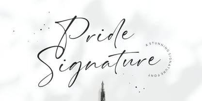 I'd like to introduce you Pride Signature! an elegant signature font. Font with natural flow and feminine style. Each letter is deliberately imperfect to make it look more natural and charming. Pride Signature comes with multilingual support, long range ligature, and ending swash from a-z. Pride Signature is perfect for many design needs such as merch, T-shirts, titles, book covers, social media posts, websites, events, and many more. Enjoy the font, Thanks!
 - Sgraffito Display by Ideabuk,
$15.00 Sgraffito Display is a geometric sans-serif typeface. It is perfect for headings, logos, posters, packaging and so much more! The font comes with full upper & lower case characters, numbers, symbols and includes the most common stylistic ligatures. Sgraffito is a technique either of wall decor, produced by applying layers of plaster tinted in contrasting colours to a moistened surface and then scratching so as to reveal parts of the underlying layer.
 - Welth Catritz by Typetemp Studio,
$16.00 Welth Catritz Serif Typeface is a stylish font It has both Classic Modern look. Comes with alternatives and ligatures, helps to create stunning logos, quotes, posts, blog posts. branding projects, magazine imagery, wedding invitations, and much more. WHAT YOU GET: Unique Letterforms Works on PC & Mac Simple Installations Accessible in the Adobe Illustrator, Adobe Photoshop, Microsoft Word Fully accessible without additional design software. To generate all ligatures, please open Adobe Ilustrator/Photoshop - Type - Glyphs.
 - Nagota Script by Typehill Studio,
$12.00 Nagota Script is a calligraphy script font that comes with beautiful alternative characters. a mixture of copper calligraphy with handleting style. Designed to bring style elegance. Nagota Script attracts such a subtle, clean, feminine, sensual, glamorous, simple and very readable typeface. The classic style is perfect to apply in various formal forms such as invitations, labels, menus, Logos, fashion, make up, stationery, letterpress, romantic novels, magazines, books, greeting / wedding cards, packaging, labels.
 - Fireside by Sarid Ezra,
$15.00 Fireside is a logo font with sharp edge that will make your logo and design looks more futuristic and edgy. With the unique characteristic lowercase, this font will make your logo even more stunning. You can use this font for any purpose, especially to make logo e-sport. You can mix and match the uppercase and lowercase to make your logo more advanced. This font also comes with number, symbol, and multilingual support!
 - Troia by Ahmet Altun,
$10.00 Troia Font Family comes in three weights; normal and italic. In addition, with rounded corners, each weight has its own smoother version. Thanks to its large letters and added spaces between the letters, this font can be used to get perfect results and create great works such as web typography, banners, logos, texts, t-shirts and printings, and also presentations. Troia's eye-pleasing and nice-looking style makes writing much more pleasant.
 - Hamada by Linotype,
$29.99 Hamada is a script typeface based on the powerful work of English calligrapher Gaynor Goffe. Hamada captures looseness and charming irregularities of the pen on the page, allowing ink to edge out from the contours and move across curves and letters. Thanks to OpenType, Hamada creates an impression very much like that of real calligraphy. Most of the letters in Hamada have alternate versions; the typeface comes with ligatures, ending swashes, and more.
 - Exorts Compressed by Seventh Imperium,
$15.00 Exorts Compressed is a display font family. This square condensed sans is designed with an increased cap character and tight kerning to give the ability create the large and bold typography. It is made specifically for editorial design, headlines, posters, magazines, clothing and other purpose printed material. The family comes in weight from extra light to extra bold and have italic version of each weight. Features include: OpenType stylistic sets, ligature, and Multiple Language Support.
 - Benevolent by Attractype,
$15.00 Introducing "Benevolent" - A pretty vintage font. With a subtle touch and unique design, Benevolent is an incredibly versatile font, perfect for any type of project from invitations and posters to magazines and corporate identity. Benevolent has two styles, solid regular and decorative which are packaged separately. Each of them comes with a swash and alternative feature. Of course, Benevolent can also be applied to various arts, crafts and jewelry. Happy crafting with Benevolent.
 - Showra by Inumocca,
$20.00 Showra Modern Display Typeface, Bold and powerfull and I want to Presenting Modern and Classy tastes. The Typeface comes with Ligature Sets (more than 240) and alternates Exellent typeface to use for covering your Project, like Branding, Movie Title, Headline Letter, Bookcover or Book Content, Magazine cover, Poster, Quotes Lettering, Logos, and more your project design. - Unique glyphs - Multilingual Characters Support - UPPERCASE - Lowercase - Numeric - Symbol - Punctuation Character - More Than 240 Ligature Set - Stylistic Set
 - Bezura by Adam B. Ford,
$14.00 Bezura is a font designed with an emphasis on minimal nodes. All bezier curves in this font have reference points on 90° or 45°. All corners have a smooth curve to them. It would probably work great when used in vinyl-cutting applications on signage. While it has a very methodical construction, there is enough sway in the font to give it a loose feel for professional projects with an unprofessional feel.
 - Houstoner Script by Martype co,
$19.00 Houstoner Script is a signature script font designed with carefully handcrafted. Also suitable for branding, T-shirt, Wedding Invitation, Classic Design, Logotype, and any project. With two style make you easier to design everything. Comes with many ampersand set to make your design prettier than yesterday, this font also can make you happy when you design something even that you don't like, and of course this font make your design classy, elegant, luxury!
 - Mithella by Lafontype,
$19.00 Mithella is a sans serif family with a pleasant touch. Some letters, especially linear ones, look normative like other rounded sans serifs, but the difference can be seen clearly in curved letters so that it gives a pleasant impression for each series of words. Mithella comes with eight weights ranging from thin to black to complement your design needs be it branding, blogging, logos, advertising, games, cooking, packaging, editorial and publishing, web and screen design.
 - Floopy Chart by Wacaksara co,
$15.00 Floopy Chart | Font Duo ? is a pair of script and sans font, this font is truly inspired by retro and groove music vibes also from American sport scene like baseball and basketball culture. Floopy Chart comes with uppercase, lowercase, numerals, punctuations and so many variations on each character include OpenType alternates and common ligatures to let you customize your designs. Perfect to use for Logotype, Letterhead, Poster, Apparel Design, Label and etc. Thanks, Wacaksara
 - Uniqloves by Fikryal,
$18.00 Uniqloves – Modern Sans, comes with three types of typefaces, Regular, Bold, and Hollow. This font is very suitable to be applied in various aspects of design, and your branding. It’s perfect for logos, branding, title, social media posts, advertisements, product packaging, product designs, label, photography, watermark, special event, magazine, web designs, etc. Features : Multilingual Support If you have any questions please don’t hesitate to contact me follow my Instagram: @fkryall Thank you
 - Aerioz by Letrasupply Typefoundry,
$18.00 Aerioz is a monoline all caps font, comes with over 600 characters including 324 alternate letters. Smooth with rounded lines, simple, elegant, and perfect in any layout project such a headline magazines, custom name, neon sign and more typography work. Aerioz is packed with ornaments and OpenType alternates, you can combine the regular font with the ornament to make it more perfect. How to get access alternate glyphs from open type fonts : http://adobe.ly/1m1fn4Y
 - Modern Cowboys by Gassstype,
$25.00 Here comes a New font, Modern Cowboys is a Cartoonist Western Typeface Vintage Serif Display font this is strong vintage Typeface western-looking display font. This font is great for your next creative project such as logos, printed quotes, invitations, cards, product packaging, headers, Logotype, Letterhead, Poster, Label, and etc. That is why Modern Cowboys has Stylish and unique characteristic more natural look to your text with a more modern look to your text.
 - Ambulatoria by Pepper Type,
$30.00 Ambulatoria is a sturdy open aperture sans-serif that comes in four variations. Each variation, A, B, C, and D, contains alternative variants for certain glyphs that allow the designer to change character and texture of the text. The font family contains 80 fonts altogether, each sporting rich language support including pan-European Latin and Cyrillic. The typeface is intended to work in both large and small text sizes, which makes it a versatile workhorse.
 - Georgica by Mevstory Studio,
$25.00 Georgica is a modern and chic typeface, best used as a display for headings, logos, branding, magazines, product packaging and invitations. Georgica come with clean lines and smooth curves give any project an extra touch of class. If there's anything else you are unsure of feel free to pop me a message :) That's it! Have fun using Georgica Typeface!!! Feel free to follow, like and share. Thanks so much for checking out my shop!
 - Bowling Script by Sudtipos,
$69.00 There is plenty of lyric and literature about looking over one's shoulder in contemplation. What would you have done differently if you knew then what you know now? This is the kind of question that comes out of nowhere. When it does and whether its context is personal or professional make very little difference. It's a question that can cause emotions to rise and passions to run hot. It can trigger priority shifts and identity crises. It's never easy to answer. Three years ago, I published a font called Semilla. My aim with that was to distill the work of Bentele, a lettering artist from early 1950s Germany. Picking such an obscure figure back then was my way of pondering the meaning and efficiency of objectivity in a world where real human events and existences are inevitably filtered through decades of unavoidably subjective written, printed and oral history. And maybe to pat myself on the back for surviving surprises mild and pleasant. Having been fortunate enough to follow my professional whims for quite some time now, I took another, longer look at my idea of distilling Bentele's work again. I suppose the concepts of established history and objectivity can become quite malleable when personal experience is added to the mix. I say that because there I was, three years later, second-guessing myself and opining that Bentele's work can be distilled differently, in a manner more suited to current cultural angles. So I embarked on that mission, and Bowling Script is the result. I realize that it's difficult to reconcile this soft and happy calligraphic outcome with the introspection I've blathered about so far, but it is what is. I guess even self-created first world problems need to be resolved somehow, and the resolution can happen in mysterious ways. Bowling Script is what people who like my work would expect from me. It's yet another script loaded with all kinds of alternation, swashing and over-the-top stuff. All of that is in here. These days I think I just do all that stuff without even blinking. But there are two additional twists. The more noticeable one is ornamental: The stroke endings in the main font are of the typical sharp and curly variety found in sign painting, while the other font complements that with ball endings, sometimes with an added-on-afterwards impression rather than an extension of the actual stroke. In the philosophical terms I was mumbling earlier, this is the equivalent of alternate realities in a world of historical reduxes that by their very nature can never properly translate original fact. The second twist has to do with the disruption of angular rhythm in calligraphic alphabets. Of course, this is the kind of lettering where the very concept of rhythm can be quite flexible, but it still counts for something, and experimenting with angular white space in a project of a very dense footprint was irresistible. After playing for a bit, I decided that it would interesting to include the option of using optically back-slanted forms in the fonts. Most scripts out there, including mine, have a rhythm sonically comparable to four-to-the-floor club beats. So the weirdly angled stuff here is your chance to do the occasional drumroll. Everyone knows we need one of those sometimes. Bowling Script and Bowling Script Balls fonts comes with 1600 characters and features extended Latin-based language support. There are also a basic version of both fonts without all the alternates and extra OpenType features. Bowling family ships in cross-platform OpenType format. We also want to present “Mute”, a visual essay narated by Tomás García and Valentín Muro, about digital life created specially to introduce Bowling Script.
 - Bristles by Typodermic,
$11.95 Step right up folks and feast your eyes on the most authentic and pure font to ever grace the pages of your ad campaign. Bristles is the name, and it’s a font that speaks volumes of homegrown authenticity with every brushstroke. As you gaze upon this sun-bleached and weathered sans-serif, you’ll notice how the paint barely holds onto the substrate. It’s as if the letters themselves are just barely hanging on, like they were painted decades ago and left to weather the storm. But that’s what makes Bristles so special. Its wispy, textured lettering gives your message a voice of purity that simply can’t be replicated by other fonts. Each letter has its own unique character, telling a story that only a sign painter’s hand could convey. And with its letter pair ligatures, Bristles breaks up the monotony of blatantly repeating characters in OpenType-savvy apps. It’s a font that’s as versatile as it is beautiful, perfect for any project that needs a touch of old-school authenticity. So what are you waiting for? Give your message the voice it deserves with Bristles, the font that speaks volumes of homegrown authenticity. Most Latin-based European writing systems are supported, including the following languages. Afaan Oromo, Afar, Afrikaans, Albanian, Alsatian, Aromanian, Aymara, Bashkir (Latin), Basque, Belarusian (Latin), Bemba, Bikol, Bosnian, Breton, Cape Verdean, Creole, Catalan, Cebuano, Chamorro, Chavacano, Chichewa, Crimean Tatar (Latin), Croatian, Czech, Danish, Dawan, Dholuo, Dutch, English, Estonian, Faroese, Fijian, Filipino, Finnish, French, Frisian, Friulian, Gagauz (Latin), Galician, Ganda, Genoese, German, Greenlandic, Guadeloupean Creole, Haitian Creole, Hawaiian, Hiligaynon, Hungarian, Icelandic, Ilocano, Indonesian, Irish, Italian, Jamaican, Kaqchikel, Karakalpak (Latin), Kashubian, Kikongo, Kinyarwanda, Kirundi, Kurdish (Latin), Latvian, Lithuanian, Lombard, Low Saxon, Luxembourgish, Maasai, Makhuwa, Malay, Maltese, Māori, Moldovan, Montenegrin, Ndebele, Neapolitan, Norwegian, Novial, Occitan, Ossetian (Latin), Papiamento, Piedmontese, Polish, Portuguese, Quechua, Rarotongan, Romanian, Romansh, Sami, Sango, Saramaccan, Sardinian, Scottish Gaelic, Serbian (Latin), Shona, Sicilian, Silesian, Slovak, Slovenian, Somali, Sorbian, Sotho, Spanish, Swahili, Swazi, Swedish, Tagalog, Tahitian, Tetum, Tongan, Tshiluba, Tsonga, Tswana, Tumbuka, Turkish, Turkmen (Latin), Tuvaluan, Uzbek (Latin), Venetian, Vepsian, Võro, Walloon, Waray-Waray, Wayuu, Welsh, Wolof, Xhosa, Yapese, Zapotec Zulu and Zuni.
 - Xylo by ITC,
$29.99Xylo is a rugged, no-nonsense typeface that was originally designed in 1924 by the Benjamin Krebs type foundry in Frankfurt am Main, Germany. Even back then, Xylo must have been very popular; the design made it at least as far as England. In 1995, after finding its design in an old London printer's reference book, the Letraset Type Studio faithfully converted Xylo into digital format. A time-proven display face, Xylo will convey a feeling of power and strength in any application. Best used big in headlines or logos; Xylo exudes an expressionistic and art deco spirit that just as much at home today as it was during the roaring 20s! - Wilderness X by Enfeeltype,
$15.00 Wilderness X is a font name that has a very wide wilderness concept. This font has a very large variety of characters, including isolated characters with strong definition and small text. It is also a font which can be used as a random display font. There are also many other options, such as: different stroke thickness and size, change the glyphs and so on A wilder a wilderness, the more rewarding the journey...I love the idea of exploring and staying on the edge, getting dirty and making my path is challenging. Wilderness X is not a bland font but has a bit of badness in it which makes it more interesting and attractive.
 - Maisharah Script by FadeLine Studio,
$15.00 Maisharah a new Modern Script Calligraphy with its own unique flow and elegant personality :) With a style like this, this font will be suitable in use for logo's, branding projects, homeware designs, product packaging, mugs, quotes, posters, shopping bags, logo's, t-shirts, book covers, name card, invitation cards, greeting cards, and all your other lovely projects. You can use this font for your job very easily. Because there are many features in it. It contains a complete set of lower and uppercase letters, punctuation, numbers, web fonts, and multilingual support. This font also includes several ligatures and alternative style Stylistic Set For those of you who have software that is capable of working OpenType (Corel Draw / Photoshop / Illustrator / InDesign).
 - FS Untitled Variable by Fontsmith,
$319.99Developer-friendly The studio has developed a wide array of weights for FS Untitled – 12 in all, in roman and italic – with the intention of meeting every on-screen need. All recognisably part of a family, each weight brings a different edge or personality to headline or body copy. There’s more. Type on screen has a tendency to fill in or blow so for each weight, there’s the choice of two marginally different versions, allowing designers and developers to go up or down a touch in weight. They’re free to use the font at any size on any background colour without fear of causing optical obstacles. And to make life even easier for developers, the 12 weight pairs have each been designated with a number from 100 (Thin) to 750 (Bold), corresponding to the system used to denote font weight in CSS code. Selecting a weight is always light work. Easy on the pixels ‘It’s a digital-first world,’ says Jason Smith, ‘and I wanted to make something that was really functional for digital brands’. FS Untitled was made for modern screens. Its shapes and proportions, x-height and cap height were modelled around the pixel grids of even low-resolution displays. So there are no angles in the A, V and W, just gently curving strokes that fit, not fight, with the pixels, and reduce the dependency on font hinting. Forms are simplified and modular – there are no spurs on the r or d, for example – and the space between the dot of the i and its stem is larger than usual. The result is a clearer, more legible typeface – functional but with bags of character. Screen beginnings FS Untitled got its start on the box. Its roots lie in Fontsmith’s creation of the typeface for Channel 4’s rebrand in 2005: the classic, quirky, edgy C4 headline font, with its rounded square shapes (inspired by the classic cartoon TV shape of a squidgy rectangle), and a toned-down version for use in text, captions and content graphics. The studio has built on the characteristics that made the original face so pixel-friendly: its blend of almost-flat horizontals and verticals with just enough openness and curve at the corners to keep the font looking friendly. The curves of the o, c and e are classic Fontsmith – typical of the dedication its designers puts into sculpting letterforms. Look out for… FS Untitled wouldn’t be a Fontsmith typeface if it didn’t have its quirks, some warranted, some wanton. There’s the rounded junction at the base of the E, for example, and the strong, solid contours of the punctuation marks and numerals. Notice, too, the distinctive, open shape of the A, V, W, X and Y, created by strokes that start off straight before curving into their diagonal path. Some would call the look bow-legged; we’d call it big-hearted. - FS Untitled by Fontsmith,
$80.00 Developer-friendly The studio has developed a wide array of weights for FS Untitled – 12 in all, in roman and italic – with the intention of meeting every on-screen need. All recognisably part of a family, each weight brings a different edge or personality to headline or body copy. There’s more. Type on screen has a tendency to fill in or blow so for each weight, there’s the choice of two marginally different versions, allowing designers and developers to go up or down a touch in weight. They’re free to use the font at any size on any background colour without fear of causing optical obstacles. And to make life even easier for developers, the 12 weight pairs have each been designated with a number from 100 (Thin) to 750 (Bold), corresponding to the system used to denote font weight in CSS code. Selecting a weight is always light work. Easy on the pixels ‘It’s a digital-first world,’ says Jason Smith, ‘and I wanted to make something that was really functional for digital brands’. FS Untitled was made for modern screens. Its shapes and proportions, x-height and cap height were modelled around the pixel grids of even low-resolution displays. So there are no angles in the A, V and W, just gently curving strokes that fit, not fight, with the pixels, and reduce the dependency on font hinting. Forms are simplified and modular – there are no spurs on the r or d, for example – and the space between the dot of the i and its stem is larger than usual. The result is a clearer, more legible typeface – functional but with bags of character. Screen beginnings FS Untitled got its start on the box. Its roots lie in Fontsmith’s creation of the typeface for Channel 4’s rebrand in 2005: the classic, quirky, edgy C4 headline font, with its rounded square shapes (inspired by the classic cartoon TV shape of a squidgy rectangle), and a toned-down version for use in text, captions and content graphics. The studio has built on the characteristics that made the original face so pixel-friendly: its blend of almost-flat horizontals and verticals with just enough openness and curve at the corners to keep the font looking friendly. The curves of the o, c and e are classic Fontsmith – typical of the dedication its designers puts into sculpting letterforms. Look out for… FS Untitled wouldn’t be a Fontsmith typeface if it didn’t have its quirks, some warranted, some wanton. There’s the rounded junction at the base of the E, for example, and the strong, solid contours of the punctuation marks and numerals. Notice, too, the distinctive, open shape of the A, V, W, X and Y, created by strokes that start off straight before curving into their diagonal path. Some would call the look bow-legged; we’d call it big-hearted.
 - Thanks Lovely by Yoga Letter,
$15.00 "Thanks Lovely" is a modern handwritten font, featuring a decorated heart on each character. It's perfect for Valentine's Day, Christmas, Thanksgiving, weddings, invitations and more. This font is PUA coded which means you can find all glyphs and glyphs easily!
 - Date Night JNL by Jeff Levine,
$29.00 The opening title card for 1931's pre-code movie drama "Other Men's Women" (with Mary Astor, Regis Toomey, James Cagney and Joan Blondell amongst the cast members) is the basis for the Art Deco type face Date Night JNL.
 - BatangChe by Microsoft Corporation,
$129.00BatangChe™ font features a mincho (serif) stroke style with half-width Latin characters. This BatangChe font file is 6.9 MB in size. BatangChe is a trademark of the Microsoft Corporation. BatangChe Character Set: Latin 1, Korean code page 949 - Achtung by Mikołaj Grabowski,
$39.00 This is an extension of Mikolaj's Grabowski first typeface. Formerly known as EPILEPSJA, now coming as ACHTUNG. Adding lowercase and small caps, as well as additional language support including Cyrillic script and some dingbats. ACHTUNG Color Type Family has a range of application from warnings and safety signage to propaganda posters and anarchist graffiti. Every place where you need an indisputable message, be it in headlines or titles, this font comes in handy. It’s a stencil, it’s layered and impossibly dimensional. Download the specimen HERE. I advise you to do so in order to being aware of how the layers work and how to use color fonts. Total of 1020 glyphs. Languages: Afrikaans, Albanian, Bosnian, Bulgarian, Catalan, Croatian, Czech, Danish, Dutch, English, Estonian, Finnish, French, German, Hungarian, Icelandic, Italian, Latvian, Lithuanian, Macedonian, Maltese, Norwegian, Polish, Portuguese, Romanian, Russian, Serbian, Slovak, Slovenian, Spanish, Swedish, Turkish, Ukrainian, Vietnamese, Zulu. OpenType features: small caps, localizations, superscript, fractions, ordinals, proportional and tabular figures, case sensitive forms, stylistic alternates, contextual alternates, and proper mark attachment.
 - Olarwe by Ardyanatypes,
$15.00 A modern and elegant look of a sans serif tagline. This font comes with nine levels of thickness, from light to black, according to your needs. It pairs well with san serif and modern script as pictured or stands alone as a representative header and brand for an elegant look. Olarwe is equipped with a professional modern character font that can present an elegant and attractive identity for your company for business use, such as business cards, name tags, and uniforms as brand elevation. This modern Olarwe typeface is suitable for embossing as letter nameplates or even sprinkling them in your office with elegant-looking cutting stickers. This elegant Olarwe-type shape also looks excellent for book covers or magazine articles. You can see all the available characters in the screenshot above, and you can try the modern & elegant Olarwe now for any design issues. Olarwe is also multilingual, making it easy to work with for any country and language use. It also comes with Ligatures and alternative stylistics to make your designs more attractive.
 - Hinnual by Jipatype,
$27.00 Hinnual เป็นฟอนต์ที่ผสมผสานระหว่างรูปทรงสี่เหลี่ยมและทรงกลมเพื่อสร้างสไตล์ที่ไม่เหมือนใคร ชื่อมาจากคำไทย 2 คำ คือ Hin แปลว่า หิน และ Nual แปลว่า อ่อน ผสมผสานองค์ประกอบที่แข็งและอ่อนนี้สะท้อนให้เห็นในแบบอักษร ซึ่งมีเส้นที่สะอาดตาและเส้นคมซึ่งถูกทำให้อ่อนลงด้วยมุมโค้งมน ฟอนต์มีให้เลือกถึง 18 แบบ มีตัวเลือกหลากหลายให้คุณได้เลือกใช้ Hinnual เหมาะอย่างยิ่งสำหรับใช้ในพาดหัวและพาดหัวย่อย ซึ่งลักษณะที่โดดเด่นสามารถช่วยดึงดูดความสนใจของผู้อ่านได้ เส้นสายที่สะอาดตาและสไตล์ที่เป็นเอกลักษณ์ยังทำให้เป็นตัวเลือกที่ยอดเยี่ยมสำหรับแบรนด์ โลโก้ และงานออกแบบอื่นๆ ที่ต้องการภาพลักษณ์ที่น่าจดจำ โดยรวมแล้ว Hinnual เป็นฟอนต์อเนกประสงค์และสะดุดตาที่ผสมผสานองค์ประกอบทั้งความแข็งแกร่งและความนุ่มนวล การออกแบบที่เป็นเอกลักษณ์ทำให้เป็นตัวเลือกที่ยอดเยี่ยมสำหรับนักออกแบบที่ต้องการสร้างผลงานที่น่าจดจำ Hinnual is a font that combines the square and rounded shapes to create a unique visual style. Its name comes from two Thai words - Hin, which means stone, and Nual, which means soft. This juxtaposition of hard and soft elements is reflected in the font's design, which features clean, sharp lines softened by rounded corners. The font comes in 18 styles, providing a range of options for designers to choose from. Hinnual is particularly well-suited for use in headlines and sub-headlines, where its bold and distinctive appearance can help to grab the reader's attention. Its clean lines and unique style also make it a great choice for branding projects, logos, and other design elements that require a memorable. Overall, Hinnual is a versatile and eye-catching font that combines elements of both strength and softness. Its unique design make it an excellent choice for designers looking to create impactful visual content.
 - Night Visions by Wing's Art Studio,
$14.00 Night Visions: An Unsettling Hand-Drawn Brush Script Font Night Visions is a hand-drawn script font with a loose style typical of late night horror and thriller movie posters. It’s designed to look as though ink has been laid with the nervous flick of the artists brush, giving a random, imperfect, but elegant result. This font comes with the flowing script of the regular version or a complete set of non-script alternatives. Added to which there are additional character alternatives and special ligatures to experiment with for a truly hand-made look. Each version comes with a full set of uppercase and lowercase characters along with numerals, punctuation and language support. I recommend this font for anyone about to design a header or title that needs an authentically hand-made look. It’s the perfect choice for movie titles or posters, album covers, comic books, t-shirts or editorials. It’s a font that rewards experimentation and offers many options for your designs. Check out the visuals for usage ideas.
 - Bigfoot by Canada Type,
$24.95 Bigfoot is the fattest font ever made. It began as a simple exercise given to students in a design course: Most people don't appreciate type because they don't really know what it actually is. One way to understand it is looking at it like a combination of sculptures that have to work together to achieve a certain harmony, where each letter form is one of those sculptures. Most people understand and appreciate that a sculpture starts from a rock of an incomprehensible form, which is manipulated by someone into becoming the recognizable or abstract work of art it eventually is. Consider type design a kind of two-dimensional sculpting. You have a rectangle. Take away as a little as possible from it until it is recognizable as the letter A. Repeat to get the letter B, and so on. After all 26 minimal letters are made, do they actually function as an alphabet to build words and sentences that are recognizable to the human eye? This exercise can trigger thoughts and theories about the overall subjective nature of identifying abstract yet somewhat familiar shapes. It can go into the psyche of art in general. But one thing for certain, this exercise has so far helped a few people find a new appreciation for finely crafted typefaces. If you are a design educator, your students' typographical perspective and arguments would benefit from it. And if you are a designer, well, fat faces are all the rage these days, and this is as fat as it can get. Please note that that this typeface, due to its minimalistic nature, does not include accented characters. It does however support the full C0 Controls and Basic Latin Unicode set. All proceeds from this font go to support the Type Club of Toronto.
 - Bookseller Bk by Cyanotype,
$20.00 Bookseller Bk is a typeface designed for books and legible text at a small sizes, with an old book feeling. This typeface is the reinterpretation of a sample found in a French book, published between 1882 and 1893 and its author —Ernest Michel— lived between 1837 and 1896. This sample has influence from Didot, Scotch Roman and Clarendon (typefaces which were in use at that time). This reinterpretation expands the basic set for the contemporary era. Bookseller Bk includes small caps, old style figures, lining figures, fractions and basic Cyrillic alphabet. Everything in 3 different optical widths. You can save some lines with Reduced weight or fill some lines with Ample weight. All of them with italics, bold and bold italics. Bookseller Bk is also available in Caption size. 12 fonts for legibility at smaller sizes. Subhead & Title sizes are now in development. Finally this typeface was the result of the course Digital Reinterpretation of Classic Typography by Oscar Guerrero Cañizares at Domestika. Do you require additional glyphs? Please contact me to consider your request in order to expand Bookseller in further updates.
 - Pegasus by chicken,
$23.00 Pegasus scrapes the DNA of a great twentieth century painter who scattered text across his work like no other… not any kind of facsimile, but tough, playful, adaptable display type forged from the bones of a unique writing hand. Three weights - Skinny, Domestic and Peso - each offer five alternates for each letter, three for each numeral and multiple versions of many punctuation and other symbols. Letters are uppercase only with the lowercase providing one of the alternate forms of each letter… with OpenType Contextual Alternates switched on, you get automatic variation between the two… and you can manually throw in wilder variations from the remaining alternates. Some repeated punctuation - periods, question marks, etc. - are automatically varied too. OpenType Stylistic Set 1 switches to a rowdier selection from the alternates… Set 2 flips all the E’s to distinctive ‘skeleton’ alternates… Set 3 introduces automatic variation into numerals. Save some $$$ by purchasing the Whole Livery Line - all three weights at a nice discount... or, if you're really hurting, Cheapskate offers just two alternates for each letter and a single set of numerals.
 - PB Roman Uncial Vc by Paweł Burgiel,
$32.00 PB Roman Uncial Vc is a font face designed for imitate Roman uncial writing style found in manuscripts from 4th to 5th century. All characters are handwritten by use ink and reed pen (calamus), scanned, digitized and optimized for best quality without lost its handwritten visual appearance. Character set support codepages: 1250 Central (Eastern) European, 1252 Western (ANSI), 1254 Turkish, 1257 Baltic. Include also additional characters for Cornish, Danish, Dutch and Welsh language, spaces (M/1, M/2, M/3, M/4, M/6, thin, hair, zero width space etc.), historical characters (overlined Roman numerals, abbreviations, I-longa, historical ligatures for "nomina sacra" and "notae communes") and wide range of ancient punctuation. OpenType TrueType TTF (.ttf) font file include installed OpenType features: Access All Alternates, Localized Forms, Fractions, Alternative Fractions, Ordinals, Superscript, Tabular Figures, Proportional Figures, Stylistic Alternates, Stylistic Set 1, Historical Forms, Historical Ligatures. Include also kerning as single 'kern' table for maximum possible backwards compatibility with older software. Historical ligatures for "nomina sacra" and "notae communes" are mapped to Private Use Area codepoints.