10,000 search results
(0.063 seconds)
- Baystar Script by Mans Greback,
$59.00 Baystar Script is a high-quality script typeface. Drawn and created by Mans Greback in 2021, this calligraphic font has power, style and stamina. The type’s organic, handwritten lettering is well suited for a variety of applications: from happy, playful designs, to super sleek web graphics and vivid logotypes. It has velocity like a mustang, a brilliant look and–with its hundreds of alternates–is truly dynamic. It flows with quick turns, marking out brush strokes and connecting tails, like a genuine, hand-painted writing should. Write multiple underscores to make swashes of different lengths. Example: Corvette_______ Baystar Script is legible and professional while retaining the personality that is valued in handwriting. Drawn in accordance with the latest trends in design, but is inspired by retro logotype lettering such as Chevrolet Chevelle and Camaro. A modern calligraphy, fast as a sport race car or sharp as a stingray, the letters are characterized by thorny edges and tall ascenders. It comes in three weights; Light, Medium and Bold, making it useful in any size and context. The font is built with advanced OpenType auto-functionality and guaranteed top-notch quality, containing stylistic and contextual alternates, ligatures and more automatic and manual features; all to give you full control and customizability. It has extensive lingual support, covering all Latin-based languages, from North Europa to South Africa, from America to South-East Asia, as well as Cyrillic (Russian, Serbian, Bulgarian) and the Greek alphabet. It contains all characters and symbols you'll ever need, including all punctuation and numbers. Let this font help you to transform your professional work into an energetic piece of handmade art!
 - Doodly by Luxfont,
$8.00 Introducing a funny, playful doodle font with soft sloppy glyphs. Easily turning text into handwritten. Font family is cool for complementing a design with a doodle or sketch illustration, the font does not have complex spelling of letters, therefore it is suitable for a children's audience and will complement a children's book, as well as fit into any design with a playful holiday theme, and much more. Family has 2 font styles with different interchangeable letters (different only uppercase and lowercase, other glyphs are identical) - can be used as alternate's. Family of 6 fonts is divided into 3 types: regular/basic, italic and outline. Features: 6 fonts 2 styles (Regular, Medium) with different interchangeable letters (different only uppercase and lowercase, other glyphs are identical) 3 types: Basic, Italic, Outline Kerning ld.luxfont@gmail.com
 - Faux Pas JNL by Jeff Levine,
$29.00 The lettering found on an 1878 Salt Lake City advertisement for the Forepaugh’s Circus inspired Faux Pas JNL, which is a bit of a pun on the circus’ name and also a commentary on how this unusual lettering style seems to break all of the rules on stroke width and balance. According to Wikipedia: “Adam John Forepaugh (February 28, 1831 - January 22, 1890) was an American entrepreneur, businessman, and circus owner. Forepaugh owned and operated a circus from 1865 through 1890 under various names including Forepaugh's Circus, The Great Forepaugh Show, The Adam Forepaugh Circus, and Forepaugh & The Wild West. In 1889, Forepaugh sold his circus acts to James Anthony Bailey and James E. Cooper and he sold his railroad cars to the Ringling Brothers. The Ringlings used the equipment to transform their circus from a small animal-powered production to a huge rail-powered behemoth, which later purchased the Barnum & Bailey Circus. Thus, in liquidating his circus assets, he indirectly contributed to the demise of his arch-rival.” Faux Pas JNL is available in both regular and oblique versions.
 - Exceptional by Studio&Story,
$16.00 Exceptional Is a super trendy Handwritten font, Elegant & modern with gentle brush texture , Exceptional comes with a complete set of lowercase and uppercase alternates(Uppercase letters can be used alone), It gives you the option to customize your text and to make it much more unique (It's very fun). And more great extra is the bonus Swash, this set come with 26 swashes, which allows you to add elegant & trendy finishing touches to your work. It's the perfect choice for personal branding projects, product packaging, social media, fashion, advertising and more!...
 - Frequent Flyer by Hanoded,
$16.00 I used to be a frequent flyer; as a tour guide I often had 6 to 10 international flights per year. At the time I didn’t even think about the consequences of flying, as I loved my job and the job was all about travel. Now, with the planet in deplorable state, I try to keep flying to an utter minimum. I guess you call it ’shame of flying’… Frequent Flyer font is a nice, eroded, all caps font. It comes with multilingual support, so you may come across it during your travels.
 - Magallanes Condensed by Latinotype,
$29.00 Say hello to the new Magallanes Condensed Family, a contemporary neo-humanist sans serif font designed by Daniel Hernández. Its strokes and terminals are related to the calligraphic strokes from humanist typefaces. It comes with 8 styles, from Ultra Light to Black, each with its true italics. Every weight comes with alternative glyphs for a more dynamic use. Magallanes is the perfect titling font to complement text faces in magazines, logotypes, etc. Languages supported include Basic Latin, Western European, Euro, Catalan, Baltic, Turkish, Central European, Romanian, Pan African Latin.
 - Magallanes by Latinotype,
$29.00 Say hello to the new Magallanes Family, a contemporary neo-humanist sans serif font designed by Daniel Hernández. Its strokes and terminals are related to the calligraphic strokes from humanist typefaces. It comes with 8 styles, from Ultra Light to Black, each with its true italics. Every weight comes with alternative glyphs for a more dynamic use. Magallanes is the perfect titling font to complement text faces in magazines, logotypes, etc. Languages supported include Basic Latin, Western European, Euro, Catalan, Baltic, Turkish, Central European, Romanian, Pan African Latin.
 - DT Skiart Serif Leaf by Dragon Tongue Foundry,
$10.00 ‘Skiart Serif Leaf’ has been on a long growing path getting to where it is now. Originally inspired by the san serif font ‘Skia’ by Mathew Carter for Apple. ‘Skiart’ was designed to feel more like a serifed font, but without any serifs. It took a step between sans serif and serif fonts. Next on the path towards a serif font came Skiart Serif Mini, with tiny serifs added. This was a true serif font, although they were subtle. This font ‘Skiart Serif Leaf’ is the next in the series. After many reiterations, ‘Skiart Serif Leaf’ was built and rebuilt many times until finally, this version deserved to be presented to the world. Style and flow had been added to this font. It remained fully readable and feels as clean and normal as any of the best body copy serifs, and yet has an original modern flair to it. The font feels strong and solid while having a subtle organic flow in its form. If compared to one of the more commonly used serifs like ‘Times New Roman’, the ‘Skiart Serif Leaf’ lowercase is more open with a taller x-height, increasing its readability and friendliness. The serifs are smaller and less distracting. They are not pretending to be ligatures. This font may be organic but is not in anyway script like. Where ‘Times’ makes its p q b d forms out of a barely touching oval and stem, the ‘Serif Leaf’ forms are much more firmly attached, appearing clearly as single letters. The standard setting for the a’s and g’s are round single story, feeling warmer and more inviting in the ‘Serif Leaf’ font. Much more friendly than the stuffy double storied versions in fonts like ‘Times’ etc. ‘Skiart Serif Font’ comes with a somewhat organic italic.
 - Dotum by Microsoft Corporation,
$129.00Dotum™ features plain strokes similar to sans serif designs with proportional Latin characters, and works well for on-screen display such as user interfaces. This Dotum font file is 5.2 MB in size. Dotum is a trademark of Microsoft Corporation. Dotum font Character Set: Latin 1, Korean code page 949 - DotumChe by Microsoft Corporation,
$129.00DotumChe™ features plain strokes similar to sans serif designs with half-width Latin characters, and works well for on-screen display such as user interfaces. This DotumChe font file is 5.2 MB in size. DotumChe is a trademark of Microsoft Corporation. DotumChe Character Set: Latin 1, Korean code page 949 - GulimChe by Microsoft Corporation,
$129.00GulimChe™ features plain strokes similar to sans serif designs with half-width Latin characters, and works well for on-screen display such as user interfaces. This GulimChe font file is 5.2 MB in size. GulimChe is a trademark of Microsoft Corporation. GulimChe Character Set: Latin 1, Korean code page 949 - MS Gothic by Microsoft Corporation,
$39.00MS Gothic™ Japanese font features plain strokes similar to sans serif designs, and works well for on-screen display such as user interfaces. This file is 4.4 MB in size. MS Gothic is a trademark of Microsoft Corporation. MS Gothic font Character Set: Latin-1, Japanese (Code Page 932) - ND Alias by NeueDeutsche,
$9.00 ND Alias is a monolinear sans serif coming in 8 weights and 3 widths, so a total of 24 styles. The design is an exploration of abnormal, minimalist, or hyper-reduced glyph shapes, which create a rather interesting degree of ambiguity while retaining legibility at the same time. Alias supports multiple scripts including a full set of Latin, Cyrillic, Greek, and Hebrew glyphs. Its aesthetics are rather serious and hyper futuristic and would be a perfect choice for a blockbuster sci-fi title sequence set over images of a nuclear wasteland or printing out the manifest of a vessel in orbit of a dark planet, the choice is yours. If you are adventurous try the regular style for copy even – you will be surprised. The wide options are great for titles and branding. Mix and match as you please!
 - Montague Script by Stephen Rapp,
$59.00 Montague Script takes its name from a small hilltown of western Massachusetts rich in culture and history. I lived in this beloved community for a number of years and it’s where I first began my study of calligraphy and lettering. While most brush scripts take their cue from mid-twentieth century samples, Montague Script is a fresh, contemporary alternative. It comes directly from lettering written with a #3 sable brush on smooth vellum and is digitized with the same sensibility a lettering artist writes with. Montague reflects a dynamic interplay between form and rhythm not usually associated with type. Words suggest a baseline, yet are not bound by it. Beginnings, endings, alternates and ligatures come in as needed while you type. Many more alternates are available in the glyph palette of most current graphic software. Exuberant swash versions of upper and lowercase letters, as well as ligatures can be accessed through both the type and glyph palettes. Montague Script is a natural for advertising, point of purchase displays, packaging and logo design, cards, invitations, journals and much more. You will be delighted at how well it can dress up a project and how easily it sets.
 - Lovely Flowers by Fargun Studio,
$14.00 Lovely Flowers is modern script that perfect for photography, branding, signature. It is so beautiful and classy for your projects. This font has given PUA code (specially coded fonts). So that all the alternate characters can easily be accessed in full by a craftsman or designer.
 - Hamdany by Fargun Studio,
$16.00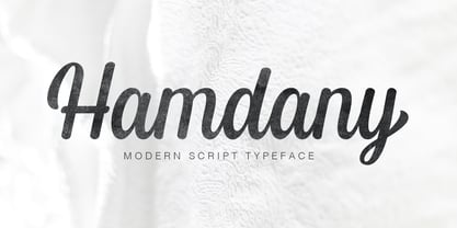 Hamdany is modern script typeface that perfect for photography, branding, signature. It is so beautiful and classy for your projects. This Font has given PUA code (specially coded fonts). So that all the alternate characters can easily be accessed in full by a craftsman or designer.
 - Hanthem Script by Fargun Studio,
$14.00 Hanthem Script is modern script that perfect for photography, branding, signature. It is so beautiful and classy for your projects. This Font has given PUA code (specially coded fonts). So that all the alternate characters can easily be accessed in full by a craftsman or designer.
 - Noeri by Inumocca,
$21.00 Noeri is Western typeface. inspiration come from cowboy era and I want to Presenting the letterform style of that era. The Typeface comes with Stylistic Set Exellent typeface to use for covering your Project, like Branding, Movie Title, Headline Letter, Bookcover or Book Content, Magazine cover, Poster, Quotes Lettering, Logos, and more your project design. - Unique glyphs - Multilingual Characters Support - UPPERCASE - Lowercase - Numeric - Symbol - Punctuation Character - Stylistic Set inumocca type Studio
 - Blob Control by Rachel McBride Creative,
$9.00 Blob Control is the perfect typeface to use for any project that needs a youthful or juvenile flair. It's inspired by the messy, eccentric nature of adolescence. It comes with seven fonts and weights, so it can work with any project it's needed in! It comes equipped with over 400 characters to support most western languages! Great for use on children's books, toys, handwritten projects, retro projects, websites, and animations/cartoons.
 - Maitland Script by Aminmario Studio,
$20.00 This font was created to look as close to a natural handwritten script, as possible by including alternates lowercase, swash lowercase, ligature and underlines. Built in Opentype features, this script comes to life as if you were writing it yourself. Comes with regular and italic. Also support multilingual.Perfect for any awesome projects that need hand writing taste. This is suitable for branding, quotes, invitations, stationery, wedding design, logos, watermarks on photography, signatures, advertisement, album covers, business cards, clothing, magazines, posters, and more!
 - Antomades by Aminmario Studio,
$20.00 Introducing Antomades font is a modern and elegant handwritten font with varying thickness and a charming gesture. This font was created to look as close to a natural handwritten script. Perfect for any awesome projects that need hand writing taste. Comes with regular and italic. With built in Opentype features, this script comes to life as if you were writing it yourself. Don't hesitate if you have any questions. Thanks for checking out this font. I hope you enjoy it! AminMario
 - Darker Marker by Hanoded,
$15.00 Darker Marker is just what the name suggests: I found a very big fat marker in a local stationary store, bought it, came home and went to work on this font. Darker Marker is a very clear, very easy to read marker font. It is all caps, but upper and lower case differ and can be interchanged. Darth Vader would have said: “come to the dark side” and I believe you should. Darker Marker comes preloaded with all the diacritics you need.
 - Tangerang by Aminmario Studio,
$20.00 This font was created to look as close to a natural handwritten script as possible by including alternates lowercase, swash lowercase, ligature and underlines. Built in Opentype features, this script comes to life as if you were writing it yourself. Comes with regular and italic. Also support multilingual.Perfect for any awesome projects that need hand writing taste. This is suitable for branding, quotes, invitations, stationery, wedding design, logos, watermarks on photography, signatures, advertisement, album covers, business cards, clothing, magazines, posters, and more!
 - Nesans by HansCo,
$15.00 Create something elegant and classy with a modern touch. Nesans Duo Font gives a sleek, elegant look to logos, business cards, wedding invitations, quotes, advertisements, and more. Nesans is a versatile typeface that's full of character and one you'll come back to time and again. Create something beautiful today with Nesans. This typeface comes in uppercase and lowercase, with punctuation, symbols, numerals, stylistic alternates and also has multilingual support. Tutorial how to Install & use Alternate / Special Character : https://hanscostudio.com/tutorial/ Enjoy!
 - Absolute Beauty by My Creative Land,
$34.99 Absolute Beauty is a happy family of a smooth casual monoline signature script and a high contrast elegant didone serif. The signature script comes in three weights to cover as much design needs as possible - from websites to brand design, from magazines to billboards. It compliments from OpenType features such as ligatures, swashes, stylistic and contextual alternates, and is fully unicode mapped. Absolute Beauty serif is an ideal partner for the script: it features the same elegance and comes in two weights.
 - Amatya Signature by Aminmario Studio,
$20.00 This font was created to look as close to a natural handwritten script as possible by including alternates lowercase, swash lowercase, ligature and underlines. Built in Opentype features, this script comes to life as if you were writing it yourself. Comes with regular and italic. Also support multilingual.Perfect for any awesome projects that need hand writing taste. This is suitable for branding, quotes, invitations, stationery, wedding design, logos, watermarks on photography, signatures, advertisement, album covers, business cards, clothing, magazines, posters, and more!
 - Isabel by Letritas,
$30.00 Isabel was made out of necessity to create a new font for children and teenagers, that could be enough friendly and versatile for text in words or even easy-to- read long texts. The purpose of Isabel is to combine all the nice and friendly features of the simple letters that the teachers teach to the pupils at primary school, as they starting to learn to read, together with the normal editorial fonts we read every day. In this way it generates a very joyful serif font, or even friendly font, with some conservative aspects. In other words, Isabel is a font that, despite of being a “classic features” typography, is proud to show its innocent and ingenuous elements, this gives to the font a new point of view. The family is composed of 3 parts: the regular version, the italic version and the unicase version. Each one of them has 5 weights, 551 characters and is composed of 208 languages.
 - Phinney Jenson by HiH,
$12.00 Phinney Jenson ML is a font with deep historical roots firmly planted in the fertile soil of the Italian Renaissance. Twenty years after Lorenzo Ghiberti finished his famous East Doors, the Gates of Paradise, of Santa Maria del Fiore in Florence and about fifteen years before Sandro Botticelli painted his “Birth of Venus,” a French printer by the name of Nicolas Jenson set up a small print shop in the powerful city-state of Venice. The fifteenth century marked the end of the plague and the rise of Venetian power, as the merchants of Venice controlled the lucrative trade of the eastern Mediterranean and sent their ships as far as London and even the Baltic. In 1470, Jenson introduced his Roman type with the printing of De Praeparatio Evangelica by Eusebuis. He continued to use his type for over 150 editions until he died in 1480. In 1890 a leader of the Arts & Crafts movement in England named William Morris founded Kelmscott Press. He was an admirer of Jenson’s Roman and drew his own somewhat darker version called GOLDEN, which he used for the hand-printing of limited editions on homemade paper, initiating the revival of fine printing in England. Morris' efforts came to the attention of Joseph Warren Phinney, manager of the Dickinson Type Foundry of Boston. Phinney requested permission to issue a commercial version, but Morris was philosophically opposed and flatly refused. So Phinney designed a commercial variation of Golden type and released it in 1893 as Jenson Oldstyle. Phinney Jenson is our version of Phinney’s version of Morris' version of Nicolas Jenson’s Roman. We selected a view of the Piazza San Marco in Venice for our gallery illustration of Phinney Jenson ML because most of the principal buildings on the Piazza were already standing when Jenson arrived in Vienna in 1470. The original Campanile was completed in 1173 (the 1912 replacement is partially visible on the left). The Basilica di San Marco was substantially complete by 1300. The Doge’s Palace (not in the photo, but next to the Basilica) was substantially complete by 1450. Even the Torre dell'Orologio (Clock Tower) may have been completed by 1470—certainly by 1500. Phinney Jenson ML has a "rough-and-ready" strength, suitable for headlines and short blocks of text. We have sought to preserve some of the crudeness of the nineteenth-century original. For comparison, see the more refined Centaur, Bruce Rogers's interpretation of Jenson Roman. Phinney Jenson ML has a strong presence that will help your documents stand out from the Times New Roman blizzard that threatens to cover us all. Phinney Jenson ML Features: 1. Glyphs for the 1252 Western Europe, 1250 Central Europe, the 1252 Turkish and the 1257 Baltic Code Pages. Accented glyphs for Cornish and Old Gaelic. Total of 393 glyphs. 400 kerning pairs. 2. OpenType GSUB layout features: onum, pnum, salt, liga, dlig, hisy and ornm. 3. Tabular (std), proportional (opt) & old-style numbers (opt). 5. CcNnOoSsZz-kreska available (salt).
 - Ongunkan France Glozel Runic by Runic World Tamgacı,
$100.00 In March 2010, Émile Fradin, a modest peasant farmer from central France, died at the age of 103. To his grave he took the secret behind one of the most controversial archaeological discoveries of the 20th century. A discovery which put into question the very origins of the written word and the paternity of European culture. It was the uncovering of peculiar artefacts would come to be known as the Glozel runes. The discovery of the Glozel runes On the first day of March 1924, a not yet 18-year-old Fradin was ploughing his family’s field in the hamlet of Glozel, when his cow stumbled into a hole. When he and his grandfather, Claude, looked closer, they discovered a mass of broken stone, under which lay an underground chamber. Within, they discovered pottery fragments, carved bones, and a peculiar clay tablet covered in bizarre characters that neither of the two could decipher. The family requested a subsidy for excavation works to be carried out, but were refused by the regional authority. With that disappointment, it seemed as though the discovery would fade into obscurity. However, the following year, news of Fradin’s unusual clay tablet reached the ears of the physician and amateur archeologist, Antonin Morlet. By the end of May 1925, Morlet began the first of his excavations.4 Within the first two years alone, he had amassed some 3,000 finds.
 - Whacker by PizzaDude.dk,
$20.00Whacker is made using a fat, inky marker. Comes with ligatures for double letters and alternate versions of the lowercase letters. You will need to use OpenType supporting applications to use the ligatures. - Triunfo by Corradine Fonts,
$19.95 Triunfo is a modern slab serif font family with sports flavor. It comes in 21 variants of weight and wide that allows you to choose the best option to use in your work.
 - Grischel by Martype co,
$18.00 Grischel Is a condensed serif font that comes with tall style for display purposes to make it satisfying, also suitable for minimalist, chic, branding, packaging and merch design to boost your design exploration.
 - Grand Cru by Fenotype,
$25.00 Meet Grand Cru – a new approach to serif type. The type family is divided to three groups – Small, Medium and Large – according to the amount of contrast in letterforms. Forget about those old Text/Display categories – it’s up to you how to use your typeface. While the Grand Cru Large fonts are highly decorative, the Small versions function as reliable workhorses. All Grand Cru fonts come with thoughtful Open Type features – built-in small capitals are found in all of them, while the italics come with handsome Swash capitals. The romans are equipped with intelligent numeral styles including subscript and superscript and fractions.
 - Morris by HiH,
$10.00 Morris is a four-font family produced by HiH Retrofonts and based on the work of the very English William Morris. William Morris wanted a gothic type drawn from the 14th century blackletter tradition that he admired both stylistically and philosophically. He drew from several sources. His principal inspiration for his lower case was the 1462 Bible by Peter Schoeffer of Mainz; particularly notable for the first appearance of the ‘ear’ on the g. The upper case was Morris’s amalgam of the Italian cursive closed caps popular throughout the 12th through 15th centuries, a modern example of which is Goudy’s Lombardic Capitals. The gothic that Morris designed was first used by his Kelmscott Press for the publication of the Historyes Of Troye in 1892. It was called “Troy Type” and was cut at 18 points by Edward Prince. It was also used for The Tale of Beowulf. The typeface was re-cut in at 12 points and called “Chaucer Type” for use in The Order of Chivalry and The Works of Geoffrey Chaucer. Morris' objective is designing his gothic was not only to preserve the color and presence of his sources, but to create letters that were more readable to the English eye. ATF copied Troy and called it Satanick. Not only was the ATF version popular in the United States; but, interestingly, sold very well in Germany. There was great interest in that country in finding a middle ground between blackletter and roman styles -- one that was comfortable for a wider readership. The Morris design was considered one of the more successful solutions. Our interpretation, which we call Morris Gothic, substantially follows the Petzendorfer model used by other versions we have seen, with the following exceptions: 1) a larger fillet radius on the upper arm of the H, 2) a more typically broadpen stroke in place of the foxtail on the Q, which I do not like, 3) inclusion of the aforementioned ear on the g and 4) a slightly shorter descender on the y. We have included five ornaments, at positions 0135, 0137, 0167, 0172 and 0177. The German ligatures ‘ch’ & ‘ck’ can be accessed using the left and right brace keys (0123 & 0125). Morris Initials One and Morris Initials Two are two of several different styles of decorative initial letters that Morris designed for use with his type. He drew from a variety of 15th century sources, among which were Peter Schoeffer’s 1462 Mainz Bible and the lily-of-the-valley alphabet by Gunther Zainer of Augsburg. Each of the two initial fonts is paired with the Morris Gothic lower case. Morris Ornaments is a collection of both text ornaments and forms from the surrounding page-border decorations.
 - DT Meman by DT Foundry,
$25.00 Meman is a practical sans serif that was enthusiastic about adding details to have more personality compared to a neo-grotesque typeface. The typeface was crafted between the concepts of mechanical oval forms and serpentine curves, with the help from open terminals, contrast joints. These 2 concepts are very different, but they balanced each other to help remain the neutral feeling as a whole. Many details are optimized so that on small scales, Meman has nothing special. But when use on bigger scales, letters are revealed to have been dived in visual flourishes, such as the "e". Also, to avoid broken fragments and remain neutral, some details were converted to alternatives. Meman has 9 upright weights (from Thin to Black), and some OpenType features like fractions, ligatures, custom decorative icons, and alternatives for "A", "E", "V", "Z", ... or "a". There are more than 660 glyphs, which support a wide range of Latin languages, including Vietnamese. For usability, the typeface was balanced and versatile, it can be pinned up as a headline or logo, and can still blend in a small paragraph.
 - Mollie Rocky by madeDeduk,
$15.00 Mollie Rocky is a modern groovy family font that is retro typography designs and stylish. The thick and thin stems of the each letters makes a unique retro font. Feature 9 Weight UPPERCASE & Lowercase Number & Symbol International Glyphs Alternative & Ligatures If you need anything else just shoot me on email at: dedukvic@gmail.com Or find more previews on my Instagram here : https://www.instagram.com/acekelgondolayu/?hl=en Hope you enjoy it.
 - Petite Fleur by Wiescher Design,
$39.50 Petite Fleur is a combination of engraved, flowery embellishments and the Capitals of my redesigned Royal Romain (Romain du Roi), the exclusive font of King Louis XIV. It is best used as initials only, but can be mixed with Royal Romain. On the keys for ≥ and ≤ I designed two filler embellishments and the ciphers 0-9 are embellished as well. Enjoy! Your designer of beautiful fonts, Gert Wiescher
 - Artegra Sans by Artegra,
$29.00 Designed by Ceyhun Birinci from 2014-17, is a comprehensive typeface family with 162 fonts. It offers 9 weights with true italics in normal, condensed, and extended widths. Each font contains over 1500 glyphs and supports multilingual including Latin and Cyrillic. It includes various Opentype features like small caps, alternates, and more. The font also provides separate alternates and small caps versions for use in software without OpenType support.
 - Sidewalker by FSD,
$50.00In Sidewalker we can see pieces of OCR-A, letters and of other fonts; letters pressed over metallic supports with too much ink and then redesigned on a computer. Reminiscent of how different materials in Burri or Rauchenberg's paintings are used. Some numbers have the same shape of some letters (J=2, 6=G=9, I=1=l ...) and many pieces of letters are copied into others. Very experimental... - Zamaica by WNGSTD,
$5.00 Zamaica is a thin and modern display font. Add it to your most creative ideas and notice how it makes them come alive!