10,000 search results
(0.023 seconds)
- Namira by Omotu,
$12.00 Namira is a modern calligraphy script font. Namira is suitable for branding, logotype, apparel, T-shirts, Hoodies, product packaging, quotes, flyer, poster, advertising, and more. What's Included? 1. Uppercase and lowercase characters 2. Multilingual support 3. Numerals, punctuation 4. Accessible in the Adobe Illustrator Glyphs panel, or under Stylistic Alternates in the Adobe Photoshop OpenType menu, Adobe InDesign, Corel Draw, even work on Microsoft Word. Please message me if you're unsure of any language support. Thanks for looking, and I hope you enjoy it! Please don't hesitate to drop me a message if you have any issues or queries. Omotu Studio
 - Chunkfeeder by Typeco,
$29.00Chunkfeeder was inspired by the many vernacular forms of lettering created for high speed printing and electronic displays found in our modern techie world such as postal packing slips, airline tickets and informational video displays. Many of these type of fonts are designed by engineers and interface designers who presumably do not have a background in letterform design and consequently these glyphs have many quirky idiosyncrasies. In keeping with it's mechanical inspiration, Chunkfeeder is a monospaced font, much like an OCR type font. Chunkfeeder has a rather ridged modularity but it incorporates more typographic nuance into the letterforms than most other fonts of this style, while exploiting some of the visual artefacts of high speed printing. Chunkfeeder is a versatile family of 6 fonts -- 3 weights, each with an accompanying oblique. - Brocades by Edignwn Type,
$16.00 The font collection is called "Brocades", it is a crafted display with vintage themes. These collections contain monoline script, sans serif stencil and serif stencil. Every font comes with 4 style typefaces (regular, rounded, rough and stamp). Brocades give more extras 2 pack illustrations (animals and motorcycle). This script font includes 3 sets alternates and swashes. The Brocades matches apply in some designs such as the logotype, poster, label, badge, packaging, apparel, branding, and more custom design. Brocades features : 4 style typefaces (regular, rounded, rough and stamp) Uppercase, lowercase, numeral, symbol, punctuation, alternate and swash in monoline script All-caps, numeral, symbol and punctuation in sans serif and serif font Multilingual PUA Encoded Brocades includes : 14 fonts (script, sans serif, serif and dingbat) 52 illustrations in dingbat Thank you for your support and choosing us.
 - Palomino by My Creative Land,
$40.00 Palomino Clean - “Clean” version of Palomino is also available Please welcome Palomino - a new modern calligraphy font family created using amazing Palomino Blackwing 602 pencils (it took 3 pencils to create the whole family!). All fonts work perfectly well together, allowing you to create stylish elegant designs with a handwritten look. The script font is loaded with initial, medial, and terminal alternates and swashes. With the help of three other fonts (condensed sans, simple sans, and design elements), you’ll be able to create stunning designs with a click of a mouse. This versatile font family will work perfectly for fashion, e-commerce brands, wedding boutiques, photography, quotes design, and a lot more. It has extensive language support and is fully unicode mapped. Palomino Clean - digitized version of Palomino is also available
 - Techno Sphere by Letterhend,
$14.00 Techno Sphere is the epitome of modernity and technology in font form. With its bold and futuristic design that convey a sense of precision and efficiency. It comes with 3 style, Regular, Oblique & Inline. With Techno Sphere, your text will stand out as the ultimate embodiment of progress and innovation. This font perfectly made to be applied especially in logo, and the other various formal forms such as invitations, labels, logos, magazines, books, greeting / wedding cards, packaging, fashion, make up, stationery, novels, labels or any type of advertising purpose. Features : Uppercase & lowercase Numbers and punctuation Alternates & Ligatures Multilingual PUA encoded We highly recommend using a program that supports OpenType features and Glyphs panels like many of Adobe apps and Corel Draw, so you can see and access all Glyph variations.
 - Horse Belonk by Arterfak Project,
$16.00 Introducing "Horse Belonk" a western style font. Designed well and inspired by cowboy, rodeo, texas, and vintage designs. This font is based on serif form and reversed contrast, featuring strong looks with the spurs in the middle. Horse Belonk is a display font with an additional Extrude style that you can apply to get a 3-Dimensional typographic design. It's bold, brave, and elegant to use on title or headline, poster, flyer, stickers, vintage logos, signboards, packaging, and more! Packed with extra special characters that allow you to create more magnificent designs. Here what you'll get : Uppercase Smallcaps Numbers & punctuation Ligatures Stylistic alternates Catchwords : And, Or, Is, The, By, On, Be, To, Out, End, In, Will, With, Of, No, For, From, At, Am, Pm. Thank you for watching! Cheers
 - Linden by Journey's End,
$12.00I hope that you enjoy the "Linden" font. The basis for this new font is my Leaf font. As much as I love the Leaf font, however, I felt (and still feel) the desire to have a larger font, for three reasons: 1. I enjoy customizing my internet browser to show different fonts. The original "Leaf" font was a bit too small for that. The new "Linden" font is perfect for this function. 2. Some of the fonts that I use in writing e-mails look their best at sizes 24 or 36. That’s fine for me, but unless I want to go to the trouble each time of changing the size, then the recipients oft my e-mails get wolloped with an enormous-sized font. When I use "Linden" for my e-mails, it’s automatically a perfect size at 12 or 14, solving this problem. 3. I also enjoy customizing the font in which I read my e-mails. Unfortunately, there are only a few which are legible in the tiny size in which this is configured. Again, "Linden" is configured to be large enough automatically so that it can easily be read by anyone. I am pleased to offer a pleasant font for use in any or all of the scenarios; I love fun solutions and hope that you will enjoy the "Linden" font. (Just a tip: when printing out documents using the "Linden" font, I love it best in font size 11!) - Dilemma by Sudtipos,
$39.00 Dilemma is a sans/sans serif type system with 42 styles; it is inspired by the anonymous Polyphème, Cyclopéen and Extra Condensé designs from the early 1900s at the Peignot Fonderie. From these initial points of reference, Sudtipos went further and reimagined these projects for an actual use by blending them into a unique and complex type system. Dilemma is defined as ‘a situation in which a difficult choice has to be made between two or more alternatives, especially ones that are equally undesirable’ and that is exactly how we designed this font. We created a workhorse system where each style functioned well alone but would be more powerful when working as a team, pairing the sans styles with the serifs. Dilemma comes in 3 different widths and 7 weights in both the sans and the serif, ranging from the more economical yet legible condensed styles, to the opulent bold and expanded weights. Dilemma also contains 2 Variable Fonts. We imagine Dilemma being used in a limitless array of graphic projects including identity systems, digital platforms, public spaces, editorial design and beyond. Now the Dilemma is yours.
 - Thuner by Linecreative,
$16.00 Thuner is a chunky bold typeface perfect for any fun quirky design work! This font is equipped with ligatures and will be very good for your work such as posters, logos, t-shirt designs, branding, or even large scale artworks. What you get dear, you will get : 1. Thuner- A clean San serif font including Upper & Lowercase characters(ALL CAPS), 2. Ligatures Character (260 characters) 3. Supports Multi linguage (Latin Western Europe), Numbers and Punctuation
 - Relaxy by HIRO.std,
$11.00 Relaxy is a Brush Handwritten Script. This font describes about funny, dynamic, informal, humanist, easy going, and will bring a good combination for your works. FEATURES - 3 alternates Uppercase and Lowercase letters - Numbering and Punctuations - Multilingual Support - Works on PC or Mac - Simple Installation - PUA Encoded Characters USE Relaxy works great in any poster, book, magazine, typeface, quotes, print, social media posts, e-book , and any projects that need semi casual and informal taste.
 - Hogly by Maulana Creative,
$20.00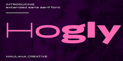 Hogly is a modern wide sans serif diplay font. With 3 weights stroke, fun character. To give you an extra creative work. Hogly font support multilingual more than 100+ language. This font is good for logo design, Social media, Movie Titles, Books Titles, a short text even a long text letter and good for your secondary text font with script or serif. Make a stunning work with Hogly font. Cheers, Maulana Creative
 - Nullomis by Kulturrrno,
$5.00 Nullomis is a modern display font inspired by Soviet Period, anti-utopia and Ancient Rome (I don't know why). It was originally planned to create an ultracondensed headliner, but now it’s a flexible font set with 49 styles or just one Variable Font with all capabilities. Best using for posters, headlines and tags. Extended latin glyph set 7 weights 3 widths Alternate crossbar heights or all of this and more in one Variable font
 - Super Duty by Typeco,
$29.00Stencil fonts often evoke rigid and sterile images such as packing crates or military vehicles, but Super Duty is somewhere between serious and fun. Super Duty is designed with sharp mechanical angles which give the letterforms a square-jawed and ready-for-action feel. A rounder companion version is included that has the sharp edges smoothed out. Unlike most stencil fonts this one has a lowercase that matches the strength of the uppercase. The lowercase has been designed with an x-height equivalent to the cap height and barely protruding ascenders so that the user can interchange the upper and lower letterforms for a funky graphic effect. Super Duty is a robust and versatile stencil font family of 25 fonts — sharp and round variations with closed versions in 2 weights each. These are provided in 3 widths — regular, narrow and condensed. Super Duty includes a text version that has more regular proportions and letter forms for a well rounded display font system. - Blue Sugar by Aah Yes,
$5.95Blue Sugar is a grunge font which has one letter-shape in white set within a different grunge letter-shape in black. The Regular and Dirty versions have their characters in conventionally upright positions; and there are 3 varieties with the characters in various states of disorder and at slightly varied angles and sizes - called Twirled and Whirled. The Mixed Caps version introduces no new characters, but combines straight capitals and jumbled capitals in the same font, for convenience, in which Upper Case A-Z displays conventional upright Capitals, and lower case a-z displays jumbled Capitals. The package contains both OTF and TTF versions - install either OTF or TTF, not both versions of a font on the same machine. - Macahe by Rômulo Gobira,
$10.00 Macahe is a modern slab serif with dynamic and irregular shapes. It comes with 7 weights, 3 widths and matching (true) italics. The typeface was inspired and name after the city I was born (Macaé-RJ, Brazil), turning the mixture between nature/beach life and the chaotic urban growth into typography. The options (weight, width and true italics) make the font useful both for web and print in multiple occasions; think websites, posters, logos, signage, packaging and etc. Macahe covers multiple languages, including a wide range of Latin and some Cyrillic languages. It also includes a full range of numerals (included old style figures, numerators, denominators), small caps, standard & discretionary ligatures and stylistic alternates. Those features and variations make Macahe a useful tool for any graphic designer.
 - Geon Soft by cretype,
$20.00 Geon Soft is the rounded version of Geon. Geon Soft Family is a modern sans-serif typeface that is clean, simple, soft and highly readable. Letters in this type family are designed with geometric shapes without any decorative distractions. The spaces between individual letter forms are precisely adjusted to create the perfect typesetting. Geon Soft is a versatile type family of 54 fonts. Geon Soft family consists of 9 weights (Thin, ExtraLight, Light, Regular, Medium, Bold, ExtraBold, Heavy & Black) & 3 widths (Condensed, Normal & Expanded)with their corresponding italics. The Open Type fonts contain complete Latin 1252, Cyrillic, Central European 1250, Turkish 1254 character sets. Each font includes proportional figures, tabular figures, numerators, denominators, superscript, scientific inferiors, subscript, fractions and case features. We highly recommend it for use in books, web pages, screen displays, and so on.
 - Tresor by Resistenza,
$39.00 Tresor is a new Sans Serif font family with contrast. It has a classic look and a romantic twist thanks to its extended set of decorative alternates and ligatures. Tresor, meaning “treasure” in French, is full of jewels, including a beautiful collection of swashes. More than 1000 glyphs accessible through OpenType features invite you to customize your test. This stylish & modern font family includes 2 different styles and 3 different weights. The thinnest weight is Tresor 100, with Tresor 200 and 400 you get an extra thickness, heavier weights that are perfect for small sizes. Tresor works beautifully for headlines, weddings invitations, instagram posts, packaging design, stationery and logos.
 - Vernacular Sans by jpFonts,
$19.95 The Vernacular trilogy was designed by Swiss designer Hans-Jürg Hunziker, who had worked for Adrian Frutiger in Paris for many years. Based on the concept of a transitional Linear Antiqua, he has developed a colorful bouquet of typefaces that contain the entire spectrum of typefaces for book design and corporate identity. Thanks to his "Swiss school" and his outstanding skills, he has succeeded in giving the typefaces a particularly noble and sympathetic expression. In addition to the Sans family, there is a Serif family and a Clarendon family, each of which, including the separately drawn italics, is equipped with 12 font weights that are finely tuned to one another. Each of the 3 font styles develops its own character, but thanks to a concept that brings the different font styles closer together, they also work well together and complement each other perfectly. Sans and Clarendon have a vertical axis and similar endings in contrast to the Serif, which has a traditional diagonal axis and horizontal endings. The straight stems and the proportions are used as an element to stress the closeness of the typeface-trilogy. They thus share a comon feature. All fonts contain tabular and proportional figures as well as old style figures. Small caps and small cap figures are also available in all fonts. In addition, some fonts have alternative characters available via style set, such as «g», which can be used to further vary the typeface. Vernacular offers all the options for well-kept typesetting for print and web - for small and large orders.
 - Vernacular Serif by jpFonts,
$19.95 The Vernacular trilogy was designed by Swiss designer Hans-Jürg Hunziker, who had worked for Adrian Frutiger in Paris for many years. Based on the concept of a transitional Linear Antiqua, he has developed a colorful bouquet of typefaces that contain the entire spectrum of typefaces for book design and corporate identity. Thanks to his "Swiss school" and his outstanding skills, he has succeeded in giving the typefaces a particularly noble and sympathetic expression. In addition to the Sans family, there is a Serif family and a Clarendon family, each of which, including the separately drawn italics, is equipped with 12 font weights that are finely tuned to one another. Each of the 3 font styles develops its own character, but thanks to a concept that brings the different font styles closer together, they also work well together and complement each other perfectly. Sans and Clarendon have a vertical axis and similar endings in contrast to the Serif, which has a traditional diagonal axis and horizontal endings. The straight stems and the proportions are used as an element to stress the closeness of the typeface-trilogy. They thus share a comon feature. All fonts contain tabular and proportional figures as well as old style figures. Small caps and small cap figures are also available in all fonts. In addition, some fonts have alternative characters available via style set, such as «g», which can be used to further vary the typeface. Vernacular offers all the options for well-kept typesetting for print and web - for small and large orders.
 - Vernacular Clarendon by jpFonts,
$19.95 The Vernacular trilogy was designed by Swiss designer Hans-Jürg Hunziker, who had worked for Adrian Frutiger in Paris for many years. Based on the concept of a transitional Linear Antiqua, he has developed a colorful bouquet of typefaces that contain the entire spectrum of typefaces for book design and corporate identity. Thanks to his "Swiss school" and his outstanding skills, he has succeeded in giving the typefaces a particularly noble and sympathetic expression. In addition to the Sans family, there is a Serif family and a Clarendon family, each of which, including the separately drawn italics, is equipped with 12 font weights that are finely tuned to one another. Each of the 3 font styles develops its own character, but thanks to a concept that brings the different font styles closer together, they also work well together and complement each other perfectly. Sans and Clarendon have a vertical axis and similar endings in contrast to the Serif, which has a traditional diagonal axis and horizontal endings. The straight stems and the proportions are used as an element to stress the closeness of the typeface-trilogy. They thus share a comon feature. All fonts contain tabular and proportional figures as well as old style figures. Small caps and small cap figures are also available in all fonts. In addition, some fonts have alternative characters available via style set, such as «g», which can be used to further vary the typeface. Vernacular offers all the options for well-kept typesetting for print and web - for small and large orders.
 - Journal by ParaType,
$25.00 Journal type family is a low-contrast text face of the Ionic-Legibility group. It was designed at the Polygraphmash Type Design Bureau in 3 styles in 1951–53 by Lev Malanov and Elena Tsaregorodtseva. The fonts were based on Cyrillic version of Excelsior that was developed in 1936 in Moscow by professor Michael Shchelkunov, Nikolay Kudryashev et al., that in its turn was based on Excelcior by Chauncey H. Griffith, 1931, Mergenthaler Linotype. Digital version was developed in ParaGraph (ParaType) in 1991. In 2012–13 designer Natalia Vasilyeva made some corrections in original digital data, extended character set and add bold italic style. The family was rereleased in ParaType in 2013.
 - MD Grotesque by Margarita Dyakovich,
$12.00 MD Grotesque is sans serif font family with a modern and minimalist feel with high readability. It’s extremely versatile and can be used for a big variety of design projects. Perfect for any simple text. It comes in 3 weights and its matching italics. Each style includes Latin and Cyrillic character set.
 - Softrock by Doehantz Studio,
$18.00 SOFTROCK, a bold sans serif font with 3 styles Regular, Rounded, and Textured Effect. SOFTROCK is made as neatly as possible with great attention to detail. softrock is very suitable to be used in making quotes, headlines, logos, labels, lettering, and packaging. What's Included? Uppercase & Lowercase, Numbers, Punctuation, and Multilingual Support. Thank You
 - Calling Cards by Ana's Fonts,
$12.00 Calling Cards is simple and clear, slightly condensed sans serif font family in 3 styles: Regular, Italic and Bold. Each font includes ligatures and stylistic alternates. Calling Cards looks great in quotes, logos, print, and social media, and is perfect for both short and long texts, at small and large font sizes.
 - Amanah Script by Alifinart Studio,
$15.00 Amanah Script is a handwritten font with a casual and modern calligraphy style. This font offers a large number of Stylistic Alternates, as well as beginning and ending swashes. This font has a total of 1660 glyphs, including capital letters, lowercase, numeral and punctuation, multilingual accents, swashes, and includes a large number of stylistic alternates and heart swashes (for lowercase letters). Amanah Script can be used for wedding card designs, invitation, best for photographer, traveling, blogging watermark or craft. Key Features: - Multilingual Accents - Stylistic Alternates up to 15 choices - Has a heart connected feature - Activate Stylistic Alternate by simply adding "period" (.) and “number” (1-15) to each lowercase letter. - Has ligature features so that the letters connect well together - Has OpenType and PUA Encodes feature. As I mentioned earlier, Amanah Script has a large number of Stylistic Alternates features, up to 15 options for lowercase letters. Interestingly, you can activate all Stylistic Alternates that are owned by each letter, just by typing; letter + period + number. For example: a.1 a.2 a.3 or b.1 b.2 b.3 and so on. As for activating the heart connected for each lowercase letters is quite easy, just by typing; letter + underscore + underscore + underscore + letter. For example: a___a or b___b and so on. If there are things you want to ask, don't hesitate to contact my email. Alifinart Studio alifinart@gmail.com Thank you.
 - Diad by Andinistas,
$29.95 Diad was born on 2000 in order to design posters about second World War. The original idea was obtained by breaking, burning and getting wet a bunch of written copies with an old writing machine. Today, Diad is a small typographic system useful for bringing relevance to any content with a grunge look. Each and every detail passed through a strict experimentation process. Its outrageous and unconventional spirit travels from high leveled corrosion, up to a delicate visual neglect. Diad 2 and 3 work for designing words. Diad 1 is ideal for long phrases and titles. Diad dingbats includes 26 illustrations about motocross. In total, adding Diad 1,2 and 3, it has around 260 glyphs. Diad will make your design shine providing different graphic atmospheres, optimizing time and work to its users. Diad is perfect for graphic design on contexts such as death metal, drum and bass, films, war and horror video games. It could work also for logos, words, titles and short texts in covers, tags, clothes, wraps, cards, stickers, toys, bicycles, surf boards, etc.
 - Eksellena by Typehand Studio,
$16.00 Eksellena is a blackletter font desiged in a modern style, minimalist and still classic look. this font is designed in 3 Style, each style have italic. That Style is Regular, Textured and Outline. Ekselllena creation idea was inspired by books, blackletter font and various feeds on instagram, This font is perfect for use as a poster design, branding, logos, apparel design, tattooo or other design needs. Eksellena modern blackletter font containing uppercase and lowercase, plus numerals and a full range of punctuation. There are alternate stylystic version and ligature. To access these, simply turn on 'Stylistic Alternates' or access them via a Glyphs panel.
 - Basquiat Irregular by Cuda Wianki,
$29.00 Basquiat Irregular is a font inspired by graffitti and children's writing. Contains 3 alternative characters for each letter, multilanguage support including cyryllic. It's perfect for creating artistic publications, writing quotes and many other designs. The family also has two fonts with frames, lines and ornaments. Its apperance is rough, hand painted and casual. Perfect for music and street art designs. Frames and lines are created by typing uppercase letters for starting or ending frame or creating an arrow and lowercase letters for typing lines.
 - Airwings by Parker Creative,
$18.00 Airwings is a retro narrow typeface that includes Regular, Distressed, and Outline versions. Each version can be used on its own or combined and overlaid to create even more design options. Airwings is a versatile typeface that can be used in many ways for many different types of designs from album covers, to movie posters, clothing lines, restaurants, and more. Combine Regular and Outline versions to create a retro 3-D look. Use the Distressed version to add a grungy feel to your design.
 - Cirkel Pro by Forte Type,
$4.90 Cirkel is a contemporary font family based on circles. Its geometrical and unusual forms gives us a nice feel of modernity and humor. Created by Jarbas Gomes, Cirkel family is composed by 3 weights (Light, Medium & Bold) and its respective ornamented fonts made of patterns (Stripes Light, Stripes Medium & Stripes Bold). The fonts also have a great set of ligatures and swashes that can be accessed in softwares with support to OpenType features. Cirkel is indicated for hype designs, on titles and short texts.
 - PR Scrolls 03 by PR Fonts,
$10.00 Inspired by food labels, signs and coats of arms, PR-Scrolls is a collection of images which can be used for framing text in contexts where antiquity, craftsmanship, or traditional quality are conveyed. There are several sets of glyphs which work together to make a variety of shapes, or banners of custom length. Most of the glyphs are presented in a range of three or more widths. Scrolls 3 has a greater unity of detail, and a greater variety of form than our earlier designs.
 - Black Thone by Attype Studio,
$12.00 Introducing Black Thone - Inspired by typeface on 70s era, Black Thone has the vintage font & retro font style. with 3 font style, It's super easy to use 3D effect wint Black Thone family font. Three style Font: Regular, Display & Extruded Black Thone is perfect for children product, branding, logo, invitation, stationery, product packaging, merchandise, monogram, blog design, game titles, cute style design, Book/Cover Title and more. Features : - Black Thone.otf - Black Thone Extruded.otf - Black Thone Display.otf - Multilingual Support --- Hope you enjoy with our font! Attype Studio
 - Brown House by Almarkha Type,
$25.00 Introducing our latest display typeface called Brown House - Vintage Typeface with vintage taste and can make your logotype become more interesting. Best Vintage font with 3 styles Regular,Rough,And Stamp, special alternative glyphs, and multilingual support. inspired by the decorative arts and architecture movement Brown House fonts is perfect for your project and allows you to create designs, headlines, posters, logos, badges, t-shirts and many more that are beautiful. It is also best used for posts, logos, posters, certificates, labels and more.
 - Roundhand BT by ParaType,
$30.00 Roundhand was created by Matthew Carter in 1966 on the basis of handwriting by Charles Snell, an English calligrapher of XVII-XVIII known in particular by his "The Pen-man's Treasury Open'd" written in 1694. The typeface has continuous cursive shapes with oval aspect, high contrast emphasized by abrupt transitions from thin to thick and regularity of slope. Its capitals are often used as initials in combinations with other typefaces. The current digital version of the typeface has 3 styles of different weights. Roundhand is clear and easy to read and is well-suited for medium size texts and headlines. It will work well in invitations, menus, packaging, and advertising accentuating elegance and the subtle nature of the content. The Cyrillic version was developed by Vladimir Yefimov and Isabella Chaeva. Released by ParaType in 2013.
 - Phrasa by Arrière-garde,
$12.00 Phrasa is a robust humanist sans-serif typeface family which will carry you through most of your design needs. Designed for legibility, she truly shines in running text. However her solid (yet elegant) construction allows for usage in such settings as branding or signage. Phrasa's most prominent features are: 13 weights, from hairline to black Moderate x-height Large apertures Modern capitals proportions Designed for readability… … without sacrificing good looks True Italics Small capitals Adobe Latin 3 language range Cyrillic alphabet Old-style and tabular figures The idea behind Phrasa was to create a stylish typeface but with legibility in mind. The inspiration came from history, namely from two of the most legible typefaces known: Garamond and Gill Sans. The new typeface boasts a smooth, easy-on-the-eyes texture which allows the reader to simply sink into the text. It also posses a set of true italics to compliment it. Phrasa has a broad linguistic range, spanning from extended latin alphabet to cyrillic.
 - Cy Grotesk by Kobuzan,
$25.00 Cy Grotesk is the result of combining the clear forms of mid 20th-century European neo-grotesks and the expressiveness of the 19th-century grotesques. It is display typeface with an eccentric character and a special rhythm. Symbols have sharp long angled spurs and large wedge incision between the bowl and the stem, diluting it with smooth curves and the tight aperture. Built like a multifunctional workhorse that has a wide range of font uses. This type family consists of 27 styles that are adjustable in weight and width. Or one variable font with 2 axes. From pure thin to radically black. From roomy key to catchy grand. All styles include an extended set of Latin characters and a basic Cyrillic. Features: – Total glyph set: 676 glyphs; – 27 styles (3 widths x 9 weights) + variable; – Support 210+ languages; – Latin Extended; – Cyrillic Basic. OpenType features: – Uppercase, lowercase; – Proportional, circled, tabular numerals, superiors, inferiors, fractions; – Punctuations and symbols; – Arrows; – Stylistic sets (ss01-ss10); – Ligatures; – Case-sensitive forms.
 - Tiverton by Adam Fathony,
$15.00 The idea behind this typefaces was to combine something retro and vintage with a style of this century. A reference from Vintage Typography, Art Deco, Neo Deco. With an improvised and create something in between those styling. Tiverton created in Serif, Sans-Serif and Script. Within 3 Style, it more helping and easier for create something without "thinking" the font compartment. Features of Sans Serif and Serif are comes with stylistic alternates and you can activated with Contextual Swash button on Adobe Illustrator or Adobe Photoshop, And Catchword such as the preview above, activated with underscore in the beginning and end of the letters, for example : _ the _ (underscore)the(underscore). Features of Tiverton Script are Ligatures, Contextual alternates, Contextual Swashes. no alternates. but Tiverton Script available with 2 Weight, Light and Regular. For a bonus, I create an Ornament Fonts. Special shout for the ornament fonts are for the borders. on the Number Character 0-9 are created for connected borders. for Beginning and end the lines you can press Shift on the Number Character. For example : type !2222@ on the text preview below and see on the Tiverton Ornament.
 - Hand of Hannah by TypoGraphicDesign,
$19.00 The typeface Hand of Hannah is designed from 2021 for the font foundry Typo Graphic Design by Hannah Englisch & Manuel Viergutz. The character of the handwritten script typeface is rough, ruggend and raw. With state-of-the-art OpenType-Feature (like Contextual Alternates (calt) and Stylistic Alternates (salt)). Each uppercase and each lowercase letter has automatically alternated two variations to bring humanly-random characteristics of handwriting to life. 4 font-styles (Regular, Bold, Heavy & Icons) with 732 glyphs (Latin 3) incl. 100+ decorative extras like icons, arrows, catch words, dingbats, emojis, symbols, geometric shapes (type the word #LOVE for ♥︎ or #SMILE for ☺ as OpenType-Feature dlig) and stylistic alternates. For use in logos, magazines, posters, advertisement plus as webfont for decorative headlines. The font works best for display size. Have fun with this font & use the DEMO-FONT (with reduced glyph-set) FOR FREE! ■ Font Name: Hand of Hannah ■ Font Styles: 4 font-styles (Regular, Bold, Heavy, Icon) + DEMO (with reduced glyph-set) ■ Font Category: Display Script for headline size ■ Font Format:.otf (Mac + Win, for Print) + .woff (for Web) ■ Glyph Set: 732 glyphs (Latin 3 incl. decorative extras like icons) ■ Language Support: 80 languages: Afrikaans Albanian Asu Basque Bemba Bena Breton Catalan Chiga Colognian Cornish Croatian Czech Danish Dutch English Estonian Faroese Filipino Finnish French Friulian Galician German Gusii Hungarian Indonesian Irish Italian Kabuverdianu Kalenjin Kinyarwanda Latvian Lithuanian Lower Sorbian Luo Luxembourgish Luyia Machame Makhuwa-Meetto Makonde Malagasy Manx Morisyen North Ndebele Norwegian Bokmål Norwegian Nynorsk Nyankole Oromo Polish Portuguese Quechua Romanian Romansh Rombo Rundi Rwa Samburu Sango Sangu Scottish Gaelic Sena Serbian Shambala Shona Slovak Soga Somali Spanish Swahili Swedish Swiss German Taita Teso Turkish Upper Sorbian Uzbek (Latin) Volapük Vunjo Zulu ■ Design Date: 2021 ■ Type Designer: Hannah Englisch, Manuel Viergutz
 - Aspire Narrow SmallCaps by Grype,
$18.00 While the Aspire SmallCaps family finds its roots of inspiration in the ACURA automotive company logo, with its wider base, the Aspire Narrow SmallCaps family condenses those styles into something more suitable for larger bodies of text in a more standardized width. Aspire Narrow SmallCaps is perhaps the most true to form tribute to the original all capitals inspiration logotype. It maintains all capital forms (whether standard or smallcaps) and yet is still strikingly powerful in its presence and readability including numerals, and a comprehensive range of weights, creating a straightforward, uncompromising collection of typefaces that lend a solid foundation and a broad range of expression for designers. Here's what's included with the Aspire Narrow SmallCaps Family bundle: - 430 glyphs per style - including Capitals, Small Caps, Numerals, Punctuation and an extensive character set that covers multilingual support of latin based languages. (see the 6th graphic for a preview of the characters included) - Stylistic Alternates - alternate characters that remove the angled stencil cuts for a more standardized text look. - 3 weights in the family: Light, Regular, & Black. - 3 obliques in the family, one for each weight: Light, Regular, & Black. - Fonts are provided in TTF & OTF formats. The TTF format is the standard go to for most users, although the OTF and TTF function exactly the same. Here's why the Aspire Narrow SmallCaps Family is for you: - You're in need of automotive sans font family with a range of weights and obliques - You're love that ACURA letter styling, and want to design anything within that genre - You're looking for an alternative to Eurostile with more stylized letterforms. - You're looking for a battle-tech typeface for your futuristic war chest labelling. - You just like to collect quality fonts to add to your design arsenal
 - Aspire Narrow by Grype,
$18.00 While the Aspire family finds its roots of inspiration in the ACURA automotive company logo, with its wider base, the Aspire Narrow family condenses those styles into something more suitable for larger bodies of text in a more standardized width. Aspire pays homage the techno display styling of the inspiration logotype, further evolving beyond its brand inspired origin to give birth to a font family that pulls on modern and historical styles. It adopts a sturdy yet approachable style with its uniform stroke forms and curves, and goes on to include a lowercase, numerals, and a comprehensive range of weights, creating a straightforward, uncompromising collection of typefaces that lend a solid foundation and a broad range of expression for designers. Here’s what’s included with the Aspire Narrow Family bundle: 477 glyphs per style - including Capitals, Lowercase, Numerals, Punctuation and an extensive character set that covers multilingual support of latin based languages. (see the 6th graphic for a preview of the characters included) Stylistic Alternates - alternate characters that remove the angled stencil cuts for a more standardized text look. 3 weights in the family: Light, Regular, & Black. 3 obliques in the family, one for each weight: Light, Regular, & Black. Fonts are available in TTF & OTF formats. The TTF format is the standard go to for most users, although the OTF and TTF function exactly the same. Here’s why the Aspire Narrow Family is for you: - You’re in need of a narrow automotive sans font family with a range of weights and obliques. - You’re love that ACURA letter styling, and want to design with a narrow font within that genre. - You’re looking for an alternative to Eurostile with more stylized letterforms. - You’re looking for a clean techno typeface for your starship console labelling. - You just like to collect quality fonts to add to your design arsenal.