10,000 search results
(0.06 seconds)
- Ballpill by bb-bureau,
$60.00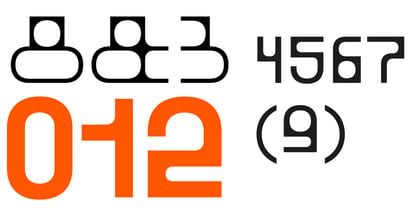 BallPill — a trapless typeface in 5 weights alternates: ss01 ss02 ss03 – language: all latin glyphs and
 - Stana by Wirtu,
$9.00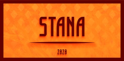 Stana is all caps, clean and tall display font. There are more than 150 glyphs included.
 - Shearlight by Patria Ari,
$15.00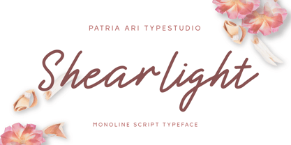 Shearlight is a beautiful signature monoline script typeface with elegant but strong shapes in every glyphs.
 - Wholecar by Mans Greback,
$59.00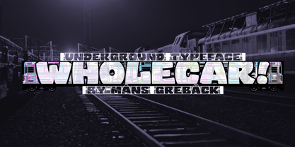 Wholecar is a train graffiti typeface. The letters are fun and friendly, with a happy personality and cartoonish quirkiness. A street style, Wholecar is drawn and created by Mans Greback, and is the perfect combination of cool and childish typography. This hip-hop styled comic typeface family comes in eight styles: Black, Inline, Invert, Regular and White. Additionally, the Wholecar Color, consisting of Noir, Pink and Silver, specifically created for Photoshop and Illustrator. Use characters [ ] { } ¤ # _ for train parts fitting the letters. Examples: [¤#¤_¤_¤#¤] [¤Graffiti¤] The font is built with advanced OpenType functionality and has a guaranteed top-notch quality, containing stylistic and contextual alternates, ligatures and more features; all to give you full control and customizability. It has extensive lingual support, covering all Latin-based languages, from North Europe to South Africa, from America to South-East Asia. It contains all characters and symbols you'll ever need, including all punctuation and numbers.
 - Textus Receptus by Lascaris,
$60.00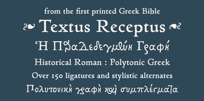 Textus Receptus is a historical revival based on the Roman and Greek types used by Johann Bebel (and later also Michael Isengrin) in Basel in the 1520s. The Roman is a low-contrast medium-to-heavy Venetian reminiscent of Jenson or Golden Type. The unusual polytonic Greek, not previously digitized, is lighter in weight and supplied with all the ligatures and variants of the original. Yet when used without historial forms the Greek has a surprisingly contemporary feel: it’s quirky and playful as a display face, but still easily legible in running text. Bebel’s Greek extended and refined the one used for the first printed Greek New Testament, Desiderius Erasmus’ Novum Instrumentum Omne, published in Basel in 1516 by Johann Froben. The name of the font was chosen in honor of this edition, which was so influential that it was later called the Textus Receptus (the “received text”), serving as the basis for Luther’s German Bible in 1522 and much subsequent scholarship for over 300 years. Following 16th century practice, Textus Receptus contains 130 ligatures and stylistic alternates for Greek, accessible either with OpenType features or with five stylistic sets. The Greek capitals, often printed bare in early editions, have been equipped with accents and breathings for proper polytonic or monotonic typesetting. The Roman includes both standard and historical ligatures along with the abbreviations and diacritics typically employed in early printed Latin. For expanded language coverage it has the entire unicode Latin Extended‑A range and part of Latin Extended-B. The capital A is surmounted by a horizontal stroke, as in some 16th century Italian designs, and the hyphen and question mark have both modern and historical form variants. Mark-to-base positioning correctly renders fifty combining diacritics, and with mark-to-mark positioning the most common diacritics may be stacked, permitting, for example, accents and breathings on top of length-marked vowels. Numerals include old-style, proportional lining and tabular lining. For further details, please download the 31-page Textus Receptus User Guide.
 - Coomeec by Linotype,
$29.99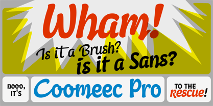 Although Andi AW. Masry designed his Coomeec typeface with one eye on comic books, this is more than just another cartoon font. Even in our short profile of the font below, we're sure you'll find enough to be surprised by the calligraphic aesthetic and the wide range of potential uses of Coomeec. Typography had been one of Andy AW. Masry's hobbies before he turned professional in 2008 and formed his own agency in Jakarta in Indonesia. The former construction engineer had already spent many hours of his leisure time in following his pastimes of designing, photography and Latin typography. Fascinated by the close interaction between text and image in comic books, one of his first projects was the development of his font Coomeec™. The condensed letters of Coomeec seem to have more in common with a calligraphic brush typeface than a more conventional cartoon font. With the characteristic line forms of a brush font, the not unextensive variations in line thickness and numerous small embellishments to the glyphs, Coomeec can be used to enhance your projects with animated effects. You can achieve this not just in the larger font sizes; the font is also very legible in small sizes thanks to its large x-height. There are certain unusual letter forms, such as that of lowercase 'g', 's' and uppercase 'Y', that provide Coomeec with a touch of the exotic. As Coomeec has numerous character alternatives, you can use it not only to create diverse designs but also to ring the changes with the character of the text itself. There are variants for most lowercase letters, some of which exhibit only minor differences, such as the lack of a curlicue on the 'b', a modified downstroke on the 'h' and an elongated base for the 'k'. In the case of other letters, such as the 'q' and the 'r', there are significant disparities between variants. The uppercase characters are also available in a lively swash style with significantly extended terminals. Among the range of characters of Coomeec are oldstyle and lining figures designed for proportional and tabular setting. All alternatives are available in the form of the corresponding OpenType versions. Coomeec comes in two weights; Regular and Bold, each with its Italic version. The form of the slightly inclined Italic characters is identical to that of their upright counterparts with the exception of the lowercase 'f', which has an ascender in its Italic version. As an OpenType Pro font, the glyphs available for Coomeec ensure that it can be used to set not only western European but also central European texts. Coomeec is not just at home when used to set headlines. The excellent legibility of this individual and vibrant typeface means that it's also ideal for setting shorter texts. The various alternative letters provide the designer with the opportunity to vary the textual appearance, and to choose between creating a more formal or more light-hearted effect. Coomeec is not only available in an OpenType version but is also obtainable as a web font, so that you can employ its exotic features to good effect when creating internet pages.
 - 1585 Flowery by GLC,
$20.00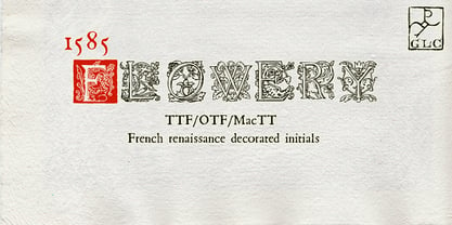 This set of initial letters was inspired from French renaissance decorated letters. Unfortunately, we don't know where they were in use, or who was the punchcutter, our models were coming from a late XIXth century copy. Note: The letters I and J, U and V are not different. It is not a mistake, but it is the exact reflection of what was customary during the period.
 - Kolo LP by LetterPerfect,
$39.00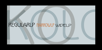 The Kolo family was designed by Paul Shaw, inspired by the lettering of Koloman Moser, Gustav Klimt, Alfred Roller and other members of the Secession, Vienna’s turn-of-the-century Art Nouveau movement. Kolo’s family variants—narrow, regular, wide & alternates—serve as stand-alone display styles, or can be used in combination to pack text creatively in the manner characterized by Secession-period graphics.
 - Areaman OT by AdultHumanMale,
$20.00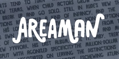 Areaman OT is a fun chunky ALL CAPS display font. I wanted it to look blocky and loud, So it can scream from Posters and Headlines. It has over 300 glyphs, several variations on the standard alphabet and all those extra pesky foreign features. It also has various letter pairing with extra ligatures and flourishes available through OpenType or your Glyphs palette. This upgraded version is now coded with OpenType features to create a randomised bespoke look and feel to your copy.
 - Gencis by Twinletter,
$15.00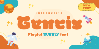 introduce Gencis unique display font. You can use this font that has a funny, cute, attractive, and playful shape for various things in your special project. It can be used as the title of your news article, or it can be used in your search button. Or you can even use it as a subtitle in various visual media to promote your company. of course, your various design projects will be perfect and extraordinary if you use this font because this font is equipped with a font family, both for titles and subtitles and sentence text, start using our fonts for your extraordinary projects.
 - Monotone - Unknown license

- DuckyCowgrrrlLuvsRudyCowboy - Unknown license

- Printers Impressions JNL by Jeff Levine,
$29.00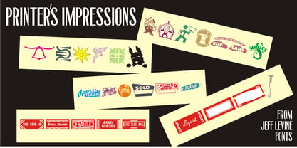 Printers Impressions JNL is an assortment of various letterpress ornaments, corner pieces, catch words and other designs, along with some shipping labels with perforated edges; all re-drawn from vintage source material. For the shipping labels, print them in red and you will recreate the standard form of gummed label so popular for years before self-adhesives took over the market.
 - Heather Flourish by Krntype Studio,
$18.00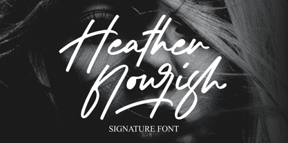 Introducing Heather Flourish font Heather Flourish is a signature font created to impress an elegant and luxurious look Heather Flourish is perfect font for branding & logo projects, such a photography studio, clothing/fashion studio, also suitable for Product Packaging, Title on your article or book cover, Stationary, and many more. this font has a ligature and swash which you can access by typing the letters a-g You can try it first by typing the name you want below, I hope you can create amazing custom personal signature or logo with this font you can buy this font at https://www.myfonts.com/foundry/krntype-studio/ Enjoy the font, feel free to comment or feedback, send me PM or email at krntype@gmail.com. Thank you!
 - Algreve by Greater Albion Typefounders,
$22.00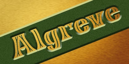 Algreve is the progenitor of our recent set of WoodType inspired typefaces. It’s more sophisticated, perhaps, and less rustic than one of the others. It’s incised or hand-tooled style lends a little sophistication and a little lightness. Ideal for period poster work…
 - Ollivette Elite by Chank,
$59.00Fly your inner geek flag with this cool new "Eleet" typewriter font. It's kinda like a wonky internet translator that converts normal text into leet-speak, so you can exchange encoded love notes with cyber-hackers and goofy-gamers. The actual glyphs in this font are interchangeable with the more logical Ollivette typewriter font, but here the characters have all been moved around to create stylized interpretation of similar glyphs. So "ELEET" could also be typed "31337". Except you don't have to think about it. Get it? Got it? Good! 3NJ0¥ TH15 ƒØÑ+ & U53 !† 0FT3N. - Teamhair Tower by Evertype,
$20.00Teamhair Tower is a “rough” monowidth font based on the face used on the old Sears Tower Gaelic manual typewriter. Teamhair was first digitized in 2002 by Michael Everson and originally used the MacGaelic character set on the Macintosh platform, and ISO/IEC 8859-14 on the PC. In 2008 Doire version 3 was released in OpenType format, completely compliant with Unicode encoding and with an extended character set. - ITC Astro by ITC,
$29.99ITC Astro is the typeface that proves you can get your work done while watching cartoons. “It all started as a series of doodles while I was watching The Jetsons,” recalls Sasa Petricic. “The show's impossibly simplistic vision of the twenty-first century cried out for a font that fit into that world -- a world where everyday objects can carry far more fun and personality than they should.” ITC Astro is the first commercial typeface design from Petricic, whose “day job” is working as a reporter for the Canadian Broadcasting Corporation. Petricic has filed stories from across Canada and around the world for CBC's flagship evening newscast, The National. His reports have also appeared on CNN and BBC Television. Petricic's work as a correspondent and video journalist have taken him to six continents, covering everything from famine and genocide in Africa to the war in Iraq. With such serious matters filling the hours of Petricic's day as a journalist, it's not hard to see why he conceived Astro as a welcome blast of whimsy. “As I began to draw the design,” he says, “I decided that every part of Astro should be a cartoon character unto itself.” Each character has its own baseline shadow (or coaster, or circular antigravity generator, depending on how you look at things). The angular caps dance jauntily, rocking from left to right, while a suite of companion small caps provide backup. The end result is a design quite unlike any other, with surprising charm and versatility. ITC Astro comes in a two-weight family of White and Black. - DuerersMinuskeln - 100% free

- Anglo-Saxon Caps - Unknown license

- ILL oCtoBer - Unknown license

- AuntJudy - Unknown license

- Garbageschrift - Unknown license

- KR Apple - Unknown license

- KR Summer Gardening - Unknown license

- Distant Galaxy AltOutline - Unknown license

- KR Grads 2002 - Unknown license

- KR All American - Unknown license

- Locked Window - Unknown license

- Pincel Caps - Unknown license

- Capitular Moldurada - Unknown license

- TeamSpirit - 100% free

- Alpine 7558S - Unknown license

- Poseidon - Unknown license

- Personalidades 1 - Unknown license

- HerzogVonGraf - 100% free

- Aleia - Unknown license

- Wave - Unknown license

- 101 Zebra Print - Unknown license

- KR All Heart - Unknown license


