10,000 search results
(0.027 seconds)
- Gothic Revival Layered by Intellecta Design,
$20.90
- Tap Water JNL by Jeff Levine,
$29.00
- Le Havre Layers by insigne,
$19.00
- Janda Happy Day - Personal use only

- Red Nose Day - Personal use only

- 7 days fat - Unknown license

- Celebrate the Day - Personal use only

- KR Career Day - Unknown license

- Elliot's Bad Day - Unknown license

- 7 days oblique - Unknown license

- KR Moving Day - Unknown license

- Field Day Filter - Unknown license

- BN-Blurry Day - Unknown license

- Bad Hair Day - Unknown license

- KR School Days - Unknown license

- 7 days rotated - Unknown license

- KR Sunny Days - Unknown license

- Days Like This by Pesic,
$19.00
- Deco Days JNL by Jeff Levine,
$29.00
- Radio Days NF by Nick's Fonts,
$10.00 - Maya Day Names by Deniart Systems,
$15.00
- Nouveau Days JNL by Jeff Levine,
$29.00
- No Bad Days by Cardigan,
$25.00
- Janda Happy Day by Kimberly Geswein,
$5.00
- Day Tripper NF by Nick's Fonts,
$10.00 - Days Are Longer by PizzaDude.dk,
$13.00
- Day N Nite by Typefactory,
$14.00
- Anti Valentines Day by Aldedesign,
$25.00
- Rainy Day Women by Elemeno,
$25.00 - Congratulatory Womens Day by Dmitriy Shchetinskiy,
$19.00
- Dollar Days JNL by Jeff Levine,
$29.00
- MTF Sunny Days by Miss Tiina Fonts,
$9.00
- Aztec Day Signs by Deniart Systems,
$15.00
- Farm Days Out by Epiclinez,
$18.00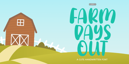
- KG Ways to Say Goodbye - Unknown license

- KG Ways To Say Goodbye by Kimberly Geswein,
$5.00
- P22 Late November by IHOF,
$39.95
- Late Hours JNL by Jeff Levine,
$29.00
- Oil On The Water - Personal use only

- Water on the Oil - Unknown license