10,000 search results
(0.021 seconds)
- Gabara Sans by Arodora Type,
$50.00 Gabara is a modern, fun and dynamic sans serif family. Thanks to its flexible appearance, it is suitable for paragraphs and headings of any length. Also includes Gabara, multilingual support, ligatures, and more. In this way, you can handle many of your needs with a single font family.
 - Sugar Story by Yumna Type,
$16.00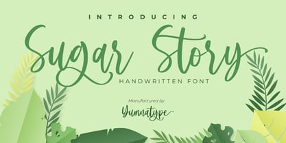 Sugar Story is a sweet handwritten font with a natural and unique design will make your project more beautiful. The font is suitable for your branding project, printing, logos dan wedding. Included: Sugar Story (OTF) Features: Beautiful Ligatures Alternates Multilingual Support PUA encoded Numeral and Punctuation by Yumnatype
 - RM Scrapheap by Ray Meadows,
$19.00 Put together from a collection of old bits and pieces, RM Scrapheap is a distinctive display face with many uses. Due to the modular nature of this design there may be a slight lack of smoothness to the curves at very large point sizes (around 100 pt and above).
 - Stolen Cassette by Gassstype,
$28.00 Stolen Cassette is a Playful Display Font that will make your designs look modern, unique and fun. This is Font Stolen Cassette 2 Style. It’s perfect for labels, quotes, posters, DIY projects, branding, packaging, greeting cards, websites, photos, photography overlays, signs, window art, scrapbooking, tags and so much more!
 - Candymore by Epiclinez,
$18.00 Candymore is a fun and playful handwritten font. Its simple and friendly style is suitable for your DIY or crafting projects. This font has 197 glyphs and its supporting 66 languages, from English to Zulu. Have fun with this super cute font and explore its awesomeness. Thank You!
 - Sweet Mango Italic by Letterafandi Studio,
$18.00 Sweet Mango is a modern sans serif font. This font is perfect for logos, greeting cards, package design, brand identity, craft designs, any DIY projects, book titles, wedding invitations, packaging, and more. Include 4 style font : Sweet Mango Regular Sweet Mango Italic Sweet Mango Bold Sweet Mango Italic Bold
 - Yargo JNL by Jeff Levine,
$29.00A little funky, a little fun and thoroughly unusual - this is the best way to describe Yargo JNL. This novelty font is best used in short phrases and at large point sizes. No kerning has been added so the letters can retain their hand-made look and feel. - Abdo Logo by Abdo Fonts,
$30.00 Abdo Logo is an Arabic display and text typeface. It is useful for headlines, books covers, logos design, slogans, advertisement and other graphic projects. The font is based on the simple lines of free style calligraphy. The font supports Arabic language and I may extended to cover additional scripts.
 - Grist Mill JNL by Jeff Levine,
$29.00Grist Mill JNL was modeled from an old wood type design and has all of the wonderful quirks that made wood type so appealing for many projects. There is minimal kerning because of the unique letter shapes, so you may wish to adjust your layout to fit your needs. - Galexica Mono by Ingrimayne Type,
$6.00 GalexicaMono is an attempt to create a futuristic typewriter font, which may be an oxymoron. Unlike most typewriter fonts, it is sans-serif. The family has two weights, plain and bold, each with an oblique style. For a variant of the design that is not monospaced, see Galexica.
 - Jello Chlour by Jolicia Type,
$5.00 Say hello for our first debut "Jello Chlour " with Modern Elegant Style this is perfect for branding, logos, invitation, masterheads and more. Jello Chlour Features : Multilanguange Ligatures Alternates PUA Encoded Files Includes : Jello Chlour Light Jello Chlour Regular Jello Chlour Semi Bold Jello Chlour Bold Jello Chlour Script
 - Mix Stitch by Mix Fonts,
$13.00 Mix Stitch, is an embroidery lesson disguised as a font, fit for handmade and DIY themed projects. Can be used to emulate embroidery in images, or as a guide to teach kids how to write. So many uses for this fun font, I don't even know where to begin.
 - Whoa Nelly NF by Nick's Fonts,
$10.00In his book of Showcard Alphabets, Dan X. Solo called this one Funhouse, and we couldn't agree more. Wild, wacky and slightly tacky, but suitable for the whole family. The Opentype version of this font supports Unicode 1250 (Central European) languages, as well as Unicode 1252 (Latin) languages. - Merlo Round by Typoforge Studio,
$25.00 Font Merlo Round is the younger brother of Merlo. Font Merlo Round is characterized by twelve different varieties – lower and uppercase characters. It is inspired by a You And Me Monthly published by National Magazines Publisher RSW „Prasa” that appeared from May 1960 till December 1973 in Poland.
 - Charons Obol by Hanoded,
$20.00 Charon's Obol is a scary, brushed typeface. It was created using cheap paint and stiff brushes - hence the rough texture of the glyphs. Using this font will ensure you a safe passage across the river styx - just don't pay the ferryman until he gets you to the other side…
 - RM Softsans by Ray Meadows,
$19.00 Strong and distinctive, yet soft and cuddly. This is a rounded sans serif design that features slightly thicker horizontals. Due to the modular nature of this design there may be a slight lack of smoothness to the curves at very large point sizes (around 100 pt and above).
 - Mough by Krntype Studio,
$16.00 a bold marker display font. Font with round and fat style. Mough imitate round marker pen in a clean way, this font fits perfectly into any background. Mough is perfect for many design such as merch, T-shirts, titles, book covers, social media posts, websites, events, and many more
 - Zuris by Mr. Typeman,
$15.00 Say hello to my new Zuris Font, a modern handwritten script, wich simulates natural handwriting. Zuris is perfect for branding, product packaging, wedding invitations, cards and so on. If you want to add a certain charm, appeal and allure in your projects, Zuris is just what you need.
 - Yalla by Borutta Group,
$39.00 Yalla was inspired during a trip Mateusz Machalski took to Cairo (Egypt). The vast array of strong Arabic headline type, geometric forms working in interesting ways and contrasting with smooth, calligraphic details fed the design. Due to the same proportions and heights, Yalla works great together with Afronaut.
 - Ecstasy by Talavera,
$60.00 This calligraphic type is based on a free-styled blackletter with an ink-stained spirit. By having several stylistic alternates (on both U&lc.) plus some non standard ligatures, your text may look like it’s written or handmade! You should combine this font with Agony, also available on MyFonts.
 - Underdoug by PizzaDude.dk,
$15.00 All caps font with squarish letters. At first sight, it may look a little bit ordinary, but watch it with massive text - then you will notice the bounciness and the contextual alternates that automatically switches between the 5 different versions of each letter! Comes with massive language support!
 - RM Smoothsans by Ray Meadows,
$19.00 A family of soft, rounded, yet bold display faces which can successfully be used in conjunction with one another. Due to the modular nature of this design there may be a very slight lack of smoothness to the curves at extremely large point sizes (around 200 pt and above).
 - BIG Alphabet Tracing by Beast Designer,
$15.99 Introducing the Big Alphabet Tracing Font – a font designed to help kids learn the alphabet in a fun way. The font looks friendly and playful, making learning feel like a game. It is perfect for teachers, parents, and anyone who wants to make learning the alphabet exciting and interactive.
 - Giecella Kids by Sipanji21,
$8.00 Say hello to Giecella Kids font. Made with love and joy. Comic look, so it will make your design more beautiful, cute, fun, and colorful Includes: Giecella Kids (OTF, TTF, WOFF) Bonus (Cute Background) Features: Character Set Numerals and Punctuation (OpenType Standard) I hope you can enjoy the font :)
 - Komica Brought by Figuree Studio,
$18.00 Say hello to Komica Brought font. Made with love and joy. Comic look, so it will make your design more beautiful, cute, fun, and colorful. Features: Uppercase and Lowercase Numerals and Punctuation (OpenType Standard) Accents (Multilingual characters) PUA Encode I hope you can enjoy the font :) Regards Figuree Studio
 - Regular Bien by JASCHA&FRANZ,
$15.00 Regular Bien is a display font that is created out of two shapes - a circle and a line. It has a plain and a mutated face, depending on the usage of lowercase or capital letters. Regular Bien can be used in various fun ways and connections between lines.
 - BabyDoll by Burghal Design,
$29.00Delicately swirled BabyDoll includes eight assorted dingbats, and like all Burghal Design fonts, includes upper and lower case letters, as well as numbers, symbols, punctuation, and accented foreign characters. BabyDoll is so cute and sweet, you just may get a cavity. Please remember to brush and floss regularly. - Clio Icons by LeType,
$39.00 Clio Icons is designed to give more elegance to your project, the font has 88 icons that can be connected to one another forming marks and backgrounds in an unique and stylish way. The quotation marks were inspired by the famous quotation marks from Computer Arts Brazil magazine.
 - Temeraire by TypeTogether,
$49.00 Quentin Schmerber’s Temeraire serif font family was not designed to be invisible. It is a typographic exploration meant to be seen — with its beauty, one could even say beheld. While some fonts aim to be as easily ignored as possible, Temeraire is offered as a gift to wide-eyed readers with its anything-but-boring character and its conspicuous inconsistency in styles. Most type families increase the weight of each character to expand the family. Instead, research into 17th century sources produced Temeraire’s wide range of letterforms, from the predictable to the odd and loosely related through time. Each style is designed to work alongside the others but are also standalone homages to specific parts of English lettering tradition: gravestone cutting, writing masters’ copperplates, Italiennes, and others. Temeraire’s Regular style is a contrast-loving Transitional Serif with vertical stress, making it great for period and classic works, ironic pieces, and modern throwbacks. The weight of the Bold squares off the ends of each glyph to give it stability, and the italic style rings true: flowing, contrasting, and purposefully inconsistent. Temeraire’s Display Black style is one salvaged from expressive gravestone artistry. The details most easily noticed are the ‘g’ with its descending bowl that has been pressed back up in the centre, and the additional serif on the ‘t’ crossbar that holds its neighbouring character at bay. (The ‘g’ and ‘Q’ have loopless alternates.) The final style is the Italienne, the horizontally stressed counterpoint to the family. By design its characters flow and bend in ways not in step with the rest of the family. All the weight has been pushed to either hemisphere within each glyph, resulting in a display style that demands space and peacefulness around it so its presence can impress. As with all TypeTogether families, Temeraire meets the current designer’s needs. Not only does its five styles shine in print work, it includes alternates for when the defaults are too boisterous and has been expertly crafted for screens. The Temeraire serif font family is resurrected from echoes in time and finds its family relation through impeccable taste.
 - Dulcinea by Re-Type,
$79.00 Dulcinea is the title of Ramiro Espinoza’s in-depth look at Spanish Baroque calligraphy’s most extreme tendencies, and especially at some of those produced by the writing masters Pedro Díaz Morante and Juan Claudio Aznar de Polanco. These 17th and 18th centuries alphabets with their plentiful calligraphic flourishes represented a marked break with the harmonic and angular Renaissance Cancellaresca style. It was Morante who first introduced and popularized the use of the pointed quill in Spain, and although his famous text entitled “Arte Nueva de escribir” – first volume published in 1616 – contains alphabets that have much in common with traditional broad nib Cancellaresca calligraphy, most of the examples therein are outgrowths of the new models put forward by the Italian master Gianfrancesco Cresci. The writing’s swashes are complex and intricate, but at the same time they feature a profusion of defects. Many of them sometimes come close to ugliness. However, these pages contain an artistic essence that bears a relationship to the ironic and sometimes somber character of Spanish Baroque. That’s why the name of the font pays homage to “Dulcinea del Toboso”, the fictional beauty from Miguel de Cervantes’s ‘Don Quixote’, a work that reveals many of the period’s conflicts, such as the contrast between utopian ideals and reality, uncertainty and madness. But Dulcinea is far from being just a revival. Its forms are not careful tracings of the outlines of Morante and Polanco’s letters, nor are they attempts to reproduce them digitally. In fact, the author of the letters says that had the font been created that way it would have been too archaic to serve as acceptable contemporary typography. However, he believes that there are myriad interesting details that can be rescued and preserved, along with the playful spirit of the original. The work of designing Dulcinea consisted of combining original historical elements with the creativity and calligraphy of the font’s author in order to produce a modern typography that isn’t based on the same traditional sources as many recently created scripts fonts. Dulcinea offers attractive options for the setting of texts and headlines: abundant ligatures and swashes along with intricate alternate characters. It sophisticated forms make it an ideal option for women’s magazines, recipe books, lingerie products or perfume packaging.
 - Sayso Chic - Unknown license

- Displace Serif by Serebryakov,
$35.00 Displace Serif is a continuation of my Displace fonts. Adding serifs allows you to see the font in a new way. There is a more pronounced charm of Italian monumental fonts, but in an expressive way. The appearance of the serifs allowed the font to move to the antiqua class, but this is purely a formal matter. The proportion of serifs changes markedly from weight to weight, allowing the font to retain its decorative character. In the Light drawing the serifs are barely visible and delicate, while in the Black they are in superposition. The font is catchy, noticeable, which makes it suitable for graphics requiring instantaneous spectator emotions. Displace Serif is suitable for editorial design, as despite the modern image it retains the classic concept.
 - Meleo by Alexis Luengas,
$1.00 Meleo is a semiserif consisting of 10 fonts with a few original quirks but still very legible at both text and display sizes. Since its conception, the aim was a balance of uniqueness and functionality. The typeface owes its energy to the slight suggestion of calligraphic crafting and humanist structure. But it also breaks the rules: a small x-height and a whimsical uppercase with resemblance to the lowercase may render Meleo more friendly than a conventional (semi-)serif. Titles and texts of moderate length, like those found on websites, flyers and packaging, are the natural habitat of Meleo, but it may as well thrive under different settings. Meleo supports most of western-european latin languages which are included in the ISO-Adobe character set.
 - Quadratique by Eurotypo,
$32.00 Quadratique is the first font of a large family that was originated in geometric patterns. We developed a system through a square of 6 modules of side, which are transformed and combined to give up 104 originals glyphs. As a result, each letter is a subfamily that may be combined by overlapping (A, a, a.salt and a.swsh) and thus generate more than 365 glyphs, or thousands if we combine different letters. Quadratique is so easy to use, that user does not need guidance. You just must typeset [aaaa, bbbb, etc.] and start to play, try to make that each module overlapping with others and repeat [(a + A) (a + A) (a + A), etc.] You may create thousands of new patterns and creative frames just combining different modules.
 - New Millennium by Three Islands Press,
$24.00New Millennium is one of three font families that share a common name, a common design philosophy, a common x-height, and basic character shapes. (The others are New Millennium Sans and New Millennium Linear; all three work well together.) New Millennium is a serif face of what some might describe as a "modern style." But although it has flat serifs, it differs markedly from, say, Bodoni or Didot -- especially in the italic, which is a radical departure from tradition. (The bold styles are in fact sans-serif, identical to those of New Millennium Sans.) There's also a nice, dark Headline style for display text. New Millennium is a distinctive, legible, accessible text face that might be well suited to, say, scientific documentation. - Credit Extension by Comicraft,
$19.00At Comicraft we're always looking for new ways to help our loyal customers get more bang for their buck. There are times when when the big financial institutions turn their backs on the average working Joe, but that’s why we want to help you restructure your finances, renegotiate your commitment to font purchases... We're here to help you stretch your dollars a little further. With that in mind, our latest release is twice as wide as our usual fare and will help you make it to the end of the month in ways other fonts won't! It’s not so much a bailout or a refi... It’s more of a credit extension. I wonder what we should call it? See the families related to Credit Extension: Credit Crunch. - Takox by John Moore Type Foundry,
$7.00 Takox is a display typeface based on a synthesis of righteousness extreme, futuristic spirit leads us to a way of plotting the words in a new way and in line with trends and technology synthesis century. Extreme music. Takox is provided with style forms to small caps, in both Regular and Italic. What was the inspiration for designing the font? Takox is the result of my own research in finding straight shapes of great simplicity. What are its main characteristics and features? Display font witn straight shapes of great simplicity. Usage recommendations: This letter design is ideal for use 3D extrusions, ideal to represent natural forms of cristals, metal or mechanical things. Fits indiustriales representations and aerospace, also for extreme music and avant garde.
 - Wordmark by W Type Foundry,
$28.00 Wordmark is our new fully equipped branding tool. Designed with a refreshed humanist style, much loved by brands that need to deliver their message in a serious way, with a current look. Drawn by the cool eye of Gaspar Muñoz, expect this font to be as good or even better than its predecessor "Herokid". "Wordmark" is super complete; it includes condensed, thin, expanded, and heavy weights plus italics with two complementary systems that work together in a powerful way. "Wordmark Normal" offers great readability for text and signage, big or small. And "Wordmark Display", designed with a noticeably taller X height specifically made for headlines, big windows, and big screens. With 48 different styles keep it simple and make reliable designs with "Wordmark".
 - Black Cluster by Hanoded,
$15.00 First things first: I am really not a Star Trek fan. I did come up with this name, which I thought had a good ring to it. When I checked whether the name was already taken, I found out that Black Cluster is a term from Star Trek. Now you want to know what a Black Cluster is, so just check out poster 2 and read all about it. For me, Black Cluster is a handmade ink font, with a lot of jumping glyphs, a lot of diacritics and a handful of ligatures. It may be rough, but you will be pleasantly surprised by what it can do to a design! May the font be with you. Oh, no, that was from Star Wars…
 - Modesto Initials by Parkinson,
$20.00 Modesto Initials had existed as a single font for several years. I recently added a fill font to put color in the Inlines. The Inline font still works by itself. The Fill font works alone too, as an ultra Modesto on steroids. They work best together. Modesto is a loose-knit family based on a signpainters lettering style popular in the late-19th and early-20th centuries. It evolved from the lettering I used for the Ringling Bros. and Barnum & Bailey Circus Logo. The Modesto family was not planned. It just happened, a few fonts at a time over about fifteen years. In 2014 seven new Italic fonts and two Chromatic families were added. There is a downloadable MODESTO USER MANUAL PDF in the Gallery section for this family.
