10,000 search results
(0.035 seconds)
- Rezerv by Gaslight,
$25.00 Reserv was inspired by a logo, which I crated for the company, EVROTERM. Once I saw this logo I asked myself: "Why not font based on this? In two or three weight?" For use in advertising and display typography.
 - Rousset Bilast by Zamjump,
$19.00 Rousset Bilast is a handwritten signature font with a calligraphy flair, ideal for creating handwritten-style logos, wedding stationery, photographer watermarks logos, modern websites, and more. Rousset Bilas features heart connectors, handwritten ligatures, and end swashes for lowercase letters.
 - Koresh MF by Masterfont,
$59.00 Stylistic and elegant, suitable for signage, logos etc.
 - Mastoc by Mans Greback,
$59.00 Round script typeface, perfect for headlines and logos.
 - Emeralde Chamerions by Almarkha Type,
$29.00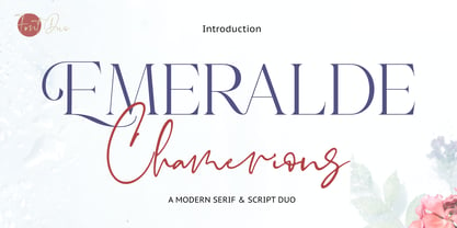 Introducing Emeralde Chamerions - Stylish Font Duo , Display Serif And Signature Stylish Script inspired by famous logo perfect for the purposes of designing templates, brochures, videos, advertising branding, logos and more.
 - P22 Virginian by IHOF,
$24.95 P22 Virginian is an historic script font designed by Ted Staunton for his historic novel centered around a family bible and the handwritten annotation through 7 generations. The Virginian font is strongly influenced by classic “Chancery cursive” script.
 - Railroad Gothic by Linotype,
$29.99Railroad Gothic was originally designed in 1906 for ATF (American Type Founders). This uppercase-only typeface is very condensed and also heavy, giving it a distinct 19th American wood type feeling. Like those 19th Century classics, Railroad Gothic is best used when set really big. Originally designed for use in railroad signage, Railroad Gothic has since been adapted for use in many American tabloid journals, which employ it in screaming headlines. When you need to set something large and loud for the whole world to see, this old ATF classic may be right for you. Railroad Gothic is an all caps font, and is available in digital format exclusively from Linotype. The typeface is included in the Take Type 4 collection from Linotype GmbH." - Garvis Pro by James Todd,
$40.00 Inspired by both turn of the century neoclassical forms and Dutch Fleischmann Type, Garvis is designed to bring the character of those typefaces into more modern times by increasing the sturdiness of the forms without losing their character. At display sizes, this typeface displays the subtle inconsistencies commonly found in traditional metal type printing. This detail is designed to virtually disappear at text size so as not to become distracting while still giving the text a warm, human quality. Garvis includes support for all contemporary (and many historic) Latin orthographies as well as complete IPA support.
 - Plantain by CastleType,
$49.00 Plantain Stencil is based on Plantain which in turn is my interpretation of Plantin Adweight, which was one of my first commissioned projects (by Smarter Image, long before they went bankrupt). Plantin Adweight is one of the most beautiful designs of the Plantin family, which is a modern revival typeface, cut under the direction of F. H. Pierpont in 1913, who based the design on that of a famous 16th century printer, Christophe Plantin, for whom Pierpont’s font was named. The stencil cut of Plantain adds a bit of sparkle to the design. Supports most European languages that use the Latin alphabet.
 - Linotype Brewery by Linotype,
$29.99Linotype Brewery is part of the Take Type Library, chosen from the contestants in the International Digital Type Design Contests of 1994 and 1997. This text font is available in six weights from light to black and was designed by Gustav A. Grinberg. An outstanding characteristic of the font is its light stroke contrast and its constructed forms. Its tiny, triangular serifs first become noticeable in very large typesizes, much like the Dutch fonts of the 17th century, Copperplate, for example. Linotype Brewery is cool and elegant and well-suited to middle-length texts and headlines. - Rever by ParaType,
$30.00 Rever is an experimental typeface by a young designer Sasha Smirnov. It clearly alludes to 19th century typefaces with reverse contrast, but still the character shapes are as simple and geometric as possible. Rever answers the question “What can a reverse-contrast typeface look like today?” Its set of styles is non-traditional: in addition to a regular one, there are also an oblique (slanted to the left, not to the right!) and a stencil styles. The typeface can work for typographic experiments of any kind -- web, print or motion design. The font was released by Paratype in 2019.
 - P22 Declaration by P22 Type Foundry,
$24.95 The new Declaration font set from P22 features two lettering fonts based on the Declaration of Independence of the United States of America. A script font that features the look of classic 18th Century penmanship, with a slightly irregular edge, as found on documents made with ink quill pens on vellum or parchment. The accompanying Blackletter font is also derived from the Declaration of Independence as it was used for emphasis and of course the famous document title itself. A third font, which features the signatures of the signers of the Declaration of Independence, is also included.
 - Rosina by Hashtag Type,
$28.49 Rosina is a geometric typeface with a distinctive charm. With a captivating fusion of dashing 1920s style and 21st Century sensibility, geometric forms have been taken and optically adjusted to create a sturdy typeface. Tall ascenders and descenders attempt to simulate architectural features of the Art Deco period, striving for a look of the future, nevertheless form always follows function. Rosina explores typographic boundaries and lends itself well to branding, posters and other display uses. Full details include 6 weights from Thin to UltraBold and include a range of OpenType features such as case sensitive punctuation.
 - Gingo by Mans Greback,
$29.00 Gingo is a wild brush script. The typeface was drawn and created by Måns Grebäck between 2018 and 2020. Its thick strokes are inspired by mid-century advertising, is full of spirit and progressiveness. The handwritten family consists of three weights: Gingo Thin, Gingo Medium and Gingo Bold. Its multiple alternate alphabets gives the font a true handwritten feeling. Use it for a logotype, a greeting card or as a headline. The font contains all characters you'll ever need, including all punctuation and numbers. It has an extensive lingual support, covering all European Latin-based scripts.
 - Chrysante by Mans Greback,
$29.00 Chrysante is a flowing pen script. The typeface was drawn and created by Måns Grebäck between 2018 and 2020. Its thin lines are inspired by mid-century advertising, emits optimism and has a strong personality. The ink script family consists of three weights: Chrysante Thin, Chrysante Medium and Chrysante Bold. Its multiple alternate alphabets gives the font a true handwritten feeling. Use it for a logotype, a greeting card or as a headline. The font contains all characters you'll ever need, including all punctuation and numbers. It has an extensive lingual support, covering all European Latin-based scripts.
 - Paestum by Three Islands Press,
$24.00Paestum is a Latin typeface inspired by Greek inscriptions of the 6th and 5th centuries B.C. Its name comes, suitably, from the Latin name for Poseidonia, a former Greek city south of Naples whose two remaining Doric temples have been on antiquities tours since at least the 1700s. Others have scanned this terrain before, of course, but earlier designs failed to supply a lower case. Although Paestum includes complete upper- and lowercase alphabets, diacritics, numerals, and essential punctuation, it does not have many unhistorical glyphs -- such as currency symbols and the @ sign. Paestum comes with three weights: light, medium, and heavy. - Nacinth by Mans Greback,
$29.00 Nacinth is a wild calligraphy script. The typeface was drawn and created by Måns Grebäck between 2018 and 2020. Its open shapes are inspired by mid-century advertising, is full of life and emits liberty and optimism. The handwritten family consists of three weights: Nacinth Thin, Nacinth Medium and Nacinth Bold. Its multiple alternate alphabets gives the font a true handwritten feeling. Use it for a logotype, a greeting card or as a headline. The font contains all characters you'll ever need, including all punctuation and numbers. It has an extensive lingual support, covering all European Latin-based scripts.
 - WL Circuits Circuits by Writ Large,
$12.00 This decorative tech typeface is inspired by the printed circuits boards of the twentieth century. Its default character set suggests commercially manufactured circuits while the OpenType alternates give more of a home-brew feel. The font is ideal for technical decorative titles in subjects as diverse as computers, techno music, ham radio, or “maker”-culture communications. It works well in large-type posters, logotypes, video games, album covers, or advertising. The OpenType font contains nearly 100 discretionary ligatures to give a varied appearance, along with several alternate cuts of common characters and ten electrical components (accessible as OpenType stylistic alternates).
 - Slabber by Monotype,
$30.00 Slabber is a big ol’ chunky serif that’s specifically designed for display purposes – headlines, logotype, branding, titles, packaging, signage, etc. Its characteristics include heavy bracketed serifs with a strong 19th century wood type influence, while a very large x-height combined with a small cap height creates an awkward tension that delivers a strong, stylish, contemporary typeface. Slabber is enhanced by 22 alternates that will allow you to add flourishes to your typography. All Latin European languages are covered in this 6-weight typeface. Key features: 6 Weights 22 Alternates European Language Support (Latin) 500 glyphs per font.
 - Positronic Toaster by Brian Crick,
$25.00 Positronic Toaster is a modern interpretation of the French upright scripts of the nineteenth century. It started off as an attempt to make a stylized script that didn't feel like it belonged on a 1950s chrome appliance. Later on, however, the design grew to embrace the qualities of that style of lettering. The result is something playful and elegant, that is not tied to any particular time period. The distinctive angular loops on the ascenders will join together in words like 'bulb' or 'wallflower' using OpenType contextual alternates. It is suitable for cards, wedding invitations, or any project requiring a fashionable, upscale look.
 - Linotype Irish Text by Linotype,
$29.99Linotype Irish Text is part of the Take Type Library, chosen from the contestants of Linotype’s International Digital Type Design Contests of 1994 and 1997. German artist Torsten Weisheit designed this font based on Irish scripts of the 5th century. Characteristic of this style is the mixture of upper case letters in the mostly lower case alphabet and vice versa. The letters look as though written with a broad tipped pen and have triangular serifs, displaying a decorative tendency akin to that of Irish calligraphy. Linotype Irish Text is intended exclusivley for headlines in large point sizes. - Calypso I by Typolar,
$65.00 Calypso I (Italian) draws its inspiration from type founders' plentiful show-off-letters, which were typical on title pages and lithographs in the early 19th century. It borrows luscious details from these but inherits a stiff modern backbone from its parent, Calypso E (Egyptian). Within the Calypso type family all fonts share the same dimensions and work together consistently. Calypso I supports many languages and includes, for example, four sets of basic numerals, circled numbers, alternative characters, case sensitive forms and dingbats. Give it a go on drop caps and headlines or even set short paragraphs with it. It loves colour and effects.
 - Montigny by Eurotypo,
$48.00 Montigny is a contemporary calligraphic font with classical roots, based on an 18th-century roundhand script. It is carefully designed, with a special emphasis on the connection of the letters, with high ascenders to give rise to the ornaments of the different letters. There is a special search for high readability. This font contain 585 glyphs, in addition, a wide selection of alternates and ligatures is included, to preserve the qualities of handwriting, in order to accommodate various design aesthetics. These alternatives are automatically applied through an advanced programming scheme or manually through several OpenType features.
 - Radix by TOMO Fonts,
$20.00 TOMO Radix gracefully merges the enduring charm of mid-century modernism with the captivating allure of pronounced inktraps. Inspired by the clean lines and geometric aesthetics of the Bauhaus movement, as well as the distinctive lowercase forms of Futura, this typeface embodies a harmonious fusion of classic and contemporary design. Featuring seven (7) weights, Radix showcases an extensive collection of spurless characters that delicately embrace and enhance the inktraps, resulting in a visually captivating and balanced composition. Complementing its versatility, the typeface offers alternate glyphs accessible through opentype stylistic sets, further expanding its expressive potential for any design project.
 - Avantime by Supfonts,
$16.00 Charming 80's retro inspired typeface with wonderful versatility given it includes 30 fonts. This is a perfect for any project Inspired by magazine adverts from the 70's and 80's - this family fit right in with bringing retro back into the 21st century. Super-versatile - have a scroll through all the preview to see the very wide range of variety the Avantime back can manifest the possibilities are really quite endless :) Avantime Font Features: 30 fonts Full Set of standard alphabet and punctuation PUA Encoded - no special software needed to access extra characters Language support: All European languages Multilingual Characters
 - Centim by Tour De Force,
$25.00 Centim is contemporary sans with sharp top endings of stems that give a bit technical charm to typeface. With a squarish look, it can be used widely in all modern publications or become a part of an corporate identity. In smaller sizes, Centim offers good readability due to its simple and good balanced lines. Centim is available in Regular and Bold weights, as an ideal high-contrasted combination where all characteristics of the typeface are purely effective. Centim is the archaic Serbian word for Centimeter, a word that was mostly used in tailoring during XIX and XX century.
 - Bookkeeper JNL by Jeff Levine,
$29.00 Bookkeeper JNL is based on the lighter weight version of R. Hunter Middleton's 'Karnak', produced in 1936 for Ludlow. "Karnak" itself was based on the geometric slab-serif "Memphis", designed in 1929 by Dr. Rudolf Wolf and released originally by the Stempel Type Foundry of Germany. According to Wikipedia, "Karnak" "was named after the Karnak Temple Complex in Egypt, in reference to the fact that early slab serifs were often called "Egyptians" as an exoticism by nineteenth-century type founders." Available in both regular and oblique versions, Bookkeeper JNL serves well as both a headline and text type face.
 - 1565 Renaissance by GLC,
$20.00 This set of initial letters was inspired from French renaissance decorated letters. It is a typical pattern, one among dozen quite similar, but this one was in use in Paris, unchanged, for centuries, and was still in use in the beginning of 1900s. This explains the difference between I and J, U and V. These characters were engraved years after the original set. Our font was inspired from a late 1800s publication. It can be used as well with Humane fonts (like our 1543 Humane Janson or 1592 GLC Garamond) as with modern fonts like our 1820 Modern or 1906 French News.
 - Nouveau Calendar JNL by Jeff Levine,
$29.00 Inspired by the lettering on Koloman Moser’s poster design for Fromme’s Calendar (circa 1912), Nouveau Calendar JNL is available in both regular and oblique versions. According to Wikipedia: “Koloman Moser (30 March 1868 – 18 October 1918) was an Austrian artist who exerted considerable influence on twentieth-century graphic art and one of the foremost artists of the Vienna Secession movement and a co-founder of Wiener Werkstätte. Moser designed a wide array of art works, including books and graphic works from postage stamps to magazine vignettes; fashion; stained glass windows, porcelains and ceramics, blown glass, tableware, silver, jewelry, and furniture.”
 - Niveau Grotesk by HVD Fonts,
$40.00 Niveau Grotesk—the companion of Niveau Serif —is a type family of six weights plus matching italics and small caps. It was designed by Hannes von Döhren in 2013. Influenced by classical nineteenth-century faces, the fonts are based on geometric forms. Because of its straight architecture, Niveau Grotesk has a “punch” in big sizes but is very legible in smaller sizes and longer texts—in print or on screen. Niveau Grotesk is equipped for complex, professional typography with alternate letters, arrows, fractions and an extended character set to support Central and Eastern European as well as Western European Languages.
 - Cottonwood by Adobe,
$29.00Cottonwood is a group effort of the typeface artists K.B. Chansler, B. Lind and J. Redick and displays the unmistakable look of the Wild West. It is stylistically modelled on the typefaces used in advertisements and signage toward the end of the 19th century. Typical for these capital alphabets are the split serifs which emphasize the markedly decorative character. Cottonwood is a kind of homage to the Western typefaces (woodtypes) which became popular through their use on Wanted signs in Western films. Cottonwood is best used sparingly in headlines to best emphasize its decorative, 'wild' character. - Yackien by Java Pep,
$13.00 Introducing the logo font called Yackien. This font is made for branding and logo font purposes, but still elegant for other design projects. In the Indonesian language Yackien (yakin) means believing, trust, and convincing. So Yackien can give off an aura of trust, believe, convincing in your brand's logo and designs. What's the included: - Yackien font and swash - Yackien logo doodles - Multilingual, support 27 languages - PUA encoded - Opentype features I hope you enjoy using Yackien. Please let me know at java.indonesian@yahoo.com if you have any questions.
 - Aviator SG by Spiece Graphics,
$39.00 Aviator, also known as Ventura Slim, is based on an old 1930s lettering style popularized by Carl Holmes in his wonderful book on the subject. Angular and at the same time aerodynamic, this low-waisted typeface is great for tight-fitting headlines and other condensed titling situations. You may find it equally useful in developing company logos with a truly retro look. This resurrected digital version of Aviator comes with a convenient and stylish set of alternate characters and small figures. Now enjoy your flight! Aviator is now available in the OpenType Std format. Some new characters have been added to this OpenType version including stylistic alternates and historical forms. These advanced features work in current versions of Adobe Creative Suite InDesign, Creative Suite Illustrator, and Quark XPress. Check for OpenType advanced feature support in other applications as it gradually becomes available with upgrades.
 - Farfa by Eurotypo,
$44.00 The Farfa fonts were designed for institutional use, commissioned by the City of Fara in Sabina, Italy. This project started from the study of the manuscripts found in the Abbey of Farfa, penned in a variant of the lower case of “Carolingian” typical style of that area. The Capital, ligatures and Small Caps, however, are based on the uncial writing that often appears in those codes and manuscripts. Farfa Abbey is a territorial abbey in northern Lazio, central Italy. It is one of the most famous abbeys of Europe. It belongs to the Benedictine Order and is located about 60 km from Rome, in the commune of Fara Sabina The origin of the Abbey is still unknown. Archaeological discoveries seem to prove that the first monastic establishment was built on the ruins of a pagan temple. The Vandals destroyed the first monastery in the fifth century. Only a few documents from the sixth-century prove the early presence of the monastic community. It had the heritage of Charlemagne (S VIII), the Lombard chiefs, and later the Carolingians, succeeded in withdrawing Farfa from obedience to the Bishops of Rieti, and in securing many immunities and privileges for the monastery. Farfa was at this period the most important monastery in Italy both from the point of view of worldly possession and ecclesiastical dignity.
 - Stay Gold by Decade Typefoundry,
$35.00 Stay Gold Script is a highly usable, powerful typeface. Perfect for everything from street wear brand to wedding invitations, sports team logos to band logos. Use it however you see fit. Just one thing - it’s not designed for all-caps settings.
 - Myglaos by Sealoung,
$25.00 Myglaos is a lovely elegant font for branding and logo design. This typeface includes a massive selection of ligatures, making it perfect for a variety of creative projects such as branding, logo design, content creation, packaging designs, stationery & so much more.
 - Bugenvil by Dansdesign,
$20.00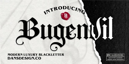 Bugenvil is a distinct, highly detailed and chic blackletter font. It is PUA encoded which means you can access all of the glyphs and swashes with ease! Bugenvil are great and usefull for product logo, poster title, headline, packaging, badge, packaging logo , clothing brand logo, Vintage design and much more
 - Irongate by CozyFonts,
$25.00 The Irongate Font Family has a retro personality. The common denominators, in all the glyphs, is a blunt center serif. The main top & bottom of each Cap & lower case glyphs have 'fan serifs', yep serifs that fan out. This font's influence is based on a monogram I designed for my daughter's wedding where she described her image of the event being 'Classic with a Vintage Flair'. Irongate can be pictured on many things dated from 1918 - 2018. The font is available in 4 basic weights Light, Regular, Bold & Extra Bold. An additional pdf is included that gives the code for an additional 14 Dingbats, with each weight. Irongate works extremely well with Invites, Stationary, Signage, Embroidery, Letterpress, Ads, Logos and anything that feels Industrial or Hand-Crafted, eg. Coffee, Breweries, Antiques, Woodcuts, Western Styles, Sports Styles, etc.
 - Bandoeng by HRDR,
$19.00 Bandoeng was inspired by the cover of the 1920 Nebiolo book. It is perfect for product logo, signage, branding projects, headlines, posters, packaging, clothing brand logos, Vintage design and much more.
 - Kingko by Graphicxell,
$20.00 Kingko Ligature Serif Font inspired by the famous minimalist logo perfect for the purposes of designing templates, brochures, videos, advertising branding, logos, invitation, layout design, elegant crafting, beauty design and more.