10,000 search results
(0.027 seconds)
- Ignorance by Typogama,
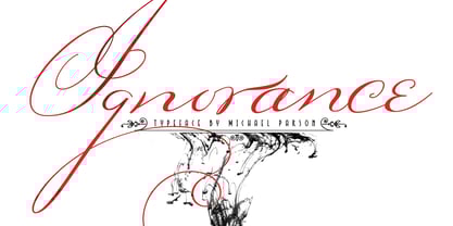
$29.00Ignorance is a script typeface that mimics traditional handwriting found in America in the 19th century. Full of vitality and personality, this typeface includes a wide range of Opentype ligatures, alternates and swash characters that allow multiple choices for each setting. This design is principally aimed for use in display and titling setting that will reveal it's finer details. - Amherst by Linotype,
$29.99Amherst is a family of blackletter-inspired typefaces. This family, created by British designer Richard Yeend in 2002, is unique in that it mains the feel of blackletter/medieval type without relying directly on historical forms. Amherst is split into two different sub-families, Amherst and Amherst Gothic. Amherst is very geometric interpretation of Fraktur. Fraktur was a style of German type very popular in central Europe from 1517 until the early 20th Century. Its letters appear "broken" at certain angles and joints. Still, we recommend using it primarily for display purposes. Amherst is available in three weights: Regular, Bold, and Heavy. Amherst Gothic is very loosely inspired by late medieval letterforms, often called Texturas or Gothics. However, the letterforms of Amherst Gothic seem just as inspired by the Art Deco movements of the 1920s and by contemporary sans serif type design as anything else. Nevertheless, certain letters in this typeface do appear more "gothic" than others, especially A, D, M, Y, d, r, and x. Amherst Gothic is made up of three fonts, Amherst Gothic Split, Amherst Gothic Split Alternate, and Amherst Gothic Italic. Amherst Gothic Split has in-lined characters, and appears very ornamented. The alternate characters in Amherst Gothic Split Alternate are quite medieval in their appearance. Amherst Gothic Italic is the least medieval-looking of the set; its characters are very round, and more geometric. All six styles of the Amherst Family are OpenType format fonts, and include old style figures. - Ongunkan France Glozel Runic by Runic World Tamgacı,
$100.00In March 2010, Émile Fradin, a modest peasant farmer from central France, died at the age of 103. To his grave he took the secret behind one of the most controversial archaeological discoveries of the 20th century. A discovery which put into question the very origins of the written word and the paternity of European culture. It was the uncovering of peculiar artefacts would come to be known as the Glozel runes. The discovery of the Glozel runes On the first day of March 1924, a not yet 18-year-old Fradin was ploughing his family’s field in the hamlet of Glozel, when his cow stumbled into a hole. When he and his grandfather, Claude, looked closer, they discovered a mass of broken stone, under which lay an underground chamber. Within, they discovered pottery fragments, carved bones, and a peculiar clay tablet covered in bizarre characters that neither of the two could decipher. The family requested a subsidy for excavation works to be carried out, but were refused by the regional authority. With that disappointment, it seemed as though the discovery would fade into obscurity. However, the following year, news of Fradin’s unusual clay tablet reached the ears of the physician and amateur archeologist, Antonin Morlet. By the end of May 1925, Morlet began the first of his excavations.4 Within the first two years alone, he had amassed some 3,000 finds. - JT Collect by OGJ Type Design,
$35.00JT Collect is a hybrid sans-serif typeface for the 21st century that takes a playful approach to the type design heritages of Germany and Switzerland. Confidently built on a geometric structure and infused with elements from traditional grotesque typefaces, it hits the sweet spot between geo and grot. I developed JT Collect purely digitally, drawing from years of experience with analog type design. The letters aren’t based on one particular source but seek to merge different type genres from the first half of the 20th century and lift them to a contemporary quality level. JT Collect is less reserved than strictly geometric designs and brings some industrial workmanship and honesty into the game. The six weights plus three optical sizes of JT Collect offer what you need to make an impact. While cool and elegant in the Light weight, the fonts show more presence on the page as they grow bolder. To this end, I drew the letterforms with a slightly unrefined, brawny air in the bolder weights. This sets them apart from the perceived purity of more geometric designs. The Book weight is ideal for short texts and medium-length copy, and the forceful Bold makes wordmarks look crisp and lets headlines radiate cosmopolitan self-confidence. JT Collect is suitable as a primary typeface for branding, advertising, packaging, stationery, posters, documents, and websites from trades and industries as diverse as food & fashion, media & makers, culture & creators, games & gems, sports & startups. Use JT Collect for film titles or watch faces, for leaflets or store signs, for business cards or billboards: this font family is as adaptable as a chameleon (and like a chameleon, it’s never boring). Try it in different contexts. You won’t be disappointed. Its adaptability also makes JT Collect a great starting point for poised and persuasive font combinations. Even a sans/sans pairing is possible due to hybrid nature of JT Collect—something that’d be hard to achieve with most other sans-serif typefaces on the market. You can add to it a heavy slab from the OGJ library, like Temper Wide. You might go for a geometric or a grotesque typeface as secondary (text) typeface. Or you could set your body copy in a classic serif typeface such as Caslon, Sabon, or Plantin. That’s right: JT Collect is a true team player. Whether you need a grotesque or a geometric sans: try JT Collect. You can get the best of both worlds. - Gersio by Rosario Nocera,
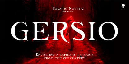
$16.00Gersio is a revisiting of a lapidary typeface from the 19th century designed for the horror and thriller genre but thanks to its strong distinctiveness it’s also suitable for branding. Gersio is available in light, regular and bold weights in two versions: solid and Scratched, it also offers a large selection of alternative letters. Gersio is suitable for display works, posters and billboards. - Sailor Marie by Otto Maurer,
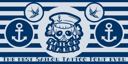
$23.00Sailor Marie is dedicated to my little lovely Daughter Marie. Sailor-Marie is an Oldschool Tattoo-Style Font, made for all Tattooartists of the world. The Tattoos of the 50th like Sailor Jerry are always designed with Fonts like this. The Font comes with many Opentype Feature and an GraphicFontfile wit Banner and more. - Virile by Monotype,
$29.99The Virile and Virile Open fonts are late nineteenth-century typefaces in a rustic style. Use the Virile fonts to add charm to book covers and posters relating to natural history and decorative arts. - Bandelwerk by 2D Typo,
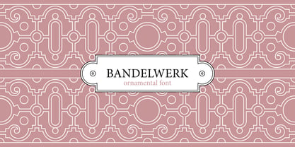
$32.00 - Stanhope by Red Rooster Collection,
$45.00Designed by Les Usherwood. Digitally engineered by Paul Hickson. Les based the design on a turn-of-the-century typeface of the same name. The foundry is believed to be Soldans & Payvers, circa 1904. - RMU Pergola by RMU,
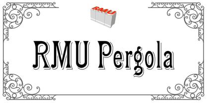
$35.00 - Mazette by Alfab,
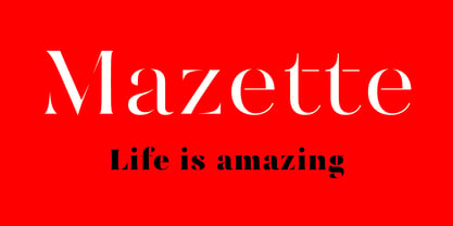
$55.00Mazette is a modern display typeface with a distinctive elegant look. Inspired by the refined forms of a nineteenth century Didot, Mazette offers the freedom to break contours in the manner that a stencil font would. Its sharp construction logic and great readability make it an ideal display font for publishing or branding. - Aramaic 450 by Archaica,
$30.00This font provides a typical set of characters for the ancient Imperial Aramaic language (the form of Aramaic that saw widespread use in the Persian Empire during the sixth to fourth centuries BC). It includes a full set of alphabetic characters, including some variant shapes, as well as the ancient numeral forms. - Chepina Script by Vástago Studio,
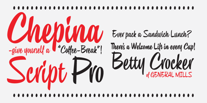
$7.00This is a type design based on a retrospective food design posters from 1950 in the United States. The intention was to create handmade letters ideal for handmade projects. The principal reference was the book of Steven Heller Mid-Century Ads. This typeface was the graduation project of my degree as graphic designer. - Netherfield by Ef Studio,
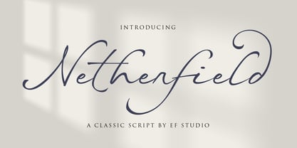
$15.00Netherfield is classic script font that inspired by eighteen century manuscript. It has unique stem and form that show antique feels. Suitable for branding project, packaging, quotes, greeting card, and so on. You can get uppercase and lowercase letters, numeral and punctuation, lowercase alternates, and ligatures. Please look at preview pictures detaily. - ArTarumianVard by Tarumian,
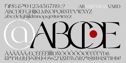
$40.00The font reproduces the characteristic detail of some Armenian fonts of the past centuries - the disruption of thin elements. At the same time, the font combines the plasticity of lapidary inscriptions and modern aesthetics. The name Vard (Rose) is highlights an elegance of style. Applicable for headlines, drop caps, advertising compositions, etc. - AT Lagermont by Amera Type,
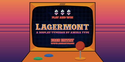
$20.00Lagermont is inspired by console games, labels and print media from the 19th century. With a strong and bold serif font style comes with an elegant, where every curve is made very gracefully and gently. It will be a perfect choice for graphic design, clothing, books, logos and many other visual displays - Hedgehog Hans by Hanoded,
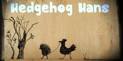
$15.00Hans My Hedgehog is an old fairytale which was made famous by the Grimm Brothers, when they published it in the early 19th century. Hedgehog Hans font is a fat, rounded and rather cute typeface, which is ideal for children's books and posters. It is highly legible, and comes with extensive language support. - Kanjur by Grummedia,
$20.00Kanjur was inspired by a page from an 18th century Buddhist book. Used for block text at first glance it has a very striking resemblance to Asian lettering. It is an English reading caps only font with minimal characters ( A-Z 0-9 & £ $ ¢ ! ? , . ). It is not intended as a serious font, just enjoy. - Kinver by Greater Albion Typefounders,
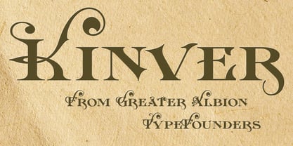
$15.00 - PL Davison by Monotype,
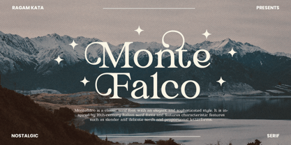
$29.99PL Davidson Americana is an all-capital typeface based on woodcut designs from the nineteenth century. The PL Davidson Americana font was designed by M. Davison in 1965, during the revival of American headline faces. - Monte Falco by RagamKata,
$16.00 - PL Davison Zip by Monotype,
$29.99PL Davidson Americana is an all-capital typeface based on woodcut designs from the nineteenth century. The PL Davidson Americana font was designed by M. Davison in 1965, during the revival of American headline faces. - Year 2000 Replicant - Personal use only
- Elettra by Flanker,
$23.00Elettra is a completely new type, primarily designed for display or titling. As you can see, Elettra adopting a transitional style between the nineteenth century printing typefaces and the new fonts at the beginning of the twentieth century: in particular serif are elongated, but the oblique or round shapes continuing softly on the horizontal line instead of staying vertical. Furthermore, two more glyphs were designed for each capital letter: a swashed form, which tends to embrace the following letter, and a backswashed version, that instead embraces the previous. The swash version is accessible from swash or from stylistc set 01 OTF features, while the backswashed version is accessible from stylistc set 02 OTF feature. Be aware that the stylistic set OTF features are not available on Photoshop or Illustrator. - Monotype Engravers Old English by Monotype,
$29.99The rather wide, caps-only Monotype Engravers family imitates scripts that evolved from copperplate and steel plate engravers hands of the nineteenth century, which were a quite expressive medium! Monotype Engravers' letters show a strong contrast between thick and thin strokes and have sharply cut serifs. In 1899, Robert Wiebking (who worked for a number of foundries in his time) designed an all-caps typeface named Engravers Roman."" Shortly thereafter, American Type Founders, Inc. (ATF) released another successful ancestor of this design in 1902, ""Engravers Bold,"" designed by Morris Fuller Benton. Engravers Bold was also released by the Barnhart Brothes & Spinder foundry. Also made available by Lanston Monotype at the beginning of the twentieth century, the Engravers faces soon became a popular choice for letter heads, advertising and stationery. - Monotype Engravers by Monotype,
$40.99The rather wide, caps-only Monotype Engravers family imitates scripts that evolved from copperplate and steel plate engravers hands of the nineteenth century, which were a quite expressive medium! Monotype Engravers' letters show a strong contrast between thick and thin strokes and have sharply cut serifs. In 1899, Robert Wiebking (who worked for a number of foundries in his time) designed an all-caps typeface named Engravers Roman."" Shortly thereafter, American Type Founders, Inc. (ATF) released another successful ancestor of this design in 1902, ""Engravers Bold,"" designed by Morris Fuller Benton. Engravers Bold was also released by the Barnhart Brothes & Spinder foundry. Also made available by Lanston Monotype at the beginning of the twentieth century, the Engravers faces soon became a popular choice for letter heads, advertising and stationery. - Mazurka NF by Nick's Fonts,
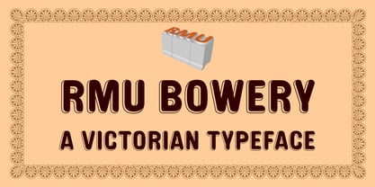
$10.00Two typefaces from the 1923 Barnhart Brothers & Spindler specimen book have been combined to produce this gem. Swagger Capitals, designed by Carl S. Junge, for the uppercase and Gothic Novelty Title for the lowercase. Named for a lively dance from the nineteenth century. Both versions of this font contain the Unicode 1252 Latin and Unicode 1250 Central European character sets, with localization for Romanian and Moldovan. - RMU Bowery by RMU,
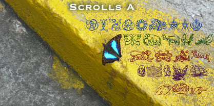
$30.00 - Scrolls A by Wiescher Design,
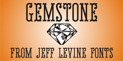
$39.50 - Gemstone JNL by Jeff Levine,
$29.00 - Penny by Wooden Type Fonts,
$20.00 - PL Behemoth by Monotype,
$29.99Dave West released the Behemoth Semi-Condensed font in 1960. With nineteenth-century wood-cut influence PL Behemoth Semi-Condensed is an example of the revival of slab serif styles, popular in the sixties and seventies. - Ultimate Ornaments by Gerald Gallo,
$20.00 - Ondine by Linotype,
$29.99Ondine is one of the early typefaces of Adrian Frutiger. It looks as though it were written with a broad tipped pen, however, Frutiger actually cut the forms out of a piece of paper with scissors. The forms of Ondine are reminiscent of the humanist period, the high point of the Italian Renaissance text typefaces of the 15th century. This movement was centered in Florence, the base of the Humanist movement overall, and the home of a famous type school of the time. The main goal of the educated writers was to faithfully recreate the writing of the admired literary works, whose aesthetic was as important as their content. Ondine displays a regular and open character. Texts set in this typeface give the impression of being hundreds of years old. Ondine should be used in point sizes of 12 and larger and is best for short texts and headlines. - Mackay by René Bieder,
$39.00Mackay is a powerful transitional serif in 6 weights plus matching italics, designed for screen and print. The eccentric serifs on uppercase letters like E, F, L and T are inspired by Alexander Kay’s “Ronaldson” from 1884, working as the starting point for the family. The lowercase letters follow the traditional Antiqua model with attributes tracing back to drawings from the early 20th century. The “grotesk” lowercase a, as well as the sharp lowercase s, derived from the closed shapes of uppercase letters like C, G or S, create a compact and bold appearance while a large x-height and small descenders add a modern look. In favor of a dynamic and elegant impression, the design of the italic cuts come with a strong calligraphic influence. This results in completely new shapes for letters like lowercase a or g, ensuring a smooth integration into their surrounding letters while maintaining a distinctive appearance when combining with romans. The family comes with a variety of opentype features like case sensitive shapes, old style figures, fractions, ordinals and many more. Additional attention was given to the standard and discretionary ligatures, extending the structure of the basic glyphs with elegantly designed letter combinations for g/i, i/t or s/t. According to their dynamic architecture, the italic weights are equipped with additional initial swash characters to subtle accentuate the calligraphic roots. As a result of a high stroke contrast the family works great in paragraphs with medium to large font sizes like headlines, short paragraphs or logos. With its 12 cuts, the family meets all requirements on high quality typography. - Vendetta by Emigre,
$69.00The famous roman type cut in Venice by Nicolas Jenson, and used in 1470 for his printing of the tract, De Evangelica Praeparatione, Eusebius, has usually been declared the seminal and definitive representative of a class of types known as Venetian Old Style. The Jenson type is thought to have been the primary model for types that immediately followed. Subsequent 15th-century Venetian Old Style types, cut by other punchcutters in Venice and elsewhere in Italy, are also worthy of study, but have been largely neglected by 20th-century type designers. There were many versions of Venetian Old Style types produced in the final quarter of the quattrocento. The exact number is unknown, but numerous printed examples survive, though the actual types, matrices, and punches are long gone. All these types are not, however, conspicuously Jensonian in character. Each shows a liberal amount of individuality, inconsistency, and eccentricity. My fascination with these historical types began in the 1970s and eventually led to the production of my first text typeface, Iowan Old Style (Bitstream, 1991). Sometime in the early 1990s, I started doodling letters for another Venetian typeface. The letters were pieced together from sections of circles and squares. The n, a standard lowercase control character in a text typeface, came first. Its most unusual feature was its head serif, a bisected quadrant of a circle. My aim was to see if its sharp beak would work with blunt, rectangular, foot serifs. Next, I wanted to see if I could construct a set of capital letters by following a similar design system. Rectangular serifs, or what we today call "slab serifs," were common in early roman printing types, particularly text types cut in Italy before 1500. Slab serifs are evident on both lowercase and uppercase characters in roman types of the Incunabula period, but they are seen mainly at the feet of the lowercase letters. The head serifs on lowercase letters of early roman types were usually angled. They were not arched, like mine. Oddly, there seems to be no actual historical precedent for my approach. Another characteristic of my arched serif is that the side opposite the arch is flat, not concave. Arched, concave serifs were used extensively in early italic types, a genre which first appeared more than a quarter century after roman types. Their forms followed humanistic cursive writing, common in Italy since before movable type was used there. Initially, italic characters were all lowercase, set with upright capitals (a practice I much admire and would like to see revived). Sloped italic capitals were not introduced until the middle of the sixteenth century, and they have very little to do with the evolution of humanist scripts. In contrast to the cursive writing on which italic types were based, formal book hands used by humanist scholars to transcribe classical texts served as a source of inspiration for the lowercase letters of the first roman types cut in Italy. While book hands were not as informal as cursive scripts, they still had features which could be said to be more calligraphic than geometric in detail. Over time, though, the copied vestiges of calligraphy virtually disappeared from roman fonts, and type became more rational. This profound change in the way type developed was also due in part to popular interest in the classical inscriptions of Roman antiquity. Imperial Roman letters, or majuscules, became models for the capital letters in nearly all early roman printing types. So it was, that the first letters in my typeface arose from pondering how shapes of lowercase letters and capital letters relate to one another in terms of classical ideals and geometric proportions, two pinnacles in a range of artistic notions which emerged during the Italian Renaissance. Indeed, such ideas are interesting to explore, but in the field of type design they often lead to dead ends. It is generally acknowledged, for instance, that pure geometry, as a strict approach to type design, has limitations. No roman alphabet, based solely on the circle and square, has ever been ideal for continuous reading. This much, I knew from the start. In the course of developing my typeface for text, innumerable compromises were made. Even though the finished letterforms retain a measure of geometric structure, they were modified again and again to improve their performance en masse. Each modification caused further deviation from my original scheme, and gave every font a slightly different direction. In the lower case letters especially, I made countless variations, and diverged significantly from my original plan. For example, not all the arcs remained radial, and they were designed to vary from font to font. Such variety added to the individuality of each style. The counters of many letters are described by intersecting arcs or angled facets, and the bowls are not round. In the capitals, angular bracketing was used practically everywhere stems and serifs meet, accentuating the terseness of the characters. As a result of all my tinkering, the entire family took on a kind of rich, familiar, coarseness - akin to roman types of the late 1400s. In his book, Printing Types D. B. Updike wrote: "Almost all Italian roman fonts in the last half of the fifteenth century had an air of "security" and generous ease extremely agreeable to the eye. Indeed, there is nothing better than fine Italian roman type in the whole history of typography." It does seem a shame that only in the 20th century have revivals of these beautiful types found acceptance in the English language. For four centuries (circa 1500 - circa 1900) Venetian Old Style faces were definitely not in favor in any living language. Recently, though, reinterpretations of early Italian printing types have been returning with a vengeance. The name Vendetta, which as an Italian sound I like, struck me as being a word that could be taken to signifiy a comeback of types designed in the Venetian style. In closing, I should add that a large measure of Vendetta's overall character comes from a synthesis of ideas, old and new. Hallmarks of roman type design from the Incunabula period are blended with contemporary concerns for the optimal display of letterforms on computer screens. Vendetta is thus not a historical revival. It is instead an indirect but personal digital homage to the roman types of punchcutters whose work was influenced by the example Jenson set in 1470. John Downer. - Xylo Script by Wiescher Design,
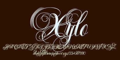
$49.50XyloScript is my first script with a woodcut look to it. Still, it is very elegant. Xylo is Greek and means “wood”. This script is another one I designed in the tradition of the 18th-century English calligrapher George Bickham and the 19th-century American calligrapher Platt Rogers Spencer. I like it, your very crafty Gert Wiescher BTW if your font manager tells you that the font is corrupted, just ignore that! This script is very complex and that’s causing some font managers to say the font is corrupted. I have tested it and it works fine! - Friar by Ascender,
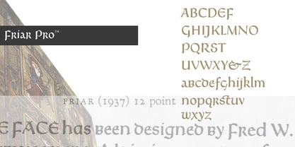
$29.99Friar Pro is a revival of Frederic W. Goudy's "Friar" typeface. Goudy described this typeface design as a 'typographic solecism' as it combines a lowercase of half-uncial forms from the 4th through 7th centuries with an uppercase of square capitals from the 4th century. Steve Matteson developed the font as a tribute to Goudy and his joy of typographic exploration. Steve created a complete character set with OpenType typographic enhancements to give the font an authentic appearance to the original. Friar Pro is a beautiful design which imparts a scribal appearance to any document including greeting cards, certificates and official papers. - Monotype Old Style by Monotype,
$29.99Monotype Old Style is a nineteenth century update of Caslon Old Face with characteristics of the moderns built in. Monotype Old Style was recut by Monotype in 1901 from a Stephenson Blake & Company version. The design originated at the Miller and Richard foundry in 1860. In some respects it can be seen as transitional between old style and modern, but the spirit of the old styles predominates. By the turn of the century it had become a successful rival to the moderns. The Monotype Old Style font family is an attractive design which gives a light, airy feel to text. - Duc de Berry by Linotype,
$29.99Duc de Berry is a part of the 1990 program Type before Gutenberg, which included the work of twelve contemporary font designers and represented styles from across the ages. Linotype offers a package including all these fonts on its web page, www.fonts.de. The design of Duc de Berry was influenced by those of typefaces created between the 13th and 16th centuries. The font was named after Duc de Berry, whose beautiful missals inspired typefaces of the 15th century. The capital letters are especially elegant and can be used either as initials or as contrast to the much more reserved lower case letters.
