10,000 search results
(0.055 seconds)
- Esquina Stencil by Green Type,
$37.00
- Oooh Baby by TypeSETit,
$24.95 - Madcut by Sebastian Cabaj,
$20.00
- Wawe by Volcano Type,
$19.00 - Roman Ornamented by Intellecta Design,
$23.90
- Gothic Nesbitt by Wooden Type Fonts,
$20.00
- Epsum by Sebastian Cabaj,
$5.00
- Super Chango 94 by Nomaszebras,
$10.00
- KG Sorry Not Sorry by Kimberly Geswein,
$5.00
- LDJ Ho Ho Snow by Illustration Ink,
$3.00 - Whisk by Jonahfonts,
$39.00
- Octane MF by Masterfont,
$59.00
- Monster Monster by Dismantle Destroy,
$19.00
- Imagine Font by Jens Isensee,
$15.00
- Ephesis by TypeSETit,
$24.95
- Hagada Mesugnan MF by Masterfont,
$59.00
- Big Mamma by Resistenza,
$39.00
- Levontin MF by Masterfont,
$59.00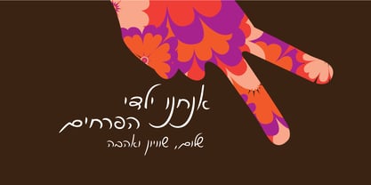
- Maza by Gaslight,
$25.00
- Bernhard Gothic Medium by Wooden Type Fonts,
$15.00
- Murray Hill by Bitstream,
$29.99 - Meruba MF by Masterfont,
$59.00
- Square Peg by TypeSETit,
$24.95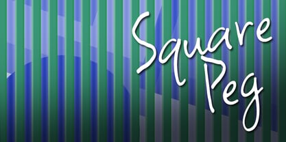
- Sign Gothic Bold Condensed by BA Graphics,
$45.00 - Palette by Berthold,
$57.99
- DHF Dipanegara - Personal use only

- Danielle Signature by Rometheme,
$18.00
- Amazing Sweety by Almarkha Type,
$33.00
- Village by Font Bureau,
$40.00
- Koldby by Factory738,
$15.00
- Lemon Press by Attype Studio,
$7.00
- Heylova Script by Atasi Studio,
$16.00
- Charllona by Yoga Letter,
$12.00
- Melancoline by Atom,
$24.00
- Halgeta by AF Type,
$10.00
- SK Yok Deve by Salih Kizilkaya,
$9.00
- Morning Sweety by Almarkha Type,
$27.00
- Quamoclit by Enfeeltype,
$15.00
- Neugrooms by Zamjump,
$17.00
- Hughson by Sarid Ezra,
$13.00
