10,000 search results (0.049 seconds)
  1. KR Snowflake 2 - Unknown license
  2. KR Harvest Dings - Unknown license
  3. Comic Book - Unknown license
  4. KR Space Dings - Unknown license
  5. Troglodyte - Unknown license
  6. Heil Vertica - Unknown license
  7. Zoloft - Unknown license
  8. Roslyn Contour - Unknown license
  9. Stricto Sensu - Unknown license
  10. KR Christmas Bells - Unknown license
  11. KR Bad Kitty - Unknown license
  12. XPFourTwoContour - Unknown license
  13. Dekon - Unknown license
  14. KR Star Letters - Unknown license
  15. KR A Round - Unknown license
  16. KR Music Class - Unknown license
  17. KR Christmas Frames - Unknown license
  18. KR Kinda Spacey - Unknown license
  19. Broken Glass - Unknown license
  20. Gutenberg Textura - Unknown license
  21. KR Paper Hearts - Unknown license
  22. KR Kitchen Dings - Unknown license
  23. Grill Sans - Unknown license
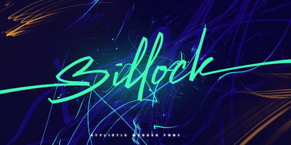
  24. Billock by Alit Design, $19.00
    Presenting the Billock Script font by alitdesign. The Billock script font is inspired by the strokes of a highlighter marker that has a bold square character combined with a dynamic signature script style. Combined with the concept of bright and neon colors, the design of the Billock font becomes more sporty and modern. This Billock script font is very suitable to be the latest collection of your font library, because it has many and very unique swashes and alternatives that make the designs you will make look different and cool. The Billock Script font is perfect for magazine cover designs, brochures, flyers. Instagram ads, Canva Design and so on with unique and modern concepts. besides that this font is very easy to use both in design and non-design programs because everything changes and glyphs are supported by Unicode (PUA). The Billock Script contains 887 glyphs with many unique and interesting alternative options. Language Support : Latin, Basic, Western European, Central European, South European,Vietnamese. In order to use the beautiful swashes, you need a program that supports OpenType features such as Adobe Illustrator CS, Adobe Photoshop CC, Adobe Indesign and Corel Draw. but if your software doesn't have Glyphs panel, you can install additional swashes font files.
  25. Coins Coupes NF by Nick's Fonts, $10.00
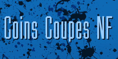
    Chamfer, released by Barhart Brothers & Spindler in the late nineteenth century, provided the pattern for this simple, elegant headline face. Both flavors of this font feature the 1252 Latin, 1250 Central European, 1254 Turkish and 1257 Baltic character sets.
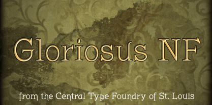
  26. Gloriosus NF by Nick's Fonts, $10.00
    Originally issued as Apollo by the Central Type Foundry of Saint Louis, this face evokes the glamor of late Victorian era. Both versions of this font support the Latin 1252, Central European 1250, Turkish 1254 and Baltic 1257 codepages.
  27. Open TECH Neue by TypoGraphicDesign, $9.00
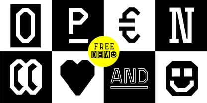
    The typeface Open TECH Neue is designed from 2018—2021 for the font foundry Typo Graphic Design by Manuel Viergutz. 6 font-styles (Sans Serif, Invert, Outline, Slab Serif, Stretch, Box Puzzle) + 1 icon-style with 1097 glyphs (Adobe Latin 3) incl. 400+ decorative extras like icons, arrows, dingbats, emojis, symbols, geometric shapes, catchwords, decorative ligatures (type the word #LOVE for ♥︎ or #SMILE for ☺ as OpenType-Feature dlig) and stylistic alternates (6 stylistic sets). For use in logos, magazines, posters, advertisement plus as webfont for decorative headlines. The font works best for display size. Have fun with this font & use the DEMO-FONT (with reduced glyph-set) FOR FREE! ■ Font Name: Open TECH Neue ■ Font Styles: 6 (Sans Serif, Invert, Outline, Slab Serif, Stretch, Box Puzzle) + Icons + DEMO (with reduced glyph-set) ■ Font Cate­gory: Dis­play for head­line size ■ Glyph Set: 1097 glyphs (Adobe Latin 3) incl. 400+ icons (decorative extras like arrows, catch words, dingbats, emojis, symbols) ■ Design Date: 2018—2021
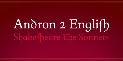
  28. Andron 2 by SIAS, $44.90
    The sister fonts Andron 2 English and Andron 2 Deutsch provide a groundbreaking new possibility to render literature text bodies in a sophisticated traditional and yet modern way of type. In German typographic history there has once been a long-lasting struggle called the Frakturstreit (the blackletter quarrel). It was about wether German text ought to be composed in blackletter or rather in Roman type, a question upon which even Goethe, Schiller and other period celebrities got grey over time. However, blackletter type remained alive and has just recently seen an astonishing renaissance. This is not about a blackletter revisionism or some ‘mixture’ concept arguably bridging the gap between either worlds. Andron 2 English and Andron 2 Deutsch offer a new approach to circumvent that old antagonism. As for the lowercase letters I applied certain features of blackletter type onto the glyphs – but entirely abandoned the principle of the broken stroke as such. The result is a lowercase alphabet in the classical Andron style which may be considered an attractive alternative for text in English, German or even other languages. So it’s no longer entirely about choosing between ‘modern’ Roman or ‘ancient’ blackletter only. Andron 2 English Regular and Andron 2 Deutsch Regular feature the same lowercase glyphs but differ in the majuscules (Andron 2 English has normal Latin capitals). ++++ 2012 + NEW! +++ In response to its growing popularity we now present five new fonts as part of the Andron 2 series. Andron 2 English is completed by an Italic and a Bold font. Andron 2 Deutsch now contains three interesting alternative fonts: Italic, Scriptive and Laendlich. Last but not least – A new set of wonderful classical typographic ornaments is part of the Italic and Scriptive fonts. – You can also purchase these ornaments separately as “Andron Ornamente”.
  29. Zekton Free - Unknown license
  30. Pakenham Free - Unknown license
  31. Mufferaw Free - Unknown license
  32. Turban Hey NF by Nick's Fonts, $10.00
    The “Moorish arch” treatment of certain letters on a 2001 book on Dutch design, executed by René Knip, provided the inspiration for this exotic unicase typeface. The font also includes arabesque designs in the brace, florin and section mark positions. Both versions of the font include 1252 Latin and 1250 CE (with localization for Romanian and Moldovan) character sets.
  33. Mangal by Microsoft Corporation, $49.00
    Mangal™ is an OpenType font for the Indic script Devanagari. Mangal can be used to write Hindi, Sanskrit, Marathi, Nepali, Punjabi and other Indic scripts. Mangal is based on Unicode, contains TrueType outlines and was designed by Raghunath Joshi for use as a UI font. Copyright ™ 2001 Microsoft Corporation. All rights reserved. Character Set: Latin-1, Devanagari.
  34. Before the Rain - Personal use only
  35. Lady Ice - SC - Unknown license
  36. Lady Ice - Light - Unknown license
  37. Lady Ice - Extra Light - Unknown license
  38. Lady Ice Revisited - Unknown license
  39. WEAR FAT SHIRT by TypoGraphicDesign, $15.00
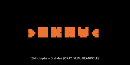
    CONCEPT/ CHARACTERISTICS A display font that allows you to »Kleckern und Klotzen« (modified German proverb »to not take half-measures«) The fat and square character to the font, a bold and loud statement. The motto is square, practical, fat. The font styles ranging from high-contrast line difference "beanpole" over mediocrity "slim" to the fattest and blackest "okay" style. A font with humor ^^ APPLICATION AREA The modern, square lightweight »Fat Wear Shirt« would be happy as a display typeface in headline size on the following areas and would find this very real bold: Edi­to­rial Design (Maga­zine or Fan­zine) or Web­de­sign (Head­line Web­font for your web­site), party flyer, movie pos­ter, music pos­ter, clothing, fashion, t-shirts, music covers or web­ban­ner. And and and… TECHNICAL SPECIFICATIONS Head­line Font | Dis­play Font | Fat Techno Font »Wear Fat Shirt« Open­Type Font (Mac + Win) with 3 styles (okay, slim, beanpole) & 268 gly­phs. Alter­na­tive let­ters and liga­tures (with accents & €) Desk­top Font (.otf) + Web Font (.svg, .eot, .woff) KONZEPT/BESONDERHEITEN Eine Display-Schrift bei der Kleckern und Klotzen erlaubt ist! (Verändertes deutsches Sprichwort »nicht kleckern sondern klotzen«) Der fette und eckige Charakter verleihen der Schrift eine plakative und laute Aussage. Das Motto lautet quadratisch, praktisch, fett. Die Schriftschnitte reichen von kontrastreichen Linienunterschied »beanpole«, über mittelmaß »slim« bis zum fettesten und schwärzesten »okay« Style. Eine Schrift mit Humor ^^ EINSATZGEBIETE Das moderne, quadratische Leichtgewicht »Wear Fat Shirt«, würde sich als Aus­zeich­nungs­schrift in Head­line­größe über fol­gende Ein­satz­ge­biete sehr freuen und fände dies echt fett: Logos/Wortmarken aller Art, Flyer für fast jede Party, Plat­ten ­Co­ver, CD-Cover und Icon Design, Pla­kat­ De­sign, Kleidung, T-Shirts, Comics und Gra­phic­no­vels, Game– und Video­spiel Design aller Gen­res, als Head­line­schrift für print und digi­tale Maga­zine, Bücher und Web­sei­ten u.v.m. TECHNISCHE INFORMATIONEN Head­line Font | Dis­play Font | Fat Techno Font »Wear Fat Shirt« Open­Type Font (Mac + Win) mit 3 Schrift­schnit­ten (okay, slim, beanpole) & 268 Gly­phen. Inkl. dia­kri­ti­sches Zei­chen, alter­na­tive Buch­sta­ben, Liga­tu­ren & €. Desk­top Font (.otf) + Web Font (.svg, .eot, .woff)
  40. JH Fares by JH Fonts, $45.00
    Jh Fares is a modern / simple Kufic style font. The user may notice plenty of white space around the text leading to a highly readable font. The Kufic script is one of the oldest Arabic Handwriting, first appeared in el Koufa - Iraq. The original calligraphy was derived from the Aramaic letters; later it went thru lots of enhancements. Its typical uses include decorative writings for Mosques / palaces, Magazines / Newspapers / Books titles and Greetings.
Looking for more fonts? Check out our New, Sans, Script, Handwriting fonts or Categories
abstract fontscontact usprivacy policyweb font generator
Processing