10,000 search results
(0.363 seconds)
- Modern MT for Dior KO by Monotype,
$29.99Cut by Monotype between 1900 and 1902, the Monotype Modern font family was based on Miller & Richards News 23 and 28; slightly condensed news text types of the 1890s. Monotype Modern is a lively typeface, with long, fine hairlines and well rounded letterforms, representing the best of nineteenth century modern face design. A classic text face, and typical of the moderns that were produced in the United Kingdom at that time, being less extreme in its rendering than some of the models of purer form being produced elsewhere. Monotype Modern is an excellent text face for magazines, newspapers and books, the heavier and more condensed versions are useful in headlines and display. - MonsterPie by Marc Lohner,
$28.00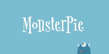 Say hello to MonsterPie. This font brings the funny appearance of irregular designed characters together with the classic look of the Didone typefaces from the 18th century – that makes it a good choice for theme parks, movie posters, games, greeting cards and kid’s products. A large database and plenty of alternate characters work in the contextual alternates feature to keep your headlines bouncing all the time. Other implemented Opentype features are case sensitive forms, ligatures, arbitrary fractions and many more. On top, MonsterPie has a set of nice arrows, two different ampersands and extensive support for south-eastern, central and western european languages, as well as for Pīnyīn to offer. Designed by Marc Lohner in 2016.
 - Harajuku Script by Hanoded,
$15.00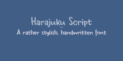 Harajuku Script is an ‘easy-on-the-eye’ script font. I made it with a Japanese brush pen. The font is quite stylish, so I named it after Tokyo’s Harajuku area, which is known internationally as a center of Japanese youth culture and fashion. Harajuku Script would look good anywhere, but product packaging, websites and magazines could profit from this handwritten gem.
 - Millenium Pro by TypoStudio Pro,
$29.00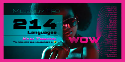 In designing the Millenium® typeface, Patrice Provost was inspired by great typographers in the great French typographic tradition to create a unique and modern variable font. His goal was to reinterpret the mid-20th century sans serif style in a variable typeface that will conform to the need of the 21st century. He succeeded with mastery in drawing large characters. In doing so, patrice provost added an exceptional dimension to the design of this typeface, a graphic personality that evolves over the styles. The attention to detail brought to each letter, each accent, each diacritic, make this font a solid tool for all Western graphic designers and layout artists. With more than 1000 glyphs per style, Millenium® can be used in more than 210 countries. With its 13 styles drawn in Classical Roman style, in Italics and in condensed Millenium® provides designers from all walks of life with a fantastic tool to bring novelty and class to your creations. Ideal for signage, Millenium, thanks to its "wide case", is also widely used for posters. It is also a gold mine for creating logos for dynamic tech start-ups. The Millenium family is made up of designs with progressive weight changes. it is very extensive. It ranges from "Super Thin" to "Extra Black". Unique in the world, its thinness makes it possible to design a very light style even to print on posters and other large formats. Designed from the outset as a variable typeface, Millenium offers a range of 900 possible variations and an infinity of creations...
 - Gemstone Monogram by MonogramBros,
$12.00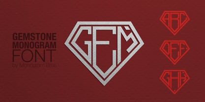 Gemstone Monogram Font is a perfect shaped monogram font consisting of 78 letters and 1 basic frame. With just a single font file you will be able to create beautiful monograms in just a matter of minutes after the purchase! Gemstone Monogram Font comes with font file in OTF format. It features all the modern advanced font features such as Contextual Alternates, effectively eliminating the need to use multiple separate font files for left, center and right letters.
 - Round Monogram by MonogramBros,
$12.00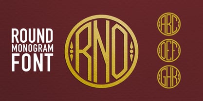 Round Monogram Font is a perfect round shaped monogram font consisting of 78 letters and 3 frames. With just a single font file you will be able to create beautiful monograms in just a matter of minutes after the purchase! Round Monogram Font comes with font file in .otf format. It features all the modern advanced font features such as contextual alternates, effectively eliminating the need to use multiple separate font files for left, center and right letters.
 - Western Monogram by MonogramBros,
$12.00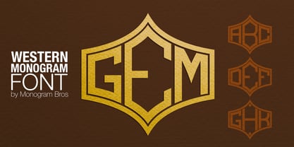 Western Monogram Font is a perfect shaped monogram font consisting of 78 letters and 1 basic frame. With just a single font file you will be able to create beautiful monograms in just a matter of minutes after the purchase! Western Monogram Font comes with font file in OTF format. It features all the modern advanced font features such as Contextual Alternates, effectively eliminating the need to use multiple separate font files for left, center and right letters.
 - Liquid Monogram by MonogramBros,
$12.00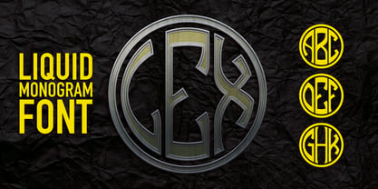 Liquid Monogram Font is a perfect round shaped monogram font consisting of 78 letters and 1 frame. With just a single font file you will be able to create beautiful monograms in just a matter of minutes after the purchase! Liquid Monogram Font comes with font file in .otf format. It features all the modern advanced font features such as contextual alternates, effectively eliminating the need to use multiple separate font files for left, center and right letters.
 - Kinder Garten by Artyway,
$18.00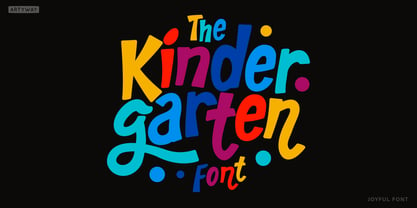 Vibrant, lively color font with a Mexican fiesta flair for joyful, child-centric designs. Celebrate the joy of childhood with this vibrant and colorful font. Perfect for creating a lively atmosphere in schools, kindergartens, and festive events. The playful, funny design captures the essence of a child's world, making it ideal for projects that speak to the hearts of both kids and adults. From birthday parties to school logos, this font adds a touch of joy to every design.
 - Mayfair by Canada Type,
$24.95The long awaited and much requested revival of Robert Hunter Middleton's very popular classic is finally here. Mayfair Cursive was an instant hit for Middleton in 1932, and it went on being used widely until late into the 1970s, in spite of it never having crossed over to film type technology. Like a few of its contemporary designs, most notably the work of Lucien Bernhard, Mayfair is a formal script that is somewhat based on traditional italic forms with swash uppercase, but also employs subsidiary hairline strokes in some of its lowercase as an emphasis to the script's cursive traits. Why these gorgeous letters never made the leap into photo typesetting is a mystery to us. But here they are now in digital form, almost three quarters of a century since they first saw the light in metal. Mayfair was redrawn from original 48 pt specimen. It also underwent a major expansion of character set. Plenty of swash characters and ligatures were added. An alternate set of lowercase was also made, in order to give the user a choice between connected and disconnected variations of the same elegant script. Mayfair ships in all popular font formats. While the Postscript Type 1 and True Type versions come in two fonts (Mayfair and Mayfair Alt), the OpenType version is a single font containing all the extra characters in conveniently programmed features that are easily accessible by OpenType-supporting software applications. We are quite sure today's graphic designers will be appreciative of having access to the face that all but defined menus, romance covers, wine and liquor labels and chocolate boxes for almost two 20th century generations. - Audacious by Monotype,
$40.00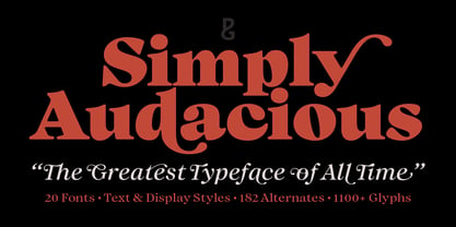 Audacious is a quirky, confident and adorable serif type family across five weights in both text and display styles. This attention-grabbing retro typeface has an imperfect nature that embraces its quirks and irregularities, giving each font a distinctive and somewhat oddball personality. Its defining characteristics include large open counters, awkward stresses, large exaggerated wedge serifs, and voluptuous teardrop terminals. Whatever typographic compositions you create, Audacious will demand attention, making it perfect for titling, headlines, logotype, and branding projects. Take advantage of the 182 stylistic alternates to embellish your type and add that touch of class to titles and logos. Display weights work really well with close line spacing and stunning headlines are a breeze to create. Text weights make for a pleasant reading experience while packing all the punch and versatility found in the display variants. There are 20 fonts altogether, in Text and Display styles with weights from Regular to Black in both roman and italic. Audacious has an extensive character set that covers all Latin European languages. Key features: 2 Styles in Roman and Italic 5 weights: Regular, Medium, SemiBold, Bold, & Black 182 Alternates Full European character set (Latin only) 1100+ glyphs per font.
 - Oval Scalloped MNG by MonogramBros,
$12.00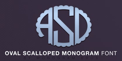 Oval Scalloped Monogram is a perfect shaped monogram font consisting of 78 letters and 1 basic frame. With just a single font file you will be able to create beautiful monograms in just a matter of minutes after the purchase! Oval Scalloped Monogram Font comes with font file in OTF format. It features all the modern advanced font features such as Contextual Alternates, effectively eliminating the need to use multiple separate font files for left, center and right letters.
 - Shell Monogram by MonogramBros,
$12.00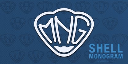 Shell Monogram is a perfect shell shaped monogram font consisting of 78 letters and 1 basic frame. With just a single font file you will be able to create beautiful monograms in just a matter of minutes after the purchase! Shell Monogram Font comes with font file in OTF format. It features all the modern advanced font features such as Contextual Alternates, effectively eliminating the need to use multiple separate font files for left, center and right letters.
 - Shield Monogram by MonogramBros,
$12.00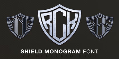 Shield Monogram is a perfect shaped monogram font consisting of 78 letters and 1 basic frame. With just a single font file you will be able to create beautiful monograms in just a matter of minutes after the purchase! Shield Monogram Font comes with font file in OTF format. It features all the modern advanced font features such as Contextual Alternates, effectively eliminating the need to use multiple separate font files for left, center and right letters.
 - Rounded Square Monogram by MonogramBros,
$15.00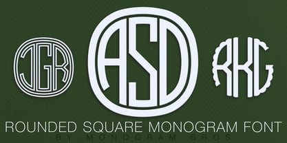 Rounded Square Monogram is a perfect shaped monogram font consisting of 78 letters and 1 basic frame. With just a single font file you will be able to create beautiful monograms in just a matter of minutes after the purchase! Rounded Square Font comes with font file in OTF format. It features all the modern advanced font features such as Contextual Alternates, effectively eliminating the need to use multiple separate font files for left, center and right letters.
 - Heart Monogram by MonogramBros,
$12.00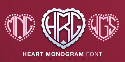 Heart Monogram is a perfect heart shaped monogram font consisting of 78 letters and basic frames. With just a single font file you will be able to create beautiful monograms in just a matter of minutes after the purchase! Heart Font comes with font file in OTF format. It features all the modern advanced font features such as Contextual Alternates, effectively eliminating the need to use multiple separate font files for left, center and right letters.
 - Block Monogram by MonogramBros,
$12.00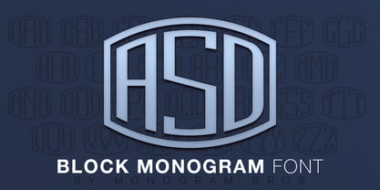 Block Monogram is a perfect shaped monogram font consisting of 78 letters and 1 basic frame. With just a single font file you will be able to create beautiful monograms in just a matter of minutes after the purchase! Block Monogram Font comes with font file in OTF format. It features all the modern advanced font features such as Contextual Alternates, effectively eliminating the need to use multiple separate font files for left, center and right letters.
 - Jemina by Creativemedialab,
$20.00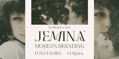 Jemina is a modern, unique serif font. The dynamic curve of each letter looks elegant and charismatic and will be the center of attention for the eye which sees it. The abstract feel of its characters strikes a balance between modern and classic typography. Perfect for branding, logo, and fashion-related concepts.
 - Loxley by Canada Type,
$24.95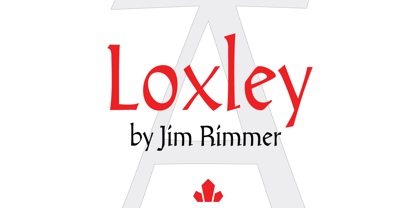 Drawn shortly before Jim Rimmer's passing in 2010, Loxley was designed to be used in a fine press edition of the folklore story of Robin Hood. It was named after the cited birthplace of the story's classic hero. Loxley's shapes were inspired the same early Roman faces (such as Subiaco from the late 1400s) that influenced Frederick Goudy's Aries, Franciscan and Goudry Thirty types. It exhibits the preculiarities of Jim's left-handed calligraphy, as well as his outside-the-box thinking with exit strokes and serif variations. Loxley was remastered for the latest technologies in 2013. Now it comes with a character set of over 450 glyphs, including plenty of stylistic alternates, a full compliment of f-ligatures, a Th-ligature, basic fractions, ordinals, a long s for historic setting, comprehensive class-based kerning, and extended Latin language support. 20% of this font's revenues will be donated to the Canada Type Scholarship Fund, supporting higher typography education in Canada.
 - Rational by René Bieder,
$39.00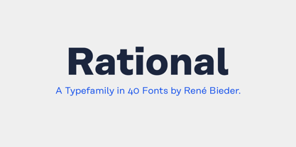 Rational is a contemporary representative of the Grotesk genre inspired by drawings dating back to the early 20th century. It is a highly utilitarian family focusing on clarity and simplicity by approaching the design with a strong modernist fused attitude. Rooted in Swiss traditional and pragmatic design, Rational contains ingredients like horizontal terminals and uniform widths which result in a highly functional and flexible font. This is juxtaposed with circular and subtle calligraphic elements creating a warm and approachable layer within an objective surrounding. With more than 800 glyphs per font, the family is optimized for numerous scenarios. It comes in 10 weights with matching italics containing opentype features like small caps, stylistic sets, case sensitive shapes, tabular figures and many more, making Rational the perfect choice for modern, contemporary and professional typography.
 - Eterea by Corradine Fonts,
$60.00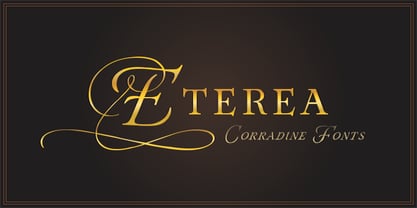 Eterea is a formal font inspired in the monumental inscriptions of classic Rome, but not strictly sticking to the ancient roman typographic characteristics. Its unique look is the result of mixing diverse typographic styles, but mostly having traces from the 16th century transitional style. It bears a big difference of proportion between upper and lower case, additionally to the upper case having much more ornamental traces. Eterea has four different flavors of capitals which change very slightly in the cursive versions. In the italic versions, the lower case (actually small capitals) changes substantially its characters to make its reading more flowing and is not simply an inclined version of the letters. Eterea is a very expressive font, ideal for titles and short texts of sober and elegant appearance.
 - Vastago Grotesk by Sudtipos,
$39.00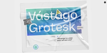 We are pleased to announce the launch of Vástago Grotesk, a nine-weight sans serif font family, inspired by the traditional grotesque designs of the 20th century. The particular ink traps, result of the G drawing, create it a visual universe that is replicated throughout the system, generating personality and a functional distinctive in multiple contexts. Vástago Grotesk was born out of an interest in exploring the possibilities of Sans Serif font design, a process that is complemented by the advice of excellent typographers throughout the world thanks to the Type Crit Crew initiative. The design was carefully constructed, achieving functionality in different sizes, ranging from a subtle Thin to a Heavy weight that projects grandeur and character. Vástago Grotesk is a challenge come true. We hope you enjoy it.
 - Neue Hammer Unziale by Linotype,
$29.99Unzial typefaces consist of letter forms of the Capitalis Monumentalis and the majescule cursive. The origins of Unizial faces date back to the 5th century. The Neue Hammer Unziale was developed from the Hammer typeface, which was designed by Victor Hammer in 1921, cut by A. Schuricht and appeared with the font foundry Klingspor in 1923. In 1953, American Unizial was expanded to include some new figures, also designed by Hammer, and was rereleased by Klingspor with the name Neue Hammer Unziale. The forms are based on old scripts in books of antiquity and the early Middle Ages and the font is a new variation of a classic. Neue Hammer Unziale has been a favorite for certificates and diplomas and is recommended for headlines and shorter texts in a point size of 12 or larger. - Magari by Sudtipos,
$49.00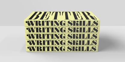 Partially inspired by the mid XIX century german condensed serif typefaces –and a clear connection to Italian classics– Magari extrapolates that idea of fusion to a new level, getting a unique variable font file, or 9 specific weights. With that in hand the user is able to find the perfect match for any design. From an ultra compressed thin to an extended black style, Magari is a perfect font for display use. It’s jazzy vibes and wide range of weights make it incredibly perform in advertising, packaging or editorial design, assuring great impact whether it’s thin and tall, or big and bold. The addition of three kinds of endings for the lowercase –from a serif to two tailed strokes– and two different swash sets for the capitals, Magari lets the user play with infinite results.
 - Itacolomi by Eller Type,
$35.00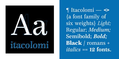 Itacolomi is a font family conceived for editorial purposes. Based on historical models, it is well placed in the present time, turning classic proportions into contemporary letter shapes. It is robust and clean in small sizes, keeping the consistency in both print and digital environments. Itacolomi is a result of an extensive investigation into Scottish style types produced in Brazil around 1820. A possible connection between Brazil and Scotland. In short, it preserves the qualities of the famous 19th-century Scotch Roman types while adding a personal approach with unique features from the early Brazilian models. It has six weights, romans plus respective italics, which makes twelve fonts with an extensive character set that supports over two hundred languages and includes small caps, ligatures, old-style and tabular numerals.
 - Cunaeus by George Tulloch,
$21.00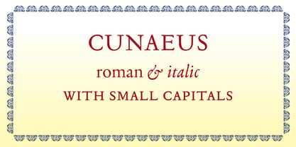 Cunaeus is intended primarily for use in running text. It brings together the types of two renowned sixteenth-century punchcutters: the roman is an interpretation of a pica font cut by Ameet Tavernier (c.1522–1570), and the italic that of a pica font of Robert Granjon (1513–1589/90). Granjon’s italics have inspired a number of revivals in the past, but usually of his more slanted styles; the present digitization features the lesser slant of his so-called ‘droit’ style typical of the mid 1560s. Cunaeus provides wide support for west, central, and east European languages that use the roman alphabet. Among its OpenType features are ligatures, small caps, several sets of numerals, contextual alternates, intelligent implementation of long ‘s’, and fractions. For more detail, please see the pdf available in the Gallery.
 - Ambroise Std by Typofonderie,
$59.00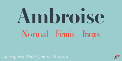 An exquisite Didot font in 18 series Ambroise is a contemporary interpretation of various typefaces belonging to Didot’s late style, conceived circa 1830, including the original forms of g, y, &; and to a lesser extent, k. These unique glyphs are found in Gras Vibert, cut by Michel Vibert. Vibert was the appointed punchcutter of the Didot family during this period. It is the Heavy, whom sources were surest that Jean François Porchez has been used as the basis for the design of the typeface family. In the second half of the 19th century, it was usual to find fat Didots in several widths in the catalogs of French type foundries. These same typefaces continued to be offered until the demise of the big French foundries in the 1960s. Ambroise attempts to reproduce more of what we see printed on paper in the 19th century; a more accurate representation of Didot punches. So, the unbracketed serifs are not truly square straight-line forms but use tiny transitional curves instead. The result on the page appears softer and less straight, particularly in larger sizes. The illustrious Didot family of type founders and printers Every variation of the typeface carries a name in homage to a member of the illustrious Didot family of type founders and printers. The condensed variant is called Ambroise Firmin. The extra-condensed is called Ambroise François. Ambroise Pro brought back to life: fifteen years in the making! Club des directeurs artistiques, 48e palmarès Bukva:raz 2001
 - Macaroni Sans by Type Associates,
$30.00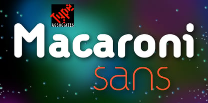 Macaroni Sans evolved from our search for an extended font family consisting of a range of weights in both uprights and obliques, with a contemporary appeal. The desired character was to be sympathetic with a range of high-tech consumer products so a friendly, soft approach was called for. The resulting mix of geometric shape, rounded terminals, subtle italic angle of just six degrees and a few quirky stroke endings met with an enthusiastic response. As its subject product line exhibits brilliant color and imagery, a style was called for that conveyed contemporary appeal and readability but would not compete with the savvy products. We arrived at a clean, modern, sociable look that would suit a broad subject field in either text, semi display or signage. Its simple lines and monoline strokes fit well with logo usage or screaming posters, enhancing letterheads or websites, for foodstuffs to autos, insurance to swimming pools, lawfirms to babyfood. Macaroni Sans is the perfect typeface for branding, logotypes, may even flatter challenging viewing conditions. Rounded types have been around (pardon the pun) for centuries; numerous examples can be seen on old wood type posters, which in a small way prompted the name: in fashion Macaroni was a term used in mid-eighteenth century Europe to describe a dandy, a chap who displayed flamboyance in dress and hairstyle and spoke outlandishly or in an effeminate manner. Hence the term macaronic verse.
 - Prangs by Sudtipos,
$59.00 The late-19th-century Prussian-American printer and publisher Louis Prang, the “father of the American Christmas card”, was well-known for his efforts to improve art education in the United States. He published many instructional books and even founded a training school for art teachers. One of the books he published included a series of alphabets for sign painters, lithographers, illuminators, architects and civil engineers. There was nothing truly original there — in the book’s preface, Prang says that the alphabets were “based on foreign forms and adapted for American taste”. The one alphabet that caught my attention in that book was one simply called “Italic”. It’s a high- contrast modern, a Didone really, but with an interesting little twist: the lowercase is almost entirely connected, which makes for an interesting mix of modern typography and classic calligraphy. That stuff is right up my alley now. Whenever my eyes happen on a modern, it’s easy, even almost impulsive for me to envision swashes coming out of serifs and terminals. The caps melt and the minuscules dance with them. And so I brought my vision to life. Prangs is an italic set of three weights, each containing more than 1400 glyphs with plenty of OpenType features and Latin language support. This set celebrates the convergence of three centuries of fancy display alphabets. These fonts should work wherever moderns are used to elevate and scripts are used to appeal — namely today’s branding, packaging and glossy publications.
 - P22 Graciosa by IHOF,
$29.95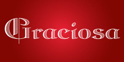 P22 Graciosa is a five font family based upon designs for a metal type by Carlos Winkow (1882–1952), a German type designer who lived and worked in Spain in the early 20th Century. Graciosa is a sort of hybrid blackletter/text font, with simplified blackletter caps and a serifed lowercase with subtle script flare. There is a Regular, Black, an open version called White, and an engraved version called Gris. The version called Multi serves as a fill font to allow for multi-colored layering options. A revival of these designs was initiated by Matthias Beck in 2015. The character set was expanded for use in 21 languages (OpenType Standard). The digitization and reintroduction of these old fonts—created in Spain and practically forgotten—makes them regain a new life. This project was subsidized by the Spanish Ministry of Education, Culture and Sport.
 - Antique Spenserian by Dharma Type,
$24.99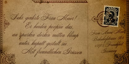 This antique script is based on Spencerian script released from MacKellar, Smiths, & Jordan in the 19th century. This family comes in two varieties, Standard and ornamented capitals. The Standard has orthodox style for formal text and display. This makes it possible you to use this style for any projects. The unique Ornamented is suitable for eye-catching part of your project: headlines, wedding invitations and logo. Every glyphs were added antique and distressed effect by hand work with great care to be looked like natural. Use your ideas to enjoy this exclusive script.
 - Zapf Elliptical 711 by ParaType,
$30.00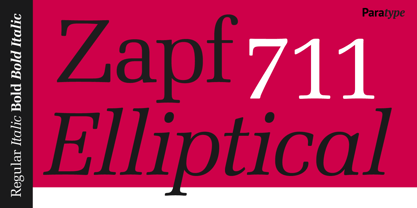 The Bitstream version of Melior, a twentieth century modern face commissioned by Stempel and designed by Hermann Zapf in 1952. It is based on Zapf’s thoughts about the squared-off circle known as a super-ellipse. The type was originally intended as a newspaper text face by Linotype. Hermann Zapf’s Melior exhibits a robust character through classic and objective forms. Versatile and extremely legible, it can be used for a variety of texts and point sizes. Cyrillic version was developed by Natalya Vasilyeva and licensed by ParaType in 2002.
 - Delicious Pro by Yes Please,
$45.00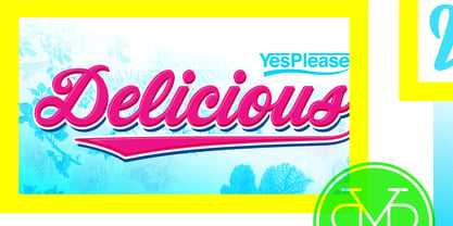 Delicious Pro from Yes Please is a bold, contemporary take on the classic Americana script. Inspired by the vibrant history of early 20th Century American packaging vernaculars, Delicious Pro delivers unique flavor packed with gestural personality perfect for headlines, packaging and more! Delicious Pro features conventional ligatures, a standard set of accents and symbols, and a full set of extended custom styling ligatures to provide a versatile end-user experience. Delicious Pro has played hard for Nike Women's Training, Nike Sportswear, IFC and more. Delicious Pro is designed by Lee Schulz.
 - Fun Time Nouveau JNL by Jeff Levine,
$29.00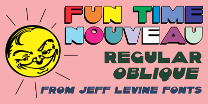 “One Hundred Alphabets for the Show Card Writer” was published in 1919 to afford sign artists the ability to create signs and show cards in then-contemporary lettering styles. One such alphabet was big, bold and representative of the Art Nouveau stylings popular in the early part of the 20th Century. Most likely it was applied to store sales and public events that were casual and informal, for its letter forms are free of any constraints. This design is now available as Fun Time Nouveau JNL in both regular and oblique versions.
 - Tertre by Paragraph,
$22.00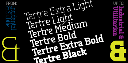 Tertre is a display/short text typeface with a wide range of applications from signage or posters to menus and pricelists; branding, packaging or publishing. It is named after Place du Tertre, a square located at the top of Montmartre—a hill overlooking Paris, made famous by the artists of the 19th and 20th Century. Like in Galette, the letters have no overhangs and the stroke thickness of capitals and lower case letters is identical, making hinting or anti-aliasing more uniform at any point size and zoom combination.
 - Zart by DSType,
$40.00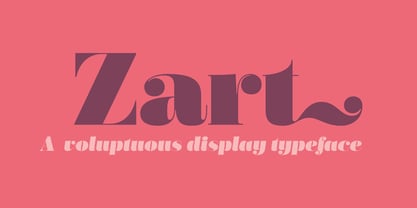 Zart is a heavy yet delicately sensitive display typeface filled with character, a free interpretation of the classical French styles from the late eighteenth century, reimagined for modern use. While it’s vertical strokes carry the typical weight of this style, the thinness of the horizontal strokes is further extended into the characters with the introduction of large vertical ink traps. This allowed us to design slightly narrower letters which, coupled with shorter serifs, result in a overall darker expression, creating really impactful headlines. Zart is available in three versions: Regular, Italic and Script.
 - Barbedor by Linotype,
$29.99The Swiss designer, Hans Eduard Meier, originally designed Barbedor for the Hell Digiset machine. Barbedor is based on handwritten humanist book scripts of the 15th century, and its chracters are typical of the style of those made by broad tipped pens. Tiny serif-like elements reveal the line of the writing utensil and emphasize the nature of this typeface. Classic and legible, Barbedor is a clear, harmonious typeface and an excellent choice for longer body texts. Its large choice of weights offers variety, which makes the typeface suitable for multiple design applications. - Atrium by Alex Jacque,
$20.00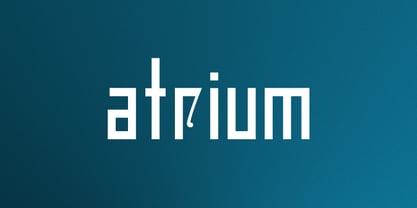 Atrium, designed by Alex Jacque, is a strong, linear, geometric sans-serif display typeface based off century-old pen art by W.E. Dennis. Atrium's stubbornly geometric letterforms are set off with a few softening flourishes on a few glyphs. It's sharp corners, straight verticals and horizontals make Atrium pack some punch when used in headlines, pull quotes, and logotypes. Atrium was released in 2012 in OpenType format and comes in three different weights: light, regular, and bold, with a regular and oblique version of each for a total of 6 styles in the family.
 - Charlemagne by Adobe,
$29.00The capital alphabet Charlemagne was designed in 1989 by Carol Twombly. The basic forms are modelled on those used in classical Roman engravings. They are distinguished by pointed serifs which sometimes extend beyond the bounds of the forms, for instance on the E, F and S. These serif forms have made other historial appearances, for example, in handwritten rectangular capitals of the 9th century. The serifs lend the typeface a light ornamental touch. Charlemagne is a typical titling typeface and is best used in large and very large point sizes to emphasize its classical elegance. - Ehrhardt MT by Monotype,
$29.99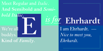 The Ehrhardt name indicates that this typeface is derived from the roman and italic typefaces of stout Dutch character that the Ehrhardt foundry in Leipzig showed in a late-seventeenth-century specimen book. The designer is unknown, although some historians believe it was the Hungarian Nicholas Kis. Monotype recut the typeface for modern publishers in 1937 to 1938. Ehrhardt has a clean regularity and smooth finish that promote readability, as well as a slight degree of condensation, especially in the italic, that conserves space. Ehrhardt is a fine text face, especially for books.