10,000 search results
(0.077 seconds)
- Nouveau Years JNL by Jeff Levine,
$29.00 Sheet music at the beginning of the 20th Century reflects both the musical and artistic tastes of the times in often colorful ways. It seemed to be a favorite thing amongst songwriters of that era to come up with very wordy song titles. The cover of the sheet music for 1907’s “Every Little Bit Added to What You’ve Got Makes Just A Little Bit More” checks in at fourteen words, but the hand lettered title (done in an Art Nouveau style) made it worthy of transposition into a digital type face. Nouveau Years JNL is available in both regular and oblique versions.
 - Halisah by MC Creative,
$11.00 Halisah is monoline script font which natural movement and elegant for valentine style. Halisah perfect for branding projects, logo, wedding designs, social media posts, advertisements, product packaging, product designs, label, photography, watermark, invitation, stationery and any projects that need handwriting taste. ________________________________________ What’s Included : • (OTF / TTF/WOFF) • Standard Glyphs • Ligature • Works on PC & Mac • Simple installations • Accessible in the Adobe Illustrator, Adobe Photoshop, Adobe InDesign, even work on Microsoft Word. • PUA Encoded Characters – Fully accessible without additional design software. • Fonts include multilingual support for; ä ö ü Ä Ö Ü ß ¿ ¡ ________________________________________ Thank you for your purchase! Hope you enjoy with our font!
 - Madinah Authentic by Ergibi Studio,
$20.00 Madinah Authentic a Stylish font Inspired by elegant and branded stuffs make this font look classy and awesome in many ways to your latest project. Madinah Authentic is font is perfect for projects that look elegant like logos, wedding designs, branding, social media posts, advertisements, product packaging, product designs, labels, photography , watermarks, invitations, stationery and any project that requires handwriting tastes. Madinah Authentic font includes over 68 ligatures to make it more natural and has a beautiful characteristic handlettering Uppercase & Lowercase, Numeral, Punctuation, Stylistic/Alternate Characters, and also Support Multi Language. if you have any Question please Message Me. Thank you ERGIBI STUDIO
 - Strom by Lasse Strøm,
$35.00 STROM is а modern sans serif font with minimalistic and geometric characters. The rounded corners give the typeface a friendly look, yet it retains a professional quality. The attention to detail paid during its development means that this typeface offers a vast range of design possibilities – and helps users create eye-catching designs. The different font styles are built on the same foundation, so they can be mixed and matched while maintaining a harmonious look. The simple, clean lines make it noticeable and ideally suited in display settings, advertising, packaging, logo, branding, poster, billboards, film, television, web, screen and print design.
 - Kids At Play by Celebrity Fontz,
$19.99 Kids at Play is a playful and curious font with children silhouettes in the form of letters. The letters/children are engaged in a variety of poses and activites. If you want to develop a text, story, or publication for or about children, this is a must-have font. Includes full set of accented characters.
 - Stamen by Wordshape,
$20.00 Stamen is the answer to a big question: What would happen if one tried to create a typeface that was ‘out of time’? If a type designer was to turn off the internet and put away the type specimens and just try to explore limbic, phantom history, what might that look like? No slavish explorations of the past. No gropings toward the future. No exhaustive core sample of the contemporary. Instead, using what one remembers of history and our collective vision of the future (usually a future imagined from the past) and channeling that into something that is, hopefully, new… The Bentons meet Frutiger for a Manhattan on a space station while Matthew Carter sways to the sweet sounds of the chorale that occasionally played through the halls of Stephenson Blake. This smear of implicit history expressed without explicit reference—this is Stamen: a family of 12 typefaces with a ton of alternate characters. The bold weight was designed for the LP “I Thought the Future Would Be Cooler” ( http://ittfwbc.com/ ) by the band YACHT in response to their request for a typeface that was ‘lost in time’, and refers to neither strict historical models nor purely futuristic forms. I built a small family out from there. It works well in text, but just as well for display setting. I think you’ll enjoy using it.
 - Dominant Youth by Fikryal,
$25.00 Introducing Dominant Youth, a bold and impactful display serif font that exudes confidence and strength. With its commanding presence, Dominant Youth is designed to make a lasting impression on any creative project. The font’s robust and assertive letterforms showcase a unique blend of classic elegance and contemporary style. Its tall and slender structure adds a touch of sophistication, while the sharp serifs give it a distinctive edge. Dominant Youth is carefully crafted to capture attention and evoke a sense of boldness and youthfulness. Whether you’re working on branding, editorial design, headlines, posters, or any other project that demands attention, Dominant Youth is the perfect choice. Its versatile nature allows it to excel in both digital and print mediums, ensuring your message stands out in a captivating manner. The well-defined characters of Dominant Youth provide excellent legibility, even at smaller sizes. The font’s wide range of weights and styles offers flexibility, allowing you to experiment and find the perfect balance for your design needs. From light and elegant variations to bold and impactful options, Dominant Youth empowers you to create visually striking compositions that leave a lasting impression. Don’t settle for ordinary typography when you can make a statement with Dominant Youth. Embrace its commanding presence, embrace its youthful energy, and elevate your designs to a new level of distinction. Features: Dominant Youth Multilingual Support Thank you
 - Patched by Mans Greback,
$39.00 Patches is a multi-faceted, victorian-era serif typeface for when you need something more than plain text. Get that extra attention while adding a genuine, original appearance to your message. Patches was designed from scratch to give a sense quality and depth. Its designer Mans Greback has created a typeface with a complex structure, yet one that will be easy to master. This work will suit every style, taste and skill level. It is a decorative and completely hand-drawn design in vintage lettering, with the perks and flexibility of present-day technology, which is exactly what you'd expect from a modern typeface. Whether you are making a decorative floral headline, drawing a cowboy logo, or creating a unique design based on this ornamental font, the hopes are that Patches can give you a set of tools and inspiration to bring out the best of your artistry. Standing on the shoulders of giants, it was inspired by a wide range of works, and will hopefully be able to continue to teach and inspire future artists. Or at least help you become a better designer when you're designing an elegant and classic headline. Set the coloring of Patches to light gold and cream tones to apply a luxurious look, or in dark tones for a more rugged impression. Bold, bright colors will make it appear In the mid-1800s, decorative design flourished in the Western major cities. Victorian style thrived and encouraged techniques such as enamelling, embroidery and calligraphy. From the 1880s onwards, there were a series of reactions to higher Victorian tastes, with Art Deco reaching the heights of the 20th century. However, the Victorian art persisted popularity, as it changed to more sophisticated designs which made it more attractive to specific professions and groups. The evolution of the Victorian style in the mid-20th century was a key factor in the succession of the movement. Classic shops and salons, sport designs and traditional festivals, and later Rock'n'Roll and Harley Davidson-themed graphics inspired the continued development of the art. Aspiring to carry on this tradition, this typeface family consists twelve different high-quality variations. The main ones are Patched and Patched In – an outlined variation – and each one provided in five weights: Thin, Light, Medium, Bold and Black. Additionally, the two rough fonts Hangaround and Prospects, that tries to grasp the rough, earthy atmosphere of a shady motorcycle club. The font is built with advanced OpenType functionality and has a guaranteed top-notch quality, containing stylistic and contextual alternates, ligatures and more features; all to give you full control and customizability. It has extensive lingual support, covering all Latin-based languages, from North Europa to South Africa, from America to South-East Asia. It contains all characters and symbols you'll ever need, including all punctuation and numbers.
 - Dundee by Red Rooster Collection,
$45.00A new design inspired by the various mastheads used in children’s comic books in the United Kingdom, published by D.C. Thomson of Dundee, Scotland. - Print Oddities JNL by Jeff Levine,
$29.00 Print Oddities JNL gathers various cartoons, embellishments, spot illustrations, border elements and arrows into one nostalgic collection; all re-drawn from vintage source material.
 - Jot by Typadelic,
$19.00A playful slab-serif font. This typeface is versatile enough to be used in any type of design work, be it serious or fun. - Belynos by Typomancer,
$24.00 Belynos, a simple and elegant didone. Plus a bit of triangular! Font family contains from Light to Black and suitable italic for various designs.
 - Auxilia by Typomancer,
$20.00 Auxilia is a geometric sans serif font with a bit of humanist feeling, comes with various weights and condensed width for all purpose design.
 - Nukman Tsabit by Doeltype,
$19.00 Nukman Tsabit a modern serif. This "Nukman Tsabit" is well suited for various design projects, such as logos, advertising, quotes, packaging design and others.
 - Champion by Berthold,
$57.99 Günter Gerhard Lange designed this “fun” typeface for Berthold in 1957. Although a departure from his more serious designs, Champion shows Mr. Lange’s diversity.
 - Little Tokyo by Epiclinez,
$18.00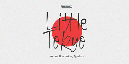 Little Tokyo is an authentic signature script font. This natural style handwritten font is suitable for various projects, such as logos, branding and packaging.
 - Rexlia Free - Unknown license

- Grafinc by PosterType,
$18.00 Grafinc is fat, black and robust. It is a geometric-based display typeface that comes in two cuts: ExtraBlack and Rounded. Grafinc can be used for all types of media – print, web, broadcasting or games. Despite its robust appearance and display character, Grafinc is very friendly typeface. It appears to be very legible in smaller sizes, too. The cuts include some very fine ligatures, making its appearance very rhythmic and smooth. Available in OpenType and western languages.
 - Bock by Latinotype,
$35.00 Is a recreational typography. Created from experimentation of the Slab Serif style with asymmetric lines. Bock is compact and stable, although having the quality of breaking the typographic rhythm, to benefit its use in short words as logotypes and lowering of text in editorials and publicity. The Fat variable was devised as an extension of the Bock concept, deleting the inner and outer space that surrounds a letter, creating a font with much weight and attitude.
 - Tomate by Re-Type,
$45.00 Tomate started in 2006 as a brush lettering exercise for a poster and was later used for the ReType identity. In 2008 its author decided to turn it into a super fat typeface suitable for packaging and mass consumption products. The possibilities of ultra heavy forms are explored in this alphabet; trying to solve the design problems that these sort of forms present. Tomate shows influences from the beautiful Goudy Heavyface Italic which is a design the author admires.
 - Litter Funk by PizzaDude.dk,
$15.00 You may already have guessed it...Litter Funk is experimental typography. Some letters are fat blocks, others have stars, stripes or dots, some are funny and funky while others are plain weird - but all in all, they leave a really nice confusing effect when used. Due to the contextual alternates, each letter comes in 5 different versions, and automatically cycle as you type. Well, the font was fun to make - I hope you have fun using it! :)
 - WyomingSpaghetti by Ingrimayne Type,
$12.95 Typefaces with very thin verticals and fat, square serifs were popular in the 19th century for display. Hollywood helped associate this style with the Old West, but reference books identify some of it as Italian style. WyomingSpaghetti, part of an extended family of typefaces, has a name which combines these two associations. Most typefaces of this type are very condensed, but this one is not. The letter o is nearly circular, which is rather unusual in this style.
 - Springwood by Hanoded,
$12.00 Spring is in the air! At least, where I live. My two pear trees are in bloom, bees are buzzing and everything turns a brighter shade of green. Time for a new and fresh font package with a spring-inspired name! Springwood is a handmade set of fonts, ranging from a fat display font to a messy script font. Use it for your freshest ideas, your coolest designs or just anything that needs a bit of springtime.
 - FF TradeMarker by FontFont,
$59.99 German type designer Critzla created this display FontFont in 1999. The family has 6 weights, ranging from Light to Fat (including italics) and is ideally suited for advertising and packaging, music and nightlife, poster and billboards, sports as well as web and screen design. FF TradeMarker provides advanced typographical support with features such as ligatures, alternate characters, case-sensitive forms, super- and subscript characters, and stylistic alternates. It comes with tabular lining and proportional lining figures.
 - Phinney Jenson by HiH,
$12.00 Phinney Jenson ML is a font with deep historical roots firmly planted in the fertile soil of the Italian Renaissance. Twenty years after Lorenzo Ghiberti finished his famous East Doors, the Gates of Paradise, of Santa Maria del Fiore in Florence and about fifteen years before Sandro Botticelli painted his “Birth of Venus,” a French printer by the name of Nicolas Jenson set up a small print shop in the powerful city-state of Venice. The fifteenth century marked the end of the plague and the rise of Venetian power, as the merchants of Venice controlled the lucrative trade of the eastern Mediterranean and sent their ships as far as London and even the Baltic. In 1470, Jenson introduced his Roman type with the printing of De Praeparatio Evangelica by Eusebuis. He continued to use his type for over 150 editions until he died in 1480. In 1890 a leader of the Arts & Crafts movement in England named William Morris founded Kelmscott Press. He was an admirer of Jenson’s Roman and drew his own somewhat darker version called GOLDEN, which he used for the hand-printing of limited editions on homemade paper, initiating the revival of fine printing in England. Morris' efforts came to the attention of Joseph Warren Phinney, manager of the Dickinson Type Foundry of Boston. Phinney requested permission to issue a commercial version, but Morris was philosophically opposed and flatly refused. So Phinney designed a commercial variation of Golden type and released it in 1893 as Jenson Oldstyle. Phinney Jenson is our version of Phinney’s version of Morris' version of Nicolas Jenson’s Roman. We selected a view of the Piazza San Marco in Venice for our gallery illustration of Phinney Jenson ML because most of the principal buildings on the Piazza were already standing when Jenson arrived in Vienna in 1470. The original Campanile was completed in 1173 (the 1912 replacement is partially visible on the left). The Basilica di San Marco was substantially complete by 1300. The Doge’s Palace (not in the photo, but next to the Basilica) was substantially complete by 1450. Even the Torre dell'Orologio (Clock Tower) may have been completed by 1470—certainly by 1500. Phinney Jenson ML has a "rough-and-ready" strength, suitable for headlines and short blocks of text. We have sought to preserve some of the crudeness of the nineteenth-century original. For comparison, see the more refined Centaur, Bruce Rogers's interpretation of Jenson Roman. Phinney Jenson ML has a strong presence that will help your documents stand out from the Times New Roman blizzard that threatens to cover us all. Phinney Jenson ML Features: 1. Glyphs for the 1252 Western Europe, 1250 Central Europe, the 1252 Turkish and the 1257 Baltic Code Pages. Accented glyphs for Cornish and Old Gaelic. Total of 393 glyphs. 400 kerning pairs. 2. OpenType GSUB layout features: onum, pnum, salt, liga, dlig, hisy and ornm. 3. Tabular (std), proportional (opt) & old-style numbers (opt). 5. CcNnOoSsZz-kreska available (salt).
 - Period Borders NF by Nick's Fonts,
$10.00 Here’s a collection of border elements taken from the pages of nineteenth and early twentieth century type specimen books of various American foundries. Download the PDF provided for each font for simple guides to constructing various borders. All characters have identical widths, so use spaces between left and right-side elements. For best results, set solid (no extra leading) and use flush left, flush right or center justification to assure proper alignment.
 - Super Love Christmas by Prioritype,
$15.00 Here comes a special Christmas font with a beautiful and unique shape equipped with various alternative characters and of course there are extra bonuses. This font makes it easy for you in various projects that you create. Can be applied to print and digital media such as invitations, clothes, crafts, packaging, and there is still so much to explore. For reference, see preview. Features: -Uppercase -Lowercase -Numeral -Punctuation -Multilingual -Ligature -Alternate -Extra Bonus
 - Abdo Strips by Abdo Fonts,
$29.00 Abdo Strips is a set of 4 strips style fonts . This is an OpenType Font supporting Arabic, Persian and Urdu to and compatible with the various operation systems and modern software. The combination of square Kufi and modern styles made it a beautiful typeface appropriate to the titles, and able to meet the desire of the user in the design of ads and modern designs of various types of audio and visual.
 - Jenriv by Linh Nguyen,
$25.00 Inspired by designs of the early Renaissance, Jenriv brings out a sedate atmosphere and generous inner spaces. Starting with the idea of mixing straightforward strokes and curves, it results in kind masculine figures, but calm and humble. It reminds some archaic air but a simplified one. Jenriv embraces text flows, multiple languages, and various styles with standard OpenType features. It is well adapted to various applications, from medium body text to large headlines, or logotypes.
 - Petrushka NF by Nick's Fonts,
$10.00The 1900 specimen book of the Leipzig foundry Schelter & Giesecke featured this curious hybrid of blackletter and Art Nouveau, under the name Petrarka. Its narrow footprint and large x-height make it an ideal choice for headlines which harken both forward and back. Both versions contain the complete Latin 1252, Central European 1250 and Turkish 1254 character sets. - Keynote Speaker NF by Nick's Fonts,
$10.00This curious little gem is patterned after a typeface named "Bloomsbury", released by P. M. Shanks & Sons, Ltd. of London in the 1920s. Its gentle curves and somewhat quirky construction combine to create a warm and friendly, if slightly offbeat, antique charm. Both versions of the font include 1252 Latin, 1250 CE (with localization for Romanian and Moldovan). - Paris Stencil JNL by Jeff Levine,
$29.00 Vintage French tin stencils with various phrases were the model for Paris Stencil JNL. The type design is available in both regular and oblique versions.
 - Vivala Media Icons by Johannes Hoffmann,
$19.90 Vivala Media Icons is a set of 97 symbols of modern media devices and controls for various functions, such as volume, brightness and many others.
 - Erotica by Lián Types,
$49.00 “A picture is worth a thousand words” and here, that’s more than true. Take a look at Erotica’s Booklet; Erotica’s Poster Design and Erotica’s User’s Guide before reading below. THE STYLES The difference between Pro and Std styles is the quantity of glyphs. Therefore, Pro styles include all the decorative alternates and ligatures while Std styles are a reduced version of Pro ones. Big and Small styles were thought for better printing results. While Big is recommended to be printed in big sizes, Small may be printed in tiny sizes and will still show its hairlines well. INTRODUCTION I have always wondered if the circle could ever be considered as an imperfect shape. Thousands of years have passed and we still consider circles as synonyms of infinite beauty. Some believe that there is something intrinsically “divine” that could be found in them. Sensuality is many times related to perfectly shaped strong curves, exuberant forms and a big contrasts. Erotica is a font created with this in mind. THE PROCESS This story begins one fine day of March in 2012. I was looking for something new. Something which would express the deep love I feel regarding calligraphy in a new way. At that time, I was practicing a lot of roundhand, testing and feeling different kinds of nibs; hearing the sometimes sharp, sometimes soft, sound of them sliding on the paper. This kind of calligraphy has some really strict rules: An even pattern of repetition is required, so you have to be absolutely aware of the pressure of the flexible pen; and of the distance between characters. Also, learning copperplate can be really useful to understand about proportion in letters and how a minimum change of it can drastically affect the look of the word and text. Many times I would forget about type-design and I would let myself go(1): Nothing like making the pen dance when adding some accolades above and below the written word. Once something is mastered, you are able to break some rules. At least, that’s my philosophy. (2) After some research, I found that the world was in need of a really sexy yet formal copperplate. (3) I started Erotica with the idea of taking some rules of this style to the extreme. Some characters were drawn with a pencil first because what I had in mind was impossible to be made with a pen. (4) Finding a graceful way to combine really thick thicks with really thin hairlines with satisfactory results demanded months of tough work: The embryo of Erotica was a lot more bolder than now and had a shorter x-height. Changing proportions of Erotica was crucial for its final look. The taller it became the sexier it looked. Like women again? The result is a font filled with tons of alternates which can make the user think he/she is the actual designer of the word/phrase due to the huge amount of possibilities when choosing glyphs. To make Erotica work well in small sizes too, I designed Erotica Small which can be printed in tiny sizes without any problems. For a more elegant purpose, I designed Erotica Inline, with exactly the same features you can find in the other styles. After finishing these styles, I needed a partner for Erotica. Inspired again in some old calligraphic books I found that Bickham used to accompany his wonderful scripts with some ornated roman caps. Erotica Capitals follows the essentials of those capitals and can be used with or without its alternates to accompany Erotica. In 2013, Erotica received a Certificate of Excellence in Type Design in the 59th TDC Type Directors Club Typeface Design Competition. Meet Erotica, beauty and elegance guaranteed. Notes (1) It is supossed that I'm a typographer rather than a calligrapher, but the truth is that I'm in the middle. Being a graphic designer makes me a little stubborn sometimes. But, I found that the more you don't think of type rules, the more graceful and lively pieces of calligraphy can be done. (2) “Know the forms well before you attempt to make them” used to say E. A. Lupfer, a master of this kind of script a century ago. And I would add “And once you know them, it’s time to fly...” (3) Some script fonts by my compatriots Sabrina Lopez, Ramiro Espinoza and Alejandro Paul deserve a mention here because of their undeniable beauty. The fact that many great copperplate fonts come from Argentina makes me feel really proud. Take a look at: Parfumerie, Medusa, Burgues, Poem and Bellisima. (4) Some calligraphers, graphic and type designer experimented in this field in the mid-to-late 20th century and made a really playful style out of it: Letters show a lot of personality and sometimes they seem drawn rather than written. I want to express my sincere admiration to the fantastic Herb Lubalin, and his friends Tony DiSpigna, Tom Carnase, and of course my fellow countryman Ricardo Rousselot. All of them, amazing.
 - Galleds Stars by Yukita Creative,
$14.00 Galleds Stars Display Typeface is a single font with a minimalistic but standout style for any work from movie titles, music album covers, magazines, beauty ads, and even wedding invitations. --- Minimalist type design has been a success for professional designers worldwide. - Galleds Stars Display Typeface is legible from much larger distances than typical fonts - Elegant letterforms give the feeling of luxury - Smooth curves for elegant typography This font has several alternative characters as in ( A,N,O,R,S,a,c,e,o,t,y ) Tips for using fonts in projects. Use this font with a simple background, not too busy so that you can highlight your branding This font file OTF
 - Happy Brain Creepy Thalamus by TypoGraphicDesign,
$19.00 CONCEPT/ CHARACTERISTICS The base was a head-vein illustration. This served as a design grid. Novel letterforms were sought and found. Hand-drawn analog and digitized later. Experimentally, novel, fresh and an eye-catcher. Completely new insights into the human brain. A font for happy thoughts. ghostly visions, or simply for the next freshen party flyers. APPLICATION AREA The happy, creepy, Horror handmade font »Happy Brain Creepy Thalamus« with many language support would look good at headlines. Magazines or websites, party flyer, movie posters, music Poster, music covers or webbanner. TECHNICAL SPECIFICATIONS Headline Font | Display Font | Handmade Horror Font "Happy Brain Creepy Thalamus" OpenType Font with 283 glyphs, alternative letters and ligatures (with accents & €) & 1 style (regular).
 - Taylor Johnson by Keristyper Studio,
$14.00 Introducing Taylor Johnson Display Font is a handmade font style dance and then traces of life to have a Grungy brush and unique calligraphic shape, the writing style is very natural and simple. This font is good for logo design, Social media, Movie Titles, Books Titles, short text even long text letters, and good for your secondary text font with sans or serif. Featured: Standard Uppercase & Lowercase Numeral & Punctuation Multilingual : ä ö ü Ä Ö Ü ß ¿ ¡ Alternate & Ligature PUA encoded We recommend programs that support the OpenType feature and the Glyphs panel such as Adobe applications or Corel Draw. so you can use all the variations of the glyphs. Hope you enjoy our fonts!
 - Yovetta by Keristyper Studio,
$14.00 Yovetta is an aesthetic sans serif typeface that looks elegant and timeless inspired by nature and classy modern. This hand-drawn typeface is made in a digital hand-drawn style with a classy scripted look. This font is good for logo design, Social media, Movie Titles, Books Titles, short text even long text letters, and good for your secondary text font with sans or serif. **Featured:** * Standard Uppercase & Lowercase * Numeral & Punctuation * Multilingual : ä ö ü Ä Ö Ü ß ¿ ¡ * Alternate & Ligature * PUA encoded We recommend programs that support the OpenType feature and the Glyphs panel such as Adobe applications or Corel Draw. so you can use all the variations of the glyphs. Hope you enjoy our fonts!
 - Limit Corner by Storictype,
$15.00 Introducing new serif display typeface its called Limit Corner. Inspired by victorian style with classic style .OpenType features some characters that allows you to mix and match pairs of letters to fit in your designs. It’s an all caps typeface, with strong and sleek letters. It features over 50 stylised alternatives, offering an infinite opportunity to customise and create logos, headlines, titling, product packaging, labeling, logo, classic shop, badges, movie title, t-shirt, posters, label, greetingcard, letterhead, book cover, etc. To access the alternat glyphs, you need a program that supports OpenType features such as Adobe Illustrator CS and Adobe Indesign Features : Character Set A-Z Numerals & Punctuations (OpenType Standard) Accents (Multilingual characters) Thanks and enjoy designing.
 - Future Bugler by Breauhare,
$35.00 Future Bugler is a font based on the second logo created by Harry Warren in early 1975 for his sixth grade class newsletter, The Broadwater Bugler, at Broadwater Academy in Exmore, Virginia, on Virginia’s Eastern Shore. This font can convey several perspectives or moods. It can suggest a space-age vision of the future, or an art-deco perspective of the future as in the movie “Sky Captain and the World of Tomorrow”. It also communicates the idea of high performance, or extreme sports, without the grunge. Also be sure to check out the upright version of this font, Future Bugler Upright, available separately. Digitized by John Bomparte. Additional tags: NFL, NFL Network, NFLN
