5,080 search results
(0.017 seconds)
- Awry by Gholib Tammami,
$15.00 Awry is a cute and quirky handwritten font that elegantly dances on the edges of organized precision and captivating disorder. With its unique design, ‘Awry’ breaks free from the confines of traditional typography, inviting you to explore a world where imperfection becomes an art form.
 - Mustafa Script by Fargun Studio,
$12.00 Mustafa Script is handwritten stylish copperplate calligraphy fonts, combines from copperplate to contemporary typeface with a dancing baseline, classic and elegant touch. Can be used for various purposes. such as headings, signature, logos, wedding invitation, t-shirt, letterhead, signage, lable, news, posters, badges etc.
 - PL Bernhardt by Monotype,
$29.99Ed Benguiat drew the PL Bernhardt font which was released in 1970. PL Bernhardt was modeled after a 1930/1931 design by Lucian Bernhard. All terminals on non-vertical strokes are diagonal so that lower and uppercase X looks as though they are dancing. - Newlook by QUADRAAT,
$25.00 Newlook is a display font drawn with geometric shapes and high contrast. The stylistic set 01 shows capital letters using heights from descenders to ascenders and x height which gives a crazy dancing look. Perfect for display, poster, magazine etc… Support all latin languages.
 - Naishila by FadeLine Studio,
$10.00 Introducing Naishila. This new font family includes a caps and script. Naishila is a lovely and sweet font duo with a dancing baseline. You will receive the regular font (not dancing) while the script comes with stylistic sets and ligatures. Like my other fonts, Naishila is made to meet the growing market of design today. This font is suitable for use in design styles such as watercolor, minimalist, flat, modern design, etc. With this font duo, you can very easily combine. Surely you can make something perfect for your design. Naishila will look gorgeous on cards, mugs, quotes, posters, shopping bags, logo's, t-shirts, branding, book covers, birthday invitations, greeting cards, and all your other lovely projects.
 - Prismatic Spirals by MMC-TypEngine,
$93.00 PRISMATIC SPIRALS FONT! The Prismatic Spirals Font is a decorative type-system and ‘Assembling Game’, itself. Settled in squared pieces modules or tiles, embedded by unprecedented Intertwined Prismatic Structures Design, or intricate interlaced bars that may seem quite “impossible” to shape. Although it originated from the ‘Penrose Square’, it may not look totally as an Impossible Figures Type of Optical Illusions. More an “improbable” Effect in its intertwined Design, that even static can seem like a source of Kinetical Sculptures, or drive eyes into a kind of hypnosis. Prismatic Spirals has two related families, its “bold” braided version Prismatic Interlaces and the Pro version. While the default is simpler or easier to use, as all piece’s spin in same way, PRO provides a more complex intricate Design which requires typing alternating caps. Instructions: Use the Map Font Reference PDF as a guide to learn the 'tiles' position on the keyboard, then easily type and compose puzzle designs with this font! All alphanumeric keys are intuitive or easy to induce, you may easily memorize it all! Plus, often also need to consult it! *Find the Prismatic Spirals Font Map Reference Interactive PDF Here! (!) Is recommended to Print it to have the Reference in handy or just open the PDF while composing a design with this typeface to also copy and paste, when consulting is required or when it may be difficult to access, depending on the keyboard script or language. As a Tiles Type-System, the line gap space value is 0, this means that tiles line gaps are invisibly grouted, so the user can compose designs, row by row, descending to each following row by clicking Enter, same as line break, while advances on assembling characters. Background History: The first sketches of my Prismatic Knots or Spirals Designs dates back then from 2010, while started developing hand-drawn Celtic Knots and Geometric Drawings in grid paper, while engage to Typography, Sacred Geometry and the “Impossible Figures” genre… I started doing modulation tests from 2013, until around 2018, I got to unravel it in square modules or tiles from the grid, then idealized it as fonts, along with other Type projects. This took 13 years to come out since the first sketches and 6 months in edition. During the production process some additional tiles or missing pieces were thought of and added to the basic set, which firstly had only the borders, corners, crossings, nets, Trivets connectors or T parts and ends, then added with nets and borders integrations. Usage Suggestions: This type-system enables the user to ornate and generate endless decorative patterns, borders, labyrinthine designs, Mosaics, motifs, etc. It can seem just like a puzzle, but a much greater tool instead for higher purposes as to compose Enigmas and use seriously. As like also to write Real Text by assembling the key characters or pieces, this way you can literarily reproduce any Pixel Design or font to its Prismatic Spirals correspondent form, as Kufic Arabic script and further languages and compose messages easily… This Typeface was made to be contemplated, applied, and manufactured on Infinite Decorative Designs as Pavements, Tapestry, Frames, Prints, Fabrics, Bookplates, Coloring Books, Cards, covers or architectonic frontispieces, storefronts, and Jewelry, for example. Usage Tips: Notice that the line-height must be fixed to 100% or 1,0. In some cases, as on Microsoft Word for example, the line-height default is set to 1,15. So you’ll need to change to 1,0 plus remove space after paragraph, in the same dropdown menu on Paragraph section. Considering Word files too, since the text used for mapping the Designs, won't make any literal orthographical sense, the user must select to ignore the Spellcheck underlined in red, by clicking over each misspelled error or in revision, so it can be better appreciated. Also unfolding environments as Adobe Software’s, the Designer will use the character menu to set body size and line gap to same value, as a calculator to fit a layout for example of 1,000 pts high with 9 tiles high, both body size and line gap will be 111.1111 pts. Further Tips: Whenever an architect picks this decorative system to design pavements floor or walls, a printed instruction version of the layout using the ‘map’ font may be helpful and required to the masons that will lay the tiles, to place the pieces and its directions in the right way. Regarding to export PNGs images in Software’s for layered Typesetting as Adobe Illustrator a final procedure may be required, once the designs are done and can be backup it, expanding and applying merge filter, will remove a few possible line glitches and be perfected. Technical Specifications: With 8 styles and 4 subfamilies with 2 complementary weights each (Regular and Bold) therefore, Original Contour, Filled, Decor, with reticle’s decorations and 2 Map fonts with key captions. *All fonts match perfectly when central pasted for layered typesetting. All fonts have 106 glyphs, in which 48 are different keys repeated twice in both caps and shift, plus few more that were repeated for facilitating. It was settled this way in order for exchanging with Prismatic Spirals Pro font which has 96 different keys or 2 versions of each. Concerning tiles manufacturing and Printed Products as stickers or Stencils, any of its repeated pieces was measured and just rotated in different directions in each key, so when sided by other pieces in any direction will fit perfectly without mispatching errors. Copyright Disclaimer: The Font Software’s are protected by Copyright and its licenses grant the user the right to design, apply contours, plus print and manufacture in flat 2D planes only. In case of the advent of the same structures and set of pieces built in 3D Solid form, Font licenses will not be valid or authorized for casting it. © 2023 André T. A. Corrêa “Dr. Andréground” & MMC-TypEngine.
 - Prismatic Interlaces by MMC-TypEngine,
$93.00 PRISMATIC INTERLACES TYPEFACE! Prismatic Interlaces is a decorative system and ‘Assembling Game’, itself. Settled in squared pieces modules or tiles, embedded by unprecedented Intertwined Prismatic Structures Design, or intricate interlaced bars that may seem quite “impossible” to shape. Although it originated from the ‘Penrose Square’, it may not look totally as an Impossible Figures Type of Optical Illusions. More an “improbable” Effect in its intertwined Design, that even static can seem like a source of Kinetical Sculptures, or drive eyes into a kind of hypnosis. Prismatic Interlaces has two related families, both as a kind of lighter weight versions Prismatic Spirals Default & Pro. While Default is simpler or easier to use, same way as Prismatic Interlaces, Pro provides a more complex intricate Design that requires typing alternating caps. Instructions: Use the Map Font Reference PDF as a guide to learn the 'tiles' position on the keyboard, then easily type and compose puzzle designs with this font! All alphanumeric keys are intuitive or easy to induce, you may easily memorize it all! Plus, often also need to consult it! *Find the Prismatic Interlaces Font Map Reference Interactive PDF Here! (!) Is recommended to Print it to have the Reference in handy or just open the PDF while composing a design with this typeface to also copy and paste, when consulting is required or when it may be difficult to access, depending on the keyboard script or language. As a Tiles Type-System, the line gap space value is 0, this means that tiles line gaps are invisibly grouted, so the user can compose designs, row by row, descending to each following row by clicking Enter, same as line break, while advances on assembling characters. Background History: The first sketches of my Prismatic Knots or Spirals Designs dates back then from 2010, while started developing hand-drawn Celtic Knots and Geometric Drawings in grid paper, while engage to Typography, Sacred Geometry and the “Impossible Figures” genre… I started doing modulation tests from 2013, until around 2018, I got to unravel it in square modules or tiles from the grid, then idealized it as fonts, along with other Type projects. This took 13 years to come out since the first sketches and 6 months in edition. During the production process some additional tiles or missing pieces were thought of and added to the basic set, which firstly had only the borders, corners, crossings, nets, Trivets connectors or T parts and ends, then added with nets and borders integrations. Usage Suggestions: This type-system enables the user to ornate and generate endless decorative patterns, borders, labyrinthine designs, Mosaics, motifs, etc. It can seem just like a puzzle, but a much greater tool instead for higher purposes as to compose Enigmas and use seriously. As like also to write Real Text by assembling the key characters or pieces, this way you can literarily reproduce any Pixel Design or font to its Prismatic Spirals correspondent form, as Kufic Arabic script and further languages and compose messages easily… This Typeface was made to be contemplated, applied, and manufactured on Infinite Decorative Designs as Pavements, Tapestry, Frames, Prints, Fabrics, Bookplates, Coloring Books, Cards, covers or architectonic frontispieces, storefronts, and Jewelry, for example. Usage Tips: Notice that the line-height must be fixed to 100% or 1,0. In some cases, as on Microsoft Word for example, the line-height default is set to 1,15. So you’ll need to change to 1,0 plus remove space after paragraph, in the same dropdown menu on Paragraph section. Considering Word files too, since the text used for mapping the Designs, won't make any literal orthographical sense, the user must select to ignore the Spellcheck underlined in red, by clicking over each misspelled error or in revision, so it can be better appreciated. Also unfolding environments as Adobe Software’s, the Designer will use the character menu to set body size and line gap to same value, as a calculator to fit a layout for example of 1,000 pts high with 9 tiles high, both body size and line gap will be 111.1111 pts. Further Tips: Whenever an architect picks this decorative system to design pavements floor or walls, a printed instruction version of the layout using the ‘map’ font may be helpful and required to the masons that will lay the tiles, to place the pieces and its directions in the right way. Regarding to export PNGs images in Software’s for layered Typesetting as Adobe Illustrator a final procedure may be required, once the designs are done and can be backup it, expanding and applying merge filter, will remove a few possible line glitches and be perfected. Technical Specifications: With 8 styles and 4 subfamilies with 2 complementary weights each (Regular and Bold) therefore, Original Contour, Filled, Decor, with reticle’s decorations and 2 Map fonts with key captions. *All fonts match perfectly when central pasted for layered typesetting. All fonts have 106 glyphs, in which 49 are different keys repeated twice in both caps and shift, plus few more that were repeated for facilitating. It was settled this way in order for exchanging with Prismatic Spirals Pro font which has 96 different keys or 2 versions of each. Concerning tiles manufacturing and Printed Products as stickers or Stencils, any of its repeated pieces was measured and just rotated in different directions in each key, so when sided by other pieces in any direction will fit perfectly without mispatching errors. Copyright Disclaimer: The Font Software’s are protected by Copyright and its licenses grant the user the right to design, apply contours, plus print and manufacture in flat 2D planes only. In case of the advent of the same structures and set of pieces built in 3D Solid form, Font licenses will not be valid or authorized for casting it. © 2023 André T. A. Corrêa “Dr. Andréground” & MMC-TypEngine.
 - Pelin by Koray Özbey,
$9.00 The design of Pelin, which began as an experiment, inspired by the harmony created by the contrast between the soft, flowing movements and sharp movements found in Circassian dances. To capture this harmony, both curved and sharp lines were used along with stems that contrasting angles.
 - Ghetto by Bosstypestudio,
$12.00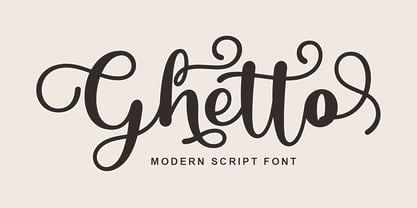 Ghetto is a modern script with handwriting, decorative characters, and dancing baselines! It's very suitable in use like blog headers, t-shirts, and for weddings, social media, product design, stationery, advertising, clothing, book covers, business cards, greeting cards, branding, merchandise, invitations and handmade quotes and more.
 - Monday Night by Letterena Studios,
$9.00 Monday Night is a romantic and sweet calligraphy typeface with characters that dance along the baseline. It will add a luxury spark to any design project that you wish to create! Monday Night is PUA encoded which means you can access all glyphs and swashes with ease!
 - Spring Skincare by Illushvara,
$10.00 Spring Skincare is a lovely handwritten font featuring charming, playful allcaps characters that seem to dance along the baseline. Have a ligatures and support the multilingual. Add this font to your most spring projects, and notice how it makes them stand out! Thank You, Illushvara Design
 - Adolle Bright by Dirtyline Studio,
$22.00 Adolle Bright – a new fresh & modern script with a calligraphy style, a dancing baseline! So beautiful on invitation like greeting cards, branding materials, business cards, quotes, posters, and more! Features Basic Latin A-Z and a-z Numbers Symbols Stylistic Set Ligature PUA Encode Multilanguage Support
 - Ah, the NAUJOKSLOVE font, the very essence of what happens when a designer decides that the alphabet had one too many glasses of romantic comedy and decided to waltz through the moonlight! Crafted by...
- Onamura by Balibilly Design,
$22.00 Initially, letterform was inspired by the gothic style of Romance decorative letters in transitional art in the Middle Ages. The conservative type in the Gothic era, especially in decorative romance, has led to the Victorian style being embedded in several forms as accents related but not forced to be combined. Rounded serif seems conventional combined with historically relevant letterform to create a harmonious blend. The art nouveau style also inspires this typeface. Approach to architectural ornamentation from 1880 to 1915, adopting the dynamic lines and curves typical of the civilization of the time. Continue time travel; we also present a more modern form influenced by the digitalization of art nouveau derivatives, familiarly called the psychedelic style. Paying homage to predecessors, we presented The Onamura font in a Japanese Ukiyo-e style that influenced the fine arts movement that broke old conservative art in Europe. We designed this font carefully with the information about the Middle Ages, Ukiyo-E, & Art Nouveau that greatly influenced art worldwide. In this font family, there are collaboration vibes. Both are the basis of the phenomenal blend of idealism between western and Japanese artists. Consisting of 10 fonts in 10 weights, it features an extended charset of over 850 glyphs, covering multilingual support, including Western European, Central European, and Southeastern European. Complete with advanced open type features like stylistic alternates, discretionary ligatures, ordinals, small caps, fractions, and case-sensitive forms. The elegant and refined details seen in this font provide a new aesthetic input, satisfy contemporary style, and give a range of choices for luxury typographic projects. This font is perfectly suited for high-impact headlines. Advance open-type features are stunning on logos, branding, magazines, website, etc. Supports languages: Afrikaans, Albanian, Asu, Basque, Bemba, Bena, Bosnian, Catalan, Cebuano, Chiga, Colognian, Cornish, Corsican, Croatian, Czech, Danish, Dutch, English, Estonian, Faroese, Filipino, Finnish, French, Friulian, Galician, Ganda, German, Gusii, Hungarian, Icelandic, Ido, Inari Sami, Indonesian, Interlingua, Irish, Italian, Javanese, Jju, Jola-Fonyi, Kabuverdianu, Kalaallisut, Kalenjin, Kinyarwanda, Kurdish, Latvian, Lithuanian, Lojban, Low German, Lower Sorbian, Luo, Luxembourgish, Luyia, Machame, Makhuwa-Meetto, Makonde, Malagasy, Malay, Maltese, Manx, Maori, Morisyen, North Ndebele, Northern Sami, Northern Sotho, Norwegian Bokmål, Norwegian Nynorsk, Nyanja, Nyankole, Occitan, Oromo, Polish, Portuguese, Romanian, Romansh, Rombo, Rundi, Rwa, Samburu, Sango, Sangu, Sardinian, Scottish Gaelic, Sena, Shambala, Shona, Slovak, Slovenian, Soga, Somali, South Ndebele, Southern Sotho, Spanish, Swahili, Swati, Swedish, Swiss German, Taita, Taroko, Teso, Tsonga, Tswana, Turkish, Turkmen, Upper Sorbian, Vunjo, Walloon, Welsh, Western Frisian, Wolof, Xhosa, Zulu
 - MGT Vallery Hills by Magetype,
$15.00 When I was surfing the internet, with rock n 'roll music. I accidentally found a picture of a hotel sign with a very unique style, namely: Mid-century Modern (MCM). It looks very pretty and charming to me. And inspired me to create Font Family. And I am proud to present the Vallery Hills Font Family. This font is in the Retro style of the 50s to 60s. Okay, here are the specifications. 1. Vallery Hills Schrift There is one unique thing about this font. Usually, script fonts with Retro style always have an angled anatomical shape, but I made this font upright. The goal is to make a difference with other script fonts I've seen. By the way, this font comes in two styles, namely: Regular and Bouncy. Why do I make it like that? Because I want to make this font into two different functions, namely: If you want to make it a Display Font, which is usually used for Headings, then use the Bouncy style. And if you want to use it as Bodytext, then use Regular. 2. Vallery Hills Sherift This second font is a font that is very synonymous with the Mid-century Modern (MCM) era. A very distinctive form of the serif font of that era. Similar to the first font, this font also has 2 styles, namely: Regular and Bouncy. You can combine this font with the other two fonts in Vallery Hills. It could be Title, or Bodytext. And you can also combine two styles, namely: Regular and Bouncy. Try! 3. Vallery Hills Suns Sherift This last font is Sans Serif. Also has 2 styles like his two brothers, namely: Regular and Bouncy. The goal is actually the same. I am sure you are cooler to create a design that uses this font family. Well, there is one advantage of this font from its two siblings, which is that it has a feature, namely: SMALLCAPS. Which will be an option when you are bored with the mediocre shape or style of Lowercase. Try combining the Smallcaps with Uppercase or Lowercase. Must be cool! : D Oops, almost forgot. This font consists of several font formats, namely: OTF, TTF, and Webfonts. And of course everything is MULTILANGUAGE. OK, friends. That's all I can describe about the Vallery Hills Family. Hopefully it will please all of you. Cheers!
 - Wascally Wabbit by Comicraft,
$49.00 This cunning, conniving, chattering font is devious, devilish and dashing! It's a toon town tattler that will lend a flippant insouciant personality to your comic books and animated features. These handsome letterforms will nab you, jab you, grab you and may even stab you with their sly wily guile. Our advice: Be Very Very Qwiet when tracking down this Wascally Wabbit. Features: Automatic alternate uppercase alphabets Western & Central European language support Manga characters & Crossbar I Technology™
 - Kamerik 105 Cyrillic by Talbot Type,
$19.50 Based on the popular Talbot Type Kamerik 105 , this Cyrillic variation is now available for the first time. Kamerik 105 is inspired by the classic, geometric sans-serifs such as Futura and Avant Garde, but has shallower ascenders and descenders for a more compact look. It's a versatile, modern sans, highly legible as a text font and with a clean, elegant look as a display font at larger sizes. The Kamerik 105 Cyrillic family comprises of five weights.
 - Bastardilla - Personal use only

- Basilisk by Factory738,
$15.00 Basilisk is a futuristic and retro-inspired typeface that works well in any sci-fi space thriller. This one is for you if you like futuristic fonts. The different weights give you a lot of flexibility when it comes to choosing the right typographic color for your project. The available Ligatures and Italic styles offer a wide range of characters to give your project design an unique design. 5 Weights (Light, Regular, Semibold, Bold, Black) 2 Styles (Regular and Italic) Basic Latin A-Z and a-z Numerals & Punctuation Stylistic Ligatures and Alternate glyps Multilingual Support for ä ö ü Ä Ö Ü ... Free updates and feature additions Thanks for looking, and I hope you enjoy it.
 - Librada Pro by Typehead Studio,
$12.00 Librada Pro is a Sans-serif style font.librada pro font has 9 variants of style weight, ranging from Thin, Regular, Bolt, Outline Style and Texture Style. Each variation has 2 types of styles Regular and italic. Librada Pro Font is suitable for any design needs, invitation design, branding, Cover Book design, advertising design, Art Quote, Home decor, Book Title, special events, birthday, custom mug, pillow, t-shirts, any handwriting signature style needs and more. Librada Pro Font supports the following languages : Albanian, Basque, Breton, Chamorro, Dutch, English, Finnish, Frisian, Galician, German, Italian, Malagasy, Portuguese, Spanish, Swedish. Thank you for your watching! Hope you Like it and you're having fun with Librada Pro ! Happy creating! Thanks. Typehead Studio
 - Place Witch by Arendxstudio,
$15.00 Place Witch is a thick lettered, cute and assertive display font. No matter the topic, this font will be an incredibly asset to your fonts’ library, as it has the potential to elevate any creation. Place Witch is PUA encoded which means you can access all of the glyphs and swashes with ease! Features : 1.Uppercase & Lowercase 2.Multilingual support 3.Number 4.Symbol 5.Punctuation. 6.Alternate 7.Support in Mac and Windows OS -Support in design application (photoshop, illustrator, and more) There it is! I really hope you enjoy it - comments & likes are always welcome and accepted. More importantly, don't hesitate to send a message if you have a problem or question.
 - Death Markers by Figuree Studio,
$25.00 Everyone who lives will surely die Death Markers is a natural brush font, inspired by a vintage aesthetic sign painting. Made in combination with hand lettering, it comes with dramatic movement and it’s great for any next creative project that needs a retro vibe and horror touch. It comes with 2 styles: Clean and Drip effect. Ideal for logos, handwritten quotes, product packaging, header, poster, merchandise, social media & greeting cards. With your purchase you get: - All Caps - Numbers and Punctuation Marks - Support for MAC or PC - Simple installation for Adobe Illustrator, Corel Draw, Photoshop, or Procreate (New Updated) - Support Multilanguage I hope you make something cool with it. If you have any questions don't hesitate to ask!
 - Lite On Condensed by Factory738,
$15.00 LiteOn Condensed is the perfect font family for designers who want to achieve a sleek and refined look. This sans serif font is both lightweight and elegant, with a smooth and contemporary feel that is sure to make any project stand out. With a variety of weights to choose from, LiteOn Condensed provides ample options to suit any design need. Choose LiteOn Condensed for your next project and take your design to the next level! 6 Weights 2 Styles (Regular and Italic) Basic Latin A-Z and a-z Numerals & Punctuation Stylistic Ligatures and Alternate glyps Multilingual Support for ä ö ü Ä Ö Ü … Thanks for looking, and I hope you enjoy it.
 - BellMore by Factory738,
$15.00 Bellmore is a beautiful serif font family with a classic feel to it. The elegant design is the result of combining modern and vintage elements. The different weights give you a lot of flexibility when it comes to choosing the right typographic color for your project. The available Ligatures and Italic styles offer a wide range of characters to give your project design an unique design. 5 Weights (Light, Regular, Semibold, Bold, Black) 2 Styles (Regular and Italic) Basic Latin A-Z and a-z Numerals & Punctuation Stylistic Ligatures and Alternate glyps Multilingual Support for ä ö ü Ä Ö Ü ... OTF file format Free updates and feature additions Thanks for looking, and I hope you enjoy it.
 - Proba Pro by Mint Type,
$- Proba Pro is a geometric sans with lowered x-height, prominent ascenders and descenders and a subtle humanist touch. It comes in 7 weights + matching italics each supporting numerous Latin-based languages as well as major Cyrillic languages. It is packed with OpenType features like ligatures, small caps, 4 sets of digits, 2 stylistic sets, superiors and inferiors, fractions, ordinals, and respective punctuation varieties including all-cap punctuation. There are also language-specific alternates for Romanian Ș/ș, Catalan punt volat, and correct small-cap versions for i/ı in Turk languages. Some of the styles of Proba Pro can be found in Mint Type Editorial Bundle together with other fonts which make some great pairs. Check it out!
 - Bumbon by Luxfont,
$18.00 Introducing unusual Sans Serif font family. Font is concise and minimalistic. But behind the apparent simplicity of the font is hidden the original feature in the form of modernized uppercase glyphs, which can be used as an accent in the header or logo. Pure letterings with excellent readability have 2 thicknesses. Font will emphasize the high status of the business and complement modern branding design, and the general versatility of the font provides for its widespread use in various directions and is combined with different styles in design. Balanced glyphs will fit into the typographic design and will not distract attention from the main point. Features: Bold, Bold Italic, Regular, Regular Italic Upgraded uppercase letters Kerning ld.luxfont@gmail.com
 - Opal Bulgarian by Context Foundry,
$6.00 Opal Bulgarian is a humanistic sans serif typeface of a modern type, inspired by the famous Optima typeface (designed by Hermann Zapf). Opal Bulgarian consists of 2 weights and corresponding italics. Opal Bulgarian is suitable for body texts; for titles; for corporate identity. Opal Bulgarian continues the design of Opal BulgarianCYR, designed in 1992 by Zhivko Stankulov. In compare to Opal BulgarianCYR the new font family Opal Bulgarian has more glyphs and cover more languages. A number of shortcomings in the construction of the glyphs have been eliminated, and the design as a whole has been updated. Opal Bulgarian is available with active support and upgradeability. Licensees will receive all new versions of the font free of charge.
 - Ostad Pro by Naghi Naghachian,
$65.00 Ostad Pro is designed by Naghi Naghashian. It is a headline font, as a modern interpretation of classic Sans Serif Roman characters in 2 weights: Regular and Bold. The character set of this Font family supports most western languages including: Afrikaans, Basque, Breton, Catalan, Danish, Dutch, English, Finnish, French, Gaelic, German, Icelandic, Indonesian, Irish, Italian, Norwegian, Portuguese, Sami, Spanish, Swahili and Swedish. There are 17 additional symbol characters: euro, litre, estimated, omega, pi, partialdiff, delta, product, summation, radical, infinity, integral, approxequal, notequal, lessequal, greaterequal, and lozenge. It also includes the characters necessary to support the following central European languages: Croatian, Czech, Estonian, Hungarian, Latvian, Lithuanian, Polish, Romanian, Serbian (Latin), Slovak, Slovenian and Turkish.
 - Madang by Aiquitype,
$15.00 Introducing Madang Font is a sophisticated fusion of classic elegance and modern flair. With its meticulously crafted letterforms, it exudes a timeless charm that effortlessly captivates the eye. The balance between its refined strokes and contemporary elements encapsulates a sense of versatility, making it a perfect choice for a wide range of creative projects. Whether used in headlines or body text, Madang Font's graceful presence lends an air of distinction and refinement to any design, establishing itself as an essential asset for discerning typographers and designers alike. What’s Include ? 1. Uppercase, Lowercase, Number and Punctutation 2. Ligature and Alternates 3. Multilingual Support 4. Installed on Mac and Windows 5. PUA Encode Enjoy our Font.
 - Richello Same by Silverdav,
$10.00 Richello Same is a decorative sans font with a mix of vintage styles, carefully crafted and clean, with neatly arranged node dots, Richello Same is a great vintage inspired font. This font consists of 2 types with lines and without lines, so that it adds to the impression of luxury in designing your product, plus some alternative uppercase and lowercase letters to add to the luxurious impression, we also include very attractive ornaments for you to use for your design. Richello Same is perfect for branding, quotes, greeting cards, invitation cards, t-shirts, signatures, and many others, you can try it. whats include: – Richello Same Clean – Richello Same Line – Richello Same Ornament Multilingual support
 - TG Minagi Sans by Tegami Type,
$30.00TG Minagi Sans is a neo-humanist sans serif that takes inspiration from some calligraphy and blackletter letterforms providing sharp details and a little stiffness in some parts of the typeface. By combining these things with the modern form of the sans serif letter, TG Minagi Sans has a forceful and distinct character. Super terrific when used at massive sizes for display purposes and headlines, but reliable enough for small text sizes. TG Minagi Sans comes with 7 weights, 2 axes & 14 Styles, including a variable font file. Has several OpenType features such as various ligatures, lining figures (proportional, old styles, superior, inferior, denominator, numerator & fraction), stylistic styles 01-04 & covered more than 100 languages Latin based. - Monkey by NJ Studio,
$19.00 Hi...Thank for your visit :) Monkey a script font. It features 2 beginning swash, 2ending swash and 7 stylishtic set alternate characters that will take your projects to the next level! This font is PUA code which means you can easily access all the glyphs and swashes that are full of swash! It also features many special features including glyphs. font designs that are made for various vector designs, printing such as digital wedding blogs, online shops, social media, while printing can be used in the field of product clothing, accessories, bags, pins, logos, business cards, watermarks and many others ... so it can make your product look cute and attractive, and also Multilingual support!!! Happy design ...
 - BD Micron Font by Typedifferent,
$10.00 The BD Micron Font is the first typedifferent variable font. It is a very technical looking typeface great for use in sci-fi, science and electronic music related projects. The BD Micron Font alphabet designed together with H1reber was initially created as the display typeface for the communication and visual identity of the TechnoCulture 2 festival in Fribourg, Switzerland summer 2019. The technologic yet playful looking font shall break boundaries between technology, science, fiction and art. Creating characters, hence little robots out of the shapes found in the BD Micron Font glyphs and the variable font technology helped breathing live into the BD Micron Robots which is also availabe here at MyFonts
 - Drop Cap One by Outside the Line,
$19.00 Drop Cap One is a drop cap or an initial cap font. Even though it has all the letters of the alphabet it is not an alphabet font to be used for headlines or body copy. It has no kerning or punctuation except a period. It does not have accent marks. There are basically 2 alphabets in this font. The lighter letters are lower case and the darker letters are upper case. The light and dark letters are interchangeable. While a fun desktop font the real inspiration for this font was my need for a webfont for initial caps for blogging. It could also make a great scrapbooking font too. Lots of uses for this quirky little font.
 - JP Alva Expanded by jpFonts,
$19.95 jpAlva is a technical and functional sans-serif that consists of 40 typefaces, divided in 2 font families jpAlva and jpAlva Extended. A universal family of typefaces that fits pretty much any purpose. It illustrates a precise balance of modern geometrics, with a functional yet sparing style that effectively communicates without distraction. A straightforward, unadorned appearance with efficient construction. Simple, clean with a technical note and a wide range of styles it is perfectly suitable for a wide range of applications, from identity systems to editorial design, from signage systems to software applications. Designed with powerful OpenType features (e.g. figure sets, fractions, ligatures, case sensitive forms) and extended language support, it is easy and enjoyable to use.
 - JP Alva by jpFonts,
$19.99 jpAlva is a technical and functional sans-serif that consists of 40 typefaces, divided in 2 font families jpAlva and jpAlva Extended. A universal family of typefaces that fits pretty much any purpose. It illustrates a precise balance of modern geometrics, with a functional yet sparing style that effectively communicates without distraction. A straightforward, unadorned appearance with efficient construction. Simple, clean with a technical note and a wide range of styles it is perfectly suitable for a wide range of applications, from identity systems to editorial design, from signage systems to software applications. Designed with powerful OpenType features (e.g. figure sets, fractions, ligatures, case sensitive forms) and extended language support, it is easy and enjoyable to use.
 - Nero by Skinny Type,
$19.00 Nero is built on the Nero framework, our popular family of geometric types. Like the sans-serif Nero letterform, it has two contemporary look and feel styles. Echoing late 20th-century modernism, the Rounded's overall look is clean and sleek, more ephemeral and dynamic than pared-down bourgeois asceticism. Nero's place in font history is a complex one. Praised for their readability and also at the same time their fashionable qualities, they look very modern and nostalgic, easy to read and very stylish, authoritative and fun. Nero and Nero Rounded when combined, offer 2 styles to suit all text types and sizes. Both are excellent for short texts that require a sense of urgency or playfulness.
 - Guthers by Omotu,
$16.00 Introducing Guthers, a monoline script font. It's perfect for logotype, headline, apparel, quotes, posters, and labels to create a vintage look. Whats Included? 1. Uppercase and lowercase characters 2. Supports international languages 3. Features: Uppercase, Lowercase, numeral & punctuation, multilanguage, stylistic alternates, and ligatures 4. Accessible in the Adobe Illustrator Glyphs panel, or under Stylistic Alternates in the Adobe Photoshop OpenType menu, Adobe InDesign, Corel Draw, even work on Microsoft Word. 5. OTF files PUA Encoded Characters - Fully accessible without additional design software. Thanks for looking, and I hope you enjoy it! Please don't hesitate to drop me a message if you have any issues or queries. Best Regads, Ibnu Utomo e-mail: ibnu.blawong2@gmail.com
 - PR Hallow Doodles 01 by PR Fonts,
$10.00 This font is a collection of ornaments and drawings suitable for Halloween themed materials. There are bats, singly and in swarms, owls, dead trees, spiders and webs, as well as calligraphic ornaments with a decidedly creepy bent. Most of the characters in this font were drawn on a napkin with a felt marker, and the resulting ragged texture was very suitable to the Halloween subject matter. Where the same stroke is repeated in one glyph, the contours have been edited to minimize obvious repetition. Use it for your Halloween party invitations and posters. Combines well with: PR Bramble Wood 1, PR Bramble Wood 2, PR Hallow Doodles 02, PR Cauldron, PR Swirlies 01, PR Swirlies 05.
 - Sibling Goals by Piece of Cake Typework,
$17.00 Hello World, Introducing, Sibling Goals is a beauty duo font suitable for your design project needs, such as; wedding themes, Christmas themes, social media posts, quotes, overlays on images, tagline logos, posters, print needs, website banners, and more. Features A set of uppercase and lowercase glyphs Number, symbol, and punctuation Multilingual Support Some Swashes and Ligatures So Easy to Use Access Swashes by keyboard key parent left ' ( ' to feature beginning swash key plus ' + ' to feature middle swash 1 key equal ' = ' to feature middle swash 2 key paren right ' ) ' to feature ending swash For Example: type (goals) Thank you a million times for downloading and using this font for your projects. Enjoy this font and happy creating!
