5,079 search results
(0.021 seconds)
- Rainbow by Nk Studio,
$20.00 Rainbow is a soft and sweet script typeface, with the characters dancing along its baseline. It has a casual and elegant touch. Can be used for various purposes such as logos, wedding invitations, headers, t-shirts, letterheads, signboards, labels, news, posters, badges etc. OpenType features with alternate styles, ligatures and multi-language support. To activate the OpenType Stylistic alternative, you need a program that supports OpenType features such as Adobe Illustrator CS, Adobe Indesign & CorelDraw X6-X7, Microsoft Word 2010 or a later version. How to access all alternative characters, using the Windows Character Map with Photoshop: https://www.youtube.com/watch?v=Go9vacoYmBw How to access all alternative characters using Adobe Illustrator: http://youtu.be/iptSFA7feQ0 There are additional ways to swap / swap, using Character Map (Windows), Nexus Fonts (Windows), Font Book (Mac) or a software program such as PopChar (for Windows and Mac). Need help? If you need help or advice, please contact me via email. Thank you!
 - Dustismo Roman - 100% free

- Dustismo - Unknown license

- Jalliya by Madhaline Studio,
$25.00 Jalliya is a realistic signature font Vol. 2 that has its own uniqueness and characteristics from a signature font, because it is handwritten manually, so it has the impression of a true signature. This font is carefully crafted with a modern touch. This font looks elegant, luxurious, natural with a beautiful signature touch. Jalliya would perfect for photography, watermark, social media posts, advertisements, logos & branding, invitation, product designs, label, stationery, wedding designs, product packaging, special events or anything that need signature taste. Your download will include 4 font files; ~ Jalliya One, Two, Three, Four, Five, Six and Seven A hand-made, all characters signature font which has a complete set of A-z characters. Includes a range of multilingual support, punctuation, ligature & alternate. ~ Jalliya Tail 1 & 2 A bonus set of 104 Uppercase & Lowercase with tail. Simply select this font and type any A-Z & a-z character to create one of the bonus elements.
 - Tita Script by Latinotype,
$59.00 Tita is dedicated to my grandmother Hebe, witty and arrabalera 1. The font is inspired by Milonga 2 music and the fileteado porteño 3. I picture it at The Moulin Rouge, sparkling, provocative, loving. It evokes Tita Merello and my grandmum singing her music. Tita is Argentinean to its very core. A font to shout goal and dulce de leche 4 with passion! Its curves originate from polirhythmic calligraphy, which I learnt from my mentor Silvia Cordero Vega. Tita is a pedigree script that is based on hand lettering and Sandra Biondi’s calligraphy works. Font digitalisation by Daniel Hernández. Edited by Javier Quintana / Programmed by Manuel Corradine. 1. A person from the arrabal (a working class neighborhood on the outskirts of the city of Buenos Aires) 2. Musical genre originated in the Río de la Plata areas of Argentina and Uruguay 3. Decorative hand lettering and artistic style that is frequently spotted in Buenos Aires 4. Sweet milk sauce
 - Lada by HS Fonts,
$49.00 About LADA Font Family The font family LADA is available in 1 weights and 2 styles: Black. There are 2 style variations of the font style. Type Designer: Kuncho Kunev The name of family - Lada is the name of slavonic goddes of harmony, joy, youth and love. Lada is also the name of our main designer's wife. Release date: December, 2020 HermesSOFT Ltd. Lada styles design is based on the design of corporate identity of the building National Palace of Culture, opened at 1981 in Sofia, Bulgaria. All the labels, tables, symbols and information identity was based on this design idea. There are some photos of these labels. There also are included all Cyrillic vowels with accents that are really necessary for the professional typesetting in Cyrillic languages. Supported Languages: Western Europe (Greek not included), Central/Eastern Europe, Baltic, Turkish, Romanian, Cyrillic. Supported Code Pages: Macintosh and Windows, any for above languages. Opentype features includes kern and ligatures.
 - Spiraltwists by Aah Yes,
$0.75Spiraltwists is a family of 2 fonts giving assorted spiral shapes. In each font they're grouped in fours - the same basic spiral in 4 different orientations (N S E W almost), and Spiraltwists has solid lines making up the spirals, Spiraltwists Antique has dotted lines making up the spirals, giving them an antique or rustic appearance. Spiraltwists has heavier spirals on Upper Case, lighter spirals on lower case; plus a group of spirals with a straightened outer end and connecting lines so you get two spiral scrolls joined together by a long line at the top or bottom. (inputting UVWXYZ into the text-box on this webpage will show it). The big example on the webpage shows it all more clearly than any explanation. A fuller description, plus the above example, are included in the zipfile. Please note: for the avoidance of doubt, the font does not contain any letters, the text in these 2 examples is not Spiraltwists but Luzaine. - Reika by Andrey Sharonov,
$20.00 Reika is a super soft and positive script inspired by the summer funny mood, simple street food and fresh drinks. It’s all about smiles, delicious, not too serious time spending with family or friends. Reika looking smooth thanks to 95 ligatures like an ak ch ck th in im ax ux and many others. Script includes Stylistic Alternates of some Uppercase and Lowercase and 12 lengths of End-Swashes (tales). You can use this font for example in logo and package design, in food business, kids and confectionery products. Reika support Western European characters and works with following languages: English, Danish, Dutch, Estonian, Faroese, Filipino, Finnish, French, German, Hungarian, Icelandic, Irish, Italian, Norwegian, Polish, Portuguese, Spanish, Swedish, Turkish. Quick combinations for Opentype features: Alternates - just add «2» End-letter - just add «underscore» End-swashes (tails) - just add -1, -2, -3…up to -12, where number is length of tail. This combinations works only with activated Standard Ligatures option in Opentype panel (Adobe Illustrator / Photoshop).
 - Al Bavistage Norm by Aluyeah Studio,
$150.00 Hallo Aluyeaholic! Introducing Bavistage, a broken smile typeface. Inspired by the vintage vibe of a girl's broken smile. It gives you past memories, disappointments and happiness at the same time. Coming with 3 styles, and each style has stunning 130+ alternatives, 30+ ligatures and it's super easy to use. Very suitable for magazine, headline, website, ads, product package and all type of design project you have. Features: OpenType support Multilingual support (15 languages) PUA Encoded Super Easy to Use alternates - It's OpenType support but you can easily call alternates character using special combination like A.2 R.3 h.5 etc. so you don't need special software. To get results like the preview just type B.4av.3is.2.tag.2e.3 You will receive: Al_Bavistage_Normal Al_Bavistage_Stamp Al_Bavistage_Vintage Thanks for checking out my font. I really hope you enjoy using it! If you have any questions I'd be more than happy to answer them, just send me a message!
 - Calligraphica by Monotype,
$49.00Calligraphica was designed because there are very few inline fonts, and even fewer inline calligraphic fonts. The original forms were written with a split pen in a single stroke. The minuscules have a rougher look and the capitals have a smoother shape to imitate hand written calligraphy with more formal, decorative initial caps. The Calligraphica family contains 6 fonts: Calligraphica Regular and Italic are the regular upright roman true italic version of the font. The ascenders on this font are a bit higher than the capital letters--this is standard for most fonts. Calligraphica LX Regular and Italic are similar to the first 2 fonts except their ascenders are longer and reach high above the capital letters--giving these fonts a taller appearance. Calligraphica SX Regular and Italic are similar to the first 2 fonts except their ascenders are shorter and are the same height as the capital letters--giving these fonts a shorter appearance. - Alliance by Degarism Studio,
$40.00 Alliance Update to version 2.0 Alliance™ 28 weights, 14 uprights and matching italics. Each typeface contains over 592 glyphs with extensive Western, Central and Eastern European language support. ALLIANCE NO.1 Inspired by Industrial-era types from the end of the 19th century. Attempts to follow the best traditions of Grotesk typefaces. Features monolinear strokes and a good amount of contrast between the stroke thickness of each weight. With its distinctive inktraps, subtle in light versions and more visible in the black ones, Alliance No.1 was developed with unique glyphs to offer maximum flexibility. An airy metric aids good legibility in short texts. ALLIANCE NO.2 Alliance No.2 is a Display typeface. Developed from the original font family for use in large sizes. Based on the combination of contrasting shapes. This is a set useful for branding and advertising. Symbols for public areas, environment, transportation, digital and urban life. OPENTYPE FEATURES Including tabular figures, alternate characters, ligatures, fractions, case-sensitive forms, superscripts, subscripts etc.
 - Bilderberg by Almeera Studio,
$12.00 Bilderberg is a luxurious bold, serif, display typeface. It comes in 2 styles, Regular and Italic, and includes many alternates with swashes that can make your lettering / logotype become more interesting. The clean and neat of a serif combined with the swirl swashes makes this font very attractive. This font fits perfectly for logos and the other various formal forms such as invitations, labels, magazine headers, books, greeting/wedding cards, clothing, branding, product packaging, fashion, make up, quotes, stationery, novels, labels or any type of advertising purpose. Features : 2 styles (Regular and Italic) uppercase & lowercase numbers and punctuation multilingual ligatures stylistic alternates swashes PUA encoded We highly recommend using a program that supports OpenType features and Glyphs panels like many of Adobe apps and Corel Draw, so you can see and access all Glyph variations. How to Access Alternate Characters: Open glyphs panel: -In Adobe Photoshop go to Window - glyphs -In Adobe Illustrator go to Type - glyphs Thanks & Happy designing
 - PLAKAT Wood by TypoGraphicDesign,
$19.00 The typeface PLAKAT Wood is designed from 2021 for the font foundry Typo Graphic Design by Manuel Viergutz. The display font based on the original wood letter from Paul Renners typeface Plak Schmalfette and is inspired in the past and present. The font started from 80 wood letters (analog) and was finally digitalize and extended to 640 glyphs (digital). 3 font-styles (Rough, Rough Mix, Rough Invert) + 1 icon-style with 640 glyphs (Adobe Latin 2) incl. 100+ decorative extras like icons, arrows, catch words, dingbats, emojis, symbols, geometric shapes (type the word #LOVE for ❤ or #SMILE for ☺ as OpenType-Feature dlig) and stylistic alternates (7 stylistic sets). For use in logos, magazines, posters, advertisement plus as webfont for decorative headlines. The font works best for display size. Have fun with this font & use the DEMO-FONT (with reduced glyph-set) FOR FREE! ■ Font Category: Display for headline size ■ Glyph Set: 640 glyphs (Adobe Latin 2) incl. 100+ decorative extras like icons
 - Red Amaretto by Paweł Burgiel,
$38.00 Red Amaretto is a script typeface influenced by different ancient writing styles. All characters are handwritten by use ink and flat nib pen on coarse paper, scanned, digitized and optimized for best quality without lost its handwritten visual appearance. Coarse glyphs edges are easy visible at medium and higher sizes. Character set support all official and semi-official languages in European Union writen in latin, cyrillic and greek scripts. Supported codepages: 1250 Central (Eastern) European, 1251 Cyrillic, 1252 Western (ANSI), 1253 Greek, 1254 Turkish, 1257 Baltic. Include also spacing characters (M/1, M/2, M/3, M/4, M/6, thin, hair, zero width space etc.) for professional text formatting. OpenType TrueType TTF (.ttf) font file include installed OpenType features: Access All Alternates, Localized Forms, Fractions, Alternative Fractions, Ordinals, Superscript, Tabular Figures, Proportional Figures, Case-Sensitive Forms, Stylistic Alternates, Contextual Alternates, Stylistic Set 1, Stylistic Set 2, Contextual Ligatures. Include also kerning as single 'kern' table for maximum possible backwards compatibility with older software.
 - Longbow BB by Blambot,
$20.00 Longbow BB is an unconventional gothic/blackletter typeface with a hefty compliment of European characters. The Opentype version has autoligatures to make any two adjacent, duplicate letters or numbers look slightly different for a more hand-lettered look.
 - Blank Manuscript by Aah Yes,
$14.95Blank Manuscript allows you to produce sophisticated musical scoresheets even on basic Word Processors - anything from simple plain staves to complex full-page orchestral scores of your own design, to write in the notation yourself. The basic stuff is really easy and straightforward, but there's some quite advanced things you can do as well. So Copy and Save these Instructions. • The main stuff is simple and tends to follow the initial letter. Treble, Bass and Alto clefs are on upper case T B A (there are more clefs, below). The 5 Lines for the clefs are on L or l. • A small v will give a small vertical line (like a bar line) and a Big U will give a Big Upright - these can start or end a line or piece. • Time Signatures - type the following letters: Think of W for Waltz and it's easy to remember that 3/4 time is on W. Then from that they go up or down together like this: V=2/4 W=3/4 X=4/4 Y=5/4 Z=6/4 Compound Times are on H I J K like this: H=3/8 I=6/8 J=9/8 K=12/8 Common Time and Cut Common symbols can be found on semi-colon and colon respectively (all begin with Co- ). 2/2 3/2 are on lower case a and b, 7/4 and 7/8 are on lower case c and d, 5/8 is on small k (think POL-k-A) • Flat signs are on the numbers. Flat signs on LINES 1 to 5 are on numbers 1 to 5. Flat signs on SPACES 1 to 5 are on numbers 6 to 0 (space 1 being above line 1, space 5 being above the top line of the stave). Sharp signs are on the letters BELOW the long-row numbers. Which is q w e r t for the sharp signs on Lines 1 to 5, and y u i o p for sharp signs on spaces 1 to 5. Doing it this way means it works the same for all clefs, whether Treble, Bass, Alto, Tenor or any other. Sharp and Flat Signs always go in this order, depending on how many sharps or flats your key signature requires: Treble Clef Sharps t i p r u o e Flats 3 9 7 4 2 8 6 Bass Clef Sharps r u o e t i w Flats 2 8 6 3 1 7 = Alto Clef Sharps o e t i w r u Flats 7 4 2 8 6 3 1 • Guitar Chord Boxes are on G and g (G for Guitar) Upper Case G has a thick line across the top Lower case g has an open top, for chords up the fretboard TAB symbols are available: Six-string Tablature is on s & S for Six. Four-string Tablature is on f & F for Four. (Lower case has the "TAB" symbol on it, Upper Case has just the lines to continue.) Five-string tablature, is on lower case "j" (as in BAN-j-O) and of course L or l will continue the 5 lines. •RARE CLEF SIGNS including Tenor Clef, are on various punctuation marks, i.e. dollar, percent, circumflex, ampersand & asterisk, above the numbers 4 to 8. NOTE: The important symbols were kept on the letter and number keys, which are fairly standard all over, but some of the less important symbols are on various punctuation keys, which in different countries are not the same as on my keyboard. If it comes out wrong on your system, all I can say is it's right on the systems we've tried, and they'll be in here somewhere, probably on a different key. CLOSING THE ENDS OF THE LINES and BAR-LINES is done with the 3 varieties of brackets - brackets, brace and parentheses - Left/Right for the Left/Right end of the line. Parentheses L/R () which are above 9, 0 give a clef with a small vertical upright (the same as a bar line). Brace L/R and Brackets L/R (both on the 2 keys to the right of P on my keyboard) will close off a staff line with tall upright bars. Brace gives a double upright - one thick, one thin. Brackets give a single tall upright. A Big Upright is on Big U, (Big U for Big Upright) and a small vertical line is on small v (small v for small vertical). The Big Upright is the maximum height, and the small vertical is exactly the same height as a stave. And there's a tall upright Bar, on Bar (which is to the left of z on my keyboard, with Shift,) which is the same height as the bar on upper case U but twice as broad. • There's a staff intended for writing melodies, which is a little bit higher up than an ordinary treble clef giving a space underneath to put lyrics in - on m and M for Melody line. Lower case has the Treble Clef on, Upper case M has just the higher-up staff lines with no clef. (Use mMMMMMMM etc.) However this clef will be in the wrong place to put in sharp and flat signs, key signatures and so on, so if you use this clef you'll have to write the sharps, flats and key signature yourself. There's also a clef that's smaller (less tall) than the ordinary clef, but with the same horizontal spacing so it will align with other standard-sized clefs - on slash (a plain clef) and backslash (with a Treble Clef). • There are some large brackets for enclosing groups of staves, such as you'd use on large orchestral scores, on Upper Case N O P Q R, which can aid clarity. N and O on the left, Q and R on the right. P is a Perpendicular line to be used on both sides to increase the height of the enclosure, in this way but with the staff lines in between: N Q P P P P P P O R OTHERS —————————————— • Repeat marks are on comma (left) and period/full stop (right). • Hyphen is left as a sort of hyphen - it's a thin line like a single staff line, with the same horizontal spacing as ordinary staff lines - in case you want to draw a line across for a Percussion Instrument, or a Title or Lyric Line. • Space is a Space, but with HALF the width or horizontal spacing as ordinary staff lines, so 2 space symbols will be the same width as a clef symbol or line. • Grave (to the left of 1 on the long row, or hold down Alt and type 0096 then let go) gives a staff line that is one eighth the width of an ordinary staff line. • If you want manuscript in a clef and key which requires a flat or sharp sign in the space underneath the 5 lines, they’re on = equals and + plus . SYMBOLS • Many of these symbols will only be useful if you have worked out in advance which bars will need them, but they are here in case you've done that and wish to include them. • Symbols for p and f (piano and forte) are on 'less than' and 'greater than' < > (above comma and full stop) and m for mezzo is on Question, next to them. They can be combined to make mp, mf, ff, pp, etc. These signs -- and other signs and symbols like Pedal Sign, Coda Sign and so on -- can be found on various punctuation mark keys, including above 1, 2, 3 in the long row, and others around the keyboard. There's a sort of logic to their layout, but in different countries the keys are likely to give different results to what is stated here, so it's probably best to just try the punctuation and see if there's any you might want to use. (But on my keyboard a Coda sign is on circumflex - because of the visual similarity. Pedal sign is on underscore. A "Sign" symbol is on exclamation mark.) They were only included in case you really need them to be printed rather than handwritten. • However, a Copyright symbol is deemed necessary, and also included are a "Registered" symbol and a TradeMark symbol. They are found in the conventional places, and can be accessed by holding down ALT and typing 0169, 0174 or 0153 respectively in the numberpad section and letting go. • Staff lines with arco and pizz. above are on capital C and D respectively ---C for ar-C-o. • An empty circle above a staff line (to indicate sections by writing letters A, B, C or 1,2,3 inside for rehearsal marks) is on n. The actual signs for an A, B, C and D in a circle above the staff line can be produced by holding down ALT and typing 0188, 0189, 0190 and 0191 respectively and letting go. • The word "Page", for indicating page numbers, is on the numbersign key. • The two quotes keys, (quote single and quote double) have symbols representing "Tempo is", and "play as triplets", respectively. • INSTRUMENT NAMES There's a whole lot of Instrument Names built in (over a hundred) which can be printed out above the clef, and you do it like this. Hold down Alt and type in the given number in the numberpad section, then let go. For Piccolo it's 0130, for Flute it's 0131, Cornet is on 0154, Violin is on 0193, and the numbers go up to over 0250, it's a fairly complete set. There's also a blank which is used to align un-named clefs on 0096. Put them at the very beginning of the line for the best results. Here they are: WOODWIND Piccolo 0130 Flute 0131 Oboe 0132 Clarinet 0133 Eng Horn 0134 Bassoon 0135 Soprano Sax 0137 Alto Sax 0138 Tenor Sax 0139 Baritone Sax 0140 Saxophone 0142 Contrabassoon 0145 Recorder 0146 Alto Flute 0147 Bass Flute 0148 Oboe d'Amore 0149 Cor anglais 0152 Pipes 0241 Whistle 0242 BRASS Cornet 0154 Trumpet 0155 Flugelhorn 0156 Trombone 0158 Euphonium 0159 Tuba 0161 French Horn 0162 Horn 0163 Tenor Trombone 0164 Bass Trombone 0165 Alto Trombone 0166 Piccolo Cornet 0167 Piccolo Trumpet 0168 Bass Trumpet 0170 Bass Tuba 0171 Brass 0172 VOICES Vocal 0175 Melody 0176 Solo 0177 Harmony 0178 Soprano 0179 Alto 0180 Tenor 0181 Baritone 0182 Treble 0183 Bass 0197 (see also PLUCKED STRINGS) Descant 0184 Mezzo Soprano 0185 Contralto 0186 Counter Tenor 0187 Lead 0206 BOWED STRINGS Strings 0192 Violin 0193 Viola 0194 Cello 0195 Contrabass 0196 Bass 0197 Double Bass 0198 Violoncello 0199 Violin 1 0200 Violin 2 0201 Fiddle 0252 PLUCKED STRINGS Harp 0202 Guitar 0203 Ac. Gtr 0204 El. Gtr 0205 Lead 0206 Bass 0197 Ac. Bass 0207 El. Bass 0208 Slide Gtr 0209 Mandolin 0210 Banjo 0211 Ukelele 0212 Zither 0213 Sitar 0214 Lute 0215 Pedal Steel 0216 Nylon Gtr. 0238 Koto 0239 Fretless 0244 KEYBOARDS + ORGAN Piano 0217 El. Piano 0218 Organ 0219 El. Organ 0220 Harpsichord 0221 Celesta 0222 Accordion 0223 Clavinet 0224 Harmonium 0225 Synth 0226 Synth Bass 0227 Keyboards 0228 Sampler 0249 PERCUSSION and TUNED PERCUSSION Percussion 0229 Drums 0230 Vibes 0231 Marimba 0232 Glockenspiel 0233 Xylophone 0234 Bass marimba 0235 Tubular Bells 0236 Steel Drums 0237 Kalimba 0240 OTHERS Harmonica 0246 Mouth Organ 0247 FX 0251 Intro 0243 Verse 0245 Refrain 0248 Chorus 0250 un-named 0096 (this is a small spacer stave for aligning clefs without a name) ALSO copyright 0169 registered 0174 TradeMark 0153 Rehearsal marks 0188-0191 (giving A, B, C, D in a circle, an empty circle is on n ) Clef signs for Treble Bass Alto without any staff lines 0253-0255 An Alphabetic List of all signs: a 2/2 time b 3/2 time c 7/4 time d 7/8 time e sharp sign, centre line f Tab sign for 4-string tab g Guitar Chord Box, no nut h half-width stave I sharp sign, third space up j Tab sign for 5-string tab k 5/8 time l Lines - 5 horizontal lines for a stave m Melody Clef - a standard clef but placed higher up, with Treble sign n Stave with an empty circle above o sharp sign, fourth space up p sharp sign, space above stave q sharp sign, bottom line r sharp sign, fourth line up s Tab sign for 6-string tab t sharp sign, top line (fifth line up) u sharp sign, second space up v vertical line (bar-line) w sharp sign, second line up x Fretboard, four strings y sharp sign, first space up z Fretboard, five strings A Alto Clef B Bass Clef C “arco” above stave D “pizz.” above stave E Double Vertical Lines F Four Horizontal lines (for 4-string tab) G Guitar Chord Box with nut H 3/8 time I 6/8 time J 9/8 time K 12/8 time L Lines - 5 horizontal lines for a stave M Melody Clef - a standard clef but placed higher up, plain N Bounding Line for grouping clefs - top left O Bounding Line for grouping clefs - bottom left P Bounding Line for grouping clefs - Perpendicular Q Bounding Line for grouping clefs - top right R Bounding Line for grouping clefs - bottom right S Six Horizontal lines (for 6-string tab) T Treble Clef U tall, thin Upright line V 2/4 time W 3 / 4 time X 4/4 time Y 5/4 time Z 6/4 time 1 flat sign, first line up (the lowest line) 2 flat sign, second line up 3 flat sign, third line up 4 flat sign, fourth line up 5 flat sign, fifth line up (the top line) 6 flat sign, first space up (the lowest space) 7 flat sign, second space up 8 flat sign, third space up 9 flat sign, fourth space up 0 flat sign, space above stave - Coffee Beans Time by TypoGraphicDesign,
$9.00 The typeface Coffee Beans Time is designed from 2018–2022 for the font foundry Typo Graphic Design by Manuel Viergutz and Annelena Grascht as a graphic design and photography project. The display font based on the original coffee beans and create a dingbat pattern. 3 font-styles (Dingbats, Mix, Coffee Ground) with 304 glyphs (Adobe Latin 2) incl. decorative extras like icons, arrows, dingbats, emojis, symbols, geometric shapes (type the word #LOVE for ♥︎ or #SMILE for ☺ as OpenType-Feature dlig) and stylistic alternates (2 stylistic sets). For use in logos, magazines, posters, advertisement plus as webfont for decorative headlines. The font works best for display size. Have fun with this font & use the DEMO-FONT (with reduced glyph-set) FOR FREE! ■ Font Name: Coffee Beans Time ■ Font Styles: 3 (Dingbats, Mix, Ground) + DEMO (with reduced glyph-set) ■ Font Category: Display for headline size ■ Glyph Set: 304 glyphs (Adobe Latin 2) incl. extras like icons (decorative extras like arrows, dingbats, emojis, symbols) ■ 93 languages: Afrikaans Albanian Asu Basque Bemba Bena Breton Catalan Chiga Cornish Danish Dutch English Estonian Faroese Filipino Finnish French Friulian Galician German Gusii Indonesian Irish Italian Kabuverdianu Kalenjin Kinyarwanda Luo Luxembourgish Luyia Machame Makhuwa-Meetto Makonde Malagasy Manx Morisyen North Ndebele Norwegian Bokmål Norwegian Nynorsk Nyankole Oromo Portuguese Quechua Romansh Rombo Rundi Rwa Samburu Sango Sangu Scottish Gaelic Sena Shambala Shona Soga Somali Spanish Swahili Swedish Swiss German Taita Teso Uzbek (Latin) Volapük Vunjo Welsh Western Frisian Zulu ■ Design Date: 2018–2022 ■ Type Designer: Manuel Viergutz und Annelena Grascht
 - Stubble by Aah Yes,
$12.00Stubble is a distressed grunge font with many useful variations that make things easy. It comes in both a Regular and Bold version, and a Smudged version as if the print block has slipped a little bit just at the vital moment. Also there’s 2 jumbled versions with the letters and numbers, and some punctuation, at odd angles and slightly off-whack; there’s 2 versions with little bits of overprint on most of the main characters (as if the corners of the block or stamp have just caught the paper); a couple of Caps Only versions; plus condensed and expanded versions of the main faces. The Bold version is not an exact expanded version of the Regular version, please note, the characters are different (i.e. the misprinting is different) in the two weights. Western and Central European accented characters are included, and there’s a set of replacements for double-letter combinations such as bb, dd and OO, TT, so that 2 different letters will appear - which avoids having exactly the same grunge letter appearing twice in succession (20 or more pairings for each case, all the pairings that reasonably exist) which work as ligature replacements. The whole family constitutes a comprehensive package that offers a great variety of ways of presenting a grunge typeface for display, headlines and posters, while maintaining the thread of the same sans-serif style. The zip package contains both the TTF and OTF versions of the font. Install only one version on the same machine, installing both versions may produce all sorts of erratic behavior. - Dellarose by Masinong Studio,
$15.00 Dellarose Script is a new fresh and modern script with a handmade calligraphy style, decorative characters and a dancing baseline. So beautiful on invitation like greeting cards, branding materials, business cards, quotes, posters, and more. Dellarose Script come with 300 glyphs. The alternative characters were divided into several OpenType features such as Swash, Stylistic Sets, Stylistic Alternates, Contextual Alternates, and Ligature. The OpenType features can be accessed by using Open Type savvy programs such as Adobe Illustrator, Adobe InDesign, Adobe Photoshop Corel Draw X version, And Microsoft Word. And this Font has given PUA unicode (specially coded fonts) so that all the alternate characters can easily be accessed in full by a craftsman or designer. Dellarose Script Features : Uppercase and Lowercase, International Languange, Symbols, Punctuation, Number PUA Unicode Range Standard Ligatures, Discretionary Ligatures, Stylistic Alternates Stylistic Set 1-2 Character ,Variant Contextual Swash Bonus. If you don't have a program that supports OpenType features such as Adobe Illustrator and CorelDraw X versions, you can access all the alternate glyphs using Font Book (Mac) or Character Map (Windows). If you have any question, don't hesitate to contact me by email masinong.studio@gmail.com
 - Handmade Dropshadow JNL by Jeff Levine,
$29.00 Handmade Dropshadow JNL was modeled from lettering found on a vintage silk screened metal sign used for point-of-sale marketing. Before the advent of computers and modern techniques, silk screens were hand cut using material called frisket and knife tools, and the lettering reflected the human inconsistencies of cutting these lettering into the template surface for transfer.
 - Roncial by Fontron,
$35.00Roncial is an Ultra Bold font with a hint of serif. This is one of the fonts originally designed before the advent of digital and started out being a bolder, slightly serifed version of Folio Extra Bold which was one of the boldest fonts at the time (old metal set). It is available as Roman and Italic. - Plastic Template JNL by Jeff Levine,
$29.00 Prior to the advent of digital type, many architectural layouts, amateur print projects and a myriad of other lettering jobs were created by the use of routed plastic templates and ink pens. Plastic Template JNL was designed from just one strip of a multi-part template set and replicates the clean lines of the original design.
 - Neurock by Almarkha Type,
$25.00 Hello Everyone, Introduce our new collection, Neurock - Futuristic Font Sans With 2 Style, Inspired from famous logos of Futuristic Style and brands that have very strong characteristics, very suitable for posters, packaging, branding, logotype and more. Neurock font with strong and challenging nuances. very suitable for the title, typography, Poster, magazines, brochures, packaging,Websites and much more for your design needs, making your designs more modern and professional.
 - Fletcher Typewriter by Ana's Fonts,
$15.00 Fletcher Typewriter font and extras is an authentic vintage typewriter font, perfect to add an extra retro look to your designs. Use it in long or short texts, in digital collages, branding and packaging, social media posts, logotypes, etc. What you’ll get: 1 font family with 3 weights (regular, bold, black - each weight drawn individually), 2 styles (regular and jumpy); an extra set of stamps, misprints, underlines and overlines.
 - Quitter by Hatftype,
$15.00 Is a font with groovy retro style. With distinctive handwritten characters perfect for branding projects, logos, wedding designs, media posts, advertisements, product packaging, product designs, labels, photography, watermarks, invitations, stationery, and any project who need handwritten dishes. Features : 1. Uppercase & Lowercase 2. Multilingual support 3. Number 4. Symbol 5. Punctuation 6. Support in Mac and Windows OS -Support in design application (photoshop, illustrator, and more) I really hope you enjoy it.
 - Incus by VladB,
$20.00 Incus is a modern sans serif geometric font, includes upper and lower case characters, Latin, Cyrillic, Latin Eastern Europe, Turkish, Baltic and other. The Incus family consists of 6 fonts, divided into 2 subgroups (according to the type of style - St, Cut), and have the 3 types of thickness in each subgroup. Incus fonts will be useful in developing a brand, creating posters and other graphic products, and for word processing
 - Honeymoon Phase by Hatftype,
$17.00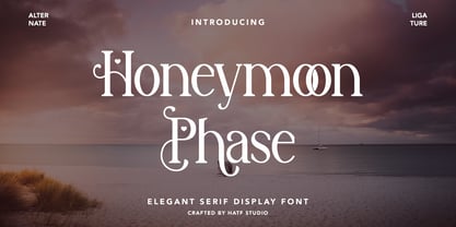 Is a elegant serif font with distinctive handwritten characters perfect for branding projects, logos, wedding designs, media posts, advertisements, product packaging, product designs, labels, photography, watermarks, invitations, stationery, and any project who need handwritten dishes. Features : 1. Uppercase & Lowercase 2. Multilingual support 3. Number 4. Symbol 5. Punctuation 6. Support in Mac and Windows OS -Support in design application (photoshop, illustrator, and more) I really hope you enjoy it.
 - Lazycat by VladB,
$28.00 Lazycat is a modern sans serif geometric font, includes upper and lower case characters, Latin, Cyrillic, Latin Eastern Europe, Turkish, Baltic and other. The Lazycat family consists of 8 fonts, divided into 2 subgroups (according to the type of style - St, Rg), and have the 4 types of thickness in each subgroup. Lazycat fonts will be useful in developing a brand, creating posters and other graphic products, and for word processing.
 - Meyer Two by Font Bureau,
$40.00 Meyer Two captures the early Hollywood flavor and nostalgia of silent-film intertitles. From 1922 through 1928, Mergenthaler Linotype cut five fonts to Louis B. Meyer’s personal specifications. Meyer Two, drawn in 1926, curiously combines Cleland’s ATF Della Robbia capitals of 1902 with lowercase and figures from ATF Post Monotone No. 2, also from the same period. Meyer Two was revived, with a Condensed added, by David Berlow; FB 1994
 - Chilly Cherry by Hanoded,
$15.00 It’s cherry season, so I bought 2 kilos of cherries at the local cherry farm. The cherries I bought had been in a cooling cell, so they were quite cold. As I was eating them, the name for this new font popped up! Chilly Cherry is a handmade serif. It’s a little wobbly, a little off-center, but it will surely put a smile on the cherry lips of your customers.
 - Robots ht by Huerta Tipográfica,
$25.00 The challenge was to build a family of robots for using assembled or separated into modules. This family consists of 7 styles: the first one contains ready-to-use robots, the other styles contain 387 modules grouped into: heads, torsos, arms & hands, legs & feet, extras (eyes, accessories) and arrows. A family for everyone’s wish. Ready-to-use or make-it-your-own: more than 2 million possible combinations!
 - The Sectarian by UICreative,
$23.00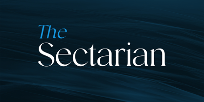 Introducing our new product the name The Sectarian Serif Font comes with 2 different weights. Modern Serif font that beautiful classy, elegant, and modern. This font is perfectly suited for a wide variety of projects, such as signature, stationery, logo, wedding, typography quotes, magazine or book covers, website headers, clothing, branding, packaging design, and more. Also for fashion-related branding or editorial design and displays both masculine and feminine qualities.
 - Wildflower Blossom by RagamKata,
$14.00 Wildflower Blossom modern serif Wildflower Blossom is a unique serif font with a modern touch. With its elegant and slim letter shapes, it offers a distinctive and captivating beauty. Available in 2 styles, regular and italic, it provides options to customize and tailor your design project to your needs. Use Wildflower Blossom to add a professional impression to your design and make it more appealing to your audience.
 - Neckar by BeJota,
$26.00 Neckar takes its name from the German river. Its rounded corners and classic geometric proportions ensure that your graphic piece will stand out. The Neckar family is available in 6 weights ranging from Thin to Black, and includes 2 different subfamilies: Neckar and Neckar Poster. In addition, thanks to the "inline" version, Neckar is ideal for designing high-impact graphic pieces. Neckar includes small caps figures (symbols, letters and numbers).
 - F2F Screen Scream by Linotype,
$29.99Heavy techno music, a personal computer, a font creation program and some inspiration had been the sources to the Face 2 Face font series. Thomas Nagel and his friends had the demand to create new unusual faces that should be used in the leading german techno magazine Frontpage". Even typeset in 6 point to nearly unreadability it was a pleasure for the kids to read and decrypt the messages." - Flying Saucer by Hanoded,
$15.00 My 7 year old son is reading a book called ‘Spees De Ruimtewees’ (Spees, the Galactic Orphan), so when I needed a name for this font family, I didn’t have to think a lot! Flying Saucer is a family of 2 fonts: a rough(ish) sans serif and a script font. Both fonts come with Italics. Use Flying Saucer for anything space related (or whatever you feel like using it for).
 - Bandy by NamelaType,
$19.00 Rounded and bended slab that's why we named this font "Bandy" This font is great for you to use as a display font and is suitable for body text. cool anyway if you use it for your design and printing needs. Available in many languages, and open type features, supported with Latin and standard Cyrillic. Build with 14 fonts with 7 sizes with matching Oblique and 2 Variables
 - Tecnica Slab Stencil by Graviton,
$20.00 Tecnica Slab Stencil font family is the stencil version of Tecnica Slab font family, it has been designed for Graviton Font Foundry by Pablo Balcells in 2014. Tecnica Slab Stencil consists of 8 styles. The 4 “Stencil 1” styles contain a narrow stem for big sizes type and/or rigid materials printing, and the 4 “Stencil 2” styles contain a wide stem for small sizes type and/or light materials printing.
 - La Vie En Flower by Arendxstudio,
$15.00 La vie en Flower is a very feminine and beautiful font with a vintage dressing that is perfect for every project of your design. With "La vie en Flower" you get: Uppercase, lowercase, 2.numeral, punctuation & Symbol multi language support ligatures ss01 ss02 Need help? Please don't hesitate to drop me an email at asep.rendi16@gmail.com if you have any issues. Comments & likes are also very appreciated! :) Enjoy!
 - Lokko by VladB,
$20.00 Lokko is a modern sans serif geometric font, includes upper and lower case characters, Latin, Cyrillic, Latin Extended symbols and other. The Lokko family consists of 8 fonts, divided into 2 subgroups (according to the type of style - St, Cut), and have the 4 types of thickness in each subgroup. Lokko fonts will be useful in developing a brand, creating posters and other graphic products, and for word processing.

