10,000 search results
(0.053 seconds)
- Altruiste by ParaType,
$30.00 Altruiste is a decorative slab serif typeface with distinctive sharp features. It was inspired by the idea of duplicating elements, conveying typeface a unique look. It is austere, sophisticated typography marked by light shapes, yet of a strong nature. Altruiste is the perfect choice for a wide range of tasks such as creating logos, signboards, posters, invitation cards and more. The typeface is available in 5 weights, from hairline to regular with italics. Each style contains 600 extended Latin and Cyrillic characters. Altruiste was designed by Alexey Chekulaev in 2021, based on the light styles of the Postulat typeface.
 - Fauna by Pasternak,
$12.00 Fauna is a stylish font inspired by hi-fi elements combined with square forms and straight lines. It also has the features of Constructivism, including solidity, emphasis on geometric shapes, and austerity. Bold futuristic characters make this font an ideal option for the development of a minimalistic and recognizable design, necessary for any modern project. It’s perfect for the creation of logos, titles, social media posts, posters, and ads. Due to the clear and eye-catching design of the characters, the font will surely attract your audience. It includes all basic symbols and characters. Plus, Fauna features proper kerning and supports several languages.
 - Victorixel by Quatype,
$35.00 Victorixel is a pixel font that incorporates the Victorian wood-type style. In order to organically combine these two styles, I abandon the exaggerated and ornate shape, yet the essence of the wood type was retained, such as the forked serif at the beginning and end of the letter stem. Victorixel family has over 800 glyphs (including emojis) and it supports lots of Latin-alphabet-based languages. It is suitable for the title, poster, etc. *EASTER EGG* Turn on the ligature OpenType features and input MBTI+emoji will output the MBTI emojis. For instance: ENTPemoji Enjoy!
 - URW Geometric Extended by URW Type Foundry,
$35.99 URW Geometric Extended is the matching complement for the URW Geometric, including 20 additional extended styles. URW Geometric is a sans serif typeface inspired by the German geometric typefaces of the 1920s but designed for modern usability. The character shapes have optimized proportions and an improved balance, the x-height is increased, ascenders and descenders are decreased. Special glyphs, which are often designed afterwards for the original geometric typefaces from the 1920s, are perfectly integrated in the URW Geometric. These design characteristics increase the usability and legibility tremendously. With its 10 weights ranging from Thin to Black, plus 10 additional oblique styles, it has a great versatility in mind. The extreme light styles shine bright in large sizes, the middle weights are perfect for body copy and the bolder variants for the use of emphasis information or bring a strong impact to headlines and information. The optically balanced styles are designed to work in perfect harmony together. URW Geometric is functional, strong, simple and harmonized in form, and at a glance appears as a modern variant of its predecessors. Apart from the basic characters the design has an extra focus on the special glyphs. These are designed for today’s needs. For example: the email glyph looks modern and unique, including a perfectly balanced spacing. The number sign, in modern use called “hashtag”, is space saving and optically balanced for body text. Additionally, various extra and alternate glyphs are designed to provide a friendly usability. Including a wide Latin language support and character sets, URW Geometric is perfectly designed for today’s requirements.
 - MM Zaftig by MM Fonts,
$19.00 MM Zaftig is a display typeface for setting text in posters and headlines where big impact is needed.
 - Charliedog by studiocharlie,
$24.00 Charliedog is a font made of various dogs. It’s ideal for graphics works like posters, flyers and similar.
 - Bamberg by Solotype,
$19.95A compressed wood poster type from the mid-1800s. Certainly handy for excessive copy on a single line. - Westo by AuburnForest,
$19.99 Westro is great for portraying western look and feel in a poster, banner or any kinds of headlines.
 - Stricken Brush by Nurf Designs,
$10.00 Stricken Brush is a very cool brushed font. Suitable for posters, movie titles, book covers, quotes and more.
 - Tiger Wong by Epiclinez,
$18.00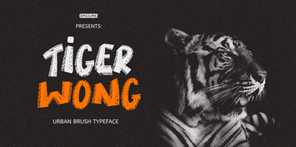 Tiger Wong is a display brush font with a very strong character. Suitable for headlines, posters, and apparel.
 - Hustyle by Skiiller Studio,
$20.00 Hustyle is a lovely and fun handwritten font. It is great for logos, invitations, posters and much more!
 - Galastone by Dimas,
$12.00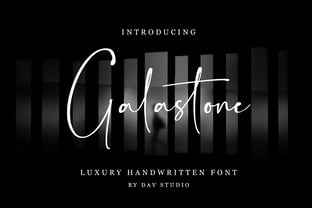 Galastone is a luxury handwritten font. It is perfect for branding, invitations, watermarks, photography, labels and movie posters.
 - Champina by Forberas Club,
$16.00 Champina is handwritten font, Recommended uses for simple write, wall type, decoration, and poster. Free for personal use.
 - Blumenkind by Catharsis Fonts,
$15.00 Blumenkind is a fresh, bright, humanist script font radiating boundless optimism and friendly enthusiasm. Its strokes are based on the rounded triangle, which lends it a dynamic bounce and a confident human touch. It shines in a wide range of display and editorial applications, but excels in particular in the context of art, creativity, food, social events, and spirituality. Blumenkind is inspired by an instance of metal-strip lettering found on the B�rgermeister Kornmesser Siedlung residential building complex in Berlin from the 1960s. The font name, being German for �flower child�, aims to capture the positive zeitgeist of that time evident in the letters. Blumenkind comes with extensive language support, tight kerning, attractive ligatures, and subtly varied alternate shapes for some of the most commonly doubled letters � and all that in three linear weights and one calligraphic weight. Furthermore, a complementary version of the font (Blumenkind Alternate) is available, in which the overlapping tittles and accent marks of the original are replaced with more traditional free-floating marks. This font is dedicated to the miracle of medical science. Thanks to Georg Seifert, Rainer Scheichelbauer, and Michael Wallner for technical aid.
 - Coil by Brownfox,
$44.99 Coil feels comfortable like a well-worn pair of shoes. It could easily pass for an assertive industrial European sans serif of the early 1960s with its slight reverse contrast, monotonous proportions, and squared-off curves, if not for its less predictable side. What appears initially as ellipses upon closer inspection turns out to be irregular shapes, closer to an inverted egg than an oval. The s looks topsy-turvy with its higher curve that is larger than the lower. Some terminal strokes overhang the bowl (as in the a), others open flat (as in the Q, the f, the j, and the t). The resulting effect shakes up this seemingly “retro” face just to make it new. Our midcentury recollections are slightly distorted and reinterpreted by this ironic typeface making it fresh while deceptively cozy and familiar. Coil’s high x-height and even texture make it readable even in small sizes despite its tight apertures. Available in four weights with their italics, with two sets of figures, fractions, and alternates for Extended Latin and Cyrillic scripts. Designed by Vyacheslav Kirilenko and Gayaneh Bagdasaryan, 2020-21.
 - HWT Etta by Hamilton Wood Type Collection,
$24.95 HWT Etta is a fun display typeface that has two styles: East and West! Its two variations ensure you have maximum wood type swagger in every display size that you might want. This fresh design takes a cue from the wild design experimentation that was happening in the heyday of mid 19th Century wood type—but filtered through 1960s photo-type sensibilities and served up for today’s design needs. Etta West is a decorative inline style and the Etta East is a whimsical reverse contrast style. They live together harmoniously, with their own specific flavors. Practically speaking, both styles are intended for display use, so use them big and use them proudly! Set your XXL size titles in West and your L to XL size types in East. As different as they might look at first, both fonts share a common DNA—Don’t be shy about using them together. The HWT Etta font is part of the Hamilton Wood Type and Printing Museum’s Type Legacy Project. In keeping with the project, Etta is named after Etta Shove Hamilton, who was J.E. Hamilton’s wife and the company’s first bookkeeper.
 - P22 Glaser Babyteeth by P22 Type Foundry,
$24.95 In 2019, P22 Type Foundry met with Milton Glaser (1929–2020) to initiate the official digital series of typefaces designed by Glaser in the 1960s and 70s. P22 Glaser Babyteeth is the first family released in the series. According to Glaser: “The inspiration for my Babyteeth type face came from this sign I photographed in Mexico City. It’s an advertisement for a tailor. The E was drawn as only someone unfamiliar with the alphabet could have conceived. Yet it is completely legible. I tried to invent the rest of the alphabet consistent with this model.” P22 Glaser Babyteeth was based on original drawings and phototype proofs from the Milton Glaser Studios archives. Over the years there have been many typefaces that borrowed heavily from the Glaser designs, but these are the only official Babyteeth fonts approved by Milton Glaser Studio and the Estate of Milton Glaser. The solid and open versions are designed to overlap for two-color font effects and can even be mixed and matched for multi layer chromatic treatments. Babyteeth includes an expanded character set to support the majority of Latin languages.
 - Rondana by Sudtipos,
$39.00 Crafted in the best tradition of the geometric sans-serif, Rondana is a typographic tribute to the the retro-futuristic aesthetics of the 1960s and 70s, as well as an exercise in purity of line. However, its spirit is decidedly non-bauhausian, since its strokes intentionally deviate from the dull, obvious, ruler-and-compass construction; its arcs and curves being much more complex, tending towards a slightly square shape, imbued with subtle modulations. This sums up to a more organic, flowing, extroverted personality than the one just expected from the use of plain, simple geometry. Another feature is the conscious use of non-standard shapes for many signs, that are quite legible but somewhat unexpected, such as the E, the g and the ampersand; making Rondana an excellent display face and also giving a particular flavor to the text composed in it, especially in its italic variants —which are, by the way, designer italics in their own right and not just an oblique version of the roman. Rondana comes in twelve variants comprising a wide spectrum of weights, allowing for an extremely diverse range of expression.
 - Moderately by Alex Jacque,
$35.00 Introducing Moderately, a chunky and friendly typeface that makes a bold statement. This high-impact font is specifically crafted for designers seeking a display typeface with presence, perfect for applications where large, expressive type is a must. The defining features of Moderately include a generous x-height, soft curves, and tight spacing, ensuring a punchy and fresh aesthetic. Moderately is a deliberate departure from your contemporary sans with nary a straight line to see, embracing the organic and dynamic qualities reminiscent of blocky Art Nouveau typefaces, notably inspired by the works of Alfred Roller. While drawing influence from psychedelic / Art Nouveau revival typefaces of the 1960s, Moderately strikes a contemporary balance, delivering a design that is both impactful and approachable. Each glyph in Moderately attempts to maximize its space within the em square, incorporating slim carve outs for counters and apertures. The name "Moderately" adds a touch of irony, as this typeface is anything but plain – it exudes affable confidence and subtle flair. Created with versatility in mind, Moderately offers broad support for Latin-based languages, ensuring its adaptability for a wide range of creative projects.
 - Beni by Nois,
$18.00 Beni is a bold & strong sans serif font family beautifully crafted to perform in short headlines in posters or contemporary interface design. Each character has been optically adjusted for maximum effect in the space between; as such, this is a strong contender for movie posters, titling, album artwork, and any design project that needs a clean sans serif that makes an impact wherever it is applied. This type family is available in four unique weights that stand well apart from one another in visual style. Beni Light is the runway model of the family, standing with a narrow posture and towering height. It’s a fantastic choice for conveying a message in a limited horizontal space. Beni Regular and Beni Bold are shorter in stature but both pack a punch, carrying bold strokes that speak with confidence and offer great legibility. The heaviest of the heavy, Beni Black is the super-bold, go-to type design for projects that need an impossibly strong type design at the helm. Beni extends multilingual support to Basic Latin, Western European, Euro, Catalan, Baltic, Turkish, Central European, Pan African Latin, Igbo Onwu, and Basic Greek for design projects intended for an international audience.
 - Mercurial by Grype,
$16.00 Geometric/Technical style logotypes have been developed for car chrome labels since the early 1980’s, but automobile companies don't monopolize the style by any means. During the 80’s and 90’s, a lot of these logos leaned towards the geometric sans styles and the swiss styling of fonts like Handel Gothic, while playing with varying degrees of squared rounds and varying expanded widths per logotype. Mercurial has this flavor, but it wasn’t derived from logotypes. Instead, it began as a digitization of a film typeface from LetterGraphics in the early 70's known as "Sam". It visual ties to this genre of automotive logotypes and fonts like Handel Gothic lend a familiarity to it, yet it has an identity all its own. As with so many automotive logotypes, this singular style film typeface, lacked an expansive family which shows off all potential the logotypes have and what they "could" be and do. And that's where we come in. What originally began as this family’s Regular Width - Bold Style has been expanded into a collection of 3 Width Families, each containing 5 Weights. Here’s what’s included with the Mercurial Complete bundle: 396 glyphs per style - including Capitals, Lowercase, Numerals, Punctuation and an extensive character set that covers multilingual support of latin based languages. (see the final poster graphics for a preview of the characters included) 3 widths in the collection: Narrow, Regular, & Wide 5 weights in each width family: Light, Book, Regular, Medium & Bold. Here’s why the Mercurial Family is for you: - You’re in need of stylish sans font family with a range of widths and weights. - You’re love those 80’s automotive logos, but want more range of use. - You’re looking for an alternative to Handel Gothic. - You’re looking for a clean techno typeface for your rave poster designs. - You just like to collect quality fonts to add to your design arsenal.
 - Nipsey by Putracetol,
$28.00 Introducing Nipsey - a unique display font inspired by vintage albums and posters from 1970s music bands. With its classic typeface and groovy impression, Nipsey brings a fun and retro vibe to your designs. What sets Nipsey apart is the combination of various alternates, such as swashes, stylistic sets, stylistic alternates, contextual alternates, and ligatures, making this font even more distinctive and versatile. Nipsey is perfect for a wide range of display purposes, including album covers, posters, labels, t-shirts, apparel, signage, quotes, logos, greeting cards, logotypes, and more. Its eye-catching design adds a touch of nostalgia and personality to any project, making it stand out in a crowd. To access the alternative characters in Nipsey, you can use OpenType savvy programs such as Adobe Illustrator, Adobe InDesign, Adobe Photoshop, Corel Draw X version, and Microsoft Word. The OpenType features allow you to easily switch between uppercase and lowercase letters, as well as apply alternates and ligatures to create unique and customized lettering compositions. In your zip package, you'll find the Nipsey font files in otf, ttf, and woff formats, providing versatility for different design projects. The font includes uppercase and lowercase letters, numerals, punctuation, and symbols, ensuring that you have all the elements you need for your designs. Nipsey also offers multilingual support, making it accessible for designers around the world to create designs in different languages. Whether you're designing for English, Spanish, French, or any other language, Nipsey has got you covered. If you have any questions, feedback, or comments, feel free to reach out to PutraCetol Design Studio via PM or email. The team is happy to assist you in your creative endeavors. In conclusion, Nipsey is a unique and versatile display font that brings a fun and retro vibe to your designs. With its alternative characters and multilingual support, Nipsey offers endless possibilities for creating eye-catching designs for various display purposes. So, let your creativity flow with Nipsey and elevate your design projects to the next level! Thanks for choosing Nipsey from PutraCetol Design Studio. Happy Creating!
 - GraySun by Inumocca,
$20.00 GraySun Futuristic Font simple, strong Character and eyecatching. Inspiration by Modern Technology, Synthwave, Sci-fi Movie Poster, science and Space Theme. Really great font to covering your Project, like Lettering, Website Interface, Magazine, Branding, Poster, wedding invitations, Quotes Lettering, Logos, and more your project design. - Unique glyphs - Multilingual Characters - UPPERCASE - Lowercase - Numeric - Symbol - Punctuation Character - PUA encoded - Stylistic Alternates inumoccatype
 - Sleepless by Gassstype,
$27.00 Introducing of our new product Sleepless is a hand drawn Horror Brush font and dramatic movement. This font is great for your next creative project such as logos, printed quotes, invitations, cards, product packaging, headers, Logotype, Letterhead, Poster, Label, and etc. Best for project that need horror vibes , horror poster, childrenbook, cartoon, comic . You can activate Ligature OpenType panel design more interesting.
 - Rolla Cossta by Gassstype,
$25.00 Rolla Cossta - Handwritten Brush Font . Introducing of designs look modern, unique and fun. It’s perfect for labels, quotes, posters, DIY projects, branding, packaging, greeting cards, websites, photos, photography overlays, signs, window art, scrapbooking, tags and so much more!our new product that inspired by Street Tagging, graffiti style with a fun theme very good for graffity poster, flyer, childrenbook, cartoon, comic etc
 - PAG Julio by Prop-a-ganda,
$19.99Prop-a-ganda offers retro-flavored fonts inspired by lettering on retro propaganda posters, retro advertising posters, retro packages all the world over. This is perfect font for your retrospective project. PAG Julio is a eye-catching, counter-contrast font with retro touch. This cool and cute font woks best for display uses, headlines, branding, print, and web design projects. - KT Mogli by Kotivoro Lab,
$18.00 KT Mogli is a Grotesque print design typeface inspired from automotive poster. KT Mogli is single style font for Headline & body copy. Stylistically it sits between the dynamic humanist sans and more rigid grotesk. The clear letterforms have broad proportions and are generously spaced. This font suitable with your projects such as poster, user interface, magazine, logo, apparel design, etc.
 - Rockadelic by Blankids,
$18.00 Introducing a new retro bold script called Rockadelic. Bring back to the 70's era Rockadelic inspired by posters and album covers of funk, disco and rockabilly music with bold and fun style. Rockadelic comes with OpenType features such stylistic alternates, stylistic sets, swash & ligatures and is good for logotype, poster, badge, book cover, t-shirt design, packaging and any more.
 - PAG Liberta by Prop-a-ganda,
$19.99Prop-a-ganda offers retro-flavored fonts inspired by lettering on retro propaganda posters, retro advertising posters, retro packages all the world over. This is perfect font for your retrospective project. Very bold stems. Pointed Apexes. Bars and some of the terminals which designed as a ball are very eye-catching. These features make a strong impact with nostalgic feel. - Patinas Pointed by Inumocca,
$13.00 Patinas Pointed with 2 Style Reguler and Destroy. Modern Urban Serif Font, Powerfull and has a great Character, Good Font to use for covering your Project, like Branding, Headline Letter, Flyer, Signage, Quotes, Poster Typography, Bookcover, Magazine cover, Poster, Quotes Lettering, Logos, and more your project design. - Unique glyphs - Multilingual Characters Support - UPPERCASE - Lowercase - Numeric - Symbol - Punctuation Character inumocca type Studio
 - PAG Auto by Prop-a-ganda,
$19.99Prop-a-ganda offers retro-flavored fonts inspired by lettering on retro propaganda posters, retro advertising posters, retro packages all the world over. This is perfect font for your retrospective project. PAG Auto is an ultra black font, but it is readable. A fat typefaces, but is is boorish. It is recommended for use as all kinds of display typography. - Liquorstore by Chank,
$99.00 Inspired by hand-painted liquor store signage in Minneapolis, as well as constructivist propaganda posters and old magazine logos, Chank created Liquorstore as a simple yet elegant exercise in font creation based on basic geometric forms with subtle, humanist sensibilities. Works great for display usage for headlines, labels and prohibitive signage. A simple and versatile, must-have display poster font!
 - Mooners by Burntilldead,
$14.00 Make your design as a time machine with "Mooners" typeface. Inspired by the decorative victorian advertising poster, Mooners came to make make your document, poster, logo, etc... perfectly have a vintage victorian vibes. It's a solid combination that can bring your design, logo, document, website, etc. back to 1800 decade. Multilingual fonts-family and playful one with 165 alternate characters.
 - Midfield by Kreuk Type Foundry,
$12.00 Introducing MIDFIELD DISPLAY. Midfield Family is All Caps display typeface with solid, masculine, urban, sporty, & bold character. Each glyph is very well suited to make an interesting quote, headline & striking poster design. This font is perfect for logos, badges, clothing, signage, posters, and much more! This font includes standard and extended Latin characters as well as numbers and symbols. Multi-language support.
 - Masserini by Studio Sun,
$16.00 Masserini is inspired by the 20's art deco era of colorful posters, fonts, and typography with a vintage flair. With its strong geometric shapes and letters, like a style of sans serif that was used in signs and posters during that time period. This collection consists of a variety of widths, weights, and variants to suit your creative needs.
 - Nimbus Sans by URW Type Foundry,
$35.00 The first versions of Nimbus Sans have been designed and digitized in the 1980s for the URW SIGNUS sign-making system. Highest precision of all characters (1/100 mm accuracy) as well as spacing and kerning were required because the fonts should be cut in any size in vinyl or other material used for sign-making. During this period three size ranges were created for text (T), the display (D) and poster (P) for small, medium and very large font sizes. In addition, we produced a so-called L-version that was compatible to Adobe’s PostScript version of Helvetica. Nimbus was also the product name of a URW-proprietary renderer for high quality and fast rasterization of outline fonts, a software provided to the developers of PostScript clone RIPs (Hyphen, Harlequin, etc.) back then. Also in the 80s, a new, improved version of the Nimbus Sans, namely Nimbus Sans Novus was designed. Nimbus Sans Novus was conceptually developed entirely with URW’s IKARUS system, i.e. all styles harmonize perfectly with each other in terms of line width, weight, proportions, etc. On top of that, Nimbus Sans Novus contains more styles than Nimbus Sans. Now, Nimbus Sans is also available as Round (like the popular URW fonts Futura Round and Eurostile Round). The Round versions are intended to facilitate the work of designers and typographers. The fonts can be used directly, without further preparatory work in graphic programs as finished, high-quality Rounds.
 - Sincerely by Canada Type,
$24.95Whether with pen on paper, or in digital, realistically connecting vertical handwriting is never an easy task to accomplish. After working with many handwriting fonts, and after intently dissecting so many different handwritings, one tends to expect such things to be quirky, disconnected, and almost never upright. In fact, in spite of vertical handwriting’s academically-sung virtues of rationality, efficiency, clarity and logic, very few people manage to deviate from the natural slant when writing. Even fewer manage to make the vertical handwriting connect and keep its natural flow. Calligraphy and upright cursive aside, it is almost impossible to make a vertical letters connect and maintain a real handwriting appearance. This is where the genius of this design comes in to bridge the gap between upright handwriting and calligraphy. Sincerely is based on one of the most fascinating handwriting designs to ever come out of Germany: Karlgeorg Hoefer’s 1968 Elegance for the Ludwig & Mayer foundry. It is a handwriting with the full meaning of the word, yet it possesses the rare, very commanding and appealing trait of being both vertical and connected while managing to remain realistic. It is the ultimate branding iron of handwriting fonts. When set and printed, Sincerely simply cannot be ignored. Ideal for humanity-asserting poster designs, lettering of short wording with plenty of space, poetry, notes, greeting cards, craft literature, book covers, history-related designs, and a whole range of other applications. - Nimbus Sans Round by URW Type Foundry,
$35.99 The first versions of Nimbus Sans have been designed and digitized in the 1980s for the URW SIGNUS sign-making system. Highest precision of all characters (1/100 mm accuracy) as well as spacing and kerning were required because the fonts should be cut in any size in vinyl or other material used for sign-making. During this period three size ranges were created for text (T), the display (D) and poster (P) for small, medium and very large font sizes. In addition, we produced a so-called L-version that was compatible to Adobe’s PostScript version of Helvetica. Nimbus was also the product name of a URW-proprietary renderer for high quality and fast rasterization of outline fonts, a software provided to the developers of PostScript clone RIPs (Hyphen, Harlequin, etc.) back then. Also in the 80s, a new, improved version of the Nimbus Sans, namely Nimbus Sans Novus was designed. Nimbus Sans Novus was conceptually developed entirely with URW’s IKARUS system, i.e. all styles harmonize perfectly with each other in terms of line width, weight, proportions, etc. On top of that, Nimbus Sans Novus contains more styles than Nimbus Sans. Now, Nimbus Sans is also available as Round (like the popular URW fonts Futura Round and Eurostile Round). The Round versions are intended to facilitate the work of designers and typographers. The fonts can be used directly, without further preparatory work in graphic programs as finished, high-quality Rounds.
 - P22 Curwen by IHOF,
$24.95 P22 Curwen was originally designed by an unknown designer. This version was created by Colin Kahn. P22 Curwen Poster is a digitized version of a rare wood type used by the Curwen Press in England in the early 20th Century for poster work. The font was known to have been cut in 6 sizes—from 3-line (3/4 inch) to 16-line (3 inch) in height. The font was based from impressions made of the 6-line type. P22 Curwen Maxima is a hyper-stylized re-interpretation of Curwen Poster by Colin Kahn. As a post-modern poster type, it evokes an organic nature within a novel maximalist framework. It is reminiscent of early phototype display faces with an illogical three-dimensionality which serves to give the font continuity. The capitals are buried beneath stylistic wood shavings complementing the sculpture like quality of the lowercase. Perfect for (almost) any project.
 - Chatter by Jonahfonts,
$25.00 A free style specifically designed for Packaging but still works well for Greeting cards, Magazines, Posters and Advertising Ads.