10,000 search results
(0.025 seconds)
- PAG Brigade by Prop-a-ganda,
$19.99Prop-a-ganda offers retro-flavored fonts inspired by lettering on retro propaganda posters, retro advertising posters, retro packages all the world over. This is perfect font for your retrospective project. PAG Brigade is a heavy, but cute font. The contrast of bold and thin stroke left a strong impression. - Chilok by Dhan Studio,
$19.00 Chilok is a cool handwritten font that is also elegant and fashionable, which looks like a signature or logo, this font also has an alternative to beautify your design. Chilok is perfect for branding, logos, business cards, posters, invitations, greeting cards, news, product packaging, blog posters, all including personal charm, etc.
 - Space Journey by Vozzy,
$10.00 Introducing retro sci-fi label font duo named Space Journey. This display font is inspired by movie posters from the 60s and 70s. Font family has two styles: Regular and Rough. This font will look good on any retro sci-fi styled designs like a poster, T-shirt, label, logo, etc.
 - Serwus by Agnieszka Ewa Olszewska,
$20.00 It's font created for posters, ads, websites. I created it when I designed a poster, then later realized that I very often need such a letters so decided to complete all of the characters. It's distinctive, spacious, hand made with narrow kern. Have more then 400 characters, smallcaps and text figures.
 - Chratos by Gassstype,
$23.00 Introducing of our new product CHRATOS is a Black Metal Display Font is handmade Rough Brush Font with Alternates and Multilanguage support. Can make it easier to convey the message in your design. use for awesome display, labeling, movie sceen, poster, movie title,quotes, posters, DIY projects, branding, packaging, greeting cards, websites, photos, photography overlays, signs, window art, tags and so much more! Best for project that need horror vibes , horror poster, childrenbook, cartoon, comic etc This font CHRATOS is PUA encoded which means you can access all of alternate glyphs.
 - Caffe by IHOF,
$24.95 Caffe was originally designed for the Artz Gallery Cafe in Budapest Hungary. The design is a contemporary handwriting style adapted from examples in lettering exercise books. It has been redrawn and expanded into six styles. The four weights were created by drawing the style using different mediums: Cappuccino in pen, Pastry in felt-tip, Lemonade in brush, and Tobacco—the original—in pencil. Poster and Poster Inline round out the family and are well suited for display purposes. This font family is perfect for bistro menus or other European-flavored poster and print design.
 - P22 Ruffcut by IHOF,
$24.95 Ruffcut is an antique wood type style that evokes the look and feel of type used in the design of poster-sized advertisements for circus, fairground and like events in the late 19th century. It is inspired by the memories of printing letterpress posters on an old cast-iron flatbed press where the oversized posters were usually composed directly on the bed of the press using mostly wood type as large as two feet high. Ruffcut is optimal at large sizes for a wide array of decorative issues.
 - PAG Trust by Prop-a-ganda,
$19.99Prop-a-ganda offers retro-flavored fonts inspired by lettering on retro propaganda posters, retro advertising posters, retro packages all the world over. This is perfect font for your retrospective project. Almost all the letters of PAG Trust are drawn by bold line, but some bars are very thin line and counters are extremely small. With this font, regular typed text transformed into unique typography. We can’t decide the impression of PAG Trust, depending on how to use it, it can be cute package, retro book cover or propaganda poster of Cuba. - Oo-la-la by Emboss,
$26.95 Inspired by old French poster art. This typeface was cut from an old rubylith.
 - Glam Rock MF by Masterfont,
$59.00 Either Futuristic or Space ship logo - it will sure fit to a mysterious poster.
 - Sharp Stroke by Kaer,
$15.00 Hand drawn felt pen font. Vector grunge style design for your posters or prints.
 - Mobie FA by Fontarte,
$39.00 FA Mobie is a contemporary decorative fat face. For use on posters, leaflets, ads.
 - Hebrew Julit by Samtype,
$39.00 Beautiful and elegant typeface, excelent using in wedding invitations, arts, posters and small texts.
 - Hebrew Provence Std by Samtype,
$39.00 Beautiful and elegant typeface, excelent using in wedding invitations, arts, posters and small texts.
 - Eqlaser by Koval TF,
$25.00 Eqlaser is a histogram-styled typeface. Excellent for party posters and music-related prints.
 - Hebrew Juless by Samtype,
$39.00 Beautiful and elegant typeface, excelent using in wedding invitations, arts, posters and small texts.
 - Jaguarundi by Dharma Type,
$9.99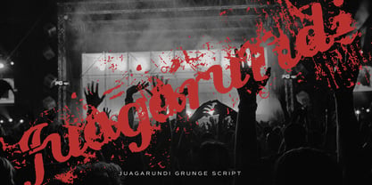 This extremely scratched and decadent font is suitable for posters of rock or grunge.
 - Hebrew Rose Pro by Samtype,
$39.00 This beautiful hebrew swash font is for book covers, poster, titles and small texts.
 - Kartisiot MF by Masterfont,
$59.00 This rough and dirty font is just perfect for your next horror movie poster.
 - Alt UAV31 by ALT,
$- UAV 31 is a geometric experimental display typeface for use on logos,posters etc.
 - Minuet by Canada Type,
$24.95 Minuet, an informal script with crossover deco elements giving it an unmistakable 1940s flavor, is a revival and expansion of the Rondo family, the last typeface drawn by Stefan Schlesinger before his death. This family was initially supposed to be a typeface based on the strong, flowing script Schlesinger liked to use in the ads he designed, particularly the ones he did for Van Houten’s cocoa products. But for technical reasons the Lettergieterij Amsterdam mandated the face to be made from unattached letters, rather than the original connected script. Schlesinger and Dooijes finished the lowercase and the first drawings of the uppercase just before Schlesinger was sent to a prison camp in 1942. Dooijes completed the design on his own, and drew the bold according to Schlesigner’s instructions. The typeface family was finished in February of 1944, and Schlesinger was killed in October of that same year. Though he did see and approve the final proofs, he never actually saw his letters in use. It took almost four more years for the Lettergieterij Amsterdam to produce the fonts. The typeface was officially announced in November of 1948, and immediately became a bestseller. By 1966, according to a memo from the foundry, the typeface had become “almost too popular”. This digital version of Schlesigner’s and Dooijes’s work greatly expands on the metal fonts. Both weights include a complete set of lowercase alternates — based on Schlesinger’s own drawings, as well as alternative variations for some of the capitals, a few ligatures, and extended language support covering Western, Eastern and Central European languages, plus Baltic, Celtic/Welsh, Esperanto, Maltese and Turkish. Minuet is available in all popular formats. The OpenType version, Minuet Pro, takes advantage of internal font programming to combine the main and alternate fonts into a single file per weight, making all alternates and ligatures automatically available at the push of a button in OpenType supporting programs.
 - Mauritius by Canada Type,
$29.95 Ten years or so after his unique treatment of Garalde design with Trump Mediaeval, Georg Trump took on the transitional genre with Mauritius, which was to be his last typeface. He started working on it in 1965. The Stuttgart-based Weber foundry published a pamphlet previewing it under the name Barock-Antiqua in 1967, then announced the availability of the metal types (a roman, a bold and an italic) a year later. The global printing industry was already in third gear with cold type technology, so there weren't that many takers, and Weber closed its doors after more than 140 years in business. Subsequently, Trump’s swan song was unfairly overlooked by typography historians and practitioners. It never made it to film technology or scalable fonts. Thus, one of the most original text faces ever made, done by one of the most influential German type designers of the 20th century, was buried under decades of multiple technology shifts and fading records. The metal cuts of Mauritius seem to have been rushed in Weber’s desperation to stay afloat. So the only impressions left of the metal type, the sole records remaining of this design, show substantial problems. Some can be attributed to technological limitations, but some issues in colour, precision and fitting are also quite apparent, particularly in Mauritius Kursiv, the italic metal cut. This digital version is the result of obsessing over a great designer’s final type design effort, and trying to understand the reasons behind its vanishing from typography’s collective mind. While that understanding remains for the most part elusive, the creative and technical work done on these fonts produced very concrete results. All the apparent issues in the metal types were resolved, the design was expanded into a larger family of three weights and two widths, and plenty of 21st century bells and whistles were added. For the full background story, design analysis, details, features, specimens and print tests, consult the PDF available in the Gallery section of this page.
 - Referenz Grotesk by Sudtipos,
$49.00 Made in Germany, Referenz Grotesk is a typeface full of references referring to the type design history of Stuttgart State Academy of Art and Design. Its typographic history holds a broad spectrum of shapes and characters, including F.H. Ernst Schneidler (1882–1956), Imre Reiner (1900–1987), Walter Brudi (1907–1987), Kurt Weidemann (1922–2011) and Frank Heine (1964–2003). During extensive research phases for Referenz Grotesk included collection and analysis. This led to further research in the Academy’s collection and archive where the majority of Weidemann’s estate is housed next to works of other designers and professors like F.H. Ernst Schneidler and Walter Brudi. Another place of research was the typesetting workshop where Schneidler had previously taught and worked. Some of his freshly cast fonts were tested and used there for the first time and are still stored in several of the type cases. Regarding the more recent history, for instance about the Emigre designer Frank Heine, former colleagues and professors have been consulted. These studies resulted in the new font Referenz Grotesk that includes traces of Kurt Weidemann’s Corporate as well as calligraphic hints that link to Schneidler’s Stuttgarter Schule (Stuttgart School) where writing played an important role during the form finding process. For the regular text fonts these features are integrated in a subtle manner whereas several alternative glyphs pick up more expressive forms. The final sans serif type family has a clarity and contemporary straightness that becomes more characteristic in its heavier weights. Additionally more than 60 alternative glyphs per weight allow for individual combinations that can be tailored specifically for each application and context. They open up a broad range of visual expressions, from subtle to playful and eccentric characteristics. Referenz Grotesk is available in six weights: Light, Regular, Medium, Bold, Extra Bold and Black, plus italics. In addition, the family includes multiple OpenType functions such as Stylistic Sets, Tabular Figures and Case Sensitive forms. Variable version of the font is included when you license the full pack.
 - Petrarka by HiH,
$12.00 Petrarka may be described as a Condensed, Sans-Serif, Semi-Fatface Roman. Huh? Bear with me on this. The Fatface is a name given to the popular nineteenth-century romans that where characterized by an extremity of contrast between the thick and thin stroke. The earliest example that is generally familiar is Thorowgood, believed to have been designed by Robert Thorne and released by Thorowgood Foundry in 1820 as "Five-line Pica No. 5." Copied by many foundries, it became one of the more popular advertising types of the day. Later, in the period from about 1890 to 1950, you find a number of typeface designs with the thin stroke beefed up a bit, not quite so extreme. What you might call Semi-Fatfaced Romans begin to replace the extreme Fatfaces. Serifed designs like Bauer’s Bernard Roman Extra Bold and ATF’s Bold Antique appear. In addition, we see the development of semi-fatface lineals or Sans-Serif Semi-Fatfaces. Examples include Britannic (Stephenson Blake), Chambord Bold (Olive), Koloss (Ludwig & Mayer), Matthews (ATF) and Radiant Heavy (Ludlow). Petrarka has much in common with this latter group, but is distinguished by two salient features: it is condensed and it shows a strong blackletter influence, as seen in the ‘H’ particularly. Petrark was released about 1900 by the German foundry of Schelter & Giesecke of Leipzig and is one of the designs of the period that attempts to reconcile roman and blackletter traditions. Making a cameo appearance in this Multi-Lingual font is the Anglo-Saxon letter yogh (#729), which, along with the thorn and the eth, is always useful for preparing flyers in Old English. There are still pockets of resistance to the Norman French influence that washed up on England’s shores in 1066. This font stands with King Canute, seeking to hold back the tide (ignoring the fact that Canute was a Dane). Support the fight to preserve Anglo-Saxon culture. Buy Petrarka ML today. Petrarka Initials brings together the Petrarka upper case letters with a very sympatico Art Nouveau rendering of a female face.
 - Marianas by Typodermic,
$11.95 Marianas is a typeface that demands attention. With its militaristic, industrial-looking Art Deco design, it’s a force to be reckoned with. It’s the typeface you choose when you want to convey strength and power. But it’s not just its aesthetics that make Marianas stand out. This font has a history, a purpose. It was first recruited for a video game about the Pacific Air War, where it proved to be the perfect choice for conveying the bold, fearless attitude of the game’s characters. Marianas is a hybrid of two distinct styles—the suave elegance of the 1920s and the serious, mechanical precision of the 1940s. So if you want to make a statement, if you want to stand out from the crowd, choose Marianas. It’s a typeface that’s not for the faint of heart, but for those who are bold enough to embrace the power of design. Most Latin-based European, and some Cyrillic-based writing systems are supported, including the following languages. A Afaan Oromo, Afar, Afrikaans, Albanian, Alsatian, Aromanian, Aymara, Bashkir (Latin), Basque, Belarusian (Latin), Bemba, Bikol, Bosnian, Breton, Bulgarian, Cape Verdean, Creole, Catalan, Cebuano, Chamorro, Chavacano, Chichewa, Crimean Tatar (Latin), Croatian, Czech, Danish, Dawan, Dholuo, Dutch, English, Estonian, Faroese, Fijian, Filipino, Finnish, French, Frisian, Friulian, Gagauz (Latin), Galician, Ganda, Genoese, German, Greenlandic, Guadeloupean Creole, Haitian Creole, Hawaiian, Hiligaynon, Hungarian, Icelandic, Ilocano, Indonesian, Irish, Italian, Jamaican, Kaqchikel, Karakalpak (Latin), Kashubian, Kikongo, Kinyarwanda, Kirundi, Komi-Permyak, Kurdish (Latin), Latvian, Lithuanian, Lombard, Low Saxon, Luxembourgish, Maasai, Macedonian, Makhuwa, Malay, Maltese, Māori, Moldovan, Montenegrin, Ndebele, Neapolitan, Norwegian, Novial, Occitan, Ossetian, Ossetian (Latin), Papiamento, Piedmontese, Polish, Portuguese, Quechua, Rarotongan, Romanian, Romansh, Russian, Sami, Sango, Saramaccan, Sardinian, Scottish Gaelic, Serbian, Serbian (Latin), Shona, Sicilian, Silesian, Slovak, Slovenian, Somali, Sorbian, Sotho, Spanish, Swahili, Swazi, Swedish, Tagalog, Tahitian, Tetum, Tongan, Tshiluba, Tsonga, Tswana, Tumbuka, Turkish, Turkmen (Latin), Tuvaluan, Uzbek (Latin), Venetian, Vepsian, Võro, Walloon, Waray-Waray, Wayuu, Welsh, Wolof, Xhosa, Yapese, Zapotec Zulu and Zuni.
 - Flink Neue by Identity Letters,
$45.00 Geometric typefaces are a staple in every typographer’s toolbox since the 1920s. It was a time when iconic faces such as Futura, Erbar, and Kabel appeared on the scene and turned the world of type upside-down. Inspired by those early giants as well as later epigones with a legacy of their own (such as 1970’s Avant Garde Gothic), Flink Neue is the Identity Letters take on this genre, characterized by a clean and focused appearance. With neat shapes and the look of pure geometry, Flink Neue adapts to a vast range of applications and topics, from the fine print in contract to website body copy to logo design to billboard-size slogans. Its x-height is considerably larger than in classic geometric sans-serif fonts; its proportions are harmonized as opposed to strictly constructed. This makes for a more contemporary look, setting it apart from the classics. With three different widths, Flink is a true all-rounder. Geometric fonts are usually quite wide, which often leads to text-settings problems with headlines or small print. The Condensed and Compressed variants of Flink Neue solve this problem easily. This font family comes along in 18 weights from Thin to Black with matching Italics. There are almost 1400 characters per style, including nine stylistic sets that offer variations to the look and feel of Flink Neue, making it even more versatile. Besides the default mood of Flink Neue, there is also a Text and Bauhaus variant, where different letters have been changed to create a new mood. In theory, you just need one single font file to change between all three moods, but to make it easier for you, we also exported each mood within a separate file. Plenty of additional Open Type Features like ligatures, small caps, case sensitive forms, old-style figures, tabular figures and symbols make Flink Neue a valuable tool for the discerning typographer. Flink Neue is the reimagination of a classic genre, designed to suit the needs of our time.
 - Caslon Graphique by ITC,
$29.99 The Englishman William Caslon punchcut many roman, italic, and non-Latin typefaces from 1720 until his death in 1766. At that time most types were being imported to England from Dutch sources, so Caslon was influenced by the characteristics of Dutch types. He did, however, achieve a level of craft that enabled his recognition as the first great English punchcutter. Caslon's roman became so popular that it was known as the script of kings, although on the other side of the political spectrum (and the ocean), the Americans used it for their Declaration of Independence in 1776. The original Caslon specimen sheets and punches have long provided a fertile source for the range of types bearing his name. Identifying characteristics of most Caslons include a cap A with a scooped-out apex; a cap C with two full serifs; and in the italic, a swashed lowercase v and w. Caslon's types have achieved legendary status among printers and typographers, and are considered safe, solid, and dependable. Caslon Antique was designed by Berne Nadall and brought out by the American type foundry Barnhart Bros & Spindler in 1896 to 1898. It doesn't bear any resemblance to Caslon, but has the quaint crudeness of what people imagine type looked like in the eighteenth century. Use Caslon Antique for that old-timey" effect in graphic designs. It looks best in large sizes for titles or initials. Caslon Black was designed by David Farey in the 1990s, and consists of one relatively narrow and very black weight. It is intended exclusively for titles or headlines. Caslon Black has a hint of the original Caslon lurking in the shadows of its shapes, but has taken on its own robust expression. Caslon Graphique was designed by Leslie Usherwood in the 1980s. The basic forms are close to the original Caslon, but this version has wide heavy forms with very high contrast between the hairline thin strokes and the fat main strokes. This precisely drawn and stylized Caslon has verve; it's ideal for headlines or initials in large sizes."
 - Thalweg by Ani Dimitrova,
$35.00 Thalweg serif typeface is a project focused on the digitalization and development of the Thalweg font. The font was originally designed in 1993 by the Bulgarian artist Ivan Kyosev. In 2018 Ani Dimitrova began the revival of the Thalweg font and converted the drawings into a digital form. The existing set of characters required some necessary expansions such as the development of capital letters, alternative symbols and many other functions. Furthermore, some additional weights were developed which aimed to make the font more complete. Thalweg was completed in 2020 with 16 weights ranging from Thin to Black with extra drawn italics and small caps versions, each style containing more than 1100 glyphs. The font comes with an extended coverage of the Latin, Cyrillic and Greek Scripts. All of the weights are specifically equipped for complex, professional typography with Open Type Features. These features include: Small Caps, Ligatures, Discretionary Ligatures, Superscript, Subscript, Tabular Figures, Old-Style Figures, Circled Figures, Arrows, Matching currency symbols and fraction. The Thalweg serif typeface is a perfect choice for body text, branding design, web design, editorial design and more. Ivan Kyosev (1933-1994) was one of Bulgaria’s most famous artists whose work influenced several generations of bulgarian designers. He was born on February 5, 1933, in the city of Burgas. In 1957 he graduated in illustration at the National Academy of Art in Sofia led by Prof. Iliya Beshkov. Mr. Kyosev was a member in the management of the “Graphics and Illustration” section in the Union of Bulgarian Artists, member of the UBA board, artist in the publishing houses “September” and “World”. Together with Boris Angelushev, he worked on the layout design of the “Literary Front” newspaper. Furthermore, in 1963 - 1964 he was the main artist in the publishing house “Prosveta”. Ivan Kyosev excelled in the field of illustration, book design and library layouts in various genres (classics, children's literature, poetry, journalism, memoirs, etc.). He is also the author of many fonts.
 - Wildlife Animal by Trim Studio,
$15.00 **Wildlife Animal** a sharp and cutting-edge typeface that perfectly captures the spirit of the forest and the wild. Ideal for Easter Day designs, this font boasts a cute and playful style that's sure to delight. Whether you're creating invitations, greeting cards, or posters, "Wildlife Animal" will help your text stand out with its unique and eye-catching design. With its forest-inspired theme and playful, yet sharp style, this font is perfect for adding a touch of nature to your designs. Download "Wildlife Animal" today and take your Easter Day designs to the next level! --- File Include: - Wildlife Animal otf - Wildlife Animal ttf - Wildlife Animal woof - Readme.pdf Thank you for let us be your design partner, If you have any questions please don't **hesitate** to drop me a message
 - Recons by Almarkha Type,
$25.00 Our new product Rekons - Sport Display, inspired by the title of the sports poster and We make it very energetically. Rekons font with strong and challenging nuances. very suitable for the title, typography, clothes, Poster, magazines, brochures, packaging,Websites and much more for your design needs, making your designs more modern and professional.
 - Beats by 4RM Font,
$29.00 Inspired by street posters, this font combines the value of beauty and authenticity in its creation. and the style set feature adds variety to the anatomy of the letters, this font belongs to the display category which is suitable for use in graphic designs such as posters, billboards, and large graphic designs.
 - Alien Space by WNGSTD,
$15.00 Alien Space display font is a playful and modern font. Alien space family contains regular and outline fonts. Alien Space is perfectly suited for traditional media and the web. Great for logos, banners, posters, and graphic artists. Its playfulness makes it great for creative projects, inspirational wall poster, or for communicating your brand.
 - Aristide by Jonahfonts,
$29.95 There are many fonts inspired by Toulouse-Lautrec. I felt this one was needed and tried to get that loose brush-stroke appearance typical of Toulouse’s style of his famous French Cabaret posters. Aristide Bruant a dancer and comedian made famous by Lautrec’s posters can now be further immortalized with this font.
 - Legal Obligation Serif by Wing's Art Studio,
$4.00 Legal Obligation - Serif Version A dedicated compressed Serif font for movie poster credit blocks and cinematic title designs. A workmanlike tool for adding extensive cast and crew information to movie posters without dominating the overall layout. Supplied with lowercase characters and three weights. Contents: - Legal Obligation (Serif Version) - Light, Regular and Bold Weights
 - Kodiak by Borges Lettering,
$45.00 Kodiak was designed by 40+ year sign painting veteran, Brian Grant, and is loosely based on the works of many great sign painting masters. Brian and Charles Borges de Oliveira teamed up to bring this beautiful sign painters classic to the digital age. Kodiak retains the warmth of a hand lettered font without being stiff and mechanical. Great for period style lettering to modern day logos. With over 160 alternates and 10 ornaments you are bound to find the right look for your next design!
 - Sonlight by sizimon,
$25.00 Sonlight Script is hand written fonts set . Very cool for logos, name tag, handwritten quotes, product packaging, merchandise, social media & greeting cards. And very easy to make design t-shirts and other products. Very save time in making the design of a product. It contains a full set of lower & uppercase letters, a large range of punctuation, numerals, and multilingual support. Sonlight Include : Uppercase, lowercase, numeral, punctuation & Symbol Multilingual support 160 Standard Ligatures and Discretionary Ligatures PUA Encoded Characters Fully accessible without additional design software.
 - Squared by Krown Creative Factory,
$5.00 Squared is a Geometric Display typeface with a box like sharped edge feel to pass the message of being Trendy but also candid in sending the desired message. It can be used to create a range of design projects like posters, advertising and marketing flyers and even to printed items. It just requires you to use your imaginative strength and your design projects will look more Bold and trendy and even better pass your message. With this typeface you can create a party poster, movie flyer, advertising and marketing posters, it can also be used on branding items, Advert Posters, book covers, music cover arts, or any purpose of your choice to make your designs look Sharp and a bit trendy, feel free to play with this typeface.
 - Secret Handshake by PizzaDude.dk,
$15.00A nice trashy font for those grungy posters...or was it the other way around? - Parmezan MF by Masterfont,
$59.00 Your logo or tag line, your next signage or poster - it's all in this family.
 - Hebrew Mairi by Samtype,
$39.00 The beautiful and elegant typeface, excellent use in wedding invitations, arts, posters, and small texts.