10,000 search results
(0.035 seconds)
- Bowdon by K-Type,
$20.00 Bowdon is a warm, Bodoni-inspired English Modern, influenced by the 1930s lettering of designer Barnett Freedman. Slightly rounded corners give characters a printed-look softness, and hairlines are thickened a little to increase legibility at smaller sizes, reducing the harshness and dazzle that can afflict Didone typefaces. Bowdon is supplied in three widths – Regular, Wide and Narrow – and each width is accompanied by a utilitarian oblique rather than a fancy italic. Each font includes a full Latin Extended-A character set and additional oldstyle numerals.
 - Didona by ParaType,
$30.00 Designed at ParaType (ParaGraph) in 1992 by Vladimir Yefimov. Based on letterforms of Firmin Didot, a French typographer from the 18th century, ITC Didi, of 1970, by Herb Lubalin and Tom Carnase, and Russian typefaces of the 18th-19th centuries. A little extragerrated decorative stylization of letterforms in the spirit of Modern Serif, with elements of an irony. For use in headlines, in advertising and display typography. Improved and added with Extra Bold, old style figures, ligatures and other symbols in 2010 by the same author.
 - P22 Tuscan Expanded by IHOF,
$24.95 P22 Tuscan Expanded is a digitization of the mid-19th Century Woodtype font "Antique Tuscan Expanded - Wells & Webb 1854". Specimens of this font are rarely, if ever, seen with a lower case. It is noted in the book American Wood Type 1828-1900 by Rob Roy Kelly that the lower case is "missing". This version was digitized from a recently discovered full set including all lower case plus ff ligatures. One unique feature of this design is the heart shape formed in the V, X & Y.
 - Tuxedo Stencil JNL by Jeff Levine,
$29.00 The sheet music for the 1934 tune "Two in A Dream" had the title hand lettered in a bold type style that utilized some stencil and some solid lettering. Following through on the stencil portion of the design, Tuxedo Stencil JNL was created in both regular and oblique versions. The 1930s were the era of elegant supper clubs and night spots, and it was not unusual to find gentlemen all decked out in formal wear for an evening on the town, hence the font's name.
 - Neology by Shinntype,
$49.00 To see the “auto-mix” effect, go to the Webfont page. This typeface has been designed to demonstrate a hypothesis: consistency in letter form and style is not essential to fluent reading. The Neology fonts also include both plain constituents, Neology Deco (1920s-style minimalist geometric) and Neology Grotesque (similar to Helvetica etc., but with a small x-height). All fonts have both three-quarter and full cap-height lining figures. The plain fonts have stylistic alternates (“a” for Deco and “g” and “l” for Grotesque).
 - Van Dijk by ITC,
$40.99Van Dijk was designed by Peter O'Donnell in 1986 and is a zigzag typeface with a printed handwritten character. Angular forms and an emphasized slant to the right make it seem energetic and forward-reaching. The s forms with their rounded and softer forms contrast all the better with the rest of the alphabet. The strong figures of Van Dijk are reminiscent of advertisements of the 1940s. Van Dijk is best used for headlines or short texts in point sizes of 12 or larger. - PAG Bravos by Prop-a-ganda,
$19.99Prop-a-ganda offers retro-flavored fonts inspired by lettering on retro propaganda posters, retro advertising posters, retro packages all the world over. This is perfect font for your retrospective project. PAG Bravos is a condensed geometric font with a retro touch. It is a great performer in posters, logo and covers. - LGF Cup by LGF Fonts,
$5.00 Decorative, Poster
 - The Final Frontier Old Style font, designed by Allen R. Walden, embodies the essence of adventure and exploration, reminiscent of the vast, uncharted expanses of outer space. This font captures the s...
- Hochland by Zealab Fonts Division,
$18.00 Hochland is a modern, condensed font, inspired by street urban style posters. It works well for headlines, logotypes, signs, posters, greeting card, letterhead, t-shirts, watermarks and more.
 - Miss Scarlett by FontMesa,
$25.00From a few hand drawn letters seen on a poster from 1939 you may find this font familiar. Miss Scarlett resembles the Gone With The Wind poster lettering. - Arcinoll by Almarkha Type,
$27.00 Introducing Arcinoll - Graffiti Font inspired by graffiti style with a fun theme very good for graffity poster, kids poster, flyer, childrenbook, cartoon, branding projects, Logo design, Quotes product packaging.
 - Argentina Script by Mega Type,
$15.00 Argentina Script is a romantic calligraphy font that features a varying baseline, smooth line, classic and elegant touch. Can be used for various purposes.such as headings, signature, logos, wedding invitation, t-shirt, letterhead, signage, labels, news, posters, badges etc. Argentina Script features 360+ glyphs and 160+ alternate characters. including initial and terminal letters, alternates, ligatures and multiple language support. To enable the OpenType Stylistic alternates, you need a program that supports OpenType features such as Adobe Illustrator CS, Adobe Indesign & CorelDraw X6-X7, Microsoft Word 2010 or later versions. How to Access Alternate Characters : • https://www.youtube.com/watch?v=xFlMwARHusY • https://www.youtube.com/watch?v=XzwjMkbB-wQ There are additional ways to access alternates/swashes, using Character Map (Windows), Nexus Font (Windows), Font Book (Mac) or a software program such as PopChar (for Windows and Mac). How to access all alternative characters, using Windows Character Map with Photoshop: • https://www.youtube.com/watch?v=Go9vacoYmBw If you have any question, don't hesitate to contact me by email : megatype04@gmail.com Thanks & Happy Designing!
 - PAG Theater by Prop-a-ganda,
$19.99Prop-a-ganda offers retro-flavored fonts inspired by lettering on retro propaganda posters, retro advertising posters, retro packages all the world over. This is perfect font for your retrospective project. PAG Theater is narrow and monoline font, it definitely retrospective font, but it is also modern and contemporary. Perfect font for display, poster and logo. - Battle Bingo by Zeenesia Studio,
$15.00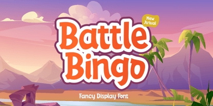 Battle Bingo is Playful and Fancy font. It was created with freehand handwriting style using a marker. It look classy and happiness to all your designs. You can use this font for a logo, kids clothing, invitation, poster, friendly design, fun design, book cover, adventure poster, outbound poster, and any cute and funny typeface needs and more.
 - Hofstad by Hanoded,
$15.00 Hofstad is a font which was modeled on a poster designed by Dutch graphic artist Jan Lavies (1902 - 2005). Lavies became famous for the posters he designed for the Holland America Line of cruise ships. Hofstad font was named after the theatre group "Vereenigd Rotterdamsch - Hofstad Tooneel" for which Jan Lavies designed a poster. Hofstad comes with all diacritics.
 - PAG Libre by Prop-a-ganda,
$19.99Prop-a-ganda offers retro-flavored fonts inspired by lettering on retro propaganda posters, retro advertising posters, retro packages all the world over. This is perfect font for your retrospective project. This retro looking font is applicable for any type of graphic design – web, print, etc and perfect for package and other items like posters, logos. - Relocation by Gassstype,
$25.00 Introducing of our new product the name is Relocation is Rough Brush horror font Bold handmade with ligature and Multilanguage support. Best for halloween poster, horror poster, childrenbook, cartoon, comic etc
 - Skjald by Monotype,
$29.99Skjald is a decorative typeface for use on posters and in books where an elaborate face enhances the mood. The Skjald font is an excellent choice for book covers and posters. - Arcaro JNL by Jeff Levine,
$29.00 There are times when a typeface is used so consistently that it becomes somewhat synonymous with the subject it's used in. The opening and end titles for the ABC-TV series "Naked City" (1958-1963) were set in a bold version of a popular font emulating the look of calligraphic hand lettering. Arcaro JNL is a somewhat lighter and slightly modified version of this typeface and is offered in both regular and oblique versions. The name Arcaro comes from one of the regular characters in this superbly-written police drama, Detective Frank Arcaro.
 - RMU Initials by RMU,
$20.00 Four fonts entirely of decorative initials of which the uppercase basic letters of RMU Initials One are occupied by Walthari initials, the lowercase ones by Eckmann initials, both released first by Rudhard’sche Gießerei, Offenbach, Germany, about 1900. RMU Initials Two consists of Jubilaeumsinitialen in the uppercases and Augsburger Initialen in the lowercases. RMU Initials Three comes with floral ornaments, whereby the lowercase initials can be colorized by yourself due to non-joining elements. RMU Initials Four consists of hand drawn initials by Rudolf Koch and letters of a former Klingspor font called Queen.
 - Octava by ParaType,
$30.00 PT Octava™ was designed at ParaType in 2001 by Vladimir Yefimov. The first (Cyrillic only) version named Scriptura Russica (1996) consisting of three styles (book, italic, bold) was commissioned by the Russian Bible Society. Lately the Latin letters and bold italic were added. Inspired by Lectura, 1969, by Dick Dooijes and Stone Print, 1991, by Sumner Stone. In spite of large x-height the typeface is both space saving and quite legible at small sizes. Expert fonts including small caps (book) and old style figures are available.
 - Architype Catalogue Outline by The Foundry,
$99.00 Architype Crouwel is a collection of typefaces created in collaboration with Wim Crouwel, following his agreement with The Foundry, to recreate his experimental alphabets as digital fonts. Crouwel's most recognized work was for the Van Abbe and Stedelijk museums (1954 –72) where he established his reputation for radical, grid-based design. Architype Catalogue originates from Wim Crouwel’s Stedelijk Museum exhibition catalogue for sculptor Claes Oldenburg, 1970. The cover’s soft ‘padded’ letterforms evoke the artist’s work. Oldenburg was so taken with the design, that he asked Crouwel to complete the alphabet.
 - ITC Musclehead by ITC,
$29.99ITC Musclehead is the work of type designer Timothy Donaldson, a robust, densely packed handwriting typeface. It almost looks like brushwork but was in fact made with a ruling pen which Donaldson had bought from a company in Salem, Massachusetts. He says, The world's gone ruling-pen mad at the moment [late 1990s] and I was beginning to tire of all the skinny splashiness of the letters that most people were making with them. I wanted to do something heavy and robust with the tool, so that's what I did."" - Interlude by Scriptorium,
$12.00Interlude originated with some title lettering which we found in an Austrian theatre program from the early 1900s. With some more research we found a similar style called Tradition which was designed by Bernard Naudin and produced by a Parisian type house during the period before World War I. Using those two sources we ultimately produced two variant versions of the font, combining elements of the two sources. Interlude features characters with open areas in the heavier strokes, while Prelude is a solid, more script-like version of the style. - Congress by Monotype,
$29.99Congress from Adrian Williams was shown for the first time at the Association Typographique International Congress, which proved to be so popular in 1980 at Kiel; designed to present a style equally appealling in European languages. Many characters are more condensed than is usual, while others have had certain elements exagerated, bringing notice to new elements of certain letters. The concept being to bring an equality of importance to the whole, producing a collection of International characters working together in harmony on the page -- a common aim that Europeans wish of any Congress. - Maiden Orange Pro by Stiggy & Sands,
$29.00 Our Maiden Orange Pro is a light and festive slab serif font inspired by custom hand lettered 1950's advertisements. Clean and legible, while also being offbeat and friendly, this font lends itself to a wide variety of uses. The SmallCaps and extensive figure sets offer a slightly more serious tone as well as a wider range of design use. Opentype features include: - SmallCaps. - Full set of Inferiors and Superiors for limitless fractions. - Tabular, Proportional, and Oldstyle figure sets (along with SmallCaps versions of the figures). - Stylistic Alternates for Caps to SmallCaps conversion.
 - CA No Dr. by Cape Arcona Type Foundry,
$30.00 No Dr. was inspired by an old movieposter lettering for the 1962 movie "James Bond: Dr. No". Just like the original Dr. No, No Dr. has a diabolical charm. It was developed into a font family that combines distinctiveness with versatility. It has a good readibility as a textfont but also looks great as a Headline. The two widths and the two weights give you a big choice. Intended to become an interesting alternative to the much used DIN Schrift, it has now developed into a highly functional family of it's own.
 - Granz by PintassilgoPrints,
$26.00 With a swinging handcut look and fanciful letterforms, Granz is inspired by the iconic Oscar Peterson’s Porgy & Bess album cover by David Stone Martin – the prolific american illustrator who created more than 400 album covers, mostly for the jazz greats of the 1940s and beyond. Granz font is loaded with interlocking pairs, swashes, contextual and stylistic alternates, making it highly flexible, just perfect to jazz up your designs.Great for book covers, titling, headlines, t-shirts and many other applications, this is a font that loves to be seen. Use it big!
 - Englebert Pro by Stiggy & Sands,
$29.00 Our Englebert Pro draws inspiration from the title screen of the 1930's film entitled, "Der Blaue Engel", starring Marlene Dietrich. Playful but subdued, yet striking enough to catch the eye, this casual sans has a distinct signature look to it. The offbeat letterforms engage the reader, while the SmallCaps and extensive figure sets lend a wider versatility to the typeface. Opentype features include: - SmallCaps. - Full set of Inferiors and Superiors for limitless fractions. - Tabular, Proportional, and Oldstyle figure sets (along with SmallCaps versions of the figures). - Stylistic Alternates for Caps to SmallCaps conversion.
 - Maiden Orange Inline Pro by Stiggy & Sands,
$29.00 A festive spin off our Maiden Orange Pro typeface, Maiden Orange Inline Pro comes packed with all of the features of the original Maiden Orange Pro typeface, but adds a little more visual flavor with hand drawn inline cuts, leaning even more towards the custom hand lettered 1950’s advertisements that inspired the original. Clean and legible, while also being offbeat and friendly, this font lends itself to a wide variety of uses. The SmallCaps and extensive figure sets offer a slightly more serious tone as well as a wider range of design use.
 - WL Rasteroids by Writ Large,
$5.00 Rasteroids is a typographic flashback to computing of the mid 1980s, when 9-pin dot-matrix printers were the state of the art, and most home computer displays were TVs hooked up to RF modulators. Rasteroids not only captures the dot-matrix printer look, but recreates the rasterized appearance of text on those lower-resolution monitors. Unlike that dot matrix type of yore, Rasteroids does have some variation in character width, and is legible in small blocks of copy. Still, it is best used sparingly, or as a special effect.
 - AggressIan by Hackberry Font Foundry,
$13.95 AggressIan is the release of the first font I ever drew. It was done by hand with triangle and parallel rule back in the mid-1980s. I originally called it Aggressor, but I never liked it. My local type designer friend, Ian Roberts, really likes this type of drawing and told me I had to release it. So I named it after him. The small caps should work well if you need a bolder version. It has oldstyle and lining figures, plus the small cap figures. I hope you like it.
 - Redig by Great Scott,
$16.00 Redig is a bold condensed display typeface with an assertive and athletic aesthetic. Inspired by newspaper headline typefaces from early 1900s it has chamfered corners with rounded edges that smooths out some harshness and generous x-height to its lower case characters. Redig will shine when used big. And I mean BIG. This is certainly a case when “bigger is better” really is the truth. Redig comes with an oblique style and ligatures and works best in headlines, logos, branding, social media or any display type use. Use it big.
 - Hess Gothic Round NF by Nick's Fonts,
$10.00 The family tree of this friendly face runs deep. Its primary inspiration is Twentieth Century, designed by Saul Hess as a monoline version of Paul Renner’s Futura. The design was reinterpreted by Herb Lubalin as Avant Garde in the 1970s. This version softens the harsh geometry of the original designs with rounded line endings: the result is a warm, inviting face that is elegant, confident and inviting. All versions of this font include the Unicode 1250 Central European character set in addition to the standard Unicode 1252 Latin set.
 - Classroom Stencil JNL by Jeff Levine,
$29.00 Roman-style stencil fonts have been around for much longer than most people realize - from the interlocking brass stencils of the 1880s to the laser-cut plastic stencils of today. A 1 inch Roman lettering guide [die-cut from oil board with spacing holes for correct alignment] made by the now-defunct Zipatone Corporation in the 1970s was a clone of an existing design of another company; but with variations in certain character shapes. This then became the working model for Classroom Stencil JNL, which is available in both regular and oblique versions.
 - Baisteach by Fontdation,
$15.00 Introducing Baisteach, our latest all-caps vintage serif. Inspired from early 1900's typography that often used in sign paintings, packaging labels, and advertisements. This typeface is made of sharp serifs, clean edges and strong form, give you a simple yet impactful feels. Suits best for headline, logo/logotype, and many more. If you're a fan of classic typography, make sure you add this font to your design toolbox. Last but not least, don't forget to activate its OpenType Feature to get the wider selection of letter combinations.
 - Roag by The Northern Block,
$27.95 Roag is an industrial geometric sans paying homage to mechanical designs of the 1930s. A precise balance of modern geometrics, with a functional yet sparing style that effectively communicates without distraction. Roag is a straightforward, unadorned type family with efficient construction. Details include seven weights with matching italics and over 950 characters per style. Opentype features consist of eight variations of numerals, including inferiors, superiors, fractions, case figures and circled figures. Additional features include small caps, case-sensitive forms, stylistic alternates, ligatures, game symbols, arrows and language support covering Western, South, Central Europe and Vietnamese.
 - AlbertBetenbuch by Ingrimayne Type,
$14.95 The inspiration for AlbertBetenbuch came from a typeface drawn by Albert Dürer and an interpretation of that face in Arthur Baker’s Historic Calligraphic Alphabets (Dover, 1980). It is not a recreation of either. The characteristic common to AlbertBetenbuch and the faces inspiring it is the decorative zig-zag with the upper-case letters. In late 2018 the inside of the shadowed style was separated out. It looks very much like the plain face but its spacing matches the shadowed version. It can be layered with the shadowed version to easily create two-colored letters.
 - Casual Deco JNL by Jeff Levine,
$29.00 The hand lettered sans serif title on the1931 sheet music for “(Potatoes are Cheaper-Tomatoes are Cheaper) Now’s the Time to Fall in Love” presented another opportunity to create a typeface from the wealth of unusual alphabets found on the covers of vintage and antique song sheets. However, it seems that even as late as the 1930s, song writers had the urge to pen long-worded titles for their musical compositions. This thirteen word verbal excursion became the model for Casual Deco JNL, which is available in both regular and oblique versions.