10,000 search results
(0.034 seconds)
- Rehn Condensed by moretype,
$40.00 With all the features of its wider relative, Rehn Condensed has been specifically designed for those situations where space is a premium. Rehn and Rehn Condensed together offer a complete package suitable for a wide range typographic applications.
 - Grundee by Ingrimayne Type,
$9.00 Grundee is a grungy serifed face. It is sloppy and irregular but still quite legible. It was one of several efforts to draw a serifed typeface by pen; see also SarahfSlob, which contains a complete family of styles.
 - Dolce Gargia by Hishand Studio,
$15.00 Introducing Dolce Gargia, a classic modern sans serif with aesthetic look. Perfect for who needing a touch of elegancy, stylish, classy, beautiful thin, and modernity for their design. Complete with ligatures alternates regular italic icon kerning multilingual support
 - Rabenau by Linotype,
$29.99 Rabenau (formerly Lucinde), the distinctly warm and legible type family For 30 years the graphic designer Axel Bertram worked at creating his typefaces: He developed complete new alphabets for magazines and typewriters as well as for the constant demand for typefaces for use by commercial artists. He has developed wall charts the size of advertising posters as teaching aids for training commercial and graphic artists to write in a clean, classic cursive script. In the eighties he used the American Chyron computer to design a screen font for television. In the mid-nineties he discovered for himself the fabulous possibilities offered by the Fontographer font software program and explored them playfully. From the results of these experiments, Axel Bertram selected a design for further development. From 2003 onwards the calligrapher and type designer Andreas Frohloff collaborated with him on the further development and production of the 16 fonts of the Rabenau™ typeface family.The Rabenau font was inspired by many factors: From the fonts used as book covers to typewriter fonts and even printed material from England dating from the beginning of the nineteenth century (e.g. those used by the skilled printer William Bulmer), Rabenau's relatively high contrast is offset by some organic tapers, subtley rounded bracketed serifs, and a fairly generous x-height. This makes for a typeface that looks especially good in print. Its broad repertoire of weights and styles - Condensed, Poster, and Shadow - give it added versatility, and make it ideal for setting both display and text in the same typeface. Throughout the heavier weights, the contrast is maintained. The Poster Italic sparkles, and will make a fine display type for dynamic headlines, or logotypes. This family of sixteen fonts works beautifully together. All Rabenau font styles have a large set of ligatures and thus cover typical letter combinations in many European languages. Besides the standard ligatures for ff, fi and fl, letter connections are also available for tt, th and fj or ffi, ffl and ffk. The range is completed with lovely arched transitions for the characters st, ck or ct. The latter gives the font that certain something, both in continuous text and above all in headlines.
 - Printers in Marks by Proportional Lime,
$19.99 In the early days of printing it was soon recognized that there was a need to identify the printer and publisher behind the printed work. So these industrious people created marks to identify themselves to clients. This font contains over 160 marks dating back to the early years of printing with the likes of Fust, Ratdolt, Manutius, Caxton, and a whole host of others represented. Some of these printers were very influential and altered the course of history, some merely enabled the broader public to access the classics. Some were imprisoned and others helped foment revolutions. But all were riding the new current of this technology of moveable type that helped transform our world through the enabling of easily exchanging information.
 - Handwriting Absolute by Alphabet Zoo,
$12.00 Handwriting Absolute is a practical handwriting style suitable for many applications. With a feeling of traditional architectural handwriting, this tidy font is sure to find a home in a variety of projects and communications requiring handwritten text and design.
 - Gothic Special Normal Italic by Wooden Type Fonts,
$15.00 A revival of one of the popular wooden type fonts of the 19th century, suitable for text or display, short descenders, tall ascenders, the narrow, italic version, completing the Gothic Special family of 5 fonts in total, sans serif.
 - Bestial by Paul Dersidan,
$23.00 Bestial is a strong, clean, all-caps ornamental typeface outlined by simple, primitive shapes. It is best suited for massive headlines, fashion editorials, album covers, logo design or any other experimental project. The complete character set has 380 glyphs.
 - Nffinitage by Eoriraya.type,
$17.00 Nffinitage is a sans serif typeface design, published by Eoriraya. The basis of this typeface is geometric shapes with a modern and futuristic impression, making it suitable for digital communication needs. Nffinitage consists of the regular and rounded typestyle
 - Joopica by Okaycat,
$24.50 Joopica is cute & fun, bringing a friendly good nature to your communication. For the casual fresh look this font has lots of appeal. Joopica features extended characters, containing West European diacritics & ligatures, making it suitable for international environments & publications.
 - Engineer by GRIN3 (Nowak),
$15.00 Engineer is a new, completely redesigned and improved version of my font TechnicznaPomoc, which was released for the first time in 2001. Language support includes Western, Central and Eastern European character sets, as well as Baltic and Turkish languages.
 - Magules by HansCo,
$15.00 Magules is a serif typeface with vintage and retro look!. Equipped with all complete characters ranging from uppercase letters, lowercase letters, numbers, punctuation marks and multi-lingual support, this font is ready to be used in any project. Enjoy!
 - Chocco by Oliveira 37,
$26.00 Chocco is a chunky and a fun display typeface. With an extra heavy but friendly personality, Chocco works well for posters, food packaging, children’s products and books, or any communications which needs to be friendly, fun, casual or loud.
 - Leky Calgria by Hishand Studio,
$15.00 Leky Calgria is elegant serif font with beautiful and luxury touch good for gorgeous wedding invitations, beautiful stationary art, eye-catching social media posts, logo, branding and much more. Complete with ligatures alternates regular italic icon kerning multilingual support
 - KG Turning Tables by Kimberly Geswein,
$5.00 A neater version of my font Complete in Him, a hand-drawn marker font. Hand drawn with a brush marker, this font is neat but still has enough twists to make it fun. Perfect for painted or brushed looks.
 - The CHE LIVES! font, designed by Levi Halmos, is a striking and evocative typeface that captures the spirit of rebellion and revolutionary zeal. This font is an artistic homage to the iconic Argentin...
- Kingthings Scrybbledot Pro by CheapProFonts,
$10.00 A fun and charming scribbled alphabet - perfect for scrapbooking and that handmade look. Lots of technical details had to be fixed, but it now has a professional quality, and our impressive language support! :) Kevin King says: "The Scrapbooking People have asked for grungy fonts - and this is one of my efforts to comply. I scribbled the letters in Paint shop Pro and imported the results into my font program directly. This is the first font i have created directly on the computer without any paper sketches - I think it took considerably more work!" Kingthings Scrybble Pro is a dotless version - perfect if you like the scribbles, but not the splutter. ;) ALL fonts from CheapProFonts have very extensive language support: They contain some unusual diacritic letters (some of which are contained in the Latin Extended-B Unicode block) supporting: Cornish, Filipino (Tagalog), Guarani, Luxembourgian, Malagasy, Romanian, Ulithian and Welsh. They also contain all glyphs in the Latin Extended-A Unicode block (which among others cover the Central European and Baltic areas) supporting: Afrikaans, Belarusian (Lacinka), Bosnian, Catalan, Chichewa, Croatian, Czech, Dutch, Esperanto, Greenlandic, Hungarian, Kashubian, Kurdish (Kurmanji), Latvian, Lithuanian, Maltese, Maori, Polish, Saami (Inari), Saami (North), Serbian (latin), Slovak(ian), Slovene, Sorbian (Lower), Sorbian (Upper), Turkish and Turkmen. And they of course contain all the usual "western" glyphs supporting: Albanian, Basque, Breton, Chamorro, Danish, Estonian, Faroese, Finnish, French, Frisian, Galican, German, Icelandic, Indonesian, Irish (Gaelic), Italian, Northern Sotho, Norwegian, Occitan, Portuguese, Rhaeto-Romance, Sami (Lule), Sami (South), Scots (Gaelic), Spanish, Swedish, Tswana, Walloon and Yapese.
 - Butterfly Wingz by Ingrimayne Type,
$5.00 IngrimayneType has put letters inside a variety of objects, including bowling pins, book covers, coffee mugs, teapots, pumpkins, Christmas ornaments, train cars, tombstones, old bottles, circles, and rectangles. In each case the letters were placed on a single shape. The use of the Opentype feature of contextual alternatives makes it easy to use two different but alternating shapes. ButterflyWingz puts its letters on the right and left wings of a butterfly. The wings provide a large surface for drawing letters, but they have a odd shape so letters must be distorted to fit. The wings are symmetrical but some letters are not, so the right and left wing versions of the same letter are sometimes quite different. Without the contextual alternative feature one could design a typeface like ButterflyWingz but the user would have to alternate upper and lower case keys. With contextual alternatives turned on, the computer automatically alternates the letters creating a line of complete butterflies. Turning on the Opentype feature stylistic styles one (ss01) replaces the empty spaces with empty wings. However, sometimes an empty wing at the end of a line is unwanted and it can be removed by changing the typeface or by turning off the stylistic style for that character. The family contains two styles, a filled style and an outline style. They can be used separately or together in layers to add color. (Empty wings are on the logicalnot and registered characters.) ButterflyWingz is hard to read and should be used in small doses for decorative effects.
 - Auchentaller by HiH,
$12.00 Auchentaller was inspired by a travel poster by Josef Maria Auchentaller in 1906. To our knowledge, it was never cast in type. Grado lies on the northern Adriatic, between Venice and Trieste. At one time the port for the important Roman town of Aquileia. With the decline of the Roman Empire, the upper Adriatic region came under the rule of the Visigoths, the Ostrogoths, the Byzantines, the Lombards, the Franks, the Germans, the Venetians and finally, in 1796, the Austrian Hapsburgs. So it remained until the dissolution of the Austro-Hungarian Monarchy in 1919, following World War I, when the seaport of Trieste was awarded to Italy. With Trieste came Montefalcone, Aquileia and Grado. The area was marked by years of political tension between Italy and Yugoslavia, exemplified by the d'Annunzio expedition to capture Fiume (Rijeka) in September, 1919. Some basic discussion of the period from 1919 to 1939 may be found in Seton-Watson’s Eastern Europe Between The Wars (Cambridge 1945) and Rothschild’s East Central Europe Between The Two World Wars (Seattle 1974). In 1965 I was traveling by train from Venice to Vienna. Crossing the Alps, the train stopped for customs inspection at the rural Italian-Austrian border, just above Slovenia. We were warned not to get off the train because there were still shooting skirmishes in the area. Through all this, Grado remained literally an island of tranquility, connected to the mainland by a only causeway and lines on a map. Auchentaller not only painted the beach scene at Grado, he moved there, living out the rest of his life in this comfortable little island town. His travel illustration contains the text from which the design of our font Auchentaller is drawn. The text translates: "Seaside resort : Grado / Austrian coastal land". Please see our gallery images to see a map locating Grado, as well as Auchentaller’s painting of the resort. Auchentaller is a monoline all-cap font, light and open in design , with a lot of typically art nouveau letter forms. Included in our font are a number of ligatures. As is frequently seen in designs by German speakers, the umlaut is embedded in the O & U below the tops of the letters. This approach led to two whimsies: a happy umlauted O and a sad umlauted U. This font has a clean, crisp look that is very appealing and very distinctive. Auchentaller ML represents a major extension of the original release, with the following changes: 1. Added glyphs for the 1250 Central Europe, the 1252 Turkish and the 1257 Baltic Code Pages. Add glyphs to complete standard 1252 Western Europe Code Page. Special glyphs relocated and assigned Unicode codepoints, some in Private Use area. Total of 336 glyphs. 2. Added OpenType GSUB layout features: pnum, liga, salt & ornm. 3. Added 116 kerning pairs. 4. Revised vertical metrics for improved cross-platform line spacing. 5. Revised ‘J’. 6. Minor refinements to various glyph outlines. 7. Inclusion of both tabular & proportional numbers. 8. Inclusion of both standard acute and Polish kreska with choice of alternate accented glyphs for c,n,r,s & z. Please note that some older applications may only be able to access the Western Europe character set (approximately 221 glyphs). The zip package includes two versions of the font at no extra charge. There is an OTF version which is in Open PS (Post Script Type 1) format and a TTF version which is in Open TT (True Type)format. Use whichever works best for your applications.
 - Ambroise Std by Typofonderie,
$59.00 An exquisite Didot font in 18 series Ambroise is a contemporary interpretation of various typefaces belonging to Didot’s late style, conceived circa 1830, including the original forms of g, y, &; and to a lesser extent, k. These unique glyphs are found in Gras Vibert, cut by Michel Vibert. Vibert was the appointed punchcutter of the Didot family during this period. It is the Heavy, whom sources were surest that Jean François Porchez has been used as the basis for the design of the typeface family. In the second half of the 19th century, it was usual to find fat Didots in several widths in the catalogs of French type foundries. These same typefaces continued to be offered until the demise of the big French foundries in the 1960s. Ambroise attempts to reproduce more of what we see printed on paper in the 19th century; a more accurate representation of Didot punches. So, the unbracketed serifs are not truly square straight-line forms but use tiny transitional curves instead. The result on the page appears softer and less straight, particularly in larger sizes. The illustrious Didot family of type founders and printers Every variation of the typeface carries a name in homage to a member of the illustrious Didot family of type founders and printers. The condensed variant is called Ambroise Firmin. The extra-condensed is called Ambroise François. Ambroise Pro brought back to life: fifteen years in the making! Club des directeurs artistiques, 48e palmarès Bukva:raz 2001
 - Ghost Sign JNL by Jeff Levine,
$29.00 Ghost Sign JNL is a spurred serif type design based on the faded lettering of an antique brick wall sign for Homer Hardware [located in Homer, NY] and is available in both regular and oblique versions. From Wikipedia: “A ghost sign is an old hand-painted advertising sign that has been preserved on a building for an extended period of time. The sign may be kept for its nostalgic appeal, or simply indifference by the owner. Ghost signs are found across the world with the United States, the United Kingdom, France and Canada having many surviving examples. Ghost signs are also called fading ads or brickads. In many cases these are advertisements painted on brick that remained over time. Old painted advertisements are occasionally discovered upon demolition of later-built adjoining structures. Throughout rural areas, old barn advertisements continue to promote defunct brands and quaint roadside attractions. Many ghost signs from the 1890s to 1960s are still visible. Such signs were most commonly used in the decades before the Great Depression. Ghost signs were originally painted with oil-based house paints. The paint that has survived the test of time most likely contains lead, which keeps it strongly adhered to the masonry surface. Ghost signs were often preserved through repainting the entire sign since the colors often fade over time. When ownership changed, a new sign would be painted over the old one.”
 - P22 Glaser Babyfat by P22 Type Foundry,
$24.95 Milton Glaser on designing Babyfat: “This is the first alphabet I ever designed. For some inexplicable reason I called it Babyfat. Because I’m not a type designer, most of my alphabets are actually novelties or graphic ideas expressed typographically. Here the idea was to take a gothic letter and view it simultaneously from two sides. It started out as a rather esoteric letterform; it ended up being used in supermarkets for ‘Sale’ signs.” This forced perspective 3-D font has appeared on many LP covers and posters from the mid 1960s onward. This revival includes the original lowercase for the first time in digital form. Besides the three original styles (Outline, Shaded, and Black) made for photo typesetting, the new P22 Glaser Babyfat introduces six additional variations to allow the user to easily colorize the type as Glaser envisioned. The Keyline, Fill, Glyph, Left, Right, and Down font styles give the user nearly infinite options to create dynamic chromatic effects. P22 Glaser Babyfat was based on original drawings and phototype proofs from the Milton Glaser Studios archives. Typographic punctuation and sorts were imagined by James Grieshaber to work with Glaser’s design, as well as diacritics to accommodate most European languages. Over the years there have been many typefaces that borrowed heavily from the Glaser designs, but these are the only official fonts approved by Milton Glaser Studio and the Estate of Milton Glaser.
 - "Night Club 70s" by Jambo! is an evocative and captivating typeface that immediately transports you into the heart of the 1970s disco era. This unique font perfectly encapsulates the vibrant, high-en...
- Mallorga by Top Type,
$11.00 Mallorga is a serif typeface. It has an elegant and modern character by adjusting design developments. Mallorga is made to complete your best work. You can use this font to create wedding invitations, logos, advertisements, web, covers, clothing, banners and more.
 - Analfabeto by Type-Ø-Tones,
$40.00 The Brazilian illustrator, Flavio Morais, devised this amusing display alphabet to have his own font for his former website. We helped to digitalize it and encouraged him to complete it with a series of “chiringuito” drawings. More about his work here.
 - Secesja Pro by GRIN3 (Nowak),
$26.00 Secesja Pro is a new, completely redesigned and improved version of my font Secesja, which was released for the first time in 2001. Language support includes Western, Central and Eastern European character sets, as well as Baltic and Turkish languages.
 - Matrole by Viaction Type.Co,
$15.00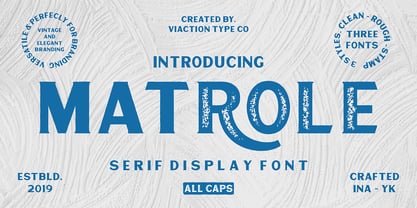 Matrole is a Display Serif with 3 styles: clean, rough and stamp, nice applied in various products. Complete with multilingual characters and stylistic alternates. It is suitable for quote, clothing design, vintage logo, label, poster, packaging design and other designs.
 - Gotyk Nr7 by GRIN3 (Nowak),
$19.00 Gotyk Nr7 is a new, completely redesigned and improved version of my font Gotyk Poszarpany, which was released for the first time in 2001. Language support includes Western, Central and Eastern European character sets, as well as Baltic and Turkish languages.
 - Decafe by Arendxstudio,
$14.00 Introducing Decafe: wrapped with texture ruling pen so that this font has its own characteristics compared to other fonts that carry a distinctly distinct style. Decafe is equipped with full simple Latin characters that meet the International character glyphs standard
 - Akbeatso by Koval TF,
$39.99 Akbeatso is a modern contemporary font for posters, visual identity and striking visual communications. Though Akbeatso is ready to be a text typeface. Modern sans serif with emotional contrast in stems and some irregular construction brings actual vibes to your designs.
 - Funky Vibes by HansCo,
$15.00 Funky Vibes font is a retro psychedelic font style with rounded touch. Equipped with all complete characters ranging from uppercase letters, lowercase letters, numbers, punctuation marks and multi-lingual support, this font is ready to be used in any project. Enjoy!
 - Frankie by Type-Ø-Tones,
$60.00 Frankie remains a classic among classics. A pioneer of the Type-Ø-Tones catalog, this is their personal eroded Franklin Gothic. Avoid imitations. Try Frankie, today still their best-seller. Now, in this updated version with a complete CE Character Set.
 - Fairgrounds JNL by Jeff Levine,
$29.00Fairgrounds JNL is the direct descendant of Twelve Oaks JNL, complete with a field of stars to draw attention to your layout for political posters, holiday events, charity bazaars, local fairs or any project that needs extra emphasis in its headlines. - SK Bade by Salih Kizilkaya,
$9.99 SK Bade is a demi serif and condensed font. It was designed by Salih Kızılkaya in 2020. This is a completely decorative font, but legibility is at the forefront. In this way, it can be used easily in long texts.
 - Digitalika by PizzaDude.dk,
$15.00 Inspired by some scribbles I made as a young kid in the 80'ies at school - when I should have paid attention to the teacher! Comes with a complete multilingual set of letters with alternate versions of both upper- and lowercase
 - TOMO Bossa by TOMO Fonts,
$12.00 TOMO Bossa is a cartoon inspired sans serif, ideal for kids related stuff, in print or digital, like posters, video, websites or books! This beauty also speak Cyrillic! The complete family comes with a Black and Black Rough style. Enjoy!
 - HU Blackout KR by Heummdesign,
$25.00 HU BlackoutKR is a typeface for titles that feels like letters are trapped in a square and has a constant and very narrow inner space. It is composed of three types of family typeface to increase usability. HU BlackoutKR includes Korean.
 - VTG Watson Steel Pen by Voltage Ltd,
$35.00 If you're regularly compelled to scrawl fiery French poetry, declare independence, or design indie folk albums, then Chris Watson's romantic Steel Pen typeface is for you. With old-school edge and spirited opentype alternates, it's as gallant as type gets.
 - Makota by Yukita Creative,
$14.00 The modern font Makota is perfect for use in luxury-related design projects. Its tall elegant typeface makes it ideal for branding and advertising, while its high legibility makes it perfect for use on websites, advertisements and other types of communication.
 - Dschoyphul by Ingrimayne Type,
$9.95 Dschoyphul is a serifed typeface that was crudely drawn with a pen. It is sloppy and irregular. It was one of several efforts to draw a serifed typeface by pen; see also SarahfSlob, which contains a complete family of styles.