10,000 search results
(0.025 seconds)
- Foundry Context by The Foundry,
$90.00 Foundry Context is a sans serif family designed to be universal in many contexts – hence the name. A ‘no-nonsense’ typeface, reminiscent of 19th century sans serif faces, Foundry Context has very round, pure letterforms, crafted without being over refined, and having minimal stroke contrast in the neo-grotesque style. A hint of personality has emerged from the very drawing of the proportions, strokes, and terminals, yet Foundry Context is still neutral enough to compete in the grotesk arena, and at the same time has something new to say.
 - Romantica Signature by Scratch Design,
$12.00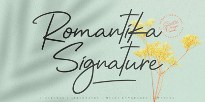 Introducing RomantiKa Signature! It's a modern script font with a signature style look. It's very recommended for you who want to make some designs with natural handwriting with signature style. Romantika will work for name card design, invitation design, wedding design, poster, packaging, book cover title, quote, social media post, etc. Just open your Opentype features ( Minimum Compatible with Adobe Photoshop CS 6 and Adobe Illustrator CS 6 ) while using the script font to use the ligatures, stylistic alternates, and swashes. As you type, your text will look like a natural signature or handwriting.
 - Tomket Boys by Dumadi,
$20.00 Tomket Boys is a fun and relaxing typeface ready to perfect your designs. This font lends itself to full color in a design so that the design feels alive. with support Uppercase, Lowercase, Numbers, Symbol, Ligature, Multilingual. Tomket Boys is perfect for product names, advertising designs, children's game titles, event titles, t-shirt designs, posters, web, banners, book covers, social media, and other designs. Compatible with design studios such as Photoshop, Affinity Design, Adobe Illustrator or Silhouette. That makes it great for creative projects. Thank you, Toni Dzulham - Dumadistyle
 - Lyster by Mans Greback,
$58.00 Lyster is a hand-painted script typeface, built and created by Måns Grebäck in 2020. Its brush strokes makes the typeface the ultimate blend between modern and classic. The balanced weight and tilt result in velocity, flow and a friendly but energetic vibe. Lyster comes as Lyster Regular and Lyster Bold, and each style contains a full OpenType compatible alternate alphabet and ligatures. The font contains all characters you'll ever need, including all punctuation and numbers. It has an extensive lingual support, covering all Latin-based, European languages.
 - Lord Elliot by Quothron,
$8.00 Lord Elliot - a new fresh handmade calligraphy font, very suitable for greeting cards, branding materials, business cards, quotes, posters, and more! This font is perfect for wedding postcards or you can create unique designs of your logos, blogs, stationery, marketing, magazines and more. Also supported PUA encoded. Access font characters are compatible with the Silhouette Studio, Cricut Design Space. Simply copy and paste the alternate characters using the Character Map (Windows), Nexus Font (Windows), Font Book (Mac) or a software program such as PopChar (for Windows and Mac).
 - Nurom by The Northern Block,
$25.80 Nurom is a contemporary sans-serif typeface influenced by the early grotesque style which is neutral and legible in purpose with a fresh personality. The goal wasn't about historic revival; it was to make a new Grotesk that could compete in an overcrowded market while offering strength, clarity and function across a vast array of applications. Details include six weights (bold free), a regular italic, and over 400 characters per style. Opentype features include decimal figures, fractions, case sensitive punctuation and language support for Western, South, and Central Europe.
 - Metronic Slab Narrow by Mostardesign,
$26.00 Metronic Slab Narrow is the condensed version of the Metronic Slab font family. This condensed style is designed for space-saving typography but with high legibility and versatility in mind.This Family also improved the needs of developers and graphic designers looking for width-compatible fonts. As the normal style this font family is an innovative and refreshing semi serif design with a contemporary look for text and headlines. It has six versatile weights from Air to Black with an alternative glyph set to improve its use in different graphic contexts.
 - CushingTwo by Hackberry Font Foundry,
$13.77 CushingTwo is the 6-font family designed for Fontographer: Practical Font Design for Graphic Designers: Regular, Oblique, Demi, DemiOblique, Bold, and BoldOblique. The two Demi variants will be listed separately in InDesign and the Creative Suite to keep things compatible with Office and such. The inspiration was a scan of the old Cushing No. 2 font in Felici's article on CreativePro about 100 year oldtype. It's a fun, open, large OpenType font of 370 characters with oldstyle figures, small caps, and small cap figures. It needs polishing, but it's good looking.
 - Bertany by Quothron,
$10.00 Bertany - a new fresh handmade calligraphy font. Very suitable for greeting cards, branding materials, business cards, quotes, posters, and more!This font are perfect for wedding postcard. Or you can create perfect and unique design of your logo, blog, stationery, marketing, magazines and more :) Also supported PUA encoded. Access font characters are compatible with the Silhouette Studio, Cricut Design Space. Simply copy and paste the alternate characters using the Character Map (Windows), Nexus Font (Windows), Font Book (Mac) or a software program such as PopChar (for Windows and Mac). FEATURES Alternates, Multilingual characters, Ligatures.
 - Quathman by Quothron,
$8.00 Quathman - a new fresh handmade calligraphy font. Very suitable for greeting cards, branding materials, business cards, quotes, posters, and more!This font are perfect for wedding postcard. Or you can create perfect and unique design of your logo, blog, stationery, marketing, magazines and more :) Also supported PUA encoded. Access font characters are compatible with the Silhouette Studio, Cricut Design Space. Simply copy and paste the alternate characters using the Character Map (Windows), Nexus Font (Windows), Font Book (Mac) or a software program such as PopChar (for Windows and Mac). FEATURES Ligatures , Multilingual characters (AÀÁÂÃÄÅCÇDÐEÈÉÊËIÌÍÎÏNÑOØÒÓÔÕÖUÙÜÚÛWYÝŸŸ ÆŒßÞàáâãäåæçèéêëìíîïðñòóôõöøùúûüýÿ)
 - Coco Gothic Pro by Zetafonts,
$39.00 Inspired by a biography of Coco Chanel and trying to capture the quintessential mood of classical fashion elegance, Cosimo Lorenzo Pancini designed Coco Gothic looking for the effect that the first geometric sans typefaces (like Futura, Kabel or the italian eponyms like Semplicità) had when printed on paper. The crisp modernist shapes acquired in printing charme and warmth through a slight rounding of the corners that is translated digitally in the design of Coco Gothic. This signature touch is enhanced by the inclusion of light humanist touches to the proportions of the letters, resulting in the unique mix that makes Coco Gothic one of our best sellers, with a look that is both contemporary and vintage. After six years from the original project (that has spawned in the meanwhile successful families like Cocogoose and Coco Sharp), we went back to the design to completely redraw and expand the original family, creating with a Pro version that has better on-screen readability, a wider weight range, variable type versions and more language coverage (with Coco Gothic Arabic adding a new script to the latin, greek and Cyrillic of the original). Coco Gothic Pro comes in three subfamilies, each with seven weights with matching italics and featuring an extended character set with open type support for small caps, ligatures, alternates, European languages, Greek and Cyrillic alphabets. The original, body-text optimised Coco Gothic and Coco Gothic Alternate subfamilies have been kept for compatibility with the previous version, while a new Coco Gothic Display subfamily has been developed with a complete redesign aimed at display usage, featuring tighter spacing and optimised letterforms. A distinguishing feature of Coco Gothic Pro is the inclusion of ten alternate historical sets that allow you to use the typeface as a true “typographic time machine”, selecting period letterforms that range from art deco and nouveau, to modernism and to eighties’ minimalism. Equipped with such an array of historical variants, Coco Gothic Pro becomes an encyclopedia of styles from the last century, ready to transform itself and adapt to the mood of your text.
 - Univers by Linotype,
$42.99 The font family Univers? is one of the greatest typographic achievements of the second half of the 20th century. The family has the advantage of having a variety of weights and styles, which, even when combined, give an impression of steadiness and homogeneity. The clear, objective forms of Univers make this a legible font suitable for almost any typographic need. In 1954 the French type foundry Deberny & Peignot wanted to add a linear sans serif type in several weights to the range of the Lumitype fonts. Adrian Frutiger, the foundry's art director, suggested refraining from adapting an existing alphabet. He wanted to instead make a new font that would, above all, be suitable for the typesetting of longer texts - quite an exciting challenge for a sans-serif font at that time. Starting with his old sketches from his student days at the School for the Applied Arts in Zurich, he created the Univers type family. In 1957, the family was released by Deberny & Piegnot, and afterwards, it was produced by Linotype. The Deberny & Peignot type library was acquired in 1972 by Haas, and the Haas'sche Schriftgiesserei (Haas Type Foundry) was folded into the D. Stempel AG/Linotype collection in 1985/1989. Adrian Frutiger continues to do design work with Linotype right up to the present day. In 1997, Frutiger and the design staff at Linotype completed a large joint project of completely re-designing and updating the Univers family. The result: Univers Next - available with 59 weights and 4 Linotype Univers Typewriter weights. With its sturdy, clean forms Univers can facilitate an expression of cool elegance and rational competence. Univers has the uncanny ability to combine well with fonts of many different styles and origins: Old style fonts such as: Janson Text, Meridien, Sabon, Wilke. Modern-stressed fonts such as: Linotype Centennial, Walbaum. Slab serif fonts such as Egyptienne F, Serifa. Script and brush fonts such as: Brush Script, Mistral, Ruling Script. Blackletter fonts such as: Duc De Berry, Grace, San Marco. Even fun fonts such as F2F OCRAlexczyk, Linotype Red Babe, Linotype Seven."
 - Knock Type by sugargliderz,
$20.00 KnockType is based on the concept of braille notation in Japanese. It does not support braille notation in other languages. KnockType is not necessarily aimed at facilitating “braille transcription”. It is designed so that someone who understands the grammar of “braille transcription” can instantly transliterate into braille text that was previously transcribed to kana characters, etc. In addition, it allows ink characters to be converted to braille using OpenType features. It is recommended for use in applications that are compatible with OpenType features. If they are not compatible, KnockType is “simply a kana font”. To be a little more specific, it is assumed that KnockType will be used in Adobe’s InDesign and Illustrator applications. If you don't have them, you will not get satisfactory results. Four types of font are available. There are “hasBox&Line”, “hasnotBox&Line”, and the reversed font of each. When displayed on a convex surface, the assumption is that they will be used mainly for printing applications. When displayed on a concave surface, the assumption is that they will be used mainly for writing on braille boards, etc. By printing, you can get a rough idea of the dot positions. It is more effective to match them to the grid size of the braille board.
 - Very Matcha by Molly Suber Thorpe,
$17.99 Very Matcha is a hand-drawn, chunky serif font with fun retro flair. Think 70s disco meets Hawaiian luau. Whether for branding, advertising, or merch, all who see it like it very matcha! 😉 It has uppercase and lowercase alphabets, dozens of beautiful ligatures and dingbats, and includes support for Modern Greek. Very Matcha has over 500 glyphs in Latin and Greek consisting of: the complete Latin alphabet (with all accent marks), the complete Modern Greek alphabet, 30 ligatures and stylistic alternates, 24 fun dingbats and arrows, numerals and math symbols, extensive punctuation and diacritical markings. The OpenType ligatures are the fun part. To get the most out of Very Matcha, use software that supports Open Type fonts (Adobe programs, Corel Draw, Affinity Designer, etc). This type family has tons of built-in OpenType ligatures and alternates, which are what make it so customizable and decorative. You can always access the ligatures, alternates, and dingbats through your software's glyphs panel. For a complete preview of all the ligatures, please look at the 4th image in this product listing. Languages Very Matcha includes the Latin and Greek alphabets with all accent markings. The most common languages it supports are: English, Catalan, Danish, Dutch, French, German, Greek, Italian, Norwegian, Portuguese, Spanish, and Swedish.
 - Ornate Initials by Gerald Gallo,
$20.00 Style One is composed of a floral ornament rotated and reflected at 90 degree increments combined with a letter or number to form each ornate initial. The initials are A through Z and 1 through 0 for a total of 36 initials. Each initial is located under its respective key in the character set. Style Two is composed of floral ornaments rotated and reflected at 90 degree increments combined with a letter to form each ornate initial. There are two sets of initials A through Z. Under the character set the initials are negative on a positive floral background. Under the shift + character set the initials are positive on a negative floral background. Each initial is located under its respective key. Style Three is composed of floral ornaments rotated and reflected at 90 degree increments combined with a letter or number to form each ornate initial. There are two sets of initials A through Z and 0 through 9 for a total of 72 characters. Under the character set the initials are negative on a positive floral background. Under the shift + character set the initials are positive on a negative floral background. Each initial is located under its respective key.
 - Waldorfschrift by Joachim Frank,
$23.00 The Waldorfschrift family was created in digital form in the years 1993-1994 by Joachim Frank, inspired by the naturally organic letters from the anthroposophical movement of the 20th century of Rudolf Steiner . In nature there are no right angles, straight lines or complete uniformity, but instead round corners, varying thicknesses and all kinds of variability. This is what the anthroposophical movement created in their buildings, their art, in their music – and also in their lettering. And this Font is like the plants in nature: it grows upwards, branches out, letters hugs to some letters, with others they keeps more distance, some letters proudly stretch their belly, others crouch in the corner - a completely natural font. Take a look at the brand of Weleda (the natural cosmetics company), Demeter (one of the biggest organic foods companies), Filderklinik (a great anthroposophical hospital in Germany) and you will see these great companies work with different but organic letter styles. More recently, Joachim revisited the Waldorf fonts with modern type design software and added extra characters such as the euro sign, and extra weights to make the fonts useable for a wide variety of design tasks. Dez 21: A big update: All fonts have been digitized again and given a complete character set, new kerning, minor bugs removed.
 - Irrlicht by Aarhaus,
$30.00 Irrlicht is based on C. H. Kleukens’ 1923 typeface Judith Type . Whilst Dunkle Irrlicht is a fairly faithful rendition and extension of Kleukens’ typeface, the Licht style was initially added as a stand-alone stencil version; yet, the two styles work perfectly together – for different nuances, for emphasis or simply stacked/layered. Irrlicht is equipped with upper- and lowercase ligatures, contextual and stylistic alternates, fractions, superior and inferior figures, extended language support and a few extra goodies. Additional information – How Irrlicht came to life Christian Heinrich Kleukens cut his Judith Type in 1923, at the peak of German expressionism, exclusively for publications with the Ernst-Ludwig-Press, such as a limited series of biblical prints – the first being the Book of Judith , hence the original’s name. I stumbled upon this typeface a couple of years ago in a nice little 1930 booklet of the Gutenberg-Gesellschaft and was struck by its forceful darkness on paper and its seemingly simple, crude letterforms. The lack of a long-ſ in the final version of Judith Type – quite unusual for a German typeface of that time – adds to this feel of crudeness and spontaneity*. Judith Type seemed to me like a semi-blackletter cousin of Rudolf Koch’s typeface Neuland (cast in the same year). Besides its apparent affinity with expressionism, it reflects a lot of that deeply spiritual craftsmanship of the era – much like Neuland. A few months later, when I was working on a stencil project and looking for a typeface that could be cut into thin wooden plates easily, I remembered those dark, sharp letters that seemed to be lacking any curves at all. After enlarging a few letters and tracing them by hand, the whole set was redrawn digitally, using only straight lines. As for spacing, the goal was to keep the letters tight but to avoid touching characters – without ironing out all the original’s tension and rhythm. Deliberate kerning, subtle contextual alternates and ligatures help to deal with critical glyph combinations. Two additional versions were developed: a stencil version with open counters and, in reference to a popular style of the 1920s and inspired by dry, cracked wood, an inline version. These two additional styles were later merged into one font – Lichte** Irrlicht was born. — AARHAUS * Consequently, the original typeface’s German eszett is simply a ligature of the “round s” and standard z . In some of his publications, Kleukens dispenses with using eszett altogether and sets double s instead. Irrlicht , however, does feature a more common eszett (ß); the original, among other more faithful letter forms, can be accessed via the stylistic sets feature ** licht – literally bright – being the German term for inline typefaces – not to be confused with leicht ( light )
 - As of my last update in April 2023, there isn't a widely recognized or standard font specifically known as "79." Fonts typically have names that are either descriptive of their style, such as "Times ...
- As of my last update, there isn't a commercially recognized or widely distributed font specifically known as "Jonny Quest Classic" within standard typographic repositories or among the major font fou...
- Ah, the ever-so-futuristic and slightly otherworldly font known as Nasalization, crafted by the visionary Ray Larabie, is like the Vespa scooter of typography: quirky, stylish, and with a hint of ret...
- LTC Kennerley by Lanston Type Co.,
$24.95 Kennerley Old Style was designed by Goudy for publisher Mitchell Kennerley in 1911. Goudy described it as a "book letter with strong serifs, firm hairlines, and makes a solid, compact page." One of Goudy's best text faces, Kennerley is considered an original American classic as it is not based on historical type designs.
 - Claudia Betta by Matra Creative,
$14.00 Claudia Betta Font is a formal script font with multilingual support. It is ideal for wedding invitations, magazines, social media, restaurant menus, greeting cards, birthday invitations, headers and more. This font is equipped with a complete set of lowercase and uppercase characters, various kinds of punctuation ligatures, numbers and and multilingual support.
 - Auldroon by Ingrimayne Type,
$12.00 Auldroon was inspired by the pseudo-medieval fonts that were fairly popular in the late 19th century. Auldroon comes in two variants. Auldroon-Eld was designed first and is a bit more compact than the regular version. Both are decorative and distinctive and neither was created with a specific use in mind.
 - Beast Sketch by 38-lineart,
$19.00 "Beast Sketch" is an extraordinary handwritten font created with bold, untamed strokes using ink and a bamboo pen. It boasts a masculine aesthetic, an organic, natural feel, and extensive Latin character support. Perfect for book titles, magazine covers, logos, and more, it adds a raw, authentic, and compelling vibe to your projects.
 - Altamonte NF by Nick's Fonts,
$10.00Logotype lettering from 1896 for the Italian confection company Talmone provided the inspiration for this curvy, cuddly face. Warm up your headlines today with this antique charmer. Both versions include the complete Unicode Latin 1252, Central European 1250 and Turkish 1254 character sets, as well as localization for Lithuanian, Moldovan and Romanian. - Italia by ITC,
$29.00Italia is the work of Colin Brignall, a refreshingly different serif typeface. At first glance, Italia might seem comparable to any other square serif typeface, but it has a distinctive pattern all its own. Italia can be used as either a display or text typeface and will give any text a unique look. - Babes In Toyland NF by Nick's Fonts,
$10.00Handlettering on a piece of sheet music from 1903 was the inspiration for this little whimsical wonder. The font features a very sinuous S and teddy-bear bookends in the {brace} positions. This font contains the complete Latin language character set (Unicode 1252) plus support for Central European (Unicode 1250) languages as well. - Dolce & Amyara by Hishand Studio,
$15.00 Introducing Dolce & Amyara classy modern serif font family that drew inspiration from stylish, modern, and classic at the same time. It looks lovely on logos, branding, invitations, marketing materials, wedding designs, social media posts, and every other design which needs a customized touch. Complete with - ligatures - alternates - regular - italic - icon - kerning - multilingual support
 - Hometown by Balpirick,
$15.00 Hometown is a Modern Handbrushed Font. Hometown is a bold and fun handwritten font. It’s playfulness make it great for creative projects, be it inspirational wall posters or for communicating your brand. Hometown also multilingual support. Enjoy the font, feel free to comment or feedback, send me PM or email. Thank you!
 - Alien Space by WNGSTD,
$15.00 Alien Space display font is a playful and modern font. Alien space family contains regular and outline fonts. Alien Space is perfectly suited for traditional media and the web. Great for logos, banners, posters, and graphic artists. Its playfulness makes it great for creative projects, inspirational wall poster, or for communicating your brand.
 - Cortex by Cubo Fonts,
$29.00 Cortex was designed for Shanghai Word Expo 2010 / A.A.D.I Pavilion corporate identity: signage, corporate communication, graphic design (a 120 pages monography), promotional items, etc. It was inspired by the pavilion "slanted" architectural concept, and had to fit the famous chinese "YOUYUAN" typeface as well. This is a both very clear and dynamic typeface.
 - Kleukens Kursiv NF by Nick's Fonts,
$10.00This classic face is based on Kleukens Scriptura, designed by Friedrich Wilhelm Kleukens in 1926 for D Stempel AG. It served as an alternative to Lucien Bernhard's Cursive and an inspiration for Oswald Cooper's Pompeian Script. Both versions of the font contain the complete Unicode Latin 1252 and Central European 1250 character sets. - Oily Brush by Pseudo,
$21.00 Oily Brush is the mix of funny, communicative, comic and sketchy directions. The font ist perfect in use with the food, doodle or the cartoon themes and has the small nuance from the oil-painting. This script designed to be informal, casual and easy in the perception and includes confidently positive emotions.
 - Ashtanga by Hanoded,
$15.00 Ashtanga was named after a type of yoga. In Sanskrit it means "eight-limbed", which I find quite appropriate, give the amount of swirls and curls. The font is 'all-caps', but the upper and lower case glyphs differ completely. They are, of course, fully interchangeable. Ashtanga comes with multi language support.
 - Highpoint Gothic NF by Nick's Fonts,
$10.00Morris Fuller Benton's 1935 offering from ATF, entitled Raleigh Gothic Condensed, inspired this ultracompact masterpiece. Benton's alternate characters are included in several lowercase positions, to add a little Art Deco sparkle to this versatile workhorse. Both versions of this font include the complete Latin 1252, Central European 1250 and Turkish 1254 character sets. - Looky Cookie NF by Nick's Fonts,
$10.00Hey, take a look at this! This typeface is just for fun, whenever you want to invite folks to take a gander, cast their eyes your way or otherwise check you out. Both versions include complete Latin 1252, Central European 1250 and Turkish 1524 character sets, with localization for Moldovan, Romanian and Turkish. - FF Dora Display by FontFont,
$62.99 FF Dora Display is the Display version of FF Dora. It provides advanced typographical support with features such as ligatures, small capitals, alternate characters, case-sensitive forms, fractions, and super- and subscript characters. It comes with a complete range of figure set options – oldstyle and lining figures, each in tabular and proportional widths.
 - Morica Script by Mans Greback,
$59.00 Morica Script, designed by Mans Greback, is a delicate and romantic handwritten typeface with a fine touch. Its thin lines and whimsical style bring a sense of elegance and charm to your creative projects. Perfect for wedding invitations, heartfelt letters, and intimate stationery, Morica Script embodies the beauty of naive handwritten communication.
 - Gothiks Condensed by Blackletra,
$50.00 This is the condensed version of Gothiks , a 6-weight display sanserif influenced by Texturas. It is ideal for everything big, compact and powerful. This family has an extensive character set — with extensive language support — and many OpenType features like fractions, small capitals and different figure sets. Default figures align with lowercase.
 - Movie Matinee JNL by Jeff Levine,
$29.00 A 1926 trade ad for the silent comedy “The Nut-Cracker” starring Edward Everett Horton has the film’s title hand lettered in a decorative bold sans serif design complete with highlight lines and accent dots. This festive type face is now available digitally as Movie Matinee JNL in both regular and oblique versions.