10,000 search results
(0.03 seconds)
- Lugatype by Tkachev,
$- This font family will be the best solution for posters, signage, magazine, product branding, corporate branding, logos and titles.
 - Behetem Lachok MF by Masterfont,
$59.00 This classic title font has a wide proportion and minor contrast to make it the ideal choice for headlines.
 - Rinjani by Dieza Design,
$11.00 The use of thick brushes and expressive strokes makes Rinjani raw and thick. Suitable for titles and short paragraphs.
 - KG Counting Stars by Kimberly Geswein,
$5.00 The uppercase letters have no stars and the lowercase letters have stars. This provides 2 unique options for titles.
 - ALT Breo by ALT,
$6.00 Breo is yet another experimental display typeface for use on logos and titles and everywhere else you want :D
 - Micrograma MF by Masterfont,
$59.00 Geometric forms make this elegant industrial font family a great companion for titles, invitations and signs, indoor and outdoor.
 - FE Sector by Egor Stremousov,
$50.00 FE Sector is made up of sectors and sticks. it is intended to create various patterns and decorative titles.
 - Alt Mun by ALT,
$- Mun is a experimental script typeface for use on logos, titles, posters, etc. Mun is not intended for text.
 - Monster Fiesta PB by Pink Broccoli,
$24.00 An offbeat, fun, and frightful serif typeface inspired by the 1969 Rankin Bass animagic classic titled, Mad Monster Party.
 - Bingana by LetterStock,
$18.00 Bingana This pair was inspired by kids movie poster design that i saw on some gallery, It was crafted by hand specially to add natural handmade feeling in its brand identity than i make it clean with pentool. We improve with handmade to make a playful feel, this font is bold so it can look strong if you use it for branding or even title for your poster design with playful decorative style. Opentype features Bingana font has 175 character set included Bingana Font is very good looking in playful decorative logotype, labels, t-shirt prints, product packaging, invitations, advertising and others. This fonts works with folowing languages: Afrikaans, Albanian, Asu, Basque, Bemba, Bena, Chiga, Cornish, Danish, English, Estonian, Filipino, Finnish, French, Friulian, Galician, German, Gusii, Indonesian, Irish, Italian, Kabuverdianu, Kalenjin, Kinyarwanda, Low German, Luo, Luxembourgish, Luyia, Machame, Makhuwa-Meetto, Makonde, Malagasy, Malay, Manx, Morisyen, North Ndebele, Norwegian Bokmål, Norwegian Nynorsk, Nyankole, Oromo, Portuguese, Romansh, Rombo, Rundi, Rwa, Samburu, Sango, Sangu, Scottish Gaelic, Sena, Shambala, Shona, Soga, Somali, Spanish, Swahili, Swedish, Swiss German, Taita, Teso, Vunjo, Zulu Thank you for using this font. LS
 - The Wickyfest by Colllab Studio,
$14.00 "Hi there, thank you for passing by. Colllab Studio is here. We crafted best collection of typefaces in a variety of styles to keep you covered for any project that comes your way! You want a playful serif font. Something elegant and charming, but still lighthearted , fun and cheerful with a dash of mischief? Introducing The Wickyfest, a playful serif font with a classic tone. If your next project requires a playful touch, you'll love this collection of special characters and features. The Wickyfest style is incredibly well-crafted, resulting in versatile characters that can present a dashing display for your branding designs and ads. For more extravagant projects, try The Wickyfest for children-related graphics, like book covers, movie titles, or posters. Download The Wickyfest Now and make your designs more memorable. String together words that spell out who you are - not just what you do. Sharpen the image of your company or give your online presence a touch of class and charm. Don’t be afraid to let your clients see there’s more to business than just that bottom line. A Million Thanks www.colllabstudio.com
 - Railway Gank by IKIIKOWRK,
$17.00 Proudly Present Railway Gank - Street Marker Type, created by ikiiko The free-spirited brush strokes of hand lettering and the strong, urban attitude of street markings combine electrifyingly to create Railway Gank. This font effortlessly jumps out and attracts attention because it embodies the fervor of the streets and the unvarnished reality of graffiti. Railway Gank's brush-style aesthetics give it a handcrafted, real charm. Its flaws and differences give it a unique personality and capture the actual spirit of street art, where each stroke is distinctive. Railway Gank uppercase letters exude confidence and flare, while the lowercase letters give off a more laid-back and welcoming vibe. It is a versatile option for numerous design concepts because of the contrast's ability to create a pleasing equilibrium. This typeface is perfect for an poster event, book cover, movie title, streetwear stuff, magazine layout, quotes, or simply as a stylish text overlay to any background image. What's Included? Uppercase & Lowercase Numbers & Punctuation Alternates Multilingual Support Works on PC & Mac Get also a good offer & FREEBIE at our site : www.ikiiko.com Enjoy our font and if you have any questions, you can contact us by email : ikiikowrk@gmail.com
 - VVDS Fifties by Vintage Voyage Design Supply,
$15.00Fifties is a mix of classic geometric and a bit of humanistic grotesque. The goal was to create the font for present with look to the past. In other words, I tried to came back the Modernism aesthetics of XX century into nowadays. The result gives you 60 styles including Italic (Slanted). Your typography may be airy and elegant with Expanded Thin, catchy and expressive with Condensed Bold or dynamic and sharp with Expanded Bold Italic. You will find your way to use this family certainly. Theatre posters or party flyers, vintage t-shirt or modern web service, movie titles or magazine header and even infographic – Fifties will suit you everywhere. You may use the completed styles or may use a Variable Font. To make it as you want to. Weights: Thin / Light / Regular / Medium / Semi Bold / Bold. Widths: Condensed / SemiCondensed / Medium / SemiExpanded / Expanded OTF and Variable Font (TTF) OpenType features: Stylistic alternates for A, G, K, M, N, R, W, a, e, g, j, m, n, r, t, u, w, y; Fraction figures; Subscript and Superscript figures; Tabular figures; Typographic spaces: Em / En / Third / Quarter / Thin / Sixth / Hair - Beni by Nois,
$18.00 Beni is a bold & strong sans serif font family beautifully crafted to perform in short headlines in posters or contemporary interface design. Each character has been optically adjusted for maximum effect in the space between; as such, this is a strong contender for movie posters, titling, album artwork, and any design project that needs a clean sans serif that makes an impact wherever it is applied. This type family is available in four unique weights that stand well apart from one another in visual style. Beni Light is the runway model of the family, standing with a narrow posture and towering height. It’s a fantastic choice for conveying a message in a limited horizontal space. Beni Regular and Beni Bold are shorter in stature but both pack a punch, carrying bold strokes that speak with confidence and offer great legibility. The heaviest of the heavy, Beni Black is the super-bold, go-to type design for projects that need an impossibly strong type design at the helm. Beni extends multilingual support to Basic Latin, Western European, Euro, Catalan, Baltic, Turkish, Central European, Pan African Latin, Igbo Onwu, and Basic Greek for design projects intended for an international audience.
 - Machismo by Fontasmic,
$16.99 Machismo is a seductively suave display font with a plump and plush persona. Bubbling with personality, this friendly font has a weighted look that gives a bold and striking feel to it. Ideal for various uses from small bursts of copy in children's books to poster work, logos, and titling. The "titling" variation swaps shortcaps into the lowercase positions, giving the font even more of a macho persona. It's smooth, it's bold, it's friendly, it's the ultimate pickup artist font, luring in onlookers to get a closer look at what you have to say. Say what you've been wanting to say with Machismo Titling.
 - Musika by Lurinzu Studios,
$12.75 Musika" is a serene and elegant display typeface that is inspired by the vibe of soft jazz. Serene, elegant, soothing, somewhat sensual and at the same time feels like a warm hug. This typeface is made with the intention to be used in both titles and body text. The bold weight (even the light weight could also be used as a title card) holds really well as a title while the lighter weights (regular and light) can be used in body text. *This font includes letters, numbers, multi-language, and all essential marks needed. * Three (3) weights are currently available. (Light, Regular and Bold)
 - Lexington by Canada Type,
$24.95A revival and major expansion of a 1926 Ludwig Wagner Schriftgiesserei typeface called Titanic, Lexington is the ultimate art deco expression of the high times of signage and theater during the first half of the twentieth century. Big feminine caps and cozy direct minuscules make for a unique combination rarely found in other deco faces. Topped off with the humorous and quite suave tall and pointy ascenders and descenders of the alternates, Lexington makes for a versatile and uniquely eye-catching display face beneficial to poster art, book covers, classy menus, product packaging and music paraphernalia. The original specimen Hans van Maanen worked from showed the majuscules, minuscules, figures, and 4 alternates of some ascending minuscules. This new digital version includes all of the above, plus many more additions: - Plenty more alternates, for some caps as well as for all the ascending and descending lowercase. - Three different size variations for the comma and the period. - Oldstyle figures. - A full complement of accented characters to support more Latin-based languages than ever, including Baltic, Celtic, Turkish, and Central/Eastern European languages. - A Handtooled style variation that covers both the main character set and the alternates. Lexington was named after Manhattan's Lexington Avenue, home of the some of the most famous and polished art deco architecture of the 1920s and 1930s. Lexington and Lexington Handtooled come in all popular font formats. The OpenType versions combine their respective alternates with the main character sets, for ease of use within OpenType-savvy applications. - Transport New by K-Type,
$20.00 Transport New is a redrawing of the typeface designed for British road signs. In addition to the familiar Heavy and Medium weights, Transport New extrapolates and adds a previously unreleased Light weight font originally planned for back-lit signage but never actually applied. Version 3.0 of Transport New features significant improvements including numerous outline and spacing refinements, and a full complement of Latin Extended-A characters. Also, to align Transport New with the 2015 release of Motorway, the other typeface used for UK road signage, Italic fonts for all three weights have been added. Originally designed by Jock Kinneir and Margaret Calvert beginning in 1957 and first published on the Preston bypass in 1958, the original Transport font has subtle eccentricities which add to its distinctiveness, and drawing the New version involved walking a tightrope between impertinently eliminating awkwardness and maintaining idiosyncrasy. The Grotesk roots of the glyphs were investigated and cheekily fine-tuned – uncomfortably close terminals of characters such as 5, 6, C, G, and e were shortened, the S and s were given a more upright aspect and their protruding lower terminals tucked in, overly wide glyphs like the number 4 were narrowed, and some claustrophobic counters were slightly opened up. The question mark was redesigned and parentheses given some stroke contrast. The x height was edged fractionally even taller. The Heavy font is actually more of a Bold, and the Light is pretty much a regular weight, but the original nomenclature has been retained for old times’ sake.
 - Neuzeit Office by Linotype,
$50.99 The Neuzeit Office family is designed after the model of the original sans serif family Neuzeit S™ , which was produced by D. Stempel AG and the Linotype Design Studio in 1966. Neuzeit S itself was a redesign of D. Stempel AG’s DIN Neuzeit, created by Wilhelm Pischner between 1928 and 1939. Intended to represent its own time, DIN Neuzeit must have struck a harmonious chord. DIN Neuzeit is a constructed, geometric sans serif. It was born during the 1920s, a time of design experimentation and standardization, whose ethos has been made famous by the Bauhaus and De Stijl movements in art, architecture, and design. Upon its redesign as Neuzeit S in the 1960s, other developments in sans serif letter design were taken into account. Neuzeit S looks less geometric, and more gothic, or industrial. Separating it from typefaces like Futura, it has a double-storey a, instead of a less legible, single-storey variant. Unlike more popular grotesque sans serifs like Helvetica, Neuzeit S and especially the redesigned Neuzeit Office contain more open, legible letterforms. Neuzeit Office preserves the characteristic number forms that have been associated with its design for years. After four decades, Neuzeit has been retooled once again, and it is more a child of its age than ever before. Akira Kobayashi, Linotype’s Type Director, created the revised and updated Neuzeit Office in 2006. His greatest change was to retool the design to make its performance in text far more optimal. Additionally, he created companion oblique to help emphasize text.
 - Mizrahi MF by Masterfont,
$59.00 Geometric forms make this revival of an elegant font, a great companion for titles, invitations and signs, indoor and outdoor.
 - Medalist by Jonahfonts,
$35.00 Flat pen script font designed for use on posters, titles, book covers, greeting cards, packaging, invitations, magazine articles and advertising.
 - Lifeguard by Enrich Design,
$24.95Lifeguard is a Titling font family. Despite its rigid design, this unique font is a very versatile and legible alternative. - Umbria by TipografiaRamis,
$29.00 Umbria is a decorative display typeface ideal for use in titles, logos, magazines, posters, as well as short text paragraphs.
 - Press Gothic by Canada Type,
$24.95 Press Gothic is a revival of Aldo Novarese's Metropol typeface, released by Nebiolo in 1967 as a competitor to Stephenson Blake's Impact (designed by Goeffrey Lee). Though Metropol enjoyed a few short months of popularity and use in Italy, Germany and France, Impact won the technological outlasting battle by moving on to film type then to computer outlines bundled with mainstream software, while Metropol never made it past the metal state until now. Too bad really, since this is one of the few faces that could have played well with all the horrendous stretch'n'squeezing of the 1970s. Just like its inspiration, Press Gothic aims to be a fresh alternative to big economical poster fonts with clear sans serif forms and an urgent, strong, yet elegant design appeal. In the summer of 2008, Press Gothic underwent a major linguistic and aesthetic reworking for an international publishing company. The result of this on the retail side are new small capitals and biform/unicase additions to the main font, as well as expanded language support that includes Cyrillic, Greek, Turkish, Baltic, Central and Eastern European, Maltese, and Esperanto. Press Gothic Pro, the OpenType version, combines all three fonts into one, taking advantage of the small caps feature, and the stylistic alternate feature for the biform shapes.
 - Fried Chicken by FontMesa,
$25.00 The name of this font brings back memories of an old fried chicken restaurant in Willow Springs Illinois circa 1960’s and 1970’s, my family would all get in the car and take a long drive down to an old country road Illionis Rt 171 through a forest preserve where we’d come upon the old Willowbrook motel with a bar and restaurant next door. The restaurant was called Kegal’s, when you entered the building you had to walk through the smoky bar first to get to the restaurant, I can still see the hard wood floors with all the finish worn off from decades of foot traffic. Up until the mid 1960’s Kegal’s used to raise their own chickens behind the restaurant, back then fried chicken in the Midwest was either coated in flour or bread crumbs, Kegal’s was covered in a beautiful layer of golden bread crumbs. Before your meal arrived they’d bring a basket of dinner rolls along with crackers, bread sticks and country butter, on the side they’d serve coleslaw with a vinegar sauce, which is very common in the Midwest, the first time you try it your face puckers up like you just sucked on a lemon but you get used it over time. After waiting for what seemed like forever to a child the waitress comes out of the kitchen with a huge tray of that golden deliciousness and your mouth begins to water, in her other hand was another tray filled to overflowing with crinkle cut french fries all made by hand, I’d eat a hole handful of those french fries first then take a bite of that tender juicy farm raised chicken. Today a fine Italian restaurant occupies the old Kegal’s building and the motel is long gone, only my fond memories remain. Fast forward to 2020 and FontMesa has just made some Fried Chicken as an eight weight type font family with alternates. With the Fried Chicken slab serif font family we’ve broken some rules by removing a few of the slabs on certain letters for a unique homemade look. Fried Chicken is perfect for your next product label, t-shirt design, logo, headline or cookbook cover. Treat yourself to some good ol’ Fried Chicken today.
 - Banks and Miles by K-Type,
$20.00 K-Type’s ‘Banks & Miles’ fonts are inspired by the geometric monoline lettering created for the British Post Office in 1970 by London design company Banks & Miles, a project initiated and supervised by partner John Miles, and which included ‘Double Line’ and ‘Single Line’ alphabets. The new digital typeface is a reworking and extension of both alphabets. Banks & Miles Double Line is provided in three weights – Light, Regular and Dark – variations achieved by adjusting the width of the inline. Banks & Miles Single Line develops the less used companion sans into a three weight family – Regular, Medium and Bold – each with an optically corrected oblique. Although the ‘Banks & Miles Double Line’ and ‘Banks & Miles Single Line’ fonts are based on the original Post Office letterforms, glyphs have been drawn from scratch and include numerous adjustments and impertinent alterations, such as narrowing the overly wide Z and shortening the leg of the K. Several disparities exist between the Post Office Double and Single Line styles, and K-Type has attempted to secure greater consistency between the two. For instance, a wide apex on the Double Line’s lowercase w is made pointed to match the uppercase W and the Single Line’s W/w. Also, the gently sloping hook of Single Line’s lowercase j is adopted for both families. The original Single Line’s R and k, which were incongruously simplified, are drawn in their more remarkable Double Line forms, and whilst the new Single Line fonts are modestly condensed where appropriate, rounded letters retain the essentially circular form of the Double Line. Many characters that were not part of the original project, such as @, ß, #, and currency symbols, have been designed afresh, and a full set of Latin Extended-A characters is included. The new fonts are a celebration of distinctive features like the delightful teardrop-shaped bowl of a,b,d,g,p and q, and a general level of elegance not always achieved by inline typefaces. The Post Office Double Line alphabet was used from the early 1970s, in different colours to denote the various parts of the Post Office business which included telecommunications, counter services and the Royal Mail. Even after the Post Office was split into separate businesses in the 1980s, Post Office Counters and Royal Mail continued use of the lettering, and a version can still be seen within the Royal Mail cruciform logo.
 - Lightyears by Match & Kerosene,
$25.00 Lightyears is a geometric typeface that features a highly stylized lowercase and variations of alternates to create titling results on the fly. You can set the typeface to all-caps for a simple look, or you can alternate uppercase and lowercase letters for a highly stylized title. Uppercase stylistic alternates have a “stereo” look as the crossbars and some stems are doubled in a non-traditional way.
 - Yilactha by Attype Studio,
$10.00 Introducing Yilactha - Inspired by typeface on 70s era, Yilactha has the vintage font & retro font with two style solid & textured. Two style Font: solid & textured. Yilactha is perfect for children product, branding, logo, invitation, stationery, product packaging, merchandise, monogram, blog design, game titles, cute style design, Book/Cover Title and more. Features : - Ending swash - Multilingual Support --- Hope you enjoy with our font! Attype Studio
 - Halaman by Attype Studio,
$15.00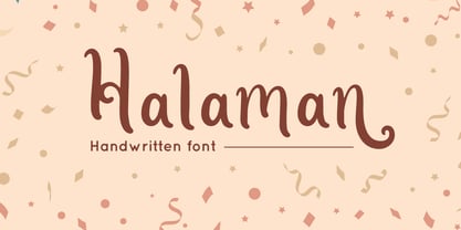 Halaman is Handwritten font with swash style, perfect for wedding design Combine it with Halaman - ending Swash to make an amazing effect on your letter! Halaman perfect for display promotion, branding, logo, invitation, stationery, social media post, product packaging, merchandise, blog design, game titles, cute style design, Book/Cover Title and more. **What's Included :** - Halaman.otf - Ending Swash - Multilingual Support --- Hope you enjoy with our font! Attype Studio
 - Rolish by Raditya Type,
$14.00 Rolish Font is a Cheerful Child Look Font, designed for Titles, Headings, Texts and more at your project. It is ready with its unique style. The Rolish font is an ideal type for display, game titles, text, print, branding, signage as well as for user interfaces, mobile devices, especially web design creation, with the optimal set of characters for your designs in any layout.
 - Intima Politha by Attype Studio,
$15.00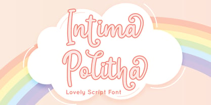 Intima Politha is a lovely script font with stylistic set and alternates. Fall in love with its incredibly versatile style and use it to create spectacular designs! Intima Politha is perfect for branding, logo, invitation, quotes, apparel design, product packaging, merchandise, game titles, cute style design, Book/Cover Title and more. What's Included : - Ending Swash - Multilingual Support --- Hope you enjoy with our font! Attype Studio
 - Bestromello Script by Lucky Type,
$12.00 Bestromello is a new modern brush font with an irregular baseline. It's a contemporary approach to design, with handmade and natural curves, suitable for use in title design such as clothing, invitations, book titles, stationery designs, quotes, branding, logos, greeting cards, T-shirts, packaging designs, posters, and more. Complete with uppercase and lowercase letters, as well as multi-language support, numbers, punctuation and some ligatures.
 - Comet Hotspur by Putracetol,
$28.00 Comet Hotspur - Display Typeface Font is a bold and distinctive font that seamlessly blends modern and retro aesthetics. With its unique character shapes, bold strokes, and alternative letterforms, this font offers a captivating typographic solution. The font exudes a retro bold and vintage vibe while maintaining a fresh and contemporary edge. Whether you're creating logos, branding materials, titles, posters, film graphics, cards, quotes, or landing page titles.
 - Rhiledia by Attype Studio,
$16.00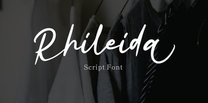 Rhileida is a beauty script font with ending swash. Fall in love with its incredibly versatile style and use it to create spectacular designs! Rhileida is perfect for branding, logo, invitation, stationery, social media post, product packaging, merchandise, blog design, game titles, cute style design, Book/Cover Title and more. What's Included : - Ending Swash - Ligatures - Multilingual Support --- Hope you enjoy with our font! Attype Studio
 - Hot Ruby by Attype Studio,
$12.00 Hot Ruby is a Hand written font duo. Regular & Outline Version. Perfect for any business logo, brand and use it to create spectacular designs! Hot Ruby is perfect for branding, logo, invitation, stationery, social media post, product packaging, merchandise, blog design, game titles, cute style design, Book/Cover Title and more. What's Included : - Ending Swash - Ligatures - Multilingual Support Hope you enjoy with our font! Attype Studio
 - Ratyin by Kavoon,
$14.00 Oxygen Script made with a transparent line texture. Suitable for use in title design such as invitations, signboards, book titles, stationery designs, quotes, branding, logos, greeting cards, packaging designs, posters, and more. Files Include: Punctuation & numbers Splashes Splatters Alternate letters Uppercase letters Multi Language Supported Languages - French, Spanish, English, Catalan, Galician, Basque, Portuguese, Italian, Albanian, Afrikaans, Dutch, German, Danish, Swedish, Norwegian, Finnish, Faroese, Icelandic, Irish and Scottish.
 - Brosley by RCKY Studio,
$18.00 Brosley is a beautiful hand-painted font, a contemporary approach to design and unique in each letter. Suitable for use in title designs such as clothing, invitations, book titles, stationery designs, quotes, branding, logos, greeting cards, T-shirts, packaging designs, posters, and more. Brosley contains a complete set of lowercase, uppercase, alternative, binder, punctuation, numbers, and multi-lingual support. Thank you for your purchase!
 - Ghoppters by Struggle Studio,
$14.00 Ghoppers is a new modern brush font with an irregular baseline. a contemporary approach to design, handmade natural, suitable for use in title design such as clothing, invitations, book titles, stationery designs, quotes, branding, logos, greeting cards, T-shirts, packaging designs, posters, and more. Complete with uppercase and lowercase letters, as well as multi-language support, numbers, punctuation. It also includes some ligatures and swash characters.
 - Toons by Bohloul Arabic Type Design,
$30.00 A very cheerful font. This font is very thick and suitable for use in children's games or animations. With this font, write very attractive, happy and comic titles and use it easily in graphic works. The design of this font looks sloppy and messy, but when you write your own text or title, while each letter is messed up, the text is completely connected.
 - Pinky Sunday by Attype Studio,
$15.00 Pinky Sunday is a Script Vintage font with stylistic set and alternates. Combine Pinky Sunday stylistic set to get amazing letterform! Fall in love with its incredibly versatile style and use it to create spectacular designs! Pinky Sunday is perfect for branding, logo, invitation, quotes, apparel design, product packaging, merchandise, game titles, cute style design, Book/Cover Title and more. What's Included : - Beginning & Ending Swash - Multilingual Support