10,000 search results
(0.029 seconds)
- Banks and Miles by K-Type,
$20.00 K-Type’s ‘Banks & Miles’ fonts are inspired by the geometric monoline lettering created for the British Post Office in 1970 by London design company Banks & Miles, a project initiated and supervised by partner John Miles, and which included ‘Double Line’ and ‘Single Line’ alphabets. The new digital typeface is a reworking and extension of both alphabets. Banks & Miles Double Line is provided in three weights – Light, Regular and Dark – variations achieved by adjusting the width of the inline. Banks & Miles Single Line develops the less used companion sans into a three weight family – Regular, Medium and Bold – each with an optically corrected oblique. Although the ‘Banks & Miles Double Line’ and ‘Banks & Miles Single Line’ fonts are based on the original Post Office letterforms, glyphs have been drawn from scratch and include numerous adjustments and impertinent alterations, such as narrowing the overly wide Z and shortening the leg of the K. Several disparities exist between the Post Office Double and Single Line styles, and K-Type has attempted to secure greater consistency between the two. For instance, a wide apex on the Double Line’s lowercase w is made pointed to match the uppercase W and the Single Line’s W/w. Also, the gently sloping hook of Single Line’s lowercase j is adopted for both families. The original Single Line’s R and k, which were incongruously simplified, are drawn in their more remarkable Double Line forms, and whilst the new Single Line fonts are modestly condensed where appropriate, rounded letters retain the essentially circular form of the Double Line. Many characters that were not part of the original project, such as @, ß, #, and currency symbols, have been designed afresh, and a full set of Latin Extended-A characters is included. The new fonts are a celebration of distinctive features like the delightful teardrop-shaped bowl of a,b,d,g,p and q, and a general level of elegance not always achieved by inline typefaces. The Post Office Double Line alphabet was used from the early 1970s, in different colours to denote the various parts of the Post Office business which included telecommunications, counter services and the Royal Mail. Even after the Post Office was split into separate businesses in the 1980s, Post Office Counters and Royal Mail continued use of the lettering, and a version can still be seen within the Royal Mail cruciform logo.
 - PT Medievil by Paupe Type,
$10.00 PT MEDIEVIL is a new display font inspired by artefacts of the dark middle-ages with a contemporary twist. It contains 195+ meticulously crafted glyphs characterized by: -Upper part indented inward to be true to imperfect handwritten medieval typography -Smooth curve shapes -Rounded intersections between shape sections -Rounded serif Easily create headlines, display titles, subheadings, body copy.
 - Tattoo Scratch by Ech000,
$10.99 Tattoo scratch is a carefully constructed abstract and artistic font made with over 190 different glyphs for latin and extended latin usage. Useable in English and latin based languages. The font is inspired by ignorant tattoo style art and by the "chicken scratch" style of hand writing. Each letter is individually crafted to make the font overall highly unique.
 - Indigo Moon by Make Media Co,
$18.00 Introducing Indigo Moon - a decadent, classic serif with over 150 hand-illustrated alternates, and preserved texture, for a uniquely vintage, yet modern feel. Each letterform has a slightly rough exterior that works beautifully to enhance Indigo Moon's soft, conventional details. This versatile display typeface has enough character for logos and branding, as well as headlines, apparel, bridal and more.
 - Basilio by Canada Type,
$29.95 In the late 1930s, old Egyptiennes (or Italiennes) returned to the collective consciousness of European printers and type houses — perhaps because political news were front a centre, especially in France where Le Figaro newspaper was seeing record circulation numbers. In 1939 both Monotype and Lettergieterij Amsterdam thought of the same idea: Make a new typeface similar to the reverse stress slab shapes that make up the titles of newspapers like Le Figaro and Le Frondeur. Both foundries intended to call their new type Figaro. Monotype finished theirs first, so they ended up with the name, and their type was already published when Stefan Schlesinger finished his take for the Amsterdam foundry. Schlesinger’s type was renamed Hidalgo (Spanish for a lower nobleman, ‘son of something’) and published in 1940 as ‘a very happy variation on an old motif’. Although it wasn’t a commercial success at the time, it was well received and considered subtler and more refined than the similar types available, Figaro and Playbill. In the Second World War, the Germans banned the use of the type, and Hidalgo never really recovered. Upon closer inspection, Schlesinger’s work on Hidalgo was much more Euro-sophisticated and ahead of its time than the too-wooden cut of Figaro and the thick tightness of Playbill. It has a modern high contrast, a squarer skeleton, contour cuts that work similarly outside and inside, and airy and minimal solutions to the more complicated shapes like G, K, M, N, Q and W. It is also much more aware of, and more accommodating to, the picket-fence effect the thick top slabs create in setting. Basilio (named after the signing teacher in Mozart’s Figaro) is the digital revival and major expansion of Hidalgo. With nearly 600 glyphs, it boasts Pan-European language support (most Latin languages, as well as Cyrillic and Greek), and a few OpenType tricks that gel it all together to make a very useful design tool. Stefan Schlesigner was born in Vienna in 1896. He moved to the Netherlands in 1925, where he worked for Van Houten’s chocolate, Metz department store, printing firm Trio and many other clients. He died in the gas chambers of Auschwitz in 1944. Digital revivals and expansions of two of his other designs, Minuet and Serena, have also been published by Canada Type.
 - Ardalista by Mercurial,
$17.00 Ardalista is lovely script calligraphy made with a touch of sweet, lovely and charming attraction that adds to the impression of a beautiful and elegant. a charming typeface and So beautiful on invitation like greeting cards, sublimation, wedding invitation, branding materials, business cards, quotes, posters, headings, signature, logos, t-shirt, letterhead, signage, lable, news, posters, badges and more What is interesting? Imagine you get a beautiful and very charming font in the design you make. that would be the answer you wanted right now. Ardalista has a script typeface and extra letters that allows you to be more free in designing. What's new? Hey..look at this. besides you get a font with over 150 alternates, ligatures and swashes. let's imagine what you can do with all that. yeah that's awesome. For those with Opentype capable software ( Photoshop CC or any version of Illustrator/ Indesign), Ardalista also comes with Opentype features such as access to all the alternate letters and double letter ligatures. And this Font has given PUA unicode (specially coded fonts). so that all the alternate characters can easily be accessed in full by a craftsman or designer. Don't forget to check out other cool fonts on our store and wait for new fonts. Follow our shop for upcoming updates including additional glyphs and language support. feel free to send me a message, comment, like and share.
 - Bunyan Pro by Canada Type,
$39.95 Bunyan Pro is the synthesis of Bunyan, the last face Eric Gill designed for hand setting in 1934 and Pilgrim, the machine face based on it, issued by British Linotype in the early 1950s — the most popular Gill text face in Britain from its release until well into the 1980s. Gill’s last face doesn't date itself anywhere near as obviously as Gill’s other serif faces, which were all really products of their time, heavily influenced by the richly ornamental and constantly changing aesthetic trends of the interwar period. When compared to Gill’s previous work, Bunyan seems like a revolution in the way he thought and drew. It’s as if he was shrugging off all heavy burden of what was popular, and going back to the basics of older standards. Bunyan had no bells and whistles, doesn't risk functionality with contrasts that are too high or too low, and didn't venture far outside the comfortable oldstyle rhythm Gill grew up with. By interbellum standards, this was utter austerity, a veritable denial of deco excess. Surprisingly, even without all the cloying trivialities, Bunyan still stood indisputably as an aesthetically pleasing, space saving design that could have been made only by Eric Gill. Bunyan Pro comes in three weights and their italics. The main font is intended for use between 8 and 14 points. The medium and the bold are great for emphasis but also have good merit in larger sizes, so can make effective display types as well. All six fonts include small caps, ligatures, alternates, six sets of figures, and three original Gill manicules. We tried to keep the best features of the handset (Bunyan) and machine (Pilgrim) versions while building a text face that can function in today’s immersive reading media. Deciding on which useful letterpress features to preserve for aesthetic importance was hell on our eyeballs — which lead to complex and painstaking ways of ironing out irregularities and inconsistencies related to metal technologies, in order to provide something with authenticity. The result is a unique typeface based on a Gill design that, to a much greater extent than any of his other faces, works well as a text face that can be used for entire books and magazines. For more information on Bunyan Pro’s character set, features, development process and some print tests, please consult the PDF in the gallery section of this page.
 - Misstho by Maulana Creative,
$12.00 Misstho is casual modern script font. With bold contrast stroke, fun character. To give you an extra creative work. Misstho font support multilingual more than 100+ language. This font is good for logo design, Social media, Movie Titles, Books Titles, a short text even a long text letter and good for your secondary text font with sans or serif. Make a stunning work with Misstho font. Cheers, Maulana Creative
 - Closterian by Maulana Creative,
$11.00 Closterian is a modern signature script font. With regular contrast stroke, fun character. To give you an extra creative work. Closterian font support multilingual more than 100+ language. This font is good for logo design, Social media, Movie Titles, Books Titles, a short text even a long text letter and good for your secondary text font with sans or serif. Make a stunning work with Closterian font. Cheers, Maulana Creative
 - Southride by Maulana Creative,
$14.00 Southride is a quirky fun casual handwritten font. With wavy bold stroke, fun character. To give you an extra creative work. Southride font support multilingual more than 100+ language. This font is good for logo design, Social media, Movie Titles, Books Titles, a short text even a long text letter and good for your secondary text font with sans or serif. Make a stunning work with Southride font. Cheers, Maulana Creative
 - Figuta by Maulana Creative,
$14.00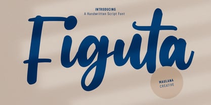 Figuta is a modern signature script font. With slanted contrast stroke, fun character. To give you an extra creative work. Figuta font support multilingual more than 100+ language. This font is good for logo design, Social media, Movie Titles, Books Titles, a short text even a long text letter and good for your secondary text font with sans or serif. Make a stunning work with Figuta font. Cheers, Maulana Creative
 - Sollesty by Maulana Creative,
$13.00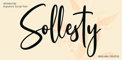 Sollesty is a modern signature script font. With upright contrast stroke, fun character. To give you an extra creative work. Sollesty font support multilingual more than 100+ language. This font is good for logo design, Social media, Movie Titles, Books Titles, a short text even a long text letter and good for your secondary text font with sans or serif. Make a stunning work with Sollesty font. Cheers, Maulana Creative
 - Glowyts by Maulana Creative,
$11.00 Glowyts is a modern simply casual handwritten font. Inspired by the peoples handwriting letters in the envelope or their notes. Glowyts includes opentype features Many Ligatures. Glowyts support multilingual more than 100+ language. This font is good for logo design, Movie Titles, Books Titles, a short text even a long text letter and any awesome project you create. Make a stunning work with Glowyts handwritten font. Cheers, Maulana Creative
 - MC Allbine by Maulana Creative,
$12.00 Allbine experimental display typeface font, fun character with a bit of ligatures and alternates. To give you an extra creative work. Allbine font support multilingual more than 100+ language. This font is good for logo design, Social media, Movie Titles, Books Titles, a short text even a long text letter and good for your secondary text font with script or serif. Make a stunning work with Allbine font. Cheers, Maulana Creative
 - Glow Night by Letterena Studios,
$17.00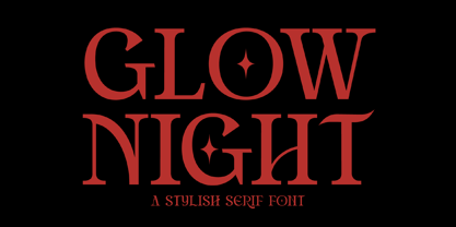 Glow Night is a classic serif font with a unique style and modern look. It is perfect for elegant and luxury logos, book or movie title design, fashion brands, magazines, clothes, lettering, quotes, and much more. Add it to any of your creative projects, and you will be amazed by the results. This font is PUA encoded, which means you can access all of the glyphs and swashes with ease!
 - Slurpy by Maulana Creative,
$14.00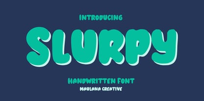 Slurpy is a casual wavy handwritten display font. With bold stroke, fun character. To give you an extra creative work. Slurpy font support multilingual more than 100+ language. This font is good for logo design, Social media, Movie Titles, Books Titles, a short text even a long text letter and good for your secondary text font with sans or serif. Make a stunning work with Slurpy font. Cheers, Maulana Creative
 - Supertall by wearecolt,
$11.00 Supertall, ultra condensed and very large. Supertall is a massive statement display font designed to command a page by filling a lot of space. Taking inspiration from hard-hitting movie titles, Supertall brings some 80s video game vibes with a modern touch. The Supertall type family features Regular and bold weights with obliques and reverse obliques for added speed and style. Features: 357 Glyphs Fractions Extensive language support.
 - Batternotch by Maulana Creative,
$13.00 Batternotch is a casual modern fun font. With regular mono-line stroke, fun character. To give you an extra creative work. Batternotch font support multilingual more than 100+ language. This font is good for logo design, Social media, Movie Titles, Books Titles, a short text even a long text letter and good for your secondary text font with sans or serif. Make a stunning work with Batternotch font. Cheers, Maulana Creative
 - Peachboys Handwritten Font by Maulana Creative,
$13.00 Peachboys is a modern handwritten display font. With slanted medium contrast stroke, fun character. To give you an extra creative work. Peachboys font support multilingual more than 100+ language. This font is good for logo design, Social media, Movie Titles, Books Titles, a short text even a long text letter and good for your secondary text font with sans or serif. Make a stunning work with Peachboys font. Cheers, Maulana Creative
 - Orecla by Maulana Creative,
$13.00 Orecla is an all caps font. With 3 weights stroke, fun character. To give you an extra creative work. Orecla font support multilingual more than 100+ language. This font is good for logo design, Social media, Movie Titles, Books Titles, a short text even a long text letter and good for your secondary text font with sans or serif. Make a stunning work with Orecla font. Cheers, Maulana Creative
 - Migoan by Surotype,
$20.00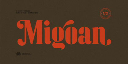 Migoan Serif is a display typeface with dynamic curve ,very suitable as to make a design choice for Headline, Movie Title, packaging, branding and more other creative project. Migoan's also has alternative characters such as Stylistic Alternates, Stylistic Set, and Swash variant. To enable the OpenType Stylistic alternates, you need a program that supports OpenType features such as Adobe Illustrator CS, Adobe Indesign & CorelDraw X6-X7. and more
 - Tricky Ghost by Senekaligrafika,
$12.00 “Tricky Ghost” Has hard unique and a signature styles with spider webs details in every letter, that speak to instant halloween sensations. “Tricky Ghost” will help you to create special and touching typographical design for your halloween and spooky projects, for greeting card, halloween project, branding, labeling, clothing, movie title, album cover, logos and many more. It is really universal and modern font. The owner of endless possibilities!
 - Gersy by Maulana Creative,
$13.00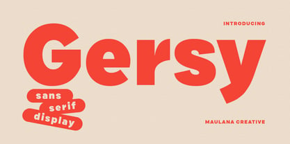 Gersy is a fancy sans serif display font. With bold stroke, fun character. To give you an extra creative work. Gersy font support multilingual more than 100+ language. This font is good for logo design, Social media, Movie Titles, Books Titles, a short text even a long text letter and good for your secondary text font with script or serif. Make a stunning work with Gersy font. Cheers, Maulana Creative
 - Lituora by Maulana Creative,
$13.00 Lituora is a condensed classic sans serif font. With bold contrast stroke, fun character. To give you an extra creative work. Lituora font support multilingual more than 100+ language. This font is good for logo design, Social media, Movie Titles, Books Titles, a short text even a long text letter and good for your secondary text font with sans or serif. Make a stunning work with Lituora font. Cheers, Maulana Creative
 - Bornholm Sandvig by Trine Rask,
$25.00 Bornholm Sandvig is named after the village, "Sandvig", on the only rocky island in Denmark, Bornholm. It is the second face in a series of rough stone cut typefaces, that shares proportions, but differs in any other aspect like different pieces of rock. It is a powerful face, but still very friendly. Good for very big sizes, but can be used for small texts, movie titles, cartoons, etc.
 - Kiez by Blackmoon Foundry,
$24.00 The “Kiez“ is an old school style font designed by Elena Albertoni in 2016. Inspired by shop and bar signage of the sixties and seventies, which can still be found today in the so called “Kiez“ in Hamburg St. Pauli or in one or another “Kiez“ in Berlin, which means neighborhood here. It also has a cinematic touch, again: think of the sixties and seventies or your favorite b-movie.
 - Gumball Machine by Rachel McBride Creative,
$9.00 Gumball Machine Typeface is everything you ever wanted in retro type design. With eight font styles, its disconnected and eccentric nature is enough to give any project some funk. Amazing for the spring and summertime! Use for website and brand design, product labeling, album/movie/project graphics, t-shirts and clothing, and anything else that needs a spark! Gumball Machine has 440 glyphs and supports most western languages.
 - Colatera Soft by Maulana Creative,
$11.00 Colatera Soft Round is a minimalist sans serif font. With regular rounded edge stroke, fun character. To give you an extra creative work. Colatera font support multilingual more than 100+ language. This font is good for logo design, Social media, Movie Titles, Books Titles, a short text even a long text letter and good for your secondary text font with script typeface. Make a stunning work with Colatera font. Cheers, MaulanaCreative
 - Rickbers Brush by Maulana Creative,
$14.00 Rickbers brush font. With three weight stroke, fun character with a bit of ligatures. To give you an extra creative work. Rickbers brush font support multilingual more than 100+ language. This font is good for logo design, Social media, Movie Titles, Books Titles, a short text even a long text letter and good for your secondary text font with sans or serif. Make a stunning work with Rickbers brush font.
 - Camore by Maulana Creative,
$15.00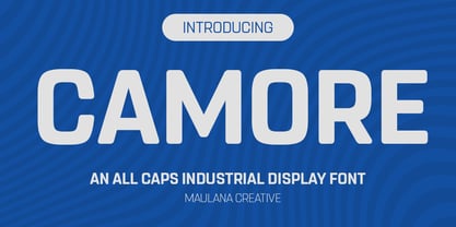 Camore is an all caps font. With 3 weights stroke, fun character. To give you an extra creative work. Camore font support multilingual more than 100+ language. This font is good for logo design, Social media, Movie Titles, Books Titles, a short text even a long text letter and good for your secondary text font with script or handwritting. Make a stunning work with Camore font. Cheers, Maulana Creative
 - Dociel by Maulana Creative,
$15.00 Dociel playful display font. Heavy stroke, fun character with a bit of ligatures. To give you an extra creative work. Dociel playful display font support multilingual more than 100+ language. This font is good for logo design, Social media, Movie Titles, Books Titles, a short text even a long text letter and good for your secondary text font with script or serif. Make a stunning work with Dociel playful display font.
 - Waltzy Blackletter Display Font by Maulana Creative,
$17.00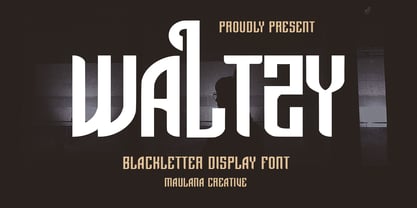 Waltzy display typeface font, fun character with a bit of ligatures and alternates. To give you an extra creative work. Waltzy font support multilingual more than 100+ language. This font is good for logo design, Social media, Movie Titles, Books Titles, a short text even a long text letter and good for your secondary text font with script or serif. Make a stunning work with Waltzy font. Cheers, Maulana Creative
 - Umbrella Man by Hanoded,
$15.00 Some time ago, I read an article about the Kennedy assassination. In that article, a person dubbed ‘the umbrella man’ played a rather bizarre role: apparently an innocent bystander with an opened umbrella was thought to be in cahoots with Kennedy’s killer. I immediately thought that the name ‘Umbrella Man’ was a good title for a horror movie, so when I created this rough brush font, I named it Umbrella Man.
 - Slayray by Maulana Creative,
$15.00 Slayray is a decorative bouncy handwritten font. With block bold stroke, fun character. To give you an extra creative work. Slayray font support multilingual more than 100+ language. This font is good for logo design, Social media, Movie Titles, Books Titles, a short text even a long text letter and good for your secondary text font with sans or serif. Make a stunning work with Slayray font. Cheers, Maulana Creative
 - Gambling Resort JNL by Jeff Levine,
$29.00 Sheet music for the song "Beyond the Blue Horizon" from the motion picture "Monte Carlo" had the movie title in hand-lettering reminiscent of the Futura Black style, but with an inline stripe through each character. These few letter examples were the basis for Gambling Resort JNL and conjure up the Nouveau Riche spending their nights in Monte Carlo packing the roulette wheels, blackjack tables and slot machines.
 - Cinema Nouveau JNL by Jeff Levine,
$29.00 Shadowland was a magazine dedicated to the arts, and was published from 1919 through 1923. The lettering for its masthead was hand lettered in a then-contemporary Art Nouveau style. Although the photoplay (movies) was just an incremental part of the magazine’s overview of the arts, the digital version of the type design has been named Cinema Nouveau JNL, and is available in both regular and oblique versions.
 - Esdoria Journey by Arttype7,
$15.00 Esdoria Journy, a font that is inspired by an ancient writing style using a fountain pen. with natural curves and has more than 100 alternatives (ligature, swash, alternative, staylistic 001-006). will make you look like a great script writer. This font is perfect for book covers, notes, magazines, wedding invitations, Valentine's greeting cards, movie titles, quotes, business cards, photographic watermarks, logos and any design that calls for beautiful handwriting.
 - MC Ifetur by Maulana Creative,
$16.00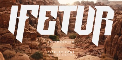 Ifetur display font. Bold stroke, fun character with a bit of ligatures and alternates. To give you an extra creative work. Ifetur font support multilingual more than 100+ language. This font is good for logo design, Social media, Movie Titles, Books Titles, a short text even a long text letter and good for your secondary text font with script or serif. Make a stunning work with Ifetur font. Cheers, Maulana Creative
 - Manforest by Maulana Creative,
$12.00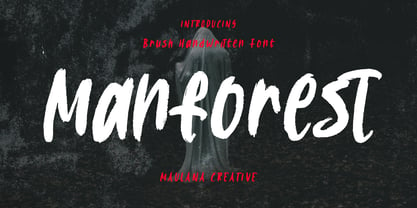 Manforest is a brush handwritten display font. With medium brush stroke, fun character. To give you an extra creative work. Manforest font support multilingual more than 100+ language. This font is good for logo design, Social media, Movie Titles, Books Titles, a short text even a long text letter and good for your secondary text font with sans or serif. Make a stunning work with Manforest font. Cheers, Maulana Creative
 - Mystice Times by Mans Greback,
$59.00 Dive into a realm where retro meets mystique with the Mystice Times font. Channeling the enchanting ambiance of 80s thriller movies, this serif typeface echoes tales of mystery wrapped in professionalism. Its characters, though rooted in the cinematic charm of yesteryears, are tinged with an unpredictable, slightly eccentric flair. Yet, there's an undeniable allure in its design - a suave nod to 70s funk, blending seamlessly with 80s charisma.