10,000 search results
(0.042 seconds)
- So Nouveau JNL by Jeff Levine,
$29.00 Three of the four letters of the name “Jane” on the cover of a vintage piece of sheet music inspired So Nouveau JNL. The free-form swoops emulating the pen lettering of the early 1900s adds a nostalgic charm to this typeface.
 - Liebestraum JNL by Jeff Levine,
$29.00 A Liebestraum, in German is a "dream of love" or "love dream". Based on the ornate sheet music title from a 1920s edition of Franz Liszt's composition, Liebestraum JNL captures and preserves the unique look and feel of this pen-on-paper lettering.
 - Trade Printer JNL by Jeff Levine,
$29.00Trade Printer JNL is another font design inspired by an old rubber stamp sign printing set. In this case, the lettering has a classic "wood type" look, reminiscent of the letterheads, billheads and fliers made by local printers of the 1880s-1920s. - Slutsker Script by ParaType,
$30.00Designed in 2003 by Isay Slutsker and Irina Smirnova. Based on the calligraphic typeface of mid-1980 by Moscow type designer Isay Slutsker (1924-2002). There is a free variation of flat nib pen calligraphy. For use in advertising and display typography. - Sutro Shaded by Parkinson,
$25.00 My affection for Slab Serifs began in the early 1960s in Kansas City when Rob Roy Kelly was at the Kansas City Art Institute, teaching and writing his book on American Wood Type. I got to know him just well enough to gain access to his fabulous collection of wood type and wood type catalogs. Later, in the1970s, I tried to re-create a Nebiolo Egiziano for Roger Black at New West magazine. And again for Roger, in the 1980s, I designed a Slab Serif logo for Newsweek Magazine. Finally, in 2003, designed the Sutro Family. There were things I didn't like about it, so, over time, I’ve been adding some things and dressing it up a little. Sutro Shaded has existed for a few years as a one color, outlined, drop-shadowed display font. It seemed like it was just dying for a little color. I added five more fonts: Fill, Gradient, Hatching, Rules and HiLite. These fonts can be used in different combinations to achieve various effects. There is a downloadable SUTRO SHADED USER MANUAL PDF in the Gallery section for this family.
 - VLNL Vondelpark by VetteLetters,
$35.00 The Vondelpark is the famous Amsterdam city park, 47 hectares stretching out from Leidseplein to the Amstelveenseweg. It was founded in 1864 when a group of well-to-do Amsterdam citizens got together and bought land at the (then) edge of the city centre in order to create a park ‘for riding and strolling’. Designed by architect J.D. Zocher, it opened officially in 1865. The park received its name two years later when a statue of Dutch writer Joost van den Vondel was placed in the park. In the 1960s and 1970s the Vondelpark became a symbol and epicenter of the hippie flower power era. The park was declared a state monument in 1996. Donald DBXL was intrigued by the handmade iron nameplate lettering on the park’s entrance gates, and decided to design VLNL Vondelpark in its glory. The somewhat clumsy iron letters were not revived as is but optimized to turn it into a useful typeface. The all-caps serif with a deliberate constructed feel, contains a Positional Open Type feature that places half circles on the vertical stems, at the beginning and end of a word, to enliven the rhythm.
 - Bananas by Canada Type,
$30.00 In the history of 20th century graphic arts, the evolution of the informal sans serif has been a uniquely American phenomenon. The ongoing saga of this (still as popular as ever) sub-genre dates back to the maturity of the Industrial Age and early Hollywood film titling, runs through the prosperous times of interwar print publications, sees mass flourishing during the various media propagations of the film type era, and solidifies itself as arguably the most common design element in the latter years of the century. Fun, bouncy, playful, and highly exciting, the casual sans serif is now all over game packaging, film and animation titles, book covers, food boxes, concert posters, and pretty much everywhere design aims to induce excitement about a product or an event. The casual sans is the natural high pill of typesetting. We figured it was high time for the casual sans to adapt to 21st century technology, gain more versatility, and become as much fun to use as the emotions it triggers. So we’re quite excited to issue Bananas, a fun sans serif family in 6 weights and 3 widths that can be used anywhere your designer’s imagination can take you. Rather than being based on a single design, Bananas was sourced from multiple American film era faces, all from 1950s and 1960s, when the casual sans genre was at its popular peak. Headliners’ Catalina and its very similar cousin, Letter Graphics’ Carmel, served as initial study points. Then a few Dave West designs informed the design development and weighting process, before narrow and wide takes were sketched out and included in the family. The entire development process happened in a highly precise interpolative environment. All Bananas fonts come with a full glyph complement supporting the majority of Latin languages, as well as five sets of figures, automatic fractions, quite a few ligatures, biform/unicase shapes and other stylistic alternates.
 - Winsel by insigne,
$29.00 You stand, poised at the brink. If you do not choose the right, the best typeface, this may be one of the greatest disasters in your history. The whole root and core and brain on which and around which your project is built seems about to perish into an ignominious end. But I do not for a moment fail to believe that Winsel shall prevail for you. This bold new face, founded from the tested mind of insigne design, will in the moment of need wield for you the full might of its ancestors. The entire strength of the British Empire’s vernacular poster lettering spanning the 1920’s to the 1950’s drives the very heart of every feature and weight this font has to offer. Winsel’s expanded design is sharp and angular, based on pointed brush strokes. Its thick, sturdy appearance will draw and direct your reader’s mind to the weight and importance of your messages and titling. Within the font’s full forces work a range of styles to achieve victory in the contest ahead: thick weights that are compact and muscular for carrying a heavier load and lighter, finer weights to lead you through your more sensitive operations. It stands equipped with OpenType features, ready to support most European Latin-based languages and providing features such as Small Caps and Titling Caps in all nine of its weights. Well-honed for the task ahead, Winsel has been crafted to ride out the storm of mediocrity and to outlive the merits of inconsequence, if necessary for years, if necessary alone. There has never been in all the world such an opportunity for you. With Winsel, you shall go on till the end. You shall write on the beaches. You shall write on the landing grounds. You shall write with growing confidence and growing strength in print or on the air. Every morn has brought forth a noble chance. Your chance this day is Winsel.
 - Sangkala by RagamKata,
$14.00 Sangkala is A serif modern and classic typeface that has own unique style & modern look. This typeface is perfect for an elegant & luxury logo, book or movie title design, fashion brand, magazine, clothes, lettering and quotes.
 - Heywa by DawnCreative.Id,
$13.00 Heywa is a nature styled, handwritten font with a mixture of ornaments that adds classic and vintage styles to it. It is very well suited to be used for book titles, bands, movies, advertising, and more.
 - Snack Shop JNL by Jeff Levine,
$29.00Snack Shop JNL draws its basic influence from the capital letters of Jeff Levine's Two Reeler JNL, but is a bolder, outline design - looking more like sign lettering than a title font from a silent movie. - Salovad Logo Type by LfarStudio,
$15.00 Hi... Thank for your visit :) Salovad logotype is a sans serif with brush, featuring a simple style and unique feel. This font suitable for social media posts, advertisements, decoration, logos, movie title and more! Happy design..
 - Cyber Track by Nirmana Visual,
$24.00 Cyber track - Techno Futuristic Display Typeface Inspired by Sci fi Movie, very suitable for the title, logo, typography, clothes, magazines, brochures, packaging and much more for your design needs,making your designs more modern and professional.
 - Hope Sans by Monotype,
$50.99 Hope Sans™ takes the jaunty style of 1950s and 60s lettering and melds it with the jubilant 1970s swashes of Bookman. The result is a sans serif family that is lively, inviting and deeply customizable. Its basic sans serif forms create engaging text, while a roaring collection of swash designs, alternate characters and ligatures make it a natural for attention-grabbing display typography. Hope Sans has been selected by the judges of the 22nd Annual TDC Typeface Design Competition to receive the Certificate of Typographic Excellence. The middle weights of the family are easy on the eyes and shine at smaller sizes and in blocks of text copy. Their friendly vibe also translates well to web and interactive design projects. Spacing is open, counters are large and Hope Sans’ range of six weights can provide just the right design for virtually any need. Headlines, subheads, banners and navigational links are naturals for its lightest and boldest weights – either with, or without, the swash letters. “Hope Sans is a paint box,” says its designer, Charles Nix. “In its basic form, it’s a sturdy grotesque, capable of setting text in a cool and relaxed way. But a bit of accenting with the alternate forms easily creates an entirely different mood and meaning. And for those that are willing to really mix with it, the variety of alternate characters can build truly unique typographic statements.”
 - Technotyp by URW Type Foundry,
$39.99 The digital font Technotyp is based on the hot metal typeface created by the German typographer and type designer Herbert Thannhaeuser (1898-1963) for the former East German type foundry Typoart in Dresden. In the typography book ‘Der Schriftsetzer’ (Fachbuchverlag, Leipzig, 1952), by Paul Fritzsche, this absolutely beautiful slab serif design is presented in all its variations. Fritzsche remarked that – because of its rather condensed form and its relatively long ascenders – the 'Werkschrift' of the Technotyp (comparable with our 'Regular') seemed to be very well suited to serve as a text face, and recommended for this purpose that the face be cut for the composing machine. However, this never happened and the entire Technotyp family was made available for hand composition only. This is finally changing and being remedied for good now: URW++ proudly presents the new digital version of this really charming font family with its distinct flavor of the 1950s, adding it to the other digital renditions of Herbert Thannhaeuser fonts at URW++, namely Garamond No. 4 and Magna. The original Typoart family had an italic style for the light version only. The new digital version of Technotyp includes italic styles for the regular, medium and bold weights as well, enhancing the family to meet today’s standards and requirements for professional type setting. To further increase its usefulness, Cyrillic faces were created, too. True to the standard for all digital fonts at URW++, the character set for Technotyp covers all West- and East European languages.
 - P22 Klauss Kursiv by IHOF,
$29.95 P22 Klauss Kursiv is the first ever digital revival and expansion of the last face Karl Klauß designed for the Genzsch & Heyse foundry in Stuttgart before he died in 1956. Karl Klauß’s classical training in the graphic arts gave him solid chops to use as a springboard for design ideas that remained relevant among the countless trends fleeting around the turmoil of two world wars. By the mid-1950s, a kind of ornamental deco aesthetic was well on its way into mainstream design in post-war Europe, and demand was high for unique, lively and non-minimal ad faces. Klauß, a reliable designer with a proven track record of calligraphic faces, pushed the envelope on his own calligraphy and designed something that packages elegance in a boldness seldom seen before in luxury scripts. Quite a bit of talent is on display in Klauss Kursiv. In spite of the restraint this kind of design imposes on itself almost by default, the interplay between thick and thin never seems forced or challenging. Clear, natural strokes build a compact alphabet that demonstrates the wrist control of a veteran calligrapher. Creative nib angling segues into very clever start-and-stop constructs to make attractive forms that work quite well together, yet stand well to individual scrutiny. P22 Klauss Kursiv comes with a load of built-in alternates and ligatures in a font of over 470 glyphs, providing extended support for Latin languages.
 - Sailor by Canada Type,
$25.00Sailor is the digital rendition of a film type that was popular in the early- to late-1970s. The type was called West Futura Casual at Photo-Lettering by David West. Some of the letter shapes of the original were replaced with more contemporary versions, but the originals remain accessible as alternates from different cells within the font, along with some other alternates and letter combinations. Just as the name implied, this sort of lettering is what happens when someone tries to apply Futura’s geometrical principles with a casual hand brush. This style has been popular for over three decades now, and is still going on strong. Posters with casual attempts at geometry are seen everywhere these days. Sailor’s brush style is now the standard visual expression of fun, cool, and happy atmosphere. It has the kind of versatility that can excite the eyes of children in cinemas, brand a product as happy and hip, turn a sign or banner into a cheerful invitation, or just make a poster or book cover that much more appealing to the eye. - Shinn Kickers JNL by Jeff Levine,
$29.00 Conrad X. 'Cobb' Shinn (Sept. 4, 1887- Jan. 28, 1951) was a Fillmore, Indiana-born post card illustrator who sold a series of successful novelty postcard lines which included (among others) Charlie Chaplin, automobiles and the Dutch culture in the beginning years of the 20th Century. After serving in World War I, Shinn found the market for novelty postcards dwindling, and he also lent his artistic skills to cartoon features and illustrating many children's books [including his own, under the nickname 'Uncle Cobb'] which taught easy step-by-step drawing methods. Some time in the 1920s, he eventually migrated into the field of supplying electrotypes and stereotypes of 'stock cuts' of photos and line art to the printing trade. In the days of letterpress printing, this was the forerunner of paper clip art and its successor, electronic clip art. Purchasing many of his designs from 'journeyman' artists of the time, the diversity of Cobb Shinn's stock cuts library grew with the passing years, reflecting changing times, styles and topics. Some of the illustrators whose signed works were presented in Shinn's 'CUTalogs' [as he called his stock cuts catalogs] include Mary Clemmitt, Louis H. Hippe, E.C. Klinge, Nelson White, Harvey Fuller, Bess Livings, Lois Head, Harvey Peake and Van Tuyl. Upon his passing in 1951, it's not known how long the Indianapolis-based company existed before finally closing its doors. One of the more popular series of cartoons were the line illustrations of men and women affectionately called 'little big head guys' by many modern fans of these cuts because the heads of the characters were drawn somewhat larger than the rest of their bodies. Shinn Kickers JNL is a collection twenty-six of these illustrations, and just like a kick in the shin (as the pun in the name implies), these charming cartoons get your attention.
 - Metrolox - Unknown license

- Kruger by Keristyper Studio,
$14.00 Kruger is a Horror font ready to be splattered on your design projects. Inspired by horror movies. This font is good for logo design, Social media, Movie Titles, Books Titles, short text even long text letters, and good for your secondary text font with sans or serif. Featured: Standard Uppercase & Lowercase Numeral & Punctuation Multilingual : ä ö ü Ä Ö Ü ß ¿ ¡ Alternate & Ligature PUA encoded We recommend programs that support the OpenType feature and the Glyphs panel such as Adobe applications or Corel Draw. so you can use all the variations of the glyphs. Hope you enjoy our fonts!
 - Bagins by Slide Shoot,
$12.00 Bagins Sans Serif is a balanced, smooth, elegant and stylish sans serif font. He has a beautiful character. It fits perfectly with invitation card designs, company logos, movie titles, movie names, business cards, book titles, brand names and various other designs. Bagins Sans Serif is a subtle Sans serif font that exudes sophistication and elegance. Its stylish alternations and ligatures make this font the perfect partner for any project. FEATURE : - Ligature - Uppercase and lowercase - Numbering and Punctuation - Works on PC or Mac - Simple Installation - Supports Adobe Illustrator, Adobe Photoshop, Adobe InDesign, also works in Microsoft Word Hope you like it. Thank you.
 - Almera by Slide Shoot,
$12.00 Almera Serif is a balanced, smooth, elegant and stylish serif font. He has a beautiful character. It fits perfectly with invitation card designs, company logos, movie titles, movie names, business cards, book titles, brand names and various other designs. Almera Serif is a subtle serif font that exudes sophistication and elegance. Its stylish alternations and ligatures make this font the perfect partner for any project. FEATURE : - Ligature - Uppercase and lowercase - Numbering and Punctuation - Works on PC or Mac - Simple Installation - Supports Adobe Illustrator, Adobe Photoshop, Adobe InDesign, also works in Microsoft Word Hope you like it. Thank you.
 - Lorisha by Slide Shoot,
$12.00 Lorisha Serif is a balanced, smooth, elegant and stylish serif font. He has a beautiful character. It fits perfectly with invitation card designs, company logos, movie titles, movie names, business cards, book titles, brand names and various other designs. Lorisha Serif is a subtle serif font that exudes sophistication and elegance. Its stylish alternations and ligatures make this font the perfect partner for any project. FEATURE : - Ligature - Uppercase and lowercase - Numbering and Punctuation - Works on PC or Mac - Simple Installation - Supports Adobe Illustrator, Adobe Photoshop, Adobe InDesign, also works in Microsoft Word Hope you like it. Thank you.
 - Malisha by Slide Shoot,
$12.00 Malisha Serif is a balanced, smooth, elegant and stylish serif font. He has a beautiful character. It fits perfectly with invitation card designs, company logos, movie titles, movie names, business cards, book titles, brand names and various other designs. Malisha Serif is a subtle serif font that exudes sophistication and elegance. Its stylish alternations and ligatures make this font the perfect partner for any project. FEATURE : - Ligature - Uppercase and lowercase - Numbering and Punctuation - Works on PC or Mac - Simple Installation - Supports Adobe Illustrator, Adobe Photoshop, Adobe InDesign, also works in Microsoft Word Hope you like it. Thank you.
 - The Glamoure by Slide Shoot,
$12.00 The Glamoure Serif is a balanced, smooth, elegant and stylish serif font. He has a beautiful character. It fits perfectly with invitation card designs, company logos, movie titles, movie names, business cards, book titles, brand names and various other designs. The Glamoure Serif is a subtle serif font that exudes sophistication and elegance. Its stylish alternations and ligatures make this font the perfect partner for any project. FEATURE : - Ligature - Uppercase and lowercase - Numbering and Punctuation - Works on PC or Mac - Simple Installation - Supports Adobe Illustrator, Adobe Photoshop, Adobe InDesign, also works in Microsoft Word Hope you like it. Thank you.
 - Astagie by Slide Shoot,
$12.00 Astagie Serif is a balanced, smooth, elegant and stylish serif font. It has a beautiful character. It fits perfectly with invitation card designs, company logos, movie titles, movie names, business cards, book titles, brand names and various other designs. Astagie Serif is a subtle serif font that exudes sophistication and elegance. Its stylish alternations and ligatures make this font the perfect partner for any project. FEATURE : - Ligatures - Uppercase and lowercase - Numbering and Punctuation - Works on PC or Mac - Simple Installation - Supports Adobe Illustrator, Adobe Photoshop, Adobe InDesign, also works in Microsoft Word Hope you like it. Thank you.
 - Veminit by Slide Shoot,
$12.00 Veminit Serif is a balanced, smooth, elegant and stylish serif font. He has a beautiful character. It fits perfectly with invitation card designs, company logos, movie titles, movie names, business cards, book titles, brand names and various other designs. Veminit Serif is a subtle serif font that exudes sophistication and elegance. Its stylish alternations and ligatures make this font the perfect partner for any project. FEATURE : - Ligature - Uppercase and lowercase - Numbering and Punctuation - Works on PC or Mac - Simple Installation - Supports Adobe Illustrator, Adobe Photoshop, Adobe InDesign, also works in Microsoft Word Hope you like it. Thank you.
 - Richard Samuels by Letterena Studios,
$17.00 A serif modern and classic typeface that his own unique style & modern look. This typeface is perfect for an elegant & luxury logo, book or movie title design, fashion brand, magazine, clothes, lettering, quotes, and so much more.
 - Bigger Summer Fest by Letterena Studios,
$10.00 Bigger Summer Fest is a bubbly handwritten font with a unique style and modern look. It is perfect for elegant and luxury logos, book or movie titles, fashion brands, magazines, clothes, lettering, quotes, and many more. **Uppercase
 - Common Rejection by Dumadi,
$18.00 Common Rejection is a modern stylish font that is attractive to any project and can be applied in logos, quotes, travel titles, movie titles, blogs, show event titles, t-shirt designs, tumbler designs, community and company logos.
 - Pickfair JNL by Jeff Levine,
$29.00Pickfair JNL is based on the vintage wood type Vandenburgh Tuscan (circa 1867), and gets its name from the mansion owned by Douglas Fairbanks and Mary Pickford—two of the founding partners of United Artists movie studios. - Panther Fighter by Yoga Letter,
$17.00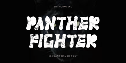 "Panther Fighter" is a modern and elegant brush font. This font is equipped with uppercase, lowercase, numerals, punctuations and multilingual support. It is suitable for logos, movie titles, Halloween, Christmas, business branding, ornaments, mock ups and others.
 - Bucktooth by Tymime Fonts,
$35.00 Bucktooth is a cartoony typeface, inspired by vintage funny-animal comic books, suitable for children's entertainment, packaging or movie titles. Fancier and more upscale than your usual toon font, Bucktooth is fun with a touch of class.
 - Cresilda Script by Seniors Studio,
$15.00 Cresilda Script is a fluid handwritten calligraphy fonts, combining calligraphy typefaces with a free flowing and moving baseline. It has a casual, yet elegant touch. features alternate characters. including initial and terminal letters, alternates, ligatures and multiple language support. ?Can be used for various purposes.such as headings, signature, logos, wedding invitation, t-shirt, letterhead, signage, lable, news, posters, badges etc. To enable the OpenType Stylistic alternates, you need a program that supports OpenType features such as Adobe Illustrator CS, Adobe Indesign & CorelDraw X6-X7.
 - Yanone Kaffeesatz is a distinctive and versatile typeface that carries a unique blend of modernity and nostalgia. It was first created by Yanone, a German type designer, in 2004. The inspiration behi...
- Digifit - Personal use only

- Zoning Department JNL by Jeff Levine,
$29.00 A 1930s-era sign lettering template set manufactured for the National Carbon Company by Wrico (The Wright-Regan Instrument Company) yielded the familiar lettering that comprises Zoning Department JNL. This rounded-end typestyle was also widely used on architectural drawings, signage, blueprints and the like.
 - Marketing Stencil by Jeff Levine,
$29.00 Vintage (circa 1960s) packaging for Parker Cartridge Pen Erasers had the product description printed in bold stencil lettering featuring a squared look with rounded corners. This design has been recreated digitally as Marketing Stencil JNL, which is available in both regular and oblique versions.
 - Millrich Moravian NF by Nick's Fonts,
$10.00Originally called Bohemian in the 1918 specimen book of the Miller and Richard Type Foundry of London and Edinburgh, this Jugendstil typeface still retains its freshness and quaint charm. Both versions of this font include the complete Latin 1252 and Central European 1250 character sets. - Paris ND by Neufville Digital,
$29.60 Paris was designed by Crous-Vidal in 1953 and is part of the Grafía Latina collection. Paris Bold originally had two alternative capital letters O, one with pronounced 45° stress; they are both incorporated in the ND version. París is a Trademark of BauerTypes SL

