10,000 search results
(0.046 seconds)
- Front Page by Jonahfonts,
$35.00 Usage recommendations: Captions, packaging, cards, posters, ads, book jackets, manuals, menus.
 - Mediafont by La Boîte Graphique,
$25.00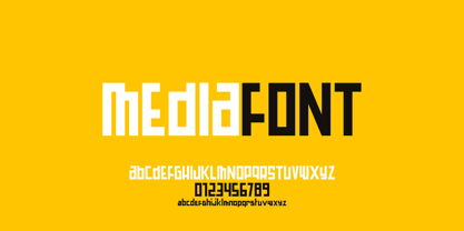 Mediafont is a modern geometric font ideal for titration, branding, poster.
 - Pricelist by Letterhead Studio-VG,
$- Price-list is the display font. Good for posters and magazines.
 - Fenotype Dingbats by Fenotype,
$19.00 A set of urban images for flyers, posters and LP-covers.
 - Olech by Sebastian Cabaj,
$14.00 Olech is great typeface for titles, posters, books, covers and labels.
 - Alte DIN 1451 Mittelschrift gepraegt - 100% free

- Doublethink by Barnbrook Fonts,
$30.00 Doublethink was developed from lettering drawn in the 1960s by Vinko Ožić-Pajić and used on the shop fronts of Yugoslavian state-owned clothes company Standard Konfekcija. The original design has been reinterpreted and expanded and is offered as a two weight typeface—Doublethink Medium and Doublethink Bold Inline. Standard Konfekcija was established first as a military fabric company and later became the premier fashion brand outlet in the Communist state of Yugoslavia. It is famous for being the first shop in the country to offer plastic bags (Standard Konfekcija stores ceased trading after the fall of Communism).
 - Collette by Scholtz Fonts,
$21.00Collette was named in honor of an art deco font called "Independent" designed in the 1930s by Collette and Dufour. Collette is influenced by the design of the original font, however, there are substantial differences: instead of small caps, a true lower case was created, the upper case character proportions and shapes have been greatly modified, and all missing characters have been created to make a truly modern font which nevertheless has all of the panache of the original. It is best used to create a retro feel and in headings, subheads and in short passages of text. - MFC Semicirculus Monogram by Monogram Fonts Co.,
$19.95 The inspiration source for Semicirculus Monogram is a stylish sans serif letterset from a vintage embroidery publication which combines to create a semi-circular form monogram. Originally intended to adorn handkerchiefs, it has so many other possibilities. Ornaments from numerous antique specimen books were combined with the letter set to accent and complete its form. This is one of many monogram designs for the early 1900s which fall into a two letter format that is either adorned or interwoven with ornamentation. Download and view the MFC Semicirculus Monogram Guidebook if you would like to learn a little more.
 - Gobsmacked by Hanoded,
$15.00 Gobsmacked is a rather new English word. It has been around since 1959 and was used mostly around Liverpool at that time. The word means: ’astounded’, ‘flabbergasted’ (another nice word!) or ‘speechless’. Gob could be of French or Scottish Gaelic origin and means ‘mouth’. Gobsmacked font was created using a brush and black gouache. The result is a very eroded, very legible and quite unique brush font. I have created alternates for the lower case letters, plus two double letter ligatures (oo and ss). Use it for any design that needs a little brushwork; I am sure the result will leave you gobsmacked!
 - Pondicherry by Hanoded,
$15.00 Pondicherry is a nice city in the South-East of India. It has changed colonial hands over time, but after the last colonial power (the French) left in 1954, it reunited with India. I have always liked the name Pondicherry. It evokes something happy and exotic and I guess I had the same feeling when I developed this font. Pondicherry font is an outlined affair with an uneven baseline and an overall 'happy' feel. It is an all caps font, but upper and lower case differ and you can use them together. Pondicherry comes with a treasure chest full of diacritics.
 - Yo Quiero Taquitos NF by Nick's Fonts,
$10.00The basic letterforms of this typeface were found in a lettering book, Rotalución Decorativa, published in Barcelona in the 1940s. Add a lowercase and a few flourishes suggested by a hand-painted sign seen at a neighborhood tavern on Staten Island, and you have a seriously fun face. To add even more spice, the font also contains alternate characters in the Logical Not, ASCII circumflex and tilde positions. It also contains a few alternate characters in the ASCII circumflex and tilde positions to perk things up. Both versions of the font contain characters to support all major European languages. - JesusLovesYouAll by LucasFonts,
$19.00 Almost every type designer feels the need, from time to time, to interrupt his or her serious work on complex text type systems for something more playful. In Luc(as)'s case this has often meant designing more typefaces. In the early 1990s, while working on Thesis, Luc(as) drew several display faces which were based on the shapes of TheSans but were either de(con)structive versions or experimental variations. Jesus Loves You All is a heretic thorny typeface vaguely based on the outlines of TheSans. Jesus Loves You was given a remarkable three-dimensional treatment in Abbott Miller's Dimensional Type project.
 - Prinzess Gravur by RMU,
$35.00 In 1905 Berthold released an engraved blackletter font called Prinzess Kupferstichschrift. Based on an old printed remnant, I revived this beautiful open-face fraktur and enriched it with several OpenType features. As usual in my blackletter fonts, the round ‘s’ lies on the number sign key, and a traditional number sign can be accessed via the Discretionary Ligature feature and typing 'N-r-period'. In this font you have also the possibility to turn I, V, X, L, C, D, and M into Roman numerals by activating the Stylistic Alternates feature. And last but not least, various useful ligatures polish up this font.
 - Pennyroyal by Stiggy & Sands,
$29.00 A Historic Revival with a Sophisticated Rustic Edge Pennyroyal began as a Barnhart Brothers & Spindler typeface called Plymouth Bold, first cut in 1900. What began as a straightforward rustic typestyle has been revived to include a more extensive character set. But this font wasn’t just revived, it has come alive with character and personality. Pennyroyal includes 564 characters. The expanded SmallCaps option for gives the typestyle a more sophisticated look, expanding on the original typeface inspiration. Opentype features include: A collection of ligatures. Smallcaps. Full set of Inferiors and Superiors. Proportional figures and Oldstyle figure sets
 - Uranos by Paweł Burgiel,
$38.00 Uranos is a serif type family with uncomplicated appearance and modern, geometric glyphs shapes. Available in three styles, include many stylistic alternates and automatic ligature creation. Character set contain the complete Unicode Latin 1252 (Western European; ANSI), 1250 Latin 2 (Central European), 1254 Turkish, 1257 Baltic. Supported OpenType features: Acces All Alternates, Capital Spacing, Case-Sensitive Forms, Contextual Alternates, Fractions, Kerning, Localized Forms, Ordinals, Proportional Figures, Slashed Zero, Small Capitals, Small Capitals From Capitals, Stylistic Alternates, Stylistic Set (1-20), Superscript, Tabular Figures, Titling. Kerning is prepared as single ('flat') table for maximum possible compatibility with older software.
 - Kevlar by Letterbox,
$50.00 Kevlar was initially inspired by an obscure logo discovered in a 1960s radio-fan magazine. Of immediate interest was that the upper half of the typeface appeared to be a sans while the lower half appeared as a curious blend of a slab serif imbued with a script-like quality. First came Kevlar Bold in 2003, closely followed by its text weight companion Kevlar Regular. The original source of the inspiration as then revisited to develop the third in the set, Kevlar Slab, a truly individual mix of script-like fluency with the heavy weight base of a slab serif.
 - Dai Vernon by E-phemera,
$20.00 DaiVernon is based on the handwriting of card magician extraordinaire Dai Vernon. Known as "The Professor", Vernon was a beloved expert in sleight-of-hand and card magic. These fonts are based on the penmanship in his notebooks from the 1920s, which feature almost no lowercase letters. DaiVernon Direct is based on what appears to be his hastier style, while DaiVernon Misdirect is based on his neater hand. Numerous OpenType bonus glyphs, contextual alternates and discretionary ligatures help to create the feel of his handwriting. Thanks go to Michael Albright, David Ben, and Gene Matsuura for helping to provide access to Vernon's notebooks.
 - Ragtime Gal JNL by Jeff Levine,
$29.00 Amongst a batch of antique sheet musical instruction booklets offered for sale online was a piece with Art Nouveau hand lettering on the cover entitled “Seven Musical Travelogues for Piano”. This design served as the inspiration and model for Ragtime Gal JNL, which is available in both regular and oblique versions. The font’s name comes from the line ‘Hello my baby, hello my honey, hello my ragtime gal…’ from the 1899 song “Hello Ma Baby”; a tune that found a new burst of popularity in an odd way within a 1955 Warner Brother’s cartoon [“One Froggy Evening”].
 - Carioca Script Pro by Stiggy & Sands,
$39.00 Our Carioca Script Pro was inspired the lettering from the RCA Records Stereo Action Series from the 1960's. It's a signature script that is both elegant yet slightly bouncy and truly sings…lending a happy-go-lucky flavor to any design. This script is loaded with extra features - truly giving Carioca Script Pro something to sing about. Opentype features include: - Swash Capitals. - Initial and Final forms of Lowercase letters via Stylistic & Contextual Alternates. - Full set of Inferiors and Superiors for limitless fractions. - Oldstyle figures. - Ordinals. - 10 Flourishes included in Carioca Script Pro. 90 Flourishes in Carioca Script Flourishes.
 - Glamwords by Mostardesign,
$9.00 If you love outrageous clothes, makeup, hairstyles, platform-soled boots, flamboyant costumes, so Glamwords is what you need for your design creations. Glamwords typeface is new font with a nostalgic reference to the Glitter style developed in 1970s. This font has been especially designed for Mostardesign Studio by Olivier Gourvat. Created in 2009, this font family can be used for very short texts however it is particularly effective for headlines in larger point sizes so that its details are emphasized. Glamwords is a very geometric face best used in experimental designs (i.e., logos, web sites, flyers, and expressive headlines).
 - Tolkiens Christmas by Kaer,
$19.00 Hey guys! Once I got a book "Letters From Father Christmas" by J.R.R. Tolkien. He wrote them for the children every December from 1920 to 1943. I totally fell in love with the calligraphy in those letters. Now I created a font and you can use it to write your own letter from the North Pole. I've also redrawn stamps and patterns from that book, so you can decorate your blank. It's Icons font style. You'll get: Regular and Icons styles Numbers and symbols Multilingual support and alternative symbols Thanks! Feel free to request to add characters you need: kaer.pro@gmail.com
 - SHAPIRIT by ME Typography,
$59.00 The Shapirit family belongs to a category of geometric sans sherif fonts, that was created in 1920s. The main feature of this category is geometric architecture of shapes. Shapirit family is perfect for headlines, brief texts used on any screen, print materials as well as logos. The whole family includes 8 fonts from Thin to Black and contains full Hebrew and Latin script. Therefore, Shapirit is an ideal solution for any adaptation into Hebrew or any Latin script language. The word "Shapirt" (in Hebrew שפירית) means dragonfly. The font’s name was inspired by the dragonfly’s slim and elegant body.
 - Egyptienne F by Linotype,
$29.99Adrian Frutiger designed Egyptienne F for the Deberny & Peignot Foundry in 1956. This was the first of several Egyptians designed by Frutiger, see also Glypha and Serifa. “Egyptian” or “Egyptienne” is a typographic designation for roman typefaces with slab (or square or rectangular) shaped serifs; and those that have bracketing between main stroke and serifs (like this one) are known as “Clarendon-style Egyptians”. Egyptienne F has a medium x-height and excellent character spacing for setting text in small point sizes. Legible, flexible, and neutral in appearance, Egyptienne F is a good choice for books, magazines, and on-screen presentations. - Dazzle by Device,
$29.00 Op-art never looked so good. Taking a cue from the popularity in the 1970s of deco Prismas and their related contemporary interpretations, this geometric font updates the trend. Overlap text in different colours or black and white for eye-teasing moiré combinations. An image above illustrates the use of Dazzle Underprint, a uniform-width version of the font that is placed under Dazzle and used to create two-colour effects simply and easily. Dazzle Underprint is not intended for solo use, only as an underprint — please see Dazzle Unicase for a range of undecorated weights.
 - ITC Charter by ITC,
$40.99 Charter was designed in the mid-1980s by Matthew Carter. The typeface was designed with the limitations of low- and middle-resolution output devices in mind; hence the squared off serifs and the economy of diagonals and curves. The design, however, became an instant success on its own merits. It is an excellent everyday typeface for a wide variety of uses including books and technical manuals. Charter offers small cap, extension and alternate typographer sets that help to make it more versatile and functional. ITC bought the Charter designs in 1993, but Bitstream retained the right to sell the original designs.
 - 1479 Caxton by GLC,
$38.00 This family was inspired by the two fonts used by the famous William Caxton in Westminster (UK) in the late 1400s. There is only one (Normal) style. We have added the accented characters and others not in use in the early time of printing, but the ligatures and the few abbreviations for the Old English language and Latin were present in the original fonts. The original cap height is about five to seven millimeters. Decorated letters like 1495 Lombardes, 1512 Initials, 1550 Arabesques, 1565 Venetian, and 1584 Rinceau can be used in complement with this font without anachronism.
 - Buxom by ITC,
$29.00Robert Trogman originally designed Buxom for Fotostar in 1975 with lettering from Herman Spinadel. Trogman’s design is an old-fashioned headline face, whose style feels at home in a number a different periods: the Wild West, the 1960s–70s, and once again today! Buxom is an all caps typeface with a three-dimensional effect: each character looks like it sits atop a trapezoidal shape, whose right side is always shaded. An inline around each letterform enhances this shadowy image. Buxom is best used in large display sizes as a single word, or single line of text. - Confetti TP by Tipo Pèpel,
$22.00 The Confetti is a typeface created about 1930 by the defunct José Iranzo foundry in Barcelona, and imitates the forms and gestures of handwriting created with a round nib as “Speedball”Series B. The original typefaces were a pair, called “Escritura Energica ” and “Escritura maravilla”. The typography has a dynamic air, caused partially by irregular alignment of the characters respect to the baseline and aesthetics takes us to the proposed commercial lettering or advertising of years 20-30. Confetti was one of the fonts selected by the website Typographica.org in its prestigious list of “Our Favorite Typefaces” in 2006.
 - Victorian Supremacy by Burntilldead,
$14.00 With over a year of design and development, Victorian Supremacy is ready to help you and your clients make a statement by adding elegance and unique flair to your next design project. Victorian Supremacy inspired by letterheads from the late 1800's and early 1900's. Set includes four major styles and layered version (gradient, outline & extrude). Victorian Supremacy offers an expansive set of options, making it the perfect choice for books, magazines, packaging, branding and signage. From period style and Victorian to modern and elegant, Victorian Supremacy is strong and stately, yet elegant and decorous.
 - Goudy Two Shoes by Canada Type,
$24.95Goudy Two Shoes is a digitization and expansion of a 1970s type called Goudy Fancy, which originated with Lettergraphics as a film type, then was released into the dry transfer (rub-on) arena, where it became really popular. This digital expansion of the original design contains many additional characters, including "plain" variants on the caps, as well as extra alternates and swashes, and even a few curly ornaments. Goudy Two Shoes comes in all popular font formats. The Postscript and True Type versions ship as 2 fonts, while the OpenType version is a single font programmed with features for OT-savvy applications. - Tautier by Sihan Wu,
$25.00 Tautier is a display font based on the specimen of Enge Mediaeval-Antigua, published in 1900 from the Bauer Type Foundry. It is intentionally redrawn to keep its overall narrow proportions. Based on the existing basic alphabets, Tautier is redrawn to appear more classical and friendly, as you can notice in the rounded corners around the beaks, as well as the lachrymal terminals in lowercases. Tautier is a display typeface suitable for large applications, for example, headlines for editorial design, branding, webpages, and environmental design. It currently comes as a single-styled typeface disposed to extend with an italic version.
 - Rapier by ITC,
$40.99 Rapier, designed by Martin Wait for ITC in 1989, is an impulsive, energetic script font with strong ties to the brush and advertisement typefaces of hte 1940s. The zestful capitals contrast with small, narrow lower case letters, lending the font its dynamism and liveliness. Desinger Wait reached the energetic, almost aggressive feel of Rapier with snappy base forms and especially with ascending strokes. For an optimal look it is advisable to set Rapier's forms near to one another, so that the ends of the strokes of one figure touch the beginning of the next. Rapier is best used for headlines and short texts.
 - Tsanger Yun Hei SC by Tsanger,
$198.00 Tsanger Yunhei was designed and published by Tsanger. Tsanger Yunhei contains 8 styles and family package options. The designer has made unique treatment on the shape and structure of the pen, based on the Chinese calligraphy style and writing, which makes it easier to identify under the same size of the font and group reading effect better. Tsanger Yunhei is more in line with the aesthetic habits of Chinese characters getting the reading an easy task. This font adopts GB 2312—1980 standard, with a total of 6763 Chinese characters, matching Latin letters, Greek letters, Hiragana, Katakana, Russian Cyrillic letters, etc.
 - Mimosa by Pelavin Fonts,
$25.00 The inspiration for Mimosa comes directly from the packaging for “Moulinard Jeune”, a line of French toiletries from the 1920s. I created the 240-odd glyphs needed to make up a complete font based upon the style of a handful of hand-lettered characters that were used on the original items. Mimosa is a mono-weight, connecting vertical script with a fairly regular set of lower case and slightly more decorative upper case glyphs. As with any decorative script, if you set copy in all caps, you will be tracked down and severely punished by the type police.
 - Rubber Stamp by ITC,
$39.00Created in 1983 by British artist Alan Birch, this dramatic design conveys all the immediacy, impact, and effect of a stencil or rubber-stamp on paper. With a corroded, rough-around-the-edges feeling, Rubber Stamp gives an impression similar to the old, beat-up looking typewriter fonts that were popular among designers during the 1990s. Rubber Stamp is an all caps font, and is primarily suited for many headline and display applications that use larger point sizes. Try out Rubber Stamp in magazines, newsletters, and any other work that would be enhanced by a stencil, branding, or rubber stamp effect. - Noris Script by Linotype,
$29.99Drawn by master German calligrapher Hermann Zapf in the 1970s, Noris Script captures the magic of the irregularities of pen strokes. The idea behind Noris Script was to bring the spontaneity of a quick handwritten script using a broad-edged pen into the modern typesetting environment. Noris is the Latin name for the German city of Nuremberg, where Hermann Zapf was born and raised. Nuremberg has something special about it, aside from Hermann Zapf, it has a great tradition of writing masters, such as Johann Neudörffer (1497-1563), Wolfgang Fugger (1515-1568), and Rudolf Koch (1876-1934). - Swing Vote JNL by Jeff Levine,
$29.00 A 1964 piece of sheet music entitled “Old Soldiers Never Die (They Just Fade Away)” was based on the farewell speech General Douglas MacArthur gave to Congress on April 19, 1951. This particular edition of the song sheet had part of his speech (as well as its title) hand lettered in a free-form sans serif reminiscent of the lettering done by such noted lettering artists as Paul Coker and Saul Bass. The casual and playful style of this type design became the inspiration for Swing Vote JNL, which is available in both regular and oblique versions.
 - Authority by RetroSupply Co.,
$19.00 Inspired by public fonts in New York in the 1970s. Authority pays tribute to the almost unnoticed but powerful effect type have on our lives. From waiting on a cold morning to catch the 307 to Morton West High School, to the rain and snow worn stencil on a postal box. Public typography is a part of the little spaces in your lives where life actually happens. Government designed fonts were chosen to communicate authority and help grease the gears of the day-to-day grind. Authority beckons back to these days with it's mildly condensed feel, squared corners and weight presence.
 - MFC Fantasie Monogram by Monogram Fonts Co.,
$169.00 The inspiration source for Fantasie Monogram is another hand-drawn design from a vintage embroidery publication which relies on rigid geometric letterforms on a dynamic slant stepping downwards. This monogram, which evokes visions of it embossed or printed on antique cookie tins, was originally intended to adorn handkerchiefs, but the possibilities of its use are up to your imagination. This is one of many monogram designs from the early 1900’s which fall into a two letter format that is either adorned or interwoven decorative elements. Download and view the MFC Fantasie Guidebook if you would like to learn a little more.
