10,000 search results (0.022 seconds)
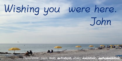
  1. PlainPensle by Ingrimayne Type, $14.95
    As its name suggests, PlainPensle is a handwriting font that emulates printing and writing with a pencil or ballpoint pen. The plain and bold styles have hand printing that is ordinary and nondescript. The italics and bolditalics contain simple handwritten cursive.
  2. Haarlem by Monotype, $40.99
    Haarlem, designed by Leslie Cabarga, was inspired by the sort of marks you get when you write with a flat-headed magic harger. There are two fonts in the Haarlem family, White and Black. Haarlem White is an outlined, shadowed version of Haarlem Black.
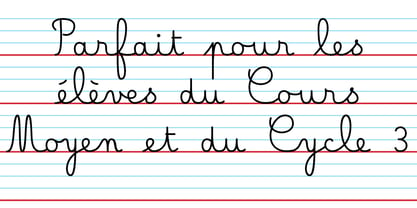
  3. Belle Allure by JBFoundry, $10.00
    Belle Allure is a font for schools. It is based on the continuity of movement and simple paths which let a fast and easy cursive writing. It respects the French habits and leans on a wide character set and on the OpenType properties.
  4. Ongunkan Younger Futhark by Runic World Tamgacı, $45.00
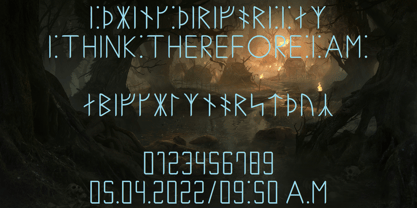
    The Younger Futhark, also called Scandinavian runes, is a runic alphabet and a reduced form of the Elder Futhark, with only 16 characters, in use from about the 9th century, after a "transitional period" during the 7th and 8th centuries. The reduction, somewhat paradoxically, happened at the same time as phonetic changes that led to a greater number of different phonemes in the spoken language, when Proto-Norse evolved into Old Norse. Also, the writing custom avoided carving the same rune consecutively for the same sound, so the spoken distinction between long and short vowels was lost in writing. Thus, the language included distinct sounds and minimal pairs that were written the same. The Younger Futhark is divided into long-branch (Danish) and short-twig (Swedish and Norwegian) runes; in the 10th century, it was further expanded by the "Hälsinge Runes" or staveless runes. The lifetime of the Younger Futhark corresponds roughly to the Viking Age. Their use declined after the Christianization of Scandinavia; most writing in Scandinavia from the 12th century was in the Latin alphabet, but the runic scripts survived in marginal use in the form of the medieval runes (in use ca. 1100–1500) and the Latinised Dalecarlian runes (ca. 1500–1910)
  5. Railroad Gothic Pro by Red Rooster Collection, $60.00
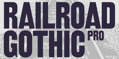
    Railroad Gothic Pro is a condensed, sans serif typeface, exclusively licensed from the Ludlow Collection. The original Railroad Gothic was produced by Ludlow in the early 1900’s, and Steve Jackaman (ITF) produced the digital version in 2017. The font provides support for Latin 1, Central, and Eastern European languages, and Cyrillic. Railroad Gothic Pro is reminiscent of typefaces used in 1900’s railyards, hence the name.
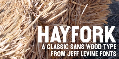
  6. Hayfork JNL by Jeff Levine, $29.00
    Hayfork JNL is based on a vintage wood type sanserif typeface from the 1880's. A font of similar design is Eckhardt Poster Display, which was modeled from a 1920's sign painter's handbook; no doubt getting its inspiration from this wood type's design.
  7. Spahrty Girl - Unknown license
  8. Baldur - Personal use only
  9. Waterfalls - Unknown license
  10. Canker Sore - Unknown license
  11. Latchboy - Unknown license
  12. Goofball - Unknown license
  13. Dearest Dorothy - Unknown license
  14. Nostalgic - Unknown license
  15. HipnOtik - Unknown license
  16. Freeze! - Unknown license
  17. D3 Spiralism - Unknown license
  18. Oliver - Unknown license
  19. Santas Big Secret BB - Personal use only
  20. Floozy - Unknown license
  21. Eskargot - Unknown license
  22. Swirly - Unknown license
  23. quiñók - Unknown license
  24. Beauvoir Demo - Unknown license
  25. the Gingerbread House - Unknown license
  26. Caffe Latte - Personal use only
  27. Spiraling - Unknown license
  28. Single Gyrl - Unknown license
  29. Marguerite - Personal use only
  30. Sachiko - Personal use only
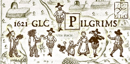
  31. 1621 GLC Pilgrims by GLC, $30.00
    This font was created with inspiration from the wood blocks carved for chapbooks, posters, calendars or newspaper in the late 1500’s and early 1600’s. We have tried to keep their innocence and rough style. It has been conceived as an homage to the “Pilgrim fathers” landing in Plymouth Bay in 1620 and celebrating the first Thanksgiving with Native Indians in autumn, 1621. The font, consisting of two English capital alphabets (so, without any accented characters): Initials and caps, and a lot of separate figures added, is especially improved by strong enlargments, 72 pts and more, and has very good results when printed.
  32. Brittes by Eurotypo, $60.00
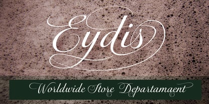
    Brittes is a fontface inspired in a formally English round hand, also called anglaise or Copperplate script. The calligraphy was the dominant style among 18th-century writing masters, whose copybooks were splendidly printed from models engraved on copper. In the mid-1800's, the Spencerian form of penmanship became a standard. An elegant handwriting was much prized. Today, in our computer age, a fine, beautiful, and legible handwriting brings a warm personal touch to your graphic design and visual communications projects. This font comes with three different kinds of capitals, regular and swashes to choose from, a full set of stylistic alternates, standard and discretional ligatures. Old style numerals ornaments and tails.
  33. Elita by Wiescher Design, $14.00
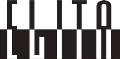
    »Elita« is a 100% geometric font designed on a 3 by 16 grid that makes it very slim. There are no optical tricks employed, it is purely geometric. The extreme narrow font design gives it high black and white contrast. The font is not made to write long copy, but it is perfect if you want to employ that magic between pure geometric and almost impossible to read. Just look at the samples and enjoy!
  34. Next Star - Unknown license
  35. Ongunkan Proto Bulgarian Runic by Runic World Tamgacı, $70.00
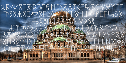
    Kъnig – the old Bulgar runes The writing kъnig emerged in the places of ancient Thraco-Bulgarian migrations in ante-deluvial times and developed in stages paralleling the other ancient writings. There have been many interactions and loanings between kъnig and these other writings. The root of the word kъnig (OBg: кънигъı) comes from the Old Chinese k'üen 'scroll' (ModCh: 纸卷 zhǐjuǎn) [57]. The word was loaned directly in the Bulgar language (*kün'ig > *küniv) restoring two individual Old Chuvash forms: 1. *k'ün'čьk > кўнчěк kind of ornament on a woman's garment; *k'ün'-gi / *k'ün'-üg > k'ün'iv book, codex, which is evidenced by the Hungarian könyv book and Mordvinian konov paper borrowings; 2. *k'ün'i- > *k'ün'i-gi > к'әn'iγь > кънигъı. This word has been preserved in Sumerian as kunuku (inscription) and kəniga (writing, knowledge). It is inherited from Bulgar to Slavic: книга (Bulgarian and Russian), књига (Serbian, Croatian and Slovenian), kniha (Czech and Slovak), książka (Polish), and non-Slavic: könyv (Hungarian) languages. Kъnig letters (kъni) have been known from archeological finds for more than 100 years already; however, until recently, no attempt has been made to decipher them, find their phonological value, or connect them to their natural successors: the Glagolitic and Cyrillic alphabets. The oldest mention on the Bulgar runes is found in the mid-9th c. AD work On the Letters by the Bulgarian writer Chernorizets Hrabъr. Being already a Christian, he wrote pejoratively about the pagan Bulgars
  36. LHF State Fair by Letterhead Fonts, $39.00
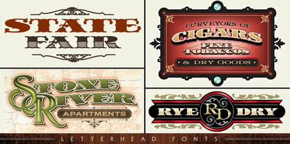
    Reminiscent of lettering used on old stock certificates from the late 1800’s. With its extra wide letters and ornate features, LHF State Fair commands attention. Get over 60 bonus panels and ornaments when you purchase the set (Regular, Lined & Light).
  37. Basco Std by Typofonderie, $59.00
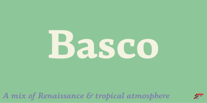
    A mix of Renaissance & tropical atmosphere Basco is an exploration of the Renaissance style, a period in which letterforms were informed primarily by hand writing. It is clearly a contemporary interpretation of calligraphic shapes forms. The serifs are subtly asymmetrical. Slightly curved arches on the n, m and u are noticeable, creating an interesting tension in the text. Bruno Mello’s distinctive style is most obvious in his mastery of super fluid curves. It is a result of his extensive exploration of calligraphic forms, their tensions and dynamics, mixing angularities with curves. The roman weights include alternate swashes, as well as initial and terminal glyphs. The italics, based on chancellery script, feature simple stroke endings, most visible on the s and c. ➼ Basco minisite
  38. PR Snowflakes 01 by PR Fonts, $12.00
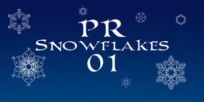
    These are curly designs arranged into fanciful snowflakes, evoking 1960’s psychedelia as well as Victorian romanticism. An excellent choice for any winter holiday material.
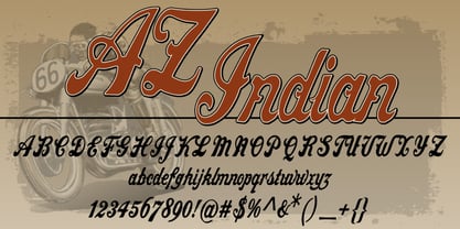
  39. AZ Indian by Artist of Design, $25.00
    AZ Indian font is inspired from the original early 1900's Indian Motorcycle Logo. This font is designed for use as a worn and antiqued headline.
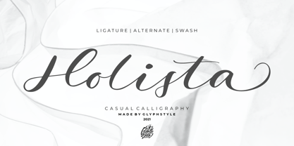
  40. Holista by GlyphStyle, $16.00
    Holista is a casual calligraphy writing style, in a consistent bold-thin cursive. Beautiful and pretty font. This calligraphy font can be use for weddings, cosmetic product, photography logo, magazine, business cards, watermarks, etc. – Font feature Uppercase, Lowercase, Numerals & Punctuations, Stylistic alternate(ending), Ss01(ending), Ss02(beginning) Ligature, Swashes, Multilanguage
Looking for more fonts? Check out our New, Sans, Script, Handwriting fonts or Categories
abstract fontscontact usprivacy policyweb font generator
Processing