4,260 search results
(0.03 seconds)
- Gather round, fellow digital travelers, for the tale of Verdana, the oft-overlooked hero of our screens. Born in the digital renaissance of the 1990s, Verdana was a child prodigy among fonts, designe...
- Xiomara - Personal use only

- LT White Fang - Personal use only

- Astralaga by SG Type,
$19.00 Elegant, graceful, and timeless. Astralaga is a versatile font family with a timeless, classic appeal, over 50 alternates & ligatures and multilingual support. Every letter has been hand-drawn and crafted with the upmost care. The variety of weights provide a range of choices that will help you find the best typographic character for your project. All 5 weights are well-suited for large display uses and high impact headlines. The available stylistic alternates and ligatures offer a number of different options that give your project a unique look. This high contrast serif typeface features a total of 1850 glyphs and offers comprehensive language support. THE 5 WEIGHTS OF ASTRALAGA Astralaga Light – very delicate and elegant Astralaga Regular – a classic beauty with gorgeous shapes Astralaga Medium – a great midground between lights and bolds Astralaga Semibold – high contrast and high impact Astralaga Bold – pure boldness and elegance FEATURES 5 weights High contrast 40 ligatures per weight 11 alternate glyphs per weight 1850 glyphs Comprehensive language support OpenType features: Access All Alternates, Discretionary Ligatures, Fractions, Kerning, Standard Ligatures, Stylistic Alternates, Stylistic Set 1, Superscript
 - Ares by Adam Jagosz,
$15.00 Ares is a crisp all-caps display typeface suitable for sci-fi logos and titles. It owes its peculiar futuristic vibe to angular, top-heavy letters that hang from the cap-height instead of sitting on the baseline. The typeface consists of six subfamilies available in 10 weights, as well as as two variable fonts of three axes: Weight [wght], ranging from 1 to 1000, Mid-height [MHGT], ranginf from 0 to 1000, Tracking [TRAK], ranging from 0 to -40. The mid-height axis affects the typeface's waistline, including crossbars, and divides the fonts into three subfamilies: Ares Lo, Ares, and Ares Hi. These three families are solid-stroked, and the other three families are their stencil-stylized counterparts: Ares Broken Hi, Ares Broken, and Ares Broken Lo. The tracking axis is only available in the variable versions, and proportionally affects the kerning, thus helping set the type more tightly without effort. Ares supports a wide range of Latin-based orthographies, including not only European, but also Vietnamese as well as major African languages like Hausa, Fula or Ewe.
 - Faux Pas JNL by Jeff Levine,
$29.00 The lettering found on an 1878 Salt Lake City advertisement for the Forepaugh’s Circus inspired Faux Pas JNL, which is a bit of a pun on the circus’ name and also a commentary on how this unusual lettering style seems to break all of the rules on stroke width and balance. According to Wikipedia: “Adam John Forepaugh (February 28, 1831 - January 22, 1890) was an American entrepreneur, businessman, and circus owner. Forepaugh owned and operated a circus from 1865 through 1890 under various names including Forepaugh's Circus, The Great Forepaugh Show, The Adam Forepaugh Circus, and Forepaugh & The Wild West. In 1889, Forepaugh sold his circus acts to James Anthony Bailey and James E. Cooper and he sold his railroad cars to the Ringling Brothers. The Ringlings used the equipment to transform their circus from a small animal-powered production to a huge rail-powered behemoth, which later purchased the Barnum & Bailey Circus. Thus, in liquidating his circus assets, he indirectly contributed to the demise of his arch-rival.” Faux Pas JNL is available in both regular and oblique versions.
 - French Stencil Moderne JNL by Jeff Levine,
$29.00 French Stencil Moderne JNL is modeled from an alphabet found in the 1930s publication "100 Alphabets Publicitaires" by M. Moullet, and is available in both regular and oblique versions. Strongly resembling the stencil motif of Futura Black, this French stencil alphabet has enough variations to give it a unique design flavor all its own.
 - Jackerton by noggindoodle,
$15.00 Jackerton is a playful, hand-drawn typeface inspired by the doodles of the designer's father. Every word is a puzzle with pieces changing and shifting as you type. Over 50,000 words in more than 100 latin-based languages have been scrutinized to make sure each combination of letters fits together precisely from the 2,000+ ligatures.
 - Falling Snowflakes by Gerald Gallo,
$20.00 Forty-six snowflake designs from the Snowflake Assortment font were three-dimensionally rotated to various viewing angles other than perpendicular (which is how they are viewed in the Snowflake Assortment). Holding the modifier keys, Shift, Option, Shift + Option, and typing the same character will access different views of the same leaf. Font contains 180 characters.
 - FHA Nicholson French by The Fontry,
$25.00 An Art Nouveau alphabet that has stood the test of time, Nicholson French, by legendary sign-painter Frank H. Atkinson, is over 100 years old and going strong. In modern typographic trim, it comes with OpenType feature replacement options and multi-language support, from standard Latin-1 to Latin Extended-A, Greek and Cyrillic.
 - Falling Leaves by Gerald Gallo,
$20.00 Forty-six leaf designs from the Leaf Assortment font were three-dimensionally rotated to various viewing angles other than perpendicular (which is how they are viewed in the Leaf Assortment). Holding the modifier keys, Shift, Option, Shift + Option, and typing the same character will access different views of the same leaf. Font contains 180 characters
 - Lazy Boutique by Bogstav,
$17.00 Lazy Boutique is and exciting and beautiful piece of work. It's 100% handmade and slightly irregular in an organic way. I've added X different versions: Regular, Line, Fill and Curl - mix and match to find your favourite kind of look . Use Lazy Boutique for your products that needs a handmade, organic and exciting look!
 - Nazgul by Hikhcreative,
$20.00 Nazgul is a modern dynamic sans serif font with subtle vintage characteristics. It works perfectly for film posters, headlines, block letters, subheadings, logo designs, big banners, classic and decorative typography, web designs, packaging and more. The two styles, Regular and Outline, include more than 100 ligatures and alternate characters allowing for versatility in design.
 - Grimalda by Hikhcreative,
$20.00 Grimalda is an elegant serif typeface with taste of modern and simplicity. It is perfectly for magazine cover, headline, wedding invitations, logo, brand, and many more. Grimalda have more than 100 characters of ligatures and alternates. You can create any imagination with this serif font. What's included? - Uppercase & Lowercase Characters - Multilingual support - Ligatures & Alternates Characters
 - RM Sans by Ray Meadows,
$19.00 RM Sans has been designed to offer an useful but inexpensive family of 5 regular weights; 3 condensed weights; 5 outline weights and an 'eco' alternative. Due to the modular nature of this design there may be a slight lack of smoothness to the curves at very large point sizes (around 100 pt and above).
 - Lippy by Thinkdust,
$10.00 Lippy is designed to give a 100% lipstick feel. The reason the lipstick feel is so authentic is because the original sketches were actually drawn in lipstick, taken into illustrator, retraced and then edited carefully in Fontlab. If you're after a lipstick typeface with an authentic feel, then lippy is the one for you.
 - Haunted House by HiH,
$8.00 Halloween lends itself to graphic images: witches, ghosts, bats, jack-o'lanterns and haunted houses. When we think of a haunted house, we generally think of a large, abandoned, derelict Victorian wood-frame house. The style is usually Second Empire or Queen Anne. There tends to be a lot of decoration. There is usually a porch or two with decorative spindle work. There is probably a tower, either square with a mansard roof such as one might see in Paris or round with a conical roof borrowed from a Loire Valley chateau. These houses were generally built in the United States between 1860 and 1900, products of the exuberance of a time before income tax. It took at least three servants to maintain such a house and was very expensive. Few can afford them today. That is why so many were converted to professional offices, multi-family dwellings or simply abandoned. HAUNTED HOUSE is our typographical contribution to Halloween. Based on our font PETRARKA ML, it features decorative capitol letters that utilize the silhouette of a Second Empire style house complete with a dead tree and a full moon. The font includes 8 ornaments suitable for flyers and party invitations. Revision 2.000 eliminates dual encoding, harmonizes metrics, adds new glyphs, and adds open type features. The zip package includes two versions of the font at no extra charge. There is an OTF version which is in Open PS (Post Script Type 1) format and a TTF version which is in Open TT (True Type)format. Use whichever works best for your applications.
 - Vendetta by Emigre,
$69.00 The famous roman type cut in Venice by Nicolas Jenson, and used in 1470 for his printing of the tract, De Evangelica Praeparatione, Eusebius, has usually been declared the seminal and definitive representative of a class of types known as Venetian Old Style. The Jenson type is thought to have been the primary model for types that immediately followed. Subsequent 15th-century Venetian Old Style types, cut by other punchcutters in Venice and elsewhere in Italy, are also worthy of study, but have been largely neglected by 20th-century type designers. There were many versions of Venetian Old Style types produced in the final quarter of the quattrocento. The exact number is unknown, but numerous printed examples survive, though the actual types, matrices, and punches are long gone. All these types are not, however, conspicuously Jensonian in character. Each shows a liberal amount of individuality, inconsistency, and eccentricity. My fascination with these historical types began in the 1970s and eventually led to the production of my first text typeface, Iowan Old Style (Bitstream, 1991). Sometime in the early 1990s, I started doodling letters for another Venetian typeface. The letters were pieced together from sections of circles and squares. The n, a standard lowercase control character in a text typeface, came first. Its most unusual feature was its head serif, a bisected quadrant of a circle. My aim was to see if its sharp beak would work with blunt, rectangular, foot serifs. Next, I wanted to see if I could construct a set of capital letters by following a similar design system. Rectangular serifs, or what we today call "slab serifs," were common in early roman printing types, particularly text types cut in Italy before 1500. Slab serifs are evident on both lowercase and uppercase characters in roman types of the Incunabula period, but they are seen mainly at the feet of the lowercase letters. The head serifs on lowercase letters of early roman types were usually angled. They were not arched, like mine. Oddly, there seems to be no actual historical precedent for my approach. Another characteristic of my arched serif is that the side opposite the arch is flat, not concave. Arched, concave serifs were used extensively in early italic types, a genre which first appeared more than a quarter century after roman types. Their forms followed humanistic cursive writing, common in Italy since before movable type was used there. Initially, italic characters were all lowercase, set with upright capitals (a practice I much admire and would like to see revived). Sloped italic capitals were not introduced until the middle of the sixteenth century, and they have very little to do with the evolution of humanist scripts. In contrast to the cursive writing on which italic types were based, formal book hands used by humanist scholars to transcribe classical texts served as a source of inspiration for the lowercase letters of the first roman types cut in Italy. While book hands were not as informal as cursive scripts, they still had features which could be said to be more calligraphic than geometric in detail. Over time, though, the copied vestiges of calligraphy virtually disappeared from roman fonts, and type became more rational. This profound change in the way type developed was also due in part to popular interest in the classical inscriptions of Roman antiquity. Imperial Roman letters, or majuscules, became models for the capital letters in nearly all early roman printing types. So it was, that the first letters in my typeface arose from pondering how shapes of lowercase letters and capital letters relate to one another in terms of classical ideals and geometric proportions, two pinnacles in a range of artistic notions which emerged during the Italian Renaissance. Indeed, such ideas are interesting to explore, but in the field of type design they often lead to dead ends. It is generally acknowledged, for instance, that pure geometry, as a strict approach to type design, has limitations. No roman alphabet, based solely on the circle and square, has ever been ideal for continuous reading. This much, I knew from the start. In the course of developing my typeface for text, innumerable compromises were made. Even though the finished letterforms retain a measure of geometric structure, they were modified again and again to improve their performance en masse. Each modification caused further deviation from my original scheme, and gave every font a slightly different direction. In the lower case letters especially, I made countless variations, and diverged significantly from my original plan. For example, not all the arcs remained radial, and they were designed to vary from font to font. Such variety added to the individuality of each style. The counters of many letters are described by intersecting arcs or angled facets, and the bowls are not round. In the capitals, angular bracketing was used practically everywhere stems and serifs meet, accentuating the terseness of the characters. As a result of all my tinkering, the entire family took on a kind of rich, familiar, coarseness - akin to roman types of the late 1400s. In his book, Printing Types D. B. Updike wrote: "Almost all Italian roman fonts in the last half of the fifteenth century had an air of "security" and generous ease extremely agreeable to the eye. Indeed, there is nothing better than fine Italian roman type in the whole history of typography." It does seem a shame that only in the 20th century have revivals of these beautiful types found acceptance in the English language. For four centuries (circa 1500 - circa 1900) Venetian Old Style faces were definitely not in favor in any living language. Recently, though, reinterpretations of early Italian printing types have been returning with a vengeance. The name Vendetta, which as an Italian sound I like, struck me as being a word that could be taken to signifiy a comeback of types designed in the Venetian style. In closing, I should add that a large measure of Vendetta's overall character comes from a synthesis of ideas, old and new. Hallmarks of roman type design from the Incunabula period are blended with contemporary concerns for the optimal display of letterforms on computer screens. Vendetta is thus not a historical revival. It is instead an indirect but personal digital homage to the roman types of punchcutters whose work was influenced by the example Jenson set in 1470. John Downer.
 - Apolline Std by Typofonderie,
$59.00 A Venetian serif in 6 styles The Apolline typeface family was created by Jean François Porchez as a means to study the transition from Renaissance writing into the first printing types. Rather than sticking to the method commonly used these days for the creation of revivals of Jenson or Bembo types, it seemed more interesting to try and get in the same mindset as those exceptional designers during this pivotal period in the history of typography. Thus Apolline is an exploration of the design methods used by people like Nicolas Jenson and his contemporaries for adapting handwriting with its multiple occurrences (a, a, a, b, b, b…) into single, unique signs (a, b…). Initially Jean François made drawings modelled after his own calligraphy. They were done at a very small size on tracing paper (2 cm high for the capitals) to preserve the irregularity of human handwriting. Besides emphasising the horizontal parts of the letter forms, the serifs were designed asymmetrically to reinforce the rhythm of the writing. The final drawings were produced at a large size (10 cm high for the capitals) to allow for subtle optimisation of specific details. The very narrow and fluid Apolline italic Influenced by various concepts for an ideal italic by Van Krimpen, Gill, etc. Apolline italic was designed at 8° degrees. Although the structure of the letterforms were informed by chancery scripts, the italic has full serifs like the roman. Very narrow and fluid, its unique design creates a good contrast when used in combination with its upright counterparts. Thanks to the presence of the serifs similar to roman typefaces it sets very neatly in large sizes. The next step was digitising the drawings with Ikarus (the pre-Bézier-curves era) to create the final roman and italic fonts. Two years later, when the family was expanded to six series the same method was used, this time with Fontographer. This was necessary for correcting a few problems caused by the conversion to Bézier outlines, and to add intermediate weights. Before the advent of feature-rich OpenType, quality type families consisted of several separate fonts for each weight to provide users with various sets of numerals, an extended ligature set and alternates, ornaments, and so on. Introducing Apolline Morisawa Awards 1993
 - Gypsy Curse - Unknown license

- Standard Request by Bogstav,
$18.00 Standard Request is 100% handmade, and was inspired by both grafitti and comic book lettering. When viewed at large sizes, the handmade look and feel really stands out - at the same time, Standard Request, is super legible even at really small sizes. I've added 5 slightly different versions of each letter, and they automatically cycle as you type!
 - Botanica by My Creative Land,
$18.00 Botanica is a 100% brush written font family with inky texture that was inspired by modern trends in brush lettering and design. The fonts look good both together or separately and possibilities are only limited by your imagination. Two types of initial and terminal swashed makes the Script font a good companion in wedding invitations design.
 - Lillyanstar by Maulana Creative,
$12.00 Lillyanstar is a casual handwriting font. It included opentype features Ligature. Lillyanstar support multilingual more than 100+ language. This font is good for logo design, Movie Titles, Books Titles, a short text even a long text letter and good for your secondary text font with sans or serif. Make a stunning work with Lillyanstar font. Cheers, MaulanaCreative
 - Righttoast by Maulana Creative,
$12.00 Righttoast is a modern script font. It's a clean store with high contrast line. It readable in short text. Righttoast includes opentype features Ligatures. It support multilingual more than 100+ language. This font is good for logo design, Movie Titles, Books Titles and any awesome project you create. Make a stunning work with Righttoast script font. Cheers, MaulanaCreative
 - Medieval Pixel VP by VP Type,
$11.00 Medieval Pixel VP is a highly stylized family of three fonts that combine familiar pixelfont forms with unique sharp details - evocative of a fantasy and historical aesthetic, retro video games, and horror movies. All styles include an extensive character set and numerous advanced OpenType features. Over 800 glyphs in each font ensure full support for over 200 languages.
 - Veggie Spray by PizzaDude.dk,
$16.00 I bet a lot of people would love to have a Veggie Spray - I bet they would use it to turn candy, ice cream, cakes and other fattening products into something more healthy! Well, this font has zero calories and is 100% handmade, and comes with contextual alternates - which means that every letter has 5 different versions!
 - Grand Prairie NF by Nick's Fonts,
$10.00This addition to the Whiz-Bang Woodtype series in based on a 100+ year-old typeface originally named Medallic. Due to the highly ornate nature of this font, it has a limited character set (no math operators or footnote accessories). The Opentype version of this font supports Unicode 1250 (Central European) languages, as well as Unicode 1252 (Latin) languages. - RM Elegance by Ray Meadows,
$19.00 With an obvious nod to Art Deco, this font offers a stylish design with distinctively elongated ascenders and descenders. Includes: Western European, Central European, Baltic & Turkish sets. Due to the modular nature of this design there may be a slight lack of smoothness to the curves at very large point sizes (around 100 pt and above).
 - Roasted by Crumphand,
$30.00 Hello, Introducing the new hand brush fonts Roasted. Roasted is truly hand made by 100%. This fonts have a Stylistic Set. You can access the Stylistic Set with lowercase too. Still have a good readibility and strong font. What's Included Inside The Fonts ? Uppercase Lowercase Numerals Symbols European Multilingual Stylistic Set 1 Stylistic Set 2 Thank You, Regards!
 - Modisframe by Cititype,
$17.00 Modisframe is a modern stylish Signature font with light mono-line stroke. This handwritten font has 100 ligature that multilanguages supported. Modisframe has the character of spontaneity and decisive mood. It will look great for digital signature, logotype, quotes, greeting cards, labels, packaging, social media overlays, prints, ads or make elegant wedding invitations and much more
 - Hachitos by Maulana Creative,
$11.00 Hachitos is a modern casual signature font. Hachitos included opentype features Ligatures and extra swash. Hachitos support multilingual more than 100+ language. This font is good for logo design, Movie Titles, Books Titles, a short text even a long text letter and any awesome project you create. Make a stunning work with Hachitos signature font. Cheers, MaulanaCreative
 - True South by Crumphand,
$20.00 Introducing True South Authentic Hand brush Fonts. this font made by 100% real brush to get real texture, strong but still calm. good for your product digital ads, thumbnail video, movie poster, book cover. as long you can match your graphic this font should be an option. What's Character Included ? Uppercase Lowercase Symbols Numerals Multilinguals Thank You, Regards!
 - Lansonia by Bosstypestudio,
$12.00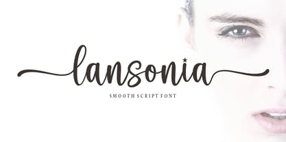 Lansonia is a modern calligraphy font with a dancing baseline and a clean, classic and elegant touch. It can be used for various purposes such as headings, signature, logos, wedding invitations, t-shirt, letterhead, signage, lable, news, posters, badges etc.Hello Bella Script features 300 total glyphs with 100 alternate characters including OpenType Stylistic alternates, ligatures and international language suppor
 - Purplemonths by Maulana Creative,
$12.00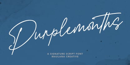 Purplemonths is a Modern Signature script font inspired by modern script nowadays, it is casual and fancy font. Purplemonths includes opentype features Ligatures. It support multilingual more than 100+ language. This font is good for logo design, Movie Titles , Books Titles and any awesome project you create. Make stunning work with Purplemonths Signature font. Cheers, MaulanaCreative
 - Codeworld by Par Défaut,
$49.00 Codeworld is a geometrical sans serif font family (5 weight, italic and variable) It contains more than 800 characters including the Latin, Cyrillic and Greek alphabet. There are also 13 OpenType features (Superior; Inferior; Numerator; Denominator; Fraction ; Small Capital; Small Capitals from Capitals; Contextual Alternate; Case Sensitive; Access All Alternates; Stylistic Set; Standard Ligature; Discretionary Ligature).
 - Spinwash by Hanoded,
$15.00 It is amazing how much laundry I have with 3 small kids! Sometimes it feels like I spend half the week sticking laundry in the machine, or hanging it out to dry. Spinwash is a nice brush font. It smells like ‘summer breeze’, is 100% environment friendly and will take the stains out of your designs.
 - Bombshell Pro by Emily Lime,
$54.00 Bombshell Pro is a passionate hand-calligraphy font that includes long connections between letters so you can create beautiful headings or signature looks. Open-type version features 800+ glyphs including initial and terminal letters, alternates, roman numerals (III & IV), and "run-on" letter connections. So you can create realistic hand-calligraphy on all of your creations!
 - Thoolloves by Maulana Creative,
$12.00 Thoolloves is a Cute modern calligraphy font. It's a clean store with high contrast line. It readable in short text. Thoolloves includes opentype features Ligatures. It support multilingual more than 100+ language. This font is good for logo design, Movie Titles, Books Titles and any awesome project you create. Make a stunning work with Thooloves handwriting font. Cheers, MaulanaCreative
 - Fallisanta by Maulana Creative,
$13.00 Fallisanta is a flourish script font with a little bit retro vibes and cursive high contrast stroke. Fallisanta includes opentype features Ligatures and Alternate lowercase flourish. It support multilingual more than 100+ language. This font is suitable for logo design, Movie Titles , Books Titles and any awesome project you create. Make stunning work with Fallisanta flourish font. Cheers, MaulanaCreative
 - Codeworld Mono by Par Défaut,
$49.00 Codeworld Mono is geometrical and monospaced sans serif font family (include 5 weight, italic and variable) It contains more than 800 characters including the Latin, Cyrillic and Greek alphabet There are also 11 OpenType features (Superior; Inferior; Numerator; Denominator; Fraction; Small Capital; Small Capitals from Capitals; Contextual Alternate; Case Sensitive; Access All Alternates; Stylistic Set; Standard Ligature; Discretionary Ligature).


