141 search results
(0.064 seconds)
- dT Jakob by dooType,
$30.00 dT Jakob started as a revival by Gustavo Soares for Paul van der Laan’s class at the Type and Media Masters, in The Hague, NL – back in 2007. There are quite a few excellent geometric sans typefaces available, but we did want to make our contribution and have a fine geometric face to offer. dT Jakob was born out of Erbar, by Jakob Erbar, one of the very first geometric sans, released in metal around 1926. Our goal was to make a versatile typeface, that handles display and text typography beautifully. To achieve that we designed a complete range of weights, matching italics and lots of OpenType Features. Hope you enjoy it :D
 - ITC New Baskerville by ITC,
$34.99 ITC New Baskerville is one of many contemporary type families based on the work of John Baskerville (1706-1775), a writing master and printer from Birmingham, England, whose types were cut by the punchcutter John Handy. Baskerville produced a masterpiece folio Bible for Cambridge University, and today, his types are considered to be fine representations of eighteenth-century rationalism and neoclassicism. ITC New Baskerville is a late 20th-century interpretation of Baskerville’s style, designed by John Quaranda. It makes an excellent and very readable text face; its sharp, high-contrast forms make it suitable for elegant advertising settings as well. ITC New Baskerville® font field guide including best practices, font pairings and alternatives.
 - Garnet Euro Typewriter by Coniglio Type,
$19.95Garnet is a rare TT typewriter face, made digital from analog samples gathered with great care by Coniglio Type. A time and place; type and life. Garnet Euro Typewriter is the first new release by designer Joseph V Coniglio in over 5 years. It is contemporary designer type, made from the struck steel hammers of an art deco san serif face transferred from a mechanical 1926 Royal Portable typewriter. It has an obsessively complete commercial roman character set ––for the pre-opentype environment of the late 1990's. Yes, it has that great “Monopoly Game” question mark -- and all on a period-piece typewriter! You should have no trouble grafting that sorely needed Euro symbol.” –And he very well did! - P22 FLW Exhibition by P22 Type Foundry,
$29.95 This font set is the second in a series from P22 Type Foundry based on the lettering styles of Frank Lloyd Wright. Created in 1931, the Exhibition lettering was intended primarily to accompany Frank Lloyd Wright's exhibition drawings and models. Many of the 72 Extras were designed to form continuous linking borders. Combinations of these geometric forms can provide endless variations of decorative elements in the style of Frank Lloyd Wright. Many of these images were based on Mr Wright's "Saguaro Forms and Cactus Flowers" illustration for an unused Liberty magazine cover of 1926. Other imagery in this set was derived from assorted geometric designs by Wright. Exhibition Regular, Light, and Bold have been remastered and now contain almost 400 characters including support for Western and Central European languages.
 - Cruickshank ML by HiH,
$12.00 Cruickshank is a decorative typeface from the late Victorian period. The upper case includes several letters with swash strokes, extending well below the baseline, as found in the original design. Alternatives to the swash caps are provided. The lower case contains small caps of simpler design. The face was designed by William W. Jackson and released by MacKellar, Smiths and Jordan Type Foundry of Samson Street, Philadelphia, Pennsylvania in 1886. MS&J was founded originally as Binny & Ronaldson in 1796 and later known as The Johnson Type Foundry. Cruickshank has a strong late Victorian flavor without the extravagance of so many fonts of the period. In its simplicity and clarity, it may be seen as a precursor to the Art Nouveau style that would develop a decade later.
 - Peckham by Los Andes,
$29.00 Peckham, designed by Daniel Hernández, is a contemporary and versatile slab serif of 8 weights (and matching italics)—ranging from an elegant Thin to a heavy Black—with strong serifs that give it a playful look while preserving the overall geometric structure of the font. Peckham comes with the standard Latinotype set of 395 glyphs resulting in a language support for 94% of the languages using the Latin alphabet. The font also includes stylistic alternates (A, R, Y, a) which provides extra versatility. The name of the font reminds us of the city that witnessed the birth of Vincent Figgins (1766). Figgins became known as the type designer who first included slab serif fonts in a commercial catalog. Peckham pays homage to classic typefaces yet looks very contemporary. Digital editing and corrections by Alfonso García.
 - Herold by HiH,
$10.00 Herold is a bold Art Nouveau advertising face released by H. Berthold, Berlin, Germany in 1901. It is also seen under the name “Herold Reklame.” The design is attributed to Hermann Hoffmann by the Klingspor Museum. A herold (‘herald’ in English, ‘heraldus’ in Latin) is one who delivers proclamations and announcements. Medieval heralds are often pictured with a horn with which to get everyone’s attention prior to performing his function. His only PA system was his own voice. Left and right glyphs of a herald with horn may be found at positions 137 and 172. Herold is quite compact with a high x-height, just right for making -- what else? -- announcements.
 - LiebeFish by LiebeFonts,
$19.90 LiebeFish is a collection of 172 individually hand-drawn fish. Each has its very own personality; some are happy, some are sad. Some like company, some are bored, most are cute and a few are weird. If you look closely, some fish will surely look like people you know. LiebeFish probably is the most comprehensive collection of hand-drawn fish ever. They look great on almost any greeting card, birthday card or invitation. LiebeFish also serve as a perfect companion to any informal graphic design that needs a personal, handmade touch. If you like this font, have a look at our other cute fonts such as LiebeTweet and LiebeRobots.
 - Brass by HiH,
$8.00 The Brass Family has a lineage that extends into English history. About five hundred years ago a devout, but anonymous Englishman gave glory to the God he worshipped by designing the capital letters and decorations of these two fonts. Originally recorded in The History Of Mediaeval Alphabets And Devices by Henry Shaw (London 1853), they are described by Alexander Nesbitt in his Decorative Alphabets And Initials (Mineola, NY 1959) as “Initials and stop ornaments from brasses in Westminster Abbey.” I wish I could say I remember seeing them when I was there, but that was forty-two years ago and all I remember was seeing the tomb of Edward the Confessor. One definition of “stop” as a noun is a point of punctuation. I have heard people from the British Isles speak of a “full stop” when referring to a period. Some may remember a 19th century form of communication called a telegram being read aloud in an old movie, with the use of the word “stop” to indicate the end of a sentence or fragment. A full dozen of these stop ornaments are provided. They occupy positions 060, 062, 094, 123, 125, 126, 135, 137, 167, 172, 177 & 190. The Brass Family consists of two fonts: Brass and Brass Too. Both fonts have an identical upper case and ornaments, but paired with different lower cases. Although the typefaces from which the lower cases were drawn are both of modern design, both are interpretations of the textura style of blackletter in use in England when the upper case and ornaments were fashioned for the Abbey. Brass is paired with Morris Gothic, which matches the color of the upper case quite well. Brass Too is paired with Wedding Regular, which is distinctly lighter than the upper case. I find it very interesting how each connects differently. The resulting fonts are unusual and most useful for evoking an historic atmosphere.
 - Ovink by The Northern Block,
$30.36 Ovink is a rounded type family designed for great distance legibility. Named after the legibility researcher Gerrit Willem Ovink, in its early stages was subjected to experimental legibilty investigations of distance and time threshold methods. The results of this heavily influence the design. The high regularity of the letters also makes the typeface suitable for running text and the wide span of weights motivates a broad usage for the setting of both display and text. Ovink is also loosely inspired by Knud V. Engelhardt’s work for the street signage, designed around the years 1926-27 for Gentofte in Denmark. Being rooted in the Danish typography tradition, Ovink has a sturdy unpretentious look to it, yet compared to its predecessor the curves are tighter, and characters have a higher level of differentiation. Details include 9 weights with matching italics.
 - Baskerville Old Face KTKM by KTKM,
$55.00 “So-called Baskerville Old Face of the type foundry Stephenson Blake & Co. of Sheffield. The Script is probably not immediately linked to Baskerville, but it is very much influenced by it. It is one of the most beautiful types of which the mats still exist; it has an incomparably different spirit than the ‘streamlined’ re-cuts of today’s Baskerville. Even keeping the general restraint extremely expressive. According to Berthold Wolpe (‘Signatures’ No. 18), the punches were cut and shown in samples in 1776 by Isaac Moore, who came from Birmingham to Bristol.” – Jan Tschichold, “Meisterbuch der Schrift”, Notes On The Plates, Page 231 Publisher note: I wanted to improve the contrast between thick and thin, reduce some ink-traps and give stems, serifs and links a smoother overall feel. I have also added some alternative letters and old style numerals.
 - 1584 Rinceau by GLC,
$20.00 This set of initial letters is an entirely original creation, inspired by French renaissance patterns used by Bordeaux printers circa 1580-1590. It contains two roman alphabets : the first of decorated letters, the second of single large capitals, all with Garamond style, and a few fleurons using the same background pattern style. Both containing Thorn, Eth, L slash and O slash. It can be used as variously as website titles, posters and flyers design, publishing texts looking like ancient ones, or greeting cards, all various sorts of presentations, as a very decorative, elegant and luxurious additional font... This font is conceived for enlargements, possibly strong ones, remaining very smart and very fine (especially decorated initials). This font may be used with all GLC Foundry blackletter fonts, but preferably with 1543 Humane Jenson, 1557 Italique, 1589 Humane Bordeaux, 1742 Civilite, 1776 Independence without any fear of anachronism.
 - Black Drum by Coniglio Type,
$19.95 Black Drum is a rare revival typewriter face, made digital from analog samples gathered with great care by Coniglio Type. A time and place; type and life. Black Drum is contemporary designer type, made from the struck steel hammers of an Art Deco Period san serif face transferred from a mechanical 1926 custom editor Royal Portable typewriter. Anna Conroy of Type Heritage, LLC, Philadelphia comments on Black Drum and its new place in time today: “Wow! nice lookin’ face Joseph! —Perfect, somewhere between Cable; [Rudolph Koch, 1927] (which was about the first transatlantic telegraph cable) with its raised x-height; and Futura [Paul Renner, 1928]. Yup, it has that great “Monopoly Game” question mark -- and all on a period-piece typewriter! You should have no trouble grafting that sorely needed Euro symbol.” –And he very well did! Author: Joseph Coniglio Producer: Coniglio Type MyFonts debut: October 2021
 - Alter Gotisch by Alter Littera,
$25.00 This is Alter Littera’s first original design. The font has been created by attempting not to reproduce any historical typeface in particular, but only to re-create the overall forms and style of classic black-letters from different time periods and places. Two specific sources must be acknowledeged nonetheless: (1) the “Black” type from William Caslon’s A Specimen of Printing Types (1785), and (2) the “Caslon Gotisch” type by D. Stempel A.G. (1926). In addition to the usual standard characters for typesetting in modern Western languages, the font includes a comprehensive set of special characters, alternates and ligatures, plus Opentype features, that can be used for typesetting as in antique writings and printings. The glyphs are clean, smooth and definitely readable, so the font will be suitable not only for large titles and headings, but also for full text pages. Specimen, detailed character map, OpenType features, and font samples available at Alter Littera’s The Oldtype “Alter Gotisch” Font Page.
 - P22 Wedge by IHOF,
$24.95 Wedge’ is the outcome of a search for the essence of a formal alphabet for text — for 26 letters of the simplest form consistent with ease of reading.. Noted New Zealand architect Bruce Rotherham (1926–2004) was inspired by Herbert Bayer’s ‘universal alphabet’ created at the Bauhaus in 1927. While he admired Bayer’s pure geometry, Rotherham felt it was ‘virtually unreadable’. The Bauhaus-inspired inclination for architectural publications to use sans serif faces provoked Rotherham to consider how a readable Roman book face might be approached using some of Bayer’s same principles of simplification, but also retracing the evolution and use of the Roman form in an analytic manner. The Wedge alphabet was started in 1947 when Rotherham was an architecture student at the University of Auckland. It was worked on and refined over several decades but never commercially released, until now. Over sixty years after it was first conceived, Wedge is available from P22.
 - 1565 Venetian by GLC,
$20.00 This set of initial decorated letters is an entirely original creation, drawn inspired by Italian renaissance engraver Vespasiano Amphiareo's paterns published in Venice circa 1568. It contains two roman alphabets : the first of large Initials, the second of small caps. Both containing thorn, eth, L & l slash, O & o slash. It can be used as variously as web-site titles, posters and flyers design, publishing texts looking like ancient ones, or greeting cards, all various sorts of presentations, as a very decorative, elegant and luxurious additional font... This font is conceived for enlargements remaining very smart and fine. The original height of the initials is at least about one inch equivalent to about four lines of characters, small caps may have the same height than the caps of the font used with, but cover two lines is better. This font may be used with all GLC blackletter fonts, but preferably with "1543 Humane Jenson", "1557 Italic", "1742 Civilite", "1776 Independence" without any fear for doing anachronism.
 - Museum Tertia Cursive by T4 Foundry,
$21.00Museum Tertia Cursive is inspired by a beautiful set of 126 matrices in the Swedish Norstedts type collection. These types were probably manufactured in Germany before 1750. The matrices are part of a set imported to Sweden by J.P. Lindh from Breitkopf & Härtel 1818. Now this exquisite design is available again, thanks to type designer Torbjörn Olsson. Please note modern additions like the ?-mark, @-sign and €-sign. Museum Tertia Cursive is an OpenType creation, for both PC and Mac. Swedish type foundry T4 premiere new fonts every month. Museum Tertia Cursive is our eighth introduction. Museum Tertia Cursive is part of the growing Museum type family. Museum also includes three different border fonts, an ornament font with some of Granjon's arabesques and a flowery Fournier font with Rococo capitals. - Futura Headline EF Pro by Elsner+Flake,
$103.00 The design of Futura seems to be timeless. This typeface family which had been developed in 1926 by Paul Renner for the Bauer Type Foundry in the style of constructivism and as part of the Bauhaus movement, experienced, however, in the course of the past 90 years, repeated time-appropriate revivals which guaranteed its on-going popularity. The version of the Futura EF Pro contains the original character constructions which Dennis Megaw described as the “first designs of Futura” in 1938 in “20th century sans serif types, Typography no. 7” (See: Dr. Christopher Burke: Paul Renner, Princeton Architectural Press, New York 1998). What makes it exceptional is the extension into three weights: “Text”, “Headline” and “Index” which came about as part of a degree dissertation at the Hochschule für Bildende Künste (HFBK) in Hamburg. In this context, the accompanying documentation “Die Kritik der reinen Futura” (“The Critique of the Pure Futura”) by Katharina Strauer was published by the Materialverlag, Hamburg, in 2003. Some copies are still available at Elsner+Flake.
 - Futura Text EF Pro by Elsner+Flake,
$103.00 The design of Futura seems to be timeless. This typeface family which had been developed in 1926 by Paul Renner for the Bauer Type Foundry in the style of constructivism and as part of the Bauhaus movement, experienced, however, in the course of the past 90 years, repeated time-appropriate revivals which guaranteed its on-going popularity. The version of the Futura EF Pro contains the original character constructions which Dennis Megaw described as the “first designs of Futura” in 1938 in “20th century sans serif types, Typography no. 7” (See: Dr. Christopher Burke: Paul Renner, Princeton Architectural Press, New York 1998). What makes it exceptional is the extension into three weights: “Text”, “Headline” and “Index” which came about as part of a degree dissertation at the Hochschule für Bildende Künste (HFBK) in Hamburg. In this context, the accompanying documentation “Die Kritik der reinen Futura” (“The Critique of the Pure Futura”) by Katharina Strauer was published by the Materialverlag, Hamburg, in 2003. Some copies are still available at Elsner+Flake.
 - Belwe by ITC,
$29.99The typeface Belwe, created in 1926 by German typographer and teacher Georg Belwe, has an uncommon style that is difficult to describe. It is a synthesis of many different genres: it is a slab serif with Art Nouveau style but also with many blackletter influences. The angled serifs on the ascenders and the calligraphic flourishes on the the upper and lowercase V, W, and Ys reference marks made by pens. There are also many other special characters that are unlike any other designs. Have a look at the fun lowercase a, the quirky lowercase f and g, and the unique C, F, L, and R for the uppercase. This design works especially well for display sizes, but is also good for short amounts of text. The mood and image suggested by this typeface is great for menus, invitations, and signs when you want to send a personal and friendly message. It's Art Nouveau roots also give it a place in history for designs from the Victorian period up through the 1920's and 30's - Belwe Mono by ITC,
$29.99 The typeface Belwe, created in 1926 by German typographer and teacher Georg Belwe, has an uncommon style that is difficult to describe. It is a synthesis of many different genres: it is a slab serif with Art Nouveau style but also with many blackletter influences. The angled serifs on the ascenders and the calligraphic flourishes on the the upper and lowercase V, W, and Ys reference marks made by pens. There are also many other special characters that are unlike any other designs. Have a look at the fun lowercase a, the quirky lowercase f and g, and the unique C, F, L, and R for the uppercase. This design works especially well for display sizes, but is also good for short amounts of text. The mood and image suggested by this typeface is great for menus, invitations, and signs when you want to send a personal and friendly message. It's Art Nouveau roots also give it a place in history for designs from the Victorian period up through the 1920's and 30's
 - Fleischmann Gotisch PT by preussTYPE,
$29.00 Johann Michael Fleischmann was born June 15th, 1707 in Wöhrd near Nuremberg. After attending Latinschool he started an apprenticeship as punchcutter in the crafts enterprise of Konstantin Hartwig in Nuremberg, which ought to last six years. For his extraordinary talent Fleischmann completed his apprenticeship after four and a half years, which was very unusual. 1727 his years of travel (very common in these days) began, during which he perfected his handcraft by working in different enterprises as journeyman. First location was Frankfurt/Main where he worked for nearly a year at the renowned type foundery of Luther and Egenolff. Passing Mainz he continued to Holland, where he arrived in November 1728 and stayed till he died in 1768. In Amsterdam he worked for several type founderies, among others some weeks for Izaak van der Putte; in The Hague for Hermanus Uytwerf. Between 1729 and 1732 he created several exquisite alphabets for Uytwerf, which were published under his own name (after his move to Holland Fleischmann abandoned the second n in his name), apparently following the stream of the time. After the two years with Uytwerf, Fleischmann returned to Amsterdam, where he established his own buiseness as punchcutter; following an advice of the bookkeeper and printer from Basel Rudolf Wetstein he opened his own type foundery 1732, which he sold in 1735 to Wetstein for financial reasons. In the following Fleischmann created several types and matrices exclusively for Wetstein. In 1743 after the type foundery was sold by Wetstein’s son Hendrik Floris to the upcoming enterprise of Izaak and Johannes Enschedé, Fleischmann worked as independent punchcutter mostly for this house in Haarlem. Recognizing his exceptional skills soon Fleischmann was consigned to cutting the difficult small-sized font types. The corresponding titling alphabets were mostly done by Jaques-Francois Rosart, who also cut the main part of the ornaments and borders used in the font examples of Enschedé. Fleischmann created for Enschedé numerous fonts. The font example published 1768 by Enschedé contains 3 titling alphabets, 16 antiquacuts, 14 italic cuts, 13 textura- and 2 scriptcuts, 2 greek typesets (upper cases and ligatures), 1 arabic, 1 malayan and 7 armenian font systems, 5 sets of musicnotes and the poliphonian musicnotesystem by Fleischmann. In total he brought into being about 100 alphabets - the fruits of fourty years of creative work as a punchcutter. Fleischmann died May 27th, 1768 at the age of 61. For a long time he was thought one of the leading punchcutters in Europe. A tragedy, that his creating fell into the turning of baroque to classicism. The following generations could not take much pleasure in his imaginative fonts, which were more connected to the sensuous baroque than to the bare rationalism of the upcoming industrialisation. Unfortunately therefore his masterpieces did not survive the 19th century and person and work of Fleischmann sank into oblivion. The impressive re-interpretation of the Fleischmann Antiqua and the corresponding italics by Erhard Kaiser from Leipzig, which were done for the Dutch Type Library from 1993 to 1997, snatched Fleischmann away from being forgotten by history. Therefore we want to place strong emphasis on this beautiful font. Fleischman Gotisch The other fonts by Fleischmann are only known to a small circle of connoisseurs and enthusiasts. So far they are not available in adequat quality for modern systems. Same applies the "Fleischman Gotisch", which has been made available cross platform to modern typeset-systems as CFF Open Type font through the presented sample. The Fleischman Gotisch has been proved to be one of the fonts, on which Fleischmann spent a good deal of his best effort; this font simply was near to his heart. Between 1744 and 1762 he created 13 different sizes of this font. All follow the same principles of forms, but their richness of details has been adapted to the particular sizes. In later times the font was modified more or less sensitive by various type founderies; letters were added, changed to current taste or replaced by others; so that nowadays a unique and binding mastercopy of this font is missing. Likewise the name of the font underwent several changes. Fleischmann himself probably never named his font, as he did with none of his fonts. By Enschedé this textura was named Nederduits, later on Nederduitsch. When the font was offered by the german type foundery Flinsch in Frankfurt/Main, the more convenient name of Fleischmann-Gotisch was chosen. In his "Masterbook of the font" and his "Abstract about the Et-character" Jan Tschichold refered to it as "Duyts" again. To honour the genious of Johann Michael Fleischmann we decided to name the writing "Fleischmann Gotisch PT" (unhyphenated). Developing the digital Fleischman Gotisch I decided not to use one of the thirteen sizes as binding mastercopy, but corresponding to the typical ductus of the font to re-create an independent use of forms strongly based on Fleischmann´s language of forms. All ascenders and descenders were standardised. Some characters, identified as added later on, were eliminated (especially the round lower case-R and several versions of longs- respectively f-ligatures) and others were adjusted to the principles of Fleischmann. Where indicated the diverse characters were integrated as alternative. They can be selected in the corresponding menu. All for the correct german black letter necessary longs and other ligatures were generated. Through the according integration into the feature-code about 85% of all ligatures in the type can be generated automatically. Problematic combinations (Fl, Fk, Fh, ll, lh, lk, lb) were created as ligatures and are likewise constructed automatically. A historically interesting letter is the "round r", which was already designated by Fleischmann; it is used after preceding round letters. Likewise interesting is the inventive form of the &-character, which is mentioned by Tschichold in his corresponding abstract. Nevertheless despite all interpretation it was very important to me to maintain the utmost fidelity to the original. With this digital version of a phantastic texturfont of the late baroque I hope to contribute to a blossoming of interest for this genious master of his kind: Johann Michel Fleischmann. OpenType features: - Unicode (ISO 10646-2) - contains 520 glyphes - Basic Latin - Latin-1 Supplement - Latin Extended-A - Latin Extended-B - Central European Glyhps - Ornaments - Fractions - Standard ligatures - Discretionary ligatures - Historical ligatures - Kerning-Table
 - Invitation Script by Intellecta Design,
$69.00 Iza W and Intellecta Design are proud to announce Invitation Script, a modern and clean revival of the classic work of the Portuguese master penman Manuel de Andrade de Figueiredo, whose work can be seen in “Nova Escola para aprender a ler, escrever, e contar (...)'' (1722). Invitation Script is the third script superfamily published by Intellecta Design, after Penabico and Van den Velde Script. Invitation Script has original letters designed by Iza W. Creative direction and core programming were provided by Paulo W. Chyrllene K assisted with some work on unusual and archaic styles, resulting in a special font - Invitation Script Archaic (soon available). Invitation started out from Andrade’s script style and evolved into a voluptuous script font family. The result is a typeface ideal for beautiful headings, signatures, art work typography, titles and short pieces of hand-lettered text. Invitation family includes two multi-table Opentype fonts, three supplementary fonts for ornaments and fleurons, and the Archaic font with some of the Andrade’s original characters. Embedded in the regular fonts are additional sets of letters. Over 40 variations are available for certain letters via the Special Sets Opentype table. The two regular versions of Invitation Script contains the following: (i) An extensive set of ligatures providing letterform variations that make eye-popping designs or simulate real handwriting. These are accessible via contextual alternates and other open-type features. (ii) Many stylistic alternates for each letter (upper and lowercase, accessed via the glyph palette, encoded in the ranges of the Special Set Opentype feature). Since there are over 1100 glyphs in each font, we suggest using the glyph palette. (iii) A set of ornaments and fleurons accessed with the glyph palette or using the Ornaments feature. Additional ornaments can be found in the two Invitation Script Ornaments fonts. (iv) Initial and final letters with artistic variations accessible using the initial and final form open-type features. (v) Major kerning work: over 6000 kerning pairs, hand-set to avoid collisions and to create intricate combinations of letters, using swashes and other resources. These powerful features are all accessible in InDesign, Illustrator, QuarkXpress and similar software. We recommend exploring the magic of this font using the glyph palette. Our sample illustrations and PDF brochures showcase the power and pizzazz of this calligraphic script. Let your imagination go wild and use Invitation Script in ways that Andrade could not have foreseen. In non-OpenType-savvy applications, Invitation Script is still an exceptionally beautiful calligraphic typeface that stands up to the competition. The regular fonts contains the complete Latin alphabet, including Central European, Vietnamese, Baltic and Turkish, with a full set of diacritics and punctuation marks. --- 1 FIGUEIREDO, Manuel de Andrade de, 1670-1735 Nova Escola para aprender a ler, escrever, e contar. Offerecida á Augusta Magestade do Senhor Dom Joaõ V. Rey de Portugal. Primeira parte / por Manoel de Andrade de Figueiredo, Mestre desta Arte nas cidades de Lisboa Occidental, e Oriental. - Lisboa Occidental: na Officina de Bernardo da Costa de Carvalho, Impressor do Serenissimo Senhor Infante, 1722. - [18], 156 p., 44 f. grav. a buril : il., ; 2º (31 cm)Engraved royal coat of arms supported by angels over the city of Lisbon, engraved portrait of the author (both of the foregoing by Bernard Picart), (12)ff., 156pp., engraved calligraphic section title, 44 engraved plates. Wood-engraved culs-de-lampe and lettrines. Sm. folio. “Andrade de Figueiredo was born in Espirito Santo, where his father was Governor of the ‘Capitania.’ The fine portrait is dated 1721 and is showing Figueiredo at the age of 48. He was an eminent calligrapher and a creator of the Portuguese handwriting until the reign of Don José I (ca. 1755). His work follows the style of the great Italian masters in its use of clubbed ascenders and descenders, and of Diaz Morante, the famous Spanish writing master, in its very elaborate show of command of hand. By his contemporaries, he was known as the ‘Morante portugues’” (Ekström). “Ce livre est un manuel, composé de quatre parties, destiné à apprendre à lire, à écrire, à conter ainsi que l’orthographe. Les planches comportent des examples d’écritures, d’alphabets et de textes ornés de remarquables traits de plume exécutés d’une main sûre et enjouée” (Jammes).
 - Larisch by HiH,
$8.00 Larisch is a hand-lettered design by the Austrian calligrapher and teacher, Rudolf von Larisch. The original was used for the title page of the 1903 edition of Beispiele Kunstlerischer Schrift (Examples of Artistic Writing). Larisch is an attractive, casual set of caps of even strokes with rounded terminals. Except for the terminals, it is similar in style to Kunstler Grotesk. The numerals are lining or ranging figures, meaning they line up with the baseline, unlike old-style text figures. All are of equal width for setting up columns of numbers. The letters are well formed and easy to read, as you would expect from a writing master. Ligatures includes CH (123), CK (125), FT (135), LA (137), LO (167), OO (172), CO (177) and TT (181. An alternative O with underscore is provided at position 111. Friendly, but not fancy -- a very useful all-cap font.
 - Patent Reclame by HiH,
$10.00 Patent Reclame manages to be light-hearted, while clearly showing its blackletter roots both in the shape of the individual letters and the rhythm of text on a page. The designer is unknown. Schriftgeisserei Flinsch of Frankfurt a.M. cast the face around 1895. Nicolete Gray shows a quite similar face called “Graphic,” from Stephenson Blake in 1896. Personally, I don't think that Patent Reclame looks like an English design, but I do not have any proof one way or the other. The numbers are proportional, intended for posters, not spreadsheets. Two ornaments are included, an art nouveau rose at #172 and a lilypad with long tendril at #177. Great for invitations, posters and flyers announcing fun events. Do not use for obituaries. Quite readable in smaller sizes for short blocks of text. I really like the buoyant quality -- a nice combination of discipline and enthusiasm.
 - Morekids by LetterStock,
$20.00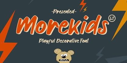 **Morekids Font** This pair was inspired by the playful poster design that i saw on some coffee shop, It was crafted by hand specially to add natural handmade feeling in its brand identity than i make it clean with pentool. **Opentype features** Morekids font has 176 character set included Morekids Font is very good looking in logo, labels, product packaging, invitations, advertising and others. This fonts works with folowing languages: Afrikaans, Albanian, Asu, Basque, Bemba, Bena, Chiga, Cornish, Danish, English, Estonian, Filipino, Finnish, French, Friulian, Galician, German, Gusii, Indonesian, Irish, Italian, Kabuverdianu, Kalenjin, Kinyarwanda, Low German, Luo, Luxembourgish, Luyia, Machame, Makhuwa-Meetto, Makonde, Malagasy, Malay, Manx, Morisyen, North Ndebele, Norwegian Bokmål, Norwegian Nynorsk, Nyankole, Oromo, Portuguese, Romansh, Rombo, Rundi, Rwa, Samburu, Sango, Sangu, Scottish Gaelic, Sena, Shambala, Shona, Soga, Somali, Spanish, Swahili, Swedish, Swiss German, Taita, Teso, Vunjo, Zulu Thank you for using this font. LS
 - Grindleaf by LetterStock,
$20.00 **Grindleaf Font** This pair was inspired by beautiful earth poster design that i saw on some coffee shop, It was crafted by hand specially to add natural handmade feeling in its brand identity than i make it clean with pentool. **Opentype features** Grindleaf font has 172 character set included Grindleaf Font is very good looking in logo, labels, product packaging, invitations, advertising and others. This fonts works with folowing languages: Afrikaans, Albanian, Asu, Basque, Bemba, Bena, Chiga, Cornish, Danish, English, Estonian, Filipino, Finnish, French, Friulian, Galician, German, Gusii, Indonesian, Irish, Italian, Kabuverdianu, Kalenjin, Kinyarwanda, Low German, Luo, Luxembourgish, Luyia, Machame, Makhuwa-Meetto, Makonde, Malagasy, Malay, Manx, Morisyen, North Ndebele, Norwegian Bokmål, Norwegian Nynorsk, Nyankole, Oromo, Portuguese, Romansh, Rombo, Rundi, Rwa, Samburu, Sango, Sangu, Scottish Gaelic, Sena, Shambala, Shona, Soga, Somali, Spanish, Swahili, Swedish, Swiss German, Taita, Teso, Vunjo, Zulu Thank you for using this font. LS
 - Asbigan by Sealoung,
$25.00 Asbigan is an beautiful and very elegant font for brand and logo design. Based on our experience as a graphic designer who works for a lot of companies, we often are requested to design a logo in a unique style but with an elegant shape. So, we try to brainstorming and create this font to make the idea is going out. This font have 126 BEAUTIFUL LIGATURES is perfect for BRANDING and LOGO DESIGN. You will get classy, elegant, and certainly unique logos with this font. Asbigan is also included full set of: ligatures uppercase and lowercase letters multilingual symbols numerals punctuation HOW TO ACCESS LIGATURES CHARACTERS Open glyphs panel: In Adobe Photoshop go to Window - glyphs In Adobe Illustrator go to Type - glyphs Thanks for checking out our font! I really hope you enjoy using it! If you have any questions I'd be more than happy to answer them, just send me a message!
 - Oliver Queen by LetterStock,
$17.00 Oliver queen Font This pair was inspired by the retro poster design that i saw on some coffee shop, It was crafted by hand specially to add natural handmade feeling in its brand identity than i make it clean with pentool. Opentype features Oliver queen font has 176 character set Cricket Font is very good looking in logo, labels, t-shirt prints, product packaging, invitations, advertising and others. What includes Multilingual support (Western European characters). This fonts works with folowing languages: Afrikaans, Albanian, Asu, Basque, Bemba, Bena, Chiga, Cornish, Danish, English, Estonian, Filipino, Finnish, French, Friulian, Galician, Gusii, Indonesian, Irish, Italian, Kabuverdianu, Kalenjin, Kinyarwanda, Low German, Luo, Luxembourgish, Luyia, Machame, Makhuwa-Meetto, Makonde, Malagasy, Malay, Manx, Morisyen, North Ndebele, Norwegian Bokmål, Norwegian Nynorsk, Nyankole, Oromo, Portuguese, Romansh, Rombo, Rundi, Rwa, Samburu, Sango, Sangu, Scottish Gaelic, Sena, Shambala, Shona, Soga, Somali, Spanish, Swahili, Swedish, Swiss German, Taita, Teso, Vunjo, Zulu Thank you for using this font. LS
 - Flinch by LetterStock,
$15.00 This pair was inspired by kids poster design that i saw on some coffee shop, It was crafted by hand specially to add natural handmade feeling in its brand identity than i make it clean with pentool. Opentype features Flinch font has 172 character set included Flinch Font is very good looking in logo, labels, t-shirt prints, product packaging, invitations, advertising and others. What includes Multilingual support (Western European characters). This fonts works with folowing languages: Afrikaans, Albanian, Asu, Basque, Bemba, Bena, Chiga, Cornish, Danish, English, Estonian, Filipino, Finnish, French, Friulian, Galician, Gusii, Indonesian, Irish, Italian, Kabuverdianu, Kalenjin, Kinyarwanda, Low German, Luo, Luxembourgish, Luyia, Machame, Makhuwa-Meetto, Makonde, Malagasy, Malay, Manx, Morisyen, North Ndebele, Norwegian Bokmål, Norwegian Nynorsk, Nyankole, Oromo, Portuguese, Romansh, Rombo, Rundi, Rwa, Samburu, Sango, Sangu, Scottish Gaelic, Sena, Shambala, Shona, Soga, Somali, Spanish, Swahili, Swedish, Swiss German, Taita, Teso, Vunjo, Zulu. Thank you for using this font. LS
 - Armthadore by LetterStock,
$15.00 Armthedore Script Font This pair was inspired by the retro poster design that i saw on some coffee shop, It was crafted by hand specially to add natural handmade feeling in its brand identity than i make it clean with pentool. **Opentype features** Armthedore Script font has 172 character set included Armthedore Script Font is very good looking in logo, labels, t-shirt prints, product packaging, invitations, advertising and others. What includes * Multilingual support (Western European characters). This fonts works with folowing languages: Afrikaans, Albanian, Asu, Basque, Bemba, Bena, Chiga, Cornish, Danish, English, Estonian, Filipino, Finnish, French, Friulian, Galician, Gusii, Indonesian, Irish, Italian, Kabuverdianu, Kalenjin, Kinyarwanda, Low German, Luo, Luxembourgish, Luyia, Machame, Makhuwa-Meetto, Makonde, Malagasy, Malay, Manx, Morisyen, North Ndebele, Norwegian Bokmål, Norwegian Nynorsk, Nyankole, Oromo, Portuguese, Romansh, Rombo, Rundi, Rwa, Samburu, Sango, Sangu, Scottish Gaelic, Sena, Shambala, Shona, Soga, Somali, Spanish, Swahili, Swedish, Swiss German, Taita, Teso, Vunjo, Zulu. Thank you for using this font. LS
 - Anziano Pro by MAC Rhino Fonts,
$59.00 Anziano follows the direction staked out with Delicato. When creating traditional typefaces, it is inevitable to be influenced by earlier designs. Anziano does show touches of another classic typeface – Weiss (by Emil Rudolf Weiss, 1926). Weiss is often misjudged and overlooked. Perhaps the most well known Swedish typeface – Berling (by Karl-Erik Forsberg, 1914–1995) is actually based largely on Weiss. MRF have appreciated the design of Weiss uprights for a long time. When Stefan Hattenbach bought the first Swedish edition of The Lord of the Rings (1959–61), in 2004, he was amazed by the excellent flow of the text presented on each page. Despite the very original character that Weiss has, it was a pleasure to read a book set in such a typeface. MRF realized that several major foundries had already done interpretations of Weiss, more or less true to the original. MRF didn’t want to add on to that list! Instead Stefan tried to find his own path. Anziano consists of three core styles, Regular, Italic and Bold; each with small caps, ornaments, stylistic ligatures, and extended Latin accents. Lining, tabular, oldstyle and smallcap numerals help round out Anziano’s typographic range and function.
 - Opa-locka JNL by Jeff Levine,
$29.00 Opa-locka JNL is named for a city in Miami-Dade County, Florida and is based on an Art Nouveau-era bit of hand lettering found on vintage sheet music. Legendary aviation pioneer Glenn Curtiss (who successfully developed the city of Miami Springs and the city of Hialeah with James Bright) began the development of Opa-locka around 1925 as a planned community with a "1001 Arabian Nights" theme. Plans for this exclusive community included a country club and a small private airfield, but the hurricane of 1926 derailed Curtiss' original vision of the city. Opa-locka gradually took shape as a residential area for middle-class families, but the closing of a long-established Marine base, changing demographics and a reputation for being a hot-spot for crime, drug abuse and corruption tarnished this once-grand community (which boasts the largest collection of Moorish Revival architecture in the Western hemisphere). Old-time Miamians bristle when the city's name (an abbreviation of a Seminole place name, spelled Opa-tisha-wocka-locka) is mis-spelled as "Opa-Locka", "Opa Locka" or "Opalocka". The correct name is hyphenated, and the second part is in lower case.
 - BF Rotwang Pro by BrassFonts,
$39.99 The BF Rotwang™ Pro is a contemporary new edition and re-design of a formerly design by Guido Schneider. Named after the C.L. Rotwang, the inventor of the Mensch-Maschine from the film Metropolis (1925/1926), BF Rotwang plays with the character traits of high-contrast transitional serif typefaces and Didone-style typefaces. BF Rotwang is a typeface characterized by balanced elegance. It is sensitive, sophisticated and self-confident, but unobtrusive. The heavy weights have the power and dynamic for strong headlines and exciting logotypes, the lighter cuts the elegance and lightness for use in continuous text. All letters and characters are a touch condensed, so the typeface looks compact and works space-saving. BF Rotwang™ Pro supports up to 200 Latin-based languages. The family comes with 7 weights plus matching Italics. Each font contains more than 1.220 glyphs, featuring a wide range of alternate characters, small caps, figure sets, fractions, more than 35 ligatures, many currency symbols, special characters and other useful symbols. The style sets give you the option to individualize and adjust the typeface to the requirement of your design, without changing the general visual feeling.
 - Andrade by DSType,
$19.00Andrade is a new typeface designed by Dino dos Santos in 2005. This typeface was inspired in the typographic work of Manoel de Andrade de Figueiredo (b.1670-d.1735), Nova Escola para Aprender a Ler, Escrever e Contar, printed in 1722 at Offcina de Bernardo da Costa de Carvalho. This is one of the most important books, and almost forgotten, about Portuguese calligraphy and typography, and the work of Andrade de Figueiredo is among the most amazing examples of type design of the Eighteenth Century. His work inspired Ventura da Silva, a Portuguese typographer, who in 1803 published a book named Regras Methodicas, where he redesigns some of Figueiredo's type specimens. But Ventura's purpose was to create a more elegant and readable typeface than Didot and Bodoni. This kind of typeface used to be called leitura and is a transition between the baroque and modern typography. Andrade is a brilliant text typeface and is available in Regular, Italic, Bold, Bold Italic, Ligatures, Ligatures Italic, Swashes and Ornaments. Andrade is my tribute to Portuguese typography and to the work of Manoel de Andrade de Figueiredo in particular. - Baskerville by Linotype,
$40.99John Baskerville (1706-1775) was an accomplished writing master and printer from Birmingham, England. He was the designer of several types, punchcut by John Handy, which are the basis for the fonts that bear the name Baskerville today. The excellent quality of his printing influenced such famous printers as Didot in France and Bodoni in Italy. Though he was known internationally as an innovator of technique and style, his high standards for paper and ink quality made it difficult for him to compete with local commercial printers. However, his fellow Englishmen imitated his types, and in 1768, Isaac Moore punchcut a version of Baskerville's letterforms for the Fry Foundry. Baskerville produced a masterpiece folio Bible for Cambridge University, and today, his types are considered to be fine representations of eighteenth century rationalism and neoclassicism. Legible and eminently dignified, Baskerville makes an excellent text typeface; and its sharp, high-contrast forms make it suitable for elegant advertising pieces as well. The Linotype portfolio offers many versions of this design: ITC New Baskerville® was designed by John Quaranda in 1978. Baskerville Cyrillic was designed by the Linotype Design Studio. Baskerville Greek was designed by Matthew Carter in 1978. Baskerville™ Classico was designed by Franko Luin in 1995." - Baskerville Classico by Linotype,
$29.99John Baskerville (1706-1775) was an accomplished writing master and printer from Birmingham, England. He was the designer of several types, punchcut by John Handy, which are the basis for the fonts that bear the name Baskerville today. The excellent quality of his printing influenced such famous printers as Didot in France and Bodoni in Italy. Though he was known internationally as an innovator of technique and style, his high standards for paper and ink quality made it difficult for him to compete with local commercial printers. However, his fellow Englishmen imitated his types, and in 1768, Isaac Moore punchcut a version of Baskerville's letterforms for the Fry Foundry. Baskerville produced a masterpiece folio Bible for Cambridge University, and today, his types are considered to be fine representations of eighteenth century rationalism and neoclassicism. Legible and eminently dignified, Baskerville makes an excellent text typeface; and its sharp, high-contrast forms make it suitable for elegant advertising pieces as well. The Linotype portfolio offers many versions of this design: ITC New Baskerville® was designed by John Quaranda in 1978. Baskerville Cyrillic was designed by the Linotype Design Studio. Baskerville Greek was designed by Matthew Carter in 1978. Baskerville™ Classico was designed by Franko Luin in 1995." - Baskerville LT by Linotype,
$40.99 John Baskerville (1706-1775) was an accomplished writing master and printer from Birmingham, England. He was the designer of several types, punchcut by John Handy, which are the basis for the fonts that bear the name Baskerville today. The excellent quality of his printing influenced such famous printers as Didot in France and Bodoni in Italy. Though he was known internationally as an innovator of technique and style, his high standards for paper and ink quality made it difficult for him to compete with local commercial printers. However, his fellow Englishmen imitated his types, and in 1768, Isaac Moore punchcut a version of Baskerville's letterforms for the Fry Foundry. Baskerville produced a masterpiece folio Bible for Cambridge University, and today, his types are considered to be fine representations of eighteenth century rationalism and neoclassicism. Legible and eminently dignified, Baskerville makes an excellent text typeface; and its sharp, high-contrast forms make it suitable for elegant advertising pieces as well. The Linotype portfolio offers many versions of this design: ITC New Baskerville® was designed by John Quaranda in 1978. Baskerville Cyrillic was designed by the Linotype Design Studio. Baskerville Greek was designed by Matthew Carter in 1978. Baskerville™ Classico was designed by Franko Luin in 1995."
 - Monotype Baskerville by Monotype,
$29.99 John Baskerville (1706-1775) was an accomplished writing master and printer from Birmingham, England. He was the designer of several types, punchcut by John Handy, which are the basis for the fonts that bear the name Baskerville today. The excellent quality of his printing influenced such famous printers as Didot in France and Bodoni in Italy. Though he was known internationally as an innovator of technique and style, his high standards for paper and ink quality made it difficult for him to compete with local commercial printers. However, his fellow Englishmen imitated his types, and in 1768, Isaac Moore punchcut a version of Baskerville's letterforms for the Fry Foundry. Baskerville produced a masterpiece folio Bible for Cambridge University, and today, his types are considered to be fine representations of eighteenth century rationalism and neoclassicism. Legible and eminently dignified, Baskerville makes an excellent text typeface; and its sharp, high-contrast forms make it suitable for elegant advertising pieces as well. The Linotype portfolio offers many versions of this design: ITC New Baskerville® was designed by John Quaranda in 1978. Baskerville Cyrillic was designed by the Linotype Design Studio. Baskerville Greek was designed by Matthew Carter in 1978. Baskerville™ Classico was designed by Franko Luin in 1995."
 - Colonial Press by Simeon out West,
$25.00 Colonial Press is a font based on serif typefaces designed by William Caslon I (1692-1766) and various revivals thereof. Caslon is cited to be the first original typeface of English origin, but some type historians point out the close similarity of Caslon's design to the Dutch Fell types, presumed to be the work of Dutch punchcutter Dirck Voskens. Colonial Press harkens to the look and feel of newspapers in Colonial North America around the mid 1700s without the rough edges commonly associated with colonial printing and many reconstructions. The rough quality of the American typeface is believed to be the result of oxidation from the exposure to seawater during the long voyage from England to the Americas. Colonial Press is a heavy font that retains some of the handcut quality of these fonts while smoothing out the irregularities that make many of these fonts so visually distracting at larger point sizes. For the italic version of this font, I chose to emulate the more ornate letterforms that I have encountered, giving the italic characters a more ornamental feel. Colonial Press comes with full punctuation and a 362 glyph character set for most Western European-based Latin alphabet languages. It is a font that is designed both for normal typing and for larger, decorative display.