10,000 search results
(0.047 seconds)
- Culebra by Mysterylab,
$18.00 Culebra is a neo-traditionalist small-caps font designed in the tradition of high-end metalwork craftspeople and Western & Victorian sign-painting styles. With a bit of a nod to the standard of perennial favorites like Copperplate Gothic font, Culebra brings some eye-catching design touches and a more condensed structure for more economical use of horizontal space. It's a font that is as readable as they come, and would hardly be out of place in any design context, as it truly takes on a complementary vibe to almost any font style you want to pair it with.
 - Centim by Tour De Force,
$25.00 Centim is contemporary sans with sharp top endings of stems that give a bit technical charm to typeface. With a squarish look, it can be used widely in all modern publications or become a part of an corporate identity. In smaller sizes, Centim offers good readability due to its simple and good balanced lines. Centim is available in Regular and Bold weights, as an ideal high-contrasted combination where all characteristics of the typeface are purely effective. Centim is the archaic Serbian word for Centimeter, a word that was mostly used in tailoring during XIX and XX century.
 - Augenblick by Etewut,
$20.00 I'm glad to introduce Augenblick! My new font fits to your design be it wedding invitation, corporative Identity or bottle of wine. Send flowers to your lover with a card signed with Augenblick, and see what happens! It has multi language support, so, please use your mother tongue. Good luck & be happy!
 - One of the guys by PizzaDude.dk,
$15.00 One of the guys is a simple, highly legible, mono lined comic book font. Simple, yes, but full of personality! Use it as it is, or spice up your text by using the extra layer. The extra layer could be ghouly slime, birthday cake cream, snow or whatever your imagination figures out!
 - Italia by ITC,
$29.00Italia is the work of Colin Brignall, a refreshingly different serif typeface. At first glance, Italia might seem comparable to any other square serif typeface, but it has a distinctive pattern all its own. Italia can be used as either a display or text typeface and will give any text a unique look. - Runaround Sue NF by Nick's Fonts,
$10.00In his book Brushstroke and Free-Style Alphabets, Dan X. Solo called this typeface "Tamarind Script" but, whatever its name, this sparkly little gem will add rollicking retro charm to any project it graces. The Opentype version of this font supports Unicode 1250 (Central European) languages, as well as Unicode 1252 (Latin) languages. - MD Grotesque by Margarita Dyakovich,
$12.00 MD Grotesque is sans serif font family with a modern and minimalist feel with high readability. It’s extremely versatile and can be used for a big variety of design projects. Perfect for any simple text. It comes in 3 weights and its matching italics. Each style includes Latin and Cyrillic character set.
 - Expletive Script by Barnbrook Fonts,
$50.00 Expletive Script is a modular font based on a circular form. Its characters can sit above or below the baseline to create unusual display typography and complex repeating patterns. Expletive Script has a playful spirit and simple geometry that makes it suitable for a variety of uses from fine detailing to expressive headlines.
 - Pyragy by Belli Creative,
$9.00 Pyragy is a display font with a classical vibe. It has beautifully crafted nine swashes. It’s genuine, interesting, and perfectly fits different design works, such as posters, book or album covers, digital spaces, or any other media. It supports various Latin-based languages and comes with powerful open-type and true-type features.
 - Grumpy Tiger by Hanoded,
$15.00 I really like tigers! In fact, I like all animals, but the tiger is my favorite! Grumpy Tiger is a ‘kiddie’ font: it is bold and rounded, very legible and doesn’t have complicated glyphs. It would look fantastic on new children’s books, posters and product packaging. Comes with a roaring amount of diacritics!
 - Ferrocarbon by Megami Studios,
$7.50 For the angular, blocky look, the future is Ferrocarbon! Designed primarily as a title font, I created it way back in 2013 and promptly forgot about, so I'm releasing it to the world now. it's meant to be used for your tech and sci-fi uses, but don't let us stop you there!
 - Chillerz by Hanoded,
$15.00 I was doodling away on a piece of paper, when I noticed that the weird letters I was producing were in fact a nice font. So, I decided to build it! Chillerz is a lovely, messy handmade script font. It comes with double letter ligatures, a healthy attitude and a relaxed fit.
 - Modern Fantasy by Hanoded,
$15.00 I have no idea why I named this font Modern Fantasy: it just popped up in my head and it stuck. I don’t consider myself to be ‘modern’ (but I’m certainly not old fashioned!), nor do I have particularly modern fantasies… Modern Fantasy is an elegant all caps font: thin, tall and lovely.
 - Munich Sans by Eldertype Studio,
$13.00 Munich Sans is minimalist and modern sans serif font. This font fits in any project. You can use it for a title, logo, quotes, or as a pairing in any script font. It is inspired by minimalist and geometric forms. This font creates modern minimal style. This font also supports multi-language!
 - Candywrap by Outerend,
$10.00 The design of the font, "Candywrap," was inspired by the various shapes of candies It gives soft and gentle, but optimistic and fun feel to your design. It offers round-shaped glyphs which can be uniquely used for your shop signs, logos, posters, menus, billboards, and many others! It's a caps only font.
 - Pixelfy by Crumphand,
$19.00 Introducing new fonts! its called Pixelfy. Pixelfy is hand made pixel font. perfect contour, shape and square. this font its very perfect match for your project. 8bit games, chiptunes music, vaporwave design, digital ads and quotes. What's inside the fonts ? Uppercase Lowercase Numerals & Punctuation Multilinguals Support Opentype Features Stylistic Alternates Thank you!
 - HT Farmacia by Dharma Type,
$19.99 This is a monoline script without descenders. Its tail gives us cute and lovely impression, but it is also methodical and punctual. Holiday Type Project offers retro hand drawing scripts. Inspired by retro script on shopfront lettering, wall paint advertisements in Italy around 1950s. Check out the script fonts from Holiday Type!
 - Labyrinthus Rounded by Cerri Antonio,
$30.00 Labyrinthus Rounded is a multiline decorative font that works very well for identity logos, posters and 3D-works. It continues the tradition of the precedent Labyrinthus but with a softer rounded impact. It's interesting to note that with it it's possible to play with the multiline concept to create endless overlapping geometric creations.
 - Zero Output by PizzaDude.dk,
$15.00 You may recognize the shapes of this font - it's because it's my Universitet font, but this time it took some beating, and turned into a grunge font! The output was Zero Output! It has 5 different versions of each letter and of course multilingual support! Go ahead and grunge up your next project!
 - Dialog by Linotype,
$39.00Dialog is my first sans serif. I had made some attempts earlier, but they didn't satisfy me. Dialog was, on the contrary, so inspiring that I made 19 different fonts of it, the most complete typeface for several years. I usually prefer typefaces with serifs, but I don't miss them in Dialog. The name needs no explanation. Dialog was released in 1993. - Cool Crayon by Hanoded,
$15.00 Cool Crayon is a nice typeface I created with the black crayola from my 3 year old son's crayola box. It was broken (because he tends to throw them around), but I managed to get the glyphs onto a sheet of paper. Cool Crayon is similar to Crayon Crumble, but is rounder and thicker. Cool Crayon comes with extensive language support.
 - Astoria Classic Sans by Alan Meeks,
$45.00 The latest addition to the Astoria Range, Astoria Classic Sans has the same basic Characteristics as Astoria but with vertical stress. A sans-serif companion to Astoria Sans. Unlike Astoria, but like Astoria Classic, the Italics in form are old style yet with a modern look. Designed specificaly as a text face it still works very well as a headline font.
 - Blackout by Blackout,
$20.00Blackout is the first and signature font to the Blackout Foundry. Inspired by gothic structures, but maintaining a constructive form. Everything in balance, simple, and straightforward. The font has hard corners on one end, and subtle curves on the other. It is intended for anyone wanting to have a moody appeal to their work, but still maintains a legible format. - Madera by Monotype,
$57.99 Malou Verlomme designed Madera with graphic designers in mind – drawing on his decade of experience designing bespoke type to create a versatile, easy-to-use geometric sans serif that ticks off a long list of branding requirements. Its sharp apexes add some flavour to the design, which offers an honest, trustworthy tone of voice – but with a twist. “The design doesn’t go out of its way to attract attention, but is still very solid,” explains Verlomme. “It still has a fair amount of warmth and personality, in a very understated manner. If you’re a large corporation, with a typeface being used in many different environments, you want something that’s easy to use but can sustain such a large amount of visibility.” The Madera typeface family has 32 fonts: Upright, Condensed and Italics. Each typeface contains over 650 glyphs with extensive Western, Central and Eastern European language support. It also supports OpenType typographic features like alternatives, ligatures and fractions. Madera Variables are font files which are featuring two axis and have a preset instance from Hairline to Extra Black.
 - Escuela by Cuchi, qué tipo,
$9.95 Escuela typeface is born in an attempt to reflect so many current influences of modern grotesque fonts that are trying to better reflect the values of today's world. Its compact proportions and high x-height, but at the same time with sort kind of modulation and open inktraps, propose a visual game that is worth enough to use it many places; Escuela can be striking and ideal for headlines in large text and heavy weights, but at the same time serious and readable in smaller bodies or regular and fine weights. Its wide range of characters, which includes a set of emoticons ideal for signage, work and evaluation documents, as well as inclusive, is ideal for educational centers, whether they are more playful (schools) or more pragmatic (universities). In fact, "Escuela" means “School” in English. For this reason, Escuela is your best ally when it comes to preparing texts that transcend students through a contemporary and different, but functional, character. Designed by Carlos Campos www.cuchiquetipo.com Dummy text from wikisource.org (1911 Encyclopædia Britannica/Universities).
 - Jules by DSType,
$45.00 At first glance, Jules, appears to be just one more Didonic variation, but a closer look starts revealing all the extraordinary features of this type family, specially designed for use in extremely big sizes. Jules reflect the last of the late 18th century and was inspired by several plates from a portuguese calligrapher named Antonio Jacintho de Araujo. Available in three different optical sizes: Big, Colossal and Epic, Jules has a plethora of ligatures and stylistic alternates, plus refined Italics and a super elegant Swashes version.
 - Nazare by Ndiscover,
$39.00 It all started with a Portuguese soap packaging from the first half of the 20th Century. The 5 uppercase letters that spell NAZARÉ were sufficient to drive the creation of this design. Nazaré fits in a semi-serif category and it has a large contrast. It works outstandingly in display use specially in the bolder weights that have even more contrast. The regular weights have a more moderate contrast and an overall less extravagant design, fitting best in the typographical conventions. this provides a better render in text use. You can use this font in large headlines, logos, posters, book covers, and general display use as well as short strings of text. Nazaré is the name of a small Portuguese fishing village known for its giant waves and peculiar people.
 - Louisa by Julia Hanft,
$30.00 Louisa is a monospaced font-family designed and optimized specifically for small font sizes. But even as headline font it looks good. It has a very good distinguishability of letter forms and legibility even in longer text paragraphs. The character of Louisa is a combination of strong elements and warm, friendly forms. The font family is not only designed for coding and tabular layout, but can be used in different fields of communication design. Therefore it provides two stylistic sets with different letter forms: one with the look of serious modern typewriter font, the second with more soft letter forms and elements of a real italic. Additionally it consists oldstyle numbers (and of course tabular numbers) and a set arrows. The font is available in four styles: regular, italic, bold and bold italic.
 - Fleursdumal by Letterhead Studio-YG,
$40.00 How should an authentic baudelairean type look like? Aesthetically beautiful, that’s for sure. Intellectual, neurotic. Uptight — oh, the conventions of the time. Easily readable — still 20 years to go until the age of art nouveau with its outrage of typefaces. It may have a vibe of a Paris salon - salute to the Parnassiens. Such a modern-class (don’t mix it with the modern-styled) pharmaceutical Antiqua. Contrasts, thin serifs, the integrity of the operating theatre. But Baudelaire is not Heredia. «Une charogne» is not that much a vivid metaphor as a drawing from nature. The baudelairean typeface should have its cavern, flow, dark side. Not to demonstrate the fragile romantic profile of a cursed poet, as Baudelaire was seen 130 years ago, but to express the real pain. A true, unattractive, egoistic, suicidal passion.
 - Berganza by Cuchi, qué tipo,
$9.95 "Berganza" is a typeface designed as a tribute to the spanish century called "Siglo de Oro". Embellished with several ornaments and swashes, it quickly reminds an age in which castilian arts & letters were flourished, as well as the fantasy knighty fables adventures of heroes, loved ladies and evil villains. Although the Siglo de Oro cannot be set in specific dates, it is generally considered to have lasted more than a century; between 1492, the year of the discovery of America and 1681, the year in which the writer Pedro Calderón dela Barca died. Lope de Vega, Francisco de Quevedo, or even William Shakespeare (in England) are also famous figures of this time. Berganza typeface takes its name from the main character of the picaresque novel "The Conversation of the Dogs" (Cervantes, 1613). Berganza is able to speak with the other dog Scipio on a big number of social & philosophical topics. Talking about technics, Berganza is a modern typeface but with a humanist flavour. Thanks to its various styles and flourishes, it immediately refers to the culteranism aesthetic of that time, whose aim was to elevate the noble over the vulgar. But also, Berganza takes advantage of the contemporary technology, highlighting in his drawing the contrasted forms and certain broken and unusual strokes in order to give it a brave and different style touch. Berganza includes four weights to be used for continuous reading with great visual richness. However, it is more recommended for large sizes, since its unusual and particular details appear when the letter grows. Finally, the hundreds of glyphs and Opentype features that it has incorporated, allow us to change the aesthetics of the type according to our needs. OPENTYPE FONT 518 CHARACTERS 1113 GLYPHS 4 INSTANCES (Regular, Bold, Italic & Bold Italic) 38 LANGUAGES 28 LAYOUT FEATURES (stylistic sets, ligatures, historical ligatures, swashes, contextual alternates, numerals, etc) DESIGNED BY CARLOS CAMPOS IN 2021 www.cuchiquetipo.com Dummy text from wikisource.org («Rinconete y Cortadillo», by Miguel de Cervantes).
 - Nicolas Cochin by Linotype,
$40.99Georges Peignot designed the font Nicolas Cochin based on copper engravings of the 18th century and Charles Malin cut the typeface in 1912 for the Paris foundry Deberny & Peignot. The font is named after the French engraver Charles Nicolas Cochin (1715-1790) although its style had little to do with that of the copper artist. Nicholas Cochin is a freer variation of another Peignot font, Cochin, a bit more balanced and elegant. - Bitumen by Hanoded,
$12.00 Bitumen is a sticky, black, and highly viscous liquid form of petroleum. When I created this font, it reminded me a bit of asphalt, hence the name. Bitumen is a handmade font based on Schmallfette Grotesk by Walter Haettenschweiler and Haettenschweiler font. The font was made with a Japanese brush pen, hence the bold lines. Bitumen comes in two styles: the regular, fat display font and a lighter version - both with italics.
 - Cute Selfie by Epiclinez,
$18.00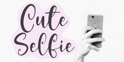 With its fun and playful style, Cute Selfie is perfect for all your creative projects! Whether you're creating invitations, birthday cards, or just looking for a font that adds a little bit of personality to your work, Cute Selfie is the right choice. So what’s included : Standard Latin. Numbers, symbols, punctuations, and ligatures. Multilingual Support. PUA encoded and fully accessible without additional design software. Simple Installations. Works on PC & Mac. Thank You!
 - Wushin by Twinletter,
$15.00 Every design project needs fonts, and the WUSHIN Blackletter font is ideal for any that calls for a gothic touch. A great place to look for fonts for your most recent logo, label, badge, music video, or film is the WUSHIN Blackletter font! This font is ideal for any project that requires a bit of gothic flair. Its various lovely and harmonious shapes let you select the perfect word for your project.
 - ALS Rundgang by Art. Lebedev Studio,
$63.00 ALS Rundgang is a decorative font designed specially for advertising purposes that reminds one of electronic display boards and bitmap typefaces. It includes only capital letters. Some of the letterforms are deliberately misshaped to have a teenage angular look‚it’s a bit crazy and out of proportion. Rundgang is well-suited for any youth-aimed design, such as various event and campaign materials, periodicals, flyers, leaflets, posters and other youngish marketing stuff.
 - Clafoutis by PintassilgoPrints,
$22.00 Clafoutis: tasty, sweet and tangy, handmade, an all original recipe. Go with the Regular for a richer option and with Rapide if you're on a light mood. Or better yet, go with both - and don't forget to sprinkle some Insolite bits over it! Notes from the test kitchen: Clafoutis Regular and Rapide contains 2 uppercase glyphs for each letter and extended language coverage. Clafoutis Insolite contains over 200 unexpected lovely pics. Use without moderation.
 - Antique Slabserif JNL by Jeff Levine,
$29.00 Antique Slabserif JNL is a reinterpretation of Monotype's Modern Antique 26, released in 1909. The name of the typeface is an oxymoron because Modern conflicts with Antique. Despite many critics of the "mechanical" look of the font's design, it has developed a bit of charm with age and the passing of time. Available in both regular and oblique versions, Antique Slabserif JNL can be used as both a text and headline font.
 - Bapalopa by Okaycat,
$24.50 Bapalopa is inspired by classic graffiti "blockbuster" letter forms. These letters are made to look as big and as wide as possible. Bapalopa's linework is kept very loose & relaxed, mostly smooth with some distressed edges. Viewed up-close, there is lots of texture from the individual pen strokes which gives Bapalopa it's cool freehand drawn look. Use "Bapalopa" and "Bapalopa Pa" together to create eye catching designs. To make it extra fun, a handful of the largely useless alternates, (like that dumb "currency" symbol) were replaced with big blocky hearts, stars, and arrows. Check it out! Bapalopa is extended, containing the full West European diacritics & a full set of ligatures, making it suitable for multilingual environments & publications.
 - CA Postal by Cape Arcona Type Foundry,
$39.00 CA Postal is a cute and clever little stamp-font. It was originally intended for a record-cover only, but when the artist wanted all lyrics printed in the booklet, it was time for a font. The initial inspiration was a moveable-stamp printing-set, which had a nice Futura-like style, being very pleasant to read, especially in small sizes. But of course it’s the loose and irregular outlines that give the font its special charms. CA Postal features two sets of characters and the "Contextual Alternates" feature will make sure that never two identical characters will stand next to each other, so that the stamp-look becomes even more authentic.
 - Cherritt by Greater Albion Typefounders,
$9.95 We think of Cherritt as a 'bullnosed' serif face, because of its rounded off serifs. What that phrase may not convey is the friendly, approachable nature of this large family of faces. The design was originally inspired by traditional draftsmens' hand-drawn serif lettering, but has been given a precise geometric flavor that suits it for work owing its inspiration to any era, from Victorian times through to the purely modern. They are ideal for headings and poster work, but also for setting small volumes of text. Four weights are included in the family, as well as wide, expanded and condensed forms, true small capitals and openface forms. All family members embody extensive OpenType features.