10,000 search results
(0.032 seconds)
- Flat10 Fraktur by Dharma Type,
$14.99 The pixelated blackletter which called Fraktur, the most famous calligraphic letter in Germany. This 8-bit pixel font is designed with respect for 80s game designers and the pixel font pioneers in middle 90s. Use at size 10 pixels or multiples of 10 and anti-alias off is recommended. List of our Pixel Font Project. ·Flat10 Antique ·Flat10 Artdeco ·Flat10 Arts&Crafts ·Flat10 fraktur ·Flat10 Holy ·Flat10 Holly ·Flat10 Segments ·Flat10 Stencil ·Flat20 Gothic ·Flat20 Headline ·Flat20 Hippies ·Flat20 Streamer ·Behrensmeyer Vigesimals ·Civilite Vigesimals
 - Qritticaly by Maulana Creative,
$14.00 Qritticaly is a Marker Script font. With regular marker stroke, fun character with a bit of ligatures and has a to files lowercase alternates. To give you an extra creative work. Qritticaly font support multilingual more than 100+ language. This font is good for logo design, Social media, Movie Titles, Books Titles, a short text even a long text letter and good for your secondary text font with sans or serif. Make a stunning work with Qritticaly font. Have some fun enjoy the products :) Cheers, MaulanaCreative
 - Brimons by Maulana Creative,
$15.00 Brimons is a condensed retro feel sans serif font. With medium low contrast stroke Caps and small caps, fun character with a bit of ligatures and alternates. To give you an extra creative work. Brimons font support multilingual more than 100+ language. This font is good for logo design, Social media, Movie Titles, Books Titles, a short text even a long text letter and good for your secondary text font with sans or serif. Make a stunning work with Brimons font. Cheers, Maulana Creative
 - Flat10 Holly by Dharma Type,
$14.99 Very decorative pixel font which has organic and soft impressions. The best pixel font for Christmas. This 8-bit pixel font is designed with respect for 80s game designers and the pixel font pioneers in middle 90s. Use at size 10 pixels or multiples of 10 and anti-alias off is recommended. List of our Pixel Font Project. ·Flat10 Antique ·Flat10 Artdeco ·Flat10 Arts&Crafts ·Flat10 fraktur ·Flat10 Holy ·Flat10 Holly ·Flat10 Segments ·Flat10 Stencil ·Flat20 Gothic ·Flat20 Headline ·Flat20 Hippies ·Flat20 Streamer ·Behrensmeyer Vigesimals ·Civilite Vigesimals
 - Nirbon Duo by Maulana Creative,
$16.00 Nirbon is a Retro sans and script font duo. With Rough sans stroke and medium contrast script stroke, fun character with a bit of ligatures and alternates. To give you an extra creative work. Shorebird font support multilingual more than 100+ language. This font is good for logo design, Social media, Movie Titles, Books Titles, a short text even a long text letter and good for your secondary text font with sans or serif. Make a stunning work with Nirbon font. Cheers, Maulana Creative
 - Black Rough by Maulana Creative,
$13.00 Black Rough Script Font is a casual signature script font. With semi bold consist stroke, fun character with a bit of ligatures and alternates. To give you an extra creative work. Black Rough Script Font support multilingual more than 100+ language. This font is good for logo design, Social media, Movie Titles, Books Titles, a short text even a long text letter and good for your secondary text font with sans or serif. Make a stunning work with Black Rough Script Font. Cheers, Maulana Creative
 - Offenders Club by Maulana Creative,
$14.00 Offenders Club is a signature script and sans serif font. With thin felt tip stroke condensed sans serif Display, fun character with a bit of ligatures. To give you an extra creative work. Offenders Club font support multilingual more than 100+ language. This font is good for logo design, Social media, Movie Titles, Books Titles, a short text even a long text letter and good for your secondary text font with sans or serif. Make a stunning work with Offenders Club font. Cheers, MaulanaCreative
 - Olds Murray by Maulana Creative,
$15.00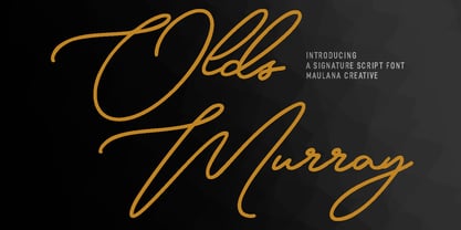 Olds Murray is an expressive casual signature script font. With regular consist mono-line contrast stroke, fun character with a bit of ligatures and alternates. To give you an extra creative work. Olds Murray font support multilingual more than 100+ language. This font is good for logo design, Social media, Movie Titles, Books Titles, a short text even a long text letter and good for your secondary text font with sans or serif. Make a stunning work with Olds Murray font. Cheers, Maulana Creative
 - Loopy Lola by Mix Fonts,
$29.00 MIX LOOPY LOLA is a very fun, quirky, off-kilter all-uppercase handwritten font. This handdrawn typeface is perfect for social media graphics, edgy posters, and bold headlines. Match the font with some fun loopy doodled elements to give your art that added bit of cute. Character set to includes (standard alphabet, punctuation, extended, accented, ligatures): ABCDEFGHIJKLMNOPQRSTUVWXYZ abcdefghijklmnopqrstuvwxyz 0123456789 !@$#%^&*()`~♥❤✿•· ÷×+−±≈=≠≥≤[]:;'",.|/?{}“”‘’-–—_… ©®™«»°¹²³ªº¡¿₱¢€£¥½¼¾¶§№† ÁÀÂÄÃÅĂĀĄÆĆĈČÇÐĐÉÈÊËĖĒĘĜĤIÍÌÎÏĪĮĴŁŃÑŇ ÓÒÔÖÕØŌŐŒŔŘŚŜŠȘŤȚÚÙÛÜŮŰŪŲẀẂŴÝŶŸŹŽŻÞ áàâäãåăāąæćĉčçðđéèêëėēęĝĥıíìîïīįĵłńñň óòôöõøōőœŕřśŝšșťțúùûüůűūųẁẃŵýŷÿźžżþß LIGATURES: bb dd ff gg itt kk ll mm nn oo pp rr ss tt
 - Logkey Block by Maulana Creative,
$12.00 Logkey Block is a fancy unique font. With bold square stroke, fun character with a bit of ligatures and has a two files lowercase alternates. To give you an extra creative work. Logkey Block font support multilingual more than 100+ language. This font is good for logo design, Social media, Movie Titles, Books Titles, a short text even a long text letter and good for your secondary text font with sans or serif. Make a stunning work with Logkey Block font. Cheers, Maulana Creative
 - Stand Against by Maulana Creative,
$15.00 Stand Against Handwritten Graffiti Font Stand Against is a street display graffiti script font. With back slanted mono-line stroke, fun character with a bit of ligatures and alternates. To give you an extra creative work. Stand Against font support multilingual more than 100+ language. This font is good for logo design, Social media, Movie Titles, Books Titles, a short text even a long text letter and good for your secondary text font with script or signature. Make a stunning work with Stand Against font. Cheers, MaulanaCreative
 - Kicaps by Grontype,
$13.00 Kicaps is an unique all caps sans serif and bold modern look font. This Font design presents a unique display of each characters that created awesome typeface. Also Kicaps design gives a bit more of a restrained option by keeping with more classic sans serif letterforms. Kicaps font provides a distinct, creative, and expressive message for branding, advertising, packaging, headlines, magazines, websites, logos, and more. Kicaps Features: Uppercase glyphs Numeral and Punctuations Currencies Standard Ligatures Stylistic Alternates Thankyou for choosing this font, Enjoy Regards, Grontype
 - Christie Dianna by Maulana Creative,
$14.00 Christie Dianna Font is a mono-line signature script font. With clean light stroke, fun character with a bit of ligatures, two files lowercase alternates and swashes. To give you an extra creative work. Christie Dianna font support multilingual more than 100+ language. This font is good for logo design, Social media, Movie Titles, Books Titles, a short text even a long text letter and good for your secondary text font with sans or serif. Make a stunning work with Christie Dianna font. Cheers, MaulanaCreative
 - Hinterlands by Maulana Creative,
$14.00 Hinterlands is a signature brush script font. With regular rough brush stroke, fun character with a bit of ligatures extra swash and alternates. To give you an extra creative work. Hinterlands font support multilingual more than 100+ language. This font is good for logo design, Social media, Movie Titles, Books Titles, a short text even a long text letter and good for your secondary text font with sans or serif. Make a stunning work with Hinterlands font. What you get: - Hinterlands - Hinterlands Swash Cheers, MaulanaCreative
 - Origin Story by Comicraft,
$49.00 Down in his secret underground font laboratory, mild mannered John Roshell was tinkering with his iPad when the Apple Pencil suddenly bit him and he found himself feverishly creating letterforms on the tablet... Before long his hand was burning and glowing with superspeed — his penstrokes were longer than one-eighth of a mile; he was suddenly able to letter a twenty-story omnibus with newfound fontastic strength and could create tremendous weights with more leading than an express train... And thus was born: ORIGIN STORY!
 - Dual by North Type,
$- DUAL is a full width sans-serif typeface with an experimental side. Its straight lines and 90 degree angles give it a very geometric feel without hindering its legibility. It’s now available in 6 weights, ranging from 100 to 600. The idea behind DUAL has been brewing for quite some time, and though there has been many “experimental” released in the past, it does have its unique features. For starters, it is a fully usable and legible font in its original state. Also, its 251 alternate glyphs and 10 stylistic sets are, of course, its main attraction making DUAL a very versatile typeface for any user, from the casual designer to the hardcore artist. Finally, it has extensive additional language support for the Americas and parts of Europe. With its 563 glyphs, It’s actually two fonts in one, and thus the name DUAL. Enjoy!
 - Chump Change by AdultHumanMale,
$20.00 Chump Change is a fun chunky serif ALL CAPS display font. I wanted it to look blocky and loud, So it can scream from Posters and Headlines. It has over 300 glyphs, several variations on the standard alphabet and all those extra pesky foreign features. OpenType coded, it has various letter pairings that interlock automatically to create a more randomized, bespoke feel to your copy. It also has some extra characters available directly through your glyphs palette. Play around with it, I hope you like it.
 - ADIstiLleRS Font - Personal use only

- Australian Sunset - Unknown license

- JH_TITLES - Unknown license

- 04b03rev - Unknown license

- Balearic Thread by Image Daddy Collection,
$31.00 Please note: the wispy effect in the illustrations were applied to characters from the font but is not part of the font itself.
 - Scat Dingbats by Monotype,
$29.99Scat Dingbats from Laurie McCanna is a set of eclectic icons originally offered with the Scat typeface but useful as general purpose symbols. - Ript Cure by insigne,
$19.99RiptCure is a futuristic, but usable typeface for everything from logotypes to magazine headlines. Several weights are included, including an interesting Ultra Light. - Desk Jockey JNL by Jeff Levine,
$29.00Desk Jockey JNL features the same font found in Jeff's Levine's Mailbox Letters JNL (based on self-adhesive lettering), but without the rectangles. - joeHand 1 by JOEBOB graphics,
$- JoeHand was one of the first scripts by JOEBOB graphics. A complete character set with numbers and most (but not all) special signs.
 - Janda Sparkle And Shine by Kimberly Geswein,
$5.00 This font is studded with sparkles but is still completely readable. Perfect for the holidays or for anything requiring a touch of glitz!
 - Sea by Luke Thompson,
$30.00 Sea is a versatile sans serif font that works well in a variety of sizes and applications. It's friendly, but robust and professional.
 - Model Railroad JNL by Jeff Levine,
$29.00 The block style lettering with rounded corners found on a package for model railroad kit parts was the inspiration for Model Railroad JNL.
 - Resiliency3 by Alphabet Agency,
$15.00 Resiliency3 font family was designed for use in sports and fitness themes. Gaming is another genres that the font family pairs well with.
 - Peanut Butter Man by PizzaDude.dk,
$20.00Forget everything about Times New Roman and all the other classic typefaces! Forget all that and take a bite of Peanut Butter Man! - LD Absurd by Illustration Ink,
$3.00This downloadable font has silly written all over it. Its versatile style makes it useful for all sorts of absurd or comical themes. - Saneyi by Andfonts,
$14.00 Saneyi is a fun, rich and emotional display font. This font is perfect for parties, birthdays, celebrations, names. Use it for your designs and explore its endless possibilities. It can easily be matched to an incredibly large set of projects, so add it to your creative ideas and notice how it makes them stand out!
 - Rotis Semi Sans by Monotype,
$40.99 Rotis¿ is a comprehensive family group with Sans Serif, Semi Sans, Serif, and Semi Serif styles, for a total of 17 weights including italics. The four families have similar weights, heights and proportions; though the Sans is primarily monotone, the Semi Sans has swelling strokes, the Semi Serif has just a few serifs, and the Serif has serifs and strokes with mostly vertical axes. Designed by Otl Aicher for Agfa in 1989, Rotis has become something of a European zeitgeist. This highly rationalized yet intriguing type is seen everywhere, from book text to billboards. The blending of sans with serif was almost revolutionary when Aicher first started working on the idea. Traditionalists felt that discarding serifs from some forms and giving unusual curves and edges to others might be something new, but not something better. But Rotis was based on those principles, and has proven itself not only highly legible, but also remarkably successful on a wide scale. Rotis is easily identifiable in all its styles by the cap C and lowercase c and e: note the hooked tops, serifless bottoms, and underslung body curves. Aicher is a long-time teacher of design and has many years of practical experience as a graphic designer. He named Rotis after the small village in southern German where he lives. Rotis¿ is suitable for just about any use: book text, documentation, business reports, business correspondence, magazines, newspapers, posters, advertisements, multimedia, and corporate design.Today Rotis ia also available with pan european caracter set.
 - Rotis Semi Sans Paneuropean by Monotype,
$92.99Rotis¿ is a comprehensive family group with Sans Serif, Semi Sans, Serif, and Semi Serif styles, for a total of 17 weights including italics. The four families have similar weights, heights and proportions; though the Sans is primarily monotone, the Semi Sans has swelling strokes, the Semi Serif has just a few serifs, and the Serif has serifs and strokes with mostly vertical axes. Designed by Otl Aicher for Agfa in 1989, Rotis has become something of a European zeitgeist. This highly rationalized yet intriguing type is seen everywhere, from book text to billboards. The blending of sans with serif was almost revolutionary when Aicher first started working on the idea. Traditionalists felt that discarding serifs from some forms and giving unusual curves and edges to others might be something new, but not something better. But Rotis was based on those principles, and has proven itself not only highly legible, but also remarkably successful on a wide scale. Rotis is easily identifiable in all its styles by the cap C and lowercase c and e: note the hooked tops, serifless bottoms, and underslung body curves. Aicher is a long-time teacher of design and has many years of practical experience as a graphic designer. He named Rotis after the small village in southern German where he lives. Rotis¿ is suitable for just about any use: book text, documentation, business reports, business correspondence, magazines, newspapers, posters, advertisements, multimedia, and corporate design.Today Rotis ia also available with pan european caracter set. - Rotis Semi Serif Paneuropean by Monotype,
$92.99Rotis¿ is a comprehensive family group with Sans Serif, Semi Sans, Serif, and Semi Serif styles, for a total of 17 weights including italics. The four families have similar weights, heights and proportions; though the Sans is primarily monotone, the Semi Sans has swelling strokes, the Semi Serif has just a few serifs, and the Serif has serifs and strokes with mostly vertical axes. Designed by Otl Aicher for Agfa in 1989, Rotis has become something of a European zeitgeist. This highly rationalized yet intriguing type is seen everywhere, from book text to billboards. The blending of sans with serif was almost revolutionary when Aicher first started working on the idea. Traditionalists felt that discarding serifs from some forms and giving unusual curves and edges to others might be something new, but not something better. But Rotis was based on those principles, and has proven itself not only highly legible, but also remarkably successful on a wide scale. Rotis is easily identifiable in all its styles by the cap C and lowercase c and e: note the hooked tops, serifless bottoms, and underslung body curves. Aicher is a long-time teacher of design and has many years of practical experience as a graphic designer. He named Rotis after the small village in southern German where he lives. Rotis¿ is suitable for just about any use: book text, documentation, business reports, business correspondence, magazines, newspapers, posters, advertisements, multimedia, and corporate design. Today Rotis ia also available with paneuropean caracter set. - Rotis Semi Serif by Monotype,
$40.99 Rotis¿ is a comprehensive family group with Sans Serif, Semi Sans, Serif, and Semi Serif styles, for a total of 17 weights including italics. The four families have similar weights, heights and proportions; though the Sans is primarily monotone, the Semi Sans has swelling strokes, the Semi Serif has just a few serifs, and the Serif has serifs and strokes with mostly vertical axes. Designed by Otl Aicher for Agfa in 1989, Rotis has become something of a European zeitgeist. This highly rationalized yet intriguing type is seen everywhere, from book text to billboards. The blending of sans with serif was almost revolutionary when Aicher first started working on the idea. Traditionalists felt that discarding serifs from some forms and giving unusual curves and edges to others might be something new, but not something better. But Rotis was based on those principles, and has proven itself not only highly legible, but also remarkably successful on a wide scale. Rotis is easily identifiable in all its styles by the cap C and lowercase c and e: note the hooked tops, serifless bottoms, and underslung body curves. Aicher is a long-time teacher of design and has many years of practical experience as a graphic designer. He named Rotis after the small village in southern German where he lives. Rotis¿ is suitable for just about any use: book text, documentation, business reports, business correspondence, magazines, newspapers, posters, advertisements, multimedia, and corporate design. Today Rotis ia also available with paneuropean caracter set.
 - Courtside by Epiclinez,
$18.00 Courtside is a casual all caps handwritten font. It's easy to read and it has a playful feel to it at the same time. Get inspired by its simplistic charm and use it to brighten up any creative projects
 - Evita by ITC,
$29.99Gérard Mariscalchi is a self-made designer. Born in Southern France of a Spanish mother and an Italian father, he has worked as a mechanic, salesman, pilot, college teacher – even a poet (with poetry being the worst-paying of these professions, he reports.) “Throughout all this, the backbone of my career has always been design,” Mariscalchi says. “I’ve been drawing since I was five, but it wasn’t until I was twenty-four that I learned that my hobby could also help me earn a living.” It was about this same time that Mariscalchi fell in love with type. He studied the designs of masters like Excoffon, Usherwood and Frutiger, as well as the work of calligraphers and type designers such as Plantin, Cochin and Dürer. With such an eclectic background, it’s no surprise that Mariscalchi’s typeface designs are inspired by many sources. Baylac and Evita reflect the style of the art nouveau and art deco periods, while Marnie was created as an homage to the great Lithuanian calligrapher Villu Toots. However, the touch of French elegance and distinction Mariscalchi brings to his work is all his own. Baylac Who says thirteen is an unlucky number? Three capitals and ten lowercase letters from a poster by L. Baylac, a relatively obscure Art Nouveau designer, served as the foundation for this typeface. The finished design has lush curves that give the face drama without diminishing its versatility. On the practical side, Baylac’s condensed proportions make it perfect for those situations where there’s a lot to say and not much room in which to say it Evita Mariscalchi based the design of Evita on hand lettering he found in a restaurant menu, and considers this typeface one of his most difficult design challenges. “The main problem was to render the big weight difference between the thin and the thick strokes without creating printing problems at small point sizes,” he says. Unlike most scripts, Evita is upright, with the design characteristics of a serif typeface. Mariscalchi named the face for a close friend. The end result is a charming design that is light, airy, and slightly sassy. Marnie Based on Art Nouveau calligraphic lettering, Marnie is elegant, inviting, and absolutely charming. Mariscalchi paid special attention to letter shapes and proportions to guarantee high levels of character legibility. He also kept weight transition in character strokes to modest levels, enabling the face to be used at relatively small sizes – an unusual asset for a formal script. Marnie’s capital letters are expansive designs with flowing swash strokes that wrap affectionately around adjoining lowercase letters. The design easily captures the spontaneous qualities of hand-rendered brush lettering. - Baylac by ITC,
$29.99Gérard Mariscalchi is a self-made designer. Born in Southern France of a Spanish mother and an Italian father, he has worked as a mechanic, salesman, pilot, college teacher – even a poet (with poetry being the worst-paying of these professions, he reports.) “Throughout all this, the backbone of my career has always been design,” Mariscalchi says. “I’ve been drawing since I was five, but it wasn’t until I was twenty-four that I learned that my hobby could also help me earn a living.” It was about this same time that Mariscalchi fell in love with type. He studied the designs of masters like Excoffon, Usherwood and Frutiger, as well as the work of calligraphers and type designers such as Plantin, Cochin and Dürer. With such an eclectic background, it’s no surprise that Mariscalchi’s typeface designs are inspired by many sources. Baylac and Evita reflect the style of the art nouveau and art deco periods, while Marnie was created as an homage to the great Lithuanian calligrapher Villu Toots. However, the touch of French elegance and distinction Mariscalchi brings to his work is all his own. Baylac Who says thirteen is an unlucky number? Three capitals and ten lowercase letters from a poster by L. Baylac, a relatively obscure Art Nouveau designer, served as the foundation for this typeface. The finished design has lush curves that give the face drama without diminishing its versatility. On the practical side, Baylac’s condensed proportions make it perfect for those situations where there’s a lot to say and not much room in which to say it Evita Mariscalchi based the design of Evita on hand lettering he found in a restaurant menu, and considers this typeface one of his most difficult design challenges. “The main problem was to render the big weight difference between the thin and the thick strokes without creating printing problems at small point sizes,” he says. Unlike most scripts, Evita is upright, with the design characteristics of a serif typeface. Mariscalchi named the face for a close friend. The end result is a charming design that is light, airy, and slightly sassy. Marnie Based on Art Nouveau calligraphic lettering, Marnie is elegant, inviting, and absolutely charming. Mariscalchi paid special attention to letter shapes and proportions to guarantee high levels of character legibility. He also kept weight transition in character strokes to modest levels, enabling the face to be used at relatively small sizes – an unusual asset for a formal script. Marnie’s capital letters are expansive designs with flowing swash strokes that wrap affectionately around adjoining lowercase letters. The design easily captures the spontaneous qualities of hand-rendered brush lettering.


