10,000 search results
(0.028 seconds)
- Cheesy Fingers by PizzaDude.dk,
$18.00 I love cheese snacks in all kinds of variations. As a kid I even loved having chessy fingers, but as an adult I prefer to wash my hands (instead of licking and sucking each finger "clean") So, as a loving memory of an all time favourite snack, I made this all caps organic looking sans. Obviously handmade, and cleaned up digitally...just a little bit. Furthermore I have made 5 different versions of each letter and made sure that there is plenty of multilingual support!
 - Simplify by pentagonistudio,
$19.00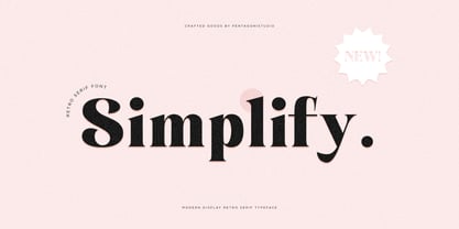 Simplify Is A Modern Display Character Inspired By Stylish and Cheek Style. SOFTWARE REQUIREMENTS : Fonts and alternate : No special software required they may be used in any basic program /website apps that allows standard fonts That's it folks! You can go ahead and get cracking :) Follow My Shop For Upcoming Updates Including Additional Glyphs And Language Support. And Please Message Me If You Want Your Language Included or If There Are Any Features or Glyph Requests, Feel Free to Send me A Message. Have a Good Day !
 - Evoria by pentagonistudio,
$19.00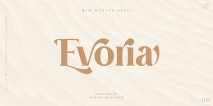 Evoria Is An Modern Stylish Font Inspired By Elegant Modern Stylish Serif. SOFTWARE REQUIREMENTS : Fonts and alternate : No special software required they may be used in any basic program /website apps that allows standard fonts That's it folks! You can go ahead and get cracking :) Follow My Shop For Upcoming Updates Including Additional Glyphs And Language Support. And Please Message Me If You Want Your Language Included or If There Are Any Features or Glyph Requests, Feel Free to Send me A Message. Have a Good Day !
 - Robuka PS by pentagonistudio,
$14.00 Robuka Is A Modern Serif Font with Stylistic Alternates and Ligatures. SOFTWARE REQUIREMENTS : Fonts and alternate: No special software is required they may be used in any basic program /website app that allows standard fonts That's it, folks! You can go ahead and get cracking :) Follow My Shop For Upcoming Updates Including Additional Glyphs And Language Support. And Please Message Me If You Want Your Language Included or If There Are Any Features or Glyph Requests, Feel Free to Send me A Message. Have a Good Day!
 - Noble Criatura by pentagonistudio,
$19.00 Noble Criatura Is A Display Font Combinated with Sans/Serif Typefaces. SOFTWARE REQUIREMENTS : Fonts and alternate : No special software required they may be used in any basic program /website apps that allows standard fonts That's it folks! You can go ahead and get cracking :) Follow My Shop For Upcoming Updates Including Additional Glyphs And Language Support. And Please Message Me If You Want Your Language Included or If There Are Any Features or Glyph Requests, Feel Free to Send me A Message. Have a Good Day !
 - Cryachy by pentagonistudio,
$19.00 Cryachy Is A Modern Display Character Inspired By Stylish and Edge Style. SOFTWARE RQUIREMENTS : Fonts and alternate : No special software required they may be used in any basic program /website apps that allows standard fonts That's it folks! You can go ahead and get cracking :) Follow My Shop For Upcoming Updates Including Additional Glyphs And Language Support. And Please Message Me If You Want Your Language Included or If There Are Any Features or Glyph Requests, Feel Free to Send me A Message. Have a Good Day !
 - Arinar by Hackberry Font Foundry,
$24.95 Arinar is a well modulated, rounded, humanist sans serif font family based on Brinar. A distant ancestor the basic letterforms is Minister (a Dutch bible font of the 19th century) through my first font, Diaconia. There are many OpenType features with over 600 characters: Caps, lower case, small caps, ligatures, discretionary ligatures, swashes, small cap figures, old style figures, numerators, denominators, accent characters (including CE), ordinal numbers (1st-infinity: lining and oldstyle), and so on. It is designed for text use in body copy.
 - Chavak by pentagonistudio,
$19.00 Chavak Is A Modern Serif Font Inspired By Sleek and Exotic Style. SOFTWARE REQUIREMENTS : Fonts and alternate : No special software required they may be used in any basic program /website apps that allows standard fonts That's it folks! You can go ahead and get cracking :) Follow My Shop For Upcoming Updates Including Additional Glyphs And Language Support. And Please Message Me If You Want Your Language Included or If There Are Any Features or Glyph Requests, Feel Free to Send me A Message. Have a Good Day !
 - Twentieth Century by Pelavin Fonts,
$20.00 Twentieth Century was designed for the cover of 20th Century French Poetry and was drawn with pure geometric shapes. It is the distillation of a broad variety of styles loosely known as Art Deco but, also categorized under such terms as Moderne, Streamline, Machine Age, Futurist, 70s Art Deco, Memphis among others. If there were a source in particular that I would cite as my inspiration, however, it would definitely be the work of Frank Lloyd Wright. I mean, look at the "W" for cryin' out loud!
 - Astrena by pentagonistudio,
$19.00 Astrena Is An Victorian Vintage Display Typeface Inspired By Nostalgic Characters. SOFTWARE REQUIREMENTS : Fonts and alternate : No special software required they may be used in any basic program /website apps that allows standard fonts That's it folks! You can go ahead and get cracking :) Follow My Shop For Upcoming Updates Including Additional Glyphs And Language Support. And Please Message Me If You Want Your Language Included or If There Are Any Features or Glyph Requests, Feel Free to Send me A Message. Have a Good Day !
 - Cowboy Junk by PizzaDude.dk,
$15.00 Cowboy Junk is my loose handmade impression of what would happen if the wild west crashed into grafitti! The letters are loose and jumpy and the terminals are kind of exaggerated to give that firce impression of handcraft! So, better get up early and leave this town, 'cos there’s only room for one sheriff in this here town, and that is Cowboy Junk! Comes with contextual alternates, which means that the font will automatically cycle through the 5 different versions AS YOU TYPE! Yieeehaaar!
 - Tropical Chemistry by Fikryal,
$18.00 Introducing Tropical Chemistry – Modern Serif font with many alternates and washes. This font is very suitable to be applied in various aspects of design, Also it’s perfect for logos, branding, title, social media posts, advertisements, product packaging, product designs, label, photography, watermark, special event, magazine, web designs, etc. Features : Tropical Chemistry (Uppercase, Lowercase) Alternates Swashes Ligatures Multilingual Support, including Latin, Western Europe, Central/Eastern Europe, Baltic, Turkis, Romanian, etc. If you have any questions please don’t hesitate to contact me follow my Instagram: @fkryall Thank you
 - Mockgent by pentagonistudio,
$19.00 Mockgent Is A Blackletter Font Inspired By Sleek and Gothic Style. SOFTWARE REQUIREMENTS : Fonts and alternate: No special software is required they may be used in any basic program /website apps that allows standard fonts That's it folks! You can go ahead and get cracking :) Follow My Shop For Upcoming Updates Including Additional Glyphs And Language Support. And Please Message Me If You Want Your Language Included or If There Are Any Features or Glyph Requests, Feel Free to Send me A Message. Have a Good Day!
 - Montage by House Industries,
$33.00 Montage has played a weighty role in some of the most influential and enduring typography of the past few decades, from book jackets and album covers, to posters and logos…you name it. Exhibiting an uncommon ability to wield immense power while demonstrating extraordinary finesse, Montage’s commanding profile packs a hefty punch which is softened only by its lithe yet durable serifs. Originally designed for Photo-Lettering in the mid-1960s by type legend, Ed Benguiat, the fonts were given a jump start by Jess Collins before ultimately being shaped into five compatible widths by longtime House co-conspirator, Mitja Miklavčič. Under the guidance of Ben Kiel, along with some additional chin-stroking by Ken Barber, Montage has been fully developed into a robust family ready to tackle any challenge you can throw at it. FEATURES LIGATURES: In order to ensure that Montage maintains its bold presence in tricky text settings, we’ve added a handy set of pre-drawn letter combinations. When enabled, the Ligature feature identifies problem pairs like—fl, fi, ff, ffl, and of course, fyi—and substitutes them with glyphs optimized to enhance font performance. ALTERNATES: For fickle typographers, we’ve also added a handful of alternate characters to allow Montage to suit any number of mood Like all good subversives, House Industries hides in plain sight while amplifying the look, feel and style of the world’s most interesting brands, products and people. Based in Delaware, visually influencing the world.
 - Gryffensee by Catharsis Fonts,
$30.00 Gryffensee is designed to be the Futura of blackletter, combining the time-honored gravity and relentlessness of the Gothic script with the clean, contemporary freshness of the geometric sans. Built from a tightly controlled inventory of lines, arcs, sharp cuts, and OpenType features, Gryffensee was born and raised in the digital age, yet retains the powerful charisma and human warmth of its mediaeval blackletter ancestors. As a result, it excels in a wide range of display settings, logotypes, and short text. Unlike most conventional blackletters, it even handles all-caps usage with grace, and includes an extensive Cyrillic character set (in the Pro version). Apart from a generous range of automatic ligatures and contextual alternates, Gryffensee offers stylistic alternates that allow users to customize its appearance to their tastes. The capital letters |AGHIKZ| come in alternate cuts that trade traditional shapes for increased legibility, while the letter |s| appears in three cuts, each with a unique, distinct flavor. All these options are accessible through OpenType stylistic sets in the main Latin font, Gryffensee Eins. For easy use in applications without OpenType support, we provide two additional Latin fonts (Gryffensee Zwei and Drei) in which these options replace the default cuts. Finally, Gryffensee Pro offers all the functionality of Gryffensee Eins, plus Cyrillic support. My intention to devise a contemporary geometric blackletter was inspired by four hand-painted letters, |ABCD|, in Sasha Prood�s online portfolio. I later found out that he had, in turn, taken those letters from an existing font, Bastard, by Jonathan Barnbrook. Luckily, by that time my project had taken on a life of its own. Gryffensee is an original design that bears only the most superficial resemblance to Bastard. Gryffensee is a mediaeval spelling of the lake Greifensee near which I grew up. It is pronounced [?gri?f?n?se?], or "GRIEF-un-say" in English approximation. This font is dedicated to Simone.
 - Zhang QA - Unknown license

- Filia by Up Up Creative,
$16.00 Introducing Filia, a vintage-inspired display font with smooth curves and plenty of OpenType features. Filia is perfect for your next editorial, advertising, branding, book, or invitation project. OpenType Features Filia includes 900+ glyphs. Specific OpenType features include stylistic alternates, several stylistic sets with features like swashes, initial forms, multilingual support (including multiple currency symbols - for kicks I even included a Bitcoin symbol in there), and three ampersand styles. It also includes 120+ standard and discretionary ligatures that add character and interest to your typography. The OpenType features can be very easily accessed by using OpenType-savvy programs such as Adobe Illustrator and Adobe InDesign. (To access most of these awesome features in Microsoft Word, you'll need to get comfortable with the advanced tab of Word's font menu. If you have questions about this, ask me!) Please note: there is only one file this font. That's the magic of OpenType - all of the alternates, ligatures, etc. are built right into the main .otf file! Mail support : julie@upupcreative.com Find inspiration (and sneak peeks at my next font-in-progress) on Instagram: http://instagram.com/julieatupupcreative Facebook : https://www.facebook.com/upupcreative Pinterest: https://www.pinterest.com/upupcreative My website: http://upupcreative.com PLEASE ENJOY! I can't wait to see what you make with Filia! Feel free to use the #upupcreative and #filiafont tags to show me what you've been up to!
 - Feel Script by Sudtipos,
$79.00 Feel Script is based on lettering that calligrapher and logo designer Rand Holub created for Intertype for his face Monterey. Fortunately, I didn’t have the technological limitations today that Intertype had back then. Holub’s lettering is presented in its entirety within Feel Script. Some letterforms were redrawn from vintage American magazine ads (some by Holub himself), along with many new alternates, ligatures, ending forms, and strangely beautiful character combinations. The experience I’ve accumulated from my previous calligraphy typefaces (Ministry Script, Affair, Buffet Script, Burgues Script, et al.) made it easier for me to apply Holub’s lettering in a new context using OpenType technology. The usual extended treatment was given to Feel Script, all the way into the implementation of three-letter ligatures and the dreamiest swashes I could imagine. I changed some of the connections between the lowercase letters in order to fit Holub’s calligraphy as opposed to the limited Intertype metal attempt. I hope you like Feel Script. I also hope what I contributed to this particular Holub design is somewhat of a happy ending to a calligraphy story that crosses many technologies. From the pen to computer Bézier. My part of this story stops here ... and yours begins. Feel Script has more than 1200 glyphs including: stylistic alternates, contextual alternates, titling alternates, swashes, and ligatures. Check out the PDF!
 - Slight by Up Up Creative,
$29.00 Introducing Slight, an elegant, full-featured script font with tons of alternate characters and OpenType features. Hand-lettered with a heavy right slant, Slight is particularly well-suited for invitations, branding, and editorial design. Slight comes with more than 1000 glyphs! Specific OpenType features include contextual alternates, stylistic alternates, initial and final forms, multiple alternate glyphs for many letters (accessed through the glyphs panel), multilingual support (including multiple currency symbols), ligatures, standard numbers, and six ampersand styles. Perhaps the most fun thing about Slight is that it includes multiple versions of all ascending and descending letters, making it lots of fun to play with in your layouts and compositions. The OpenType features can be very easily accessed by using OpenType-savvy programs such as Adobe Illustrator and Adobe InDesign. (To access these awesome features in Microsoft Word, you'll need to get comfortable with the advanced tab of Word's font menu. If you need help with this, ask me!) Files included: Slight-Regular.otf Mail support : julie@upupcreative.com --- Find inspiration (and sneak peeks at my next font-in-progress) on - Instagram: http://instagram.com/julieatupupcreative - Facebook : https://www.facebook.com/upupcreative - Pinterest: https://www.pinterest.com/upupcreative - My website: http://upupcreative.com --- PLEASE ENJOY! I can't wait to see what you make with Slight! Feel free to use the #upupcreative and #slightscriptfont tags to show me what you've been up to!
 - ALS SyysScript by Art. Lebedev Studio,
$63.00 Handwriting of a strong Carelian personality revived: It’s autumn time once again, harvesting season, mushroom & berry time – the favourite season of my Karelian aunt Katri. A postcard she sent me more than twenty years ago had inspired me to SyysScript, “Script of Autumn” in Finnish. Katri had a very kind but also energetic personality, and I always thought her handwriting was a mirror of it. By making SyysScript I felt I could revive some of her unforgettable character. My Finnish autumn font has by now become a favourite for many and is branding fine food in both the Eastern and the Western hemisphere – even far beyond the arctic circle. “SyysScript“ is actually a growing family. For enhanced functionality in small sizes I added “SyysScript Eco” a year ago, a style with shortened extensions and simplified letterforms especially suited for packaging. And this autumn, a special one for Finland which is celebrating its 99th birthday, SyysScript grew again: Two long awaited newcomers, “SyysScript FeltTip” and “SyysScript FeltTip Eco” joined the family. They are bolder and softer than the previous styles but keep their positive, lighthearted feel. Use them to make a powerful individual mark on any background. – They are equally well suited for paper, packaging, a screen or even a concrete wall! Language support: Western and Central European, Extended Cyrillic.
 - Starboy by Shakira Studio,
$19.00 Introducing Starboy - The Hottest Bold Serif Display Font of the Moment! Starboy is here to redefine your design game with a boldness that's right on-trend. This dynamic font duo features both a regular and outline version, making it the ultimate choice for designers who want to stay ahead of the curve in today's design scene. The regular version of Starboy is a powerhouse of bold serifs and stylish sophistication, perfect for creating designs that make a bold statement. The outline version takes this to the next level, adding an extra layer of modernity and versatility to your projects. In a design world that's constantly evolving, Starboy stands out as the go-to font for capturing attention and creating memorable visuals. Whether you're working on cutting-edge branding, striking headlines, or contemporary packaging, Starboy's duo of fonts ensures your work aligns with the latest design trends. Here's what you get: Regular, Outline All Multilingual symbol Opentype features ( ligature, alternate ) Accessible in the Adobe Illustrator, Adobe Photoshop, Adobe InDesign, even work on Microsoft Word. PUA Encoded Characters - Fully accessible without additional design software. Multilingual character supports : (Afrikaans, Albanian, Catalan, Croatian, Czech, Danish, Dutch, English, Estonian, Finnish, French, German, Hungarian, Icelandic, Italian, Lithuanian, Maltese, Norwegian, Polish, Portuguese, Slovenian, Spanish, Swedish, Turkish, Zulu) Follow my shop for upcoming updates, and for more of my work, Thank you!
 - Alimentary by Missy Meyer,
$12.00 Alimentary (adjective): relating to nourishment or sustenance. If you've seen my other fonts, you know I tend to lean into food-based names. This name has to do with food and science combined, so it's double nerdy in the ways I like to be nerdy! I started with Alimentary Medium, which was inspired by my shorter, wider font MacGuffin - I wanted something taller, narrower, with a hip and retro feel. When I finished the Medium weight, I felt like I wanted a Light weight. Then a Heavy weight. Then I figured, "what the heck," and made an outline version of the Medium weight too. In the end, I wound up with four members of the Alimentary family, each with over 700 glyphs! Not only do they all have the basics (A-Z, a-z, 0-9, and tons of punctuation), but they also each have 330 characters for European language support, and a limited selection of Greek, Coptic, and Cyrillic characters. Plus a double handful of alternates and ligatures to add a little variety to your designs! And of course, all of the Alimentary fonts are super-smoothed, with reduced nodes and clean curves, so whether you're cutting them out, printing them, engraving them, or using them in a way I haven't even thought of, these fonts will be sharp and crisp!
 - WTF Strange Crispy by Wasabib Type Foundry,
$15.00 WTF Strange Crispy - is a playful bounced display font that inspired by retro typeface, I make it with 100% hand drawn to get the artistic look. Perfectly suited for quotes, branding, logos, and social media posts, “WTF Strange Crispy” has a unique touch to every design, ensuring it stands out and makes a lasting impact. Illuminate your content with the enchanting allure of “WTF Strange Crispy” font, and let your creativity shine in every project.
 - Energy Grotesk by Tall Chai,
$9.00Energy Grotesk is a modern grotesque family. It is an OpenType Variable font with weight axis going from 100 to 900. Energy Grotesk is extrovert, bold and full of energy. Most wide, grotesque fonts are uppercase only, but Energy embraces upper and lowercase. Available in 9 weights Over 1000 glyphs supporting extended Latin Ideal for display texts: Titles, Logos and Headlines etc. Supports OpenTypes features like Ligatures and Stylistic Alternates Tabular Numerals included - Otoiwo Grotesk by Pepper Type,
$39.00 Otoiwo Grotesk is an extremely versatile sans-serif typeface with a closed aperture. It features whopping 126 styles over 7 widths, each containing 9 weights with corresponding italics. The mood of the family ranges from fairy neutral in Normal and Condensed widths to very flavorful Compressed and Ultra Wide. Rich language support, which includes Cyrillic and spans 131 language ovarall, makes Otoiwo Grotesk a worthy choice for brands that strive to reach international audience.
 - Fabitha Script by stiplinestudios,
$11.00 Proudly Present .. Fabitha Script Fabitha Script goes with Modern and Natural Calligraphy, ready to give your design project with Fresh and Fabulous Style. This font have an 177 Standard Glyph + 109 Glyph Alternate in Open Type Standard Format. Suitable for various purpose such as digital lettering, headings, logos, wedding invitation, t-shirt, letterhead, signage, lable, news, posters, badges, branding materials, t-shirt, print, business cards, quotes, logo, poster, and suitable for any graphic design project.
 - Tescellations by Ingrimayne Type,
$9.95 Though there are many thousands of digital typefaces available, none seem to be made exclusively of letters that tessellate, a complete tessellating alphabet. This void is now filled with not one typeface, but a group of typefaces, the Tescellations kinship group. Even though I am aware of only one use for this typeface--writing about tessellations--that does not mean there are not hundreds or perhaps thousands of other uses. These typefaces are a byproduct of two maze books I designed, Puzzling Typography and Puzzling Typography A Sequel. I found the challenge of making mazes from tessellations, including letter tessellations, intriguing and these typefaces are a byproduct that endeavor. There are seven members of this typeface kinship group. I tried to select the the glyphs that fit together best to form Tescellations; it is the most readable of the lot. The reason for an Italics version is that I needed one for the maze project. In constructing it, I tried to include as many different lower-case glyphs as I could rather than just skew the regular version. A purist might insist that the tessellation deal with the counters. My approach was to worry only about the exterior of any letter that has an interior, but for anyone who who might object to the counters, versions with filled counters are included. What did not fit into Tescellations was dumped into Tescellations Two, which is somewhat of a ransom-note type of face. It comes in two styles, a regular version and a version in which the counters are removed. TescellationPatterns shows how many of the characters in these typefaces tessellate. It has over 100 tessellation patterns, each on only one character. Simply type several lines with any character and make sure the leading is the same as the font size, and you have an instant tessellation pattern of a letter.
 - BASEHEAD - Unknown license

- KR For Baby B - Unknown license

- Crown Title - Unknown license

- Apla Clare by Hooper Type,
$9.00 Apla Clare comes from the love of my wife.. She's 'Simply' Clare. It's a straihght forward sans, but with a little bit of play, and a friendliness that ensures it moves away from sterile, serious sans. PLease enjoy!
 - Bar Book by Lauren Ashpole,
$15.00 My take on a cocktail themed dingbat font. The lowercase and uppercase letters offer an assortment of glassware, bottles, and drinks while the numbers include accessories and garnishes that can be mixed and matched to create new combinations.
 - Breakfast by PizzaDude.dk,
$15.00 This is close to insane! My Breakfast font has got 8 (yes EIGHT!) different versions using contextual alternates! They cycle nice and easy AS you type! How cool is that?! Ofcourse, the font is also loaded with diacritics!
 - PaddingtonSC - Unknown license

- GrandPrix - Unknown license

- Jagz - Unknown license

- Pixel Technology - Unknown license

- Pixelzim - Unknown license

- Pixel Technology + - Unknown license

- TA Bankslab by Tural Alisoy,
$33.00 The building of the Northern Bank of St. Petersburg's Baku branch was built in 1903-1905. It was the first Art Nouveau-style building in Baku, Azerbaijan. Later the bank was transformed into the Russian-Asian Bank. After the oil boom in Baku in the 19th century, branches of many banks and new banks were opened in the city. The branch of the Northern Bank of St. Petersburg was among the first banks that was opened in Baku. N.Bayev was the architect of the building for the branch of the Northern Bank of St. Petersburg located at Gorchakovskaya 3 in 1903-1905. The building currently houses the Central Branch of the International Bank of Azerbaijan. My purpose in writing this is not to copy and paste the information from Wikipedia. What attracted me to the building was the word "Банкъ" (Bank) written in Cyrillic letters, which was also used in Azerbaijan during the Soviet era. The exact date of the writing is not known. Every time I pass by this building, I always thought of creating a font of this writing someday. I had taken a photo of the building and saved it on my phone. I did a lot of research on the font and asked a lot of people. However, some did not provide information at all and some said they did not have any information. I was interested in the history of this font but I do not know if this font really existed or it was created by the architect out of nowhere. If there was such a history of this font, I wanted to recreate this font and make it available. If not, I had to create it from scratch in the same way, using only existing letters on the building. Finally, I made up my mind and decided to develop the font with all letters I have got. It was difficult to create a font based on the word, Банкъ. Because in the appearance of the letters, the midline of the letters on A, H, K was very distinct, both in the form of inclination and in more precise degrees. The serif part of the letters, the height of the upper and lower sides, differed from each other. I don't know whether it was done this way when the building was constructed or it happened over time. I prepared and kept the initial version of the font. I took a break for a while. I started digging on the story of the font again. Meanwhile, I was researching and got inspired by similar fonts. Unfortunately, my research on the font's history did not yield any results. I decided to continue finishing up the font. After developing the demo, I created the font by keeping certain parts of these differences in the letters. In addition, I had to consider the development of letters in the Cyrillic, as well as the Latin alphabet, over the past period. Thus, I began to look at the appearance of slab-serif or serif fonts of that time. In general, as I gain more experience in developing fonts, I try to focus on the precision of the design for each font. In recent years, I specifically paid attention to this matter. YouTube channel and articles by Alexandra K.'s of ParaType, as well as, information and samples from TypeType and Fontfabric studios on the Cyrillic alphabet were quite useful. I gathered data regarding the Latin alphabet from various credible sources. I do not know if I could accomplish what I aimed at but I know one thing that I could develop the font. Maybe someday I'll have to revise this font. For now, I share it with you. I created the font in 10 styles. 7 weight from Thin to Extra Black, an Outline, Shadow, and Art Nouveau. The Art Nouveau style was inspired by the texture in the background used for the text on the building. The texture I applied to capital letters adds beauty to the font. If you like the font feel free to use it or simply let me know if your current alphabet doesn't support this font.


