10,000 search results
(0.071 seconds)
- Megatropolis by Just My Type,
$35.00 Introducing Megatropolis : intellectual, architectural, urban and urbane. What started as an idea where the counters would be letters (3 scribbled glyphs on a piece of scrap paper), has grown into a mighty font family of eight stackable fonts. First came Megatropolis itself, a Deco font within a Deco font; Double Deco, you might say. In Illustrator, you can deconstruct it to make solid letters, outline letters or just the inset letters on their own, and you can stack them how you wish. Or you can get the whole Megatropolis family with Black , Outline , Inset , Smog , Shade and Shade with Inset and keep them all separate stackable, editable fonts. In addition, there’s Megatropolis Benday (available in TT only), with its fabulous stackable comic dots. Megatropolis is a typographer’s playground.
 - Rainfall by Arkalandara,
$130.00 Nightmare font is a simple attempt to convey the essence of a handwritten font with strong lines. In a real handwritten font, you would find more variation in line thickness, curves, and other design elements that contribute to the overall style. Creating a visual representation of a handwritten font using lines can be a bit challenging in plain text, but I'll provide a simple ASCII representation that may give you an idea of a strong handwritten style. Keep in mind that this is a very basic representation, and actual fonts would have much more detail and nuances.
 - Shout Out by Comicraft,
$19.00 Here's a big shout out to all our Loud and Proud font homies -- If you've got a good set of lungs on you -- fill 'em up and get ready to Shout, SHOUT! Yes, let it all out because this is a font you can't do without -- It will make you wanna SHOUT! Throw your hands up, SHOUT! Kick your heels back, SHOUT! Throw your head back, SHOUT! Come on now, SHOUT! And don't forget to say you will... Don't forget to SHOUT! Yeah yeah yeah yeah, SHOUT! A little bit softer now, (Shout) A little bit softer now, (Shout) A little bit softer now, (Shout) A little bit louder now, SHOUT! A little bit louder now, SHOUT! A LITTLE BIT LOUDER NOW! SHOUT! SHOUT! SHOUT! SHOUT! PHEW -- Who says Comicraft doesn't know how to Pump it Up AND Get Down?!
 - Patent Reclame by HiH,
$10.00 Patent Reclame manages to be light-hearted, while clearly showing its blackletter roots both in the shape of the individual letters and the rhythm of text on a page. The designer is unknown. Schriftgeisserei Flinsch of Frankfurt a.M. cast the face around 1895. Nicolete Gray shows a quite similar face called “Graphic,” from Stephenson Blake in 1896. Personally, I don't think that Patent Reclame looks like an English design, but I do not have any proof one way or the other. The numbers are proportional, intended for posters, not spreadsheets. Two ornaments are included, an art nouveau rose at #172 and a lilypad with long tendril at #177. Great for invitations, posters and flyers announcing fun events. Do not use for obituaries. Quite readable in smaller sizes for short blocks of text. I really like the buoyant quality -- a nice combination of discipline and enthusiasm.
 - Bluewind by Nathatype,
$29.00 Bluewind is an elegant script font that is designed to replicate the beauty of a handwritten signature. Every letter in this font is crafted with a subtle and low-contrast approach creating an effortless appearance reminiscent of an artist's signature on paper. The calibrated spacing and graceful curves ensure that it remains not only visually captivating but also easy to read. You can use this font in headlines, logos, posters, invitations, name cards, branding materials, and many more.
 - Orthotopes - Personal use only

- Harajuku Script by Hanoded,
$15.00 Harajuku Script is an ‘easy-on-the-eye’ script font. I made it with a Japanese brush pen. The font is quite stylish, so I named it after Tokyo’s Harajuku area, which is known internationally as a center of Japanese youth culture and fashion. Harajuku Script would look good anywhere, but product packaging, websites and magazines could profit from this handwritten gem.
 - Happy Cookies by Tlatous Type,
$19.00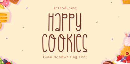 Introducing Happy Cookies Font by Tlatoustype Happy Cookies is a Modern Handwritten Font. Happy Cookies is perfect for book cover, product packaging, branding project, megazine, social media, wedding, or just used to express words above the background. This font also multilingual support.
 - Golden Sand by Fidan Fonts,
$19.80 Inspired by the retro cars/motorcycles, desert and wild west the Golden Sand script stays classy and elegant. It's a handwritten font which includes full set of uppercase and lowercase basic characters, multilingual symbols, numerals, punctuation and ligatures. It's works perfectly for handwritten quotes, greeting cards, posters, branding, book cover designs, packaging, wedding stationery, album covers, social media posts and many more. Latin-based Language Support. If you want to type with stylistic ligatures make sure you have them turned on (use a capable software like Photoshop, Illustrator, InDesign, Word, Pages etc). Note: If you don't use this font with these programs stylistic ligatures won't work. Happy creating!
 - Core Magic by S-Core,
$20.00 Core Magic is a slab-serif version of Core Circus which is a layered type family consisting of seven 3D effect layers, eight 2D effect layers and one shadow effect layer. Uppercase and lowercase letters are separated by such features that counters are opened or closed. Core Magic provides other closed counter styles such as numbers with opentype feature (Stylistic Alternatives). Using Core Magic with Core Circus could make your works more charming and special with endless combinations (at least 262,551 kinds). This family is really nice for book titles, headlines, logotypes and any artworks. Also available the rough version of this family - Core Magic Rough.
 - Curro by Bon Bon Lab,
$12.00 Curro is a handwritten font that radiates joy and happiness. With playful and charming curves, this typeface adds a lighthearted touch to any design. Whether it's crafting greeting cards, designing invitations, or adding a touch of whimsy to your branding. Curro will uplift and captivate your audience. Unlock a world of positivity and vibrant creativity with this font, and let your designs come alive with the infectious spirit of happiness.
 - Helena Signature by Pixesia Studio,
$15.00 Introducing Helena Signature - Signature Script Font Coming with special features combined with such an elegant style, Helena Signature becomes one of a kind typeface that you'll surely need. With its unique, bubbly yet extravagant mode, this Helena Signature typeface will suit any occasion. The handwriting style of this Helena Signature typeface not only shows the authenticity but also provides such a familiar and personal feeling—which adds the kind of intimacy that the readers are probably seeking. The beauty of its style is also engaging, easily catches the readers eye and creates the eager for them to read any kind of message that the Helena Signature is delivering. Hope you Like it. Thanks.
 - RoyHand RP by BluHead Studio,
$25.00RoyHand RP is a new OpenType font family release by BluHead Studio, LLC from the wonderfully talented English designer and illustrator Roy Preston. RoyHand, as the name would suggest, is based upon the handwriting of Roy himself. The family has three weights and is suitable for many everyday uses. - Whomp by Sudtipos,
$59.00 Whomp takes its inspiration from the work of an American master in sign painting and alphabet manipulation: Alf Becker . In 1932, Becker began designing a series of alphabets to be published in Signs of the Times magazine at the rate of one alphabet per month. Nine years later, 100 of those alphabets were compiled in one book that became an enormous success among sign painters. In the late 1990s and early 2000s, many Alf Becker alphabets were digitized with blurbs that falsely credit an “Alf Becker typeface”. Alf Becker was not really a typeface kind of guy. He was more of a calligrapher and sign painter. His alphabets were either incomplete or full of variations on different letters, and didn't become typefaces until the digital era. This particular Becker alphabet was quite incomplete. In fact, it wasn't a showing of an alphabet, but words on a poster. Alejandro Paul took the challenge of drawing, digitizing, restructuring, and finally building a complete usable typeface from that partial alphabet. He then extended his pleasure by once again playing with the wonderful possibilities of OpenType. Whomp comes with more than 100 alternates, tons of swashy endings and ligatures, all built into the font and accessible through OpenType palettes in programs that support such features. This is the in-your-face kind of font that stands among other Becker-based alphabets as paying most homage to the vision of this great American artist who saw letters as live ever-changing beings. Whomp is right at home when used on packaging, signage, posters, and entertainment related products.
 - Valerie by Solotype,
$19.95Here is another attempt to create a font for invitation work unlike any already out in the world. In casting about for a name, I decided to call it Valerie after Valerie Hope, a mindreader of days long gone, who played California theatres in the 1930s and 1940s. And who, incidentally, was my mother. - Kaipara by Gleb Guralnyk,
$14.00 Presenting originally designed decorative font named Kaipara. The main goal of this font is a pattern that flows between the characters. Each letter has six variations that switches automatically to create a solid pattern feeling. Check out that "context alternates" OpenType feature is activated to achieve neccessery result. Also a simple supporting font is available here. Note: Please note that full pattern effect is working only with english alphabet and numbers. All other characters has only one variation. Note: Check out that all of your letters has the same case (lowercase or uppercase) to make the effect work properly.
 - Supplier Stencil JNL by Jeff Levine,
$29.00 The design idea for this condensed sans serif stencil font was inspired by a post-World War II brass stencil spotted in an online auction. The United States was assisting Europe with much-needed goods, and the text in the middle of a “stars and stripes” shield used for marking the shipping containers read “For European Recovery supplied by the United States of America”. It was the first line (“For European Recovery”) that became the working model for Supplier Stencil JNL, which is available in both regular and oblique versions.
 - Jingle Condensed by ArFF,
$24.95I once tried to imagine what the children of Schoolbook and Bodoni would look like if they were married. I'm still trying to imagine that! In the meantime I drew the Jingles. - Jingle Wide by ArFF,
$24.95I once tried to imagine what the children of Schoolbook and Bodoni would look like if they were married. I'm still trying to imagine that! In the meantime I drew the Jingles. - Volatile Serif by Mans Greback,
$59.00 Volatile Serif, designed by Mans Greback, is a luxurious and romantic typeface that exudes an air of softness and delicate beauty. Its flowing, liquified forms, and delicate swirls evoke feelings of empathy, creating a sense of connection and warmth. This font is perfect for high-end projects that demand a touch of fine elegance. Inspired by the gentle movements of water, the designer sought to capture the essence of fluidity in Volatile Serif. The result is a typeface that feels alive, as if its character is organically creating the word, making it a perfect choice for luxury brands, romantic designs, and storytelling. The font is built with advanced OpenType functionality and has a guaranteed top-notch quality, containing stylistic and contextual alternates, ligatures, and more features; all to give you full control and customizability. It has extensive lingual support, covering all Latin-based languages, from Northern Europe to South Africa, from America to South-East Asia. It contains all characters and symbols you'll ever need, including all punctuation and numbers. Mans Greback is a Swedish typeface designer with a passion for creating unique and versatile fonts. With an extensive background in design and typography, Mans has built a reputation for his meticulous attention to detail and prolific craftsmanship. His many fonts are widely used by designers around the world, making his work synonymous with creativity and innovation.
 - Hellebore by Harvester Type,
$15.00 Hellebore is a font inspired by the logo and the game Mortal Shell itself. The font conveys the medieval era, the spirit of cutting weapons and dark fantasy. It is sinister, dark, dark, Gothic, rough and sharp. Perfect for logos, headlines, posters, banners. The font is named after the plant of the same name. The name conveys the font's mood.
 - Space Journey by Vozzy,
$10.00 Introducing retro sci-fi label font duo named Space Journey. This display font is inspired by movie posters from the 60s and 70s. Font family has two styles: Regular and Rough. This font will look good on any retro sci-fi styled designs like a poster, T-shirt, label, logo, etc.
 - TG Haido Grotesk by Tegami Type,
$35.00 Haido is a new contemporary grotesk typeface influenced by post-modernism style. This typeface is has very neutral look, thus making this new typefaces has versatility for use in all kinds of modern design. Haido comes with 18 Styles including 9 Weight, italic and variables font. The small detail of inktrap in this typeface, making Haido is has high legibility in small size and very useful especially for printing needs. And last but not least, Haido has several alternates characters, ligatures and covered more than 100 languages including 2 script latin and cryllic.
 - TT Phobos by TypeType,
$35.00 TT Phobos useful links: Specimen | Graphic presentation | Customization options TT Phobos is a pliable display serif with a soft and gentle character. The features of the typeface are the moderate contrast between bold and thin strokes, pliable visual compensators, and the counter-clockwise bend of internal ovals. In addition to 6 weights and 6 italic, TT Phobos also includes two original decorative fonts, inline and stencil. Despite its pliability and display character, TT Phobos is dynamic enough and is well suited for text arrays even in large text blocks. The serifs of letters are completely asymmetrical and bring in dynamics when reading the text from left to right. Thanks to the harmonious contrast of black and white forms and internal negative spaces of the letters, as well as its broad letter spacing, the typeface is well read in small sizes. In this case, the character of the letters is completely preserved, partially thanks to the exaggerated elegant visual compensators. The ornamental pattern used in TT Phobos Inline varies for capital and lowercase letters. Capital letters implement a more complex double inline with a rhombic element in the middle, and in the lower case features a simplified form of the inline, made in a single movement. Thanks to the original cutting, TT Phobos Stencil stands out for its expression, and the rounded cuts add even more visual style to the font. TT Phobos consists of 14 faces: 6 weights (Light, Regular, DemiBold, Bold, ExtraBold, Black), 6 Italics, inline and stencil. There are 17 ligatures in TT Phobos, including several Cyrillic ones. The typeface has stylistic alternates, which adds an italic effect to the upright fonts, and a little solemnity of the upright version to the italics. In addition, we have not forgotten about the old-style figures and other useful OpenType features, such as ordn, sups, sinf, dnom, numr, onum, tnum, pnum, liga, dlig, salt (ss01), frac, case.
 - Doretypo by Rosario Nocera,
$10.00 Doretypo was born accidentally, during the design of a poster for a jazz festival in Rome. I was going to realize a typesetting, but I could not find the right character and decided to draw the letters I needed, starting from the first letter of the headline, capital M. I was looking for a lettering able to evoke musical notes, where each letter could be linked to the following one, to the previous one, to the largest at the top and the smallest at the bottom. From this idea doretypo came to life gradually. In the beginning there were a few medium capital letters with very few glyphs, but given the good results I decided to decline in light and bold, integrating minuscule letters, for a whole of 374 glyphs. Today doretypo OpenType is a family of fonts with three weights, 374 glyphs, supporting about 57 languages, ligatures standard, plus a new “NY”. Moreover, each glyph can be used individually to create textures and graphic symbols.
 - Side A by bb-bureau,
$60.00 Side A – Bauhaus-inspired Experimental and spiky type in 3 sizes (1 - 1/2 - 1/3), designed by Benoît Bodhuin (An ideal use could be: Side A unit in 48 pt, half in 24 pt and A third in 16 pt, then bars would have the same width and spaces between the forms would be equal, but it’s just an ideal use)
 - Primordial by Hanoded,
$15.00 Primordial is a chaotic handmade script font. It is rough around the edges, glyphs are shaky and don’t follow a baseline. Yet, in all this chaos, you will find the budding of a new idea, a glimpse of hope and a glint of something beautiful. Primordial comes in a regular and italic style, plus a back slanted style called Primordial Chaos.
 - Mc Lemore by Galapagos,
$39.00Back when OpenType hadn't yet opened and Apple was developing the Line Layout Manager called GX Typography I created a test font that I name after my stepdaughter, Kristen (now ITC Kristen). Not wanting to offend my wife I started on a font project and gave her name to this new set of glyphs, Roberta. Unfortunately, the name was already in use so I needed to find another name for the fonts. After September 11th I decided that there were people I'd met during my life who were truly cut from the cloth of the hero. Master Sargent McLemore of the 75th Ranger Battalion was one of these people. I met the Sarge when I was in basic training at Fort Gordon. I saw him 2 weeks before he died in 1970. All of the heroes we see on the silver screen pale in comparison to this man. John Wayne and Clint Eastwood both have played the type well, both could have taken lessons from the Sarge. - Featherly Handlettered by Joanne Marie,
$10.00 I had to do it :-) - A hand lettered version of featherly is here! As always with featherly, it's perfect for anything to do with romance, weddings and love but this hand lettered version can give you an even more authentic, handmade look to your designs. There are 26 left and right swashes. No alternates with this one though. Hence the lower price.
 - Agasthiya Rococo by Bykineks,
$15.00 agasthiya rococo is a script type font with 552 glyphs, supports western & eastern europe, turkish, cyrillic languages. equipped with alternates lowercase, ligatures, and swash. inspired by the art of rococo architecture, which is an ornamental architectural style that emerged in the 18th with its characteristic intricate and layered details. The rococo style is a further development of Baroque, where the forms used have not changed. The Rococo style first appeared in the 18th century in Paris. makes this font has a distinctive character style similar to victorian
 - Schuss News Poster by typic schuss,
$10.00 Schuss News Poster ist the very heavy headline font (titling/display/poster) of Schuss News. (No italic, no additional figures, no tabular figures, no small Caps, slyghtly different heights as the other font of the Schuss superfamily (Sans, Slab, News and Serif). The character set is different to the other styles. It is not developed for small text sizes.)
 - Go by Canada Type,
$24.95 Five years into the 21st century and the promise of nanotechnology, high-end popular culture design seems to thrive on combining opposites and drawing a fine line between traditionally contradictory ideas. This is seen in modern society's usual cultural frontrunners - like consumer electronics, fashion items, music packaging and publications, where it is evident that traditionally complex marketing statements of fashionability and lifestyle are attempted with simple minimalism. But at the typographic end of this realm, the creative majority still uses old faces that help the modern statement only in passing. Some of the more adventurous creative professionals actively seek new elements to emphasize contemporary impact in their modern design. To those adventurous types (pun intended), Canada Type presents this new face called Go. It is very much a child of the new millennium, inspired by the unmistakable minimalist style of modern 21st century corporate logos, recent design shifts in electronic music and club-marketing collateral, and disc jockeys who have enthusiasm, energy, precision and total control of each and every vibration traveling from mixer to speakers. Go is an original modern techno-lounge face that offers the eyes pleasing collages of friendly minimal forms that give the words an impression of simplicity and depth at once. This is a font that prides itself on its precise grouping of elements and just enough original creativity in combining those elements. The precision builds the sharp edge sought for modern statements, while the creativity keeps the message rejuvenated, clear and interesting. Go's character set consists of a versatile and unexpected, yet mild mix of the uppercase and lowercase forms, with multiple variations on the majority of the letters. The e being a vertical mirror of G is only the first of the pleasant surprises. More than 30 alternates are inside the font. All the accented characters in Go have been meticulously (perhaps obsessively) drawn to be unusual for logos and short statements. Take a look at the character map and be ready for a space-age surprise. To borrow a Star Trek cliché, this font can Go where no font has gone before.
 - OPN StunFillaWenkay - Unknown license

- Vianor by Larin Type Co,
$15.00 Vianor this is a lovely vintage label font. It is presented in two styles, regular and rough, as well as a decorative layer for them. This font works great with text, but it looks even better with display titles, logos, and others. This font is included many alternates for the uppercase and lowercase has alternatives for uppercases and many alternates for lowercaes, with them you can make your design more expressive, varied and playful, change them and you will see how many options you can get for your design, also use ornaments to complement your design.
 - Diamend by Craft Supply Co,
$15.00 Diamend is an elegant sans-serif font that merges modernity with sophistication. Its sleek lines and refined aura are ideal for infusing projects with a touch of timeless class. Elevate your designs with Diamend's exquisite charm and open the door to a world of creative possibilities. This typeface is ideal for greeting card, packaging, brand identity, poster, or any purpose to make your design project look eye catching and trendy. Feel free to play with this typeface!
 - Vauxhall NF by Nick's Fonts,
$10.00 Get your groove on with this trippy little gem, based on a Fotostar face called Angelica. Not for the faint of heart. Both versions support the Latin 1252, Central European 1250, Turkish 1254 and Baltic 1257 codepages
 - Gorod.Volgograd by FontCity,
$15.00The general idea: Can You imagine to yourself, what the hydroelectric power station is? The building of this electricity production foundry is half hidden under the water, but the visible above-water part astonishes your sense. It is a construction almost 1,5 km length dammed out the powerful river stream. Besides thousand of electricity conduction lines supports it bears also the highway and the railroad. From a faraway distance the train seems like a caterpillar that has climbed up the stout tree. There are also the navigable sluices, the flood channels and other erections. The idea of this typeface outlines arrived to the authors exactly on the viewing platform, under the impression of the waterfalls, which are escaping from the dam womb, falling from almost 50 meters altitude and becoming white-haired during this flight. Release: in the form of "gorod.Volgograd" font with the one style. We work with other styles now and sometime we will be very glad to introduce the Bold and Italic styles to You. We should explain the font name meaning. "Gorod" is "city of" in Russian and Volgograd is the old, big and famous Russian city. The Volga hydroelectric power station of a name of XXII congress of the CPSU caused the Volgograd sea formation. It expands of 14 km width and more than 600 km along the Volga river-bed. But HEPS isn't the sole Volgograd sight. There are many interesting places here. The most known tourist sight, the visit card of Volgograd is the Mamaev Hill. Being here You can see almost all 100 kilometers of city length. Due to its geographical position, Mamaev Hill has got a great importance during the Great Patriotic War (1941-1945). It became and still is the Main Height of Russia. Soviet people have built the huge stately memorial ensemble here. There are many other witnesses of the heroic past of Volgograd: the Alley of Heroes, the Perished Fighters Square, the Soldiers Field and others. The line of tank turrets is stretched out along all town not far from Volga bank. It marks the line, where fascist troops was stopped in 1943. It is very amazingly when You dive under the ground on a usual tram. Volgograders have built a few underground station for the high-speed tramway. The river tram need a quarter of an hour to get an island in the Volga. And You need the same time to walk across the river station. The Volga-Don navigable channel starts from Volgograd. There are planetarium, circus, some theatres, many museums in Volgograd. One of football matches of Euro-2004 qualifying round took a place in the "Rotor" stadium in Volgograd. Volgograd holds the longest - above 50 km - park in the world. Its avenues, squares, embankments are beautiful, Volgograd central districts are built in unique architecture style called the Stalin Empire. You can enjoy fountains, parks, attractions, water-pools and other Volgograd sights. If You visit Volgograd once You'll never forget it. You can read about the ancient history of Volgograd city on the Tsaritsyn font page. Also we plan to create the Stalingrad font and give You a short story about another period in Tsaritsyn-Stalingrad-Volgograd history. - Simplified by Redy Studio,
$19.00 Simplified – Casual Chic Font Simplified is a casual and natural font, with a spirit of clean-cut modern and classic. This typeface has been specially designed to give a feeling of casual luxury. This is not easy typography! We have done a lot of effort to build this font. In the past, we have experimented with a ton of fonts that are similar to Simplified, and Simplified is better in every aspect that I have found, including some OpenType features and ligatures, lowercase beginning & ending swashes that you can use to make your own style. In short, it’s a typeface that you must have! Simplified features: A full set of upper & lowercase characters Numbers & punctuation 63 Gorgeous ligatures Lowercase beginning swashes Lowercase ending swashes Multilingual symbols PUA Encoded Characters – Fully accessible without additional design software. Feel free to give me a message if you have a problem or question. Thank you so much for taking the time to look at one of our products.
 - Letter Gothic 12 Pitch by ParaType,
$30.00 The Bitstream version of Letter Gothic designed by Roger Robertson in 1956-62 for IBM electric typewriter. It is a condensed, monospaced font resembling a typewriter face, suitable for tabular material. Primarily used for slide presentations and for word processing applications, Letter Gothic is very helpful for printing out software source listing, for informal office communications and for tabular charts where alignment of columns is important. Besides, being a clear and easy-to-read font, Letter Gothic is popular now for display and advertising matters. Cyrillic version was developed for ParaType in 2000 by Gayaneh Bagdasaryan.
 - Bertoni by Greater Albion Typefounders,
$12.00 Bertoni is a high contrast Didone family of twenty faces, which combines extreme legibility with distinctive character. It is able to hold its own in modern usage while having features rooted in a deep period charm. The family includes two widths as well as two weights. Bertoni regular, bold and wide are small capitals faces ideal for posters, book covers, packaging and signage. The text faces are body faces which form the ideal accompaniment. For more distinctive features, the Title, Capitals (all capitals, but in two forms) and Flamboyant faces are ideal. Bertoni offers a blend of the modern with classical revivalist charm which makes it up to the minute and never out of place. The family is extensive enough to form the foundation of a commercial house style, but can also lend an element of character in single usage.

