10,000 search results
(0.041 seconds)
- Sterling Script by Canada Type,
$54.95 Sterling Script was initially meant to a be digitization/reinterpretation of a copperplate script widely used during what effectively became the last decade of metal type: Stephenson Blake's Youthline, from 1952. The years from 1945 to 1960 saw a heightened demand for copperplate faces, due to post-war market optimism, as well as the banking and insurance industries booming like never before, which triggered the need for design elements that express formal elegance and luxury. The name Sterling Script is a tip of our hat to England, the Stephenson Blake foundry's country of origin. It is also a historical hint about copperplate scripts having been used mainly for banking and bonds in the 19th century. Originally we just wanted to resurrect a gorgeous metal type from the ashes of forgotten history. But after the main font was done we saw that the original s really needed an alternate. We made one. But we felt sorry for the original s and didn't want to see it dropped from use altogether, so we saved it by building a set of ligatures that solve the minor connection problem with the s at large sizes. Before the completion of the ligatures, a few different alternates were also drawn, and we were faced by the fact that the single font we set out to do was now a much larger set than we anticipated. While thinking about how to split up our unexpected bundle of large characters, we drew a few more alternates and some swashes. This abundance "problem" reached a certain point where there was no looking back, so we just decided to go all the way with this font. We added many more alternates, swashes, ligatures, and two full sets of each beginning and ending lowercase letter. The result is over 750 characters of sheer elegance. Sterling Script has many features that set it above and beyond other copperplate scripts: - It has 2 beginning and 2 ending alternates for every single lowercase character. The beginning and ending variants on the vowels are also available in accented form in the appropriate cells of the character map. - Sterling Script is the ultimate elegant font choice for luxury design. Very elegant, but not too soft. Its strong and confident shapes convey a message that is real, comforting and assuring. - One of the eventual purposes of expanding Sterling Script this extensively was to create a script that finds the middle ground between formal and informal without compromising either trait, a script where the degree of formality can be gauged, tweaked, cranked up or toned down depending on the layout's needs. Aside from beginnings and endings, there are multiple variations for the majority of the basic characters. This is a formal script on steroids, where twirls and swashes can be set to come out unexpectedly from any place in the word, which is great for reducing the inherent rigidity of words set in copperplate scripts and "humanizing" them whenever needed. This is especially useful for wedding, postcard and invitation design, where not every viewer of the collateral material has something to do with banking or insurance. - With such an extensive character set, a designer can easily set a word or a sentence in 10 or more different ways, and choose the perfect one for the task at hand. This is particularly useful for work where details are of utmost importance, like logos, slogans, or elegant engravings that consist of one to three words. Let those swashes and twirls intertwine for maximum elegance. The Sterling Script complete package consists of 7 fonts: Sterling Script, Alternates, Beginnings, Endings, Swashes, Swash Alternates, and Ligatures. Sterling Script is available in five different purchase options and price ranges. But with such a massive offering of variation, the Sterling Script complete package is definitely the most value-laden set in its class. Once you use Sterling Script, you will never want to go back to other copperplates.
 - Metrolox - Unknown license

- Blomma by Up Up Creative,
$16.00 Blomma is a hand-lettered all-caps display font with intricate botanical details. It includes full support for 201 languages, plus a full set of punctuation, numerals, and more, all drawn in the same botanical style. The uppercase and lowercase versions of each letter were drawn independently of one another, so that means you get two versions of each letter to play with. This is so helpful if you want to give a more authentic hand-lettered look to type with repeating letters. Blomma is perfect for monograms, logos, headlines, editorial design, branding, poster design, and more. Blomma includes approximately 390 glyphs.
 - Aila by TipoType,
$30.00 Aila is a surprising slab serif built on the structure of a realistic Roman, but with unique organic features that make this typeface an exercise in tension between structure and rhythm. This expressive tension is displayed in heavier styles (Aila Bold and Aila Black), and is strongly evident in the italic forms. Aila's italics offer an interesting re-interpretation of the cursive ductus of classic italic forms, to offer rhythmic and swift variants, which are the ideal counterpoint to the regular set in body text. Each style of the Aila family offers an extended character set specially designed for editorial design projects.
 - Dominant Type by Hanoded,
$15.00 We’re in a lockdown of sorts (again) and things are pretty … uhm … boring at the moment. No going out for a coffee, no school (so the kids are at home), no meeting with friends… The new reality kinda sucks if I say so myself. Besides that, it turns out that we have a new dominant type of Covid in Holland.. wait, Dominant Type! Ahh, great name for my latest font! Dominant Type is a handmade all caps font. It comes with extensive language support (including Vietnamese) and 2 sets of alternate glyphs for that bit of ‘random awesomeness’!
 - Interrupt Display Pro by T4 Foundry,
$21.00Torbjörn Olsson's Interrupt is a salty dog of a sanserif, harboring memories of freighters unloading their cargo in a run-down port. Interrupt works great for signs, and looks just fine painted on the side of a wooden crate or stencilled on an old tarpaulin. Interrupt is recommended for use over 36 points. You have run out of packing crates and would like to use it on paper? Sure, Interrupt can add its sturdy sailor's gait to any medium... just don't set any novel in Interrupt. Not even Melville. Interrupt is an OpenType typeface for both PC and Mac. - Plain Stupid by PizzaDude.dk,
$17.00 Really, there is nothing stupid about this font. In some strange and weird way, I just thought that the name sounded like something eye-catching - in the same way that the font is eye-catching! It may look like your average comic font, but it's not! I carefully put a lot of funk, twist, comic and a spoonful of pizzadude into each and every letter. The result is a bouncy crazy looking comic font. Oh, I almost forgot - I topped the letters with a spoonful of grafitti mixed with the sounds of a party...that's the recipe for this lovely multilingual font! :)
 - Lounge Beach by HansCo,
$15.00 Long beach font is a retro serif and bold display font. You will get two types of fonts in this pack, clean version and textured version. Use this display font to add that special retro touch to any design idea you can think of!. Masterfully designed to become a true favorite, this font has the potential to bring each of your creative ideas to the highest level! Very suitable for logotype, Stickers, Packaging design, Cricut Project, headlines, brand identity, t shirt or apparel industry, posters, magazines, books, YouTube, Instagram, websites, or any of your creative design projects. Enjoy!
 - Dexurita Outline by Dora Typefoundry,
$18.00 Dexurita is a mix of modern sans and serif combined in one beautiful and inspiring font. I also love the combination of Sans and serif which makes it classic and nostalgic. Dexurita brings a touch of charm and sophistication. It is recommended that you can use this font for magazines, posters, logos, titles, quotes, and is suitable for headlines. which makes your text stand out! You can see in the picture. Dexurita Regular. Dexurita Outline. Families like this have become a true labor of love, making it as easy and enjoyable as possible. I really hope you enjoy it! Thank You!
 - Disalina by Picador,
$29.00 Disalina is a typeface adjusted to your needs. You are looking for geometrical shapes, stylized ligatures or lettering reminiscent of Art Nouveau? Three stylistic sets that are included in every weight will make your project more creative. The Disalina family was inspired by the lettering and posters of late 1800s and the beginning of the 1900s. It merges beautiful vintage design and modern graphic thinking. The whole family consists of 7 weights – you will find different opentype features such as ligatures, stylistic sets, arrows, swashes and more. Disalina is a true friend – no more different fonts to mix & match different styles.
 - Hidalgo by Graphicfresh,
$16.00 Introducing our bold and versatile font collection, perfect for creating retro, classic, and vintage designs inspired by the iconic styles of the 70s, 80s, and 90s. Whether you're working on a poster, magazine layout, or logo for your brand, this font adds a touch of modern elegance to any creative project. Transform your designs into stunning works of art with our bold and vintage-inspired font, capturing the essence of the 70s, 80s, and 90s. From logos to branding and magazine layouts to posters, this modern and elegant typeface is the perfect choice for creating eye-catching visuals that leave a lasting impression.
 - SK Pangramma by Shriftovik,
$48.00 SK Pangramma is a modern universal geometric typeface. For greater universality, it was developed in two stylistic variations: sans serif and slab serif. The uniqueness of the typeface is supported by stylistic alternatives that give the character set the spirit of modern typeface design. The SK Pangramma typeface is named this way because it supports more than 200 languages, including the Extended Latin Alphabet, Cyrillic, and even Greek. Thanks to a wide range of characters, alternatives, and two stylistic variations, the typeface is great for design projects of any complexity, no matter whether it is printed products or web design.
 - Basic Sans Narrow by Latinotype,
$29.00 Basic Sans Narrow is a narrower version of Basic Sans. It is a family of Grotesque features with a functional, neutral and seeming clean style that looks to keep a neutral (or basic) appearance on paper, but including lots of details that give it a unique personality. Basic Sans Narrow is a sans-serif typeface well-suited for publishing projects, medium-sized text, branding, posters, headlines and more! This font family comes in 7 weights—ranging from Thin to Black—plus matching italics and it has a set of 416 characters that support 206 different languages.
 - Cerebri Sans by Hanken Design Co.,
$30.00 Cerebri Sans is a design inspired by early geometric and grotesque typefaces. Subtle humanist details provide an undercurrent of warmth that simmers just beneath the bones of its contemporary simplicity. Cerebri Sans’ concept involved the development of a hybrid appearance. Its soft elegance and finely-tuned legibility make it appropriate for a vast range of applications including headlines, editorials, publishing, advertising, corporate communications, white papers, educational texts, web content, and mobile applications. Cerebri Sans' multilingual support is extensive, covering Basic Latin, Western European, Euro, Baltic, Turkish, Central European, Romanian, Vietnamese, Pan African Latin, Pinyin and Igbo Onwu for global accessibility.
 - 1786 GLC Fournier by GLC,
$38.00This family was inspired by numerous documents and books printed in Paris during the end of the 1700s. Mainly, documents printed by P.G. Simon & N.H. Nyon, “Printers of the parliament” were used for the Normal and italic styles and “Caps”. “Titling” characters were coming from a collection of hymns printed by Nicolas Chapart. In France these Fournier characters, as Baskerville in Great Britain, were the most often in use in the late 1700s, just before the Didot designs. This font supports strong enlargements, specially the capitals of “Caps” file and “Titling”, remaining very smart, elegant and fine. - Linotype Brewery by Linotype,
$29.99Linotype Brewery is part of the Take Type Library, chosen from the contestants in the International Digital Type Design Contests of 1994 and 1997. This text font is available in six weights from light to black and was designed by Gustav A. Grinberg. An outstanding characteristic of the font is its light stroke contrast and its constructed forms. Its tiny, triangular serifs first become noticeable in very large typesizes, much like the Dutch fonts of the 17th century, Copperplate, for example. Linotype Brewery is cool and elegant and well-suited to middle-length texts and headlines. - Bad Cake Recipe by Bogstav,
$15.00 I've had a lot of lovely cakes through the years (My wife is a great cook!) But I've also tried some really...ehem...not so good cakes. Actually, the worst cake I ever had, was at work - if you didn't know, I work as a kindergarten teacher - and the cake was made by one of the kids! Anyway, this font was made as a sort of tribute to that cake - the font may not represent something that is smooth and lovely, but it was made with lots of personality and love - just like that cake from that kindergarten kid!
 - Accia Variable by Mint Type,
$159.00 Accia is one of the world’s first true sans-to-serif variable fonts. Its weight axis ranges form Thin to Extra Bold, and its serif axis ranges from Sans to Forte. Accia is designed to be perfectly usable at every possible point of the design space, and its different instances work together perfectly as an infinitely flexible type system. The typeface contains a total of 879 glyphs supporting multiple Latin-based and Cyrillic- based languages, together with added sets of numbers and punctuation, small capitals, ligatures and other commonly supported OpenType features. Accia is also available as separate font families.
 - Kyoto Northern by 38-lineart,
$14.00 Kyoto Northern is a great choice for a brand identity, suitable for packaging, web banners, headlines and business cards, very unique and natural. This font is handwritten using a marker pen, equipped with a ligature following the habit of writing quickly, so you can feel the sensation of handwriting which is very natural. When you write in a relaxed and calm state, your writing will look very good and the writing flows well. Kyoto is the name of the city that we chose as a representative of calm and natural. Type and feel the amazing handwriting.
 - Robusto by Galapagos,
$39.00Thirteen or 14 years ago I admired, out loud, a book I found on a shelf in Matt Carter's office. That Christmas I was pleasantly surprised to find that Matt had found another copy of the book and he gave it to me. The book was about the life of Oswald Cooper and it contained numerous specimens of Cooper's lettering jobs. Among them was an interesting image of 7 letter that spelled out the word 'Robusto'. These letters were used as the model for the font Robusto. All I needed to do was develop 221 other glyphs to finish the font. - Andron Corpus Publix by SIAS,
$49.90 The two fonts Andron Corpus Publix-General and Andron Corpus Publix-Transport offer a selection of most useful public orientation signs as occurring in public spaces as well as in digital and printed media. The unusual feature of these fonts is a thorough and fancyful typographical detailing, which makes the characters appear more sophisticated and less schematic. The ductus of these fonts matches the style of Andreas Stötzner’s Andron typeface family. Use these fonts for signage systems, marking, catalogues and brochures. Test the unusual high recognisability – with small sizes and at large distances – and compare to other, more template-like fonts!
 - Povetarac Didone by Tour De Force,
$25.00 Povetarac Didone font family is part of Povetarac Superfamily together with Povetarac Sans and Povetarac Display. Available in 6 weights with matching italics, Povetarac Didone relays on lively uppercase proportions that took inspiration from vintage typefaces. It is well balanced family, elegant and fully recognizable. One of its characteristics are straight and wide terminals without usual serifs for this kind of typefaces. Playful and harmonic italics are one more uniqueness of Povetarac Didone. They were gently crafted to fulfil they role not just for editorial use, but as display typeface as well. Comes with Fractions and extended Latin character map.
 - Debira by Nasir Udin,
$25.00 Debira is a contemporary display wedge-serif typeface. Its sharp and longer serif makes Debira a versatile type family that can be used in many different themes of design projects, from classic style to modern. It comes in seven weights from thin to bold with matching italics. Its mixture of weights provide a wide range of styles that will help you find the best vibe for your projects, for headlines or a short paragraph. The set of special ligatures can be perfect mates for your brand. It is well suited for book covers, editorial, branding, advertising and more.
 - Flawless Flygirl PB by Pink Broccoli,
$16.00 Flawless Flygirl is a quirky sans-serif font inspired by the titling sequence from the 1964 film, "The World of Henry Orient". Fun and full of personality, it is one of those lettering styles that was a joy to flesh out and make into a typeface filled with double letter ligature alternates to keep the typesetting weird and wonderful. With a pseudo unicase character set, and offbeat letter weighting, Flawless Flygirl is fun to typeset, with ligature combinations that are pleasant surprises. You’ll find this Flawless Flygirl is ready to dance to the beat of your designs.
 - Hoodie by TypeUnion,
$25.00 Hoodie was born out of a love for retro Americana and vintage signs but designed with a contemporary fresh twist that makes the font a true attention seeker. The font is made up of 7 weights, plus 3 fun specials (dots, lines and shade) that create a multitude of uses and options. From logos to packaging and everything in between, Hoodie will be an attention grabber in all types of layouts and placements. Hoodie has features such as extensive language support, case sensitive characters, ligatures and number options (Denominator, Numerator, Superior and Inferiors), making it a truly versatile font.
 - Aljameela by Niznaztype,
$18.00 Aljameela is a script typeface that has a rounded corner style with unique, simple and easy characteristics. Aljameela inspired from the shape of building of the Muslim Culture that is dominated by curved and rounded shapes like the pillars and domes of a mosque. Aljameela is very recommended and perfect for graphic designs that use a script typeface. It is like tagline, book cover, book text, posters, signature styles, titles, postmodern designs, web design, logos, branding, advertising, posters, invitations and more. Aljameela is suitable for all modern and classic of graphic designs. You will happy with Aljameela.
 - Angkora Volk by Skinny Type,
$18.00 Angkora Volk - a stylish OpenType rich serif with letters that seem to dance and swirl in harmony - to form a unique & elegant typographic design. A large selection of interwoven Opentype binders and replacements, meaning lots of choice and variety in your final look. To access these OpenType features, you need Opentype-enabled software such as: Word, Textedit, Photoshop, Sketch, Pages, Keynote, Numbers, iBooks Author, QuarkXPress, Indesign and Illustrator. A wide variety of useful glyphs are included - see preview images of all glyphs. Angkora Volk also includes the full set: -uppercase and lowercase letters -multilingual symbols -number -punctuation -alternative style -fastener
 - Andes by Latinotype,
$29.00 Andes, designed by Daniel Hernández, is a display typeface that has neo-humanist characteristics. Its different terminals, among other elements, give it a look of mixed typography. Andes is a typeface with 10 Upright weights, 10 Italics & Condensed version , ranging from Ultra Light to Black, each of the same x-height. This typeface contains additional italic glyphs (a, y, z, g) that help to emphasise text or words. Andes is based on the design of Merced and both of them share several features. This type is well-suited for use in retail, magazines, logotypes, books, etc.
 - Suave Script Pro by Sudtipos,
$49.00 Sun-tanned, smooth, and fluid. Suave Script is based on disconnected calligraphy originating from a how-to lettering book from the 1950s. The uppercase letters dance, and then dance some more - Samba, Tango, Mambo or Candombe - take your pick. The lowercase flows like honey waiting to be licked off the comb. A rare gem - depicting the sweet hustle and bustle of life of a history-rich urbanism. Suave Script is at once fashionable, human, and creative. For this new Pro version a number of endings, ligatures and an extensive range of languages were covered (Western and Eastern European, Baltic, Turkish, Maltese and Celtic)
 - NoweAteny by Linotype,
$29.99Linotype Nowe Ateny is part of the Take Type Library, which features the winners of Linotype’s International Digital Type Design Contest from 1994 to 1997. Designed by Dariusz Nowak-Nova, Nowe Ateny is a frantic handwriting font whose capital letters include technical-looking grid lines and end points. These seem to anchor the letters without reducing their volatility. The font consciously lacks elements which increase legibility, sacrificing them for the sake of more design oriented ideals. Nowe Ateny is thus good for headlines in larger point sizes, especially when the look of the text is as important as its content. - Goby by Atlantic Fonts,
$26.00 Goby has several distinct personalities, and can definitely help you make some waves. Lower case Goby is sweet, lively, easy to read, bold, and always friendly. Goby also works great in all-caps, and if you turn on discretionary ligatures, discover a huge stash of funky two and three-letter ligatures that can make ordinary words look extraordinary. The Goby font family also includes Goby Graphics, an ocean-y collection of illustrations by Amy Dietrich. If you need some artful seaweed, a head of coral, a seahorse, or maybe a smiling hermit crab, the unique images of Goby Graphics will work swimmingly.
 - M Ying Hei HK by Monotype HK,
$523.99 M Ying Hei™ is designed by type designer Kenneth Kwok and Robin Hui. Unnecessary details have been eliminated to pursue a minimal form. The structure of characters are well balanced, neat and dignified. Different components of a character are cooperating perfectly in an appropriate proportion. Thickness of strokes are modified according to the number of strokes, thus achieving an even texture throughout the paragraphs. Therefore a perfect choice for prints, user interface and signages. M Ying Hei™ is equipped with 7 weights, which is sufficient for various occasions like matching with different Latin typefaces and handling complex information hierarchy.
 - Rosina by Hashtag Type,
$28.49 Rosina is a geometric typeface with a distinctive charm. With a captivating fusion of dashing 1920s style and 21st Century sensibility, geometric forms have been taken and optically adjusted to create a sturdy typeface. Tall ascenders and descenders attempt to simulate architectural features of the Art Deco period, striving for a look of the future, nevertheless form always follows function. Rosina explores typographic boundaries and lends itself well to branding, posters and other display uses. Full details include 6 weights from Thin to UltraBold and include a range of OpenType features such as case sensitive punctuation.
 - Emily Austin by Three Islands Press,
$39.00 An indomitable woman who traveled a lot, Emily Austin (Bryan) Perry was one of the children of Moses Austin, of Austinville, Virginia. Like her famous brother, Stephen F. Austin, she settled in Texas as one of that region's earliest colonists. While traveling about seeking treatment for a sickly daughter, she wrote many letters home -- letters that show a distinctively compact, legible hand. The challenge for me in designing the face: resisting the temptation to read and re-read her bossy directives and urgent appeals, all packed tightly together on a page. Emily Austin has a complete character set, and then some.
 - Narration by Pesic,
$39.00 Narration is a bright serif font with classic proportions, that is inspired by the Renaissance as well as neoclassical tradition, contemporary design with a delicate sense of rhythm, clarity and legibility. Serif fonts, although reduced and simplified geometric lines, have a role model in the Roman lapidary inscriptions. Narration is suitable for the style that requires elegance and grace of the text, publications of historical, archaeological, artistic and other cultural events, as well as fashion, labels for cosmetics, wine... Character folders correspond to all functional letterpress requirements and contain all the glyphs of Latin European languages and Cyrillic.
 - Sprightful Font by Get Studio,
$15.00 Sprightful Font is a casual dry brush font with a bunch of letter variations to make that perfect and unique design. Ideal for the header, logos, handwritten quotes, product packaging, poster, merchandise, social media & greeting cards. Sprightful Font comes with upper and lowercase characters, a large set of punctuation glyphs, numerals, and the second version of Sprightful, with a completely new set of both lower and uppercase characters. If you wanted to avoid letters looking the same each time to recreate a custom-made style, or try a different word shape, simply switch to this font for an additional layout option.
 - Sign Painter by Vintage Voyage Design Supply,
$10.00 The Sign Painter – a layered type system with a lot of decor stuff. Inspired by Victorian era signs of IX and XX century. Traditional sans with moonlike script are cool pair to give you really vintage touch, especially with Decoration, which one you find inside. Simple layered system give you easy way to get really cool result. You will get many variations of your inscription with layered system (PDF "How To Use" instruction inside). The Sign Painter script has stylistic alternate with swashes for each letter (Initial, Middle and Final) so you can have swashes for any length of your inscription.
 - Monospasz by Yanone,
$30.00Monospasz means mono-fun in English. It's spelled with 'sz' instead of 'ß' for all you english speaking folks out there who always mistake it with a 'B'. Monospaced fonts keep on drawing attention to them because their proportions stand out from the canon of common fonts. "Yuck. Look at the condensed little m. Isn't that ludicrous?" But Monospasz isn't copycatting traditional typewriters, the most popular of monospaced fonts. It's completely manually ink-written and hand crafted. Monospasz has been designed and first used for the third incarnation of our annual Weimar based typography symposium dubbed "TypograVieh lebt" in the summer 2006. - Dazzle by Device,
$29.00 Op-art never looked so good. Taking a cue from the popularity in the 1970s of deco Prismas and their related contemporary interpretations, this geometric font updates the trend. Overlap text in different colours or black and white for eye-teasing moiré combinations. An image above illustrates the use of Dazzle Underprint, a uniform-width version of the font that is placed under Dazzle and used to create two-colour effects simply and easily. Dazzle Underprint is not intended for solo use, only as an underprint — please see Dazzle Unicase for a range of undecorated weights.
 - Lamberds by Letterhend,
$19.00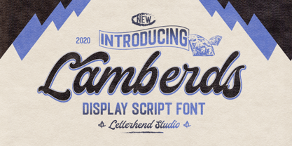 Introducing, Lamberds - a standout bold script with a touch of vintage look and feel. This type of font perfectly made to be applied especially in logo, headline, signage and the other various formal forms such as invitations, labels, logos, magazines, books, greeting / wedding cards, packaging, fashion, make up, stationery, novels, labels or any type of advertising purpose. Features : uppercase & lowercase numbers and punctuation multilingual alternates / swashes and ligatures PUA encoded We highly recommend using a program that supports OpenType features and Glyphs panels like many of Adobe apps and Corel Draw, so you can see and access all Glyph variations.
