10,000 search results
(0.025 seconds)
- Terafile by Sudtipos,
$39.00 Terafile, a sans serif family designed by Raúl Plancarte who was inspired by hi-tech aesthetics. It is made up of eight weight variants with their respective italic versions. Ideally it works to capture in a graphic way the universe related to technology, sci-fi, industry and similar topics. It is a mixed family, because the construction of certain letters (as in "a", "f", "z", "B", "P", among others) is enriched with different finishes in structure to gain differentiation and plasticity. In other words, it moves away from an entirely academic design. Another important line in the creative concept of this typeface is the function of its ink traps, which, in addition to fulfilling their primary function, serve to gain gestuality in its use. This font is capable of covering complex design needs by enabling association with specific themes, which makes it highly competitive in its graphic line.
 - Egregio Script by Fontscafe,
$39.00 We at Fontscafe are forever trying to work on conniving up typography that will blend itself into your work space in a manner that will make you wonder how you ever managed without it…and that effort has led us to the birth of yet another all-new font for you! And this one like most of our others has a niche appeal although it is versatile as versatile can be. Now this is a font that can pretty much fit the bill when you want to send out an exclusive appeal but yet not overly formal. It is styled with fonts that cry out ‘eliteness’ and exclusivity, but without the part where it becomes so exclusive and classy that it goes way over people’s heads! The ‘Egregio’ can still connect on a very personal, almost friendly level with your audience while it remains in a class of its very own!
 - Ata Rounded by Bülent Yüksel,
$19.00 My son’s name is Ata Caner Yüksel. After building this character, I wanted to honor him by using his name for this font. I think it fully reflects the character I created in my mind. Ata Rounded, only one of the four other deep end with rounded corners consist of sharpened flat plate. Matched to one another and are optimized for screen. The family, with eight weights plus matching italics, was designed by Bülent Yüksel in 2016. Ideally suited for advertising and packaging, editorial and publishing, logo, branding and creative industries, poster and billboards, small text, way-finding, and signage, as well as web and screen design. ATA provides advanced typographical support for Latin-based languages. Case-sensitive forms, classes and features, small caps from letter cases, fractions, superior, inferior, denominator, numerator, old-style figures, stylistic alternates; just one touch easy In all graphic programs. You can enjoy using it.
 - Big Stripes Mono by Ingrimayne Type,
$9.00 BigStripesMono is another typeface family from IngrimayneType that explores the possibilities of alternating letters sets. The family is monospaced with four fonts: a base or solid style, an outlined style, and two styles in which each character is cut diagonally and the halves are separated to form two characters. These split styles are not designed to be used alone but layered with the base style, outlined style, or both to form colorful lettering with an unusual striped appearance. The stripe is not apparent in single letters but only in words or lines of text. For best results use an application that supports the OpenType feature Contextual Alternatives (calt) to alternate the letters of the split styles. The four styles can be combined in several ways to create unusual lettering appropriate for titles, headlines, and similar uses. And if one wants a bold, monospaced, sans-serif face, BigStripesMono has that too.
 - Monkton Book Condensed by Club Type,
$36.99 Packing more copy in a narrow space is the main reason for using a condensed type. Characters with a more ovular shape tend to be less wide than their circular counterparts and will allow for more letters per line. In narrow columns for example, this typeface can provide up to 25% more copy than the regular typeface in the same space. Another reason is when a larger type size is called for — used sparingly it is useful for headings or headlines. For emphasis, narrower letters can provide a stark contrast in the flow of reading, creating impact while retaining typographic character. Condensed types can specially useful in tables and charts because typically both use few words in each block. If space now allows, you may think about the luxury of a larger point size. This optimizes space while keeping your typography more easily legible.
 - Ata by Bülent Yüksel,
$19.00 My son’s name is Ata Caner Yüksel. After building this typeface, I decided to honor it with my son’s name. I think I fully reflects the character I created in my mind. Ata typefamily, only one of the four other deep end with rounded corners consist of sharpened flat plate. Matched to one another and are optimized for screen. The family has eight weights plus matching italics was designed by Bülent Yüksel in 2016. Ideally suited for advertising and packaging, editorial and publishing, logo, branding and creative industries, poster and billboards, small text, way-finding and signage as well as web and screen design. ATA provides advanced typographical support for Latin-based languages. Case-Sensitive Forms, Classes and Features, Small Caps from Letter Cases, Fractions, Superior, Inferior, Denominator, Numerator, Old Style Figures, Stylistic Alternates in just one touch easy In all graphic programs. You will enjoy using it.
 - Quatre by Blank Is The New Black,
$15.00 Quatre is a clean, friendly, monoline display script with a number of subtle but significant features. Originally based on the style of cursive you may or may not have been taught in middle school, Quatre has a clean geometric flow to it while containing a robust set of OpenType features such as ligatures, swash capitals, and stylistic alternates that give it a unique look. With over 700 glyphs, coverage for over 30 languages, arbitrary fractions, contextual alternates and more, Quatre will have you covered for whatever situation you may run into. I mean, probably. I can’t know every single weird way you might be trying to use it. The point is, it’s got all of the bells and whistles you could reasonably hope for. Make sure you open up the OpenType panel in Illustrator, Photoshop, and InDesign to make use of all of those features.
 - Print Assistants JNL by Jeff Levine,
$29.00 For those who can't get enough of the wonderful illustrations, embellishments and dingbats of days gone by, Print Assistants JNL collects more of them in one handy font file.
 - "Club Dia" is a unique and vibrant font designed by dibujado | dabnotu, an artist known for their distinctive and imaginative approach to creation. This particular typeface stands out with its bold a...
- Yume by Thinkdust,
$10.00Yume is a fun loving font with a cruel streak that can sometimes turn laughter into daggers. This wicked personality can lead to some aggressive turns of phrase, but when it’s not being mean, Yume can use its strength and sense of humour to do a lot of good. Either way, Yume is sure to have a big impact on your audience, shocking them into paying attention through crisp, sharp lines and chunky, bold characters. - Obrigado by Hanoded,
$15.00 Obrigado means 'Thank You' in Portuguese. It is my way of saying thanks to the unknown designer of a Portuguese port-wine poster from the thirties. Obrigado font is based on that poster. As I had to work with a handful of glyphs, I designed the missing ones myself. Obrigado is a quite elegant and refined art deco font, which would be ideal for posters and logos. Obrigado speaks most Roman based languages.
 - Manihot by PintassilgoPrints,
$26.00 Manihot is a cool display sans-serif font, loaded with interlocks, ligatures and alternates to render your message in a nice eye-catching way, topped off with the usual je-ne-sais-quoi of PintassilgoPrints fonts. The family brings rough and clean styles and yet a very useful dingbat font with dozens of tiny graphics to complement your words. It’s up, witty, honest and just impossible to ignore. Give it a go!
 - Hybi17 Legend by Hybi-Types,
$12.00 The name says it: This font is made for usage in story-telling, movies, legends, fairy tales, sagas. It will tell about strength and bravery, forgotten tales and ancient kingdoms. You may use it for headlines, slogans and advertising. The style with real capitals will enlarge your potential of design. The fonts are offering a huge character set for usage in many languages. Also thousands of kerning pairs within both styles are obligatory.
 - Search by PintassilgoPrints,
$19.00 Search is a brush script font, seasoned with unconventional choices here and there – 'Hey, they are everywhere!', one may say, and that's okay. This is a contemporary upbeat font with loads of personality and yet some alternates: there are two choices for each letter, delivering that nice, organic, tasty handmade feel. Available in two flavors: with and without a dry brush texture. Isn't it what you've been searching for? We bet! Cheers!
 - Blauhaus by Hanoded,
$15.00 Yes, you're right. Blauhaus should have been 'Blaues Haus', as that is the proper way of saying Blue House in German. But hey, Blauhaus sounds much better and in writing, it is quite similar to Bauhaus. Blauhaus is a stylish, rounded sans serif font, modeled after some early 20th century German typefaces. It is easy on the eye and it will certainly give your work a sophisticated punch. Comes with a classy collection of diacritics.
 - The Cartel by Say Studio,
$12.00 About the Product The Cartel is a elegant serif font . This typeface has been made carefully to make sure its premium quality and luxury feel. The ligatures makes this typeface unique and stands out rather than the regular serif font. Very suitable for logo, headline, tittle, and the other various formal forms such as invitations, labels, logos, magazines, books, greeting / wedding cards, packaging, fashion, make up, stationery, novels, labels or any type of advertising purpose. Features : numbers and punctuation multilingual ligatures alternates PUA encoded FAQ's : Where are the TTF's? They are included in a download link( in a text file) in your main download file. 1 user 2 computers installation (Desktop License) You may NOT use for broadcast or Cinema/Motion Picture. You may NOT resell this font in any platform without further permission from designer. Do NOT embed font files in app/game/e-pub (for desktop license) You may NOT use the fonts in templates for sale/free. ( web/print/app ) For other license use please contact us. SOFTWARE REQUIREMENTS : Fonts and alternate : No special software required they may be used in any basic program /website apps that allows standard fonts That's it folks! You can go ahead and get cracking :) Follow My Shop For Upcoming Updates Including Additional Glyphs And Language Support. And Please Message Me If You Want Your Language Included or If There Are Any Features or Glyph Requests, Feel Free to Send me A Message. Have a Good Day !
 - Amonus by Ronin Design,
$15.00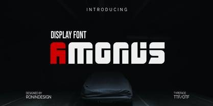 Amonus is a modern and simple display font. This font is ideal for logo design, labels, posters, or pretty much anything else that requires a unique touch.
 - Kingthings Lickorishe Pro by CheapProFonts,
$10.00 Kevin King says: "When I started this font it was called Pestle... It didn't run - it didn't even walk. At some point I thought, Hmm! Looks a bit like Liquorice! And now... Voila! I remember being able to buy about a yard of Liquorice rolled round a central comfit - how fab! Tuppence worth of sticky afternoon! You could also buy bundles of Liquorice root - which looked like black twigs with bright yellow wood - they left my teeth full of black twiggy bits... The past is a strange Lady - Bless her! This was almost Kingthings Leechy... just another one of my bulbous shiny things - I have always liked letter-shapes with 'bottom', probably a 70's thing, as many a seventies thing did indeed possess it - including the fabulous Chaka Kahn... Oooh, Diva!" ALL fonts from CheapProFonts have very extensive language support: They contain some unusual diacritic letters (some of which are contained in the Latin Extended-B Unicode block) supporting: Cornish, Filipino (Tagalog), Guarani, Luxembourgian, Malagasy, Romanian, Ulithian and Welsh. They also contain all glyphs in the Latin Extended-A Unicode block (which among others cover the Central European and Baltic areas) supporting: Afrikaans, Belarusian (Lacinka), Bosnian, Catalan, Chichewa, Croatian, Czech, Dutch, Esperanto, Greenlandic, Hungarian, Kashubian, Kurdish (Kurmanji), Latvian, Lithuanian, Maltese, Maori, Polish, Saami (Inari), Saami (North), Serbian (latin), Slovak(ian), Slovene, Sorbian (Lower), Sorbian (Upper), Turkish and Turkmen. And they of course contain all the usual "western" glyphs supporting: Albanian, Basque, Breton, Chamorro, Danish, Estonian, Faroese, Finnish, French, Frisian, Galican, German, Icelandic, Indonesian, Irish (Gaelic), Italian, Northern Sotho, Norwegian, Occitan, Portuguese, Rhaeto-Romance, Sami (Lule), Sami (South), Scots (Gaelic), Spanish, Swedish, Tswana, Walloon and Yapese.
 - Alpha Dance - Unknown license

- Kremlin Minister - Unknown license

- Fitriyah by Din Studio,
$29.00 Are you looking for a way to enhance your copy? Looking for a way to stand out from your competition? Maybe you are missing that “something”. Introducing Fitriyah-A Display Font Fitriyah was fully thought out to easily meld inside your designs. These fonts make a good foundation of what you want it to be! Discover the beauty in your own imagination while this font gives you a quick kickstart to what it can be. Wait no more, this beautiful font can be yours right now! This custom made font was specifically designed to fit whatever you need! Perfect for social media posts and ads, printed quotes, t-shirt designs, packaging, or even as a modern text overlay to any background image. Fitriyah includes Multilingual Options to make your branding globally acceptable. Features: Standard Ligatures Alternates Stylistic Sets Swashes Multilingual Support PUA Encoded Numerals and Punctuation Thank you for downloading premium fonts from Din Studio
 - Reina by Lián Types,
$37.00ATTENTION! See the newest version of Reina here. Reina Neue is now a family of 45 styles and it's also a Variable Font! Have a look. For the traditional version of Reina, you may stay here ;) --- Reina is Sproviero’s didone of the year. We recommend seeing its user’s guide . Inspired in the sweet letters of calligraphy and typography masters of our past; such as Didot, Bodoni and the incredible Herb Lubalin, its aim was to incorporate the decorative accolades from blackletter and copperplate styles of calligraphy into a Modern Roman typeface. Reina reflects sovereignty due to the enveloping atmosphere and the sensation of greatness that can be felt when using it. It has an unique way of standing over paper and screen, being its swashes responsible of an extreme elegance. Similar to what Lian did in his last font Breathe , Reina was designed to be playful yet formal: While none of its alternates are activated it can be useful for short to medium length texts; and when the user chooses to make use of its open-type decorative glyphs, it can be useful for headlines with dazzling results. TECHNICAL Reina is a family with many members. In order to achieve better results when printing, Lian took his time to design the necessary styles: Reina 72 Pro, prepared for display sizes; Reina 36 Pro, for medium sizes; and Reina 12 Pro, the best for text or decorative words in small size. Each of these members have variants inside, which are open-type programmed: The user decides which glyph to alternate, equalizing the amount of decoration wanted. Reina Engraved Pro has the same features than the variants mentioned above. The family also contains variants which were made exclusively for decoration. These are: Reina Words, a set of the most common words used in english, german, italian, french and spanish; Reina Capitals, which consists in a big set of ornamented capitals; and Reina Fleurons, those little friends which always help to embellish our work. - Aromatica by Latinotype,
$39.00 Aromática—designed by Sofia Mohr—is a rounded typeface with a simple and clean look that reminds us of those strokes found in handwriting while providing functionality and readability. Aromática consists of 7 fonts: a monolinear Script, a Sans-serif of 5 weights, ranging from Extra Light to Bold, and a Patterns font, inspired by aromatic herbs and spices, which is the perfect companion to the Script and Sans faces. Aromática was specially designed for branding and packaging, but it may also be used for headlines, publishing and advertising. The family comes with a character set that supports 207 different languages.
 - Aeonis by Linotype,
$29.99 After Generis™, Aeonis™ is the second large family of typefaces by Erik Faulhaber. The basic Aeonis sans-serif form references Ancient Greek lapidary inscriptions from the 9th century BC. Between the poles of antiquity and modernity, a deliberate contradiction of round and rectangular forms gave way to a new and energised font: Aeonis. Aeonis is available in three widths and seven weights, all of which have been carefully coordinated in terms of their proportions. The clear contrast in the bold stroke intensity emphasises the organic nature of the font and creates exciting aesthetics. In light of their open forms, the letters guarantee a good level of readability, even in small point sizes. Given that the dynamic individual forms of Aeonis also fit perfectly in a functional image, this typeface is ideal both for complex, text-heavy documents as well as for logos and display text settings. Particular attention was paid to ensuring carefully coordination proportions: all styles and weights have the same cap height, as well as identical ascender heights, x-heights, and descender lengths. The widths of all figures, currency symbols, mathematical operators, and special characters have been carefully aligned for tablular settings. Aeonis is an extremely systematic design. All of its widths and weights may be combined with one another, without restrictions. For users who do not like the open A, an alternate A with a crossbar is included in each font as well.
 - Catania by Intellecta Design,
$17.90Note: The Lined and Shadow styles are no longer available due their complexity and the resulting memory and performance issues. - deccodisco - Personal use only

- Adhesive Serif Letters JNL by Jeff Levine,
$29.00 A few scant examples of die cut gummed letters (R, C, Y and &) provided the design inspiration for Adhesive Serif Letters JNL. Influenced by the Caslon style, this typeface offers clean, legible titling. The sample letters were once manufactured by the Tablet and Ticket Company of Chicago and sold under their brand name of Willson's [named for the founder of the company]. Gummed letter sets were available in a variety of styles and sizes for various sign, merchandising and marking needs.
 - Feltboard JNL by Jeff Levine,
$29.00Feltboard JNL was drawn from images of letters and numbers contained in a felt board (also known as a flannel board) sign kit from the 1940s or 1950s. The irregularity of stroke widths and character shapes is representative of the actual shapes of the die-cut pieces found within this kit. Note: The cap height is slightly smaller than normal for the respective point size. This will give the effect of wider line spacing - similar to that of hand-made signs. - Cisalpin by Linotype,
$29.99 The ideal typeface for cartography The Swiss designer/typographer Felix Arnold designed Cisalpin during the late 1990s, after he had challenged himself to create a contemporary typeface that could be used for cartographic uses. Arnold came to the subject of cartographic typefaces after analyzing many maps and atlases, and discovering that there was no standard typeface for these types of documents. Like any good cartographic type, Cisalpin is very legible at small sizes. While he was drawing this typeface on his computer, Arnold used a reduction glass to refine his design, making it work in these situations. Cisalpin is a linear sans serif face, with slight resemblance to renaissance serif types. The various weights are all clearly differentiated from one another. And because space is often a premium on maps, Cisalpin runs narrow. Words close in around themselves to help them become more identifiable. The letterforms in Cisalpin are durable, and can maintain their readability when placed over complex backgrounds. They have open interior forms, flattened curves, tall x-heights, and a capital height that almost reaches the tops of the ascenders. Cisalpin also has pronounced Italics, with a very clear angle of inclination. Each letterform in the family has been optimized so that they cannot be easily mistaken for another. This again helps minimize the misunderstandings that often occur because of illegibility. Although Cisalpin was developed for use in cartography, it may be used for countless other purposes; any font that can work well in small sizes on a map could be used almost anywhere else!
 - Newland - Unknown license

- Margit - Unknown license

- Coming Together by Font Aid,
$20.00 Coming Together contains over 400 glyphs and is supplied as a single, cross-platform OpenType font. All glyphs are accessible using OpenType-savvy applications, Unicode-savvy utilities, the Character Map utility on Windows, and FontBook on Mac OS X. Nearly 400 designers contributed to “Coming Together”: Adam Humphries, Aditi Dilip, Adrien Midzic, Afraa Gutub, Al Insan Lashley, Alan Lima Coutinho, Alaric Garnier, Alejandro Cabrera Avila, Alejandro Lo Celso, Alejandro Paul, Alessandro Segalini, Alex Cameron, Alex Coblentz, Alexander Trubin, Alexandre Freitas, Alexey Murashko, Alicia Jabin, Aline Horta, Allison Dominguez, Amanda Postle, Amy Brown, Amy Papaelias, Anderson Maschio, Andrea Emery, Andres Perez, Andrew Boardman, Andrew Jesernig, Andrey Furlan, Andrij Shevchenko, Ann Tripepi, Antonio Gutierrez, Antony Kitson, Anushree Kapoor, Anya Cam, AP303 Estudio Design, Becky Krohe, Beejay, Ben Mitchell, Benjamin K. Shown, Benjamin Varin, Brad McNally, Brad Nelson, Bradley Trinnaman, Brady Baltezore, Brandon Horne, Breck Campbell, Brian J. Bonislawsky, Brian Jaramillo, Brian Jongseong Park, Brian Mueller, Brock French, Bruce Rodgers, Bruno Pugens, Bryan Angelo Lim, Buro Reng, Caitlin Martin-Frost, Calou, Carlos Fabián Camargo Guerrero, Carlos Vidal, Cayo Navarro, Cesar Puertas, Chank Diesel, Charles Williams, Chris Lozos, Chris Trude, Christophe Badani, Christy Lai, Claes Källarsson, Claire Coullon, Claudio Piccinini, Colby Cook, Craig Eliason, Cristina Pegnataro, Curve Doctor, Dan DiSorbo, Dan Liggins, Dan Rubin, Daniel Justi, Daniele Capo, Dav(id Hubner), Dave Bailey, Dave Cohen, David Jonathan Ross, David Sudweeks, David Thometz, Dawn Mercurio, Delve Withrington, Diana van de Blaak, Didier Mazellier, Diederik Corvers, Dino Santos, Dmytro Pobiedash, Donald Beekman, Dries Wiewauters, Duncan Bancroft, Ed Hoskin, Eddy Ymeri, Edineide Oliveira, Eduardo Manso, Eduardo Rodríguez Tunni, Eero Antturi, Eli Castellanos, Elias Bitencourt, Elias Stenalt Werner, Elman Padilla, Emery Miller, Emily Leong, Emily Maher, Enrico Limcaco, Eric Frisino, Eric Stine, Erik Brandt, Espen, Evan Moss, Evangeline Rupert, Fabiane Lima, Fabio Foncati, Fabrizio Schiavi, Farbod Kokabi, Felipe Lekich, Francisco Martin, Frank Riccio, Frans van Bellen, Gary Holmes, Gautam Rao, Gayle Hendricks, Gene Buban, Georg Herold-Wildfellner, George Aytoun, Gerd Wiescher, Giles Edwards, Gist Studio, Glen Barry, Glenn Parsons, Goro Mihok, Grace Engels, Grant Alexander, Grant Hutchinson, Greg Smith, Gunnar Swanson, Gustavo Machado, Hans Nieuwstraten, Harold Lohner, Hilary Salmon, Hillary Fayle, Hrant H Papazian, Hugo Gallipoli, Ian Drolet, Ian Lynam, Ilona Kincses, Isac Corrêa Rodrigues, Ivette Chacon, Ivo Federspiel, Jacques Le Bailly, Jae-hyoung Choi, Jaime Vasquez, James Edmondson, James Grieshaber, James L. Stirling, James Lukens-Gable, James Martin, James Ockelford, James Puckett, Jarbas Gomes, Jarett Knuth, Jason Adam, Jason Robinson, Javier Suzuki, Jay Chu, Jayson Zaleski, Jean Francois Porchez, Jeff Fisher, Jeff Jarvis, Jeffrey Vanlerberghe, Jelmar Geertsma, Jennifer Clarke, Jennifer Rutherford, Jens Kutilek, Jerry Allen Rose, Jess Latham, Jesse Ragan, Jessica Page, Jesvin Yeo Puay Hwa, Jim Ford, Jim Lyles, Jim Rimmer, Jin Ping, Jo De Baerdemaeker, Joachim Muller-Lance, Joanna Abbott Moss, Joe Francis, Joe VanDerBos, Joel Vilas Boas (J85), John Downer, John Flanagan, John Foley, John Langdon, John Lopez, John Lyttle, John Skelton, Johnny Dib, Jonathan Hughes, Jonathan Pierini, Jos Buivenga, Jose Luis Coyotl Mixcoatl, Juan Acosta, Judd Crush, Judith Lee, Julie Johnson, Julie Oakley, Julie Thomas, Juliet Shen, Jumin Lee, Jurgen Weltin, Justin Callahan, Justin Chodzko, Karel Piska, Karen MacKay, Karin Eberhardt, Karin van Soest, Karla Perez, Katie Parry, Katie Snape, Katri Haycock, Katy Brooks, Kelley Garrard, Kelly Redling, Kent Lew, Kevin D’Souza, Kevin J. Boynton, Kevin McDermott, Kim Arispe, Kokin, Kristen Caston, Kristen Hartman, Kristian Möller, Kristians Šics, Kyle Jones, L Bollinger, Lan Huang, Larry Van Dyke, Laura Ricker, Laura Worthington, Laurel Wilson, LeAndrea James, Lijklema Design, Linda McNeil, Lise Barreto, Louie Crumbley, Louis Duchesne, Luke Dorny, Luke Stouffer, Madison Cramer, Måns Björkman, Marc Salinas Claret, Marcus Leis Allion, Marcus Parker, Marcus Sterz, Marie-Anne Verougstraete, Mark Simonson, Martin Majoor, Matheus Barbosa, Mathias Forslund, Matt Desmond, Matt McInerney, Matt Millette, Matthew Jerauld, Max Kisman, Michael Browers, Michael Bundscherer, Michael Cina, Michael Doret, Michael G. Adkins, Michael Hernan, Michael Paul Young, Michael Wallner, Miguel Catopodis, Mikael Engblom, Mike Jarboe, Mike Petschek, Miriam Martincic, Moira Sheehan, Monica Pedrique, Nacho Gallego, Naomi Atkinson, Natanael Gama, Nathanael Ng, Neil Fox, Neil Patel, Neil Summerour, Neil Woodyatt, Ngoc Ngo, Nguyen Pham, Nicholas Curtis, Nicole Hudson, Nicole Sowinski, Nicolien van der Keur, Nina Stössinger, Noah Scalin, Ojasvi Mohanty, Oleg Macujev, Olivia Choi, Ong Fang Zheng, Pata Macedo, Patrick Gallagher, Patrycja Zywert, Paul Hunt, Paul Langman, Pedro Moura, Pedro Paz, Per Ohlsson, PJ Onori, Premm Design Ltd, Rae Kaiser, Rafael Carozzi, Rafael Cordeiro, Rafael Neder, Randy Jones, Ray Larabie, Raymond Forbes, Ressa McCray, Ricardo Esteves, Ricardo Martins, Riccardo Sartori, Richard Kegler, Richard Miller, Rob Keller, Roballo, Rose Coplon, Roy Rub, Rudo van der Velden, Russell McGorman, Ryan Rushing, Ryan Thorpe, Sander Neijnens, Sara Cross, Scott Boms, Scott Fisk, Sergio Jimenez, Shi-Min Chin, Sílvio Gabriel Spannenberg, Soohyen Park, Sorin Bechira, Stanley Friesesk, Stefan Hattenbach, Stefan Kjartansson, Stephen Lay, Steve Harrison, Steve Marsh, Steve Matteson, Steve Mehallo, Steve Zelle, Steven Bonner, Steven Wulf, Stuart Brown, Stuart Ford, Stuart Sandler, Sue Zafarana, Sulekha Rajkumar, Susan Surface, Tanya T Stroh, Taylor Loman, Ted Ullrich, Teja Ideja, Tena Letica, Terrance Weinzierl, Theo França, Thiago Martins, Tiffany Wardle, Tim Whalen, Titus Nemeth, Tom Plate, Tom Rickner, Tomato Košir, Tomi Haaparanta, Travis Kochel, Troy Leinster, Tyler Heron, Type Mafia, Vanessa Robertson, Veronika Burian, Victor Esteves, Victor Zuniga, Viktor Nübel, Viviana G, Wellinton Reis, Wilson Thomas, Wolfgang Homola, Xavier Dupre, Xerxes Irani, Zvika Rosenberg These designers represented the following countries: Argentina, Australia, Austria, Belgium, Brazil, Canada, Columbia, Croatia, Czech Republic, El Salvador, England, Finland, France, Germany, India, Ireland, Italy, Japan, Latvia, Lebanon, Mexico, New Zealand, Peru, Poland, Portugal, Scotland, Siberia, Singapore, Slovenia, Spain, Sweden, Switzerland, The Netherlands, Ukraine, United States, Venezuela, Vietnam
 - The KG Ways to Say Goodbye font embodies a unique and evocative personality within the realm of typography, crafted with a blend of whimsical charm and heartfelt expression. This font is the creation...
- First Grade by m u r,
$10.00Searching for a font that resembled true children's handwriting, this font's creator designed a font from his own first grade penmanship assignments. Ideal for anything related to children. - Ghost Flames by Letterafandi Studio,
$14.00 Ghost Flames is a bold and spooky decorative font. Add it to your Halloween crafts, horror movie posters, t-shirts and anything else that requires a spectacular look.
 - Sugared Beat by PizzaDude.dk,
$14.00 Its handmade, playful and super useful for anything that needs a fun and handmade twist! I have added 3 different versions of each letter and multilingual support - enjoy!
 - Quakeland by ARToni,
$24.00 Quakeland is a cool, modern and stylish display font. Add this trendy font to your web designs, logos or pretty much anything that requires a smart, cool touch.
 - Optimus by Letterafandi Studio,
$12.00 Optimus is a cool and modern display font. This font is ideal for writing web designs, business cards, or pretty much anything else that requires a unique touch.
 - Crowden by Aftertime Studio,
$17.00 Crowden is a cool, bold and futuristic display font. It works great on games, science projects, sporting events or pretty much anything that requires a high-tech vibe.
 - Fabrics - Personal use only


