10,000 search results
(0.031 seconds)
- Decolot by Ryzhychenko Olga,
$6.00 Decolot font was created being impressed by the art deco era. It is built on simple geometric forms. The font is ideal for posters design, invitations, headlines.
 - Gastino by Ronin Design,
$15.00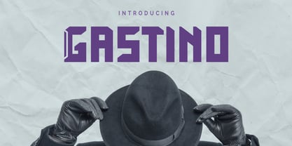 Gastino is an casual and unique display font. Gastino is designed for any project, this font is perfect for poster design, logotype design, advertising and many more.
 - Latin Fiesta JNL by Jeff Levine,
$29.00 The playful, casual hand lettering on the 1941 movie poster for “Blondie Goes Latin” inspired Latin Fiesta JNL which is available in both regular and oblique versions.
 - Glide by Typedepot,
$35.00 Elegant custom font with rounded corners, great for logos, posters, motion graphics and t-shirts. The name is inspired by the sleek curves and its smooth look.
 - Gemoy by San Studio,
$9.90 A cute and playful display font is good to go on your projects such as poster design, merchandise, quotes, t-shirt designs, social media posts, and more.
 - Suki by Joachim Frank,
$22.00 Sookie is a hand designed font for posters, invitations, headlines, lettering of nursery hooks, signs, young, fresh and round. Designed in March 2022 by Joachim Frank, Germany.
 - Amonus by Ronin Design,
$15.00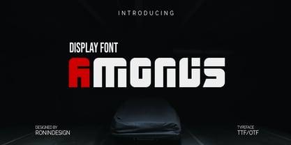 Amonus is a modern and simple display font. This font is ideal for logo design, labels, posters, or pretty much anything else that requires a unique touch.
 - The Mighty Major by Just Lett,
$18.00 The Mighty Major is a new script and is perfect for signatures, posters, fashion, weddings, branding, logos and more. Features: ~ Uppercase ~ lowercase ~ Numeral and Punctuation ~ Multilingual ~ Ligature
 - AZ Harpers July by Artist of Design,
$25.00 AZ Harper's July font is inspired from original early 1900's Edward Penfield's poster art. This font is designed for use as a worn and antiqued headline.
 - Syage by Nirmana Visual,
$19.00 Syage a classy, contemporary of Serif font, inspired by Art Deco Era. Ideally suited for advertising and packaging, festive occasions, editorial and publishing, creative industries and posters.
 - Mustang DD by Doffdog,
$14.00 Mustang is a vintage handmade all caps font. It is perfect for: logos, posters, labels, headlines, apparel & more. It comes with characters, numbers, marks and punctuation. Enjoy!
 - Art And Design JNL by Jeff Levine,
$29.00 A 1930s-era WPA (Works Progress Administration) poster advertising a Federal Art Project exhibit entitled "Index of American Design" was the basis for Art and Design JNL.
 - Kircher by Turto Studio,
$10.00 Kircher is a typography inspired by old building facade letterings. It is a vintage style geometric sans serif typography great for logos, banners, posters and graphic artists.
 - Jimbo by Adobe,
$29.00First used by the designer on his personal letterhead, Jimbo has an informal modern style. Use the Jimbo font family on posters, in advertisements and on packaging. - Steletto OS Flair by Jonahfonts,
$42.00 Condensed Oldstyle Gothic with flair. Great for tight-fitting headlines and other condensed titling situations such as headlines, ads, invitations, captions, packaging, bulletins, posters, and greeting cards.
 - MB SIXTYTHREE by Ben Burford Fonts,
$20.00 A heavy black display face with lots of retro 'cool'. Modernist to the extreme MB SIXTYTHREE oozes 'mod' culture. Great for magazines & headlines, logotypes, posters, album artwork.
 - Round Block by Motokiwo,
$16.00 Round Block is a techno Sans Serif font. It’s suitable for sports logo, poster, headline, products design, print design, etc. Round Block also support standard multilingual characters.
 - Ticketbook by Suomi,
$20.00 Univers and Helvetica Compressed are most often used for movie posters, but they lack variants. Therefore I made a compressed family with seven weights for more versatility.
 - Sambi Lemon by RahagitaType,
$15.00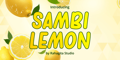 Sambi Lemon is an uppercase awesome font suitable for your many great project as branding, packaging, poster, comic, flyers, and more. Features: - Uppercase & Lowercase - Multi-lingual Support
 - RTCO Fransworth by Roams Type Co,
$12.00 RTCO Fransworth Inspired by Vintage Horror Novel & Movies Poster Typograhphy This font is suitable for graphic designs such as logotypes, merchandise, printed stickers, and other branding needs.
 - Sarmal by Ahmet Altun,
$19.00 The sarmal font contains ligatures that are functional and useful. It can be a stylish font choice for your posters, t-shirts, prints and many more works.
 - Handsta Signature by Nirmana Visual,
$19.00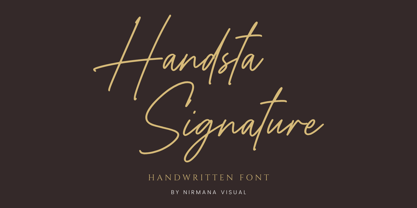 Handsta Signature a classy, contemporary of script font, inspired by Handwriting Signature. Ideally suited for advertising and packaging, festive occasions, editorial and publishing, creative industries and posters .
 - Bros Rover by Blankids,
$27.00 Introducing a new font is Bros Rover Classic Sans Serif. Bros Rover good for logotype, poster, badge, wedding invitation, book cover, tshirt design, packaging and any more.
 - Retro British by Nirmana Visual,
$29.00 Retro British A classy eighties Poster inspired serif, offers beautiful typographic harmony for a diversity of design projects, including logos & branding, social media posts, advertisements & product designs.
 - Hnm by Krown Creative Factory,
$5.00 Hnm is a Geometric Sans Typeface with some bold and round glyphs to give a sense of confidence but also not rigid or strictly its a jovial Happy Typeface It can be used to create a range of design projects like posters, advertising and marketing flyers and even to printed items. It just requires you to use your imaginative strength and your design projects will look more native and even better pass your message. With this typeface you can create a party poster, movie flyer, advertising and marketing posters, it can also be used on branding items, Craft design, book covers, music cover arts, or any purpose of your choice to make your designs have that bold and confident look without looking too serious, feel free to play with this typeface.
 - Meier Kapitalis by Elsner+Flake,
$39.00 As a late work the “Meier Kapitalis” forms an arch within the typographic creations of the Swiss type designer Hans Meier who died in 2014. The first sketches of this typeface can be found in the teaching manual “The Development of Script and Type” (German: “Die Schriftentwicklung”; French “Le développement des caractères”) which was published in 1994, however, under the title “Roman Lapidary, 1st Century”. The booklet was first published by the Syntax Press, Cham, Switzerland and contains an introduction by Max Caflisch in which he writes: „The present work, „The Development of Script and Type“ is a concise, authoritative textbook, concentrating on the essentials in a wide survey from ancient Greek inscriptions to the printer’s typefaces of the present day. His (Meier’s) 72 varieties of letterforms enable the student or general reader to understand the history of script and type, while more than 60 of his own calligraphic specimens provide excellent models for all who practice this art.“ Unfortunately, the “Meier Kapitalis” is one of the few typeface families in this publication which has been digitized. It was to be the last type project fully realized by Meier. In cooperation with Elsner+Flake, the typeface family was developed and expanded and now contains the four cuts: Roman, Medium, Demi Bold and Bold with either a complement of characters for 78 Latin-based languages (EL=EuropaPlus) or in West-Layout.
 - Potbank by Asdesign,
$50.00 Like many cities in the Midlands and North of England, Stoke-on-Trent has a rich history linked to making and industry. In Stoke’s case it was pottery. In the early 1900s bottle kilns could be seen covering the landscape of the six towns making up Stoke-on-Trent with hundreds of factories producing some of the best ceramics in the world. But by the 1990s most of these had gone. Torn down for development of housing or just left to rot. During the next few decades Stoke continued to change. The industry was in a decline and Stoke itself was seen as another poor midlands city with a dwindling industry. Then in 2008, Spode, one of the largest and most famousceramics factories in Stoke entered into administration. Pens cast aside, drawings left half finished, designs left in the turned-off kilns; Spode factory was abandoned. This was a real shock and the way everything was getting thrown into skips to be put on the tip was heartbreaking. Thankfully people salvaged some of the technical drawings, sketch design, old sample pieces and ceramics that people hard worked so hard on. Potbank has been in development over a number of years taking inspiration from the heritage and designs from the ceramics industry. It has a mixed Clarendon and Antiqua style structure with its main purpose to be used as a printed type.
 - Petite Annagri Cyrillic by Ira Dvilyuk,
$19.00 The font pair Petite Annagri Cyrillic will look gorgeous on wedding stationery, love stories, branding materials, monoline logos, business cards, Insta quotes, elegant fashion sketches, and much more. Petite Annagri script font contains the Cyrillic and Greek glyphs too. Petite Annagri is a pretty monoline cursive font, plus a Symbols font with 36 lovely monoline swirls, flourishes, and illustrations. Petite Annagri script font contains a full set of uppercase and lowercase letters. Petite Annagri Symbols is a font with over 36 hand-drawn monoline elements, illustrations, and swashes that can help you to make your design unique and matchless. Combine and merge swashes, flourishes, and illustrations to create your own designs and make borders, frames, dividers, logos, and more. To make the swirl or flourishes in the beginning or in the end of the word just type the letter (A-Z or a-z and 0-9 keys) and choose the included Petite Annagri Symbols font. See preview images. Multilingual Support for 33 languages: Latin glyphs for Afrikaans, Albanian, Basque, Bosnian, Catalan, Danish, Dutch, English, Estonian, Faroese, Filipino, Finnish, French, Galician, Indonesian, Irish, Italian, Malay, Norwegian Bokmål, Portuguese, Slovenian, Spanish, Swahili, Swedish, Turkish, Welsh, Zulu. Also, the Greek language is supported. And Cyrillic glyphs support for Russian, Belorussian, Bulgarian and Ukrainian languages Kazakh. Works perfectly on the Canva platform. For Cricut & Silhouette recommended.
 - Fishmonger by Suitcase Type Foundry,
$39.00Fishmonger originated from a commission of two fonts for the corporate identity of a fishmonger shop. When sketching the elementary principles for the lettering, the idea for a modern, extensive font family with a large number of styles was born. The first step consisted of defining the range of widths and weights. Then the master design Medium Regular was completed. The next step was adjusting the Extra Condensed Thin, the Extra Condensed Bold, The Extra Extended Thin and the Extra Extended Bold weights, as they are the vertices of an imaginary square map of the face. This meant that, in order to achieve a harmonious result, the x and y axis needed to be defined. From top to bottom, from the widest to the most condensed cut, the proportions are linear. However, from light to black, the line curves gently, allowing lesser difference between the light cuts, and a dramatic one between the heavier cuts. To ensure the original parameters were respected each position on the vertex was checked against the Medium Regular. After sorting out the ideal set-up, the remaining characters of each of the weights were drawn, and the remaining cuts were interpolated according to the principles above. Fishmonger is a functional, clean design, free of any buoyant, ornamental shapes, almost minimalist. Maybe this is what lends the type family its unique appearance. - Linex Sans by Monotype,
$29.99Linex Sweet was designed by Albert Boton in the late 1990s. It's a smallish family of three weights; the middle weight has an italic companion face. With its soft corners and slightly quirky head-serifs, Linex Sweet is a friendly design that sees much use. Several years later, Boton began sketching a new design, based on the original Linex Sweet but with a little more authority and grace. Linex Sans is the result. A mix of crisp angles and soft shapes, this new addition to the extended Linex family is both inviting and elegant. The subtle calligraphic overtones distinguish the design from more traditional sans serif designs. A three-weight family with a complementary italic for the Regular weight, Linex Sans is a versatile communications tool in both text and display sizes. It offers that mix of sophistication and joie de vivre that characterizes the designs of Albert Boton. Boton began his professional career as a carpenter. Fortunately for designers and typographers, he quickly turned from pounding nails to hammering out graphic design and constructing great letterforms as a profession. In his long career, he has created hundreds of distinctive, highly useful and award-winning designs. And even though he is now retired from active business, Boton continues to create fresh, new typeface designs. Add Linex Sans to the list. - Cutie Sugary by Jafar07,
$14.00 Cutie Sugary is a delightful font that exudes charm and sophistication. With its graceful serifs and refined letterforms, it adds an air of elegance to any design. The carefully crafted swashes on select letters provide a whimsical and playful element, making it perfect for creating eye-catching headlines, invitations, and branding materials. Designed with love and attention to detail, Cutie Sugary captures the essence of timeless beauty. Its classic style, combined with the hand-drawn sketch medium, adds a touch of warmth and authenticity to your projects. Whether you're designing wedding stationery, crafting unique greeting cards, or creating stunning logos, this font will add a delightful and personalized touch. The friendly and simple nature of Cutie Sugary makes it incredibly versatile. It effortlessly blends into a variety of design styles, from modern to vintage, ensuring its adaptability for different projects. Its legibility and balanced letterforms make it equally suitable for both small and large-scale designs, guaranteeing a seamless reading experience for your audience. As you bring your creative ideas to life, Cutie Sugary will be your trusty companion. Its charming aesthetics will help your creations stand out on marketplaces like Etsy, Creative Market, and MyFonts. With Cutie Sugary, you can add a sprinkle of sweetness and elegance to your designs, captivating the hearts of your customers
 - Obla by LetterPalette,
$20.00 The Obla font family is a modern serif typeface accompanied by appropriate italic in seven weights. Sketches of letters were drawn manually, using thick marker for creating shape and pencil for finishing details. Calligraphic origin of shapes is revealed beneath strained curves drawn on computer. All of the weights were carefully adjusted to each other. Obla is equipped with some basic OpenType features and supports Cyrillic and Latin script. Using Obla in small sizes is very convenient, because of its large x-height, and Obla is a very readable typeface. It seduces the reader with its vivacious character. The typeface is also suitable for usage in large sizes. The best choice for headlines is using the heaviest (Black) and the lightest (Thin) weight. There are two smaller family packages in offer: Obla Basic Set contains Regular, Italic, Bold and Bold Italic, while Obla Light Set contains Light, Light Italic, SemiBold and SemiBold Italic. These two sets are the most appropriate for working with small text. Other weights can be bought separately, or within the whole family. Obla is an awarded typeface. It got Special Mention in Cyrillic Typefaces category in Granshan 2016 competition and it was chosen as a Merit Winner in Print’s Typography and Lettering Awards competition. At that time, before publishing, the typeface was named Petra.
 - Fnord by Monotype,
$23.99 Fnord is a contemporary humanist serif typeface, it is ideally suited for display purposes, titling, headline copy and branding. The family has been designed to be highly versatile, containing a total of 23 fonts. Each font features discretionary ligatures, swash alternates and true small caps. The overall design is clean and simple with a little bit of rebelliousness thrown in for good measure – Fnord does not conform to the traditional serif blueprint. Fnord’s design has been strongly influenced by the complex, thought-provoking and mischievous works of authors Robert Anton Wilson and Robert Shea from the 1970s. I was re-reading their work while sketching the initial letterforms and realised that some of the proportions and angles were coinciding with some themes that run through the books – particularly the numbers 5, 17, 23, 40 and 93, which are key to this font family’s spacing and geometry. I found it both very interesting and enjoyable to play with a specific theme and purpose for creating this typeface. I am sure you will enjoy working with it in your own design projects. Key features: • 5 Weights in 4 Styles – Roman, Italic, Condensed and Extended • 3 Additional Display Styles in 1 Weight – Engraved, Inline and Woodcut • Small Caps, Alternates, Swashes and Discretionary Ligatures • Full European character set • 680 glyphs per font.
 - Pershal by insigne,
$29.00 Pershal is something of an oddball, and that's the point. Dynamic and fast, Pershal attracts interest. Its architecture evokes growth and progress. Inspired by the futuristic styles of the 1990s, Pershal started on an aircraft ride as a sketch on a napkin. I set the concept aside for almost a decade before I went back to play with the typeface. Pershal is planned to complement applications in consumer finance, technology firms or biotechnology. As such, it has a complete set of both tabular and proportional figures. For the lowercase, Pershal features a distinctive shape that emphasizes its x-height. Its horizontal movement is highlighted by some of its other features, such as its crossbars. To emphasize growth, acceleration and inventiveness, crossbars and other elements are cut at a dynamic angle. It's a sans serif without a lot of contrast. Another unique feature of this typeface is the vast number of OpenType alternates. If you prefer a more conventional appearance to your sans, with stylistic alternates, you have that option. Altogether, there are more than seven separate sets of stylistic alternates and about 250 alternates for characters. This enables you to mix-and-match and create your own personal typeface. For branding, this makes it very useful. For your next project that requires a dynamic and technological appearance, give Pershal a shot.
 - FS Hackney by Fontsmith,
$80.00 Elliptical The squareness of curves. That was the elliptical – in more than one sense – notion being explored in the making of FS Hackney. The squareness of curves and vertical terminals to create a gentle, soft sans serif, with a little bit of magic. A momentary thought – “It doesn’t have to be like this” – provided the spur to explore the verticals and skeletons of letterforms beyond conventional type design limits. A 12-month gestation period gave rise to a font with a larger-than-usual character set, including non-lining figures, small caps and superior and inferior numbers. It’s a collection that speaks confidently for itself. Assertive It was the Hackney carriage – the black London cab – that gave this font its name, not the north London neighbourhood. Solid, dependable, effective and built to last, FS Hackney was honed to perform in all conditions. Cool, compelling lines and a satisfying overall simplicity lend FS Hackney its assertive air. Assured, versatile and effective; just like a black cab (but without the grumbling). Machined Over a string of meetings, Jason Smith and FS Hackney designer Nick Job worked out how to infuse Nick’s sketched letterforms with Fontsmith’s familiar geniality. “Nick is very meticulous and produces very clean design work,” says Jason. “Hackney is ideal for branding as it’s very clear and its quirks are sensible ones, not odd ones, that don’t distract from the message.”
 - Bello Pro by Underware,
$50.00 Now check this, Underware’s blockbuster type, Bello. Bello Pro is a brush typeface for headline point sizes - it’s big & beautiful. Bello has lots of ligatures and start and ending swashes. They are automatic in Bello Script Pro, which is a cross-platform OpenType font with many OpenType features. Bello has Underware’s world-dominating Latin Plus character set, supporting a total of 219 languages (Latin 1 + 2 and beyond). After a period of hand sketching and lettering, Bello got two main styles: Script and Caps. These two fonts create a strong typographic contrast - while Bello Script Pro is flourished and flowing, Bello Caps Pro provides upright and sturdy capital lettering. As sturdy as brush lettering allows, of course. Careful spacing and kerning ensures* that Bello appears like fluently written handwriting. However, that’s not enough for a hand-lettered feel. Therefore Bello comes with a set of 64 ligatures. Some of them are typographic, some made simply to create a more intimate, natural impression. For the same reasons we have added a few ornaments and a set of snap-on beginning and ending swashes which attach to the lowercase letters of Bello. With Bello Words Pro you can add some two-color words in your text by the pre-designed word logotypes. Trust the brush! *So take care: use ‘metrics’, not ‘optical’ as a spacing setting in layout apps.
 - Ma Braille by Echopraxium,
$5.00 The "Ma" in "Ma Braille" is used as a minimalist way to say "Negative Space". "Ma" in japanese arts is an "esthetical usage of emptiness". Thus this font explicits the negative space around visible braille dots in each glyph. A. Font user guide a.1. Lowercase glyphs { A..Z } In these glyphs, dots are represented as "black squares" while the negative space is displayed as 1 or 2 white filled polygons. a.2. Uppercase glyphs { a..z } In these glyphs, dots are represented as "white squares" while the negative space is displayed as 1 or 2 black filled polygons. a.3. Digits: they are just the same than a..j, but the "North US version" is also provided in ascii codes 0xE0..0xE4 (1..5) and 0xE7..0xEB (6..0). a.5. "Dashed Border": a.5.1. "Black dashed" border glyphs; { £, ¥, µ, Â, Ä, Ê, Ë, Î, Ï, Ô } a.5.2. "White dashed" border glyphs; { Ö, Õ, °, ô, ö, î, ï, û, u, õ } B. Posters Poster 1: "Font Logo" version 1, it displays "Ma Braille" text surrounded by the "black dashed border" glyphs. Poster 2: "Font Logo" version 2, it displays "MA" glyphs in big size and smaller "Braille" glyphs within "M" and within "A" as well. Poster 3: the classical pangram to test a font "The Quick Brown Fox jumps over the Lazy dog". Poster 4: Article 1 of the Human Rights: All human beings are born free and equal in dignity and rights. They are endowed with reason and conscience and should act towards one another in a spirit of brotherhood. Poster 5: the "Glyph set" (Border glyphs not included) with A..Z, a..z, digits and special characters.
 - Rigel by Supremat,
$15.99 Rigel was inspired by one poster by American artist and illustrator Katherine Milhous. It was a poster promoting the Ephrata Cloister in 1936. The letters from the Ephrata title on this poster are very concise and expressive, reminiscent of blackletter, but have a simplified look, which looks quite fresh even today. It was very inspiring to bring this font to life. In the process of redrawing and redesigning, the font has been slightly modified, but retained the character of those six letters from the reference poster. This is a header font consisting only of uppercase letters. It contains 6 styles from Light to ExtraBold. Despite the fact that the font has the character of blackletter, due to simplified forms, increased contrast and sharp lines, the font looks like a modern rethinking of Gothic script and it has found a new life. The name Rigel is taken for a reason. Rigel is a star, an blue supergiant in the constellation of Orion, and the Ancient Egyptians associated Rigel with the Sah - king of stars and patron of the dead. The human body after mummification was also seen as the embodiment of the soul. Of course, there is no direct connection between the font and Egyptian mythology, but indirectly in this way I wanted to emphasize even more the idea of incarnation, rebirth. Rigel is good for posters, large headlines, logos and any other large font compositions.
 - Tombola by RMU,
$30.00 Inspired by painted letters of Otto Heim, "Tombola" reflects in a charming way the feelings of the Roaring Twenties, especially in advertisement and in the creation of posters.
 - Bernhard Fashion by URW Type Foundry,
$35.99 Bernhard Fashion is a fine line sans serif typeface designed by Lucian Bernhard in 1929. Use the Bernhard Fashion font for posters, book covers, promotional material and packaging.