10,000 search results
(0.015 seconds)
- Linotype Game Pi by Monotype,
$29.00 - Summer Fades Away by PizzaDude.dk,
$20.00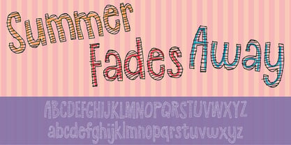
- Linotype Face Value by Linotype,
$29.99 - Society Dame JNL by Jeff Levine,
$29.00 - Frames And Banners by Outside the Line,
$19.00
- Freckle Face Pro by Stiggy & Sands,
$29.00
- Game Rules JNL by Jeff Levine,
$29.00
- HU The Game by Heummdesign,
$15.00
- FF Type-Face by FontFont,
$41.99 - Polytype Numa Frames by Prime Graphics,
$45.00 - Face Your Fears by Hanoded,
$15.00
- Baskerville Old Face by URW Type Foundry,
$35.99
- College Game JNL by Jeff Levine,
$29.00
- Retro Frames 2 by Edyta Demurat,
$28.00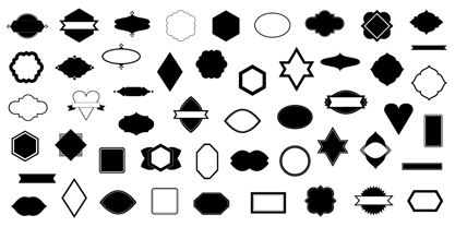
- Frames And Borders by Outside the Line,
$19.00 - Trekbats - Unknown license

- Scribbles AF by Andrew Foster,
$18.00
- Berlewi FA by Fontarte,
$39.00
- AF Diwa by ACME Collection,
$44.00 - AF Cashier by ACME Collection,
$44.00 - AF Screen by ACME Collection,
$44.00 - Komunikat FA by Fontarte,
$39.00
- AF Interface by ACME Collection,
$44.00 - AF Hadrian by ACME Collection,
$44.00 - Riot AF by Alien,
$40.00 - AF Carplates by ACME Collection,
$44.00 - Modernista FA by Fontarte,
$39.00
- AF Retrospecta by ACME Collection,
$44.00 - Saturator FA by Fontarte,
$39.00
- AF Kub by ACME Collection,
$44.00 - Peepz AF by Andrew Foster,
$29.00
- AF Track by ACME Collection,
$44.00 - AF PAN by ACME Collection,
$44.00 - AF Wendingen by ACME Collection,
$44.00 - AF Camberwell by ACME Collection,
$44.00 - AF Angel by ACME Collection,
$44.00 - Spud AF by Andrew Foster,
$12.00
- AF Oneline by ACME Collection,
$44.00 - Cindy FA by Fontarte,
$39.00
- Moi Non Plus by Hanoded,
$15.00
